
Sabiá Arquitetos and Trema Arquitetura Merge Two Units Inside Niemeyer's Copan Building
A 340-square-meter apartment carved from two mirrored flats opens a 24-meter curved facade onto São Paulo's skyline.


The Copan Building is one of those structures that swallows its own mythology. Oscar Niemeyer's sinuous concrete megablock on Avenida Ipiranga houses more than a thousand apartments across six residential blocks, and its sheer scale tends to flatten the stories of the people who actually live inside it. So when Sabiá Arquitetos and Trema Arquitetura were asked to combine two three-bedroom units in Block D into a single 340-square-meter apartment, the real task was not just demolition and reconfiguration. It was about making a domestic interior hold its own against one of Brazil's most famous facades.
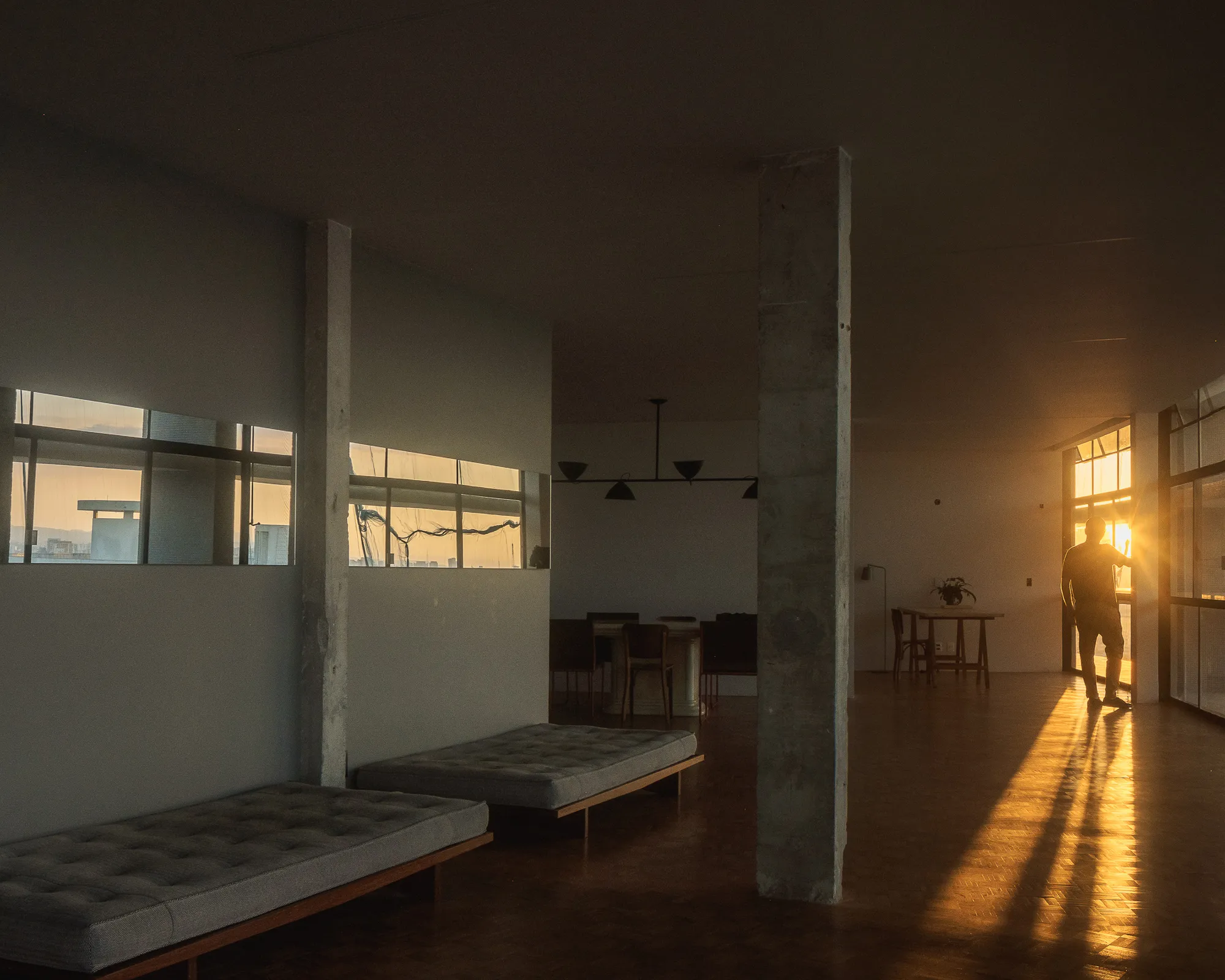
The result, completed in 2022 by lead architects Beatriz Marques and Nilton Suenaga of Sabiá and Raphael Souza of Trema, does something deceptively simple. By removing the wall that once separated the two living rooms and partially demolishing two adjacent bedrooms, the design unlocks a continuous social zone that runs the full 24-meter length of Copan's curved brise-soleil facade. A strategically placed mirror on the circulation core wall opposite the glass line multiplies the urban panorama, creating vanishing points that reach toward the Serra da Cantareira. The apartment stops being a pair of boxes and starts behaving like a belvedere.
The Curve Unlocked
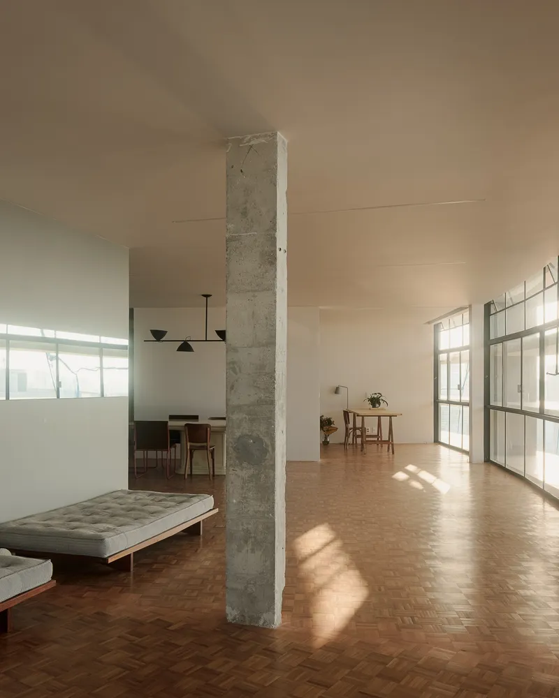

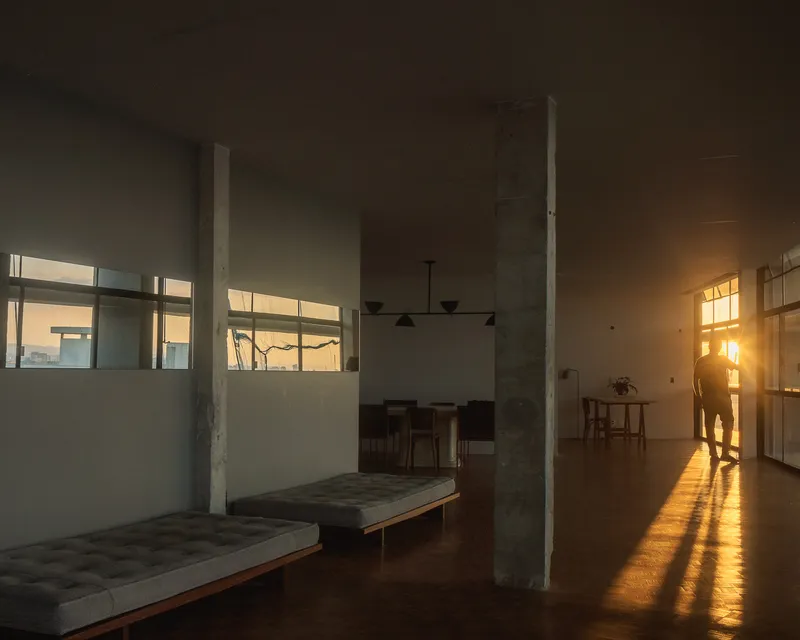
Copan's defining formal gesture, its serpentine plan, is something most of its residents experience only from the street. Inside, the curve is chopped into narrow units whose windows offer fragments of the panorama. By stitching two mirror-image apartments together, Sabiá and Trema allow the curve to be felt from within. The open social area runs uninterrupted beneath exposed concrete columns, and the herringbone parquet floor reads as a single continuous surface rather than two disjointed rooms. Afternoon sunlight sweeps across the space in long arcs that track the building's geometry.
The structural columns that punctuate the living and dining zones are left raw, their cylindrical profiles acting as spatial markers rather than obstructions. They give rhythm to a room that could otherwise feel sprawling, and they remind you, constantly, that this is Niemeyer's concrete skeleton doing the heavy lifting.
Steel, Glass, and the Brise-Soleil
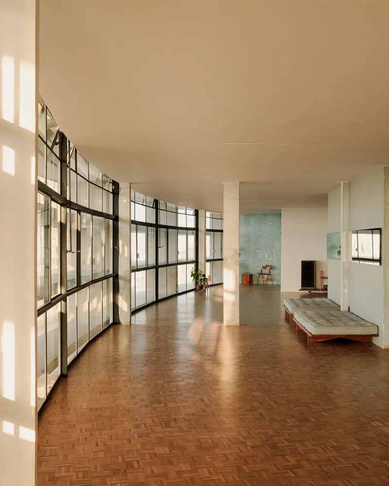
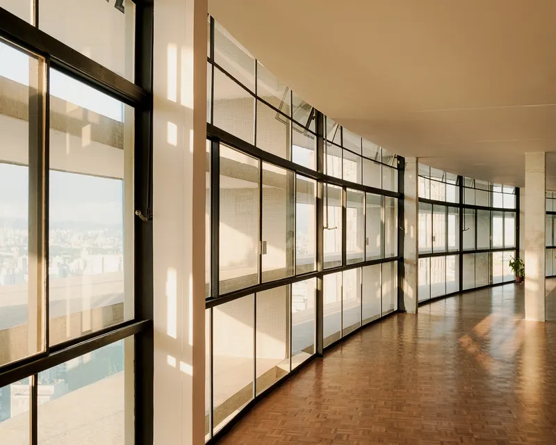

The apartment's most striking interior element is the series of black steel-framed glass partitions that line and subdivide the facade zone. These frames echo the proportions of Copan's external brise-soleil, creating a layered reading of the envelope: the original sun shading outside, the new steel-and-glass screen inside. The effect at different times of day ranges from crisp geometric shadows on the parquet in the morning to a warm amber glow at dusk, when the city skyline becomes the dominant visual.
At twilight, the steel frames read almost like a gallery display, with the cityscape mounted behind them. It is a deliberate choreography of interior and exterior that avoids the cliché of floor-to-ceiling transparency. The glass is filtered, screened, and subdivided so that the view is always composed rather than simply exposed.
Color as Material System

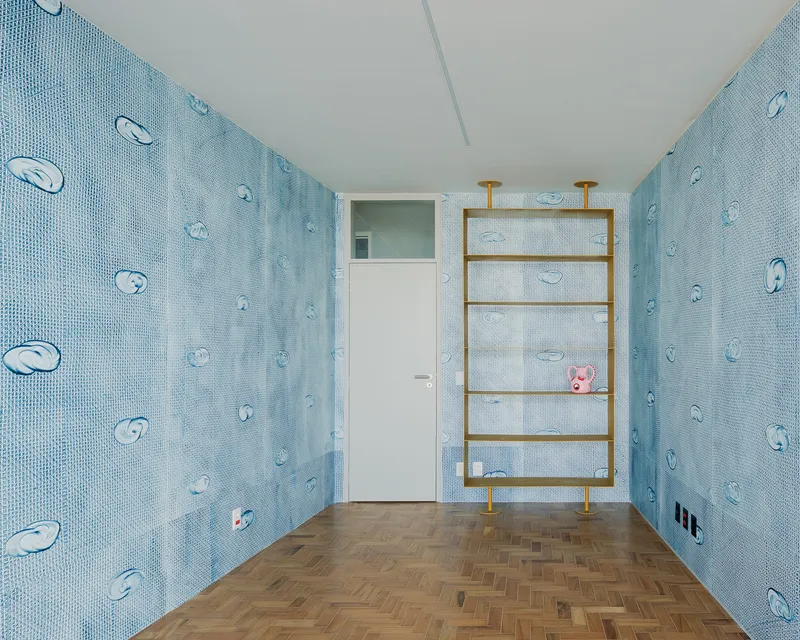

One of the bolder decisions in this renovation is the use of saturated color not as accent but as an entire material language. A blue mosaic tile room with applied ceramic fish motifs occupies one wing, its turquoise field contrasting sharply with the warm timber tones of the adjacent living spaces. Viewed against the dense cityscape through floor-to-ceiling glazing, the blue room becomes almost cinematic, a domestic aquarium suspended above São Paulo.
The palette shifts room by room with conviction. Sage green panels and ribbed blue-green partition doors define the transition zones, while the teal terrazzo of the bathrooms and the pink terrazzo of a secondary bath each claim their own chromatic territory. The effect is not whimsical. Each color zone corresponds to a material system: terrazzo by Casa Franceza, custom metalwork by Mekal, woodwork by Marcenaria Taniguchi. Color, here, is the diagram.
Kitchen as Social Infrastructure
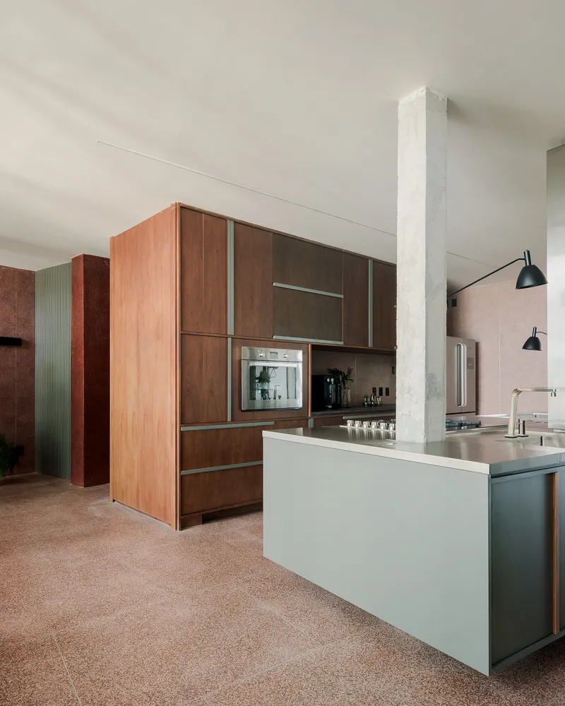
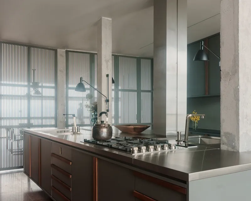

The kitchen occupies the hinge point of the plan, sitting between the public living zone and the more private bedroom wing. A pale island with integrated gas cooktop anchors the room, flanked by concrete columns and vertical fluted glass panels that control visibility without sealing off the space. The fluted glass is a recurring motif throughout the apartment: it provides privacy while maintaining the sense of a continuous, light-filled interior.
Stainless steel countertops and walnut cabinetry give the kitchen a quieter material register than the tiled rooms elsewhere. It is the one space where utility takes precedence over spectacle, and it benefits from the restraint. The concrete columns, left unclad, tie this room directly to the structural logic of the building.
Terrazzo Bathrooms and the Balcony Edge
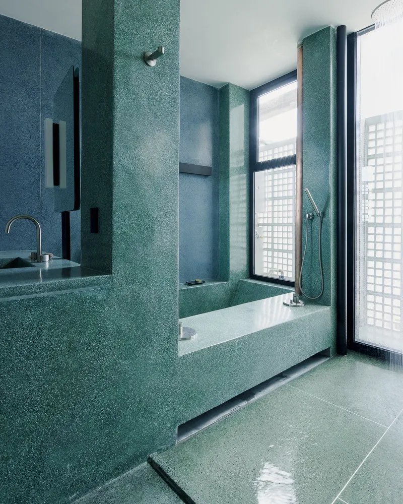
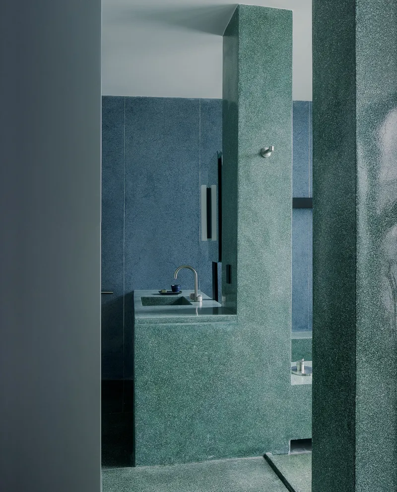
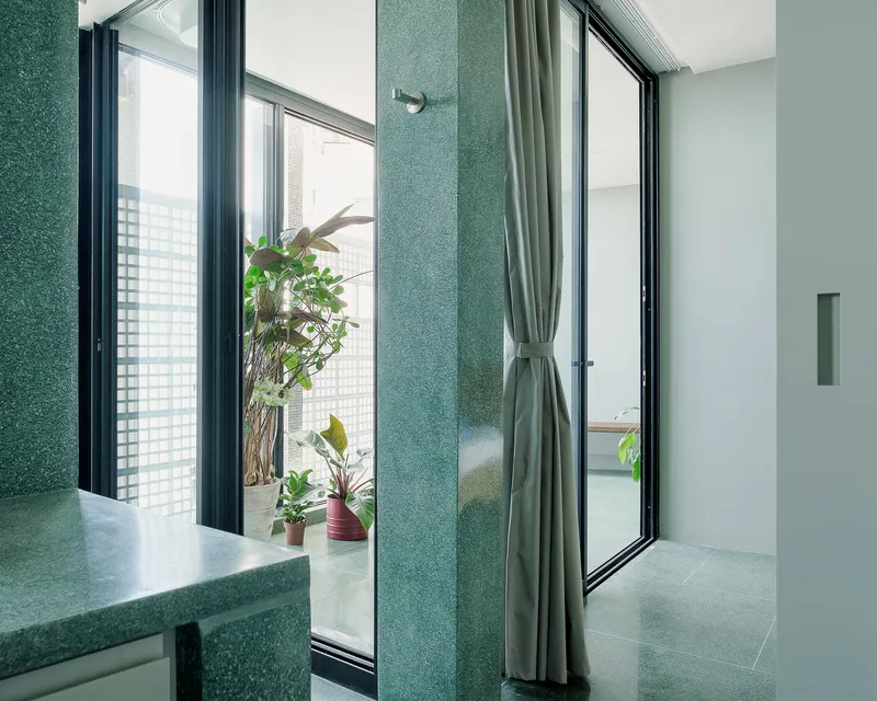
The bathrooms are the most materially ambitious rooms in the apartment. Teal terrazzo wraps floors, walls, bathtub niches, and vanity counters in a single continuous surface, punctuated by recessed black storage niches and brass fixtures. The effect is monolithic and immersive, as though these rooms were carved from a single block of aggregate. Glass block screens on the exterior wall filter daylight into a soft, even wash that keeps the green tones luminous.
Planted balconies line the exterior of these wet rooms, visible through black-framed windows. The overlap of green terrazzo inside and green foliage outside collapses the boundary between interior finish and landscape. It is a small detail, but it transforms the bathroom from a utilitarian enclosure into a space that feels genuinely connected to its environment.
The Bedroom Wing and Filtered Light
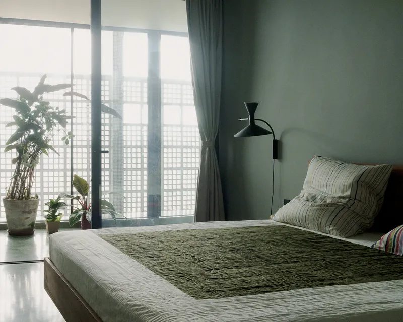
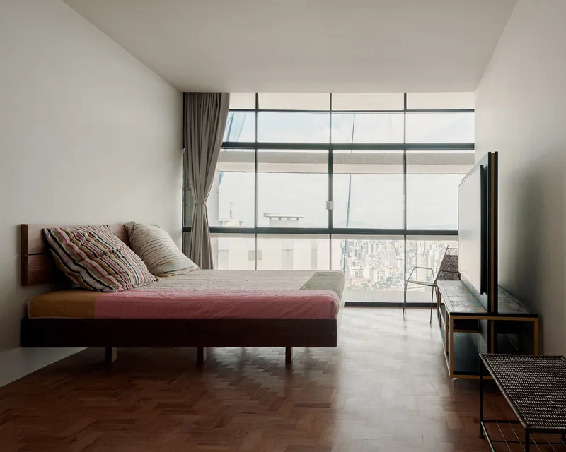
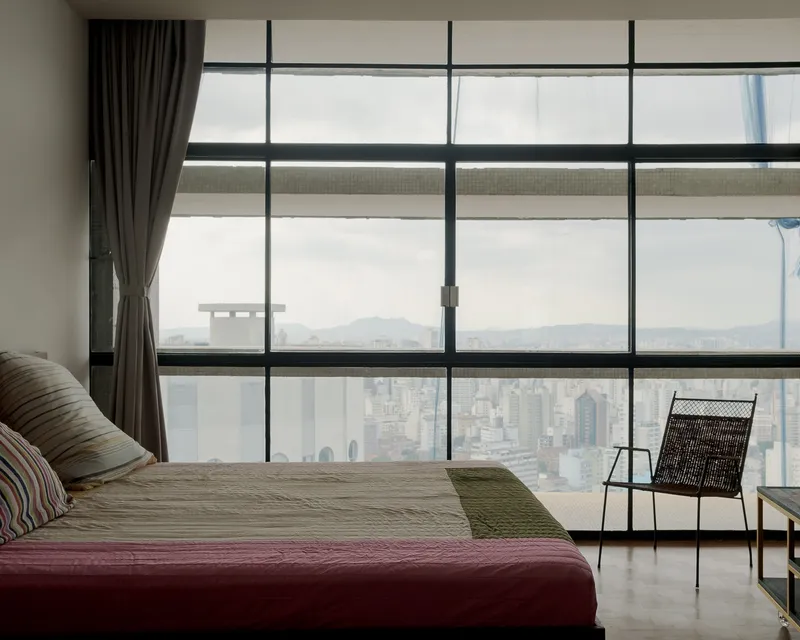
The bedrooms pull back from the openness of the social zone. Grid-patterned glass screens filter morning light into soft geometric patterns across beds and timber floors. The shift in atmosphere is immediate: the city view, so dominant in the living areas, is here diffused and controlled. A bedroom with full-height glazing overlooking the skyline offers the panorama in its most direct form, but even there, the framing is tight and deliberate.
Hanging planters and potted palms populate the window edges, and the palette cools to muted greens and natural timber. These are rooms designed for retreat, and they prove that the architects understand the difference between living with a view and being overwhelmed by one.
Threshold Details
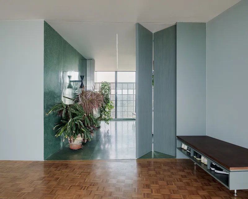
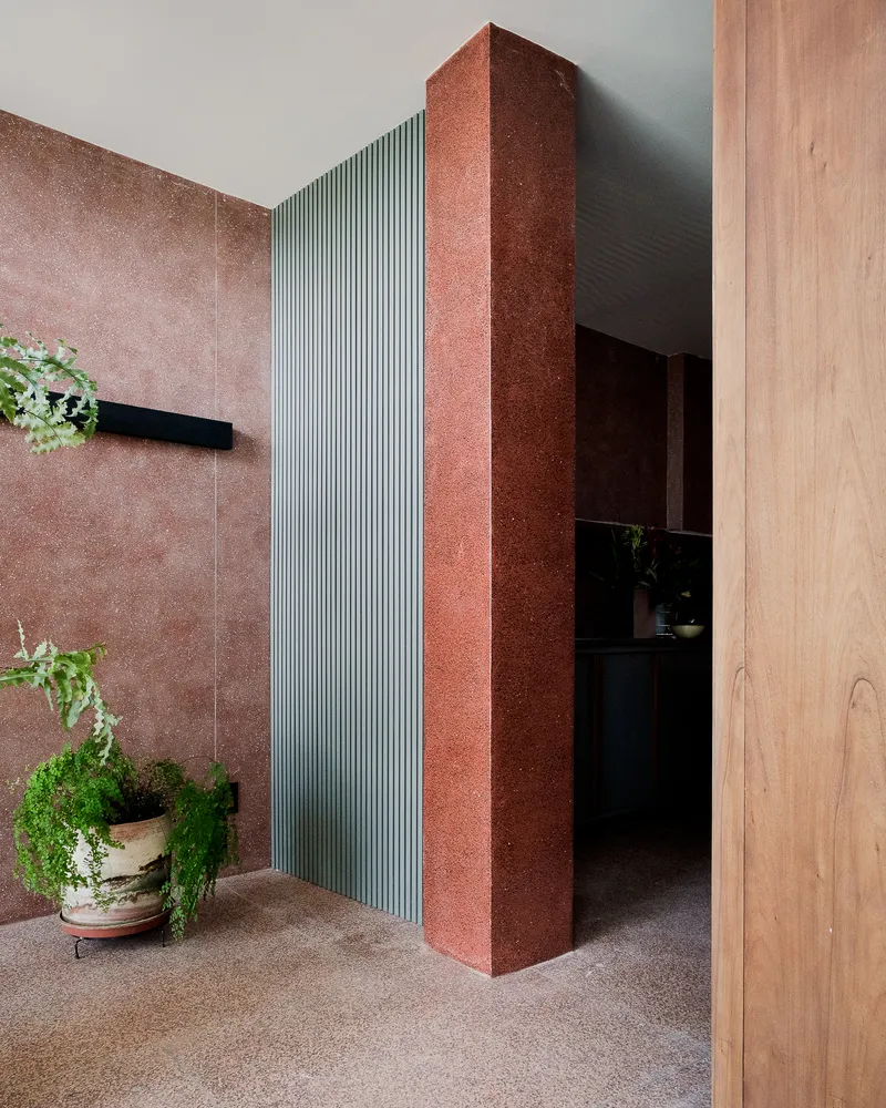

The craft of this project lives in its transitions. Folding ribbed partition doors in blue-green connect rooms with a tactile, almost textile quality. A red textured stone column at the entrance corridor marks the threshold between public corridor and private apartment with unapologetic material force. Vertical timber slat walls along hallways modulate the rhythm of movement from one zone to the next.
These are not decorative choices. Each threshold condition signals a change in program, material palette, and light quality. The architects use the long corridors inherent to the merged plan as opportunities for spatial compression before release, so that arriving in the open living zone or the tiled blue room carries genuine impact.
Plans and Drawings
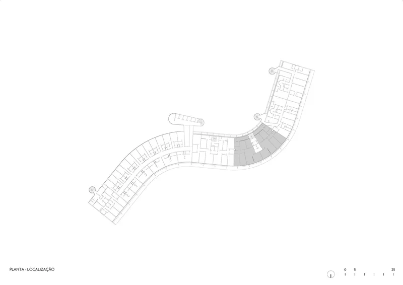

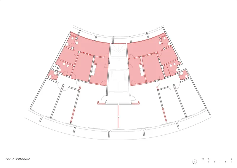
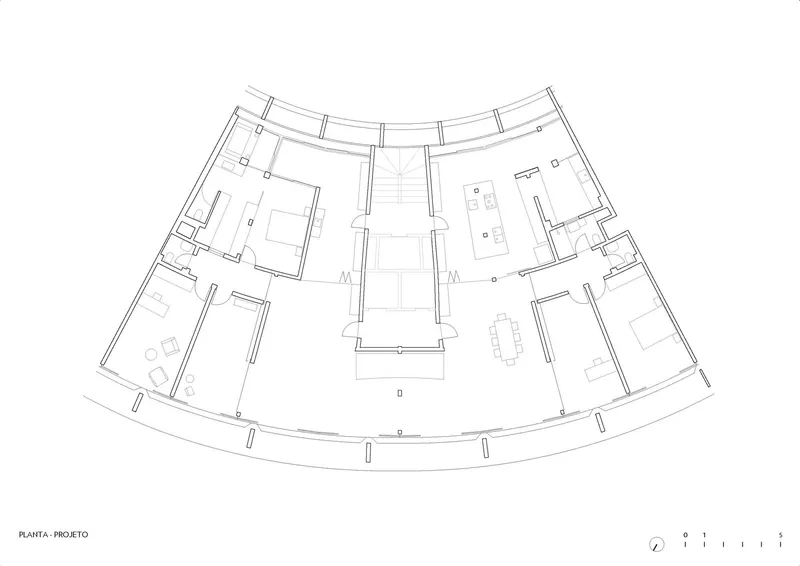

The drawings reveal the logic of the merger clearly. The site plan shows Copan's characteristic curved bar with its cellular repetition, and the floor plans illustrate how two symmetrical units have been opened into a single organism. The demolition plan, with its pink-shaded walls to be removed, is the most telling drawing: it shows just how much partition wall had to come down to liberate that 24-meter facade run. The color-coded plan of the final layout maps each material zone, confirming that the apartment's chromatic shifts are not improvised but planned with the precision of an urban diagram.
Why This Project Matters
Renovating inside a landmark building is a specific kind of design problem. The temptation is either to defer entirely to the original architecture or to ignore it and impose a white-box neutrality. Sabiá Arquitetos and Trema Arquitetura do neither. They treat Niemeyer's concrete frame and brise-soleil as active participants in the new design, not as sacred relics, and they respond with materials and colors that have enough presence to hold a conversation with the existing structure.
More importantly, the project demonstrates that unit mergers in large residential buildings can produce spatial experiences that the original architects never intended. Niemeyer designed Copan for density, not for panoramic living rooms. By working within those constraints and removing only what is structurally permissible, the design team has produced a home that feels both loyal to the building and entirely its own. That balance, between respect and ambition, is the hardest thing to get right in renovation work, and this apartment gets it right.
Copan D Apartment by Sabiá Arquitetos and Trema Arquitetura. São Paulo, Brazil. 340 m². Completed 2022. Photography by Pedro Kok.
About the Studio
Share Your Own Work on uni.xyz
If projects like this are the kind of work you want to make, uni.xyz is a place to publish your own, find collaborators, and enter design competitions.




Popular Articles
Popular articles from the community


AL-JANNAH: Sustainable Architecture and Permaculture for Afghan Widows
AL-JANNAH uses sustainable architecture and permaculture to create resilient oasis of housing, learning, work and renewal for Afghan widows.

Riyadh For All: Intergenerational Urban Design for Active Aging in Rabat
Riyadh For All reimagines urban design in Rabat with intergenerational co-living, adaptive courtyards, and Moroccan cultural exchange today.
The Earth Pod: 3D Printed Homes for Resilient Refugee Communities
The Earth Pod reimagines refugee housing through 3D printed homes made from clay, combining resilience, self-sufficiency, and rapid shelter.

The Ocean Hive: Sustainable Architecture for a Self-Sufficient Civilization at Sea
The Ocean Hive imagines sustainable architecture at sea, where modular habitats, algae, wave power and ocean waste sustain a growing colony.


Similar Reads
You might also enjoy these articles

Bao Huynh Watercolor Atelier: A Serene Art Retreat in Hội An
Bao Huynh Watercolor Atelier in Hội An blends multifunctional art spaces, sustainable design, local materials, and family-friendly living in a serene environment.

Atelier Macri Concept Store Interior Design by CASE-REAL
Atelier Macri store features a "ko" counter, walnut wood details, cork displays, blending retail, gallery, and seamless customer experiences.

Manuel Vargas Izquierdo Stadium and High-Performance Sports Center: Architectural Excellence in Jalpa de Méndez
The Manuel Vargas Izquierdo Stadium blends sustainable design, inclusive sports facilities, and cultural-inspired architecture, revitalizing Jalpa de Méndez’s public spaces.

KAKR Buluh Awar Hall: Revitalizing Community and Ecology Through Bamboo Architecture
Community built bamboo hall revitalizes Buluh Awar village, empowering youth, restoring ecology, celebrating vernacular craftsmanship through sustainable architecture and culture.





Comments (0)
Please login or sign up to add comments
No comments yet. Be the first to comment!