
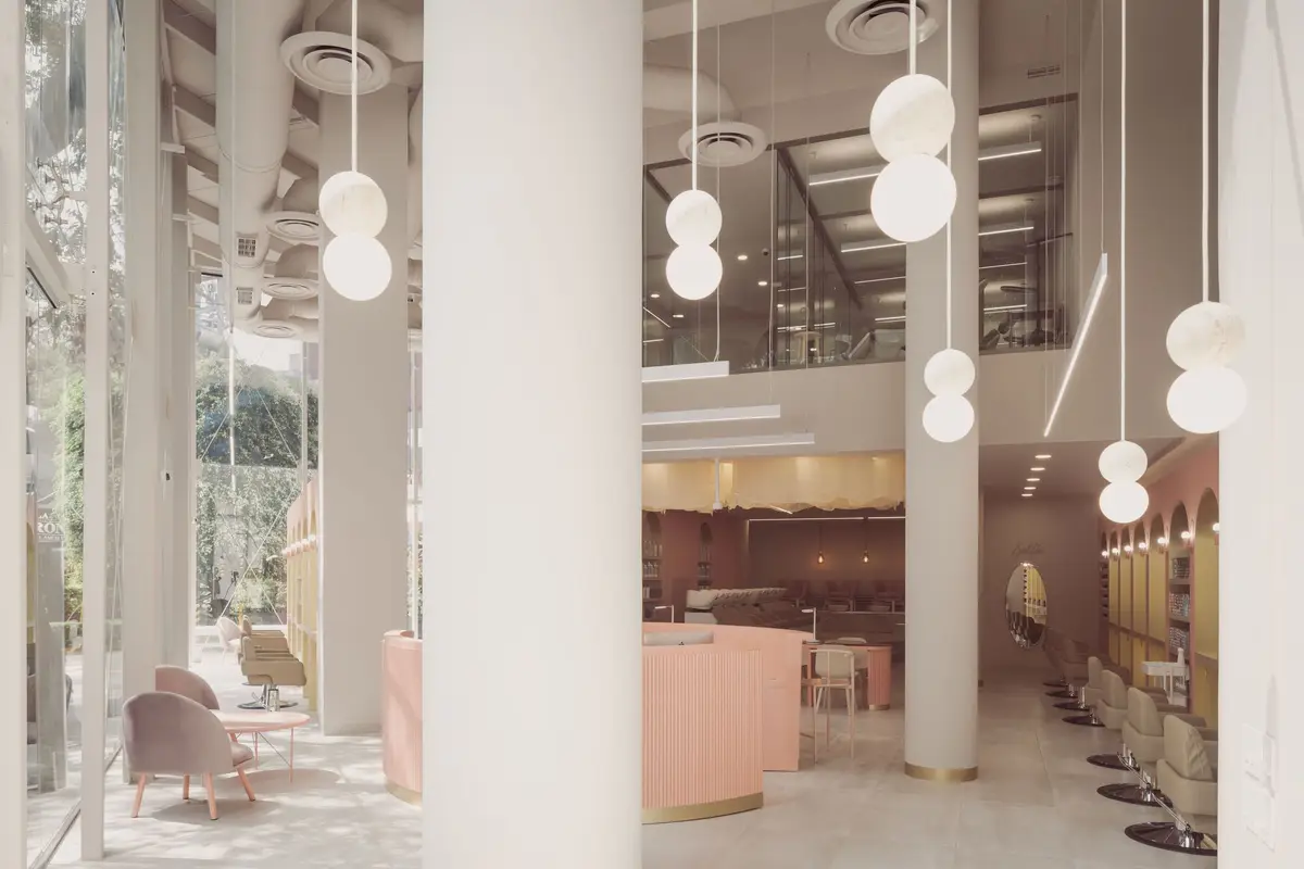
VOID Studio Wraps a Mexico City Beauty Salon in Curves, Brass, and Choreographed Pink
Leonora Studio in Polanco turns a double-height retail space into a salon where movement and mirrors multiply every gesture.


A beauty salon is a place of transformation, so it makes sense that the architecture should perform one too. VOID Studio designed Leonora Studio on Avenida Horacio in Mexico City's Polanco neighborhood as the flagship of a chain that planned to open at least six locations across the capital in 2022. The challenge was not simply to design a single striking interior but to develop a modular baseline that could adapt to different floor plates and conditions while maintaining a legible identity. That baseline, it turns out, is built on a single word: movement.
What makes the project genuinely interesting is how literally and methodically VOID Studio pursued that concept. Curves appear in the staircase, the reception desk, the ceiling coffers, and the arcaded walls. Brass sheets wrap mirrors and columns, bouncing reflections until the space feels twice its actual size. A palette of blush pink, pale wood, and white creates a cohesive softness that never dips into sentimentality, partly because the planning is so rigorous: symmetries, matching sight lines, and consistent angles between walls and furniture hold everything in disciplined tension.
The Double-Height Facade as Window Display
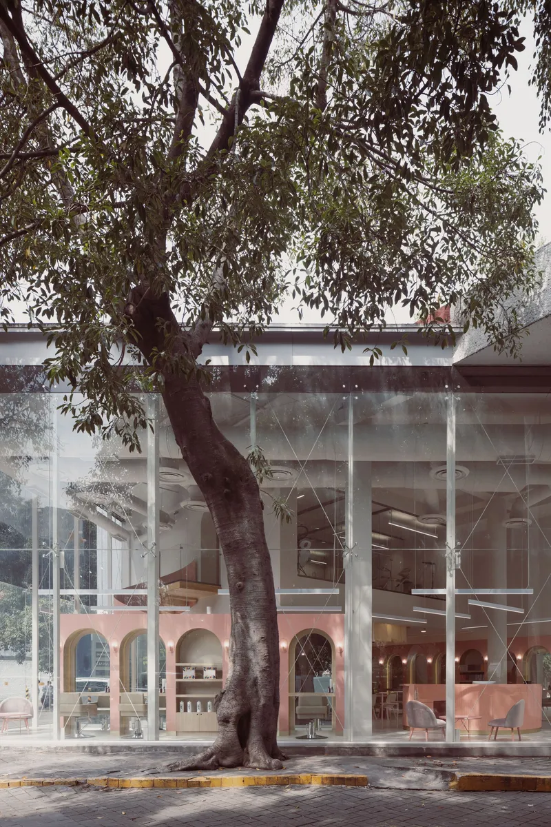
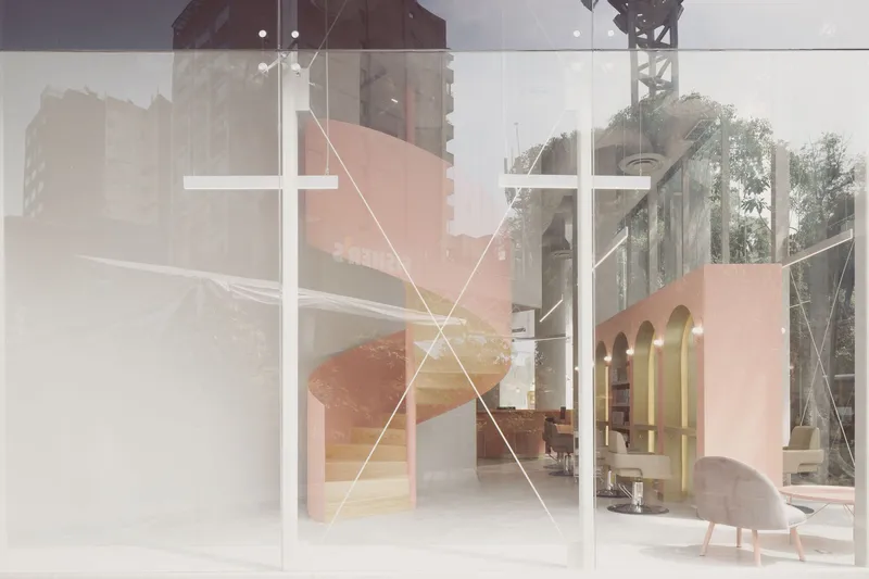
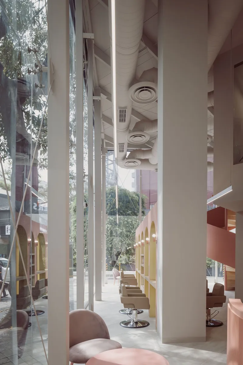
From Avenida Horacio, the salon reads as a single tall vitrine. Floor-to-ceiling glass panels expose the full double-height interior, turning the helical stair and the activity on both levels into a continuously changing tableau. A mature tree on the sidewalk filters the view just enough to give the composition depth, its organic canopy contrasting with the controlled geometry behind the glass. The frosted panels that wrap the stair soffit add a layer of translucency, so even from oblique angles the spiral form registers as a pink glow.
VOID Studio describes the effect as a "window display image" generated through reflections. The brass-clad columns and rhythmically placed mirrors inside multiply the glazed facade's transparency, making the boundary between street and salon feel negotiable. Natural light floods in, which is both an aesthetic choice and a practical one: accurate color rendering matters in a space where hair dye and nail lacquer need to be evaluated under real light.
A Staircase That Teaches the Building's Language
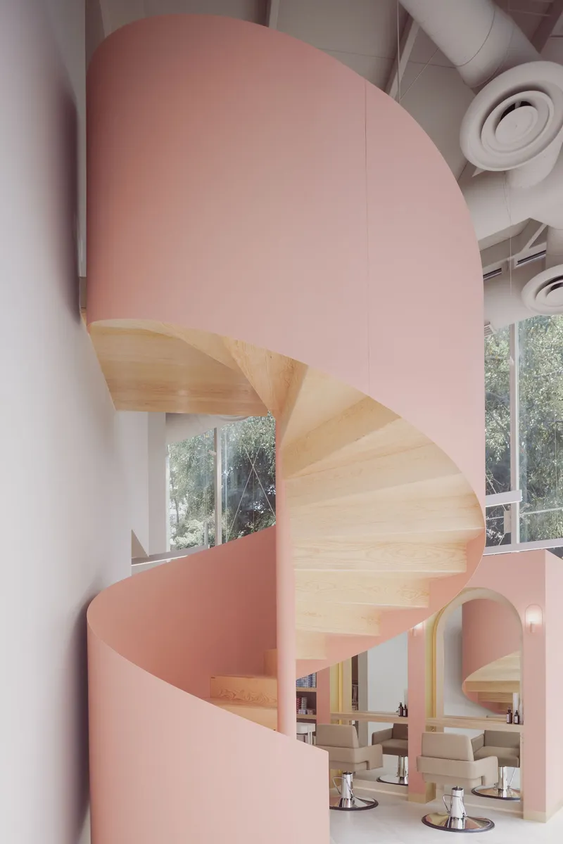
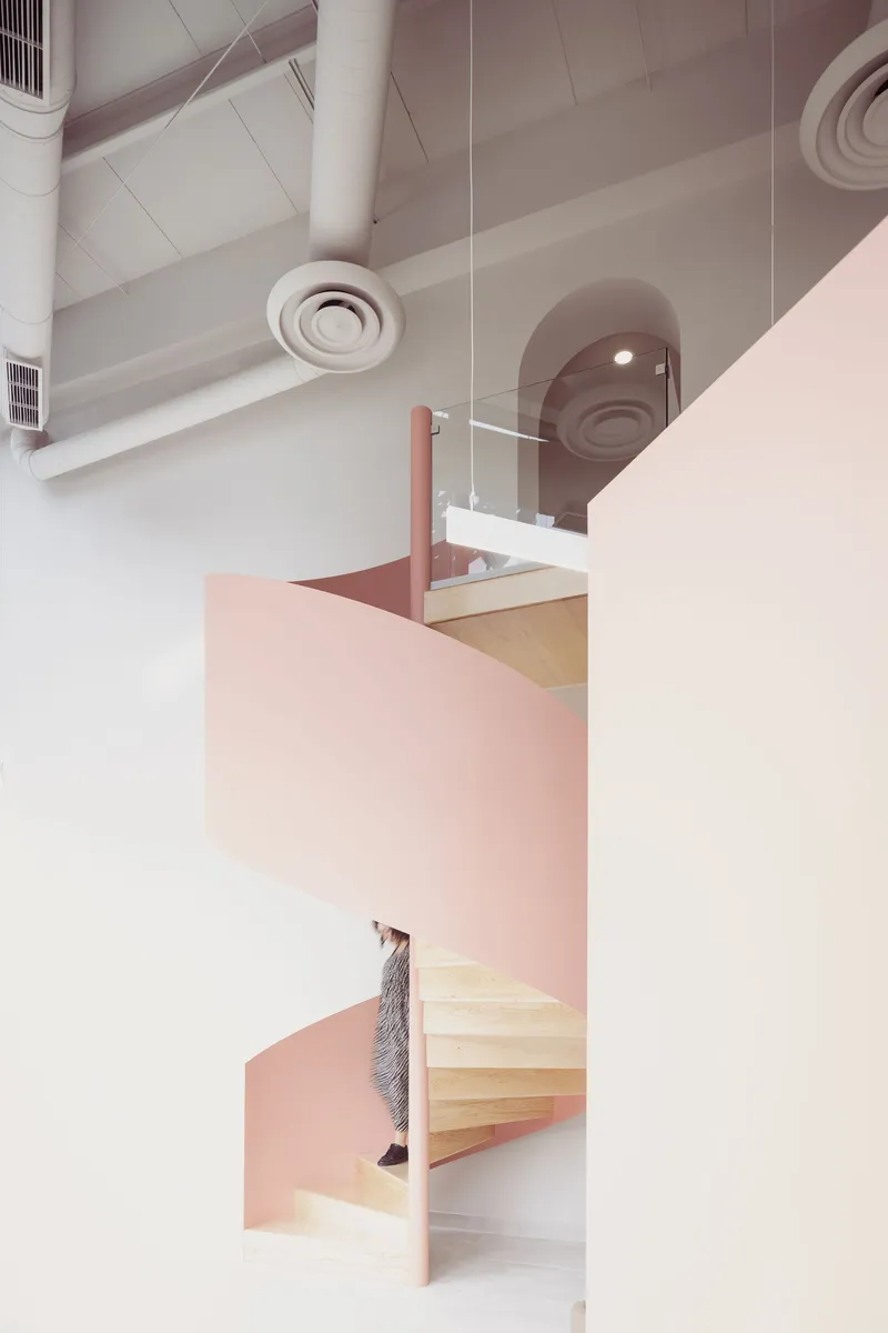
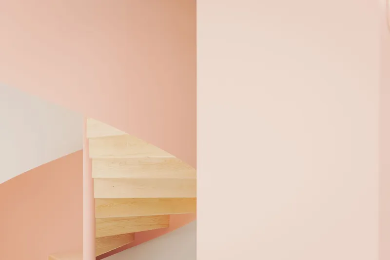
The helical timber stair is the spatial engine of the project. Its light wood treads spiral upward through a pink curved soffit that peels away from the ceiling like a ribbon mid-unfurl. The stair introduces every material and every formal move the rest of the interior will repeat: the warmth of wood grain, the soft radius of the pink millwork, the interplay of transparent and opaque surfaces. Ascending it, you see the salon floor below through gaps in the partition walls, so the act of moving between levels is also an act of surveying the space.
Beneath the stair, intersecting pink and white walls create pockets of enclosure that screen back-of-house functions without resorting to solid corridors. Exposed ductwork and ceiling vents above are left visible, a pragmatic note that keeps the interior from tipping into fantasy. The contrast between raw services overhead and the sculpted surfaces below gives the project an honesty that many retail interiors lack.
Reception and the Ritual of Arrival
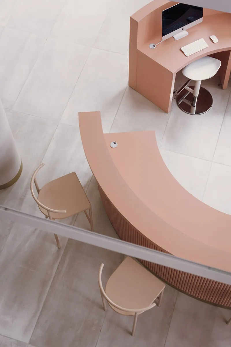
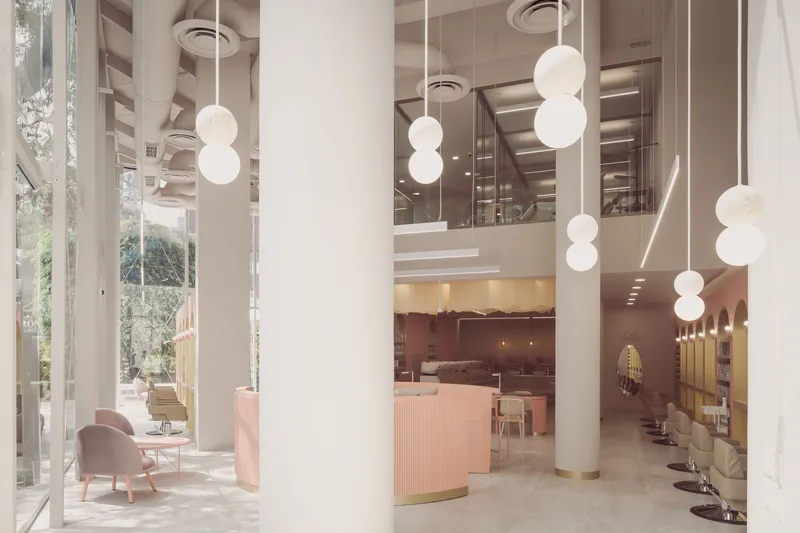
The curved reception desk, finished in fluted pink millwork and set on pale stone tiles, anchors the ground floor. Its form echoes the stair's radius and establishes the curvilinear geometry that governs every subsequent element. David Pompa's Origo pendant lamps hang at the entry and exit, their spherical forms rhyming with the white circular columns that punctuate the double-height volume. The effect is of a carefully sequenced threshold: you pass the pendants, arrive at the desk, and only then do the mezzanine levels and the salon beyond reveal themselves.
VOID Studio's decision to keep the waiting area visually open to the working salon is deliberate. Clients are invited into the spectacle from the moment they sit down, which collapses the typical separation between lobby and service floor. It is a smart commercial move too: seeing other clients mid-treatment normalizes the experience and shortens the psychological distance between arrival and service.
The Salon Floor: Coordination as Choreography
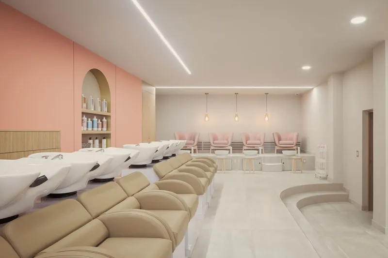
Hair-washing stations, pedicure chairs, and manicure positions line up in coordinated rows under linear lighting, each station framed by pink millwork that doubles as storage and spatial divider. The layout puts every function in clear view, an operational choice that lets staff monitor the floor and lets clients feel attended to even when their stylist steps away. Mirrors are placed at rhythmic intervals to extend sight lines and amplify the sense of volume, a trick borrowed from retail design that works especially well in a salon where reflective surfaces are already expected.
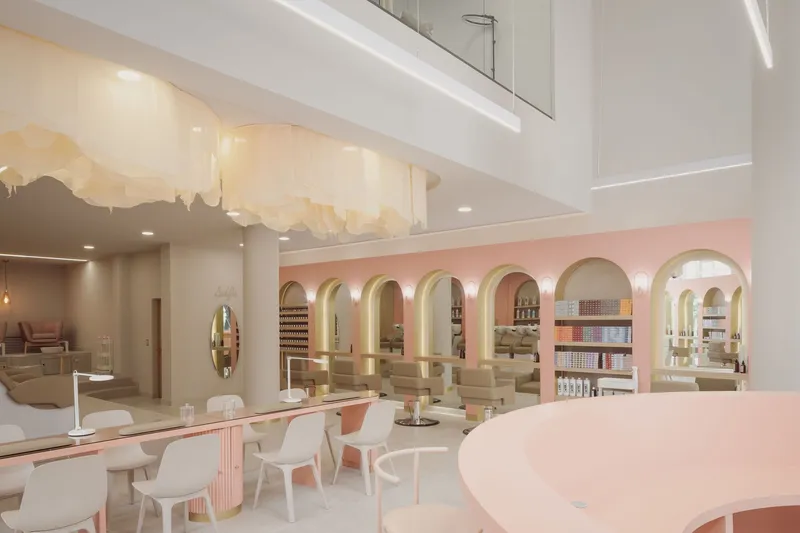
The white circular columns that rise through the double-height space carry sculpted ceiling coffers overhead, creating a gentle rhythm that breaks up what could otherwise be a monotonous open plan. Translucent fabric clouds installed in parts of the ceiling soften the acoustics and diffuse artificial light, adding a layer of tactile warmth to the upper volume.
Treatment Rooms and the Arcaded Wall
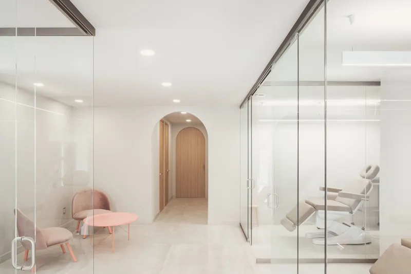
Behind floor-to-ceiling glass partitions, microblading rooms and eyelash stations occupy enclosed volumes with a deliberately clinical appearance, separating procedures that require precision and privacy from the sociable bustle of the open floor. A timber-clad arched doorway at the end of the corridor signals the threshold between the two atmospheres, its warm material and curved profile maintaining the project's formal vocabulary while clearly marking a change of mood.
The pink arcaded wall on the upper level is perhaps the most theatrical gesture in the project. Its repeated arches frame a white seating area and draw the eye upward to a mural on the ceiling, creating a moment of visual extravagance that rewards clients who ascend the stair. Yet even here, the symmetry and matching angles that VOID Studio imposed across the design keep the drama disciplined. The arcade is exuberant but not gratuitous: it defines a zone, directs circulation, and reinforces the brand identity that will travel to every future branch.
Plans and Drawings
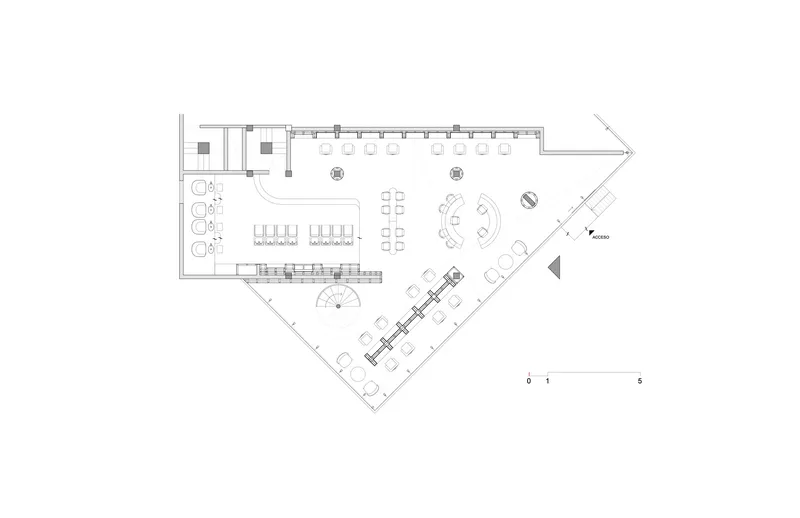
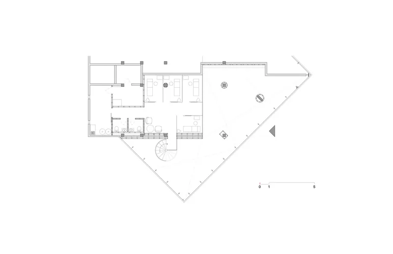
The floor plans reveal the angular logic beneath the project's curving surfaces. Service stations, seating areas, and enclosed treatment rooms are organized along angled axes that maximize sight lines while carving out moments of privacy. The compact service rooms cluster toward the back, freeing the glazed street frontage for the most public and visually active functions. What reads on plan as a series of tight geometric decisions reads in person as fluid, almost intuitive spatial flow, proof that careful planning and sensory richness are not opposites.
Why This Project Matters
Retail interior design for beauty salons rarely gets serious architectural attention, which is precisely why Leonora Studio deserves it. VOID Studio treated the brief not as a cosmetic exercise but as a systems problem: how to create a legible, replicable spatial identity that can adapt to different sites while maintaining coherence. The modular baseline they developed, with its consistent angles, material palette, and formal vocabulary, is a genuine design tool, not a style guide stapled to a mood board.
The project also demonstrates that movement, as a design concept, only works when it is embedded in every decision, from the spiral stair to the mirror placement to the rhythm of the arcade. Half-measures produce gimmicks; full commitment produces architecture. In Polanco, on a busy commercial avenue, VOID Studio committed completely, and the result is a salon interior that feels less like decoration and more like a spatial argument for taking beauty culture seriously as a program.
Leonora Studio by VOID Studio, located in the Polanco neighborhood of Mexico City, Mexico. Completed in 2022. Photography by Zaickz Moz.
About the Studio
Share Your Own Work on uni.xyz
If projects like this are the kind of work you want to make, uni.xyz is a place to publish your own, find collaborators, and enter design competitions.


Popular Articles
Popular articles from the community


Aquadapt: An Underwater Habitat That Rewrites Its Rooms by the Hour
Curved modules ring the seabed while one shell shifts from breakfast room to cinema, farm and football pitch as residents' needs change.


FCC Arquitectura Expands a Portuguese Granite House with a Board-Marked Concrete Wing
In Portugal, JV House pairs a cleaned-up whitewashed and granite dwelling with a timber-shuttered concrete extension, courtyards and a garden pool.

David Ortega Stacks a Two-Story Mexico City Penthouse Around a Steel Stair and a Pergola-Shaded Roof Terrace
In Colonia Roma, a 300 m² penthouse uses oak joinery, a planted steel stair and a slatted roof pergola to make a new-build apartment feel like a house.

Singing Woman: An Opera House That Performs Before the Curtain Rises
Ovidiu Cristian Pavel's conceptual opera house translates Estonia's choral identity into a sculpted waterfront landmark facing the Baltic Sea.

Similar Reads
You might also enjoy these articles

LAVA Architecten Gives Vocational Education a Sawtooth-Roofed Face on a Mechelen School Campus
In Mechelen, Belgium, a 2,053 m² STEM school on a 6×6 m grid turns workshops and classrooms into rooms that can be rearranged as teaching changes.

KEMA Studio Turns a Derelict Marvila Attic into a 60 m² Lighthouse Apartment Above Lisbon
In Lisbon's Marvila district, a rebuilt roof, four skylights and two plywood volumes turn an unlivable attic into a bright home facing the Tagus.

Pixel Gardens: One Repeated Module Stacked Into a Terraced Social Housing Tower for Famagusta
Salem Bader's shortlisted housing tower builds a vertical neighbourhood from one repeated module, offsetting units to carve terraces, light and air.

Bao Huynh Watercolor Atelier: A Serene Art Retreat in Hội An
Bao Huynh Watercolor Atelier in Hội An blends multifunctional art spaces, sustainable design, local materials, and family-friendly living in a serene environment.

Comments (0)
Please login or sign up to add comments
No comments yet. Be the first to comment!