

Space Timefill: Birch Plywood in a Cheongju Cafe
SAISA STUDIO stripped a Korean shopping mall to its concrete bones and inserted birch plywood, a raised platform, and a bar counter. Nothing more.
Cheongju is a mid-sized city in central South Korea, not a design destination. Its old centre has quiet alleys lined with aging commercial buildings from the 1980s and 1990s: tile facades, low ceilings, dark interiors. Space Timefill, designed by SAISA STUDIO, takes one of these buildings, a former shopping mall, and turns it into a cafe that is both a renovation and a lesson in how little material it takes to produce a good room.
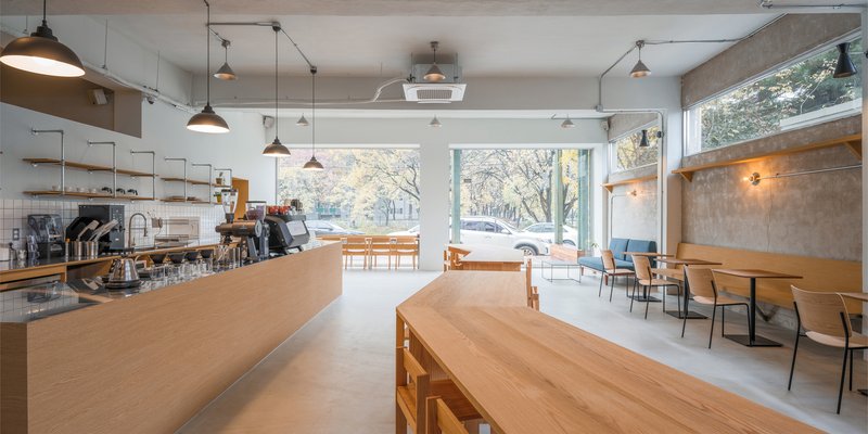
The palette is three things: birch plywood, exposed concrete, and white paint. The intervention is two moves: strip the walls back to their original texture, and insert a raised timber platform. That is the entire project. It works because the moves are precise, and the existing building has more character than anything new could provide.
The Existing Building and the Street
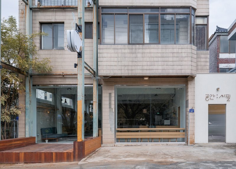
The street facade is a two-storey tile-clad building on a quiet alley. A full-height glass shopfront replaces the original ground-floor closure. A timber bench sits outside. The Korean signage reads vertically. The building does not announce itself. It waits for you to look through the glass and see the interior, which is where the architecture happens.
Stripped Walls: Concrete, Stone, and Patina
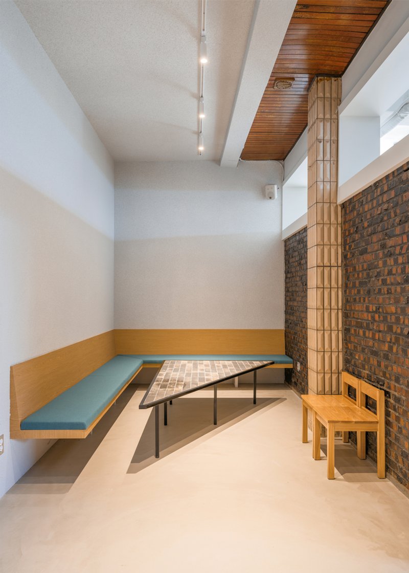
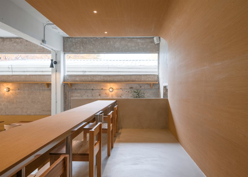
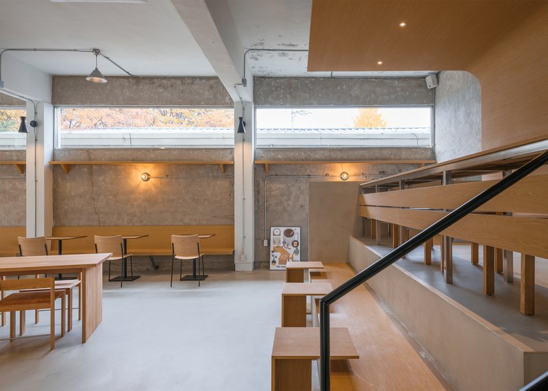
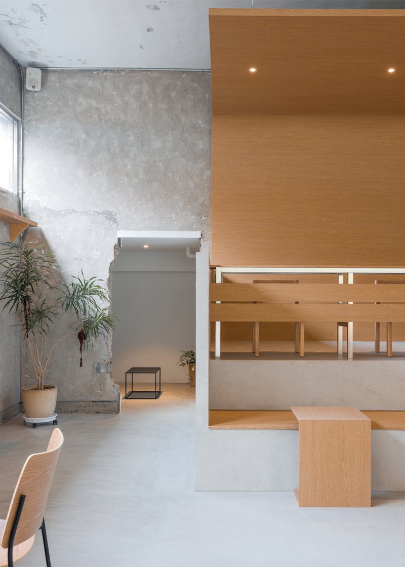
The most important decision was what to remove. The designers stripped the interior walls back to their original state: exposed concrete, stone, and brick. The textures are raw and varied. Some patches are smooth plaster. Some are rough aggregate. Some show the ghost of old tile adhesive. None of it is fake. It is the actual history of the building, revealed.
This is the vintage in "vintage minimalist." The old surfaces give the cafe a depth and warmth that new materials cannot replicate. The clerestory windows above the exposed walls let in a band of daylight that washes across the concrete, changing through the day.
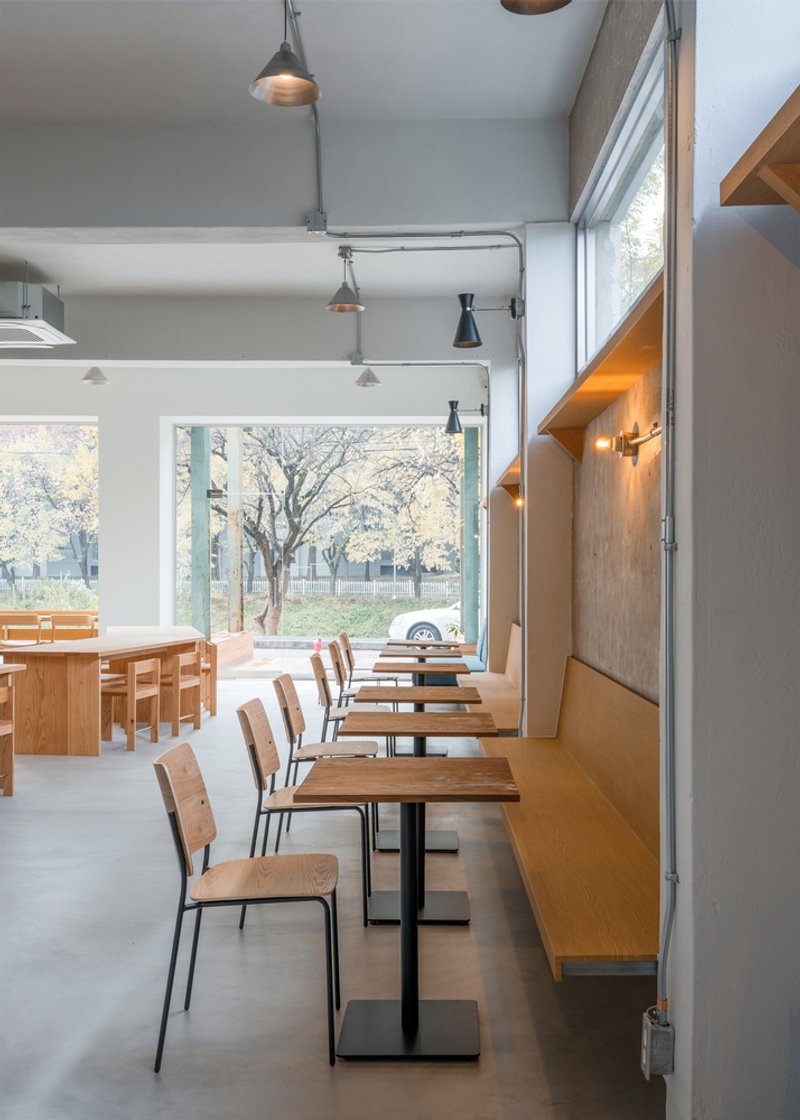
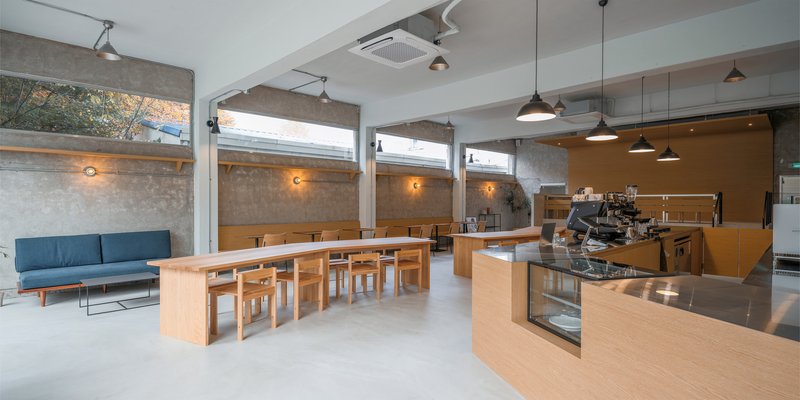
The Birch Plywood Interior
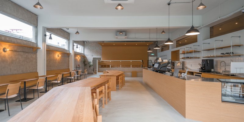
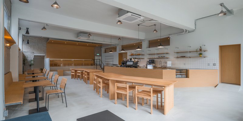
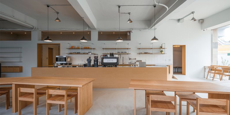
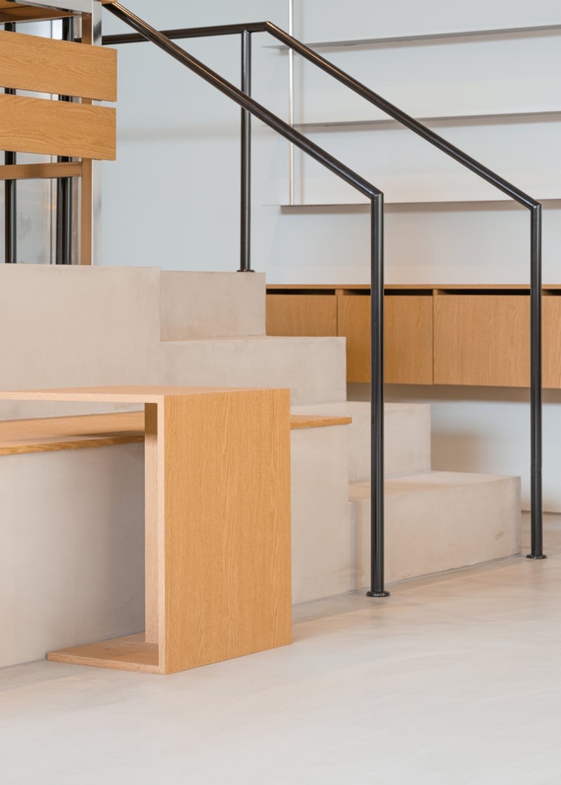
Against the raw walls, every new element is birch plywood. The L-shaped bar counter, the communal tables, the stools, the raised platform, the wall shelving: all the same material, all the same warm blonde tone. The plywood reads as a single continuous intervention inserted into the existing shell. Old and new are immediately legible because they are two different colours and two different textures.
The bar counter is the anchor. It sits at the centre of the L-shaped plan with the espresso machine, a glass display case, and open shelving behind a white tile backsplash. The counter is low enough to see over and wide enough to lean on. It organises the room without dividing it.
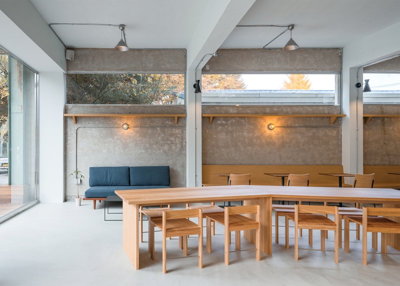
The Raised Platform
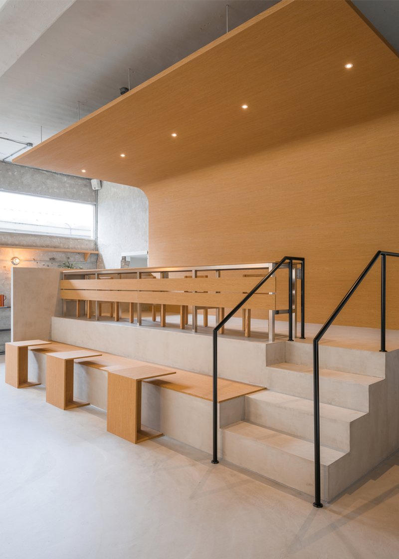
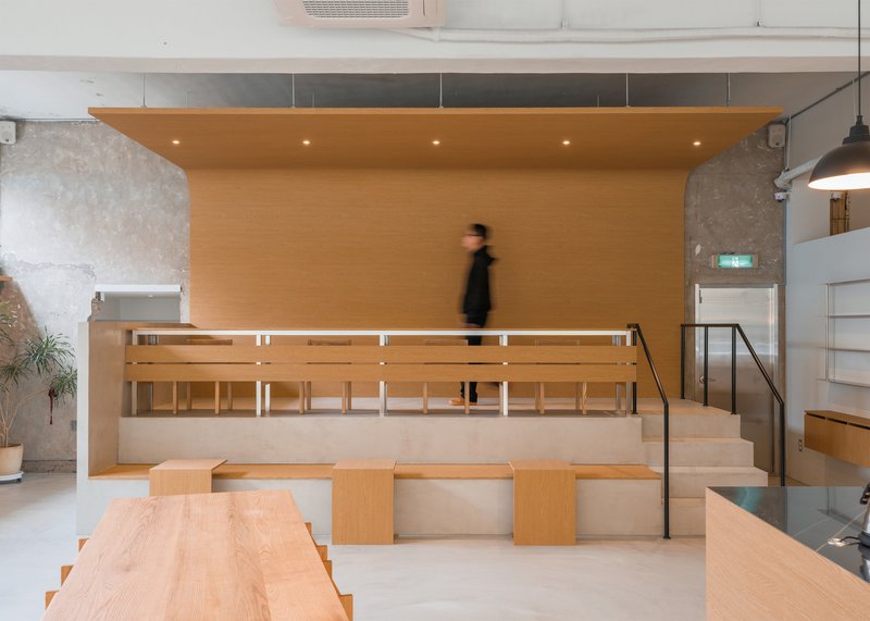
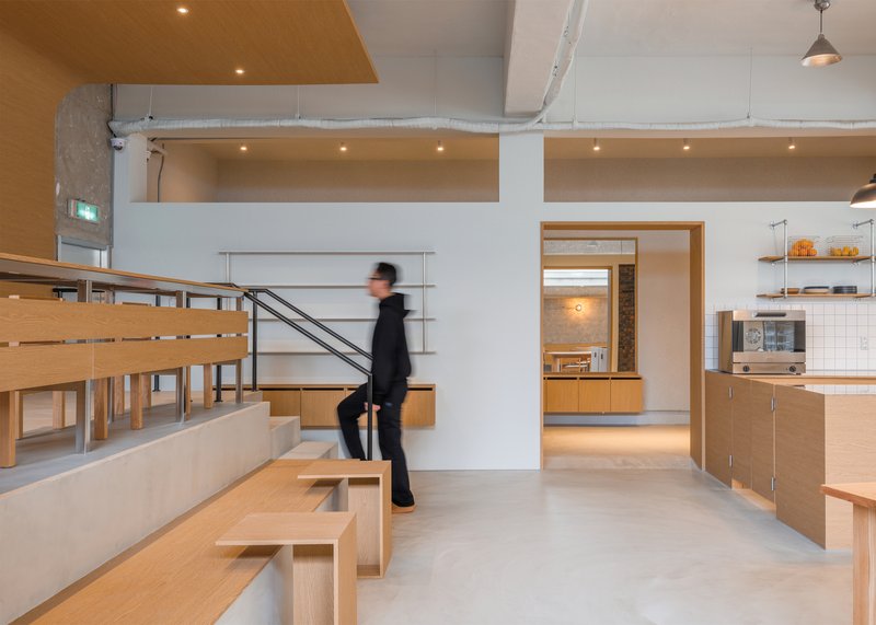
The raised platform is the project's second move. A birch plywood volume steps up from the main floor in three tiers, creating a grandstand-like seating area with integrated desks and benches. A timber ceiling panel above lowers the scale and warms the acoustic. A black steel railing marks the edge.
The platform does several things at once. It creates a separate zone within the open plan. It provides elevated seating with a view across the cafe and out to the street. It adds seats to a compact floor plate without making the room feel crowded. And it gives the cafe a spatial event that a flat floor cannot provide.
Plan
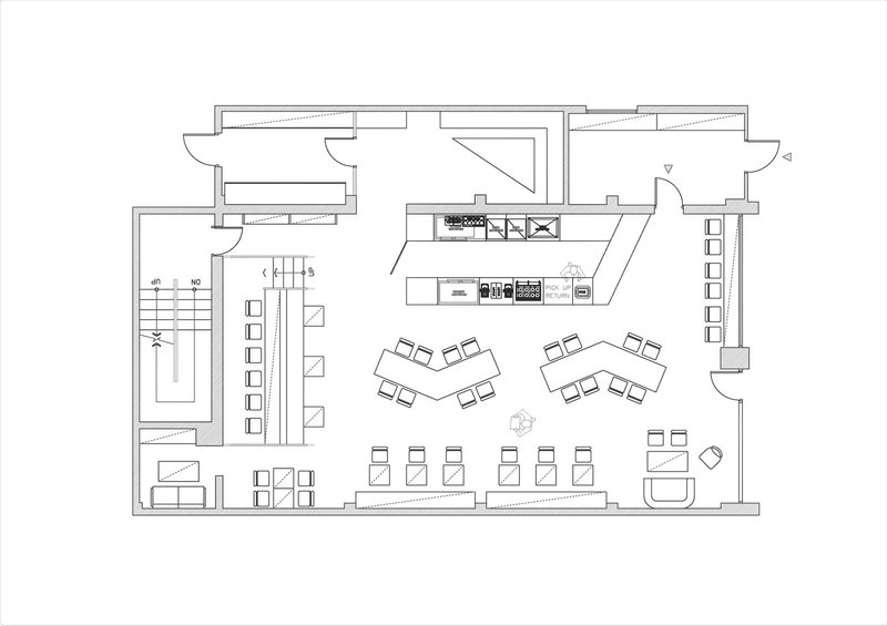
The floor plan shows the L-shaped layout. The raised platform occupies the left wing. The bar counter and main seating fill the right. The kitchen sits behind the bar. The stair to the upper level is beside the platform. The street entry is at the bottom. The plan is compact, but the level change and the L-shape prevent it from feeling like a single room.
Why This Project Matters
Korean cafe design has become one of the most active testing grounds for small-scale interior architecture in the world. Seoul gets the attention, but secondary cities like Cheongju produce some of the most interesting work because the budgets are smaller and the buildings are less precious. Space Timefill proves that stripping an old building back and inserting a few pieces of good plywood is a more effective design strategy than starting from scratch.
If you are renovating a small commercial space on a limited budget, this project is worth studying for the ratio of effect to material. Two colours, three materials, one level change. The existing building does the rest.
About the Studio
Share Your Own Work on uni.xyz
If you are working on cafe design, commercial renovation, or vintage-minimalist interiors, uni.xyz is a place to publish your work and connect with a global design community.
Project credits: Space Timefill Coffee Shop by SAISA STUDIO. Cheongju, South Korea. Photographs: Kobou Studio.


Popular Articles
Popular articles from the community
20 Most Popular Commercial Architecture Projects of 2025
From sustainable market concepts to heritage factories, the commercial buildings and proposals that drew the most attention on uni.xyz this year.
Rede Arquitetos Builds an Open-Air School in Fortaleza That Doubles as a Neighborhood Living Room
Educar II SESC-CE folds sports, dance, and community gathering into a courtyard campus wrapped in mesh and tropical color.
Marvila Apartment Renovation in Lisbon: A Bright Minimalist Attic Transformation by KEMA Studio
Bright attic transformed into minimalist Lisbon apartment with skylights, sustainable materials, open plan layout, and industrial-inspired interior design elements.
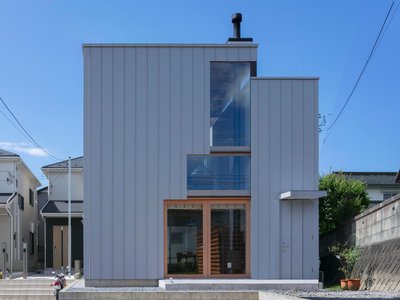
Split House: A Compact Urban Home Blending Privacy, Light, and Flexible Living in Japan
Compact Japanese home featuring DOMA space, flexible café potential, passive lighting, privacy zoning, and sustainable urban living design.

Similar Reads
You might also enjoy these articles
Filtering Space: A Gradual Spatial Experience
From urban intensity to spatial calm.
The Ken Roberts Memorial Delineation Competition (Krob)
As the most senior architectural drawing competition currently in operation anywhere in the world, it draws hundreds of entries each year, awarding the very best submissions in a series of medium-based categories.
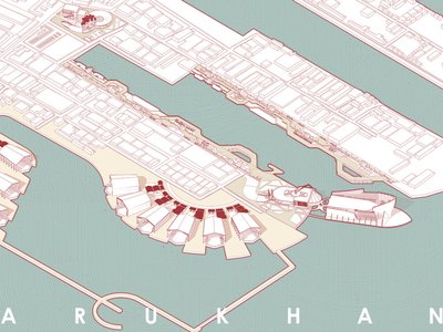
Waterfront Redevelopment and Urban Revitalization in Mumbai: Forging a New Dawn for Darukhana
A transformative waterfront redevelopment project reimagining Darukhana’s shipbreaking heritage into an inclusive urban future.

OUT-OF-MAP: A Call for Postcards on Feminist Narratives of Public Space
Rhizoma Design and Research Lab invites artists, designers, architects, researchers, and students to reflect on how feminist perspectives can reshape public space. Selected works will be exhibited in Barcelona, October 2026. Submissions open until 15 April 2026.


Explore Architecture Competitions
Discover active competitions in this discipline


The International Standard for Design Portfolios


The Global Benchmark for Architecture Dissertation Awards


The Global Benchmark for Graduation Excellence


Challenge to reimagine the Iron Throne
Comments (0)
Please login or sign up to add comments
No comments yet. Be the first to comment!