
Studio on the Rye Wraps a Peckham Terrace House in Weathered Corten Steel
A 40-square-metre extension in South London's Holly Grove Conservation Area refuses pastiche and opts for oxidized honesty.
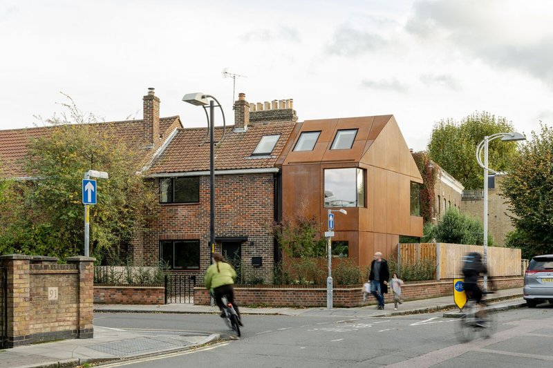
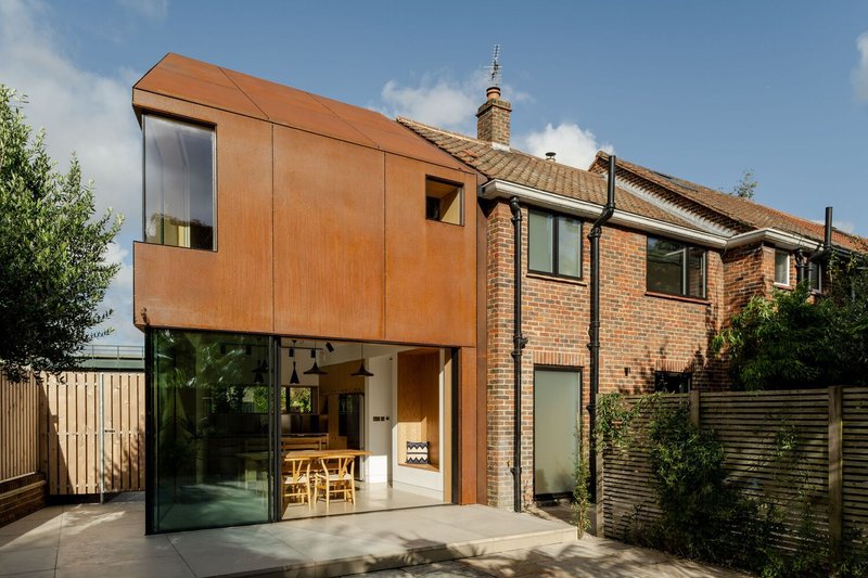
Conservation areas tend to produce timid architecture. Planners want deference, neighbors want continuity, and the result is usually a polite brick box that adds square footage without adding much else. Studio on the Rye, led by architect Sarah Borowiecka, took a different route with Rusty House, a two-storey side extension to a 1950s end-of-terrace property in Peckham's Holly Grove Conservation Area. The firm clad the entire addition, walls and roof alike, in pre-weathered Corten steel, creating a monolithic volume that reads as a geological deposit beside the red brick of the original house.
What makes this project worth studying is the precision of the argument it makes. The Corten does not mimic the brick; it rhymes with it. Both materials are red-brown, both are earthen, both patinate over time. But the steel is emphatically modern, gutterless, pitched, and separated from the brick by deliberate shadow gaps. The result nearly doubled the house to 106 square metres and solved real problems: damp, poor ventilation, lack of daylight, cramped rooms. All of this was achieved by an all-female project team working within conservation constraints that could have flattened the ambition entirely.
A Monolith on the Corner
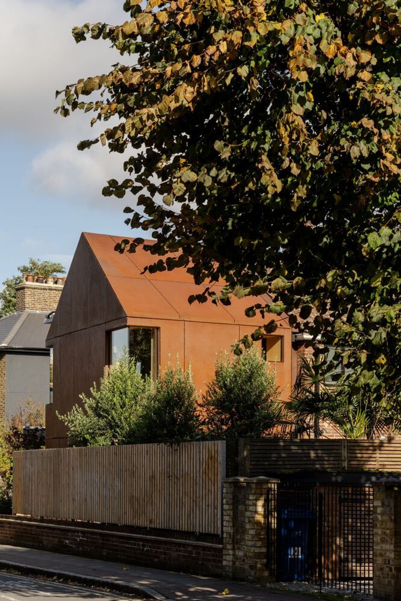
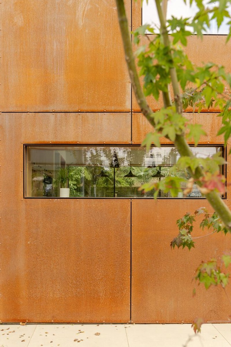
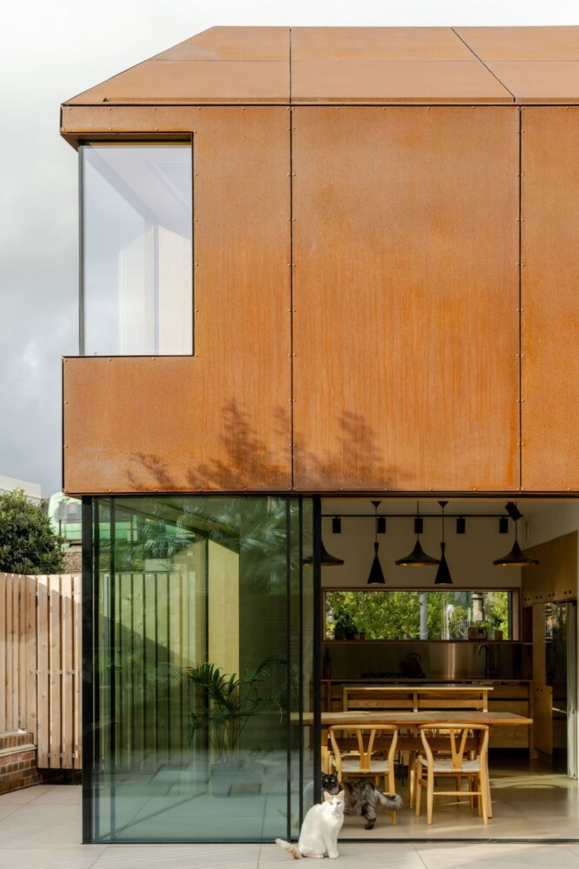
From the street, the extension registers as a single, continuous surface folding from wall to roof. Recessed gutters and the absence of visible fixings reinforce the monolithic read. The steel panels were pre-patinated and then sealed, a necessary step to prevent rust-stained rainwater from bleeding onto the concrete floor tiles below. The custom fixing method the team developed kept the surface sleek and uninterrupted, which is the whole point: this is a form defined by material, not by joints.
The house sits at a highly visible corner of Bellenden Road, with sightlines from the nearby railway line. That exposure demanded conviction. A half-measure, Corten on the walls but slate on the roof, or expressed flashings, would have diluted the gesture. Wrapping everything in one material gives the extension the confidence it needs to hold its own beside the Georgian and early Victorian villas that characterize the conservation area.
Old Brick, New Steel
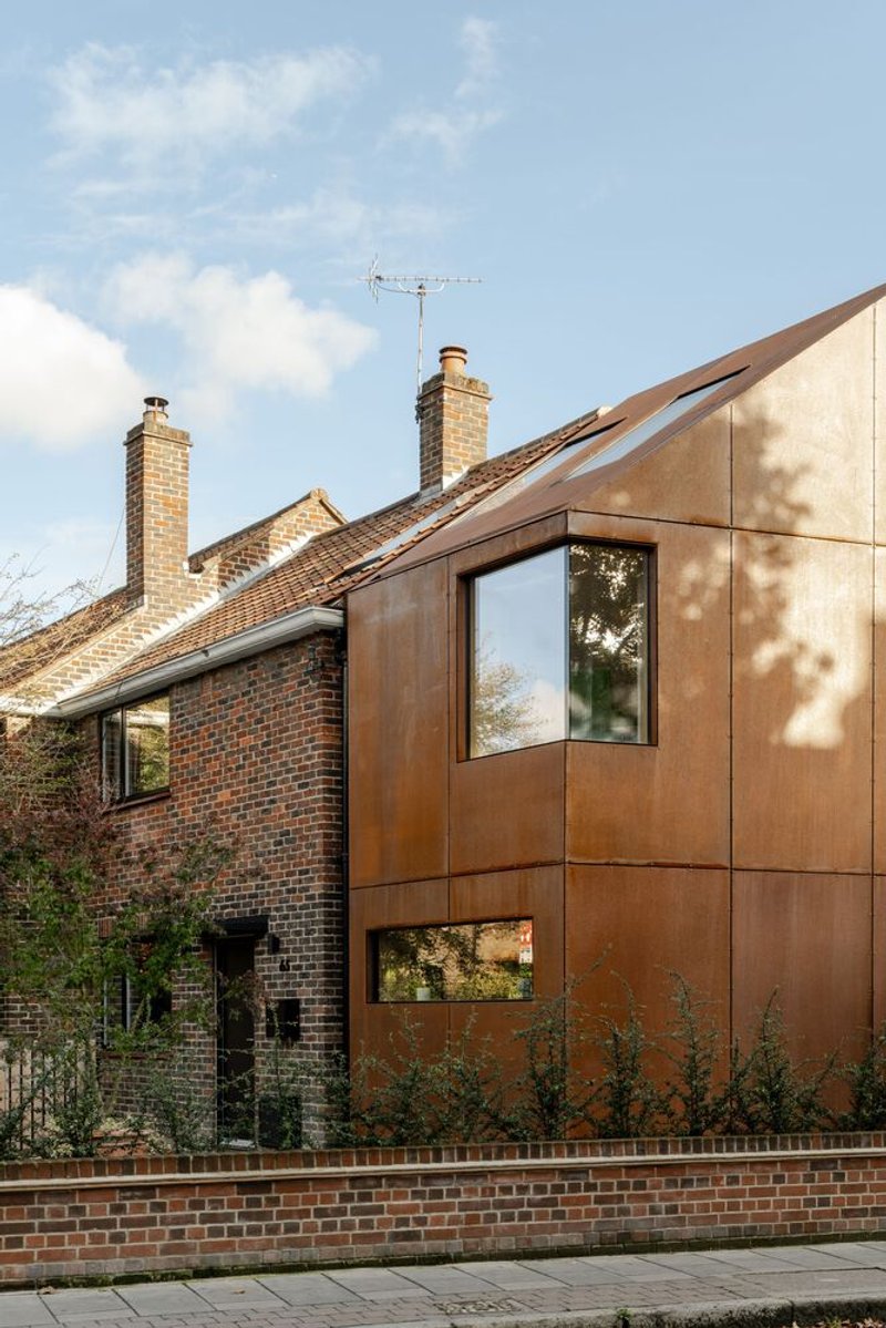
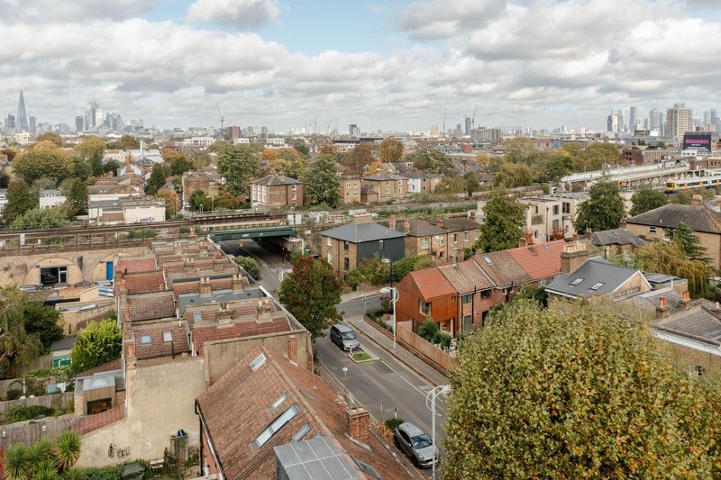
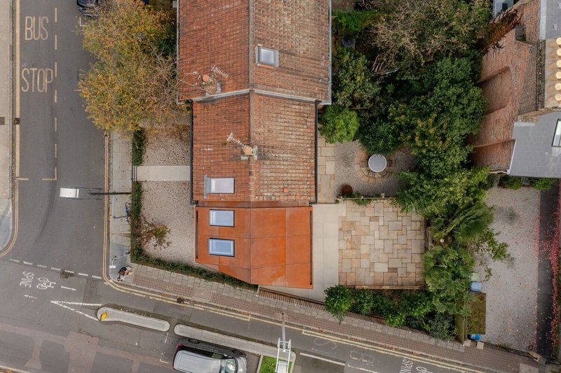
The relationship between the existing brick and the new Corten is articulated through shadow gaps that mark the boundary between old and new. It is a familiar detail in contemporary extensions, but the tonal kinship between the two materials gives it extra charge here. In certain afternoon light conditions, the steel and brick nearly merge; in others, the steel pulls away, darker and more reflective. The aerial views reveal how the copper-toned roof sits among the neighborhood's grey slate, asserting its presence without overwhelming the roofscape.
Working in a conservation area characterized by period architecture, the design avoids pastiche entirely. No fake sash windows, no decorative string courses. Instead, simple monolithic forms, a pitched roof at the right scale, and materials that age honestly. It is contextual without being deferential, which is the hardest line to walk in heritage-sensitive planning.
Ground Floor: Kitchen as Threshold
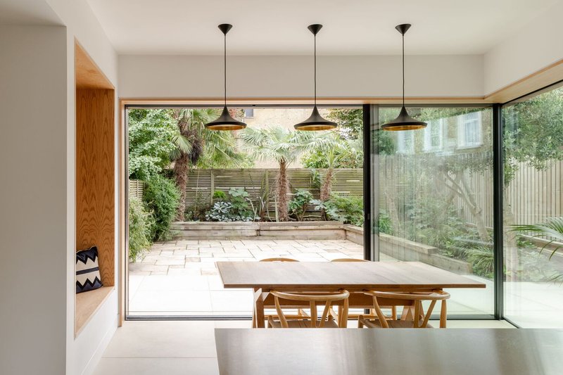
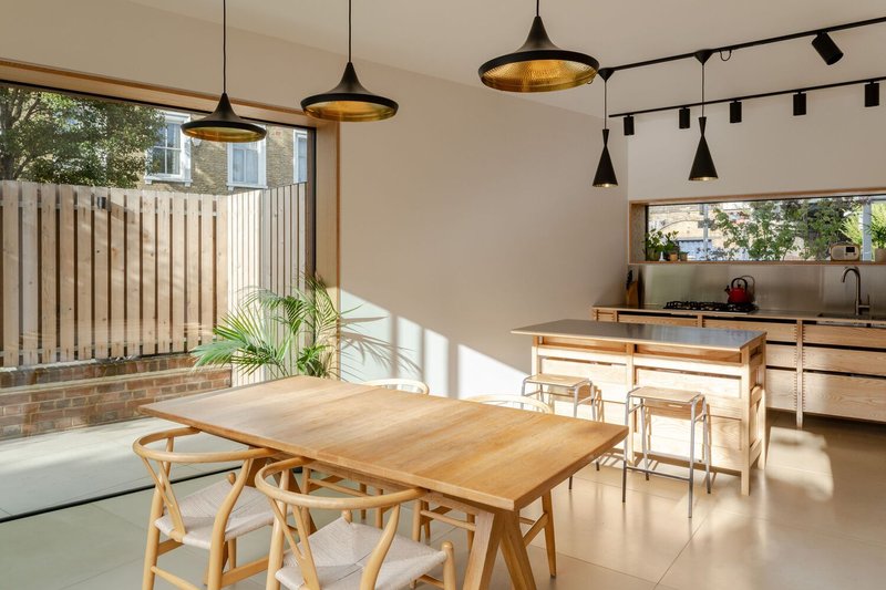
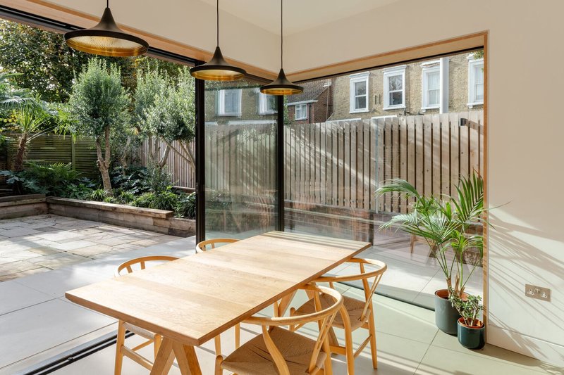
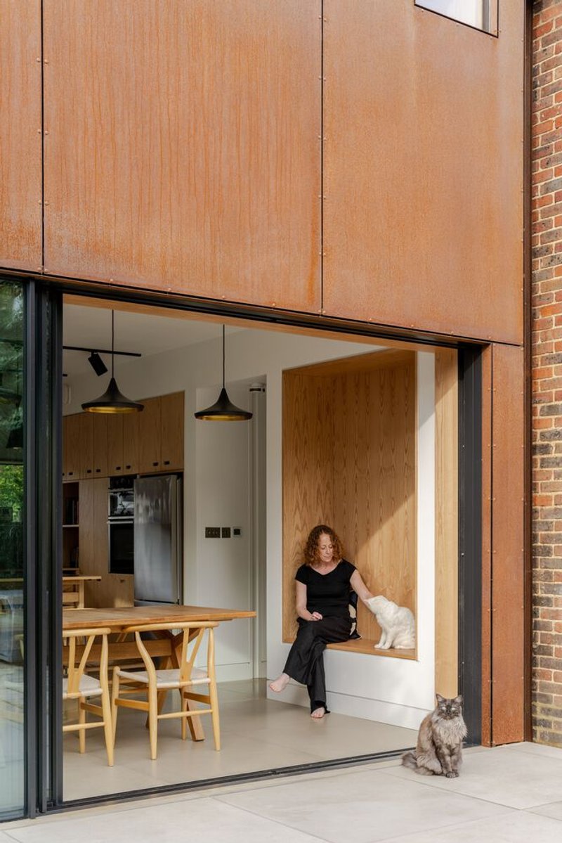
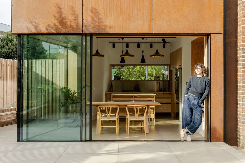
The ground floor of the extension houses the kitchen, dining area, and a utility room. The kitchen joinery is bespoke ash, warm-toned and minimal, set against polished concrete floor tiles that provide thermal mass and visual weight. Stainless steel splashbacks keep the palette restrained. The space is oriented toward the rear garden through large sliding doors and a glazed corner, a detail fabricated by specialist supplier Fluid Glass to accommodate the awkward angles dictated by the property boundary.
That corner window is the key move on the ground floor. It dissolves the junction between two walls and makes the garden feel continuous with the kitchen. When the sliding doors are open, the distinction between inside and paved terrace effectively disappears. The garden was always the standout feature of the property, and the design treats it as an additional room rather than a backdrop.
Interior Calm and Natural Materiality
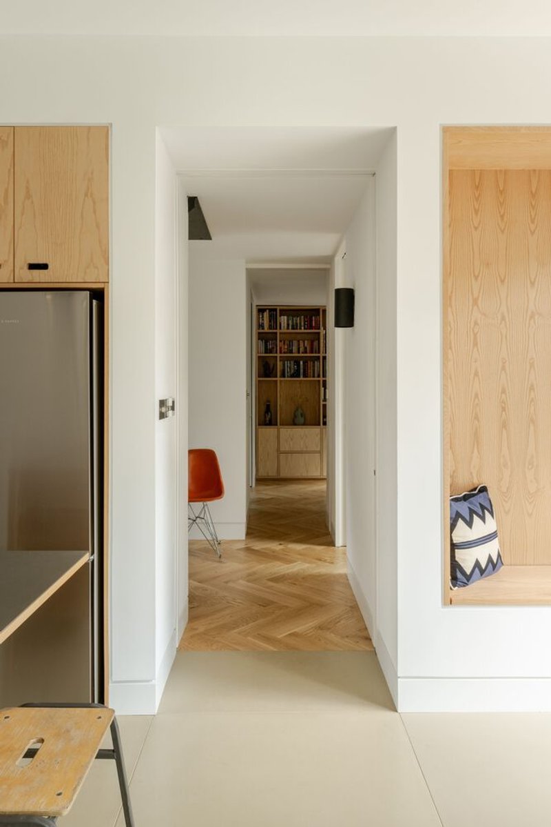
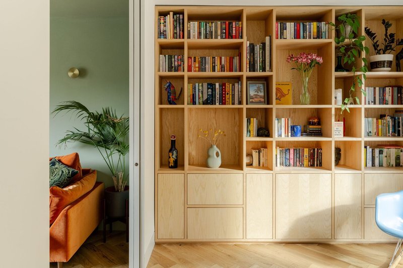
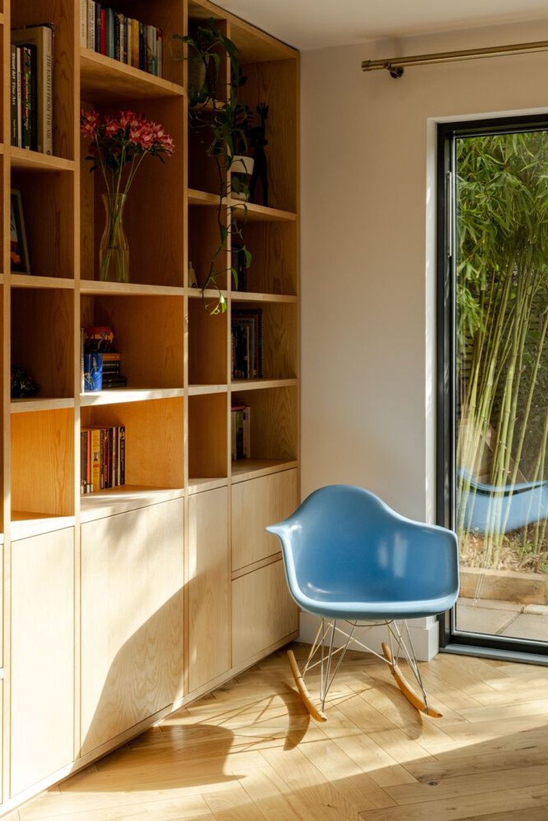
Step inside and the Corten bravado gives way to a Scandinavian-inflected restraint. White walls, oak parquet in herringbone, built-in timber shelving: the interiors are quiet and precise. The corridor from the original house to the extension reads as a transition from the existing domestic scale to the new, more generous volumes. A full-height bookshelf anchors the living area, and the material palette stays tight: ash, oak, white MDF, concrete.
The contrast between exterior and interior is deliberate. Outside, the house wants to be noticed. Inside, it wants to recede, letting daylight and the garden do the expressive work. It is a sensible split for a house this size. At 106 square metres, you cannot afford visual clutter.
Staircase, Light Wells, and Vertical Flow
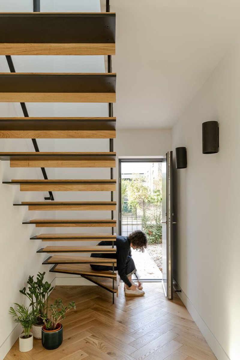
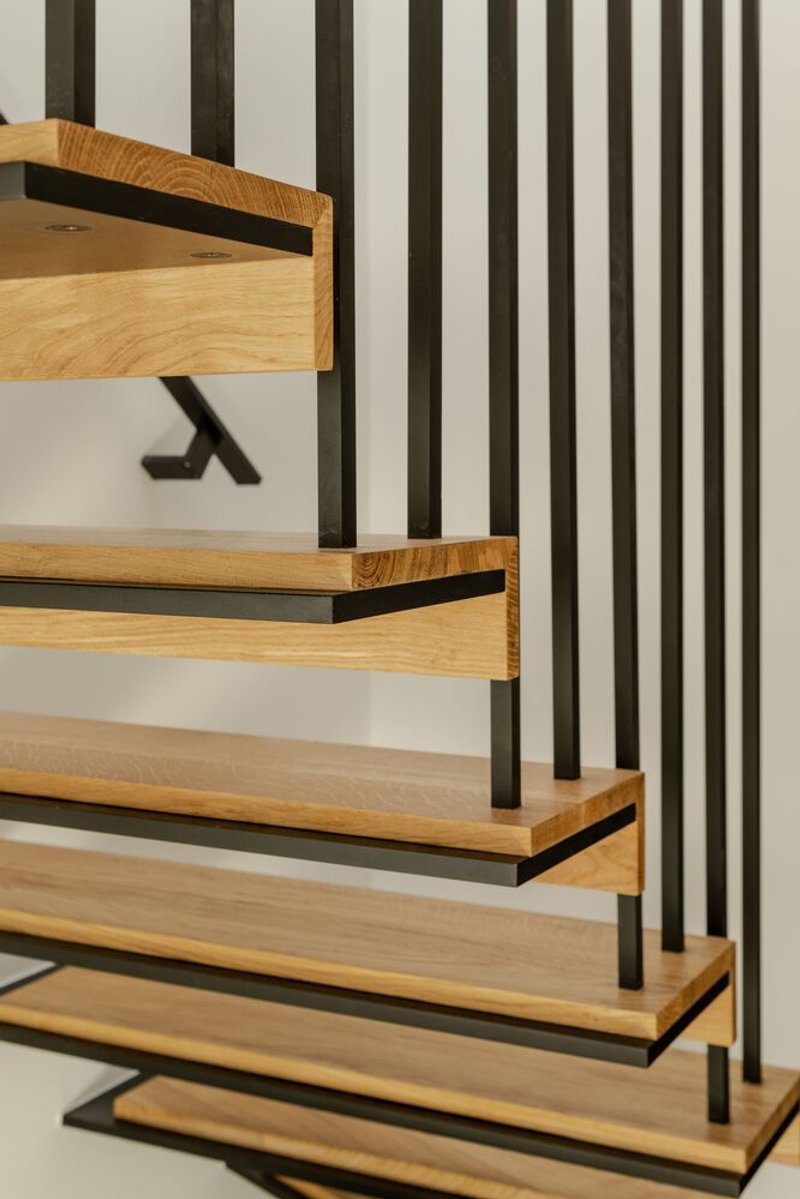
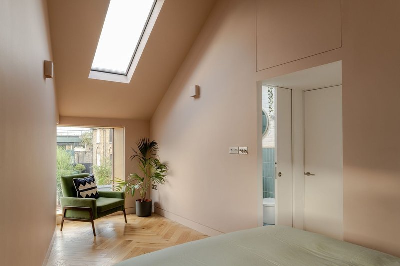
A cantilevered staircase in timber and black steel connects the two floors. The treads are solid timber with steel plate edges, and a slender vertical balustrade keeps the composition transparent. A skylight above the stairwell pulls daylight down through the core of the house, supplemented by additional roof lights over the master bedroom and ensuite. These light wells are essential in a mid-terrace condition where borrowed light from side windows is limited.
The staircase doubles as the threshold between old and new. You enter through the original front door, pass the stair, and arrive in the extension's open-plan ground floor. Upstairs, the new volume contains a master bedroom with ensuite shower room and walk-in wardrobe. Bespoke sliding MDF shutters in the bedroom tuck into the walls when not in use, keeping the surfaces clean and the corner windows unobstructed.
The Garden and the Rear Elevation
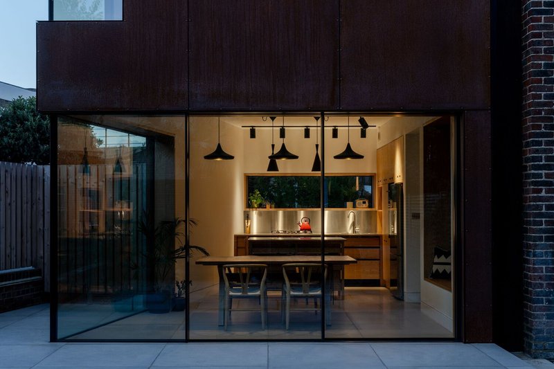
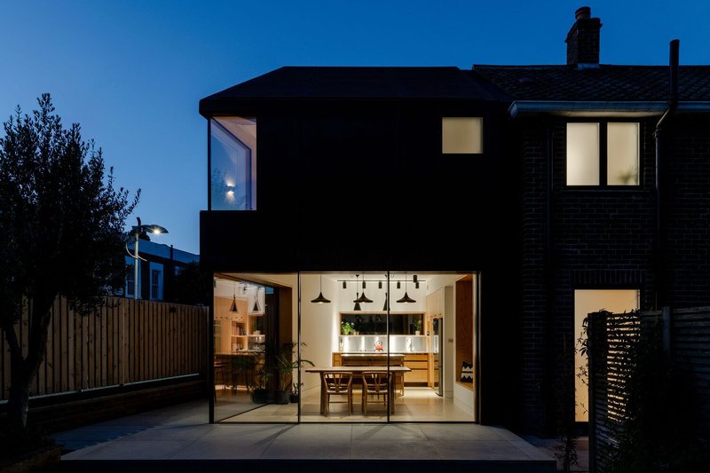
From the rear garden, the extension reveals its structural logic most clearly. The upper Corten volume cantilevers over the fully glazed ground floor, creating a sheltered zone along the terrace. At dusk and after dark, the glass wall turns the dining area into a lantern, projecting domestic life into the garden. The composition is simple: opaque and heavy above, transparent and light below.
The paved terrace is planted with palms and ferns, giving the garden a slightly subtropical texture that plays well against the industrial steel above. The loss of side garden space to the extension's footprint was compensated by intensifying the connection to the rear garden, a trade-off that clearly paid off. The garden is not an afterthought; it was, by the architect's own account, the standout feature from the beginning.
Details That Solve Real Problems
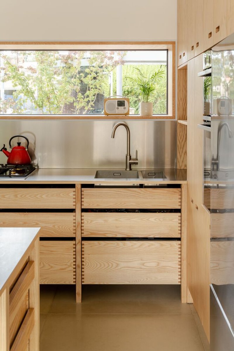
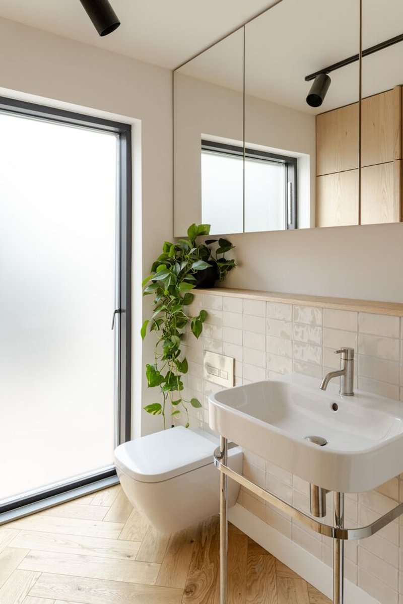
The bespoke kitchen storage is worth noting: ash drawer interiors with considered compartmentalization suggest a house designed for daily use, not a magazine shoot. The bathroom pairs wall-mounted fixtures with a corner window, trailing greenery on a shelf, and simple white tile. These are small moments, but they reflect an attention to lived experience that elevates the project beyond its headline material.
Triple-glazed windows, improved insulation, and a bioethanol stove address the thermal performance deficiencies of the original 1950s house. The project also resolved damp and ventilation problems that had plagued the property. Materials were sourced from UK-based suppliers: Havwoods for timber, Lazenby for concrete tiles, The Rooflight Company for roof lights. These are not glamorous decisions, but they are the decisions that determine whether a house actually works.
Plans and Drawings
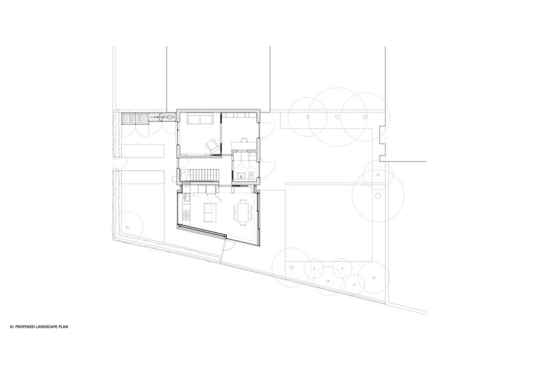
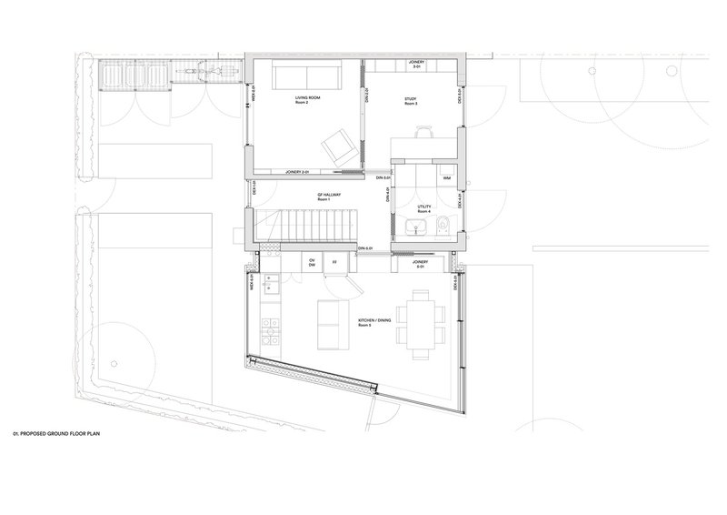
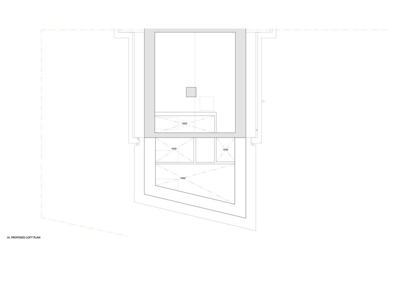
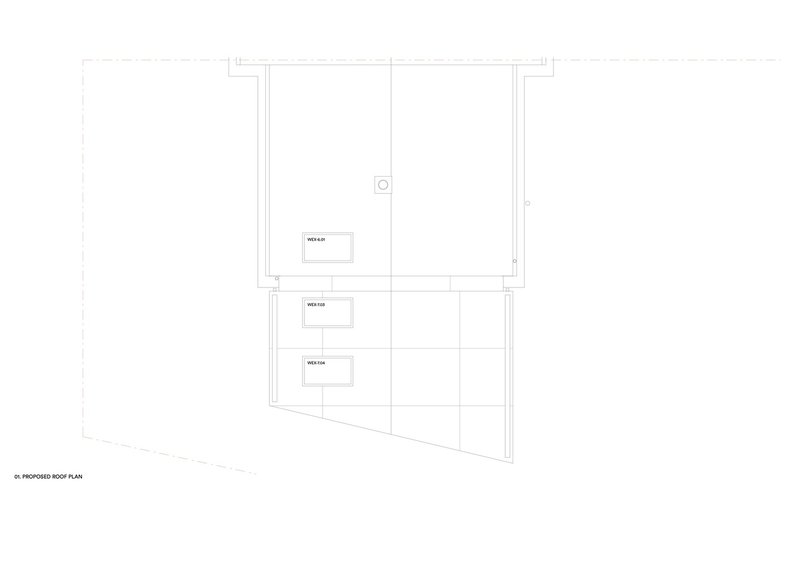
The floor plans reveal the angular geometry that the site demanded. The extension's footprint is not a simple rectangle; it follows the irregular property boundary, which is what necessitated the bespoke corner glazing from Fluid Glass. The ground floor plan shows how the kitchen, dining, and living spaces wrap around the central staircase, with the angled glass wall opening to the terrace. The upper level is compact: bedroom, ensuite, wardrobe, and a void over the stair. The roof plan indicates mechanical service zones along the angled edge, tucked out of sight.
Why This Project Matters
Rusty House is a useful case study in how to be bold within constraints. Conservation area planning could have produced a brick extension with traditional proportions and nobody would have objected. Instead, Studio on the Rye argued for a material that is both contextually sympathetic, its color genuinely relates to the existing brick, and unmistakably contemporary. The fact that the planning process allowed it suggests that the argument was well made, grounded in material logic rather than stylistic novelty.
At 40 square metres of added footprint, this is not a large project. But it demonstrates that a modest residential extension can carry real architectural ideas without resorting to spectacle. The Corten is striking, yes, but its purpose is specific: to age, to rhyme with the brick, to unify wall and roof into a single weathering surface. The interiors are calm because the exterior is doing the expressive work. That division of labor, loud outside and quiet inside, gives a small house more range than its square footage would suggest.
Rusty House on the Rye, designed by Studio on the Rye. Holly Grove Conservation Area, Peckham, South London, United Kingdom. 106 square metres. Completed 2024. Photography by French + Tye.
About the Studio
Share Your Own Work on uni.xyz
If projects like this are the kind of work you want to make, uni.xyz is a place to publish your own, find collaborators, and enter design competitions.
Popular Articles
Popular articles from the community
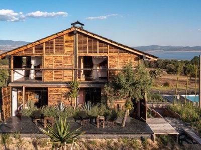
Fausto Terán and Toro Fuse Japanese Craft with Mexican Tradition in a Lakeside Retreat
Nakamura House pairs Shou-Sugi-Ban charred pine with handmade clay tile at the foot of Atlangatepec Lagoon in Mexico.
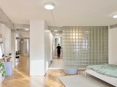
RDTH architekti Rips Out Nearly Every Wall in a Prague Apartment and Replaces Them with Furniture
A 101-square-meter post-war flat in Prague trades rigid partitions for a single rotated furniture block, curtains, and glass concrete.
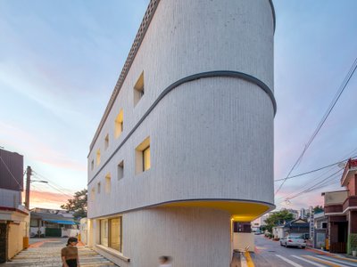
YOAP Architects Round a Corner in Yeongcheon with a Cylindrical Community Hub
A 197-square-meter brick and ribbed-clad tower turns a forgotten alley corner in South Korea into a public garden with a low threshold.
20 Most Popular Office Building Projects of 2025
From biophilic workspaces in India to net-positive energy offices in New Delhi, 20 office building projects that defined architecture in 2025.
Similar Reads
You might also enjoy these articles
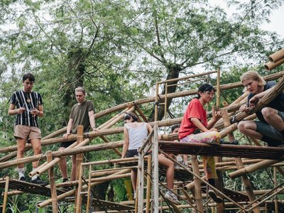
Bamboo Housing Challenge 2026: Design Affordable, Sustainable Homes Using Bamboo
An international design competition by Bamboo U and IBUKU inviting architects and designers to reimagine affordable housing using bamboo — with the winning design built full-scale in Bali.

Computational Design & Education: Beegraphy Design Awards Introduces 7th Category (Featuring Jiyun's Innovative Approach)
Dive into Beegraphy’s 7th Design Awards category, where computational design meets education to create immersive, interactive learning tools, inspired by Jiyun’s work.

From Parametric Lighting to Urban Furniture: Join the 2nd Workshop in Beegraphy’s Computational Design Series
Dive into Cutting-Edge Design Techniques and Practical Applications with Industry Experts

Introducing Sphere by UNI: Pioneering a New Era in AEC Industry
Unlocking Global Potential with BIM and Agile Management

Explore Architecture Competitions
Discover active competitions in this discipline


The International Standard for Design Portfolios


The Global Benchmark for Architecture Dissertation Awards


The Global Benchmark for Graduation Excellence


Challenge to reimagine the Iron Throne
Comments (0)
Please login or sign up to add comments
No comments yet. Be the first to comment!