

Emptied House: A Stable Reborn in Rural Segovia
estudio veintidós converted the remains of an old stable in Soto de Sepúlveda, Segovia into a 207 m² seasonal house with a central courtyard pool.
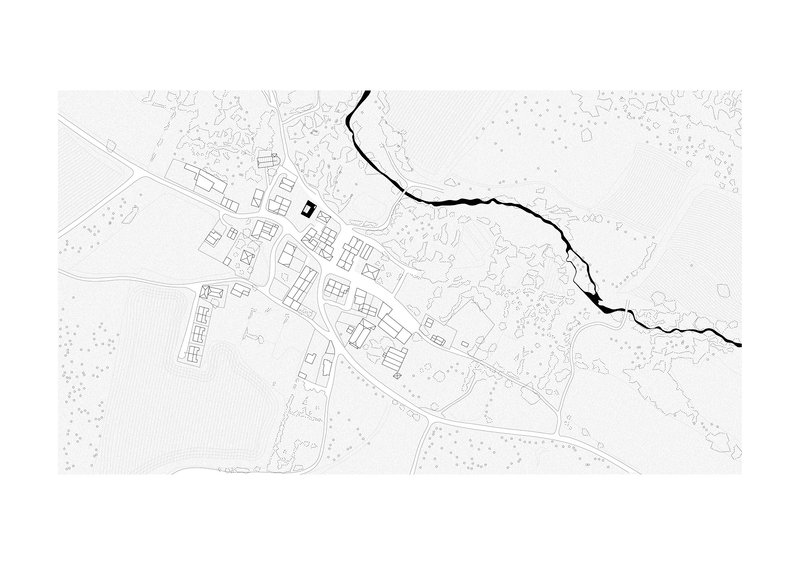
Spain is full of empty rural buildings. The villages of Castile and León, in particular, are dotted with houses, stables, and barns that lost their original use decades ago and are now slowly weathering back into the landscape. Emptied House, a 207 square metre seasonal refuge in Soto de Sepúlveda, Segovia, completed in 2025 by estudio veintidós, is one of the more careful answers to what to do with one of them.
The brief was simple. Take the remains of an old stable in a small village in the Riaza Mountains and turn it into a house for occasional use. The architects, Alejandro Infante and Javier Muñoz Godino, chose to do as little as possible to the existing structure and as much as necessary to make a contemporary house possible inside it. The result is a project that is more about restraint than invention, and that is exactly what the situation called for.
The Site, Kept
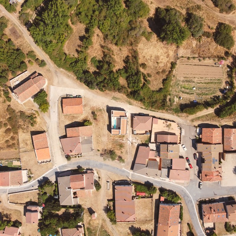
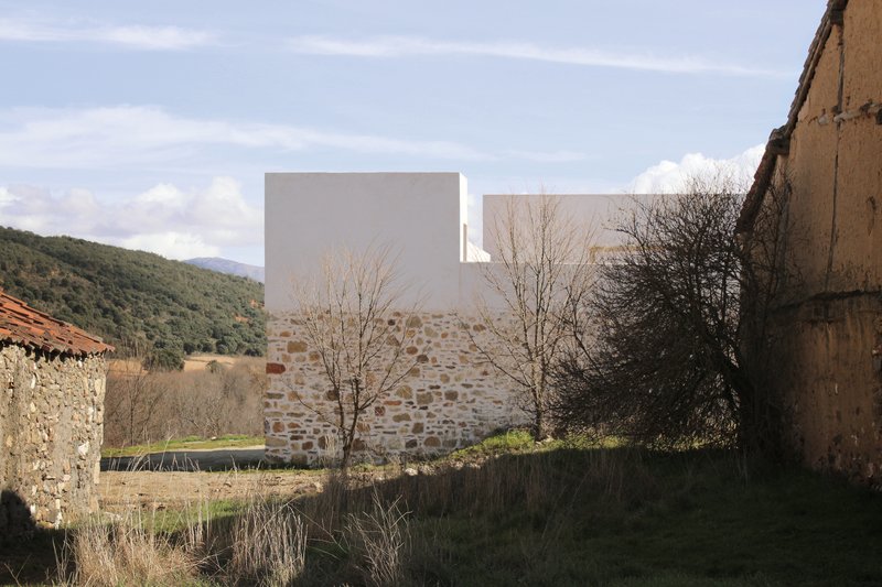
From the air, the house looks like just another roof in the village, slightly larger and slightly more rectilinear than its neighbours. The architects did not extend the footprint or push beyond the line of the original stable. The new building sits exactly where the old one did, with the same orientation and the same relationship to the village street.
The plan is the result of a constraint that has become rare in contemporary residential architecture: don't make it bigger. The 207 square metres are exactly what the existing footprint allowed. There is no extension, no annex, no second pavilion in the garden. Whatever the architects wanted to do had to fit inside the walls that were already there.
Old Stone Below, New Plaster Above
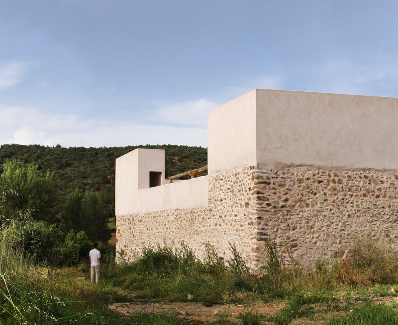
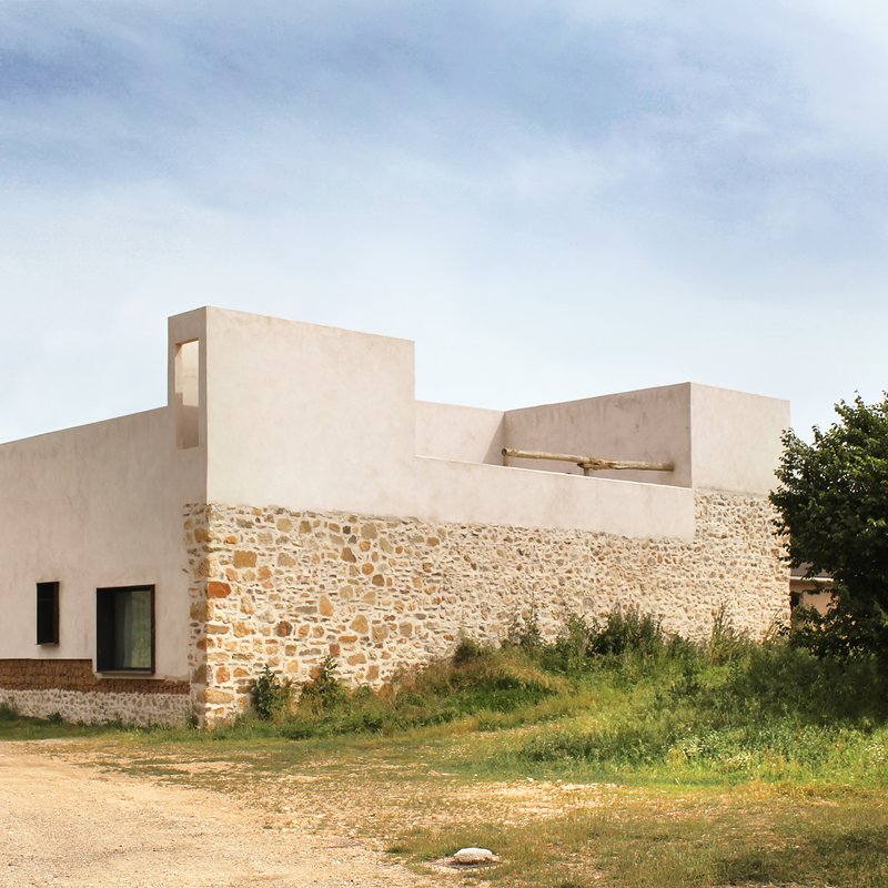
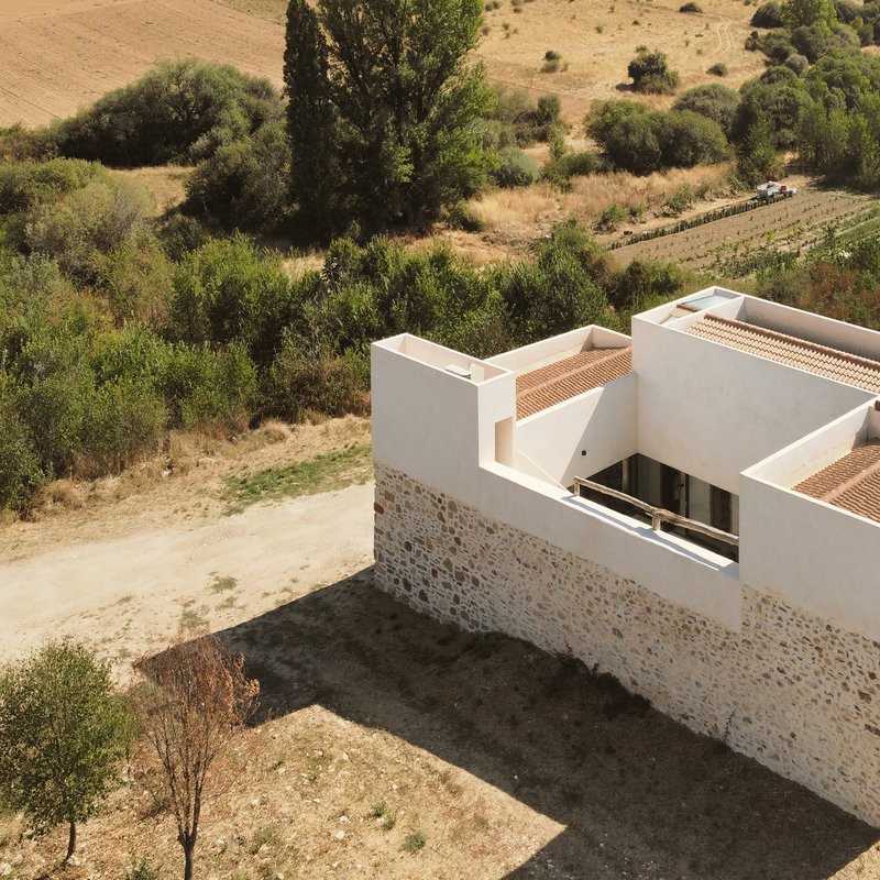
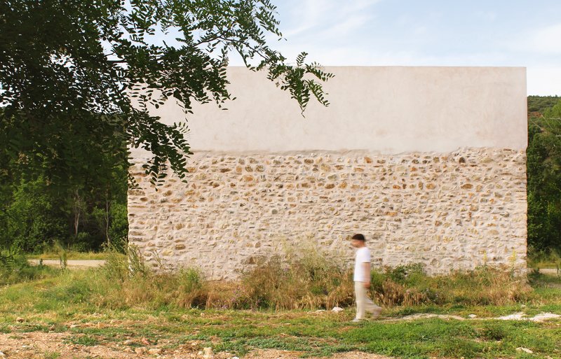
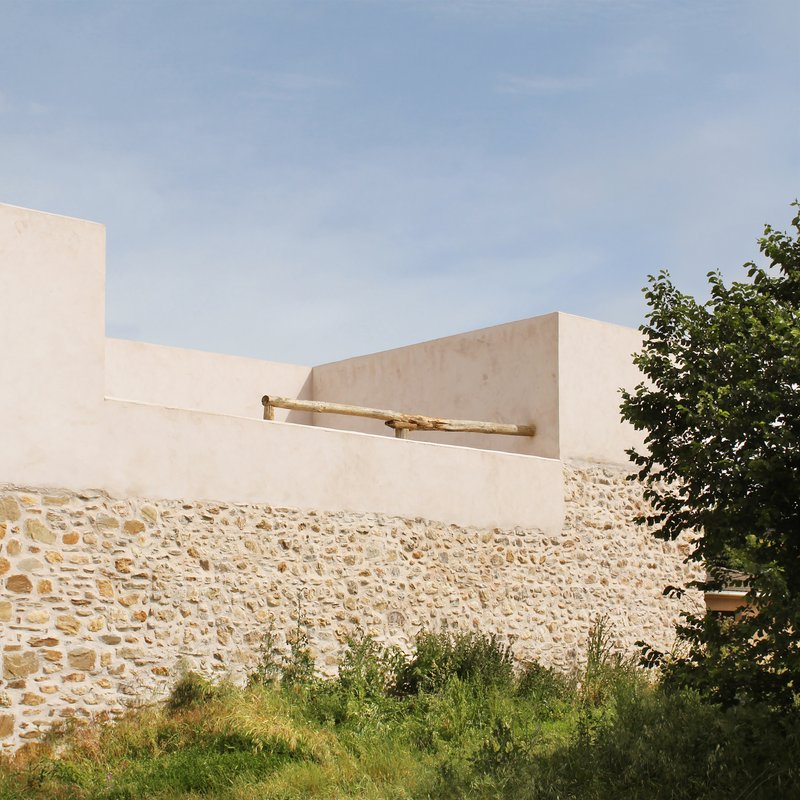
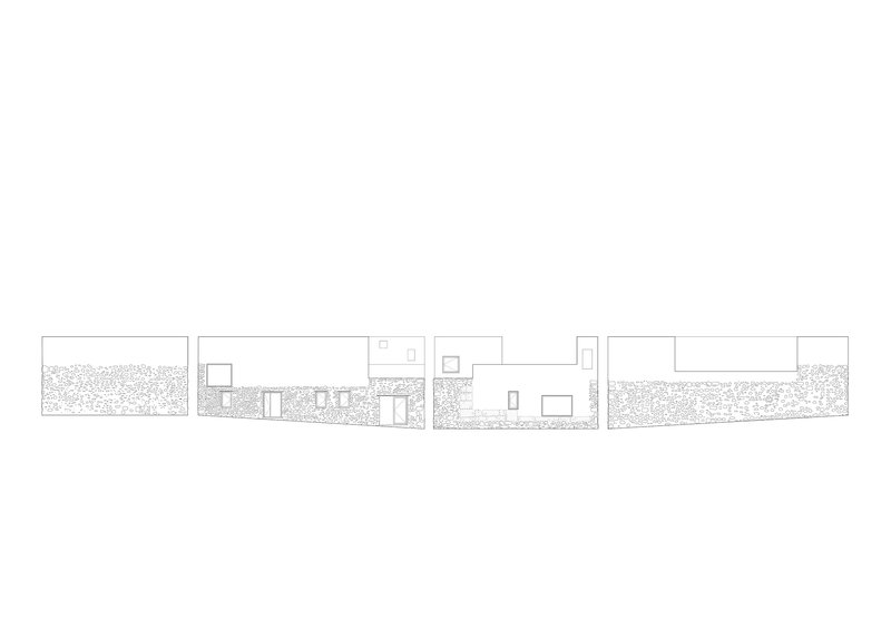
The clearest move is the way the architects handled the elevation. The original stone walls of the stable, which were the soundest part of the existing structure, are kept and exposed. Above them, a new white plaster volume is added to complete the form. The seam between the two is not hidden. You can read it from any angle: rough stone below, smooth plaster above, no transition.
This is the project's defining gesture. It separates old and new in time, not in style. Both layers are honest. Both are visibly themselves. A future visitor will be able to read the building's history without needing a sign.
The Stone Walls at Close Range
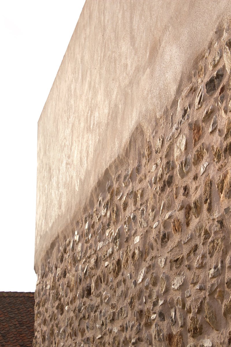
Up close, the stone walls reveal the kind of texture that no contemporary building can produce. Random sizes, irregular bedding, lichen and discolouration, the marks of weather and use. The architects have stabilised the masonry without trying to make it look new. The mortar joints are flush with the stone, the surface is brushed clean, but the stones are exactly the ones that were laid two centuries ago.
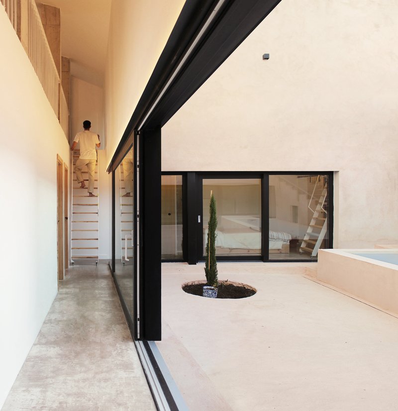
The Courtyard at the Centre
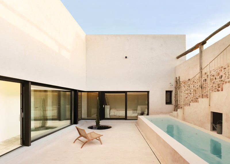
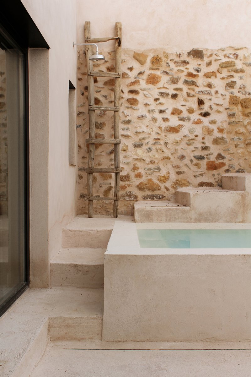
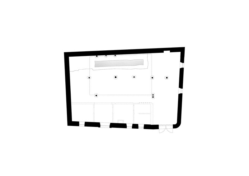
The plan organises the rooms around a small inner courtyard with a lap pool. This is the project's most luxurious gesture, but it is also its most functional. In the dry summers of the Riaza Mountains, the courtyard provides shade, ventilation, and a private outdoor room that the original stable never had. The pool is small enough to feel like a feature of the courtyard rather than a separate amenity.
The architects keep the courtyard simple. A folding wooden chair, a single tree planted in a circular cut in the floor, an outdoor shower with a simple timber ladder against the stone wall. There is no landscaping in the conventional sense. The courtyard is treated as a piece of architecture, not a garden.
Entrances and Thresholds
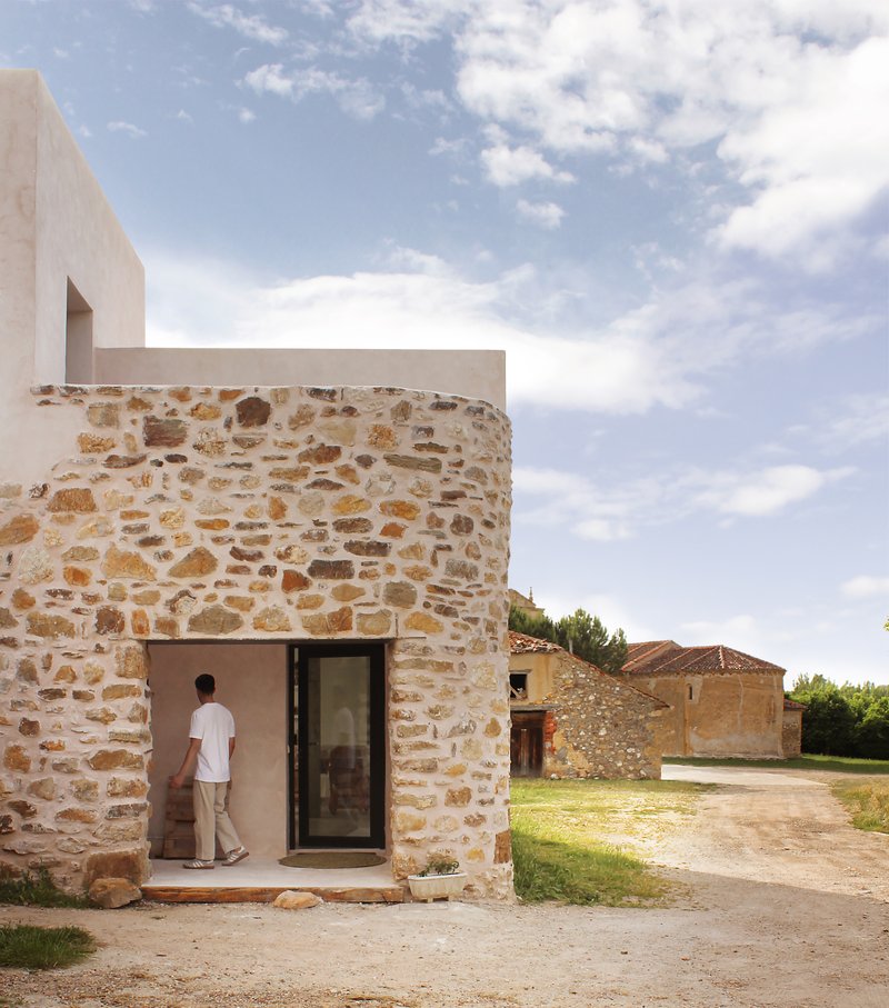
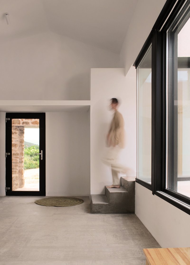
The entrance is at the corner of the building, where the curved stone wall meets a black steel door. Inside, the entrance hall is a quiet white room with a polished concrete floor and a single concrete step that becomes the start of the stair to the upper level. There is nothing to negotiate, no intermediate vestibule, no reception area. You walk in and you are already in the house.
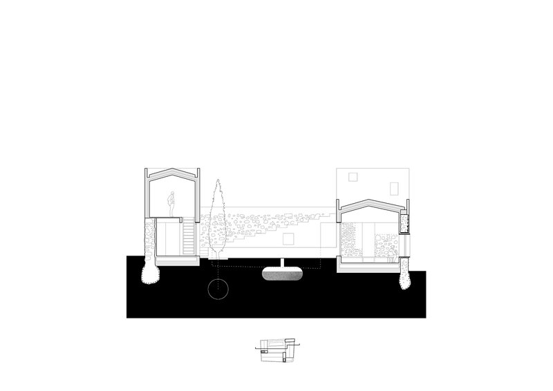
The Roof Terrace and the Cut-out Wall
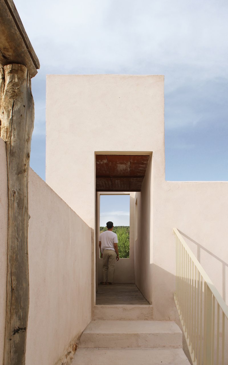
A stair leads up to a roof terrace tucked between the new plaster walls. The architects have cut a portal in the parapet that reveals the surrounding fields and mountains. This is one of the rooms that only becomes possible in a conversion. You cannot design it from scratch, because the geometry only makes sense in relation to the original walls below.
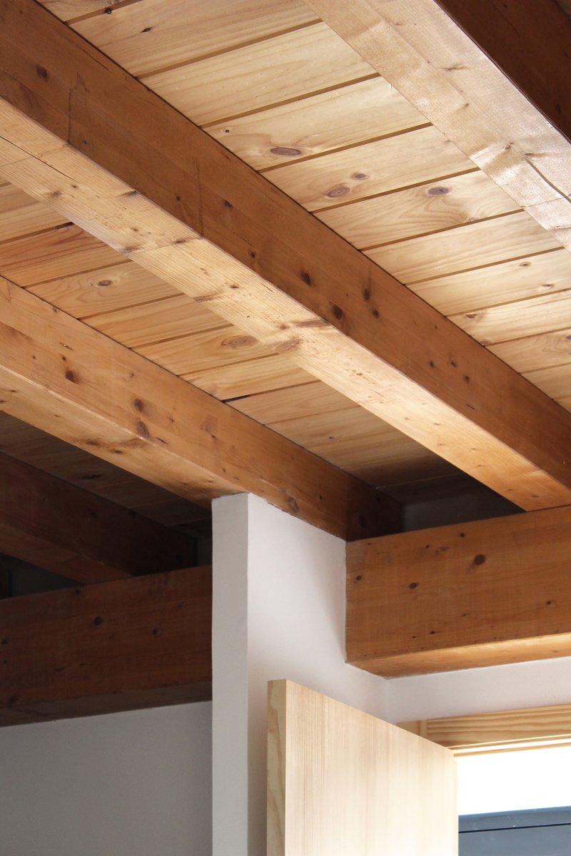
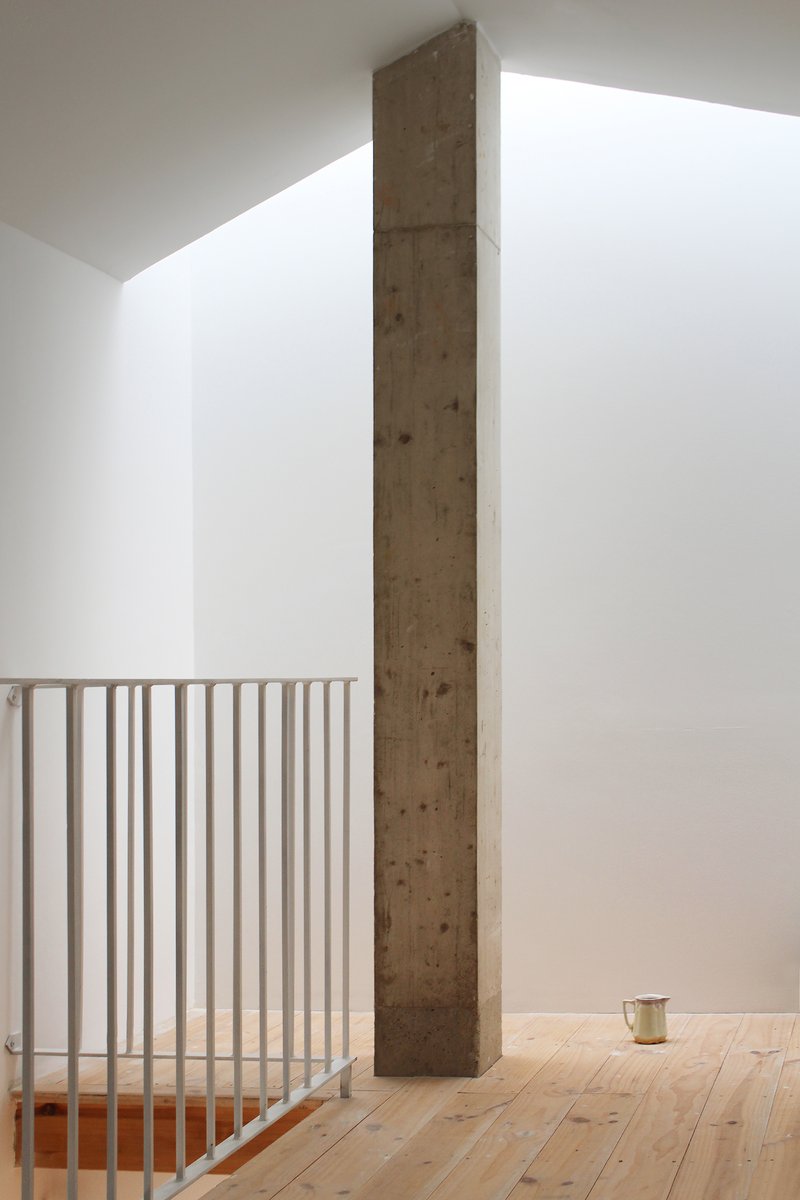
Inside: Beams, Light, and a Single Column
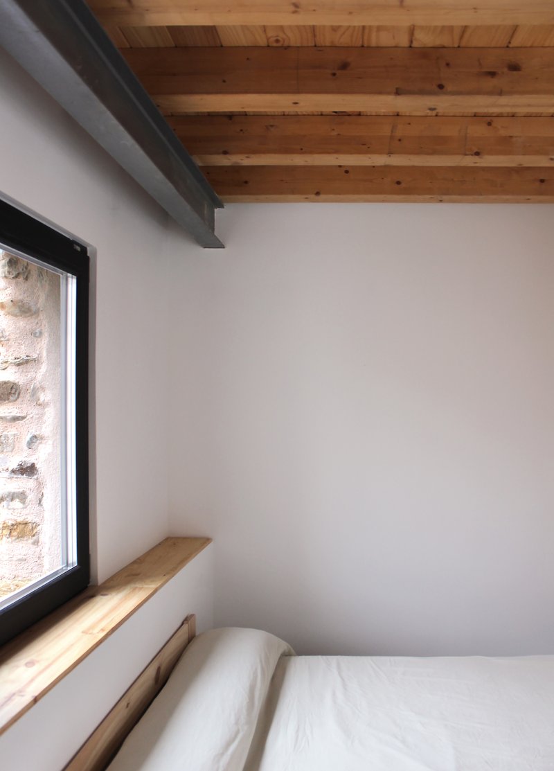
The interior is unusually quiet. The original timber beams and the tongue-and-groove pine ceiling are kept and exposed in some rooms, while the new white walls and concrete floors recede into the background. A single timber column rises the full height of one upper room as the only ornament. Bedroom corners are framed by deep windows cut into the original stone walls, with a wooden sill that doubles as a shelf.
The decision to expose the timber roof and leave most other surfaces blank is the project's clearest interior move. The room becomes a frame for the structure rather than a stage for furniture. A bed, a chair, a window, and the beams overhead. That is enough.
The Window as Detail
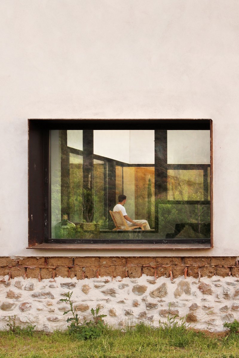
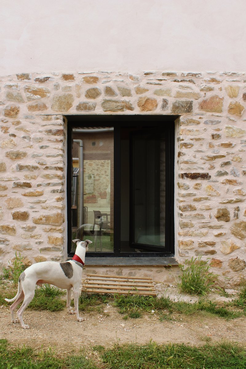
The new windows are rectangular openings cut cleanly into the old stone walls. Each one has a deep reveal, a corten or black steel frame, and a single pane of glass. The contrast between the irregular stone and the precise opening is the project's smallest and best gesture. From outside, the windows read as eyes set into the stone. From inside, they read as carefully framed views of the village and the surrounding fields.
This kind of opening is harder to do than it looks. The stone above and around the new opening has to be re-tied, the lintel has to be hidden, and the frame has to be set so that the glass sits flush with the inside face of the wall. The detailing is invisible in the photographs, which is the highest compliment you can pay it.
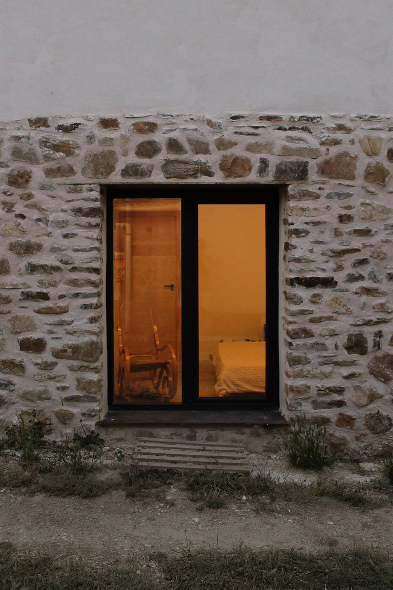
Dusk and the Lit House
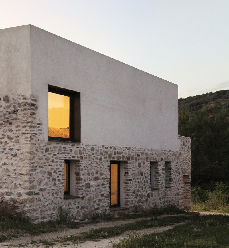
The most atmospheric photograph in the set shows the house at dusk, lit from inside, with the warm orange interior glowing through the small stone windows and the larger upper opening. This is the kind of image that explains adaptive reuse better than any drawing can. The old building, kept as it was, is now alive again. The light is new but the walls are ancient, and the whole thing feels like a quiet act of repair rather than a renovation.
Drawings
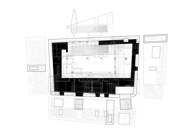
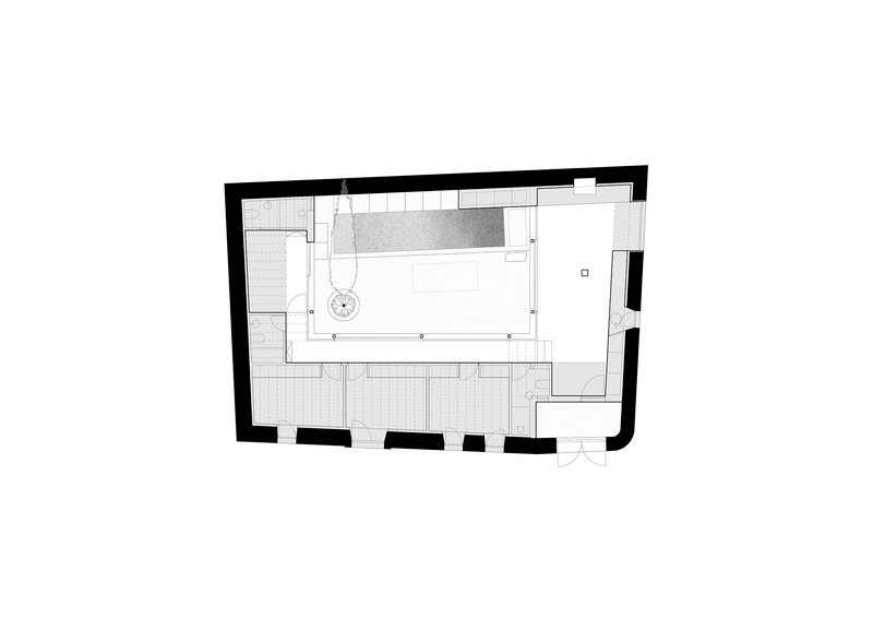
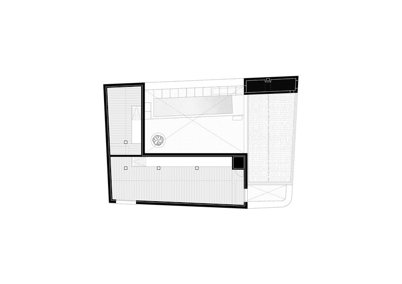
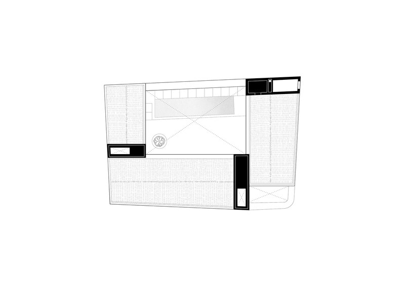
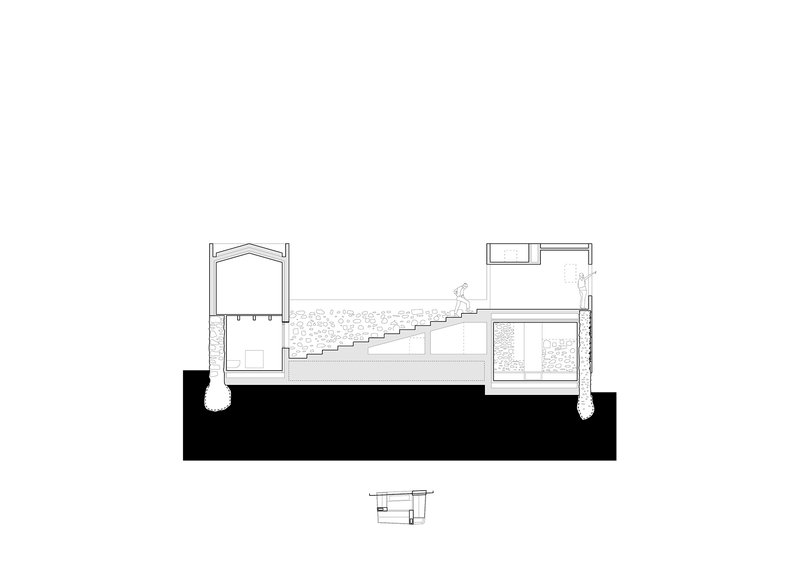
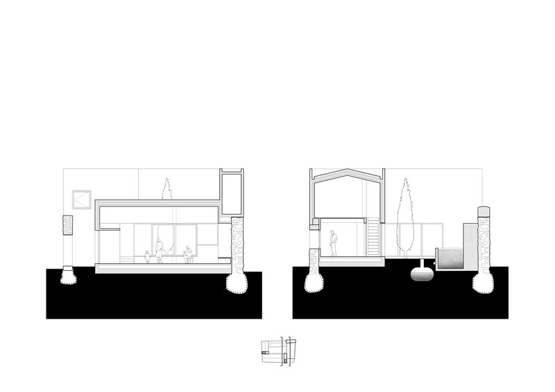
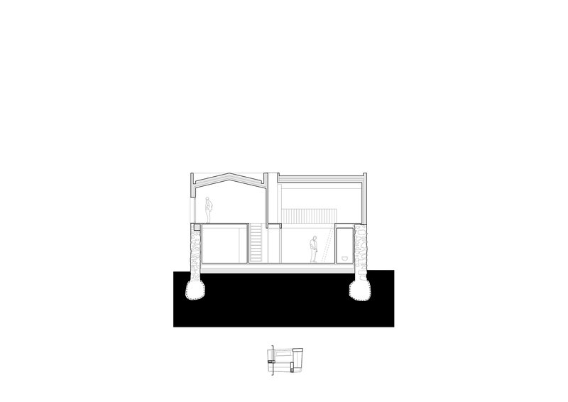
The drawings show how minimal the intervention really is. The existing footprint is kept entirely. The internal walls are mostly removed and replaced with a clearer, contemporary plan organised around the central courtyard. The new upper volume sits exactly within the line of the original perimeter walls, so from the village street the building still reads as the same object it always was.
Why This Project Matters
Most rural restorations in Spain get one of two things wrong. They either over-restore, scrubbing the building until it looks like a new fake, or they under-restore, leaving the structure exactly as it was and adding a contemporary insert that ignores everything around it. Emptied House sits in the middle. The original stone is kept exactly as it found it. The new layer above is contemporary in form and material but proportionally faithful to what was there. The two parts read as one building made over time.
The lessons are direct: keep the perimeter walls, do not extend the footprint, separate old from new visibly rather than blending them, build a courtyard if you have the space, and let the timber roof do most of the interior work. estudio veintidós has produced one of the cleaner examples of this approach in recent Spanish residential architecture, and the photographs by the studio itself show the project at every scale.
About the Studio
Share Your Own Work on uni.xyz
If you are working on rural adaptive reuse, residential conversions, or stone restoration projects, uni.xyz is a place to publish your work, find collaborators, and enter design competitions.
Project credits: Emptied House by estudio veintidós. Soto de Sepúlveda, Segovia, Spain. 207 m². Completed 2025. Lead architects: Alejandro Infante, Javier Muñoz Godino. Technical team: Enrique Gutiérrez Barahona. Photographs: Courtesy of estudio veintidós.


Popular Articles
Popular articles from the community
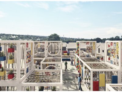
The Faith: Modular Architecture for Play, Learning, and Hope in Kutupalong Refugee Camp
A modular playground architecture project in Bangladesh where play, learning, safety, and hope rebuild childhood inside a refugee camp anew.
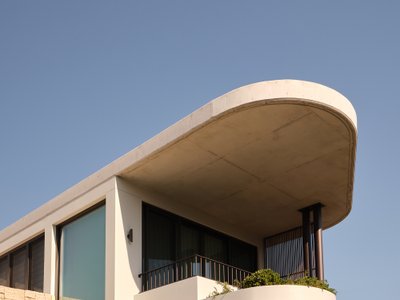
Stanton Architects Sculpts a Curving Family Home into Sydney's Inner West Fabric
Five Dock House uses cantilevers, curved concrete, and layered courtyards to carve out privacy on a tight suburban lot in Sydney.
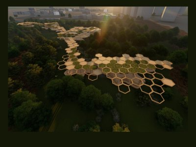
Eco Chapel: A Green Architecture Pavilion Designed in Symbiosis with the Forest
Eco Chapel uses green architecture to weave prayer, learning and reuse into a forest pavilion shaped by modular hexagonal canopies for life.
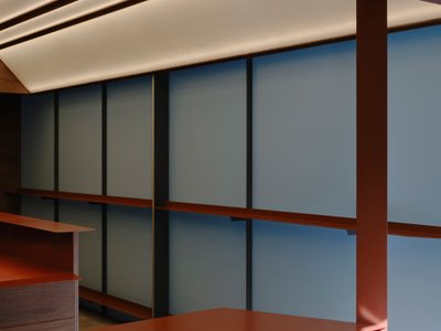
Kerry Kounnapis Packs 800 Daily Coffees into a 43-Square-Metre Melbourne Laneway Bar
Palace Coffee channels Pellegrini's and European standing bars through oxide-red steel and spotted gum timber in a Ridgway Place sliver.


Similar Reads
You might also enjoy these articles
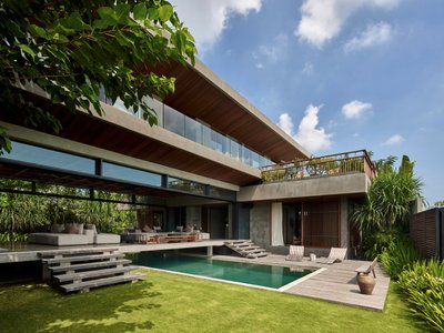
Freebird Residence by Alexis Dornier: A Tropical Modernist Sanctuary in Bali
Floating living pavilion above pool anchors H-shaped tropical villa, blending Japanese minimalism, sustainable strategies, lush landscape, and sculptural interiors.
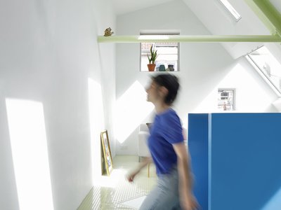
127af Flips a Tiny Bagnolet Rowhouse Upside Down with a Handcrafted Roof Extension
A 55-square-meter terraced house on the edge of Paris gains a luminous upper living floor through lightweight timber and steel.
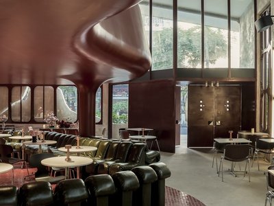
1.61 Design Workshop Wraps a 600-Square-Meter Café in Vietnam in Sculptural Burgundy Drama
Reden Café & Bistro pairs a helical staircase, mosaic floors, and deep red interiors to rethink Vietnamese hospitality space.
The Unbound Brain: A School Shaped by Cognitive Architecture
Cylindrical learning pods radiate like neurons from a central cortex, turning the floor plan into a spatial model of human thought.


Explore Installations Competitions
Discover active competitions in this discipline


The Global Benchmark for Architecture Dissertation Awards


Challenge to design a portable theatre


Challenge to design a portable music platform

Challenge to design an open learning module for the elderly
Comments (0)
Please login or sign up to add comments
No comments yet. Be the first to comment!