

Estúdio Lava Restores a 1960s Brazilian House by Wrapping It around a Reclaimed Brick Courtyard in Red and Blue
A 1960s house in a Brazilian garden suburb gains a rear dining pavilion, reclaimed brick courts and saturated red and blue planes.

Most renovations of mid-century houses go one of two ways. Some treat the original as a relic and freeze it. Others gut it and keep only the address. In Blue House, completed in 2018 in a Brazilian garden suburb, Estúdio Lava takes a third route. The 220 m² house from the 1960s keeps its pitched roofs, its original features and its single-storey reading from the street. Behind that, the plan is reorganised around a brick-paved courtyard and a new glazed pavilion at the rear.
What interests us is how little the project relies on new form to make its case. The intervention works through colour, surface and sequence: a blue envelope, a deep red screen wall, a timber slat canopy and a floor of reclaimed brick that runs from inside to outside. These are inexpensive, legible moves, and they shift the house's centre of gravity from its rooms to the open ground between them.
A Blue Face to the Street


From the street the house hardly announces itself as renovated. The blue stucco volume, the sloped roof and the stone column read as the original building, softened by ornamental grasses and young trees. The colour does the heavy lifting. It turns an ordinary suburban bungalow into a single, coherent object without adding a storey or changing the profile.
The new elements step in quietly. A concrete lintel spans the sliding glass doors, and a blue garden wall carries a grass roof above a bench. The palette holds, but the details shift: heavier, more tectonic and plainly contemporary. You can tell which parts are new, yet nothing fights the older house.
The Courtyard as the Real Living Room


The reclaimed brick paving is the project's most important decision. It turns the gap between the existing house and the rear pavilion into a room with a floor, planted beds, a bench and a concrete porch edge for sitting. The dogs that appear in almost every photograph are not decoration. They show that this ground is lived on all the time, not admired from behind glass.
Reclaimed brick also settles the age question neatly. A new house laid on old material looks less like a renovation and more like a place that has always been worn in. At dusk, with the porch and pavilion lit, the court works as the hinge of the whole plan.
A Glazed Pavilion for Cooking and Eating


At the back of the lot, Estúdio Lava adds an open pavilion with exposed brick walls and large glazed doors. It holds the social life of the house: a long green onyx island, a built-in grill, a concrete barbecue and an onyx-topped dining table under a large cloud painting. Pushing these functions out of the original volume is what lets the old rooms breathe.
The material choice is smart. Exposed brick ties the pavilion to the courtyard floor, so the building reads as a continuation of the paving rather than a separate object. With the doors slid open, inside and outside become hard to separate, which is the right outcome for a climate that rewards living half outdoors.
Red Screens and Slatted Shade


If blue belongs to the existing house, red belongs to the intervention. Vertical red panels form a long screen wall under a concrete slab, while a timber slat roof filters sunlight above a covered terrace and outdoor bar. The kitchen pass-through cut into the red wall, with three stools outside, is a modest detail that does real work: the cook stays part of the courtyard.
The slats throw striped shadows across every surface below them, so the light changes through the day. That kind of effect usually needs expensive glazing systems. Here it comes from timber and spacing.
Narrow Passages, Saturated Edges


The project's best moments may be its leftover spaces. Thin corridors between red and blue planes, paved in brick or concrete and roofed with slats, connect the front of the house to the court. They are tight, but the colour makes them feel deliberate, almost like painted galleries rather than service routes.
Red against blue is a risky pairing that can easily turn cartoonish. It holds up because each colour is assigned to one layer, envelope or screen, and because the floor and roof stay neutral. The discipline lies in the rules, not the hues.
Interiors That Keep the Old Bones


Inside the original house, the palette continues at a domestic scale. A brick wall with open timber shelves anchors the living room. The galley kitchen pairs concrete counters with red cabinetry and a blue tile backsplash. A bathroom seen through a blue-framed door combines a concrete trough sink with terracotta tile.
The detail that tells you most about the brief is small: a wrought iron window latch kept beneath timber rafters and red steel beams. Where the old house had something worth saving, it stays, and the new structure is painted to sit alongside it rather than hide it.
Roof Terrace and Water Garden


Two smaller spaces round out the plan. A rooftop terrace with a timber deck, a concrete water tank and a red-framed skylight looks out toward distant apartment towers, a reminder of how much of the city has grown up around this kind of low suburb. At ground level, a gravel court with a square water basin, a concrete bench and bromeliads gives the house a quieter outdoor room, shaded by tall trees and edged in blue.
Plans and Drawings


The drawings make the strategy clear. The isometric and plan show an L-shaped house wrapped around the courtyard, with the rear pavilion closing the composition and a street wall with a ramp at the front. The exploded axonometric separates the layers: pavilion roof, red-slatted screens, pitched-roof house, courtyard trees. That is the order in which you experience the project.
The sections and elevation sharpen the detailing: a blue tiled bathroom beside a red louvred screen, a blue cabinet wall of shelved glassware under a thin roof slab, and a long brick street wall broken by a central blue panel of sliding doors and clerestory windows.
Why This Project Matters
Brazil's mid-century suburbs hold a large stock of modest houses that are easy to demolish and hard to justify keeping. Blue House shows a credible alternative. Keep the shell, move the heavy programme into a new pavilion, and invest in the ground between them. The result gains space and daylight without erasing what was there.
The broader lesson concerns economy of means. Colour, reclaimed brick, timber slats and a few well-placed openings carry most of the architectural effect. For anyone working with an ageing house and a limited budget, the project argues that a clear set of material rules can do more than a dramatic new form.
Blue House by Estúdio Lava. Location: Brazil. Area: 220 m². Year: 2018. Photography: Lauro Rocha.
About the Studio
Share Your Own Work on uni.xyz
If projects like this are the kind of work you want to make, uni.xyz is a place to publish your own, find collaborators, and enter design competitions.


Popular Articles
Popular articles from the community


The Amber Palace Opera: A Geological Fiction Surfaces on Tallinn's Baltic Waterfront
Pierre Brillard reimagines a Baltic legend as a public landscape, opera house, and waterfront promenade rooted in Tallinn's coastal identity.

Temporary Home for Dogs: A Reversed Zoo Rethinks Animal Shelter Architecture
In Bucharest, a sinuous corridor and freed landscape flip the logic of containment, designing a shelter that works to make itself unnecessary.

Manzana Morphosis: Stretching Barcelona's Grid into a Living Landscape for 2050
A radical reworking of the Eixample manzana turns density into a tool for generous public space, vertical ecology, and environmental performance.
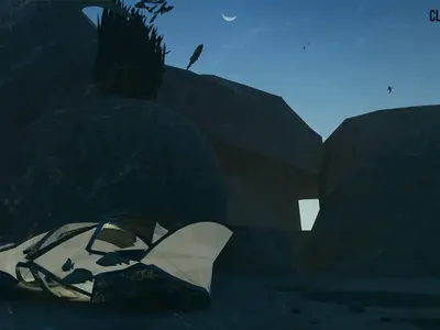
Cloaked Colonization: A Mobile Underwater Habitat That Moves Like a Fish
Micah Abaya's shortlisted EHC Pacific entry reimagines ocean settlement as a dispersed network of self-sustaining architectural organisms.

Similar Reads
You might also enjoy these articles

Pixel Gardens: One Repeated Module Stacked Into a Terraced Social Housing Tower for Famagusta
Salem Bader's shortlisted housing tower builds a vertical neighbourhood from one repeated module, offsetting units to carve terraces, light and air.

Bao Huynh Watercolor Atelier: A Serene Art Retreat in Hội An
Bao Huynh Watercolor Atelier in Hội An blends multifunctional art spaces, sustainable design, local materials, and family-friendly living in a serene environment.

Atelier Macri Concept Store Interior Design by CASE-REAL
Atelier Macri store features a "ko" counter, walnut wood details, cork displays, blending retail, gallery, and seamless customer experiences.

Manuel Vargas Izquierdo Stadium and High-Performance Sports Center: Architectural Excellence in Jalpa de Méndez
The Manuel Vargas Izquierdo Stadium blends sustainable design, inclusive sports facilities, and cultural-inspired architecture, revitalizing Jalpa de Méndez’s public spaces.


Comments (0)
Please login or sign up to add comments
No comments yet. Be the first to comment!