
THE ARTISTORY - FLOATING IN SPACE
The purpose of this design challange is to create a comfortable and creative space for artists where the atmosphere to create and appreciation of art prevails.
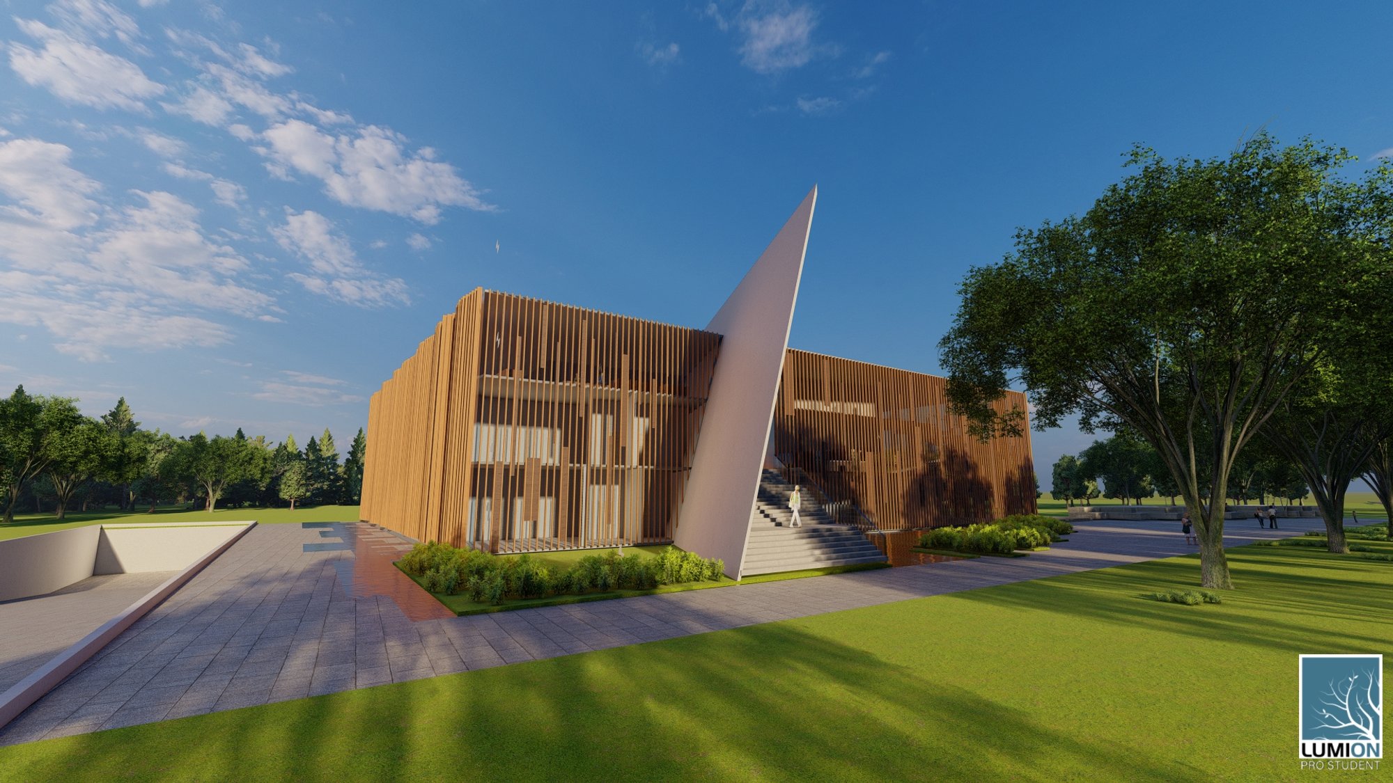
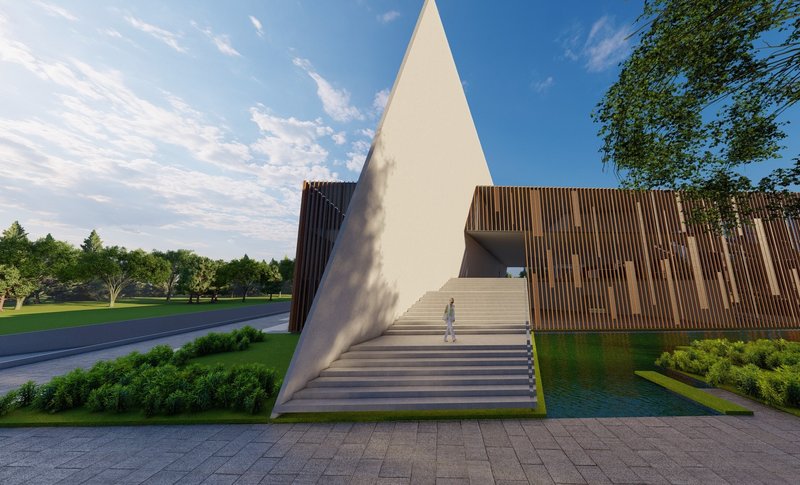
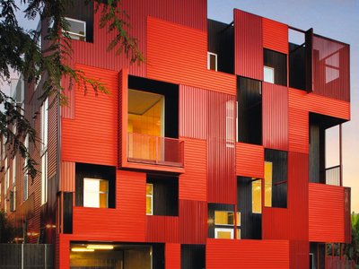
Having the ability to describe everything with nothingness, Malevich has opened a new era for abstraction. As palin as it can be, the whole painting is about a blank white sheet that carries a black square on top that works a proof for the beauty of simlicity. Square being the main concept of the project, the main body of the building is all about a giant square that has features to better fit to the topography. The most eye catching feature of the structure is the big tilted concrete wall that divides the building into two. On the contrary to the divided look it has on the outside the builging is connected on three floors out of four floors in total. The idea that lies behind this seperation is the aim that Malevich was looking for in his very famous painting: The Black Square. When first looked at, the painting can look as simple as any person holding a brush can paint one in ease. But what they don’t know is that the underlying idea had the power to open a whole new era in art called the abstraction. Coming back to the project, the tilted wall indicates the deep dive that one needs to better understand the meaning of the simple looking square. Having given the entrance of the building from this slit, the staircase that organically emerge from the wall, indicates the idea of the deep immerse that is needed to comprehend the “square”.
When the painting is carefully observed, the flat looking black square seems to have something to tell us in the third dimension via its brush strokes. These beautiful details than cannot be recognized from afar, and will show its beauty when the time is taken to take a closer look at it. Wanting to reflect this on the façade, the long wooden ribbons that vary in width and depth seems to have a flat pattern from afar, just like the painting. But when approaching the building one can see the smooth wavy texture that is made by the variation of the ribbons depth, is a hidden detail that gives the structure a subtle comprehension. These variations in the depths, take the sun path a reference and increase and decrease accordingly. The front façade has the least weight in façade since it lays behind the sun path. But the sides and the back of the structure have the most density in the depth of the ribbons to have a better control over the effects of the sun. Paris having a mild climate, thin ribbons that only work on a vertical axis is enough to provide the thermal comfort needed.
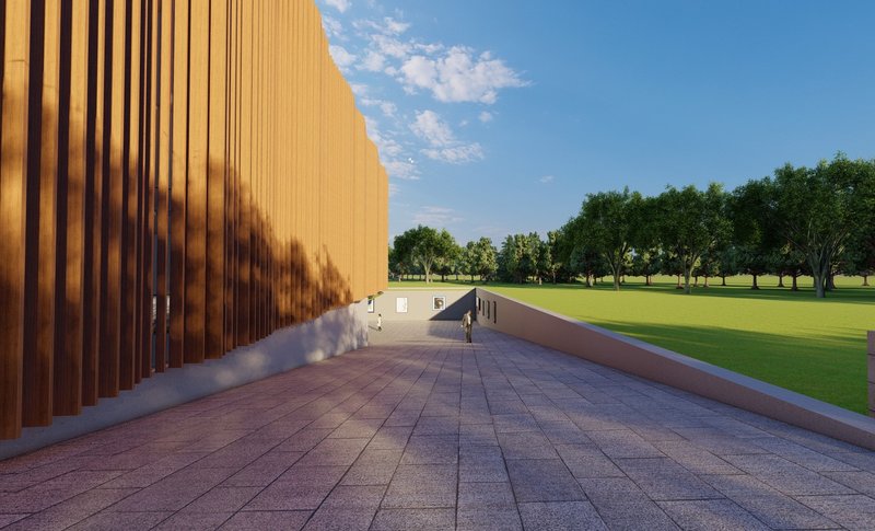
The tunnel that lays on the west side of the building also works as slit that secretly sneaks the visitor into the building. Not wanting to disturb the square shape and the entirety of the building, the entrance was designed to have a hidden sense. This tunnel does not work only as an entrance but as an open air exhibition area that gives space for the visitors to have a different experience of an art gallery that is just not like the regular art galleries. Also is a good idea to attract small visitors that find art centers and galleries a boring place rather than places that have the ability to widen their perspectives in life and remind them that making art is an essential core of being a human.
When taken a closer look at the plans, the irregular and almost chaotic language can be contradictory to the tidy looking square from the outside, but that is the aim! What Malevich did was to scream to the audience with a silent black square with its plainness in both its shape and color, nothingness was translated into the fulfillment of everything. So the fundamental principle was plain on the outside but complex on the inside. This got reflected to the structure as a plain façade and chaotic plans. The building consists of four floors one basement and three upper floors. The basement floor has two entrances that are provided by ramps that lay on the west and the east side of the building, one working for cars to enter to the underground garage and one that has the open exhibition area which leads to basement floor art galleries. The ground floor does not have an entrance from outside and can be accessed through the first and the ground floors, consisting of the big main art gallery and atelier that provide spaces for the art students. The first floor that has the main entrance, can be accessed through the staircase that sticks out of the tilted wall. This staircase leads to a tunnel that lays in the very core of the building and connects to a mini balcony at the end. The tunnel has two entrances, one on the left and one on the right, giving a sense of division although the well-connected building. This division helps maintaining the separation of the different functions since the east side is the educational side and the west side is more of a social area that carries the café and gallery like places.
The overall concept of the structure is the chaotism within the plainness. The aimed for look was a simple shape and a simple façade that made the visitors curious for what is inside. Having a big tilted wall that creates a smooth slit within the structure and welcoming the visitors from that mysterious gap. Malevich brought a new definition for plain that translated into exited. All this structure wants is to be a good example for such!
 The Tunnel
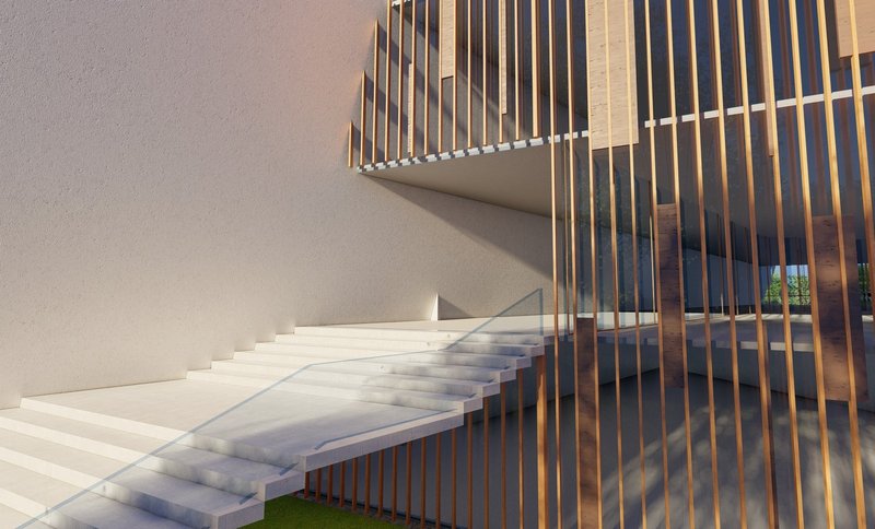 The Slit
 The Tilted Wall
Saranda PELINGU - Nejla ALTOM


Popular Articles
Popular articles from the community
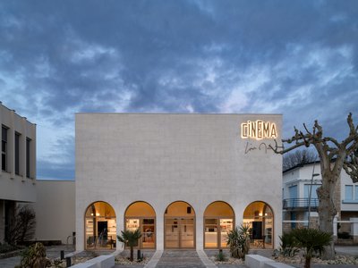
Louis Malle Cinema: A Limestone Cultural Landmark Revitalizing Community Life in Prayssac
Limestone cinema extension with public forecourt, blending heritage and modern design to create flexible cultural spaces and strengthen community interaction.
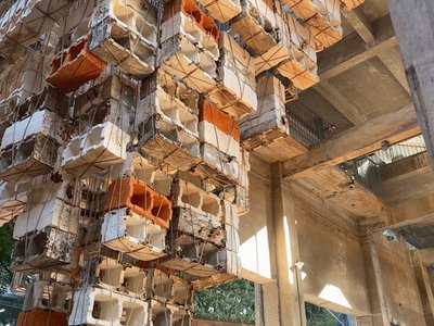
Inverted Architecture Installation by Studio Link-Arc: Exploring the Intersection of Architecture and Living Organisms
Inverted Architecture Installation by Studio Link-Arc blends mycelium, sustainability, inverted design, ecological cycles, and urban adaptive architecture in Shenzhen.
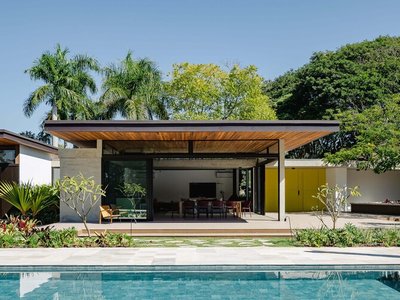
Flamboyant House by Juliana Camargo + Prumo Projetos
Modern Brazilian house integrating existing tree, pool, and volumes with glass, wood, and transitional spaces blending interior, exterior, and landscape seamlessly.
The Ken Roberts Memorial Delineation Competition (Krob)
As the most senior architectural drawing competition currently in operation anywhere in the world, it draws hundreds of entries each year, awarding the very best submissions in a series of medium-based categories.


Similar Reads
You might also enjoy these articles
Converge Hub – A Human-Centered and Sustainable Mobility Hub at the Urban Edge
Its open and permeable design promotes sustainable movement through walkable connections, green axes, and integrated public transport

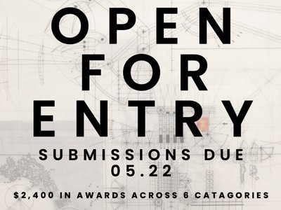
51st Annual KRob - Ken Roberts Memorial Delineation Competition
Join us in celebrating 51 years in excellence in architectural representation! With $2,400 in prize money awarded across 8 categories, this prompt-less competition is accessible to all!


Explore Architecture Competitions
Discover active competitions in this discipline


The International Standard for Design Portfolios


The Global Benchmark for Architecture Dissertation Awards


The Global Benchmark for Graduation Excellence


Challenge to design public laboratory
Comments (1)
Please login or sign up to add comments
Nice project!