
Grzywinski+Pons Gives Seattle a 31-Story Tower That Feels Like a Palazzo
Kaye Residences in Belltown synthesizes 1920s masonic language with a diaphanous glass tower above a deeply civic ground floor.
Belltown is Seattle's densest urban neighborhood, a place where new high-rises jostle with maritime warehouses and light-industrial relics. Building tall here is unremarkable. Building tall in a way that strengthens the street, engages a block of 1920s Tudor Revival and Georgian Revival neighbors, and still reads as genuinely contemporary: that is another thing entirely. Kaye Residences, designed by Grzywinski+Pons for developer Skanska and completed in 2026, manages exactly that trick across 31 stories and 35,117 square meters of program.
The site once housed Kaye-Smith Productions, the recording studio later known as Bad Animals, where Heart, Soundgarden, and Pearl Jam tracked albums. That history is gone physically but lingers in the building's name and, more subtly, in the architects' insistence on making the ground floor perform. Grzywinski+Pons designed the building, all interiors, and much of the furniture. The result is a tower where a sage-hued brick plinth meets a diaphanous glass volume above, connected by an onyx-clad monumental stair, a double-height great hall, and a level of material specificity that most residential towers in this price class never attempt.
A Plinth That Earns the Street
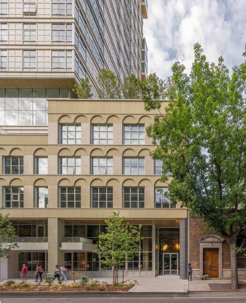
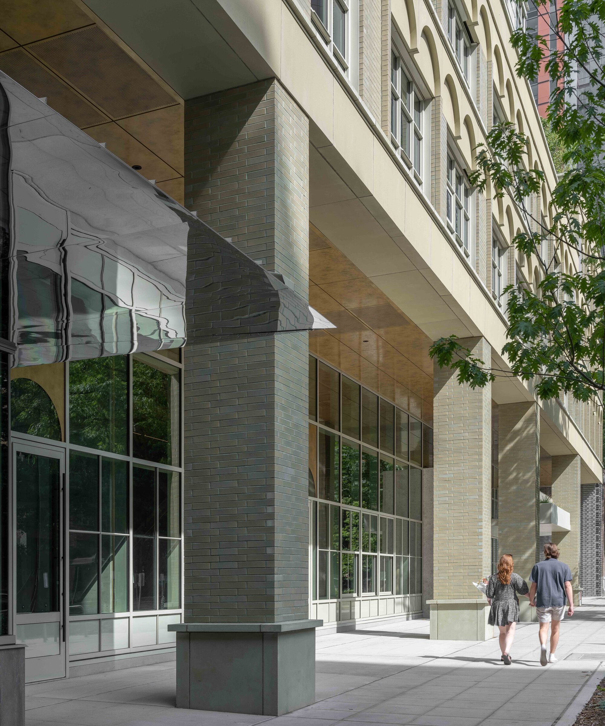
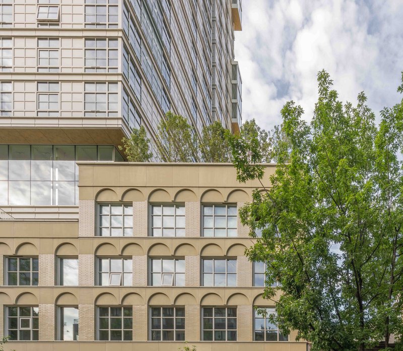
The podium is where Kaye makes its strongest argument. Sage-hued glazed Roman brick, precast string courses, and debossed arches at each window header give the base a visual density that matches its 1920s block-mates in material temperament without mimicking them in form. The colonnade of brick and cast stone sets the ground floor back, creating a covered zone between sidewalk and lobby that actually invites occupation. Street furniture and generous plantings complete the invitation.
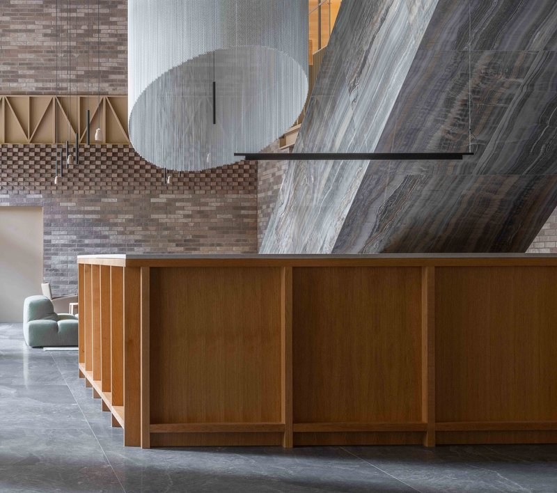
Grzywinski+Pons describe the podium mass as something to be "eroded to human scale." You can see the logic in how the arched openings repeat and widen, pulling the eye along Fourth Avenue rather than forcing it upward. A projected retail volume clad in Tennessee pink marble punctuates the base, anchoring the commercial program with a material that reads as permanent. The mirror-finished awning above the entry reflects pedestrians back at themselves, a small theatrical gesture that signals the building cares about what happens at five feet, not just five hundred.
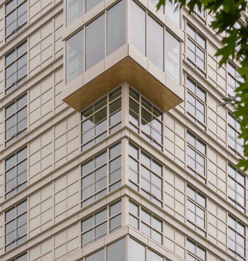
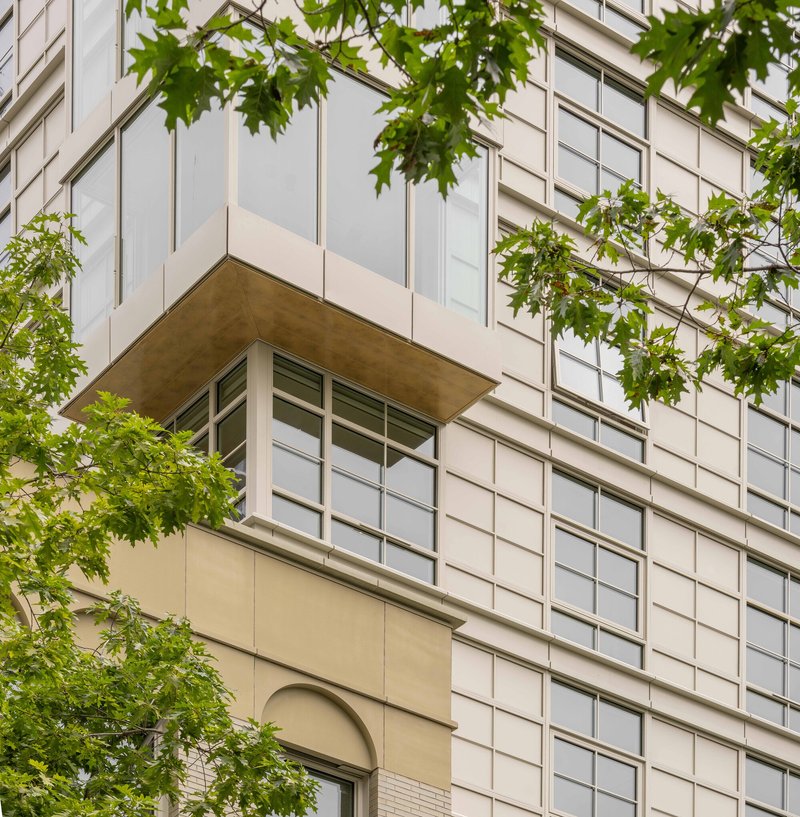
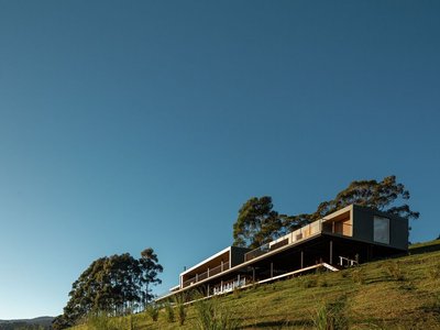
The Tower Dissolves
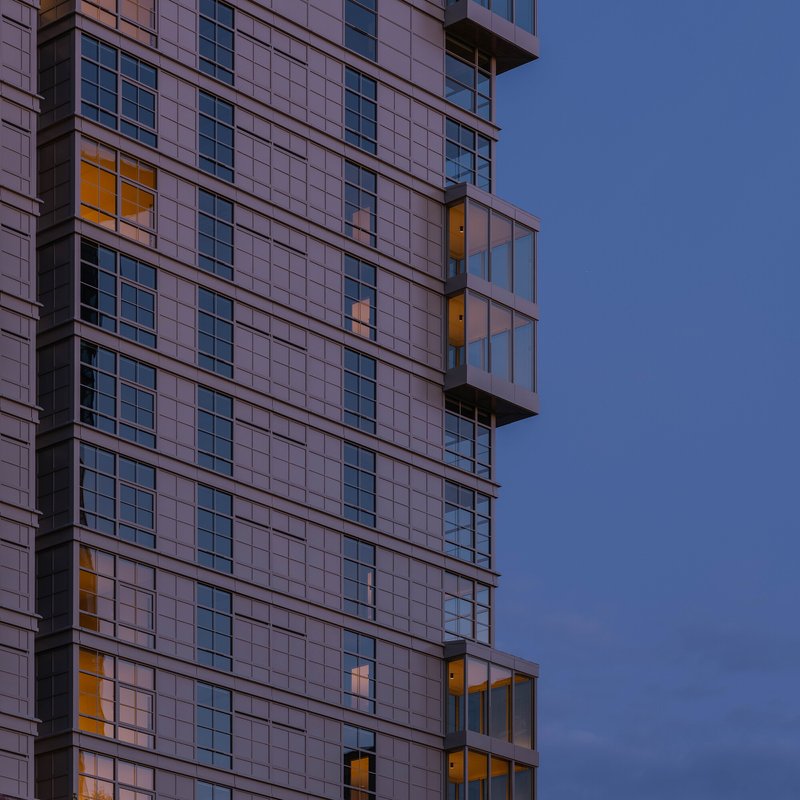
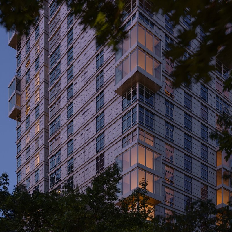
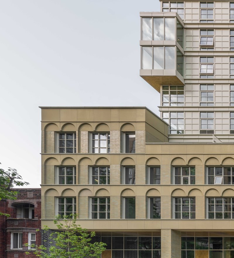
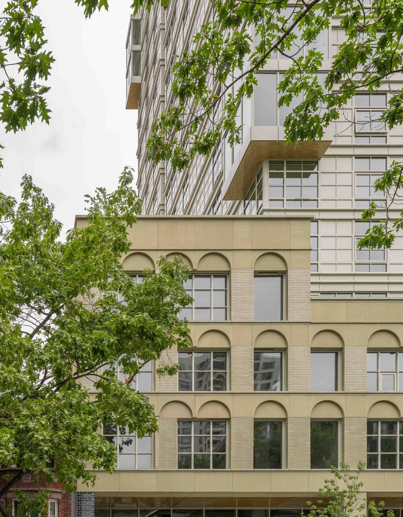
Above the masonry plinth, the tower shifts register entirely. Light olive-colored facade panels and a loosening grid create a volume that looks increasingly diaphanous as it rises. The architects describe this as synthesizing the masonic language of the 1920s with something more ephemeral, and the dusk photographs make the case convincingly: the upper floors glow like a lantern, their projecting glass balconies catching interior light against a deepening sky.
The grid's loosening is not arbitrary. It strengthens the sense of verticality in the upper portion while the tighter rhythm of the lower floors maintains visual weight where the tower meets the plinth. Corner balconies with timber soffits and an aged brass finish on the metal panels add warmth to what could otherwise read as a generic curtain wall. The transition from solid to light is the building's core formal idea, and it works because the materials support it at every scale.
A Ground Floor That Works as a Room
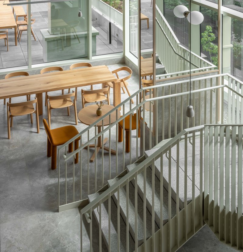
The 6,100-square-foot great hall is the project's civic heart. Operable glass storefronts open it to Fourth Avenue, and behind them sits an internal secondary facade clad in masonry, creating a layered threshold between public and private. The double-height space is bathed in afternoon light through tall windows, and the brick walls carry the same textured specificity as the exterior. A mail and bike room functions as a visual and physical connection from the avenue through the great hall to the alley, turning service into circulation.
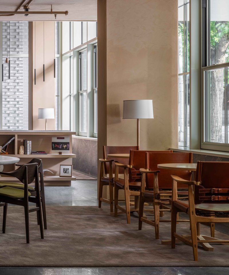
The lobby furniture, much of it designed by Grzywinski+Pons, reads more like a members' club than a residential check-in. Timber tables, a reception desk backed by a sculptural suspended element and brick wall, and carefully placed seating areas suggest that the architects understood this space would be judged not by renderings but by whether people actually linger. The operable sash windows at ground level reinforce this: a building that can breathe is a building that wants to be inhabited.
The Onyx Stair and Amenity Sequence
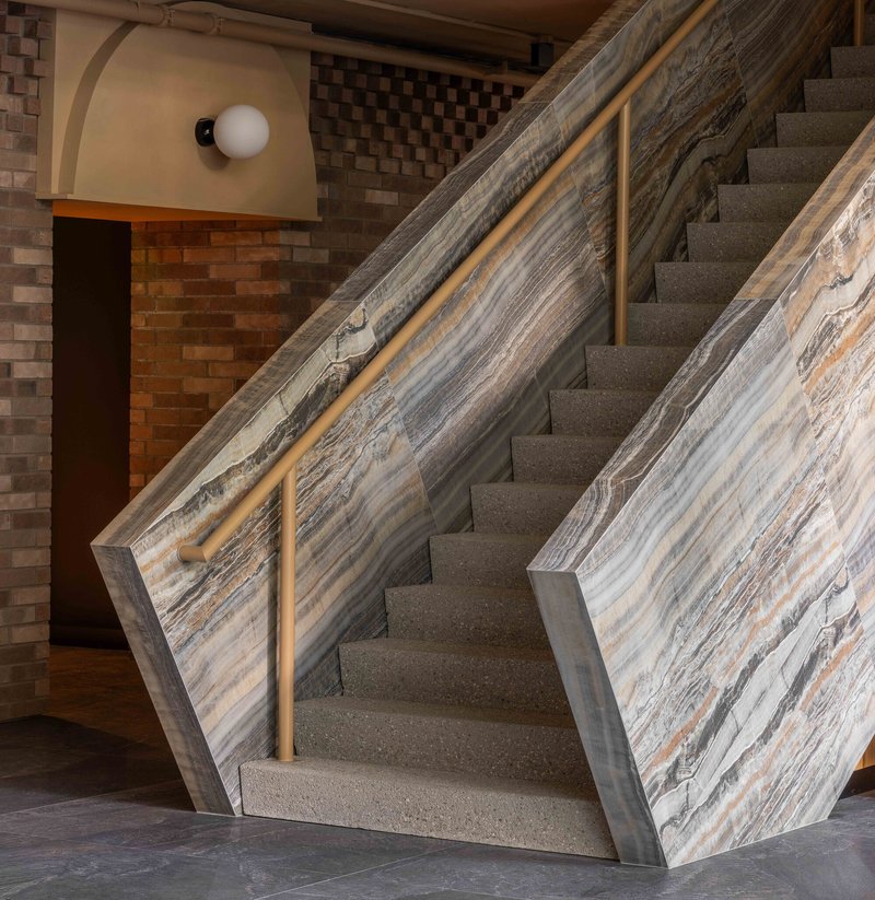
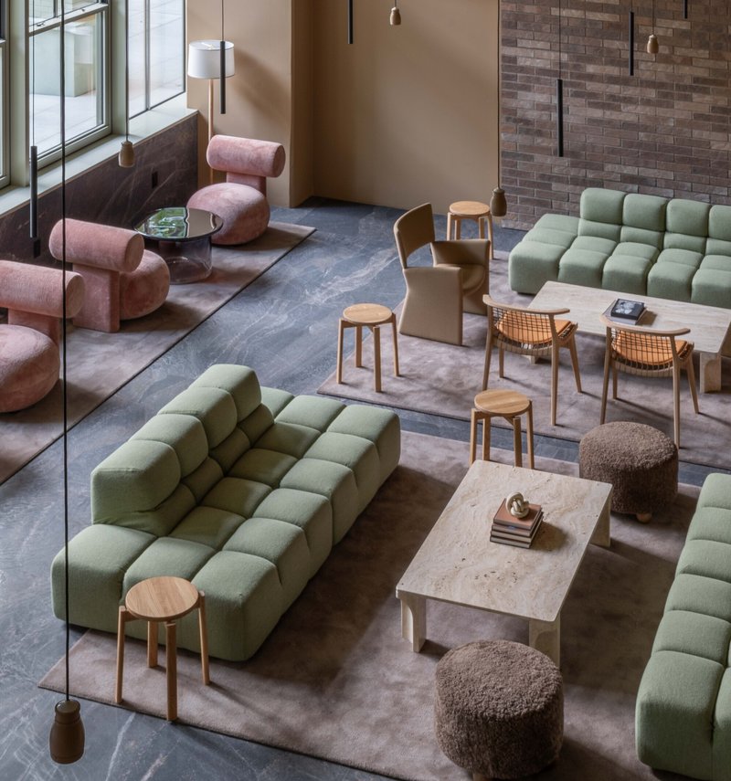
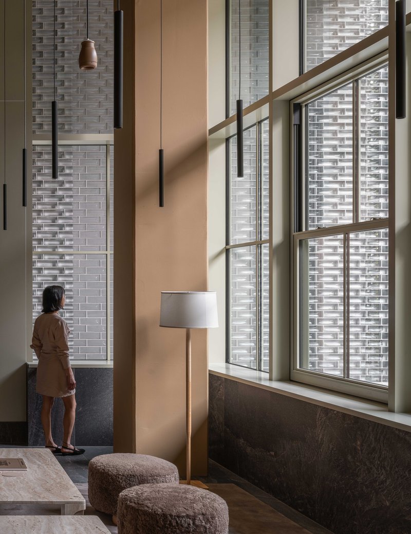
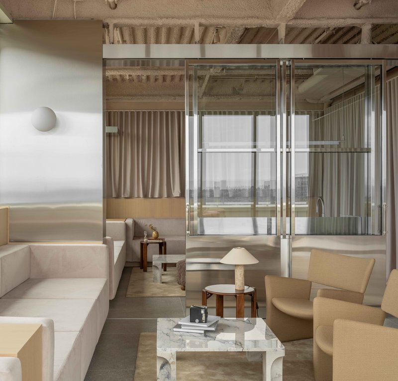
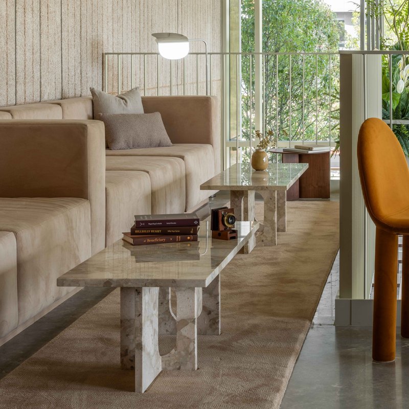
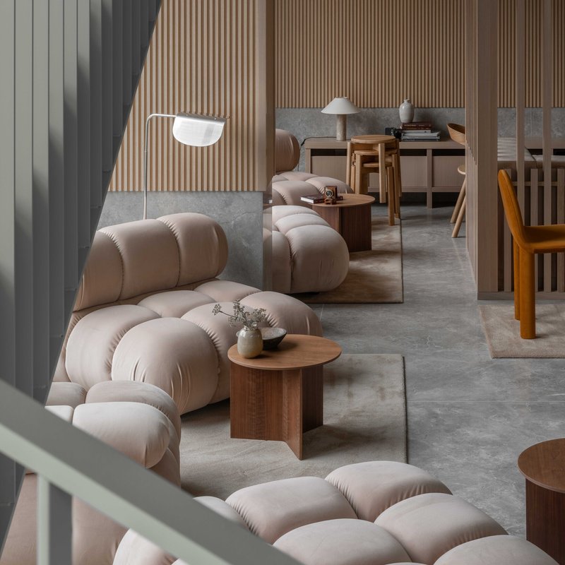
A monumental stair clad in onyx connects the ground floor to the mezzanine amenity level, and it is the kind of move that separates a project with conviction from one that is merely competent. The stone's veined grey and amber striations turn a vertical circulation element into a geological event. The terrazzo treads and layered stone balustrade complete a material palette that would be at home in a mid-century European bank, repurposed here for a co-working space and resident lounge.
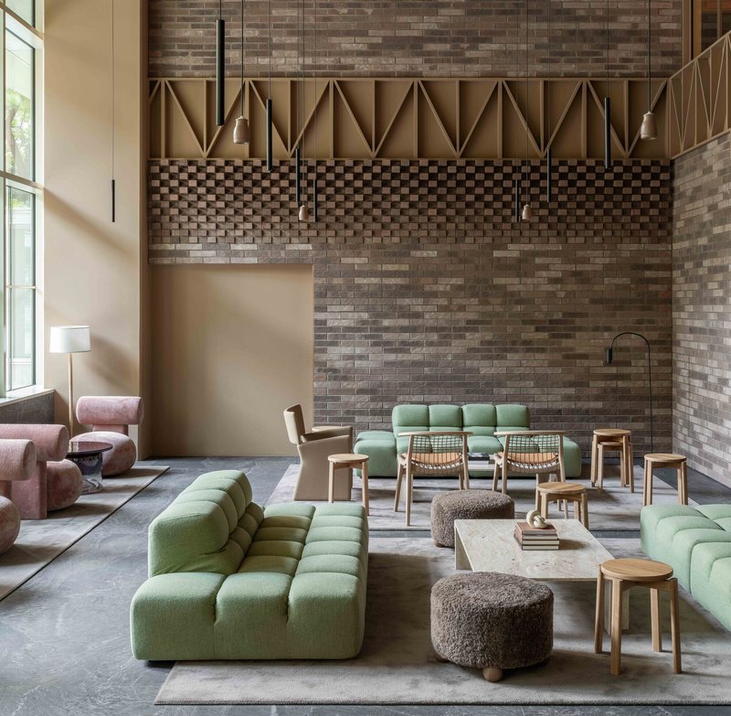
The mezzanine itself features variegated brick walls, geometric paneling, and modular seating arranged to encourage different modes of occupation. A reading alcove with timber shelving and terracotta stools overlooks the brick facade below, threading the interior program back to the exterior. Hospitality-grade amenities continue on the seventh and thirty-second floors, but the mezzanine sequence is where the building's material ambitions are most concentrated.
Upper Amenities and the Winter Garden
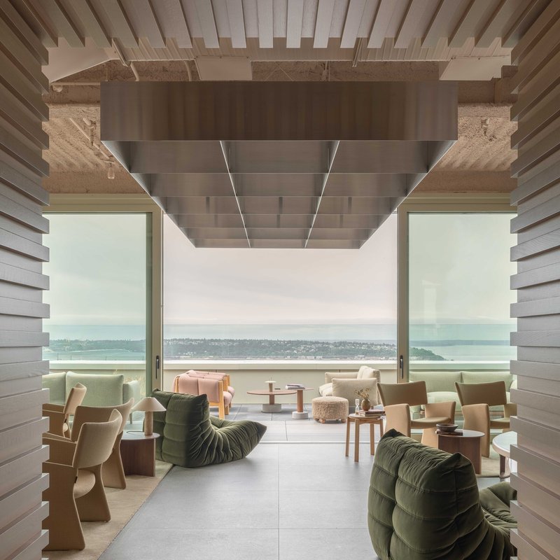
At the upper amenity levels, the material palette shifts toward timber, rammed earth, and steel-framed glazing. A covered terrace with a timber slat ceiling and a rammed earth beam frames water views in soft daylight, offering the kind of prospect that justifies the tower's height in experiential rather than purely numerical terms. Adjacent lounge spaces use exposed timber joists and steel-framed glazing to divide zones while maintaining visual continuity.
The winter garden on the southwest corner, where the Fourth Avenue cladding turns the corner, is a quieter gesture. It mediates between the tower's conditioned interior and the Pacific Northwest weather, providing a sheltered outdoor room that extends the usable season. In a city where overcast skies are the norm for months at a stretch, spaces like this are not luxuries. They are necessities that most towers never bother to provide.
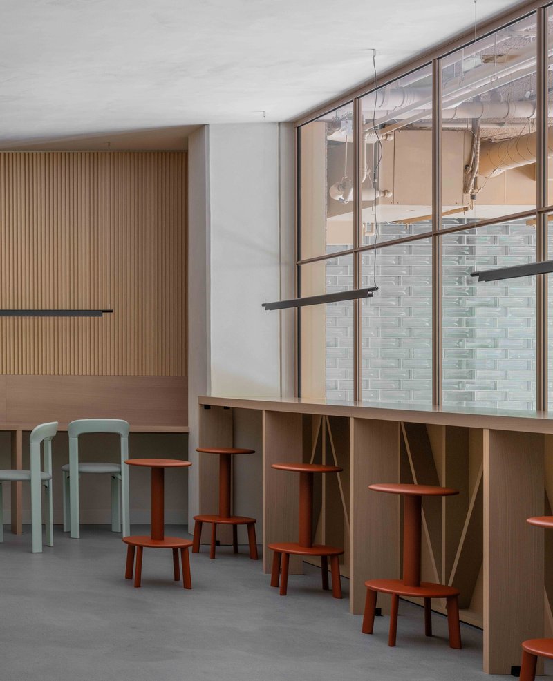
Inside the Units
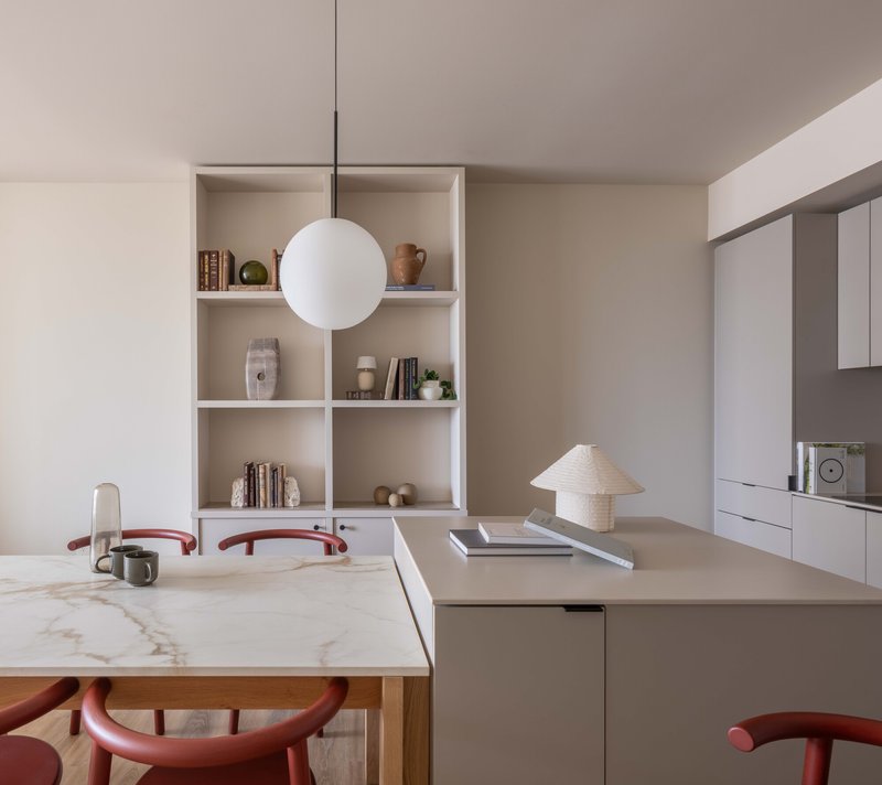
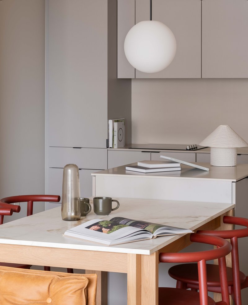
The 324 apartments, including ten three-bedroom family units, continue the architects' total-design approach. Kitchens feature a marble-topped, timber-framed island whose dimensions align with the muntins of adjacent glazing, a detail that reveals the degree of control Grzywinski+Pons exercised over the interiors. Built-in sideboards with integrated bookshelves between windows turn structure into furniture, and the spherical pendant lights above dining areas add a sculptural note without competing with the views.
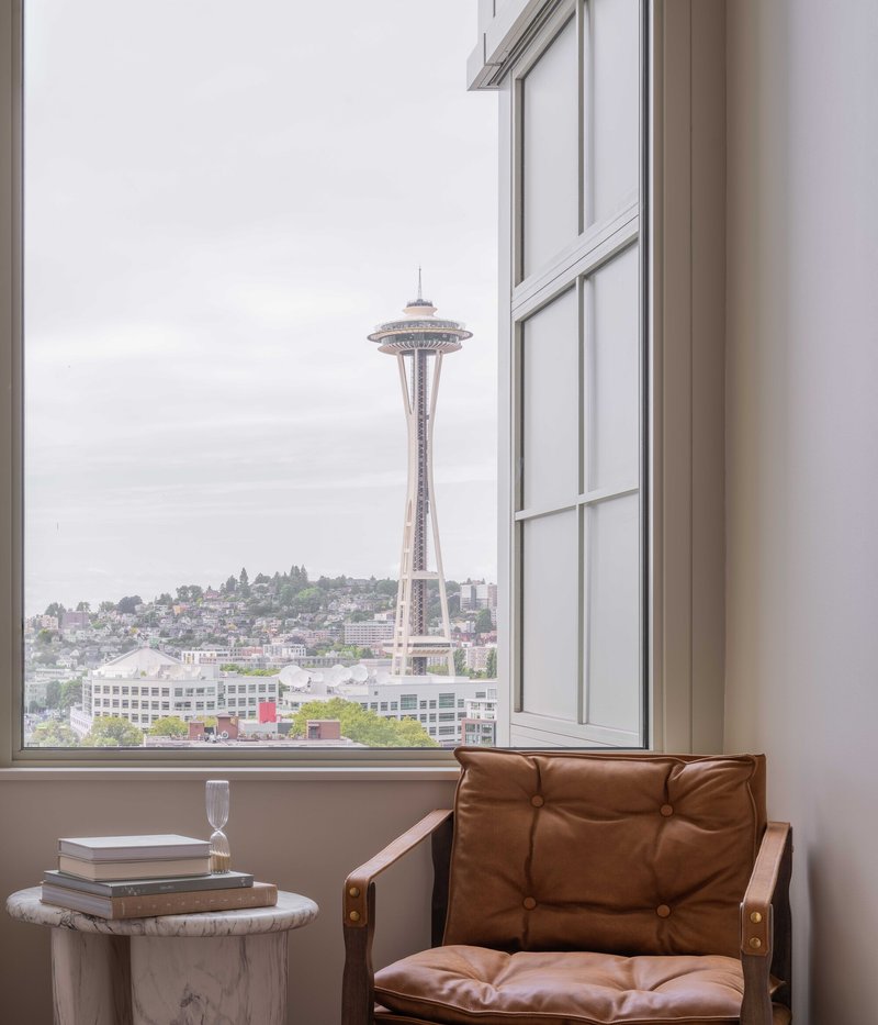
Corner units frame the city through floor-to-ceiling glazing, and planted balconies accessible through glazed doors extend the living space outdoors. The palette is restrained: marble, timber, pale green metal, and soft plaster. What distinguishes these units from the glossy neutrality of most luxury apartments is the sense that every element was drawn rather than specified from a catalog. The red curved stools at the dining table, the vertical timber slat walls in seating nooks, the green metal staircase railings: these are the signatures of architects who refused to hand off the interiors.
Dusk and the Threshold
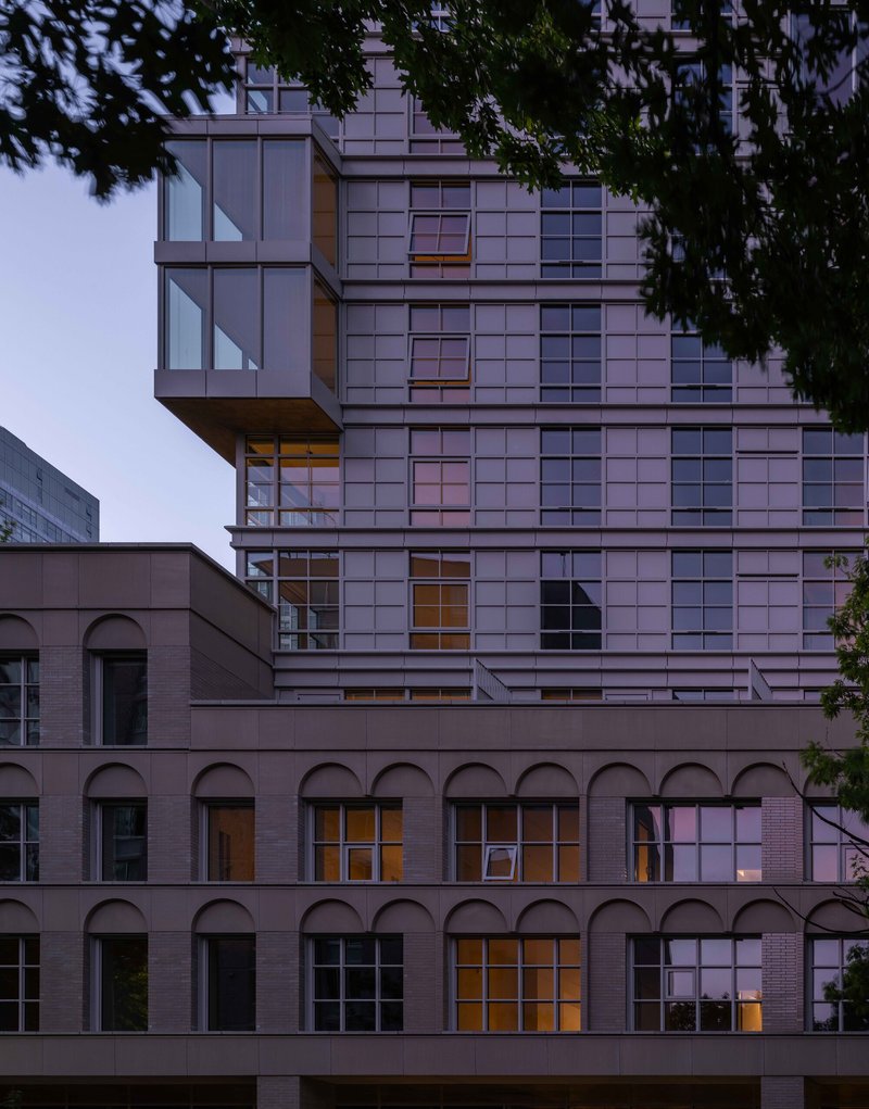
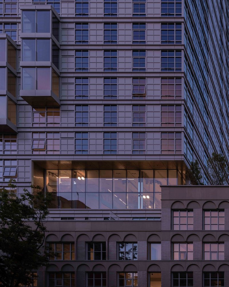
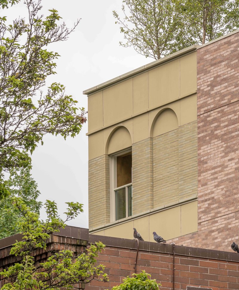
The building photographs well at dusk, and that is not incidental. The glass-enclosed lobby bridges the historic brick base and the gridded tower, and at twilight the two registers become legible simultaneously: the warm glow of the podium's arched openings against the cooler shimmer of the tower above. The facade detail shots reveal the care taken with the horizontal banding and the debossed arches, elements that disappear at a distance but reward the pedestrian who looks up.
Kaye Residences is targeting LEED Gold, Salmon-Safe, WiredScore Gold, and Fitwel certifications, a comprehensive sustainability profile that matches the project's ambitions at the street level. KPFF's structural and civil engineering supports the rectangular tower atop the multi-story podium, while Perkins Eastman served as architect of record and GGLO handled landscape architecture. The team is deep, but the design voice is singular.
Plans and Drawings
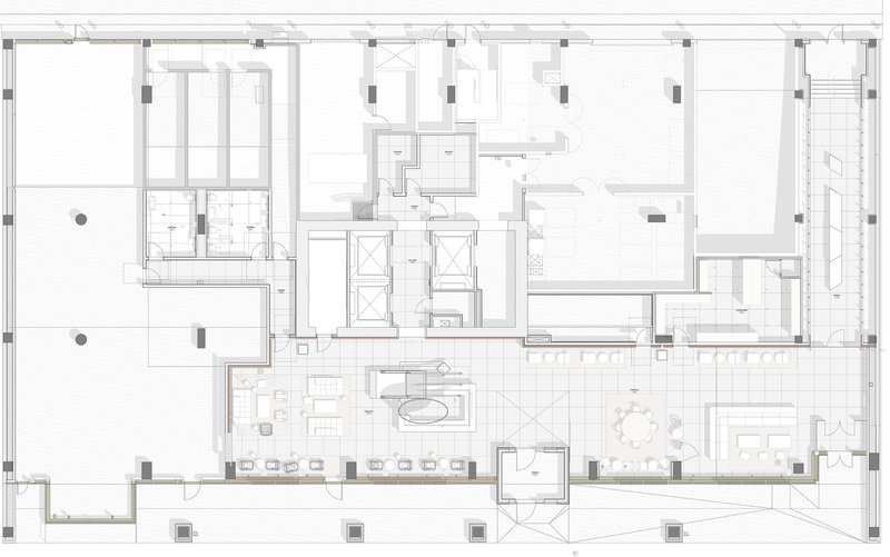
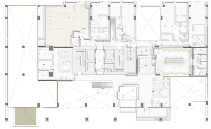
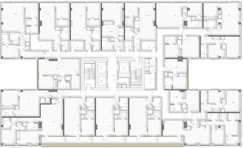
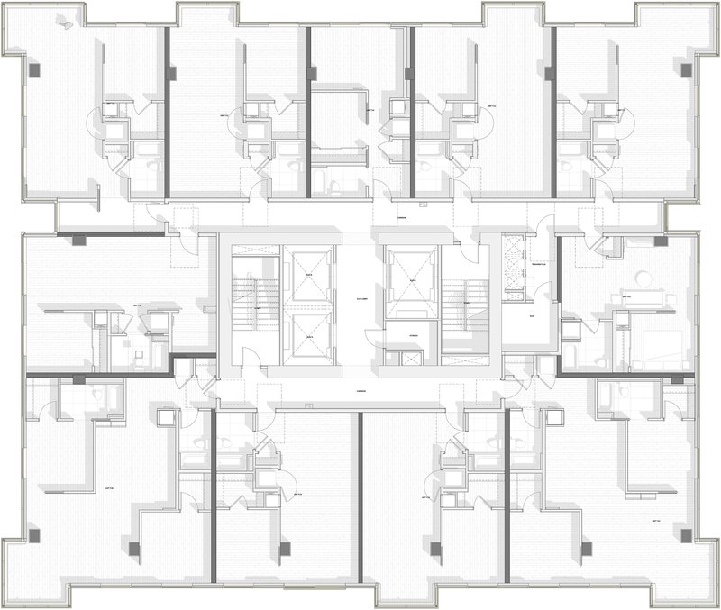
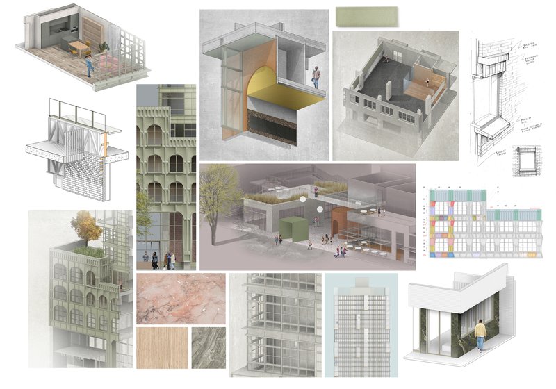
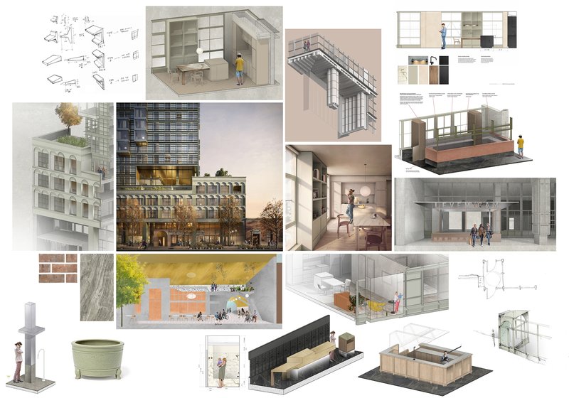
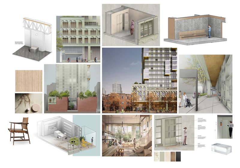
The floor plans reveal a central core strategy with residential units wrapping the perimeter to maximize daylight and views. Double-height spaces appear at the amenity levels, confirming the sectional ambition visible in the photographs. The presentation boards, with their axonometric drawings, elevations, material samples, and section cuts, document the design's evolution from a massing study into a building with genuine tectonic personality. The typical floor plans show how balconies and individual unit layouts vary around paired stair and elevator shafts, avoiding the monotony of identical floor plates.
Why This Project Matters
Most residential towers in North American cities treat the ground floor as a problem to be solved with retail tenants and a lobby desk. Kaye Residences treats it as the building's primary public offering: a double-height great hall, a colonnade, a covered passage, an onyx stair, and a winter garden, all designed by the same hand that shaped the apartments upstairs. The result is a tower that participates in Belltown's street life rather than simply rising above it. That alone distinguishes the project from the vast majority of its high-rise peers.
More broadly, Kaye demonstrates that the total-design ambition once associated with boutique hospitality can translate to a 324-unit residential building if the client allows it and the architects insist on it. Grzywinski+Pons, a firm better known for hotel interiors and smaller commissions, have produced a tower that holds together from the macro scale of the skyline to the micro scale of a muntin dimension matching a sideboard. In a decade when most tall buildings are designed by committee and detailed by spreadsheet, that coherence is worth noting.
Kaye Residences by Grzywinski+Pons. Seattle, United States. 35,117 m². Completed 2026.
About the Studio
Pons
Share Your Own Work on uni.xyz
If projects like this are the kind of work you want to make, uni.xyz is a place to publish your own, find collaborators, and enter design competitions.


Popular Articles
Popular articles from the community
20 Most Popular Commercial Architecture Projects of 2025
From sustainable market concepts to heritage factories, the commercial buildings and proposals that drew the most attention on uni.xyz this year.
Gunawarman 35: Jakarta's Corner of Quiet Complexity
WOFF's mixed-use building in Jakarta pairs translucent glass block walls with a buff brick cylinder to hold coffee, wellness, and work under one roof.
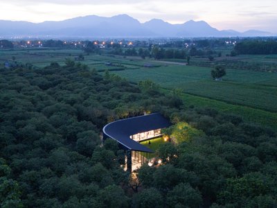
Cafe MADA: A Chiang Rai Pavilion in a Mango Orchard
BodinChapa Architects threaded a 254 m² black-roofed cafe through an existing mango orchard in Chiang Rai, Thailand, built around mature trees.
A Park Building That Wants to Be a Landscape
Omrania's Operations & Maintenance Building at King Salman Park dissolves industrial program into Riyadh's largest green infrastructure.


Similar Reads
You might also enjoy these articles
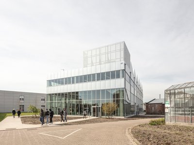
STEM School Mechelen by LAVA Architecten: A Future-Ready Educational Architecture in Belgium
Flexible, sustainable STEM school in Mechelen featuring modular classrooms, acoustic innovation, and energy-efficient design supporting future-focused collaborative learning environments.
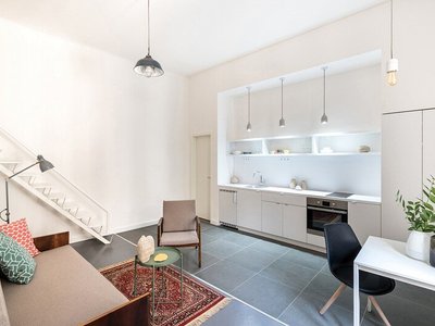
Marvila Apartment Renovation in Lisbon: A Bright Minimalist Attic Transformation by KEMA Studio
Bright attic transformed into minimalist Lisbon apartment with skylights, sustainable materials, open plan layout, and industrial-inspired interior design elements.
20 Most Popular Commercial Architecture Projects of 2025
From sustainable market concepts to heritage factories, the commercial buildings and proposals that drew the most attention on uni.xyz this year.
Mantiqueira House by SysHaus and M Magalhães Estúdio
A linear modular house embedded in Serra da Mantiqueira, integrating panoramic views, sustainable prefabrication, minimal terrain impact, and contemporary interiors.


Comments (0)
Please login or sign up to add comments
No comments yet. Be the first to comment!