
TAOA Wraps an Unfinished Ruin in Fluted White Armor
Hangzhou's Empathy Museum transforms an abandoned parking garage into a community art space wrapped in a corrugated facade that reads like urban origami.
What do you do with a half-built underground parking garage and a pile of structural leftovers? If you're TAOA, you turn it into a 1,628 square meter community art museum on the banks of a canal in Hangzhou. The Empathy Museum is a renovation project in the truest and most radical sense: it doesn't polish an existing building so much as conjure a new one from the skeleton of an abandoned one, layering a sculptural white fluted envelope over raw concrete bones.
What makes the project genuinely interesting is not the facade alone, though its rhythmic vertical tubes are impossible to ignore. It is the way TAOA has choreographed a series of interior voids, split levels, and narrow passages that give a relatively modest building the spatial complexity of something three times its size. The museum operates simultaneously as a gallery, a community gathering point, and a piece of public infrastructure that stitches together a canal edge, a streetfront, and a residential neighborhood. The empathy in the title is not decorative. It describes the building's posture toward its context.
A Facade Built from Tubes, Not Walls
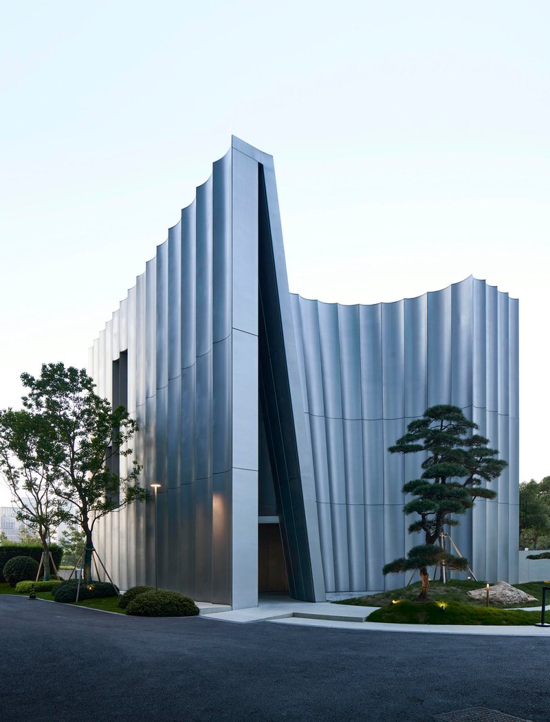
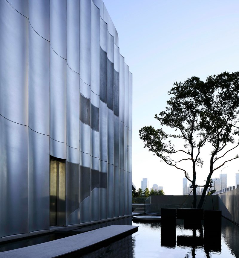
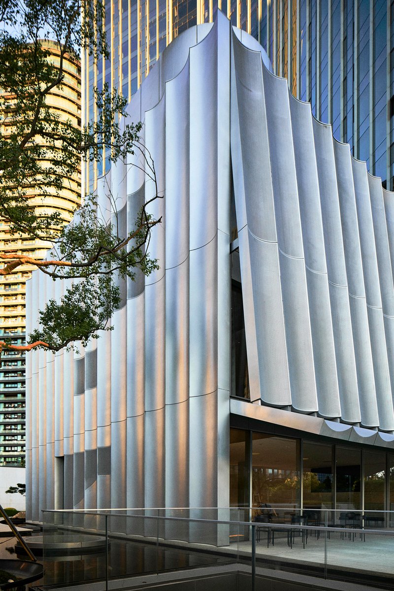
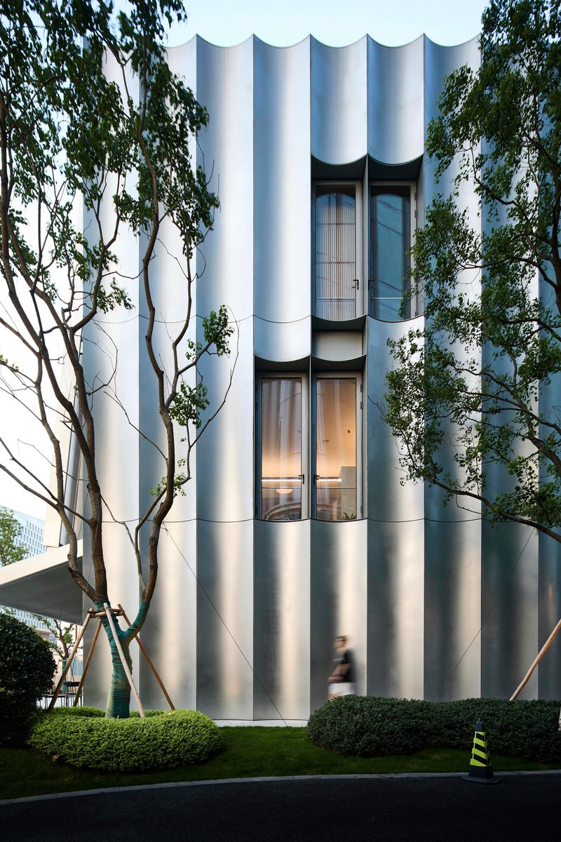
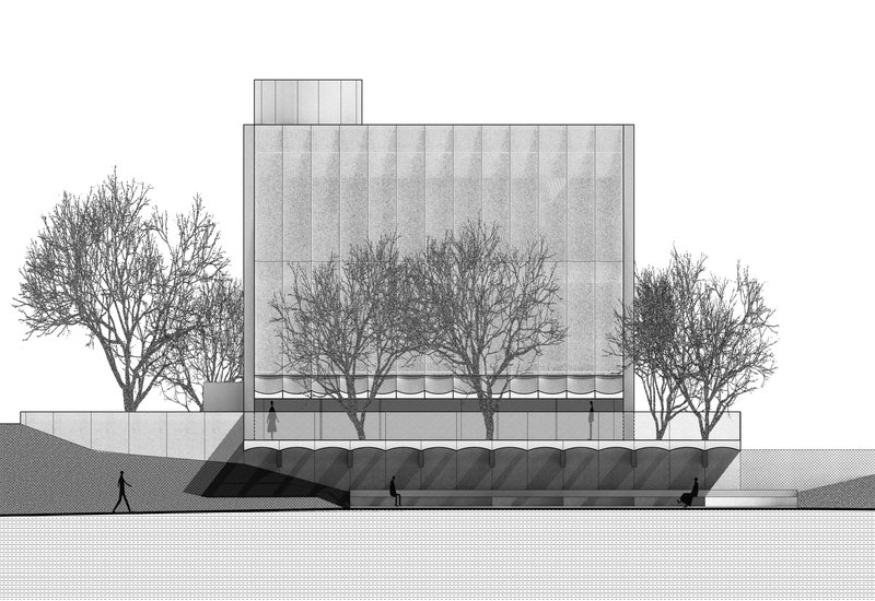
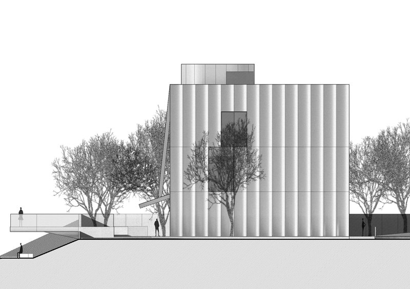
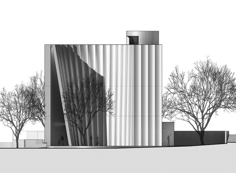
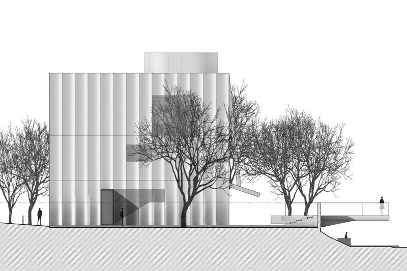
The corrugated white facade is the building's calling card. Composed of closely spaced vertical tubes, it wraps the entire volume in a continuous scalloped skin that shifts between opaque and semi-transparent depending on the angle of light and the viewer's position. At twilight, the interior glow seeps through the gaps between tubes, turning the entire structure into a lantern. During the day, the fluting casts deep shadows that give the surface a muscular, almost geological texture.
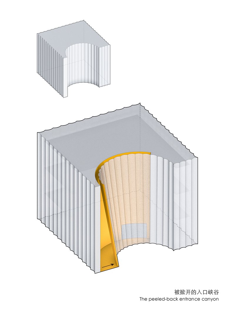
The tubes are not merely decorative. They mediate between the public realm and the interior galleries, filtering views and daylight in a way that gives occupants a sense of enclosure without claustrophobia. Where the facade peels open at the entrance, the tubes are sliced away at an aggressive diagonal, creating a canyon-like threshold that announces the transition from street to gallery with real spatial drama.
Entering Through the Canyon
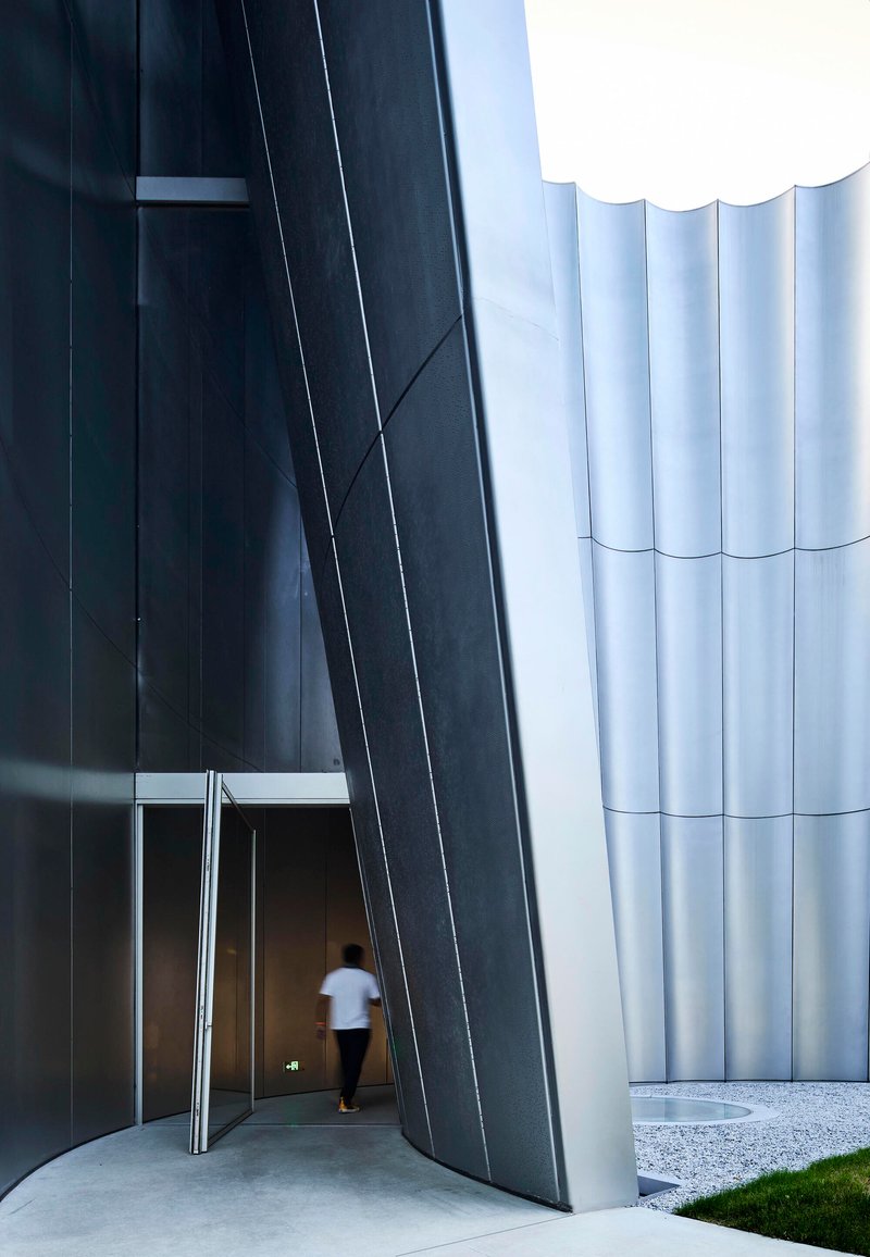
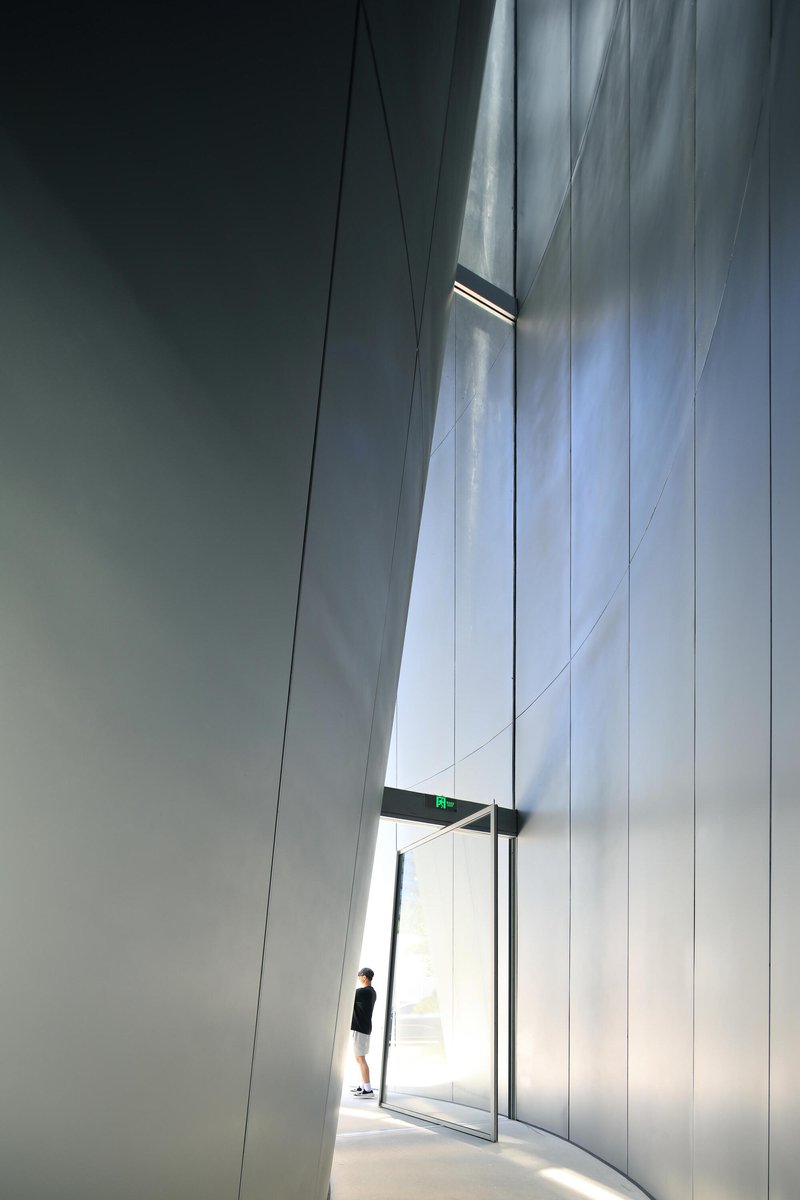
The entry sequence is the most cinematic moment in the building. A deep, angled void is carved into the facade, its walls darkened and compressed to heighten the sense of passage. A single figure silhouetted in backlight is enough to convey the scale: this is a doorway designed to make you feel small before the lobby opens up and makes you feel held.
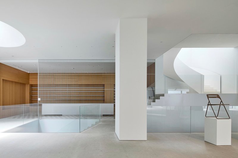
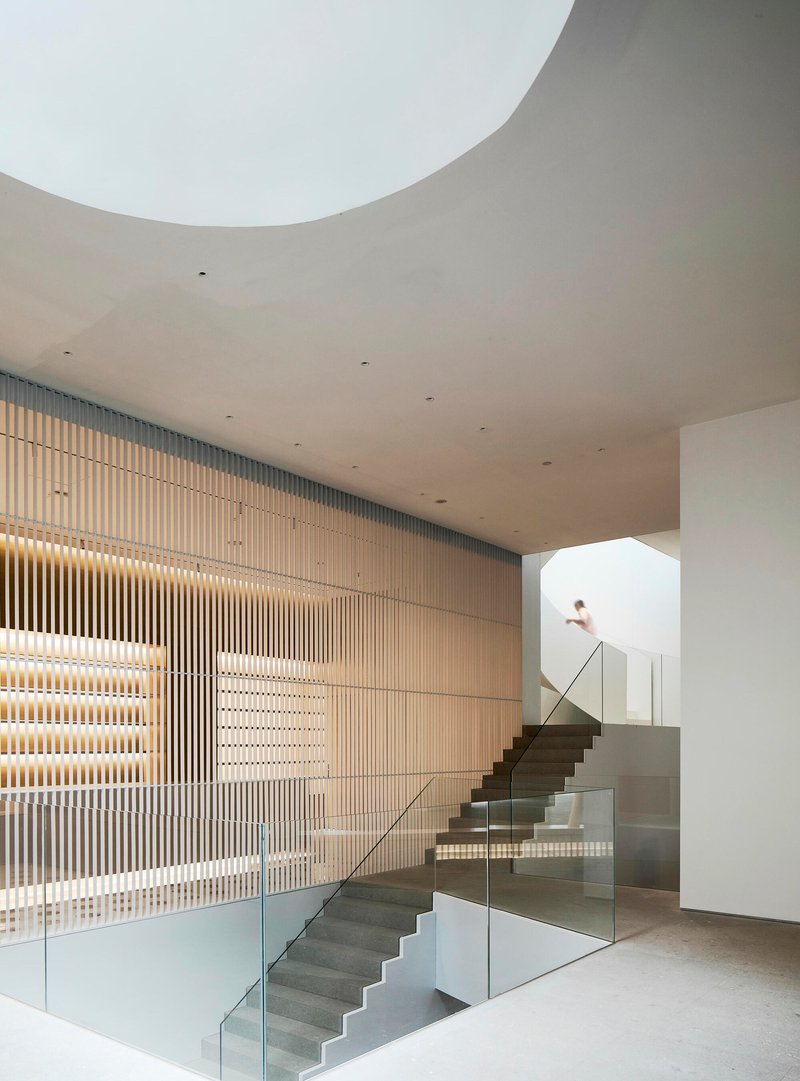
Inside, the double-height lobby uses curved white walls and a vertical timber slat partition to create layered depth within what is structurally a simple volume. The timber screen functions as both spatial divider and display surface, with integrated shelves for catalogues at arm height. The terrazzo floor, carried through from the entrance to the upper galleries, provides a continuous material thread that ties together spaces of very different character.
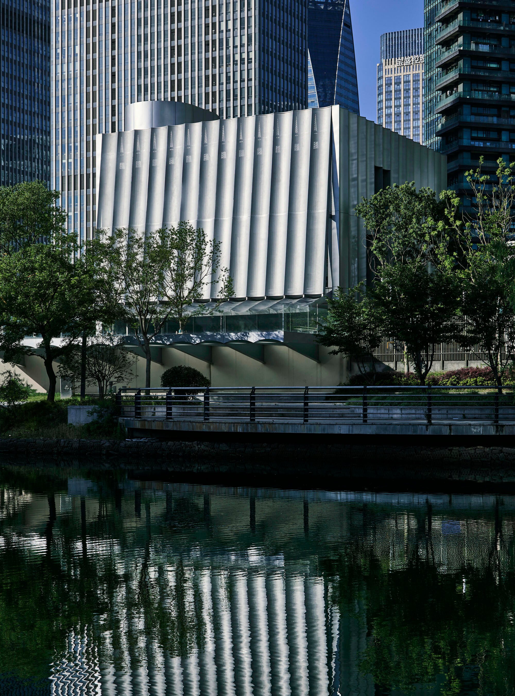
The Canal and the Tower
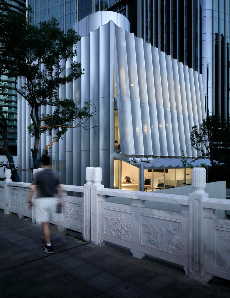
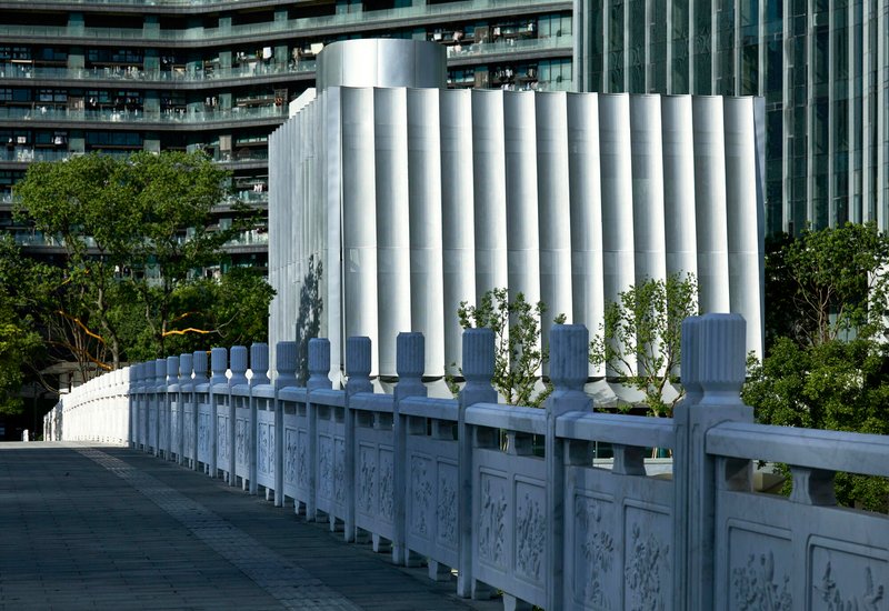
Seen from across the canal, the museum reads as a cylindrical tower rising behind an ornamental stone balustrade, its fluted surface reflected in still water alongside bare winter trees. The juxtaposition is striking: the carved stone panels of the canal railing are centuries-old Chinese craftsmanship, while the white tubes behind them are unambiguously contemporary. TAOA does not try to resolve the tension. Instead, the building holds its ground as a distinct object that respects the canal's heritage without mimicking it.
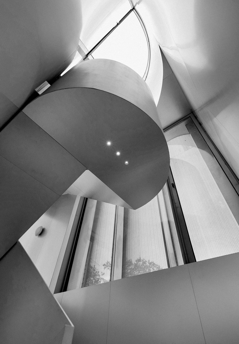
The tower volume houses the vertical circulation and upper galleries, its curved plan reinforcing the sense that the building is not a box but a series of interlocking cylindrical and rectilinear forms. The recessed glazed openings punched into the fluted skin give the tower a monastic quality, small apertures admitting controlled light into tall interior spaces.
Light as Building Material
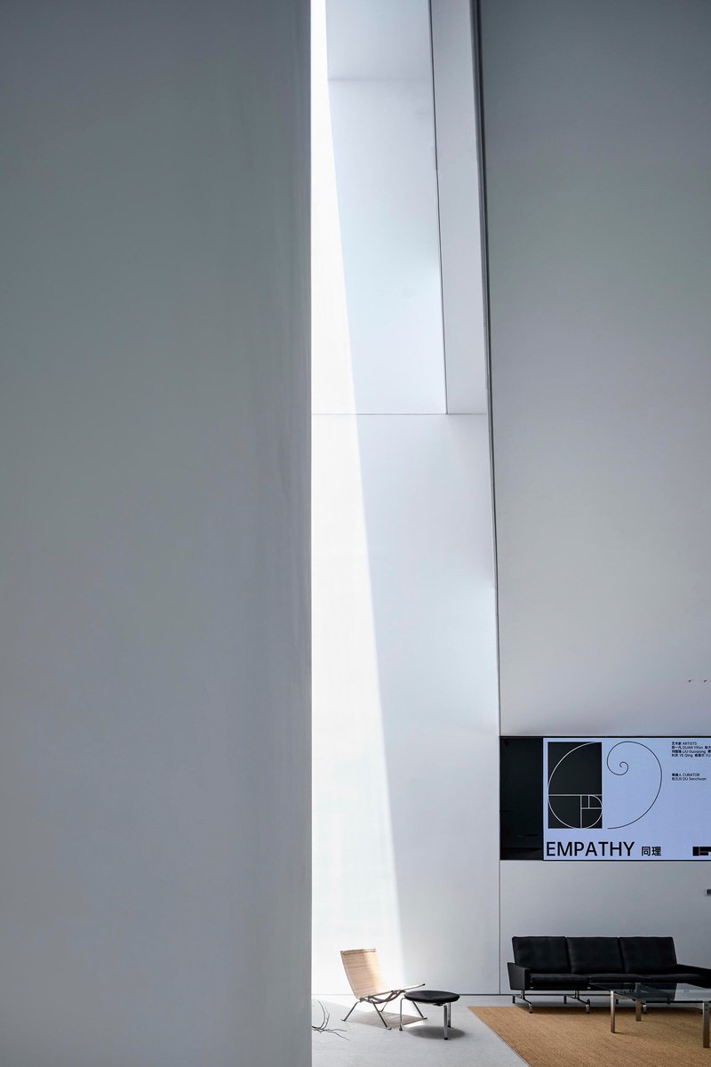
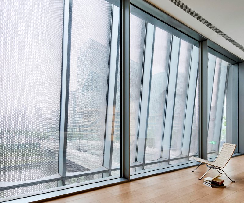
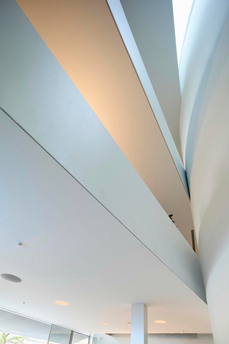
TAOA treats natural light with the same precision other firms reserve for structural calculations. A tall vertical skylight slices through the gallery walls like a surgical incision, casting a blade of daylight that moves across the floor over the course of the day. Elsewhere, perforated metal curtain panels filter light into soft, diffused washes that turn the timber flooring warm and the white walls into projection screens for shadow.
The clerestory windows that appear above angled ceiling planes add yet another register: unexpected slashes of sky visible from the gallery floor, pulling the eye upward and reminding visitors that they are inside a building with real volumetric ambition. None of these light strategies feel accidental. Each one is calibrated to a specific room and a specific mood.
Vertical Circulation as Spectacle
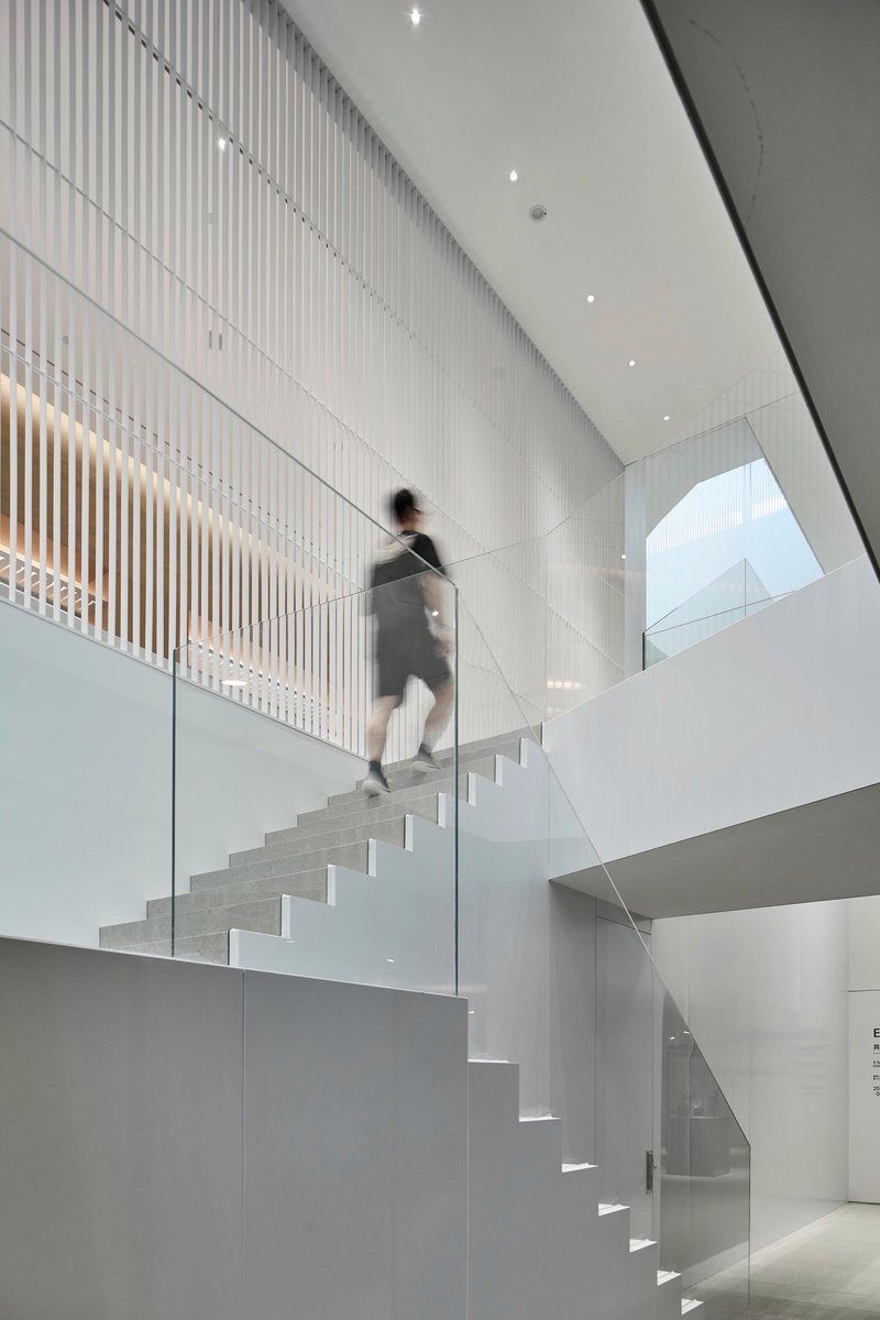
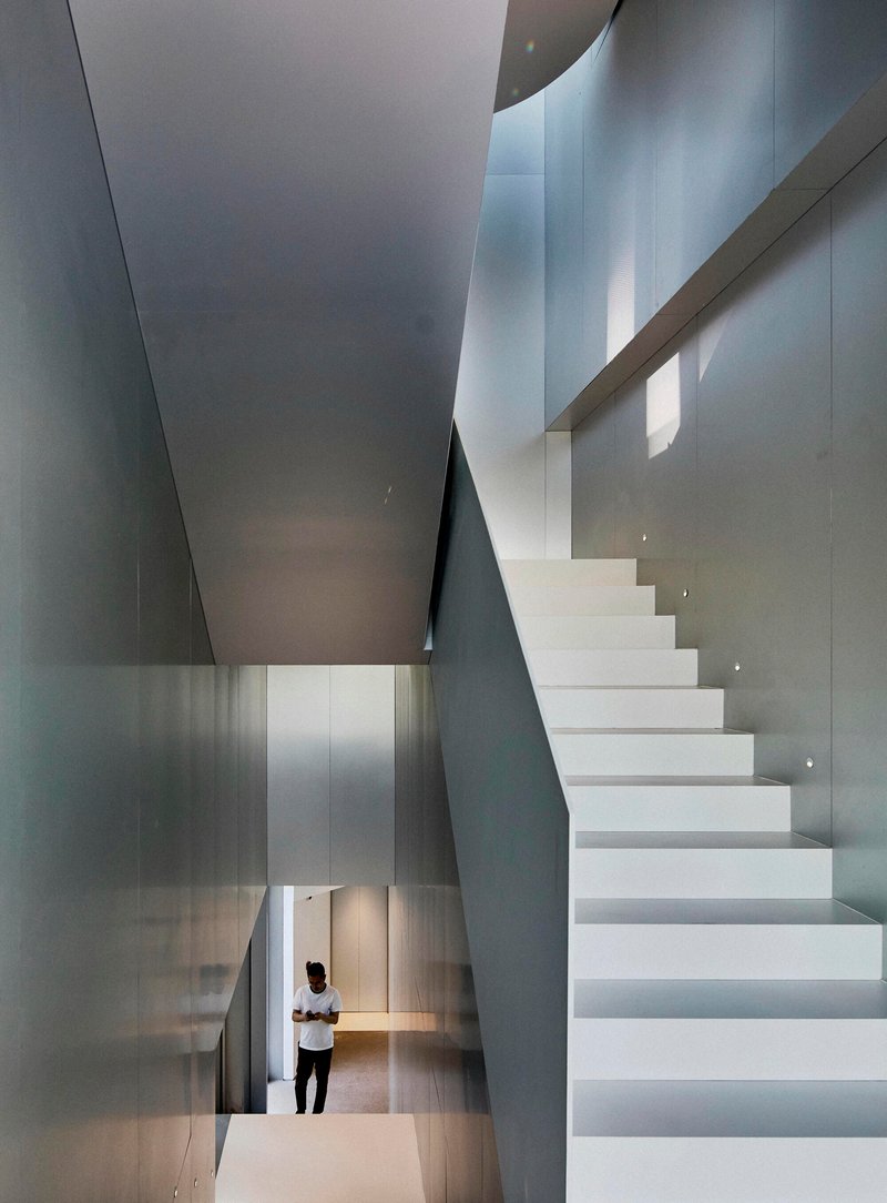
The staircases are among the building's most compelling elements. A white cantilevered stair with glass balustrade rises through a multi-story volume, its clean geometry set against the vertical screen wall of the facade. The effect is vertiginous: looking up, the stair appears to float free of the building's structure, a ribbon of terrazzo and steel suspended in a column of light.
From the upper levels, a curved balcony edge wraps around the central atrium, offering views down through overlapping floor plates to the lobby below. The spiraling circulation connects every level of the museum without ever feeling like a simple corridor. Moving through the building is itself a spatial experience, not just a means to reach the next gallery.
Gallery Spaces and the Art of Restraint
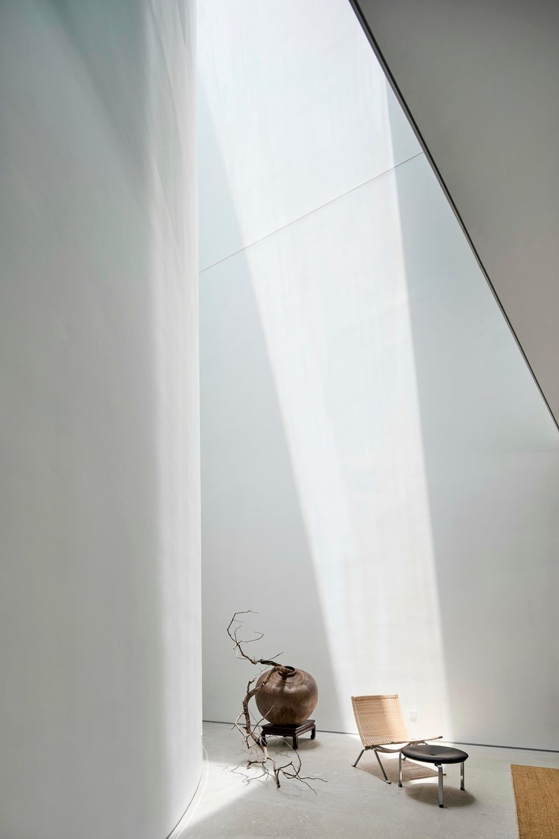
The exhibition rooms are deliberately restrained. Angular white ceiling planes and smooth walls provide a neutral backdrop for art, while controlled daylight keeps the atmosphere from sliding into the sterile fluorescence of a typical white cube. One gallery features a sculptural branch in a vase under diffused overhead light, a gesture that signals the museum's ambition to blur the line between curated object and found beauty.
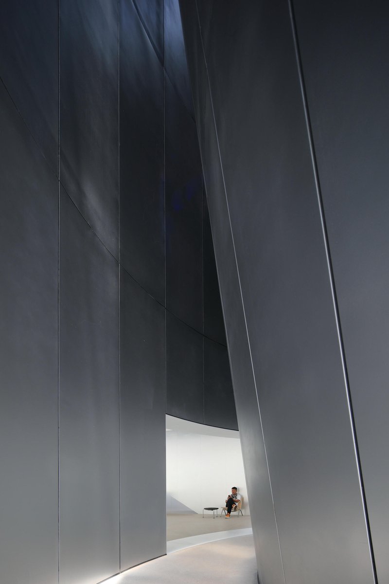
A narrow passage between towering dark panels leads to a smaller, more intimate room where a seated figure is visible in warm light. The compression and release of these sequences, from tall open volumes to tight dark corridors, gives the museum a narrative rhythm that keeps visitors engaged across its relatively compact footprint.
Inside and Outside, Blurred
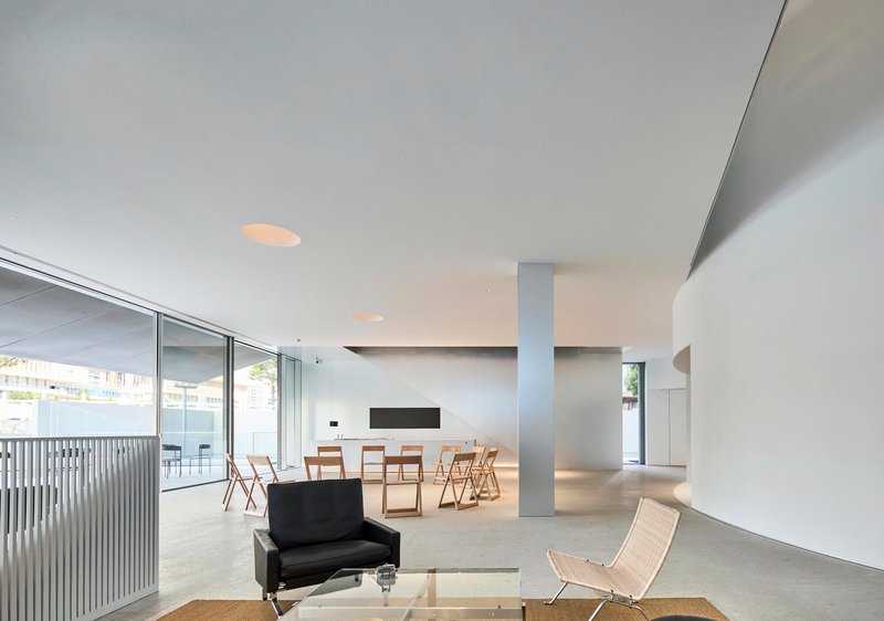
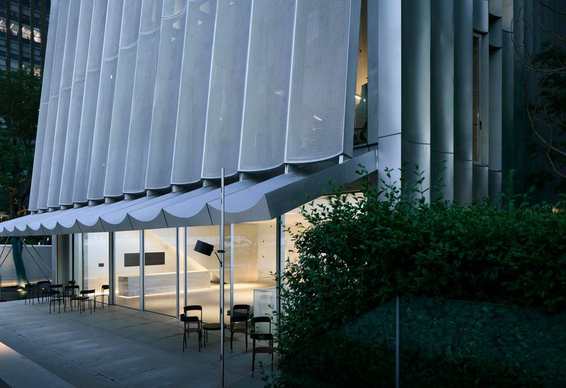
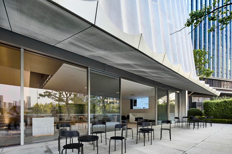
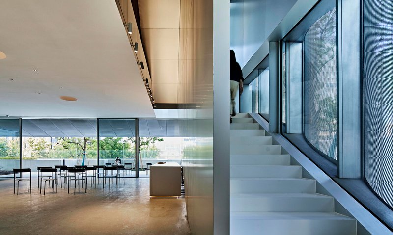
At ground level, full-height glazing dissolves the boundary between interior and exterior. The open-plan spaces with terrazzo flooring extend visually onto terraces furnished with metal chairs, while the scalloped screen facade overhead provides shade and a sense of enclosure without closing things off. The covered outdoor terrace, with its perforated soffit filtering dappled light, is as much a part of the museum experience as any interior gallery.
This porosity is essential to the building's role as a community institution. The museum is not a fortress. Its ground floor invites passersby to sit, look, linger. The terrace overlooking neighboring buildings and hedges reads less like an architectural statement and more like a public room that happens to be attached to a gallery.
Plans and Drawings
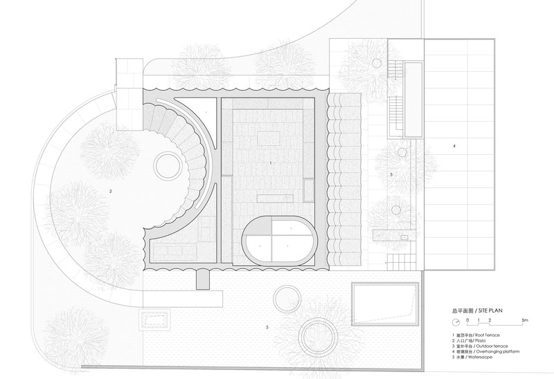
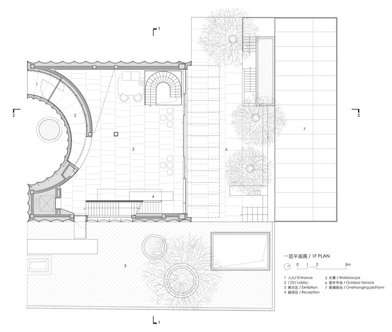
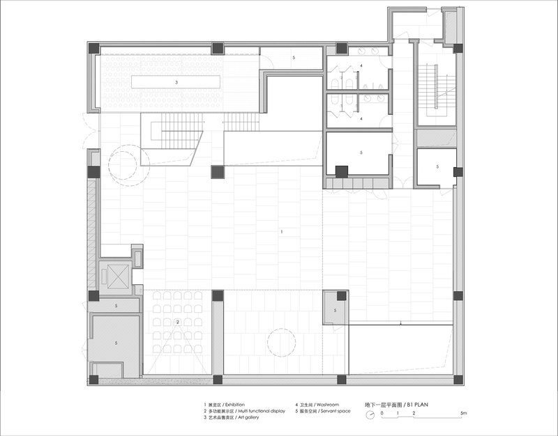
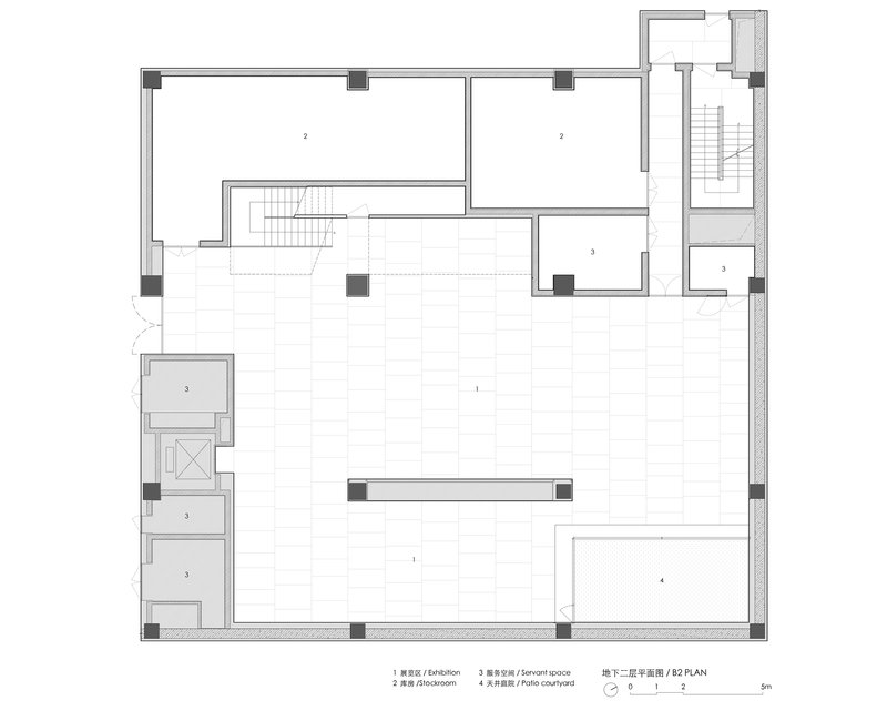
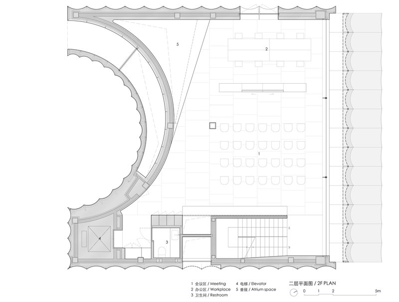
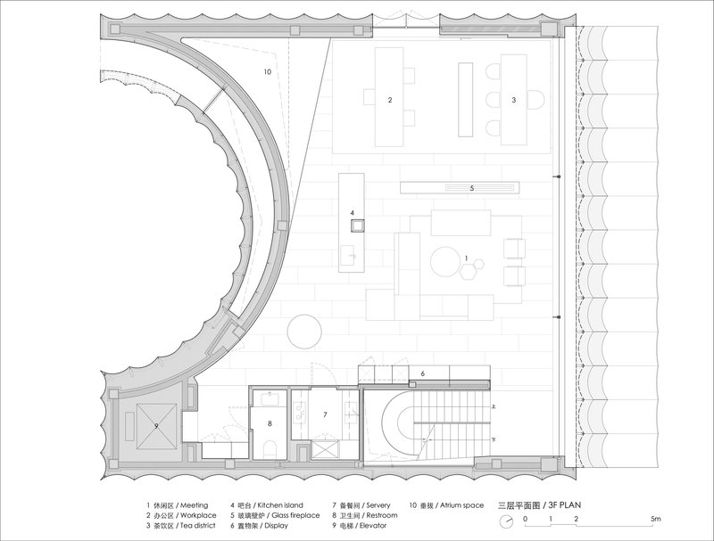
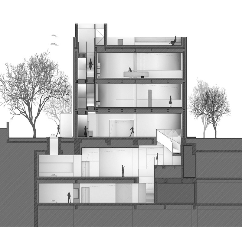
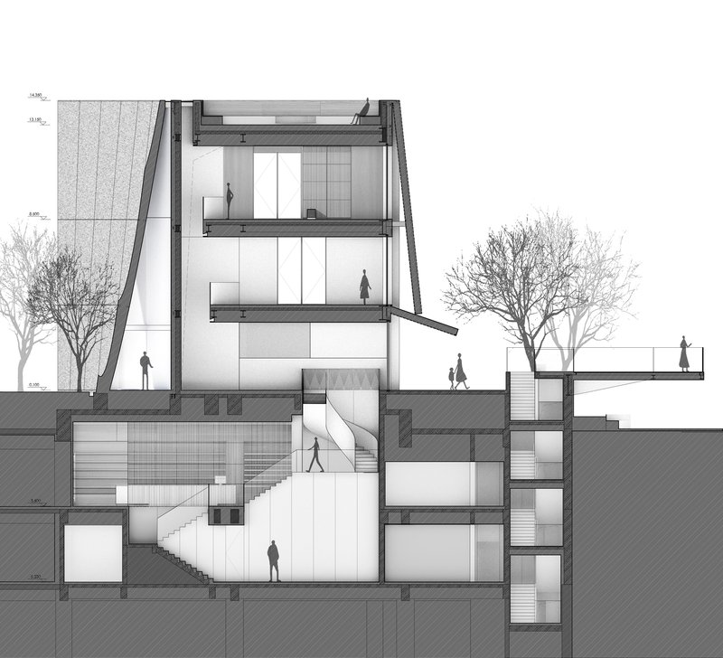
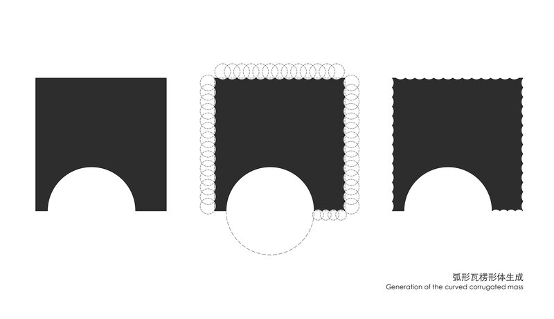
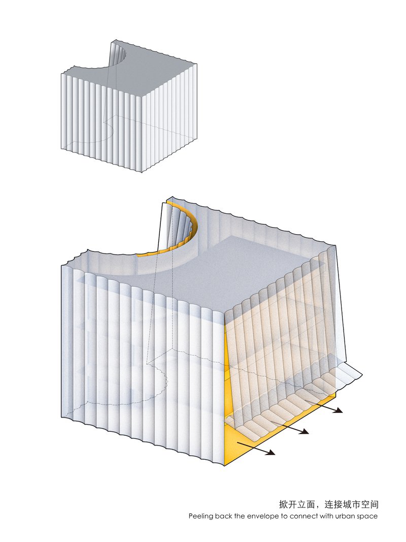
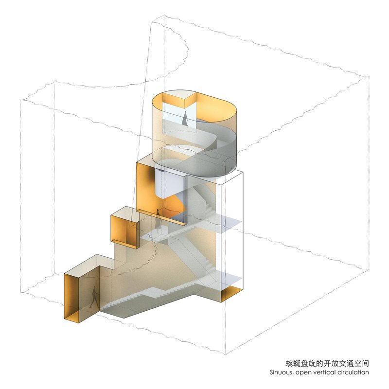
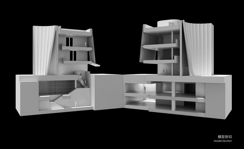
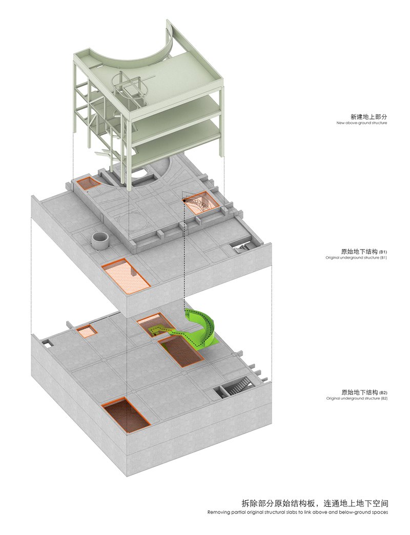
The drawings reveal the project's generative logic with unusual clarity. The conceptual diagrams show how three solid volumes are merged and then wrapped in a single curved corrugated envelope, with arched openings carved out to create the entrance canyon and the canal-facing aperture. The axonometric cutaways expose the spiraling vertical circulation threading through multiple open floor plates, confirming that the spatial complexity experienced inside is not incidental but deeply embedded in the plan.
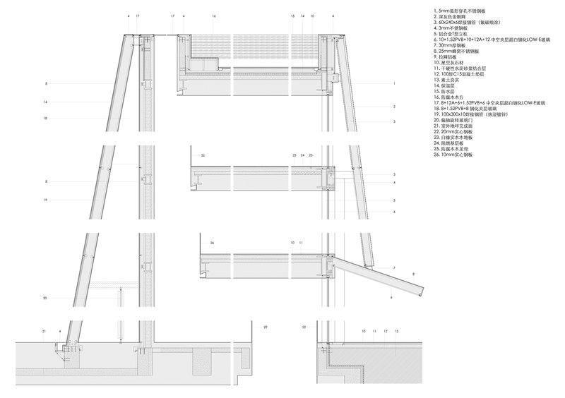
The sections are particularly revealing. The central atrium with its spiral staircase reads as a hollow core around which the galleries orbit, while the relationship between the existing underground parking structure and the new above-grade volumes shows how TAOA leveraged the abandoned foundation as both structural and spatial resource. The facade detail sections demonstrate the layered assembly of mullions and horizontal panels behind the fluted tubes, a reminder that the building's apparently simple surface is the result of a sophisticated constructional system.
Why This Project Matters
The Empathy Museum matters because it demonstrates that renovation does not require a complete existing building. TAOA has taken the least promising starting point imaginable, an abandoned parking garage, and produced a museum with genuine spatial ambition and civic presence. In a Chinese development context where unfinished projects are often demolished and rebuilt from scratch, this is a meaningful act of architectural resourcefulness. The building argues that constraints are not obstacles to design quality but catalysts for it.
It also matters as a model for the community art museum as building type. At 1,628 square meters, this is not a major institution. It is a neighborhood-scale space that punches well above its weight through careful choreography of light, circulation, and threshold. The fluted facade gives it identity without spectacle. The ground-floor porosity gives it generosity without pretension. If more cities treated their abandoned infrastructure as raw material for public culture rather than embarrassments to be erased, we would have better cities.
Hangzhou Empathy Museum by TAOA. Hangzhou, China. 1,628 m². Completed 2025. Museum, Renovation.
About the Studio
Share Your Own Work on uni.xyz
If projects like this are the kind of work you want to make, uni.xyz is a place to publish your own, find collaborators, and enter design competitions.


Popular Articles
Popular articles from the community
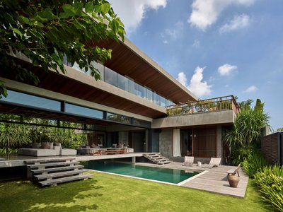
Etea and Ghostframe Carve a Surreal Domestic World from Arches and Circles in Mérida
Casa Eclipse wraps 385 square meters of sculptural living space around a lush courtyard pool in Mexico's Yucatán Peninsula.
Reincarnation Weaves a Three-Story Retreat into the Green Landscape of Rural Bangladesh
Ara Manor in Narsingdi dissolves the line between domestic architecture and its lush surroundings through screens, courtyards, and planted rooftops.
Healing Façade: Sustainable Architecture for Reforestation, Community, and Sacred Ecology in Ethiopia
Healing Façade reimagines sustainable architecture as a living wall that restores soil, catches water and renews Ethiopia's forest churches.
LGA Architectural Partners Build Toronto's First Multiplex Condo on a Single-Family Lot
Ulster House packs five zero-carbon units into a Harbord Village lot, proving gentle density can be market-ready and livable.


Similar Reads
You might also enjoy these articles
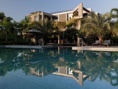
Freebird Residence by Alexis Dornier: A Tropical Modernist Sanctuary in Bali
Floating living pavilion above pool anchors H-shaped tropical villa, blending Japanese minimalism, sustainable strategies, lush landscape, and sculptural interiors.
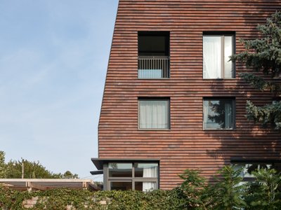
127af Flips a Tiny Bagnolet Rowhouse Upside Down with a Handcrafted Roof Extension
A 55-square-meter terraced house on the edge of Paris gains a luminous upper living floor through lightweight timber and steel.
1.61 Design Workshop Wraps a 600-Square-Meter Café in Vietnam in Sculptural Burgundy Drama
Reden Café & Bistro pairs a helical staircase, mosaic floors, and deep red interiors to rethink Vietnamese hospitality space.
The Unbound Brain: A School Shaped by Cognitive Architecture
Cylindrical learning pods radiate like neurons from a central cortex, turning the floor plan into a spatial model of human thought.

Explore Interior Design Competitions
Discover active competitions in this discipline


The Global Benchmark for Architecture Dissertation Awards


The Global Benchmark for Graduation Excellence


Challenge to design luxury tourism on rails


VR headsets Storefront design competition
Comments (0)
Please login or sign up to add comments
No comments yet. Be the first to comment!