

Ippolito Fleitz Group Treats a Wuxi Mall's Interior as an Urban Landscape in Coppery Red Metal
Three sculpted atriums, 360 shops, and a stainless-steel Moon Garden anchor a new retail destination on the banks of Wuxi's waterfront.


Retail architecture in China operates at a scale and speed that most Western studios never encounter. The Wuxi MixC Mall, completed in 2024 by Stuttgart-based Ippolito Fleitz Group for China Resources Land, spans roughly 70,500 square metres and houses 360 shops, a cinema, a food court, event spaces, a rooftop garden, and a Riverside Market that spills outdoors. The numbers alone are staggering, but what distinguishes this project from the dozens of mixed-use retail podiums rising across eastern China is a legible interior identity built on a single, restrained material decision: dark coppery-red metal panels applied to escalator soffits, balcony undersides, and ceiling zones, set against a deliberately neutral white architectural shell.
The design premise is that the mall interior should read less like a corridor of storefronts and more like an urban district, complete with its own streets, plazas, and landmarks. Three six-story atriums, each with a distinct spatial character, anchor the plan. Functional infrastructure (bridges, escalators, signage) is treated as sculptural incident rather than background utility. The result is a commercial space that borrows the visual grammar of landscape architecture and urban design to give shoppers something more than a route between anchor tenants.
Coppery Red Against White: A Two-Tone Material Strategy


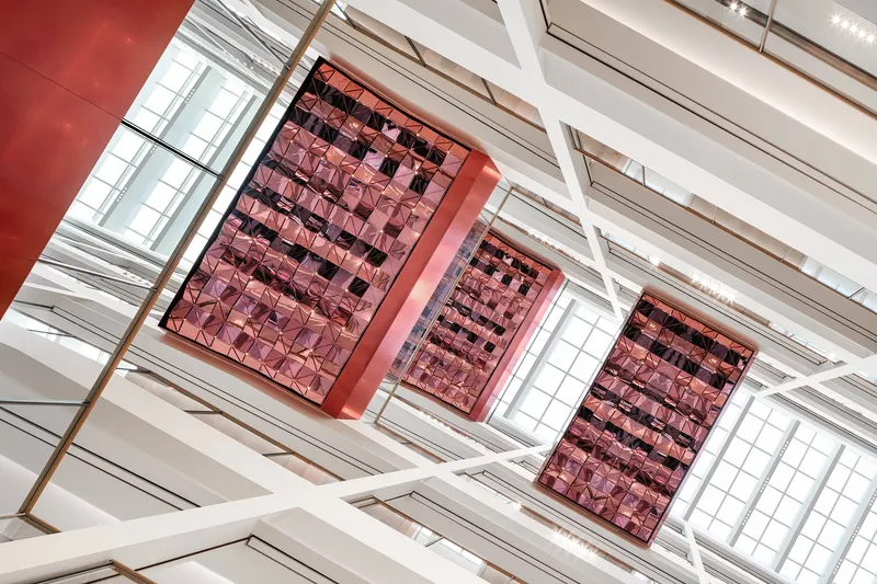
The most immediately striking element of the MixC Mall is the relationship between its white structural frame and the faceted, coppery-red metal panels that clad virtually every secondary surface. Escalator undersides become sculptural ribbons. Balcony parapets pick up faceted geometries that catch light differently at each level. The panels are not wallpaper; they wrap around three-dimensional forms that project into the atrium voids, giving vertical circulation a monumental presence it rarely receives in commercial interiors.
What makes the palette effective is its discipline. The red is a single tone, deployed consistently, and the white shell is kept clean enough to serve as a foil. There is no gradient, no competing accent color. The contrast is binary and readable at speed, which matters in a building where visitors are likely navigating on foot through enormous floor plates.
Three Atriums, Three Characters


Each of the mall's three six-story atriums is designed with a distinct spatial personality. One features the heavy coppery-red cladding and curving balconies seen in the hero images, reading almost like a geologic formation hollowed from the building's mass. Another is anchored by a reflective stainless-steel ceiling and a suspended light installation that transforms the void into a more ethereal, moon-like volume. The third pushes toward an angular, almost crystalline geometry with white staircases cutting through red-paneled walls.
The differentiation is a practical wayfinding tool as much as a design flourish. In a building this large, repetitive corridors kill orientation. By giving each atrium a legible identity, Ippolito Fleitz provides visitors with three landmarks they can remember and navigate by. It is spatial branding without literal signage.
Perforated Ceilings and the Food Court Below



The basement-level Yummy food court deploys a perforated red metal ceiling that undulates across the space, punctuated by circular light openings. The perforations soften the acoustic environment, a genuine functional contribution in a zone that will be loud during peak hours. Meanwhile, individual food counters are clad in marbled backsplashes, pink terrazzo panels, and blue aggregate surfaces, introducing a warmer, more textured materiality than the atriums above.
The food court is the toughest space in any mall to design well, because it must accommodate heavy foot traffic, grease-laden air, and an ever-changing roster of tenants. The decision to make the ceiling the primary design surface is pragmatic: it is the one element that persists regardless of which vendor occupies a stall. The red tone ties the basement back to the upper floors without being monotonous.
Concourses and Circulation as Streetscape
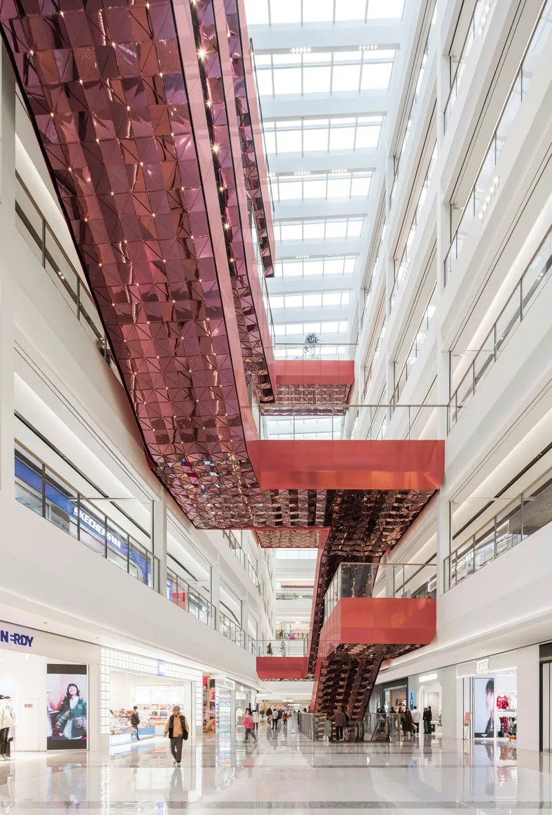


The mall's corridors are treated as streets rather than service connectors. Suspended metallic tile panels overhead create a continuous canopy effect. Red-wrapped columns, planters, and terrazzo floor inlays break the linearity, and reflective ceilings in certain zones expand the perceived height. Glass-railed display cases and accent bands add moments of visual interest at the pedestrian scale, keeping shoppers' eyes engaged even in stretches between major anchors.
Ippolito Fleitz's concept of the interior as an urban landscape is most convincing in these in-between zones. The firm has cited Wuxi's proximity to Tai Lake, Huishan Forest Park, and Meiyuan Hengshan Nature Reserve as contextual references, and while the interior makes no literal botanical gestures, there is a topographic quality to the way surfaces rise, fold, and open that echoes the language of landscape rather than conventional retail fit-out.
Thresholds and Transitional Moments

The elevator lobbies and entry vestibules receive their own material treatment: arched ceiling reveals, taupe paneling, and textural red artworks that signal a shift from the commercial floor plates to the building's vertical circulation. These threshold moments are often the first thing a visitor encounters and the last thing they remember. The careful detailing here, with backlit edges and a slightly warmer palette, suggests that the design team understood how important arrival sequences are in large-format retail.
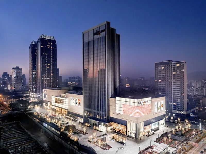
The evening exterior view reveals the podium's illuminated storefront wall and the vertical tower above, grounding the interior ambitions in a legible urban form. The building sits at the intersection of Wuxi's business district and the city's recreational waterfront, a position that the Riverside Market exploits by extending the commercial program outdoors.
Plans and Drawings
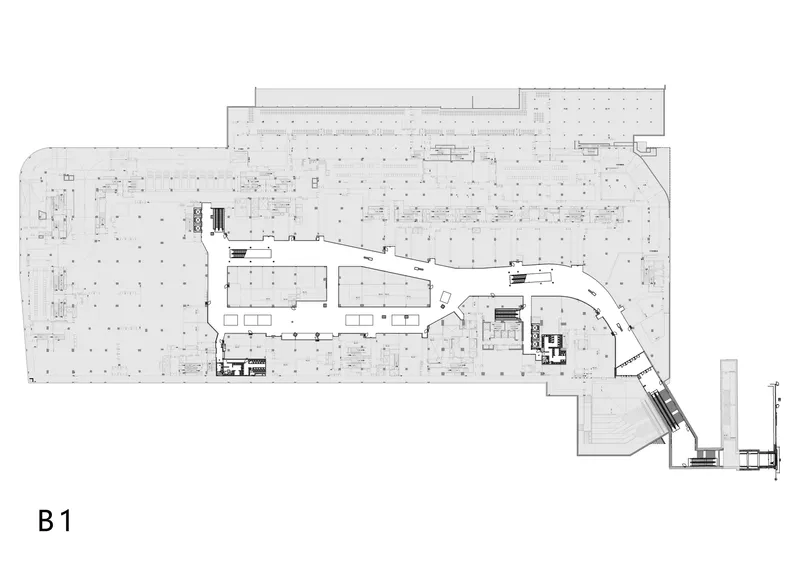


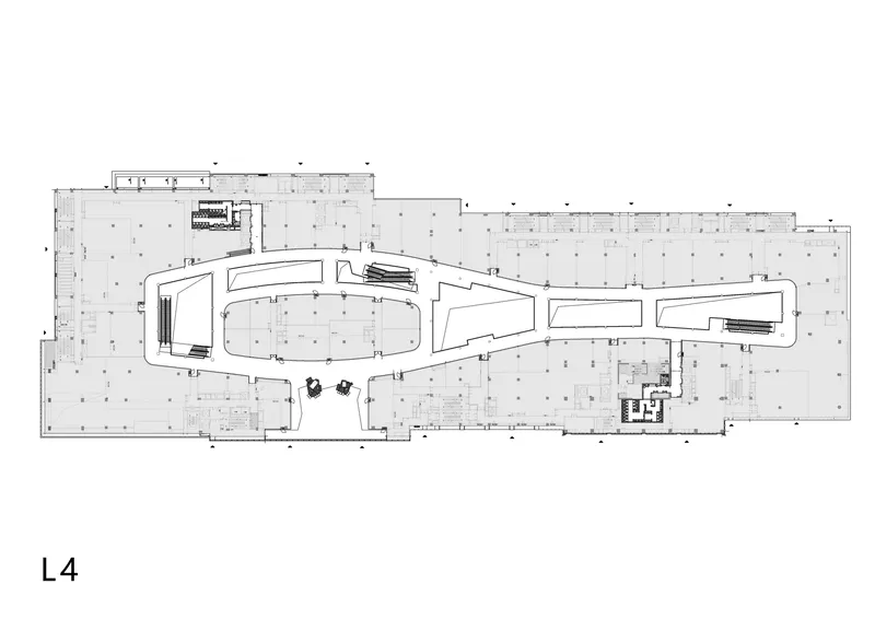

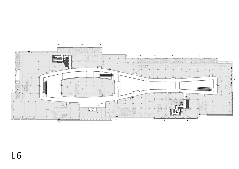
The seven floor plans reveal the organizational logic behind the project's three atriums. The voids are not punched symmetrically through a regular grid; they are curvilinear forms that taper and shift as they rise, creating different proportions at each level. Service cores and vertical circulation elements cluster at the perimeter and at strategic points along the void edges, keeping the retail floor plates as open and flexible as possible. The irregular building perimeter, visible in the lower-level plans, accommodates the site's relationship to the river and adjacent urban fabric.
Why This Project Matters
Large-scale retail design in China is an intensely competitive field where spectacle often overwhelms coherence. What Ippolito Fleitz has achieved in Wuxi is a project that is visually dramatic without being chaotic. The two-tone material strategy, the differentiated atriums, and the treatment of infrastructure as sculptural form all serve a single legible idea: the mall as miniature city. That idea is not new, but the execution here is unusually rigorous for a building of this size and program.
The project also demonstrates how a European design studio can work at Chinese commercial scale without losing its design identity. Ippolito Fleitz is known for interior environments that foreground material craft and spatial sequence, and the MixC Mall translates those priorities into a 70,000-square-metre format. Whether the building ages well will depend on tenant turnover, maintenance budgets, and shifting consumer habits, but as a piece of spatial design delivered in 2024, it sets a high bar for the typology.
CR Land: Wuxi MixC Mall, designed by Ippolito Fleitz Group with landscape design by Jose Miso Landscape. Located in Wuxi, China. 25,528 m². Completed in 2024. Photography by CreatAR and SHADØO PLAY.
About the Studio
Share Your Own Work on uni.xyz
If projects like this are the kind of work you want to make, uni.xyz is a place to publish your own, find collaborators, and enter design competitions.


Popular Articles
Popular articles from the community

Faces of the Soviet Avant-Garde: Turning Moscow's Street Names into an Open-Air Museum
A network of sculptural installations across a Moscow residential district transforms forgotten architect names into spatial encounters with cultural memor

The Amber Palace Opera: A Geological Fiction Surfaces on Tallinn's Baltic Waterfront
Pierre Brillard reimagines a Baltic legend as a public landscape, opera house, and waterfront promenade rooted in Tallinn's coastal identity.

Cloaked Colonization: A Mobile Underwater Habitat That Moves Like a Fish
Micah Abaya's shortlisted EHC Pacific entry reimagines ocean settlement as a dispersed network of self-sustaining architectural organisms.
Extended Shell: Retrofitting Kolkata's Balconies as Living Urban Thresholds
A modular retrofit system recovers the social and environmental intelligence of Kolkata's historic verandas for contemporary Park Street residents.

Similar Reads
You might also enjoy these articles

Pixel Gardens: One Repeated Module Stacked Into a Terraced Social Housing Tower for Famagusta
Salem Bader's shortlisted housing tower builds a vertical neighbourhood from one repeated module, offsetting units to carve terraces, light and air.

Bao Huynh Watercolor Atelier: A Serene Art Retreat in Hội An
Bao Huynh Watercolor Atelier in Hội An blends multifunctional art spaces, sustainable design, local materials, and family-friendly living in a serene environment.

Atelier Macri Concept Store Interior Design by CASE-REAL
Atelier Macri store features a "ko" counter, walnut wood details, cork displays, blending retail, gallery, and seamless customer experiences.

Manuel Vargas Izquierdo Stadium and High-Performance Sports Center: Architectural Excellence in Jalpa de Méndez
The Manuel Vargas Izquierdo Stadium blends sustainable design, inclusive sports facilities, and cultural-inspired architecture, revitalizing Jalpa de Méndez’s public spaces.

Explore Shopping Mall Competitions
Discover active competitions in this discipline

Challenge to design luxury tourism on rails

VR headsets Storefront design competition

Designing a staircase for a client
Comments (0)
Please login or sign up to add comments
No comments yet. Be the first to comment!