
RD&A Wraps Kaltura's Tel Aviv Offices Around a Helical Staircase Built from Glass Block
A two-story workspace in Herzliya, Israel, channels the video platform's identity through kinetic architecture and bold material contrasts.
Corporate offices tend to fall into one of two traps: either they drown in the brand's palette until every surface screams logo, or they ignore the company entirely and deliver generic coworking with a nameplate on the door. RD&A's design for Kaltura, the video technology platform headquartered in Herzliya, Israel, sidesteps both. The workplace is organized around a dramatic double-height atrium and a helical staircase constructed from glass block, a material choice that transforms circulation into the building's central spectacle. Rather than slapping brand colors on accent walls, the architects embedded movement, light, and transparency into the architecture itself, qualities that mirror what a video streaming company actually does.
What makes the project genuinely interesting is the conviction behind its material decisions. Glass block serves as structure, screen, and light filter simultaneously. Wire mesh partitions frame views without closing them. Colored gradient panels shift from yellow to coral as you walk down a corridor. These are not decorative afterthoughts; they are spatial strategies that keep sightlines long, daylight diffused, and the floorplate legible across two levels. The result is a workspace that feels like a single connected organism rather than a collection of meeting rooms strung along a hallway.
The Glass Block Core
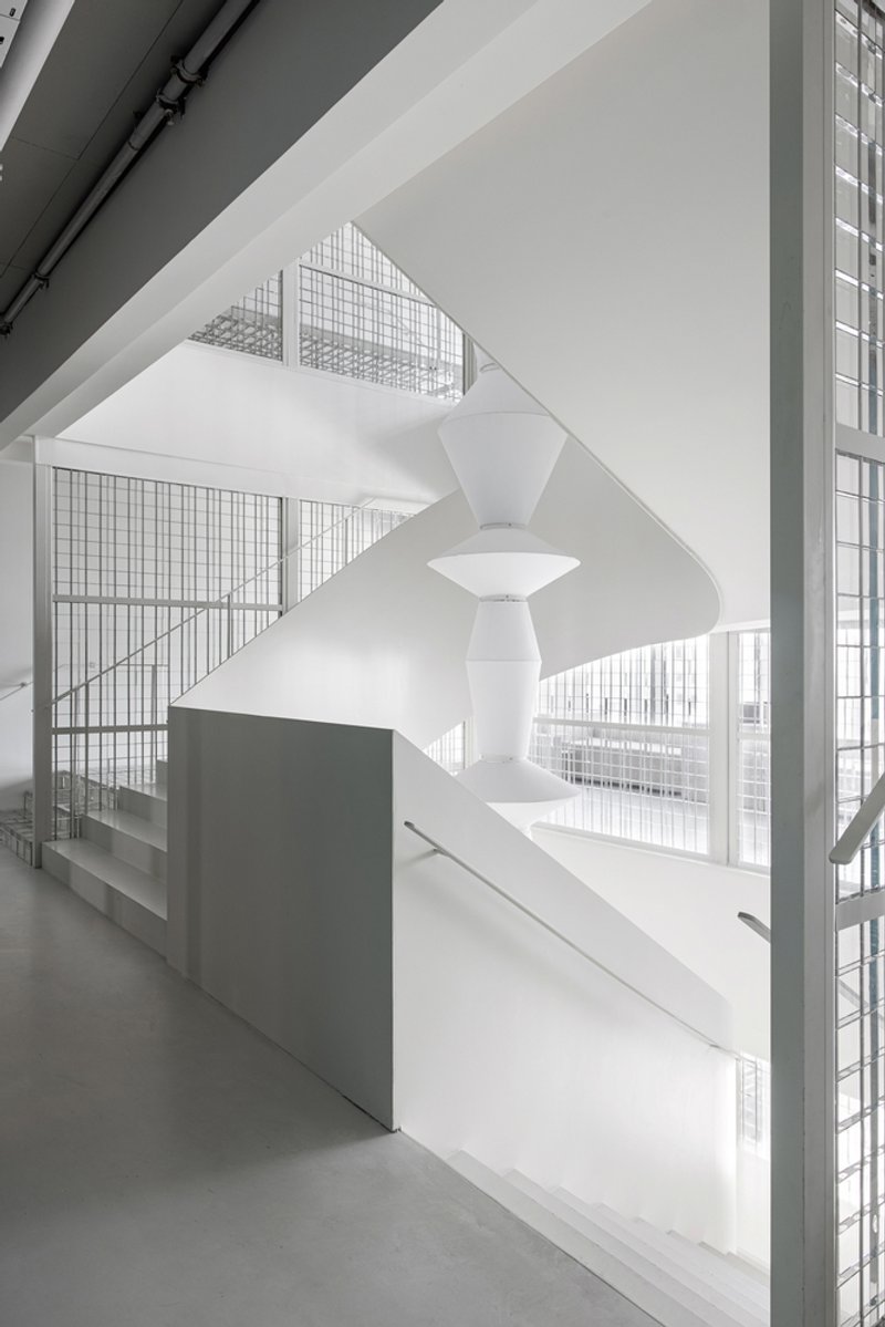
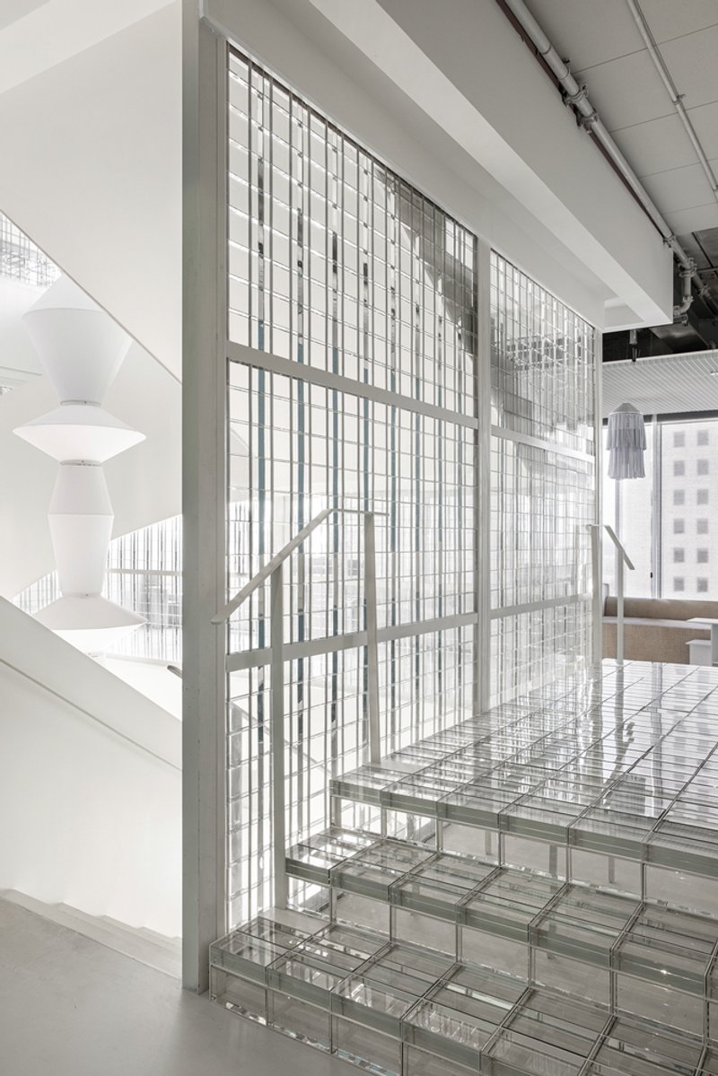
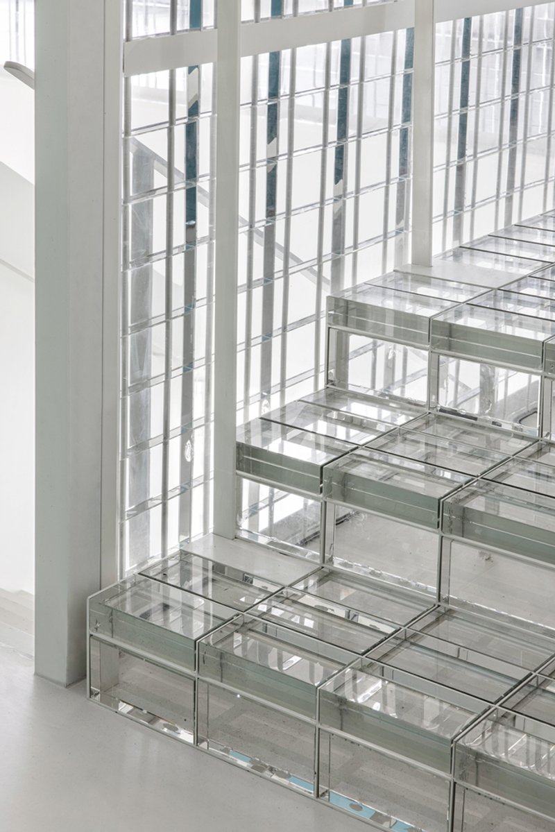
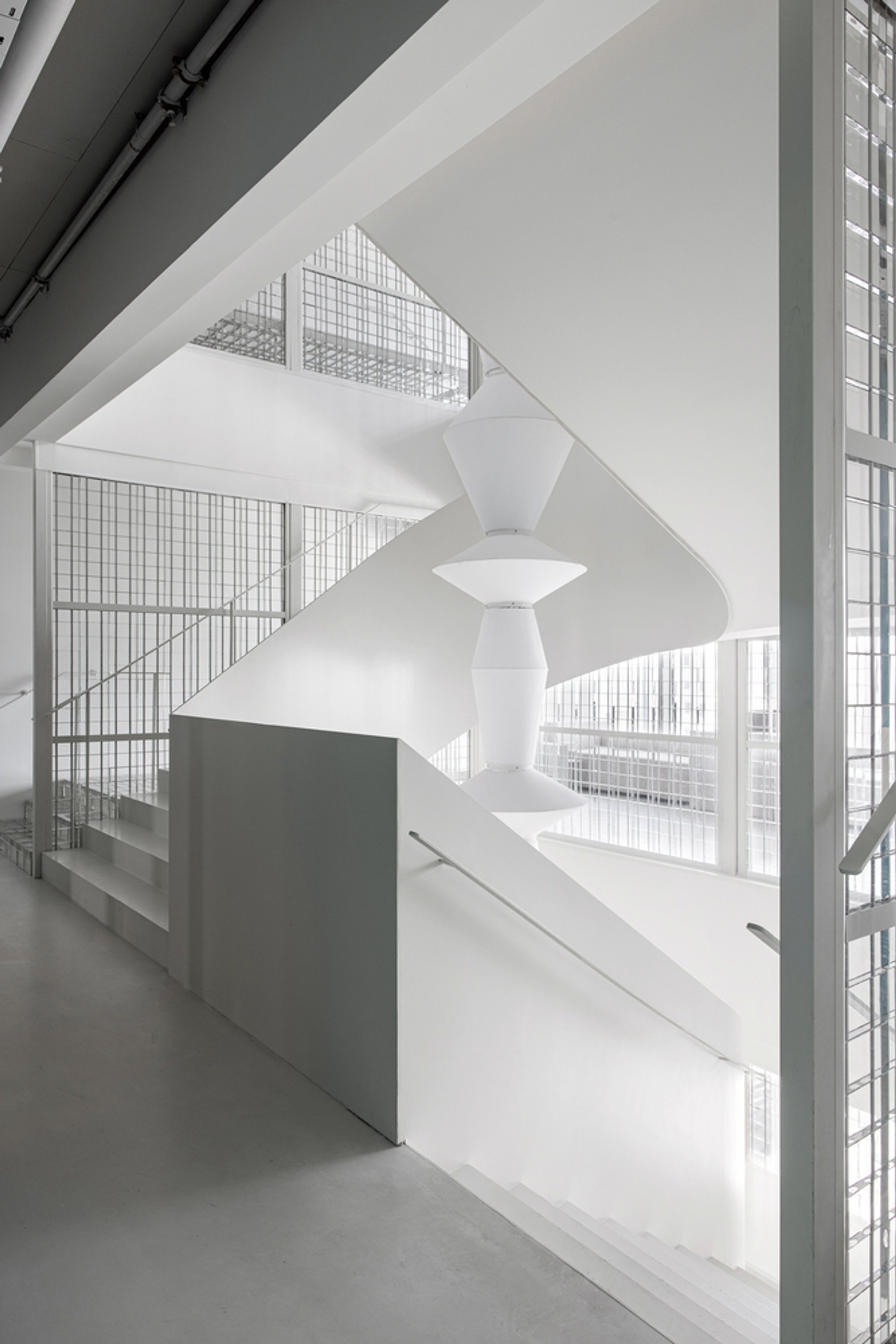
The helical staircase is the building's spine, and it earns the role. Rising through a double-height void, the stair is flanked by walls of glass block that diffuse daylight into a soft, even glow. The translucency creates a visual depth that solid walls simply cannot: you sense movement on the other side without seeing it clearly, a deliberate blurring that keeps the atrium alive with ambient activity. The stair treads themselves meet the glass block screen wall with a precision that reads as almost furniture-scale, an unusual level of detail for a commercial fitout.
By making the stair the visual and spatial center of the plan, RD&A ensures that vertical circulation is not buried in a fire core or pushed to the building's edge. Everyone passes through it, everyone sees it, and it becomes the primary orienting device on both floors. That sounds simple, but it requires a floor plan that genuinely opens up around the core rather than treating it as an obstacle.
Framing Movement Through Mesh and Screen
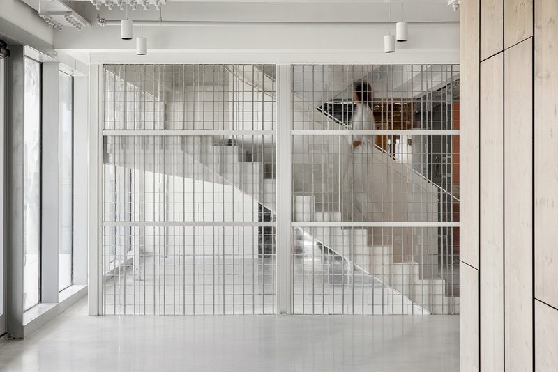
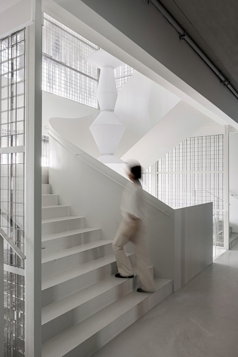
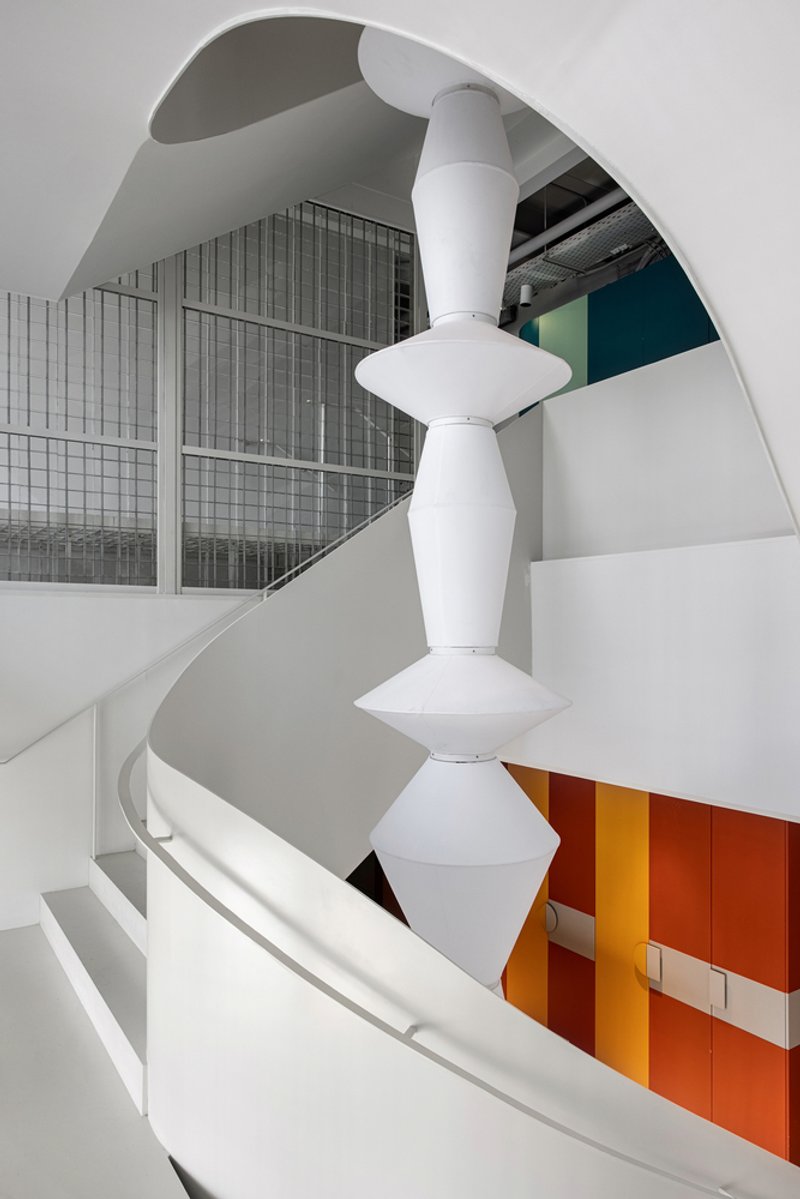
Wire mesh enclosures around the central staircase introduce a second layer of filtration between the public atrium and the workspaces beyond. Where the glass block walls handle daylight, the mesh handles sightlines: it is transparent enough to register a figure in motion ascending the steps, but dense enough to give the stair its own spatial identity. A sculptural white column overhead reinforces the sense that you are passing through something architectural, not just walking upstairs.
The curved balconies visible from the atrium level amplify this effect. Their white surfaces bounce light back into the void, and the colored gradient panels below them inject warmth without overwhelming the predominantly white envelope. The layering of mesh, glass block, and colored panel creates a parallax effect as you move through the space, exactly the kind of kinetic perception that gives a workplace energy over the long term.
Corridors as Color Sequences
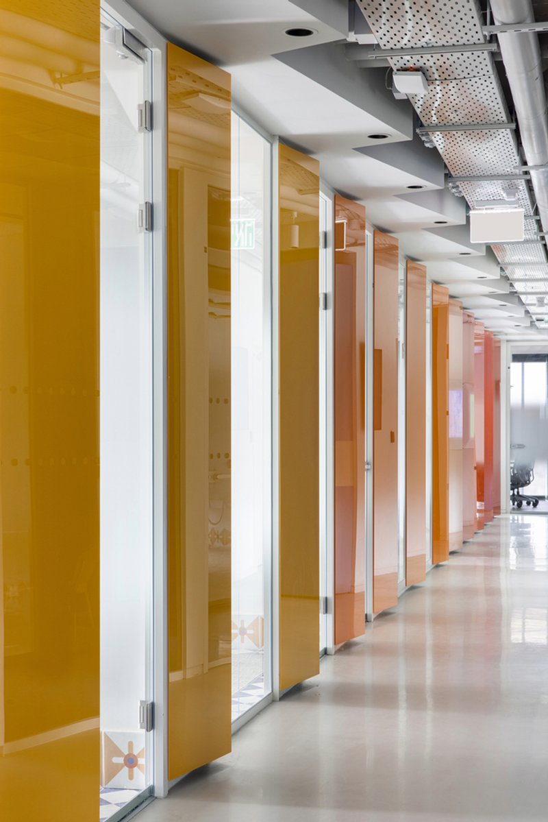
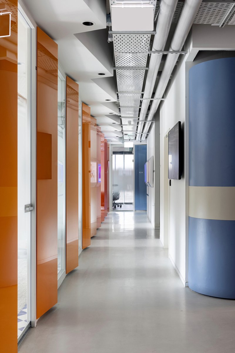
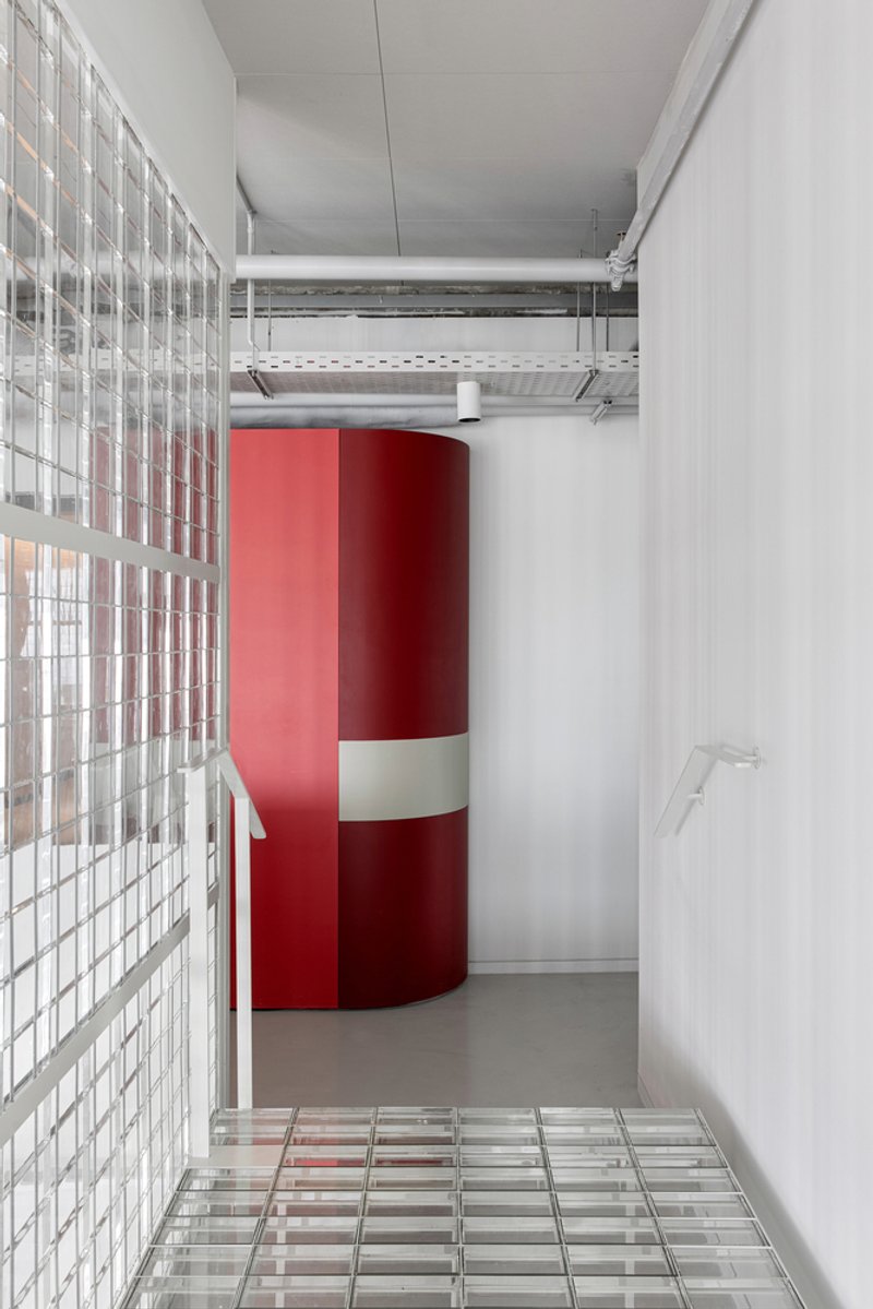
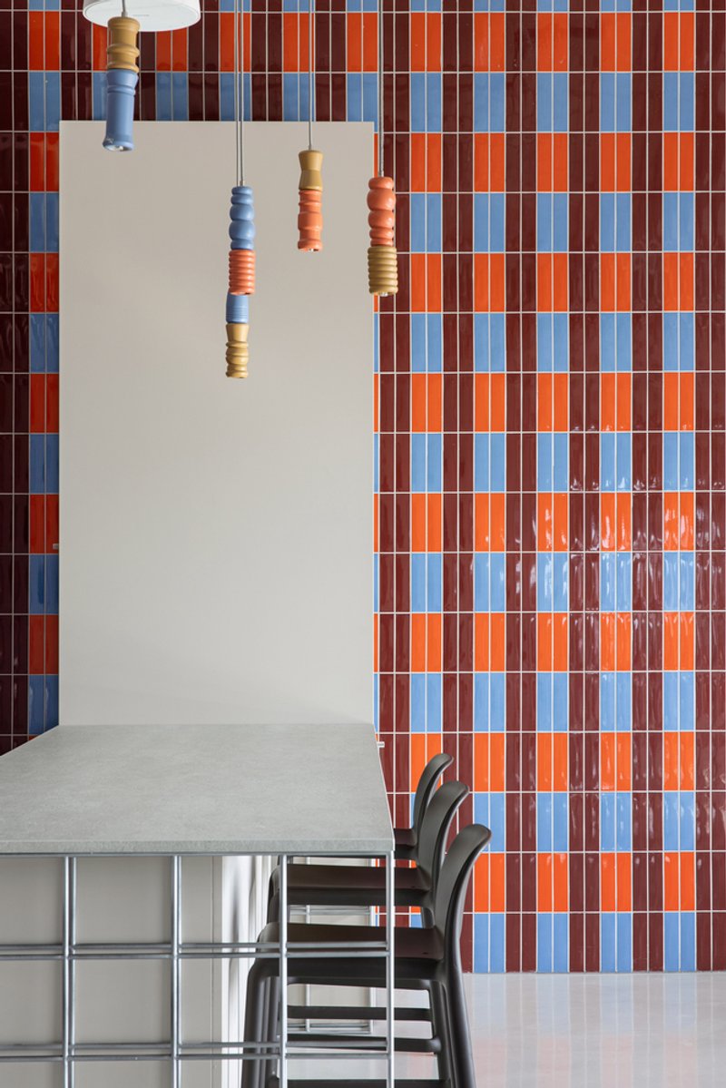
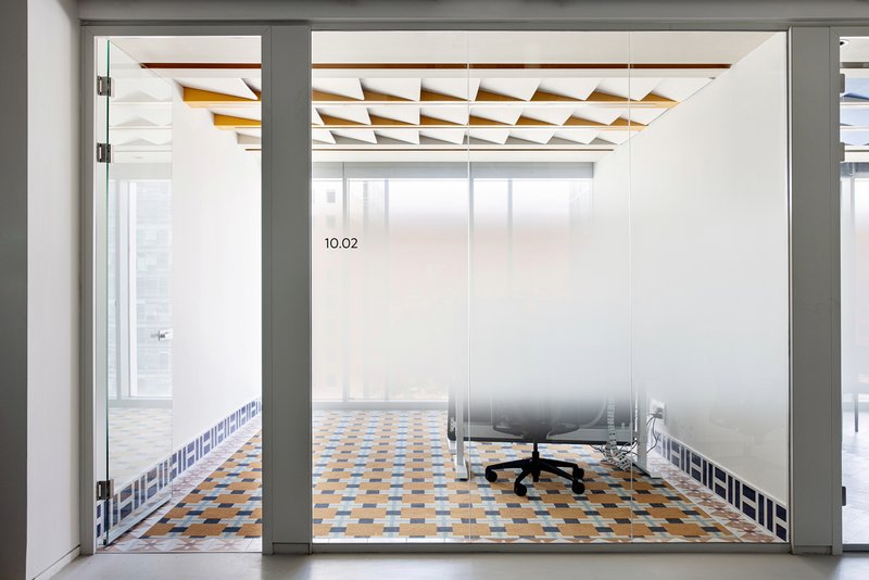
RD&A treats the corridors not as leftover space between rooms but as designed experiences in their own right. One passage is lined with glass-doored rooms featuring gradient panels that shift from yellow to coral, turning a walk to a meeting into a chromatic event. Another corridor pairs orange glass doors with a blue cylindrical column and perforated ceiling panels, a combination that sounds risky on paper but reads as confident in person. A third swaps the palette for glass block walls, a red column, and glass tile flooring, proving the architects were willing to vary the material logic zone by zone rather than enforcing uniformity.
The exposed ceiling ducts running above these corridors are left deliberately raw: no dropped ceilings, no acoustic tile. The contrast between the carefully composed wall surfaces and the honest infrastructure overhead keeps the space from feeling precious. It reads as a workplace, not a showroom.
Meeting Rooms with Distinct Personalities
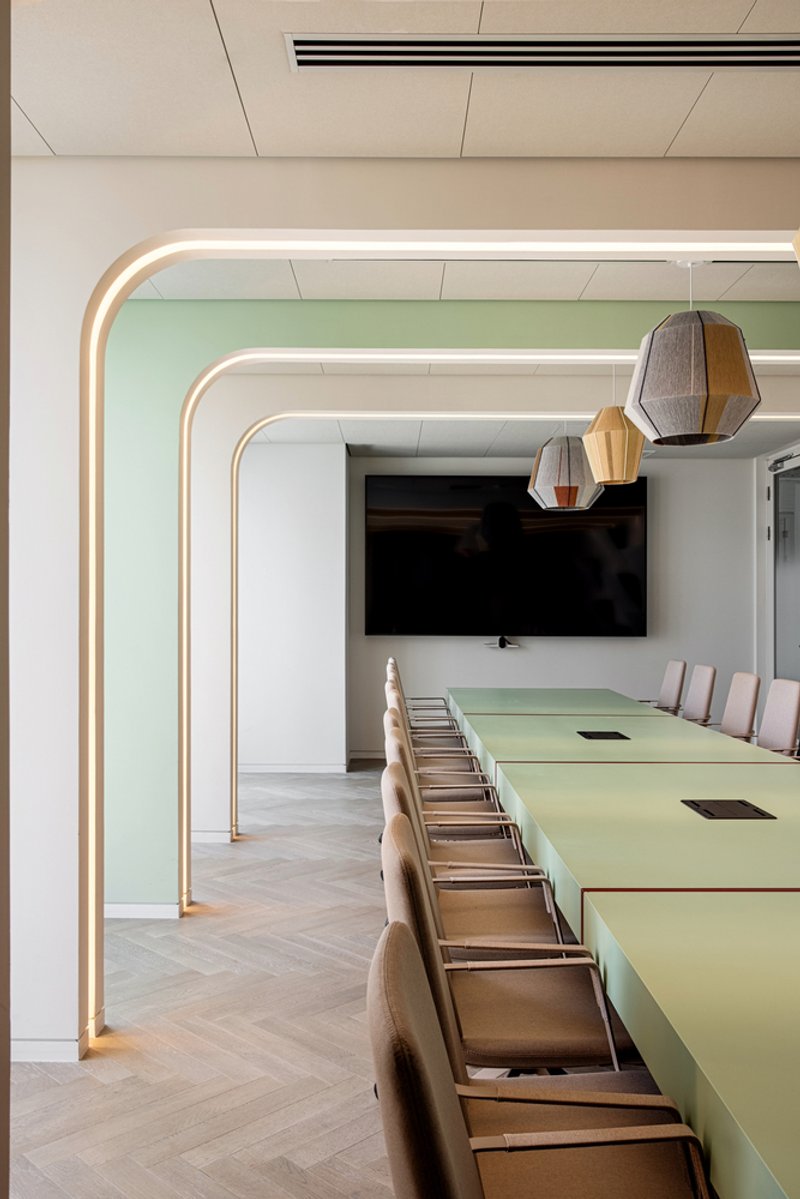
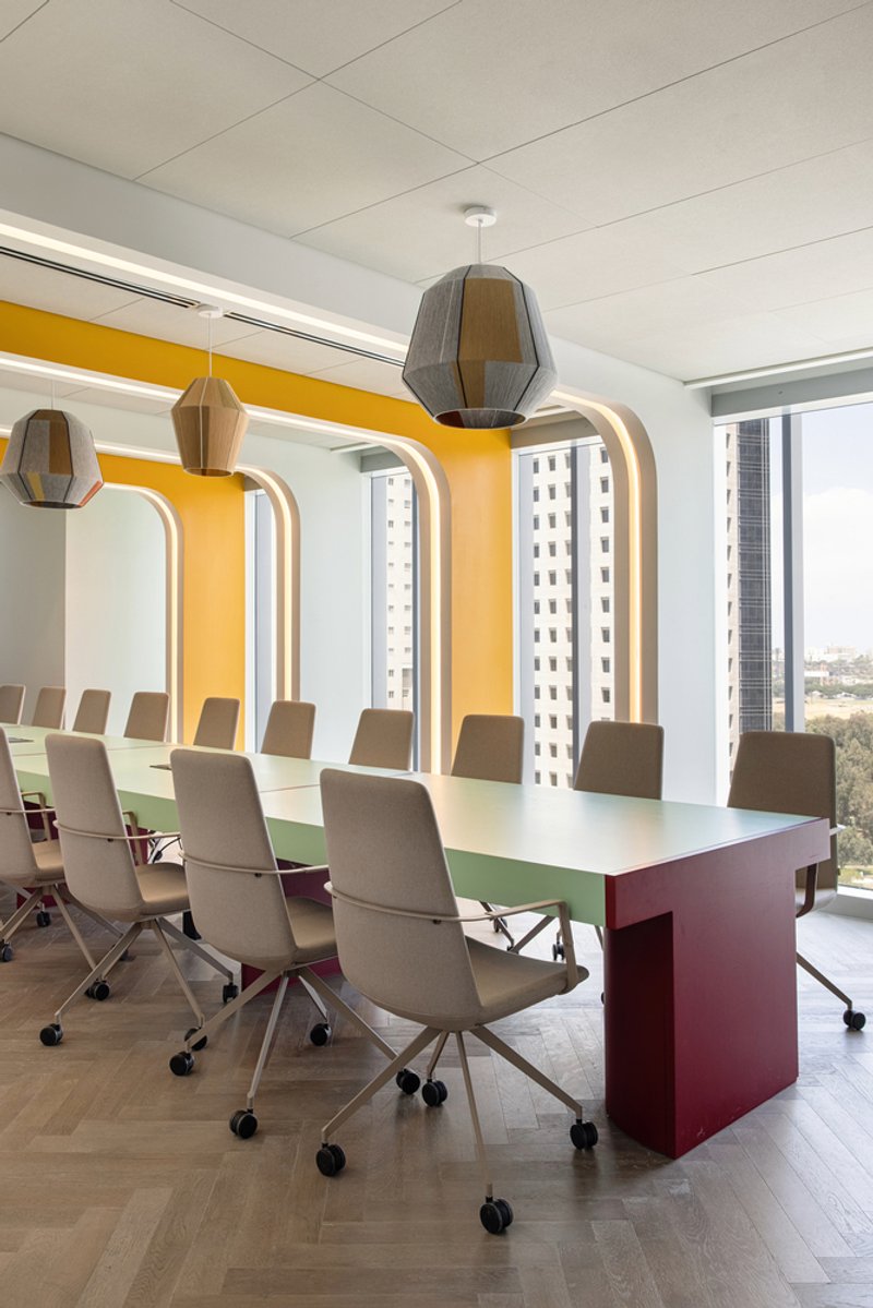
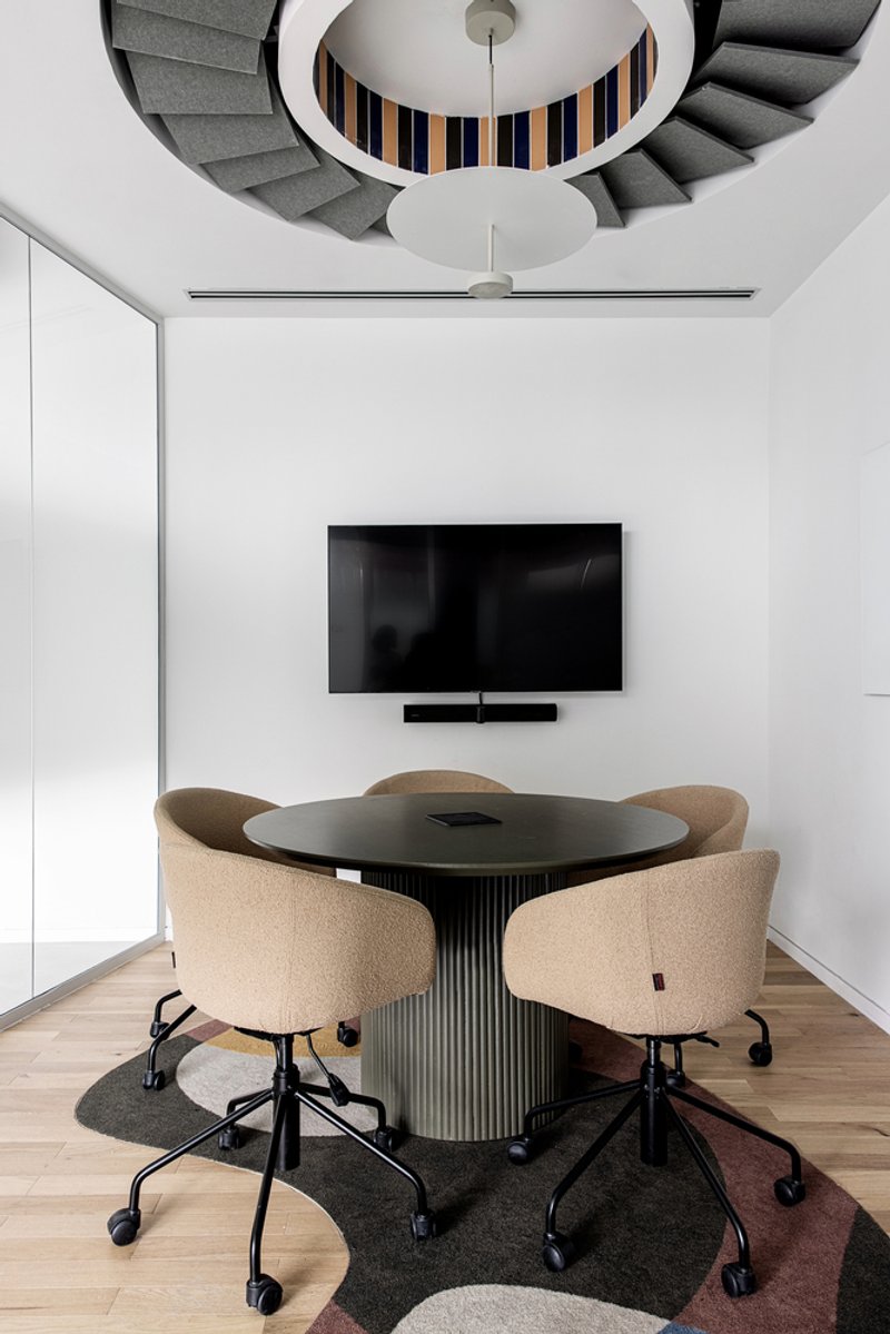
Each conference room gets its own spatial identity, a strategy that helps orientation in a large open floorplate. One room uses rounded illuminated portal frames that turn the entry into a threshold event, pairing them with a pale green table and pendant lights. Another deploys an arched yellow accent wall with faceted pendants above a mint green table. A smaller meeting room features a circular opening that reveals striped stairs beyond, collapsing the boundary between meeting space and circulation.
The risk with this approach is visual chaos, but RD&A keeps it under control by limiting the material palette within each room to two or three moves. The variation between rooms is strong; the variation within each room is disciplined. That balance is what separates themed workplaces that age well from those that feel dated within a year.
Social Spaces and the Kitchen as Commons
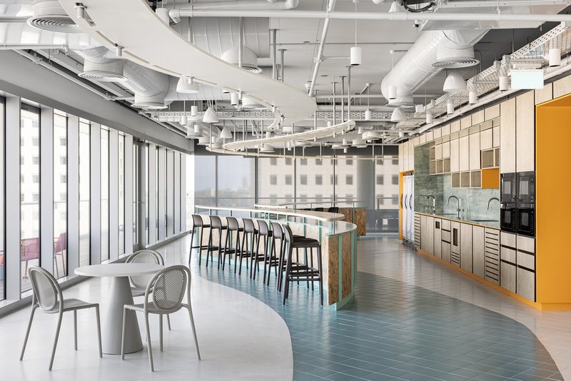
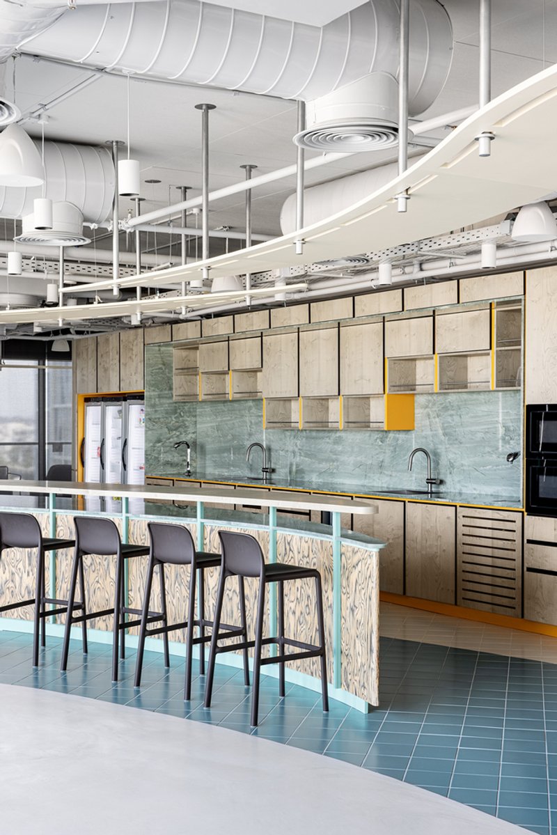
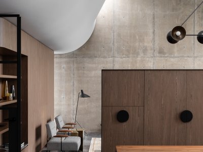
The pantry and kitchen zones pull their weight as social infrastructure. The main open-plan pantry uses teal herringbone flooring and a yellow accent wall to differentiate itself from the workstation zones without needing a partition. A breakfast bar with a turquoise tile base and mint green marble backsplash offers a more intimate counter-height option. Elsewhere, a kitchen island sits on a glass block base surrounded by bar stools, extending the building's signature material into the most casual space on the floor.
Glass block as a kitchen island base is a delightfully strange choice. It glows, it signals transparency, and it links the social heart of the office to the architectural heart of the staircase. It is the kind of decision that only works when a designer is committed to a material logic across the entire project.
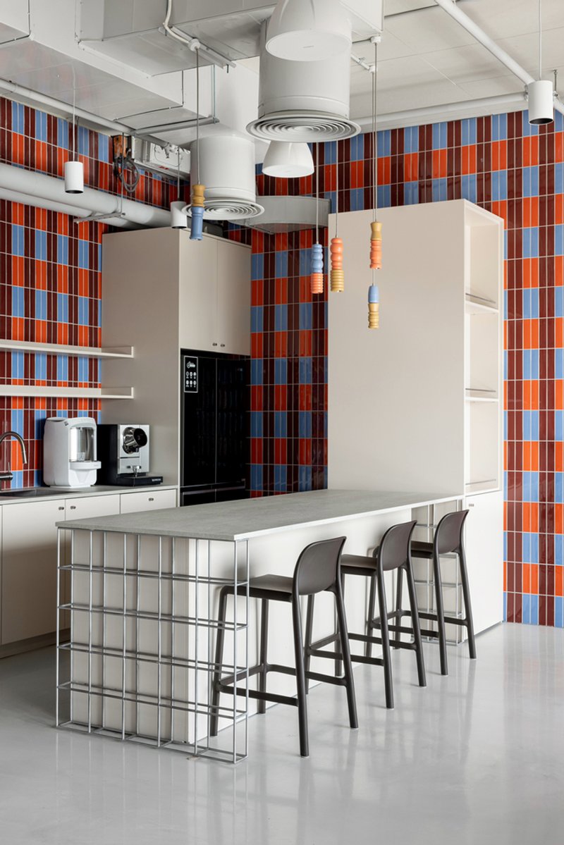
Dining, Lounging, and the Quieter Moments
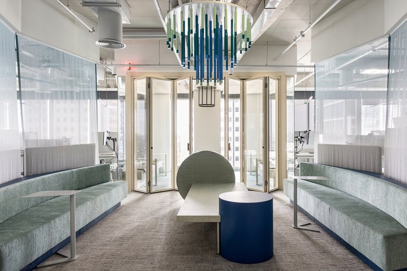
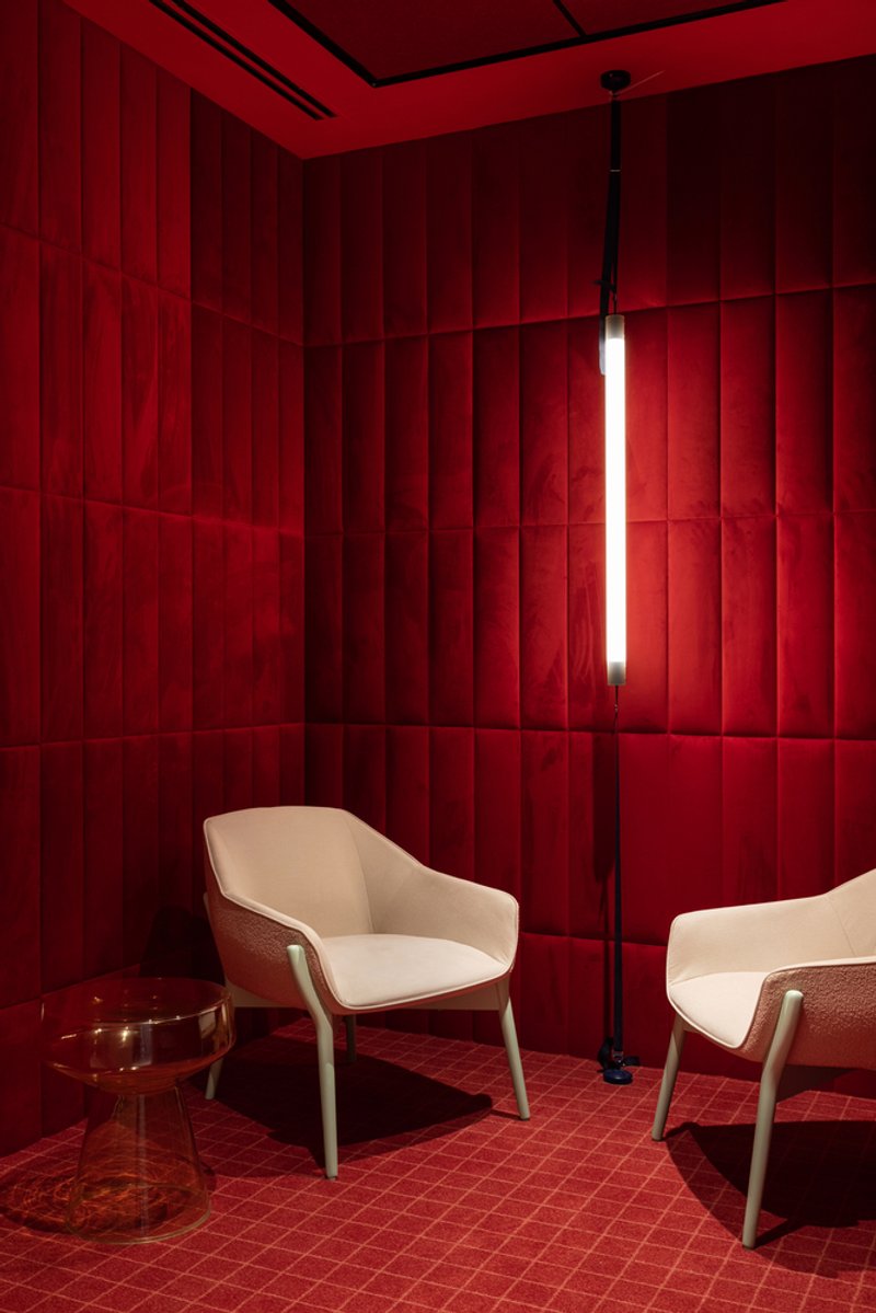
The dining areas offer two moods. One features a blue and orange checkered tile wall with ceramic pendant lights, bold and communal. Another, with cane-backed chairs under exposed mechanical systems, is quieter and more domestic. The lounge zones follow a similar split: a green upholstered bench arrangement beneath a cascading glass chandelier provides a calm retreat, while a fully red upholstered room with vertical paneled walls and cream armchairs delivers the kind of saturated, cocoon-like enclosure that introverts will gravitate toward.
What ties these varied spaces together is a consistent commitment to material specificity. Every surface has been chosen, not defaulted to. The ceramic pendants, the cane-back chairs, the glass chandelier: none of these are generic office procurement items. They give the spaces a personality that transcends the tech-office archetype.
Ceiling and Detail Logic
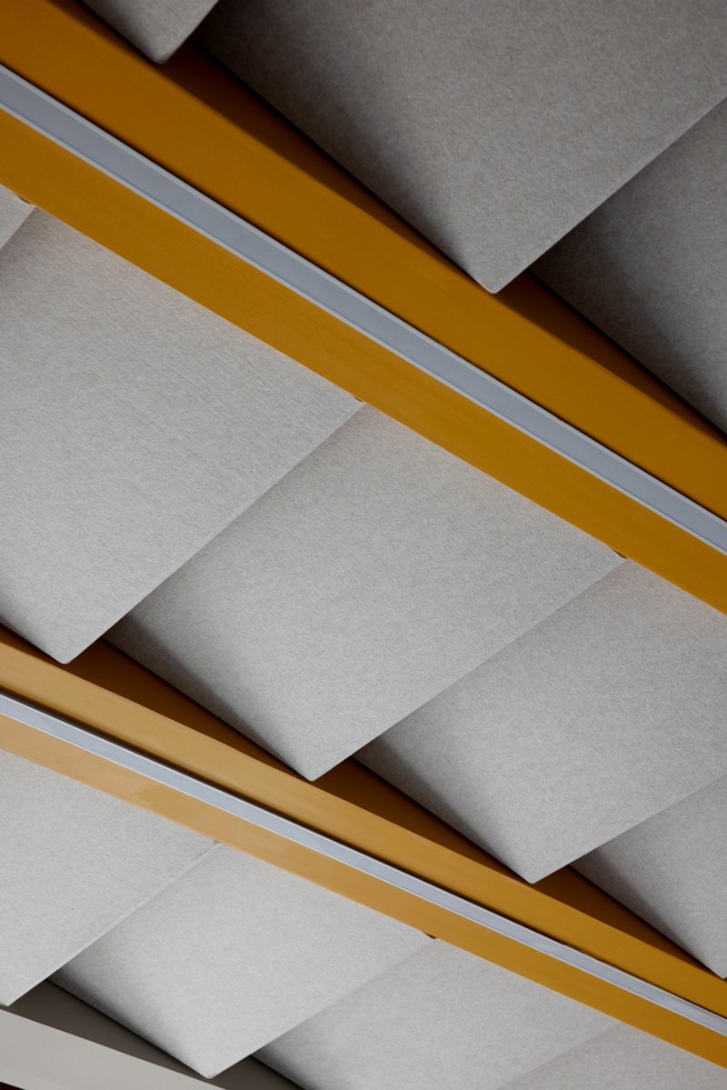
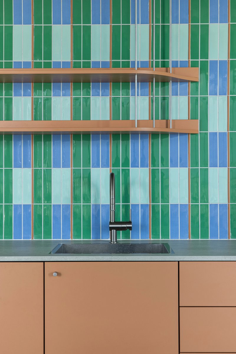
The ceiling treatments deserve a closer look. In one zone, white panels with yellow and tan timber beams cast angular shadows that shift with the daylight, turning the overhead plane into something active. Glass-walled offices get faceted timber ceiling panels that break up the acoustic monotony and introduce warmth above eye level. Even the kitchen backsplash, with its vertical stripe tiles in green and blue alongside timber shelves, maintains the same logic of color-within-restraint that governs the larger spaces.
These details matter because they demonstrate that RD&A's design intent extends to every surface, not just the photogenic ones. A ceiling you notice is a ceiling that was designed. In too many workplaces, the fifth surface is an afterthought. Here, it participates.
Plans and Drawings
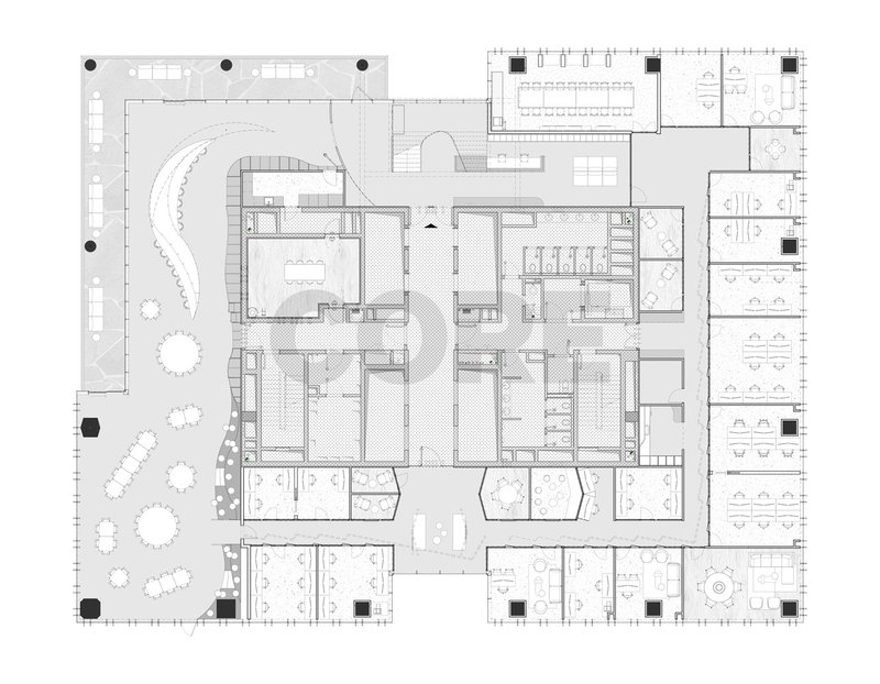
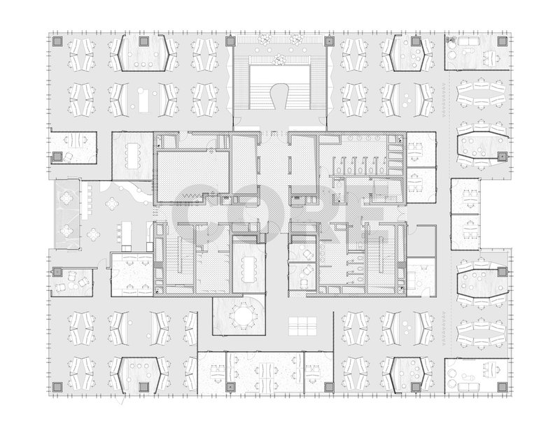
The floor plans confirm what the photographs suggest: the curved central staircase is the organizational anchor. Workstations scatter around it in loose clusters within an irregular perimeter, and an outdoor terrace extends the floor plate beyond the building envelope. Support spaces distribute throughout rather than concentrating in a single zone, which keeps the plan porous and avoids dead-end corridors. The open office areas surround the central core on both levels, reinforcing the atrium as the primary spatial event.
Why This Project Matters
Kaltura's offices matter because they demonstrate that corporate identity and architectural ambition are not mutually exclusive. RD&A did not reduce brand expression to a color scheme applied to drywall. Instead, the firm built an architectural argument around transparency, movement, and material honesty, qualities that happen to align with what a video technology company values, but that would make for a compelling workplace regardless of the tenant. The glass block staircase alone justifies the project's existence as a piece of interior architecture.
More broadly, the project pushes back against the flattening of workplace design into a universal formula of open plan plus phone booths plus branded breakout space. Every zone here has a spatial identity rooted in material and geometry, not signage. That takes more effort and more coordination, but it produces a workplace people can actually orient themselves within and, over time, develop an attachment to. If the goal of office design is to make people want to show up, giving them architecture worth experiencing is a better strategy than a free snack bar.
Kaltura Offices by RD&A, Herzliya, Israel. Photography by Itay Benit Photography.
About the Studio
Share Your Own Work on uni.xyz
If projects like this are the kind of work you want to make, uni.xyz is a place to publish your own, find collaborators, and enter design competitions.


Popular Articles
Popular articles from the community
Studio Gram Unfurls a Concrete Curve Through an Adelaide Queen Anne Villa
In Rose Park, a billowing concrete threshold stitches a century-old house to a sun-chasing pavilion organized around an existing pool.
boq architekti Fits a Gabled Family House onto a Tiny Moravian Hillside Plot with No Room for a Garden
A 115 square meter home in South Moravia trades a garden for a rooftop terrace and a fully glazed facade facing the village below.
H&P Architects Stack a Vertical River of Brick and Greenery in Hanoi
A perforated terracotta tower in Dong Anh channels water, light, and air through eight staggered levels of domestic life.
Goldstein Heather Doubles a Victorian Terrace in West London with a Four-Storey Lateral Extension
A 244 square metre addition in Stamford Brook transforms a narrow end-of-terrace house into a 500 square metre family home of sculpted arches and daylight.

Similar Reads
You might also enjoy these articles
Olio Towers: A Mid-Rise for Performers That Fuses Housing, Rehearsal, and Stage
Located blocks from Houston's Theater District, this modular tower stacks living units around a central performance atrium.
Oasis: Modular Green Housing Carved into Dhaka's Urban Fabric
A shortlisted Plugin Housing entry reclaims unauthorized settlements in Dhaka with stepped concrete volumes, green roofs, and ventilation-driven design.

Black Hole: A Floating Megastructure for the Post-Physical Era
Emiliano Mazzarotto envisions a spherical, self-scaling arena where e-sports, digital hotels, and holographic stadiums replace traditional public space.
Compact & Sustainable Living in Piraeus: A Four-Level Family Home Built Around Light and Air
A narrow townhouse in one of Greece's densest port cities uses a central atrium and passive strategies to house three generations under one roof.


Explore Architecture Competitions
Discover active competitions in this discipline


The International Standard for Design Portfolios


The Global Benchmark for Architecture Dissertation Awards


The Global Benchmark for Graduation Excellence


Challenge to reimagine the Iron Throne
Comments (0)
Please login or sign up to add comments
No comments yet. Be the first to comment!