
Spicy Architects Carves a Wedge-Shaped Coffee Shop into a Shimokitazawa Corner
Light Up Coffee's newest outpost in Tokyo turns a sliver of a building into a plywood and timber haven for specialty coffee.
Shimokitazawa has always been the kind of Tokyo neighborhood where culture grows in tight spaces. Thrift stores, live houses, and ramen counters wedge themselves into improbable footprints, and the area's charm depends on exactly that compression. So when specialty roaster Light Up Coffee decided to open a second location here, the brief almost wrote itself: make something tiny feel generous, and let the coffee do the talking. Spicy Architects took on a narrow, wedge-shaped corner plot and delivered a shop that treats constraint as its primary material.
What makes this project worth studying is not just its efficient plan but the way it builds atmosphere from a deliberately limited palette. Plywood, exposed timber framing, white paint, and a handful of blue ceramic accents account for nearly every surface. The result is a space that reads as handmade without feeling precious, a quality that maps neatly onto the ethos of the specialty coffee movement itself. Every joint, stool, and shelf broadcasts the idea that craft is a form of hospitality.
A Corner That Invites
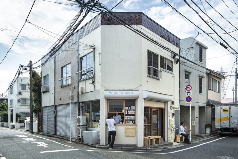
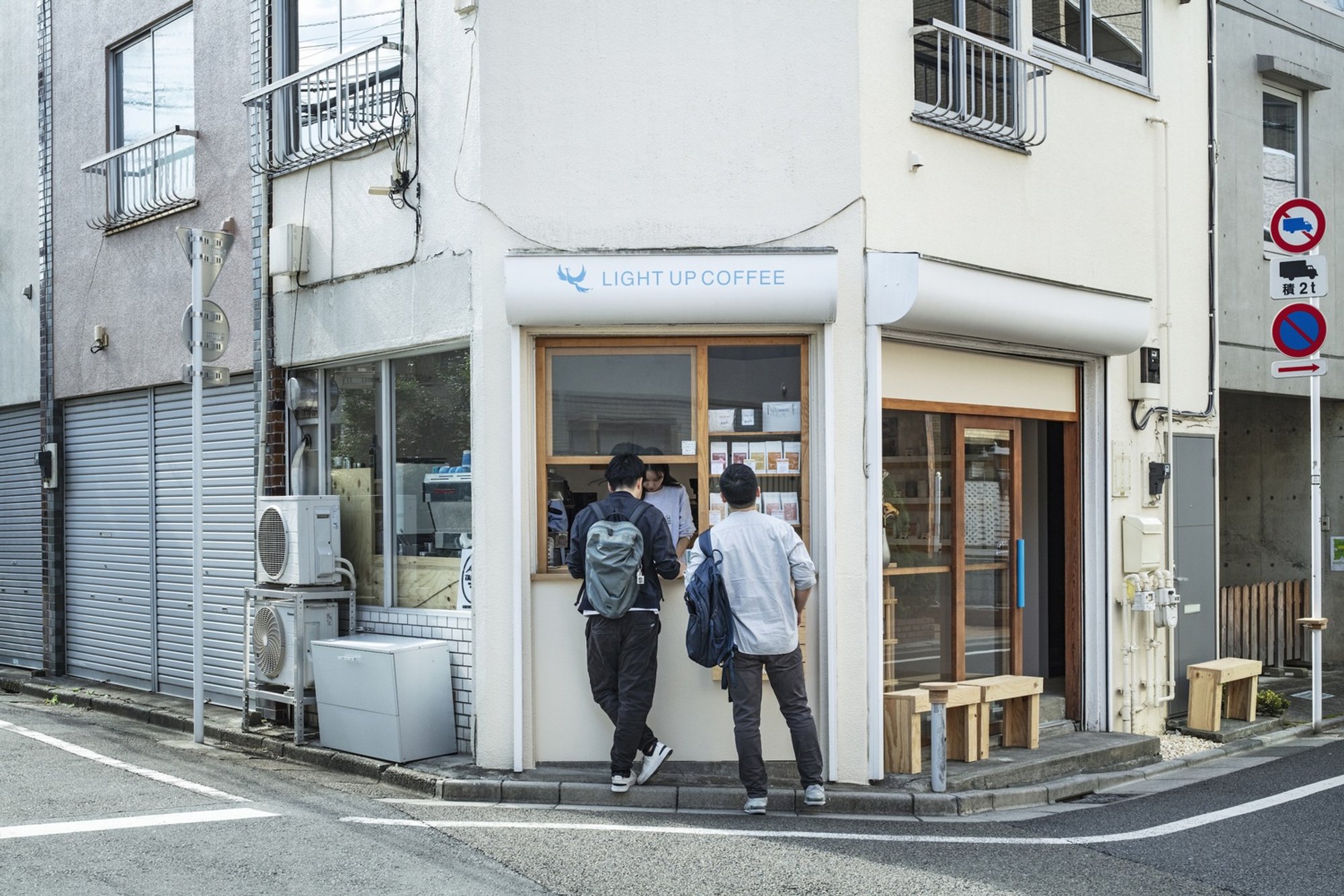
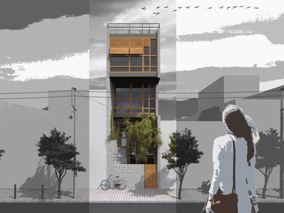
The building's white facade is almost aggressively modest. On a street of competing signage and overhead wires, it reads as a quiet pause. The corner is gently curved, pulling pedestrians toward the entrance rather than deflecting them. Glazed doors fold open to erase the boundary between sidewalk and counter, a move that turns the shop into something closer to a kiosk during warm months.
Two things give the exterior its identity: the timber-framed doorway, which introduces the interior's material logic before you step inside, and the sheer narrowness of the plot, which makes the building feel like a sliver of light between its neighbors. The proportions are almost theatrical. You sense you're about to enter a space that has been carved rather than built.
Timber Frame as Interior Architecture
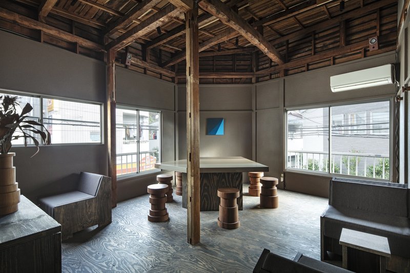
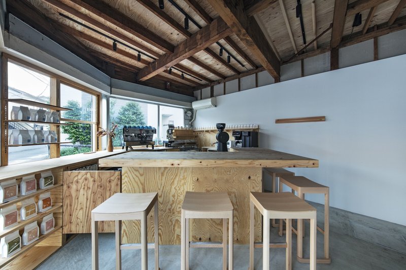
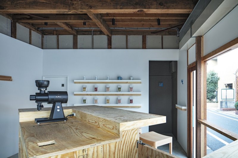
Inside, an exposed timber frame does double duty. Structurally it holds up a clerestory that floods the narrow plan with daylight from above. Experientially it creates a rhythm of bays that organizes the space without walls. The beams are left unfinished, their grain and joinery visible, lending the room a warmth that plywood alone cannot achieve.
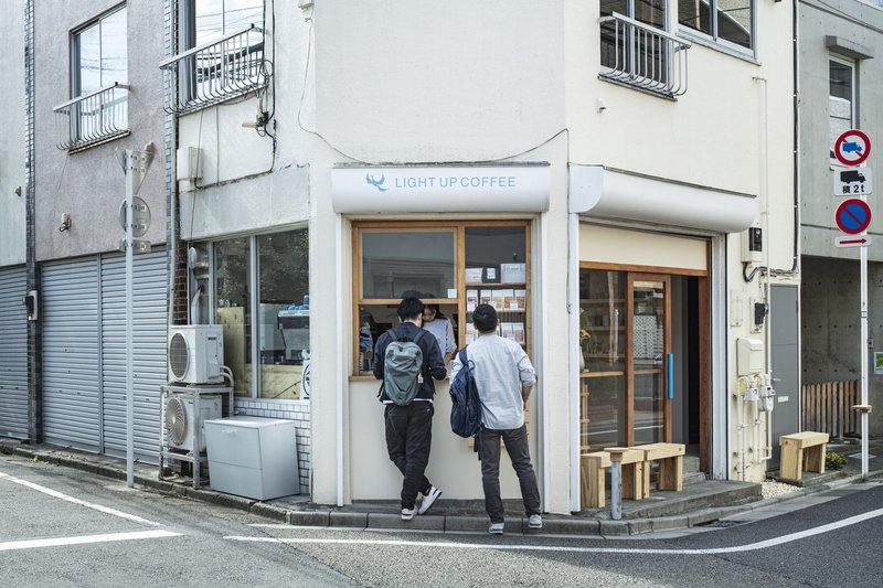
The bar sits beneath this frame like a worktable in a carpentry shop. Espresso machines and grinders line the plywood counter, and baristas work in full view. Clerestory windows above the service zone ensure the coffee preparation area never feels like a dark back-of-house. Instead, it becomes the spatial center of the room, a stage framed by timber.
Plywood Counter and the Craft of Service
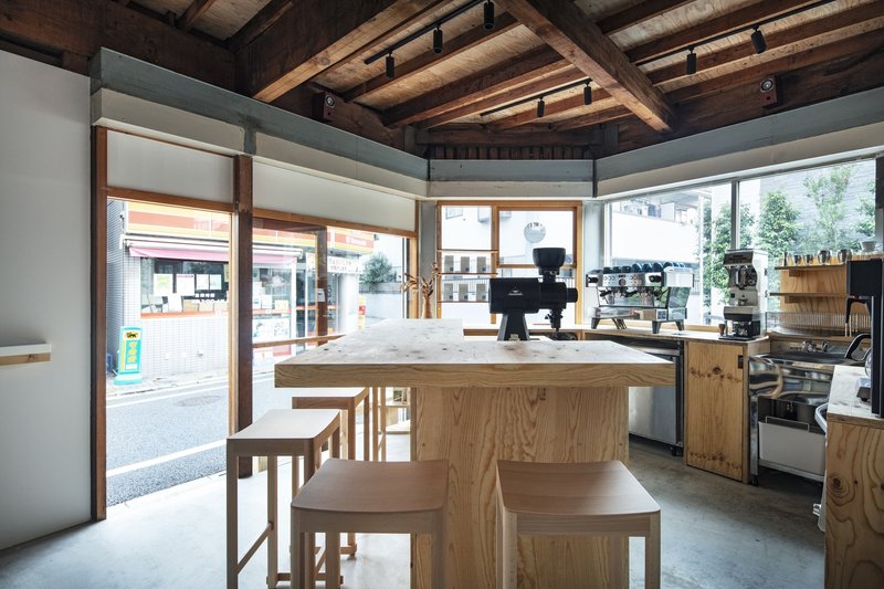
The service counter runs parallel to the street-facing windows, setting up a clear transaction line that keeps circulation moving in a space with almost no room for queuing. Roller shades modulate glare without blocking the view, a practical detail that also keeps the facade transparent from the outside. You always know the shop is alive before you enter.
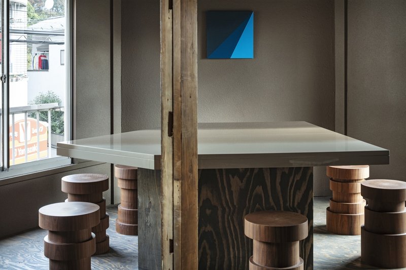
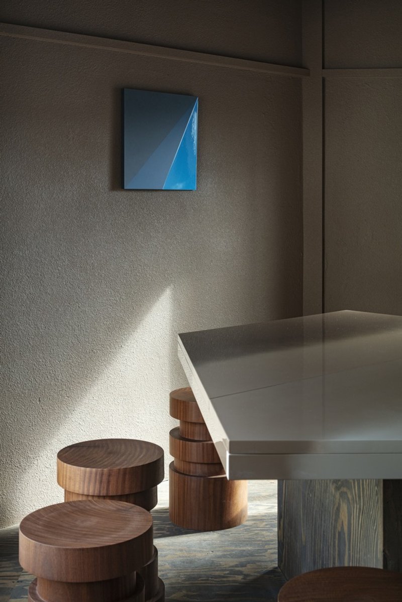
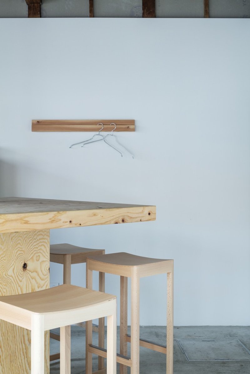
A communal table with a thick plywood base sits near the glazed storefront, surrounded by cylindrical timber stools. The table is heavy enough to anchor the room and simple enough to disappear. Its placement encourages strangers to share a surface, an increasingly rare gesture in a city of solo-pour-over counters.
The Stools Tell the Story
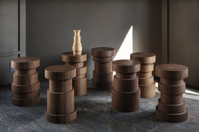
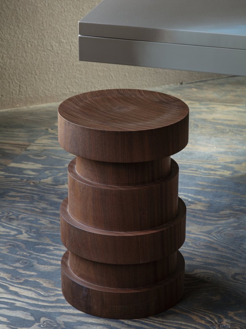
These stacked cylindrical stools are the project's signature object. Each one is turned from solid timber and composed of four sections that can be nested or separated. They are compact enough to tuck under counters, stackable for cleaning, and visually playful in a way that softens the otherwise austere interior. Catching afternoon light, they cast long shadows across the patterned wood flooring.
Custom furniture in a cafe of this size is not vanity. It is necessity. Off-the-shelf stools would either be too large for the plan or too generic for the brand. These pieces solve a spatial problem and a branding one simultaneously, a reminder that good architecture and good product design often converge in hospitality projects.
Details and Material Accents
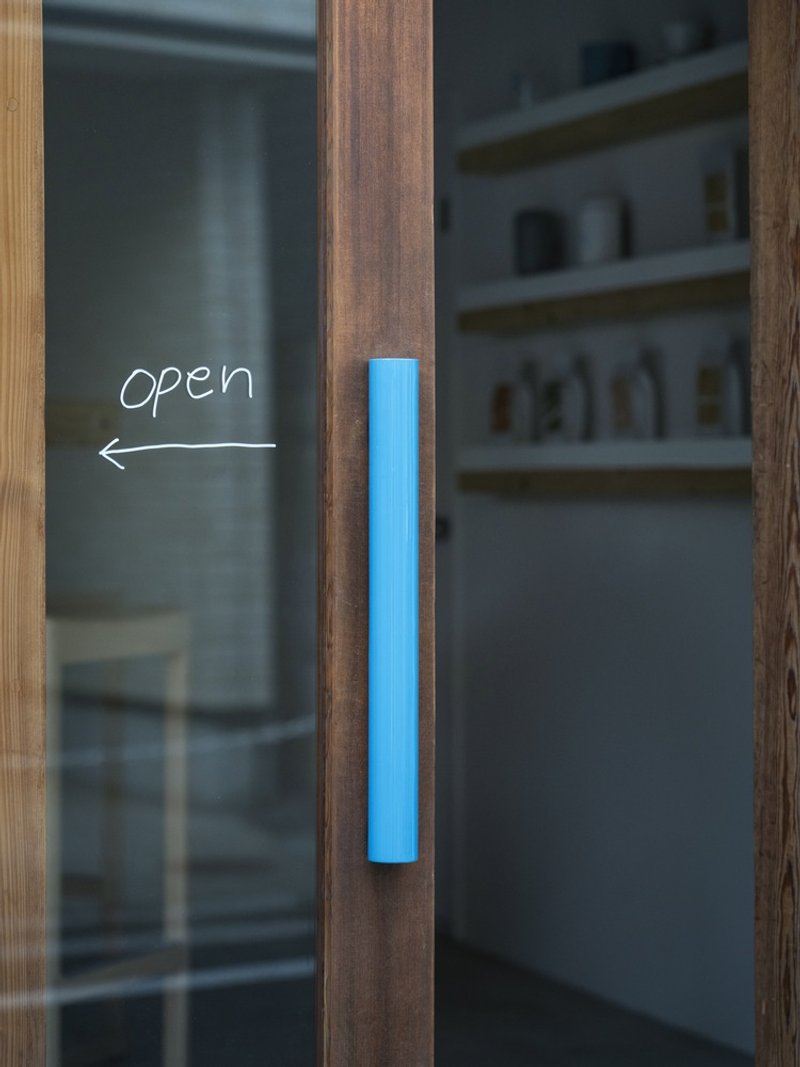
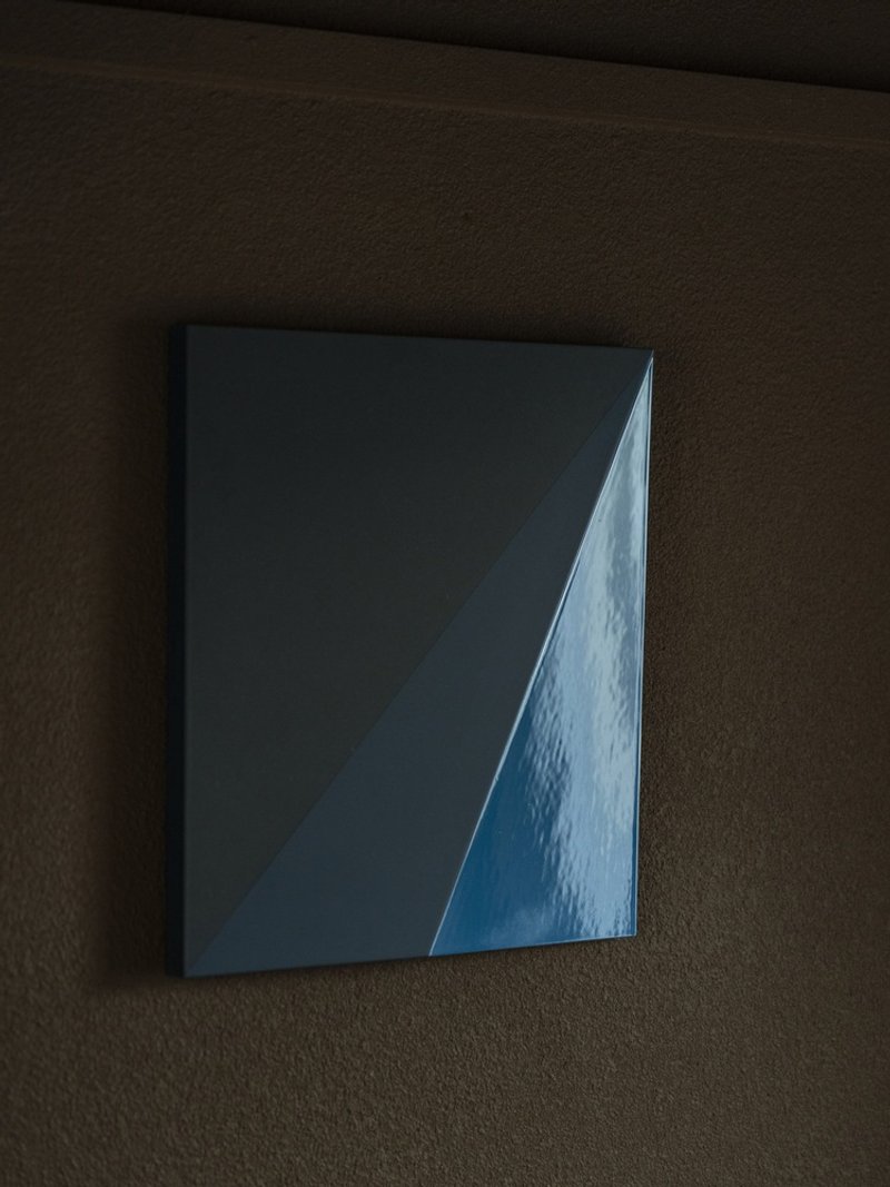
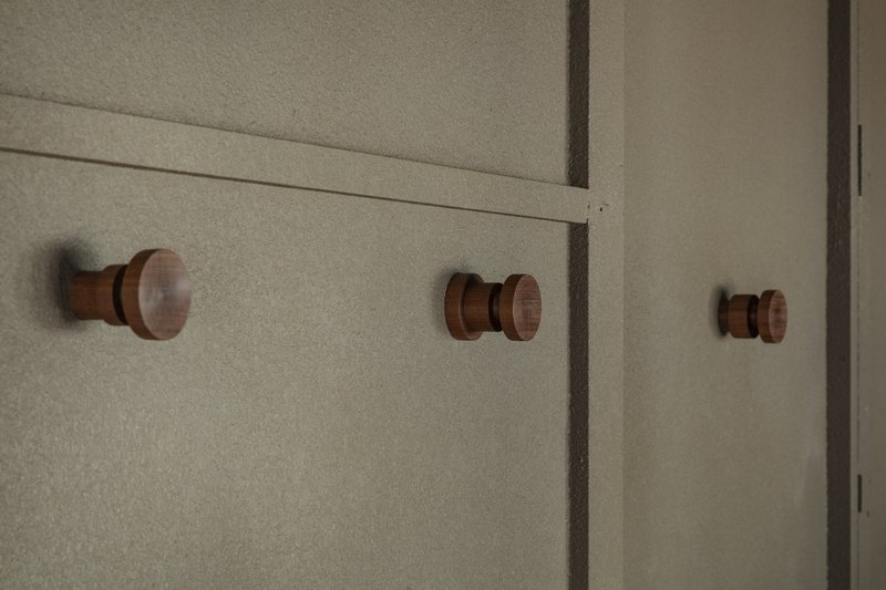
A blue cylindrical door handle, a single glazed ceramic tile on a textured brown wall, three turned timber wall hooks: these are the moments that separate a considered interior from a merely competent one. The blue accents appear sparingly, just enough to register as intentional, never enough to dominate the plywood and white paint.
The wall hooks are a small but telling gesture. They are turned on a lathe like the stools, linking furniture and hardware through a shared fabrication technique. Even the coat storage participates in the design language. Nothing is an afterthought.
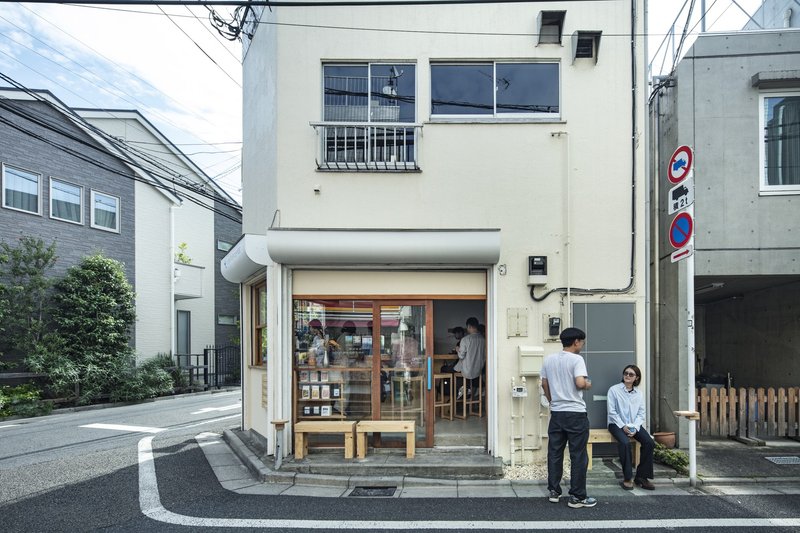
Thresholds and In-Between Spaces
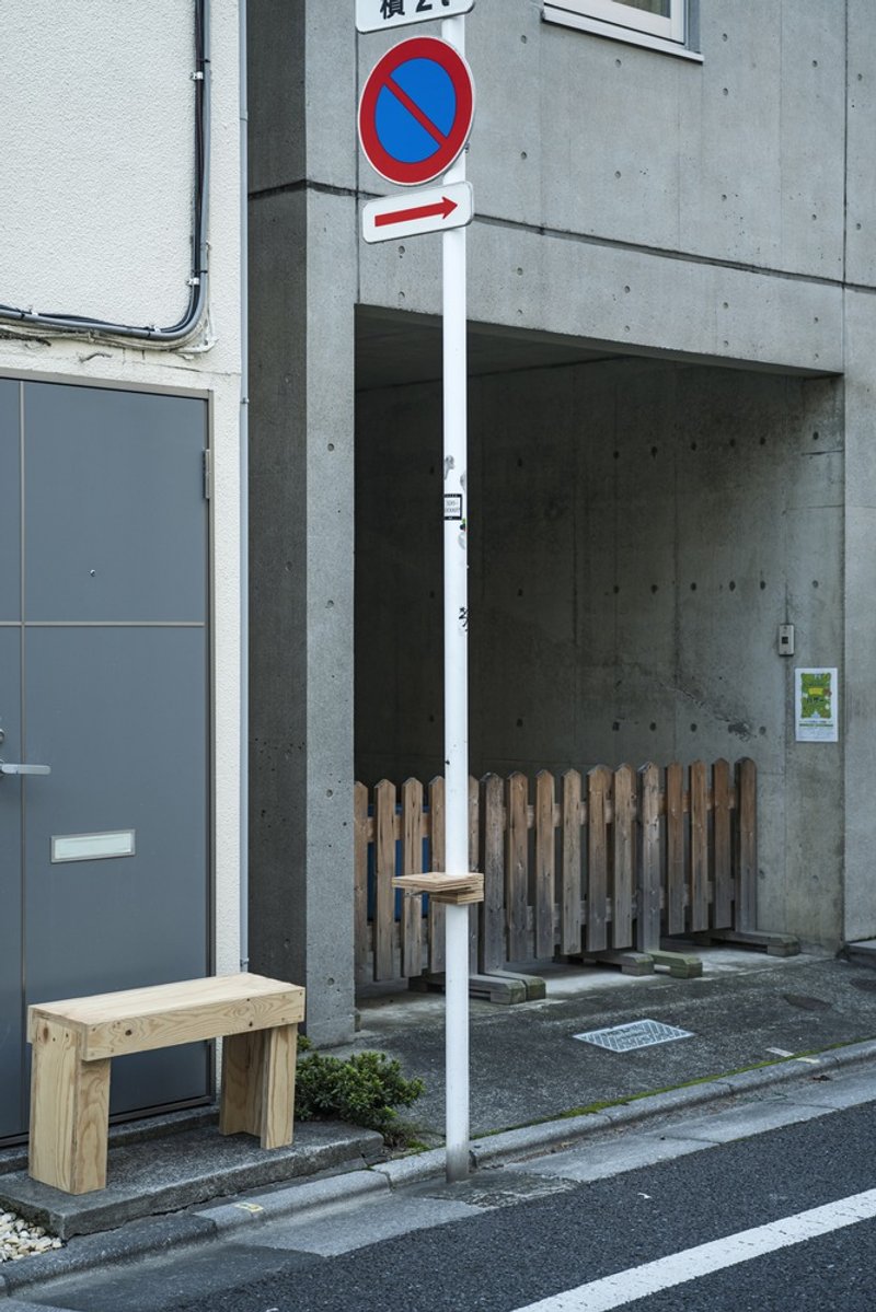
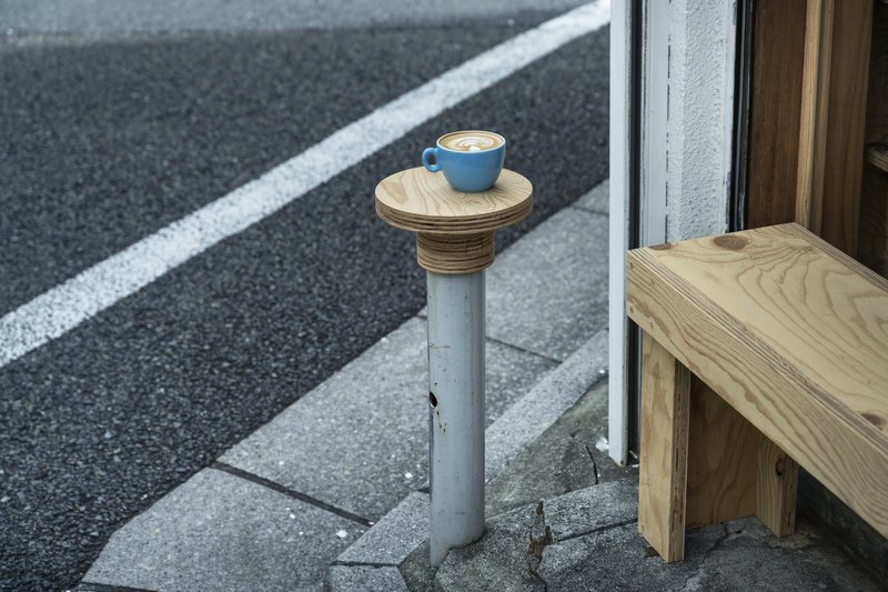
A concrete alcove with timber slat screening and a plywood bench faces the street, creating a semi-outdoor zone that belongs to neither the sidewalk nor the interior. It is a seat for those who want coffee without commitment, a threshold condition that extends the shop's hospitality outward. Nearby, a repurposed steel post holds a plywood top just large enough for a single cup, a detail that feels improvised but is clearly placed with care.
Inside, a small seating nook with wall-mounted hooks and a plywood surface offers a more enclosed alternative. The range of seating conditions, from open-air bench to intimate nook to communal table, is impressive for a shop this small. Each position offers a different relationship to light, street life, and the bar itself.
Streetscape at Dusk
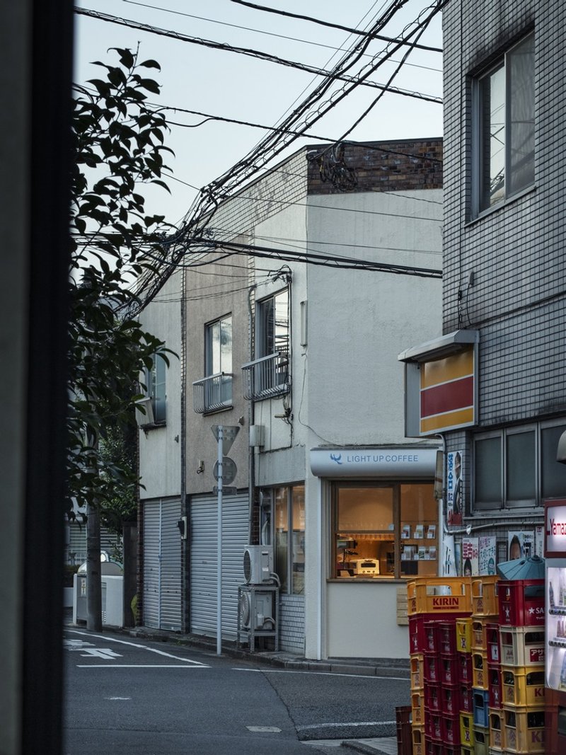
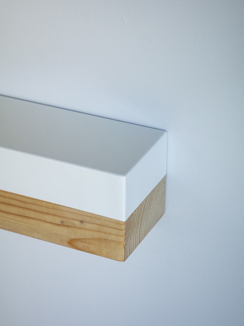
Seen at dusk alongside its neighbors, the building's restraint becomes its advertisement. Stacked beverage crates and tangled power lines give the streetscape its characteristic Tokyo texture, and the white facade glows quietly among them. A painted shelf with an exposed timber edge, visible through the window, hints at the interior without revealing it. The shop belongs to the block without deferring to it.
Plans and Drawings
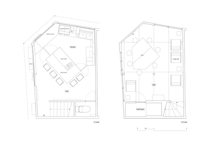
The floor plans confirm what the photos suggest: this is a true wedge. The acute corner of the site dictates an angled seating arrangement on the first level and a compact second floor above. The stair threads along the party wall, keeping the main volume open. Reading the plan, you understand why every centimeter of furniture had to be custom. A standard rectangular table would waste a quarter of the floor area.
Why This Project Matters
Specialty coffee culture and architecture share a preoccupation with process, material honesty, and the idea that small decisions compound into experience. Light Up Coffee Shimokitazawa succeeds because Spicy Architects treated the brief not as a fit-out job but as a furniture-scale building problem. The timber frame, the plywood surfaces, the lathe-turned stools, and the threshold alcove are all responses to the same question: how do you make twelve square meters feel like a destination?
The answer, it turns out, is consistency. Not uniformity, which would be boring, but a coherent set of material and fabrication choices that extend from the door handle to the roof beams. In a neighborhood saturated with character, this project earns its place by being quietly, rigorously itself.
Light Up Coffee Shimokitazawa by Spicy Architects, Shimokitazawa, Tokyo, Japan. Photography by Kenta Hasegawa.
About the Studio
Share Your Own Work on uni.xyz
If projects like this are the kind of work you want to make, uni.xyz is a place to publish your own, find collaborators, and enter design competitions.

Popular Articles
Popular articles from the community
Johnston Architects Reimagines the Methow Valley Hay Barn as a Small-Town Library in Winthrop
A 7,300-square-foot timber library channels the region's agrarian vernacular to serve a rural Washington community of 400 year-round residents.
BLDUS Turns a 250-Square-Foot Screened Porch into a Pine Forest Temple in East Hampton
A gabled cedar pavilion mimics the rhythm of surrounding pines, anchoring a 1990s wooded home to its hollow in Long Island.
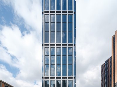
Foster + Partners Wraps a 200-Meter Shanghai Tower in Stainless Steel and Industrial Memory
The Suhe Centre Office Tower anchors a regenerated waterfront district in Shanghai with an all-steel structure that nods to local warehouse heritage.
VEIVE Architects Builds a Mountain Hostel That Disappears into a Hangzhou Hillside
On the Huihang Ancient Trail in Xiangjian Village, a shelter of wood, steel, and rammed earth roots itself in the rural landscape.


Similar Reads
You might also enjoy these articles
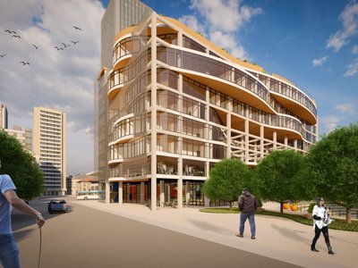
Olio Towers: A Mid-Rise for Performers That Fuses Housing, Rehearsal, and Stage
Located blocks from Houston's Theater District, this modular tower stacks living units around a central performance atrium.
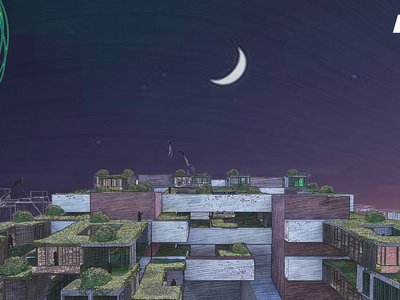
Oasis: Modular Green Housing Carved into Dhaka's Urban Fabric
A shortlisted Plugin Housing entry reclaims unauthorized settlements in Dhaka with stepped concrete volumes, green roofs, and ventilation-driven design.

Black Hole: A Floating Megastructure for the Post-Physical Era
Emiliano Mazzarotto envisions a spherical, self-scaling arena where e-sports, digital hotels, and holographic stadiums replace traditional public space.
Compact & Sustainable Living in Piraeus: A Four-Level Family Home Built Around Light and Air
A narrow townhouse in one of Greece's densest port cities uses a central atrium and passive strategies to house three generations under one roof.


Explore Architecture Competitions
Discover active competitions in this discipline


The International Standard for Design Portfolios


The Global Benchmark for Architecture Dissertation Awards


The Global Benchmark for Graduation Excellence


Challenge to reimagine the Iron Throne
Comments (0)
Please login or sign up to add comments
No comments yet. Be the first to comment!