
Margine Replaces Walls with Color to Reorganize a Pre-War Roman Apartment
On Via dell'Acqua Bullicante in Torpignattara, saturated pink, yellow, blue, and green surfaces define rooms without partitions.


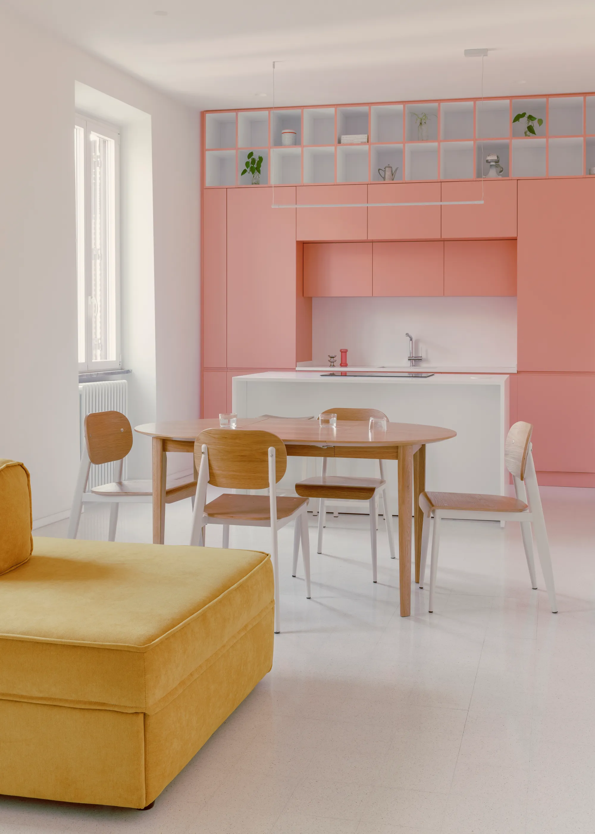
The conventional approach to a pre-war apartment renovation involves some familiar moves: tear out the old layout, build new partitions, assign rooms. Margine skipped the last two steps. In Casa Tahiti Interior, a 100-square-meter flat on Via dell'Acqua Bullicante in Rome's Torpignattara neighborhood, the studio stripped the fragmented plan back to a single open volume and then used color, not walls, to tell you where one room ends and another begins. Pink owns the kitchen. Yellow owns the sofa zone and a bathroom. Blue claims the daughter's sleeping alcove and study desk. Green surfaces a second bath. The boundaries are chromatic, not structural, and the result is an apartment that feels both spacious and highly specific.
Designed for a young advertising professional in a part of Rome undergoing genuine cultural transformation, the project reads as a deliberate rejection of the neutral interiors that dominate renovation culture. Margine treats color the way other firms treat materiality: as a primary organizational tool with real spatial consequences. The apartment functions as a pop-character retreat from Rome's density, but it earns its exuberance through disciplined decisions about joinery, tile, and surface continuity rather than through decoration.
Pink as Architecture
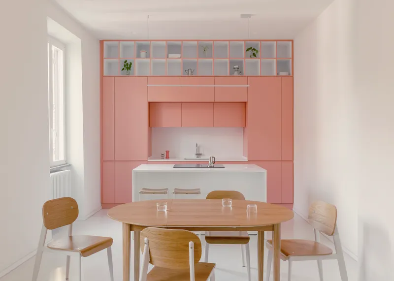
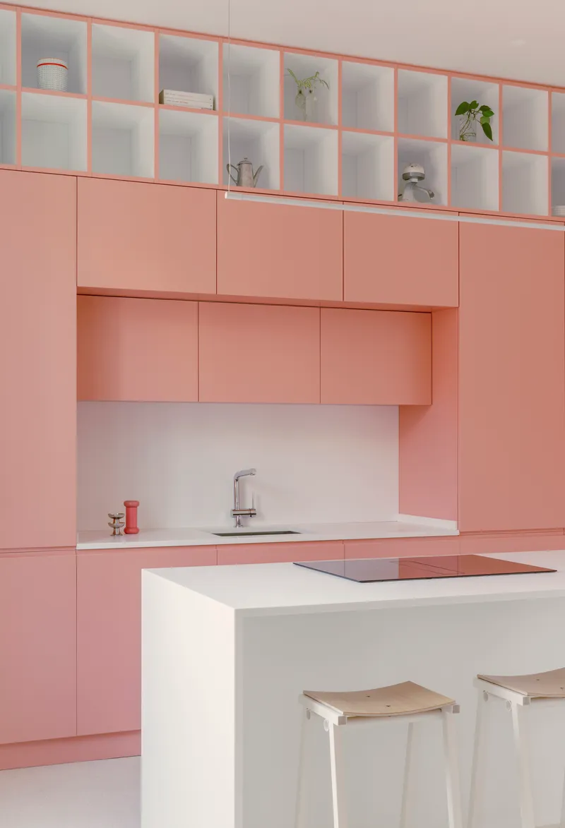

The kitchen is the apartment's most assertive space. Floor-to-ceiling pink lacquered cabinetry lines both sides of what was probably once a corridor, wrapping the room in a single hue. Upper glass shelving keeps things from feeling oppressive, letting daylight pass through while displaying plants and objects. A white Krion island anchors the center of the composition, its pale surface serving as a necessary counterpoint to the saturation around it. Two pale timber stools and a round dining table provide the only warm-toned interruptions.
What makes this work is consistency. The pink is not an accent; it is the material identity of the room. Cabinet faces, shelving frames, and even the joinery details all share the same tone, which means the eye reads the kitchen as a single volume rather than as an assemblage of furniture. The move is bold but not reckless. Margine clearly understands that saturated color succeeds when it is total, not partial.
Joinery and Detail


A close look at the joinery reveals how seriously Margine takes craft within this playful palette. The pink cabinet faces meet the white Krion countertop with a clean, recessed reveal that allows the two surfaces to remain visually independent. Overhead cabinets are set back slightly, creating a shadow line that prevents the upper zone from reading as a monolithic slab. These are small decisions, but they prevent the interior from collapsing into a cartoon.
The pink steel grid shelving unit, with its potted plants above and white storage compartments below, demonstrates the same logic. Color is structural here, literally carried by the metal frame. The galley corridor view, lined with pink cabinetry and punctuated by a small framed artwork on a white wall, shows how the architects use moments of blankness to give the eye a place to rest.
Living Through Color Thresholds
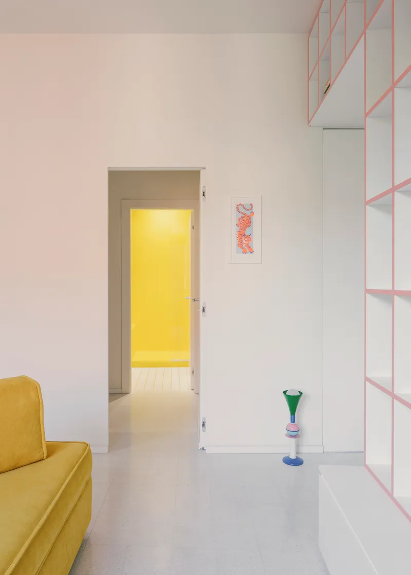
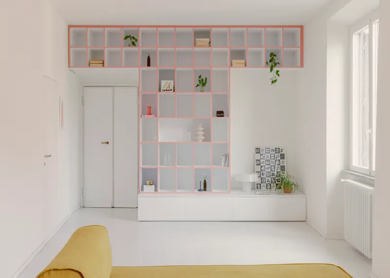

Without partitions, the open plan could easily feel like a single undifferentiated loft. The trick is that chromatic shifts do the work that doorframes normally handle. Looking through a doorway from the living room, you see a yellow-lit space beyond, with pink shelving running along the wall. The transition is readable because the colors are distinct enough to register as separate territories, even across an open threshold.
The pink-framed shelving unit, bathed in bright daylight with books and plants arranged above white storage cabinetry, shows how this approach also produces genuinely pleasant domestic scenes. Arabescato terrazzo flooring by Grandinetti runs throughout, providing the single continuous surface that holds the color zones together. Without this neutral ground plane, the palette would fragment. With it, the colors read as episodes in a single spatial narrative.
The Yellow Bathroom


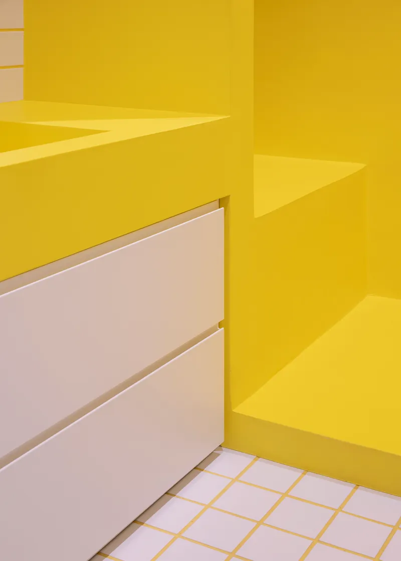
Each of the apartment's three bathrooms gets its own color identity, and the yellow one is the most photogenic. CE.SI ceramic tiles in a warm, matte yellow cover the wall behind a round mirror, while the vanity counter extends the same tone into the horizontal plane. Chrome fixtures read as punctuation. The effect is immersive without being overwhelming, partly because the tile scale is small enough to create texture and partly because the white grout lines provide subtle relief.
The detail of the yellow countertop meeting white drawer fronts and a grid tile floor demonstrates Margine's discipline: color occupies specific surfaces and stops cleanly. There is no bleeding, no gradient. Each material gets its own hue, and the junctions between them are articulated rather than hidden. It is a simple principle, but executing it at this level of control across three separate bathrooms requires real coordination.
The Blue Annex

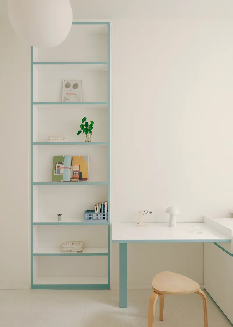
The daughter's section operates as a self-contained zone within the open plan. Pale blue steel shelving defines a desk and sleeping alcove, with a bentwood stool and spherical pendant light providing warmth. The blue is cooler and softer than the pink or yellow elsewhere, which gives this corner a quieter character. It reads as a retreat within a retreat, a place for study and sleep set apart from the sociable kitchen and living zones.
The steel shelving unit doubles as both storage and spatial divider, proving that Margine's color-as-partition strategy works at the scale of furniture as well as architecture. A simple desk surface spans between uprights, and books fill the open bays. The arrangement is restrained, almost monastic, which makes it a useful foil for the exuberance elsewhere.
The Green Accent and Bedroom Calm
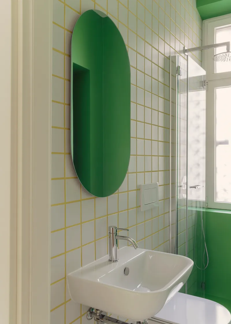

Green appears more sparingly, concentrated in the second bathroom where an oval mirror sits on white square tiles with yellow grout, a subtle detail that cross-references the palette without repeating it. The grout color is a particularly clever move: it turns an otherwise neutral tile wall into a warm, textured surface without adding another dominant hue. It suggests that Margine is thinking about color at the level of millimeters, not just meters.
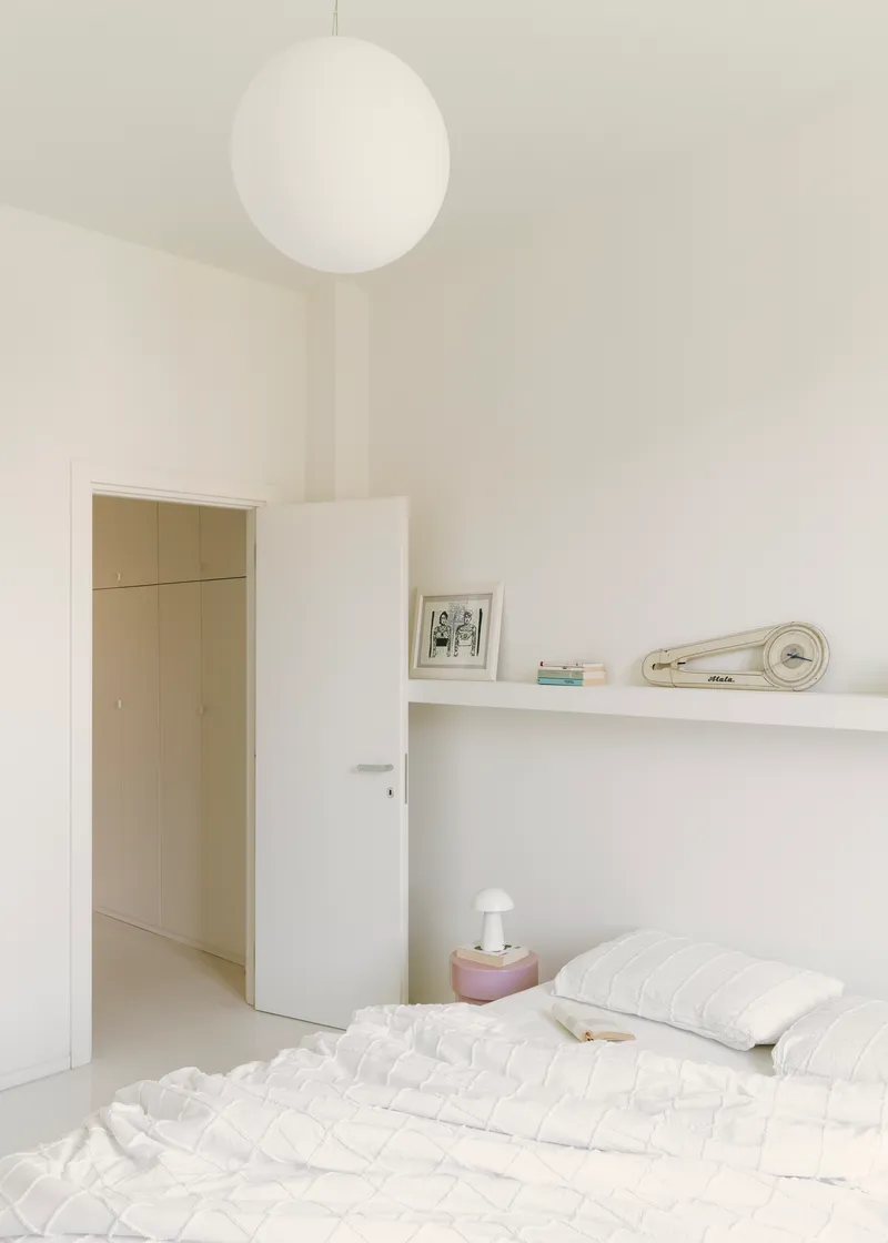
The bedrooms, by contrast, pull back. White walls, arched windows revealing rooftops, and pink cylindrical bedside lamps keep the palette present but subdued. A spherical pendant light in one room echoes the daughter's blue annex, creating a visual thread between private spaces. The arched window framing the Roman skyline is a reminder that this apartment exists within a specific city, not in a vacuum of color theory.
Plans and Drawings
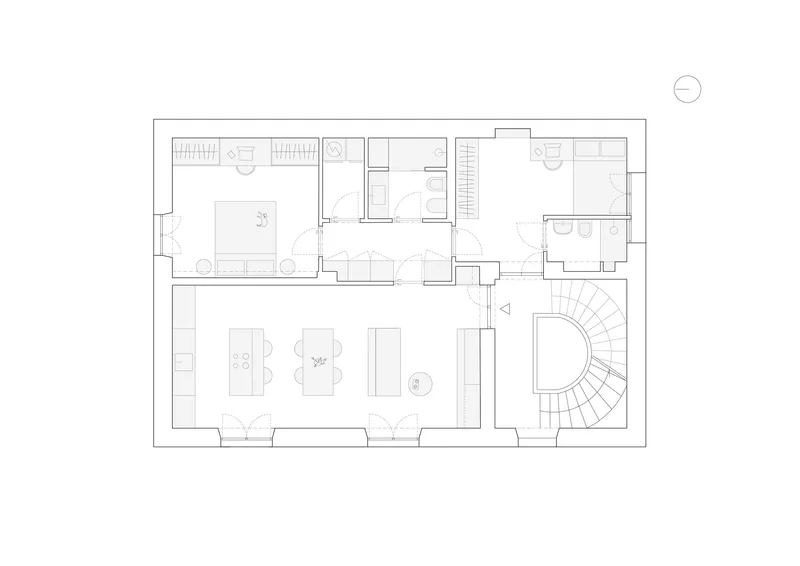
The floor plan confirms what the photographs suggest: the apartment is a single open volume with minimal partitions. A curved stair, bedrooms, and bathroom are the only enclosed zones. The kitchen, dining, and living areas flow together in an L-shaped arrangement, with the color zones overlapping at their edges. Reading the plan, you can see how the project's logic depends on furniture and joinery to create spatial definition rather than on conventional walls. It is an honest plan, revealing the simplicity of the structural move that makes the chromatic strategy possible.
Why This Project Matters
Color in residential interiors is usually decorative. You pick a wall, you paint it, and you call it a feature. Casa Tahiti Interior does something more rigorous. It treats color as an organizational system, assigning each hue a spatial role and then executing that assignment with the precision of custom joinery, coordinated tile, and carefully chosen grout. The result is an apartment where you always know where you are, not because of walls or doors, but because of the surface around you. That is a genuinely architectural use of color, and it is rare.
Margine's project also matters for its context. Torpignattara is not Trastevere or Parioli; it is a neighborhood in the middle of real cultural change, attracting a younger creative community. An apartment that refuses beige minimalism and instead commits to a pop-character identity feels appropriate to this moment. It is not nostalgic for old Rome and it is not pretending to be Milan. It is specific, confident, and fully committed to its own terms.
Casa Tahiti Interior by Margine, located in Roma, Italy. 100 m², completed 2026. Photography by Nicolò Panzeri.
About the Studio
Share Your Own Work on uni.xyz
If projects like this are the kind of work you want to make, uni.xyz is a place to publish your own, find collaborators, and enter design competitions.




Popular Articles
Popular articles from the community

Hill & Cross Opera: Sculptural Opera House Architecture Shaped by Tallinn’s Landscape and Identity
Hill & Cross Opera reimagines opera house architecture in Tallinn through its sculptural hill, civic plaza, glass wave and a luminous cross.

Riyadh For All: Intergenerational Urban Design for Active Aging in Rabat
Riyadh For All reimagines urban design in Rabat with intergenerational co-living, adaptive courtyards, and Moroccan cultural exchange today.
EW PARK: Sustainable Architecture Reimagines the Future of Urban Parking
EW PARK reimagines city parking as a modular wooden tower combining automation, solar energy, electric mobility, and adaptable urban design.
The Musturak Paradise: Senior Living Architecture for a Connected Future in Temara, Morocco
The Musturak Paradise reimagines senior living architecture in Temara via private homes, social spaces, culture, community, and shared care.


Similar Reads
You might also enjoy these articles

Bao Huynh Watercolor Atelier: A Serene Art Retreat in Hội An
Bao Huynh Watercolor Atelier in Hội An blends multifunctional art spaces, sustainable design, local materials, and family-friendly living in a serene environment.

Atelier Macri Concept Store Interior Design by CASE-REAL
Atelier Macri store features a "ko" counter, walnut wood details, cork displays, blending retail, gallery, and seamless customer experiences.

Manuel Vargas Izquierdo Stadium and High-Performance Sports Center: Architectural Excellence in Jalpa de Méndez
The Manuel Vargas Izquierdo Stadium blends sustainable design, inclusive sports facilities, and cultural-inspired architecture, revitalizing Jalpa de Méndez’s public spaces.

KAKR Buluh Awar Hall: Revitalizing Community and Ecology Through Bamboo Architecture
Community built bamboo hall revitalizes Buluh Awar village, empowering youth, restoring ecology, celebrating vernacular craftsmanship through sustainable architecture and culture.


Explore Architecture Competitions
Discover active competitions in this discipline



Challenge to reimagine the Iron Throne


Photograph architecture without architects


Illustrate the lost glory of Angkor Wat - Render Challenge


Design challenge to reuse E-waste
Comments (0)
Please login or sign up to add comments
No comments yet. Be the first to comment!