
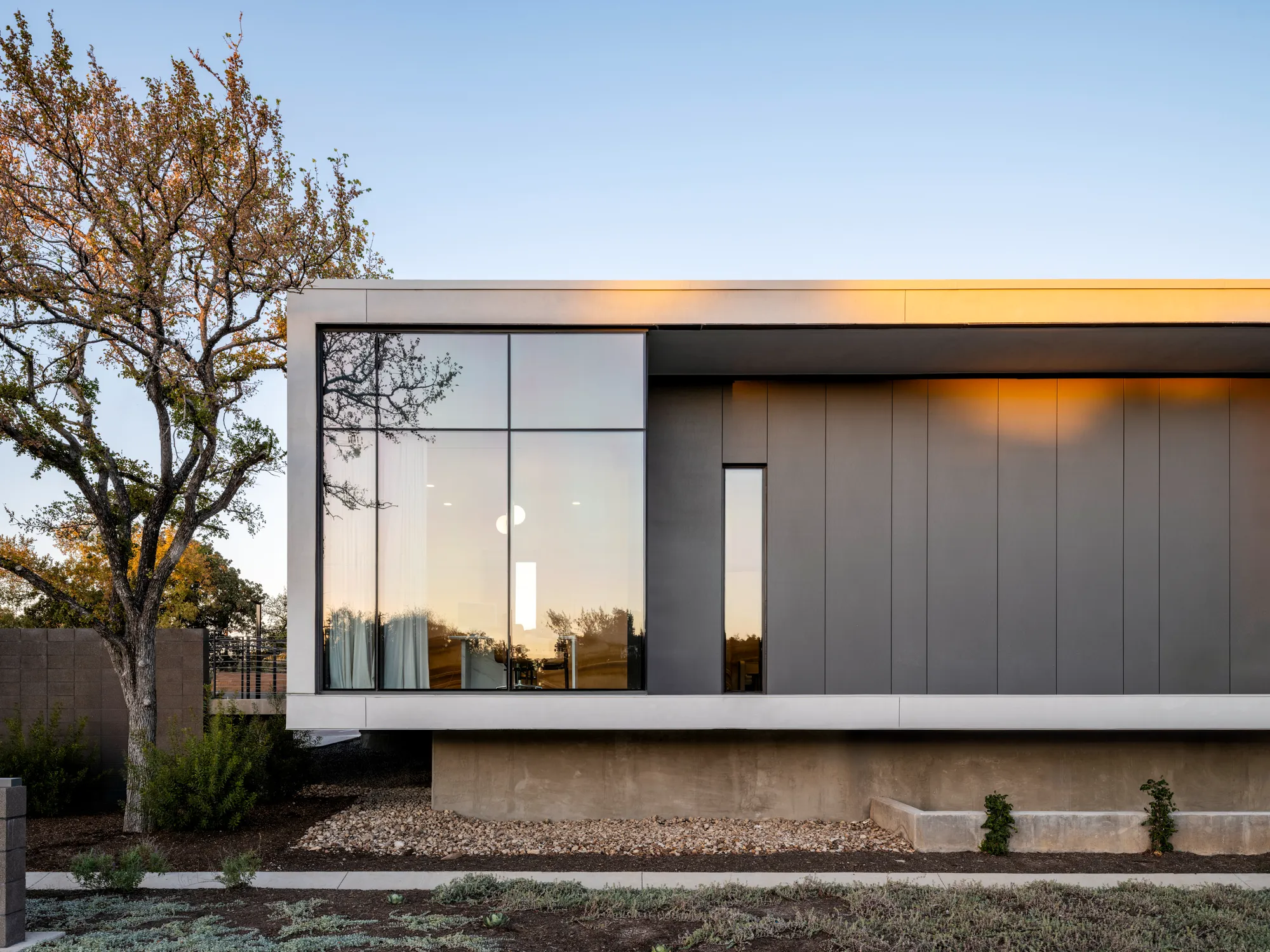
Matt Fajkus Architecture Floats a Zinc Cube Along a Georgetown Scenic Corridor
A dermatology clinic on Williams Drive in Georgetown, Texas, calibrates light and privacy through a precise envelope of zinc and glass.


Medical buildings rarely get to participate in the architectural conversation. Most clinics are tenant improvements inside speculative shells, invisible from the street and indistinguishable inside. Westlake Dermatology Georgetown, completed in 2024 by Matt Fajkus Architecture, rejects that formula outright. At just over 4,000 square feet and a single story above grade, the building on Williams Drive reads as a compact, hovering volume of dark zinc panels and carefully placed glass, set back behind preserved trees and a required scenic landscape buffer. It is small, deliberate, and surprisingly muscular for a dermatology office.
The core move is elemental: treat every facade as a distinct condition. The street side opens with a generous glass curtain wall framed by vertical fins. The flanking volumes close down to zinc with only narrow vertical slot windows. The rear dissolves at the corner into glass again, pulling tree shadows across white panels. The result is a building that modulates daylight, privacy, and presence on each side independently, which happens to be exactly the kind of nuance a skin care practice should demand from its architecture.
The Floating Volume
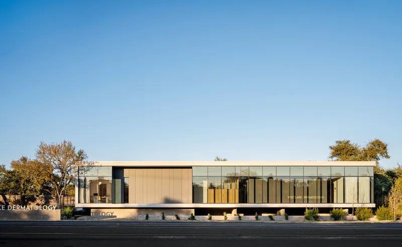
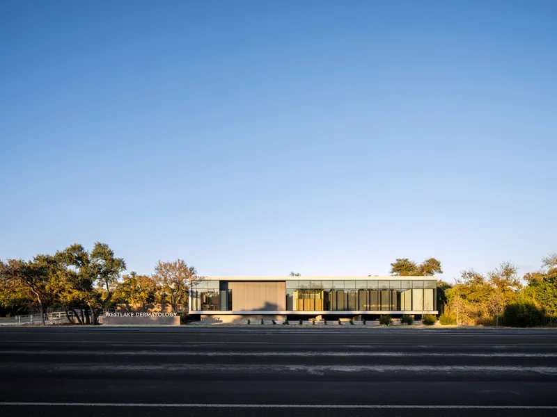
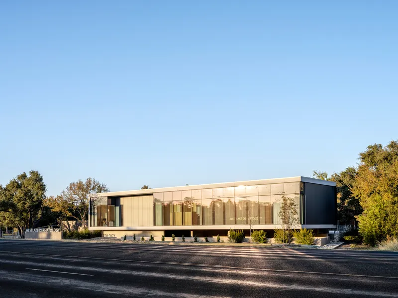
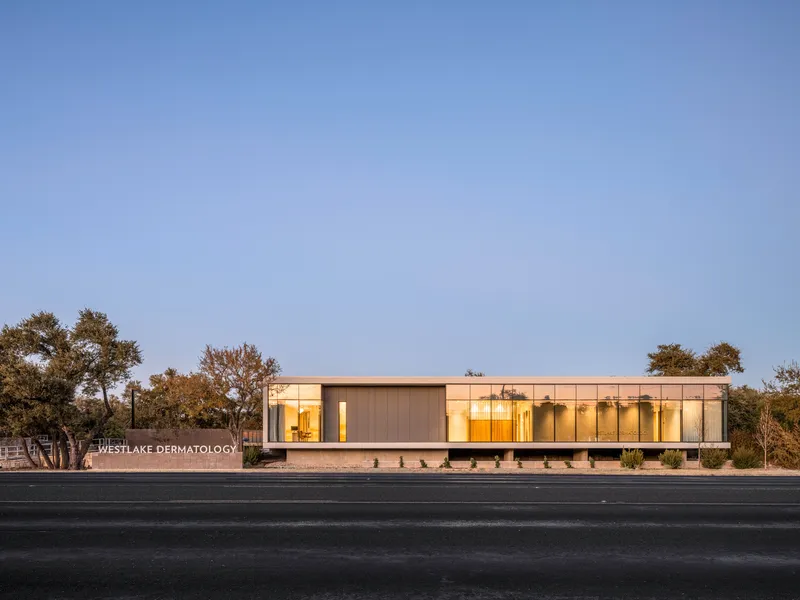
The building is conceived as a cube lifted off the ground, a concrete plinth supporting a dark zinc volume that appears to hover above the landscape. From the street, the horizontal proportions keep the mass low and grounded even as the cantilever and shadow line beneath the cladding suggest weightlessness. The combination of vertical metal panels and the framed glass facade between darker bookend volumes gives the street elevation a tripartite rhythm: solid, transparent, solid.
This reading holds from a distance, where the building registers as a single bar behind mature trees. Up close, the zinc paneling reveals a tighter vertical grain that counters the building's horizontal emphasis. It is a simple compositional decision that pays off at multiple scales, especially from the vantage point of a car on Williams Drive.
Zinc and Slot Windows
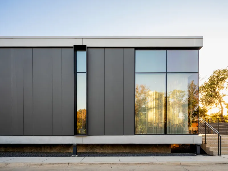
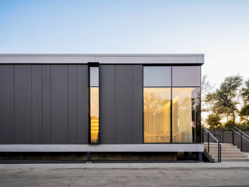
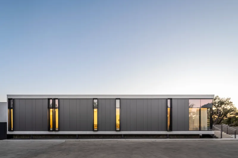
The darker zinc panels that wrap the side and rear volumes are punctured by tall, narrow slot windows. These are not decorative. In a dermatology practice, exam rooms require controlled lighting and visual privacy, yet patients should never feel sealed inside a box. The slots admit a sliver of daylight and a vertical slice of sky and foliage without exposing the room to passersby. It is a functional strategy dressed in a precise aesthetic.
At dusk, these slots reverse their role entirely. Light spills outward in thin vertical lines, turning the opaque zinc surfaces into lanterns. The larger glazed openings at grade reinforce the effect, creating a warm glow that reads clearly from the street. The building becomes more legible, not less, as natural light fades.
Cantilevered Planting and the Scenic Buffer
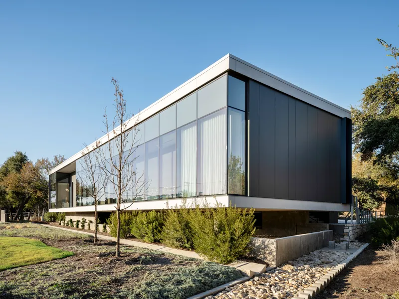
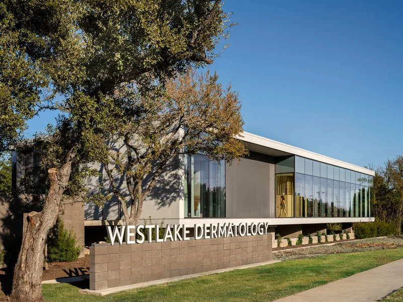
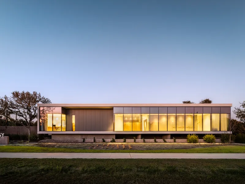
Georgetown's Scenic Natural Overlay requires a landscape buffer along Williams Drive, and rather than fighting the constraint, the design absorbs it. Parking is tucked behind the building entirely. The front is reserved for a curated sequence of mature preserved trees, young plantings, and evergreen shrubs below the cantilevered zinc volume. A stone base wall anchors the entry side and grounds the composition in a material that reads as permanent against the more industrial cladding above.
The landscape strategy also solves pragmatic problems: increased queuing distance from the street for safer vehicle entry and exit, on-site stormwater management, and tree preservation. These are not glamorous goals, but they keep the building's public face clean and inviting. The fact that the clinic's landscaped frontage improves the Williams Drive corridor rather than detracting from it is a win that most commercial medical projects never attempt.
Corner Glazing and the Entry Sequence
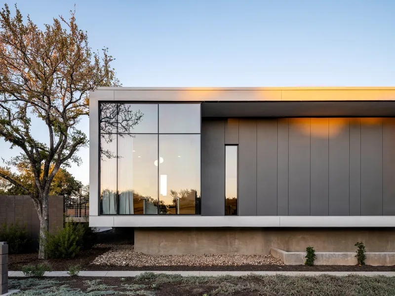
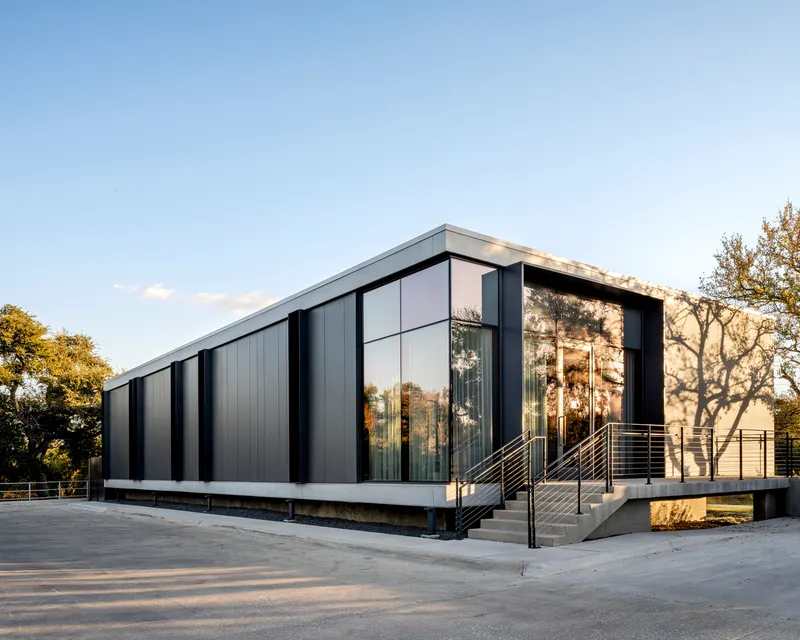
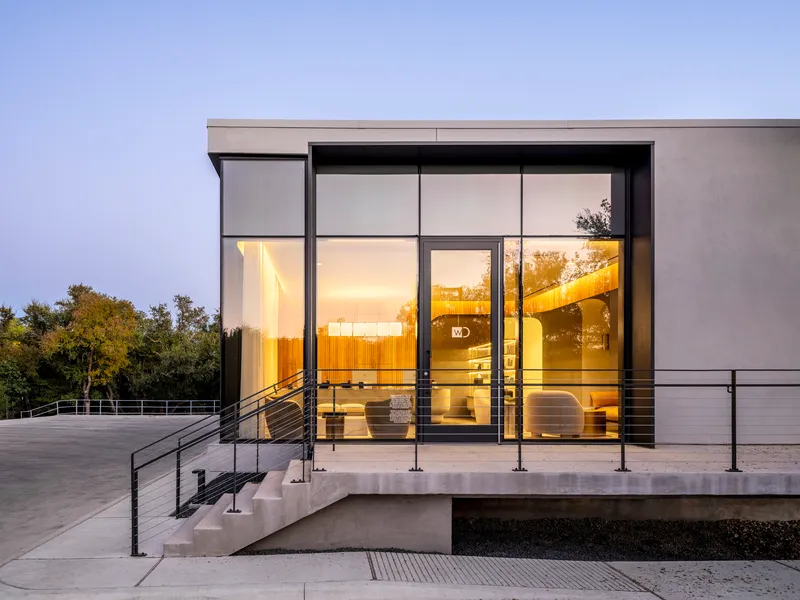
The entry corner is the building's signature moment. A full-height glass corner meets a concrete stair with metal railings, framed above by the cantilevered zinc soffit. At twilight, the illuminated interior is visible through this transparency: timber-lined surfaces, warm tones, and the reception desk beyond. The architecture tells you what the experience will be before you step inside.
This corner also dissolves the boundary between the building's two primary facade conditions. The glass curtain wall of the street side wraps into the zinc volume of the flanking mass, and the concrete plinth anchors the transition. It is a compact building, but the corner gives it a sense of depth and spatial generosity that its footprint alone would not suggest.
Rear Elevation and Tree Shadows
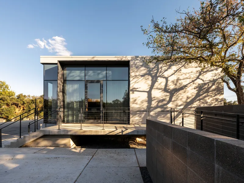
The rear facade shifts to lighter panels, and a glass corner opens the back of the building to the preserved tree canopy. Tree shadows fall across the white surfaces in constantly shifting patterns, introducing a layer of visual texture that the architects did not draw but clearly anticipated. In a practice devoted to skin, the interplay between sunlight and shade on the building's own skin is a resonant detail.
From this side, the building's single-story proportions are most apparent. The volume sits close to the ground, almost domestic in scale, yet the crispness of the panel joints and the frameless glass corner maintain an institutional precision. It is a productive tension.
Interior: Reception and Daylit Circulation
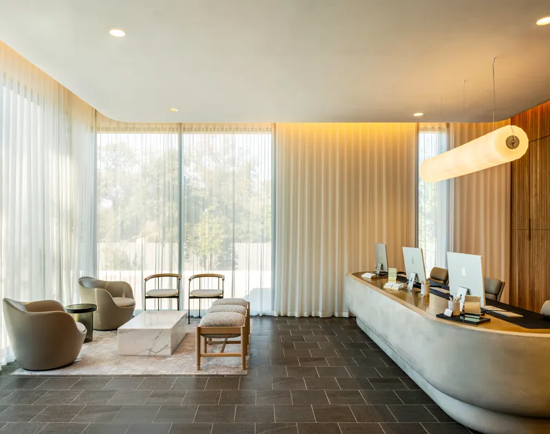
Inside, the interior design by Michael Hsu Office of Architecture complements the architecture's material restraint. A curved reception desk anchors the lobby against a dark herringbone floor. Floor-to-ceiling sheer curtains soften the glass facade, filtering the abundant daylight into a diffuse, even glow. It is the kind of lighting that flatters both patients and clinicians, which is presumably the point in a dermatology setting.
Daylit circulation paths lead from the reception toward exam and treatment rooms, ensuring that natural light accompanies patients throughout their visit rather than dropping them into windowless corridors. The tall thin windows in the exam rooms continue this strategy at a more intimate scale: just enough light and just enough connection to the outdoors without compromising the clinical environment.
Plans and Drawings
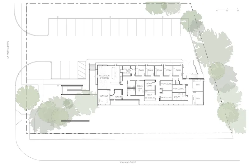
The site plan confirms what the photographs suggest: a tight rectangular footprint oriented to maximize the landscape buffer along Williams Drive. Parking wraps behind the building, screened from the street. The plan reads as a simple bar, but the way the building addresses its four edges, each with a different ratio of solid to glass, reveals a level of site-specific calibration that a plan alone cannot fully communicate. The surrounding tree canopy is preserved and integrated into the arrival sequence, making the 4,083-square-foot clinic feel embedded in its setting rather than dropped onto a cleared lot.
Why This Project Matters
Westlake Dermatology Georgetown demonstrates that a small medical office building can be architecturally rigorous without being extravagant. At $4.5 million and barely over 4,000 square feet, the budget demanded discipline. Matt Fajkus Architecture responded with a limited palette of zinc, glass, and concrete, deploying each material where it performs best: zinc for privacy and presence, glass for transparency and wayfinding, concrete for grounding. The result is a building that earns its visibility on a scenic corridor.
More broadly, the project makes a case for treating clinical architecture as civic architecture. By hiding the parking, preserving the trees, and giving all four facades careful attention, the building contributes to Williams Drive rather than extracting from it. That is a low bar, perhaps, but one that most medical office buildings fail to clear. Georgetown's scenic overlay regulations provided the constraint; the architecture provided the ambition.
Westlake Dermatology Georgetown by Matt Fajkus Architecture (lead architects: Matt Fajkus, Tony Marco, Sarah Johnson, Shelby Taubenkimmel), with interior design by Michael Hsu Office of Architecture. Georgetown, Texas, United States. 4,083 sq ft. Completed 2024. Photography by Leonid Furmansky.
About the Studio
Share Your Own Work on uni.xyz
If projects like this are the kind of work you want to make, uni.xyz is a place to publish your own, find collaborators, and enter design competitions.




Popular Articles
Popular articles from the community


Riyadh For All: Intergenerational Urban Design for Active Aging in Rabat
Riyadh For All reimagines urban design in Rabat with intergenerational co-living, adaptive courtyards, and Moroccan cultural exchange today.

Lunar Spiral: Space Architecture Shaped by the Mathematics of the Universe
Lunar Spiral reimagines space architecture through Fibonacci geometry, lunar regolith, levitating habitats, and self-sustaining Moon living.

The Ocean Hive: Sustainable Architecture for a Self-Sufficient Civilization at Sea
The Ocean Hive imagines sustainable architecture at sea, where modular habitats, algae, wave power and ocean waste sustain a growing colony.

Co-life: Sustainable Architecture for Age-Friendly Community Living
Co-life reimagines sustainable architecture for seniors through courtyards, rammed earth, shared gardens, and spaces designed for belonging.


Similar Reads
You might also enjoy these articles

Bao Huynh Watercolor Atelier: A Serene Art Retreat in Hội An
Bao Huynh Watercolor Atelier in Hội An blends multifunctional art spaces, sustainable design, local materials, and family-friendly living in a serene environment.

Atelier Macri Concept Store Interior Design by CASE-REAL
Atelier Macri store features a "ko" counter, walnut wood details, cork displays, blending retail, gallery, and seamless customer experiences.

Manuel Vargas Izquierdo Stadium and High-Performance Sports Center: Architectural Excellence in Jalpa de Méndez
The Manuel Vargas Izquierdo Stadium blends sustainable design, inclusive sports facilities, and cultural-inspired architecture, revitalizing Jalpa de Méndez’s public spaces.
KAKR Buluh Awar Hall: Revitalizing Community and Ecology Through Bamboo Architecture
Community built bamboo hall revitalizes Buluh Awar village, empowering youth, restoring ecology, celebrating vernacular craftsmanship through sustainable architecture and culture.


Explore Architecture Competitions
Discover active competitions in this discipline



Challenge to reimagine the Iron Throne


Photograph architecture without architects


Illustrate the lost glory of Angkor Wat - Render Challenge


Design challenge to reuse E-waste
Comments (0)
Please login or sign up to add comments
No comments yet. Be the first to comment!