
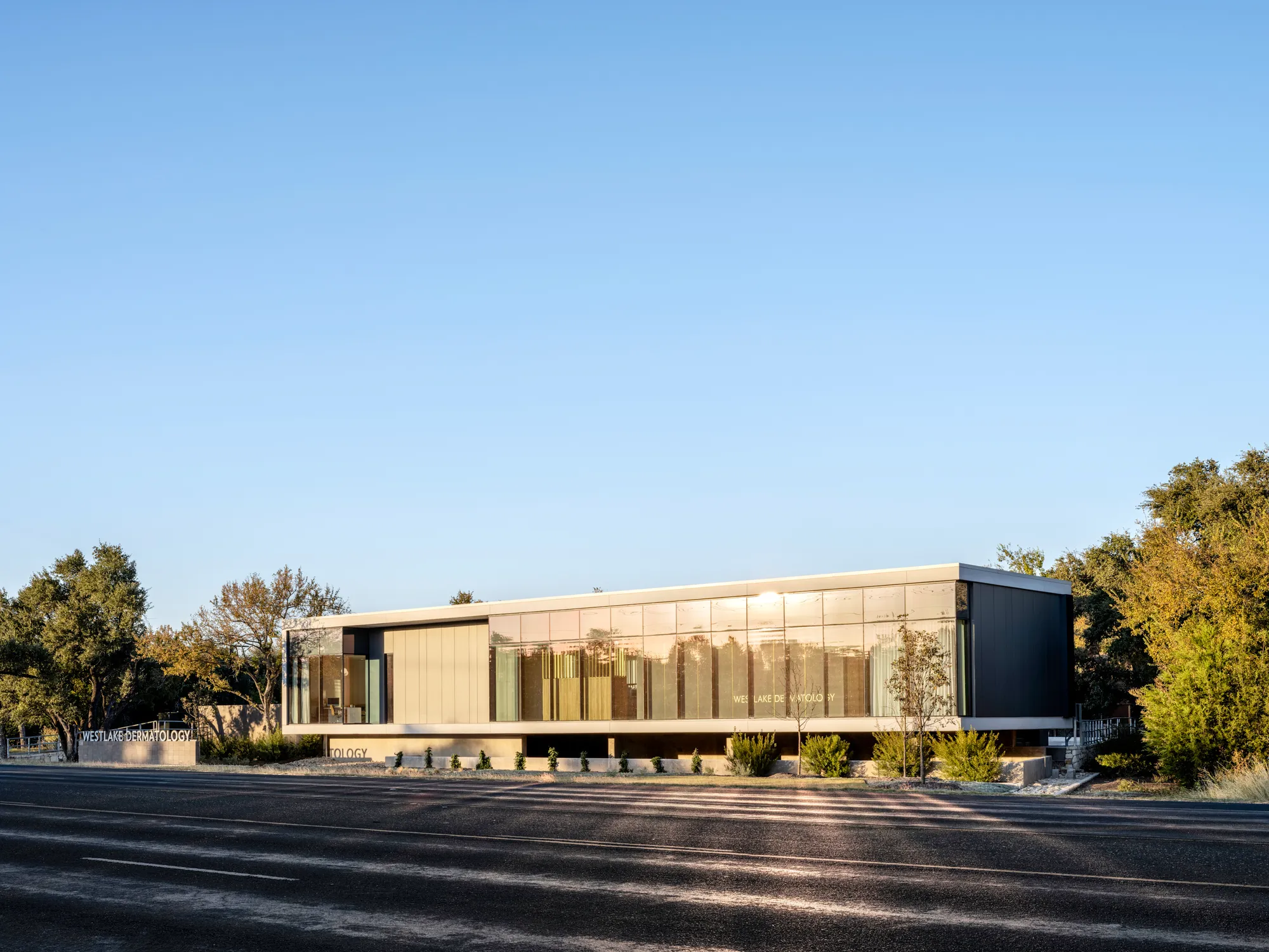
Matt Fajkus Architecture Floats a Zinc Cube Above the Texas Landscape for Westlake Dermatology
A 4,083-square-foot dermatology clinic in Georgetown, Texas, calibrates its facade to balance daylight, privacy, and brand identity.


A medical office building rarely gets to be this controlled. Matt Fajkus Architecture's new clinic for Westlake Dermatology on Williams Drive in Georgetown, Texas, is a single-story, 4,083-square-foot volume clad in dark zinc panels that reads as a precise floating box hovering above a planted slope. The project, completed in 2024 at a construction cost of $4.5 million, was designed to embody the brand's positioning as a gold standard in cosmetic dermatology. That ambition could easily have tipped into surface-level gloss. Instead, the architects delivered something more disciplined: a building whose every facade is composed differently in response to sun, privacy, and the experience of arrival.
What makes the project worth studying is how seriously it takes the idea that a medical building is experienced from all four sides, not just the entrance. The street-facing elevation is more opaque, holding its ground against a scenic overlay buffer. The parking side opens up. The exam rooms get tall, narrow windows that let in daylight without exposing patients. The result is a building that behaves differently depending on where you stand, and that specificity is what elevates it beyond the typical suburban clinic.
A Floating Volume on Williams Drive
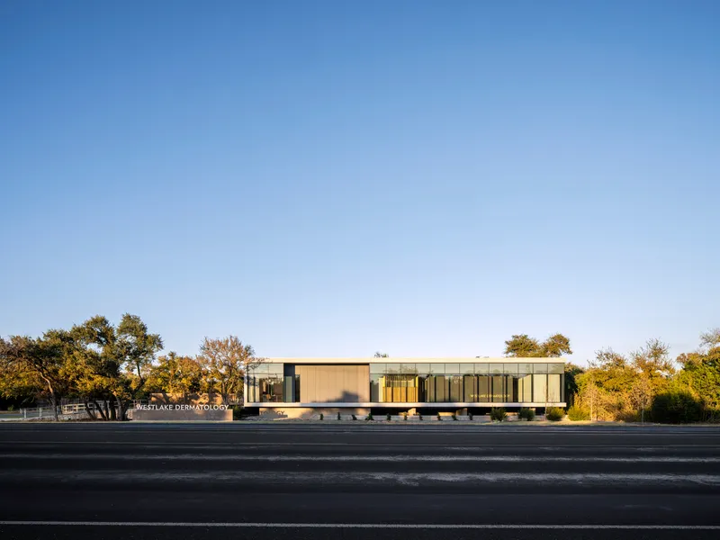
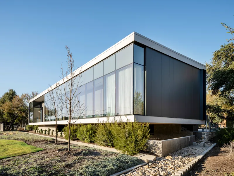
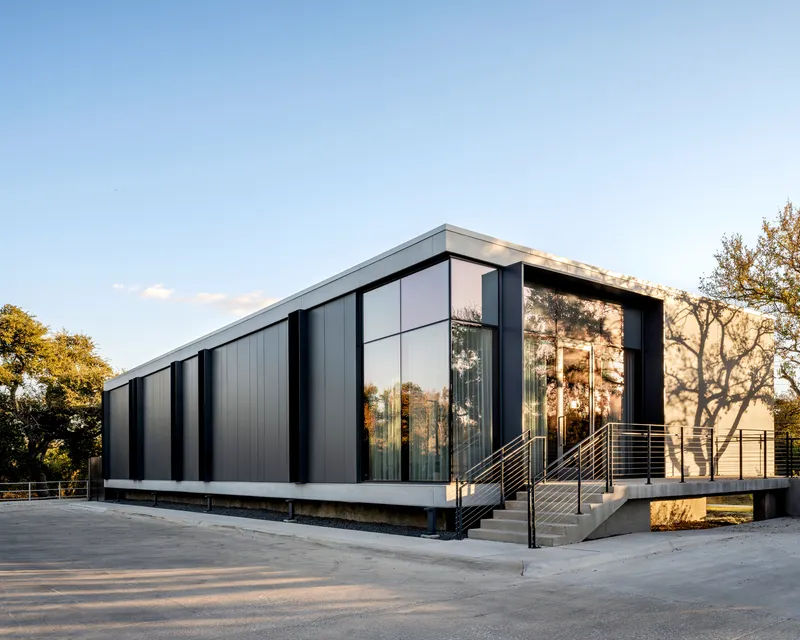
The building's primary formal move is its apparent levitation. The rectangular volume cantilevers over a landscaped base, its dark zinc cladding creating a sharp horizontal line against the sky. A stone retaining wall and planted slope anchor the composition to the ground, while concrete stairs provide pedestrian access at the corners. The effect is that of a building that arrived fully formed and settled, just barely, onto the Texas terrain.
This is not a gratuitous gesture. The elevated posture allows the architects to tuck parking behind the building, preserving the City of Georgetown's Scenic Natural Overlay Landscape Buffer along Williams Drive. Mature oak trees were retained, and the increased queuing distance at the vehicle entry improves safety. The form solves practical problems while projecting quiet authority from the road.
Four Facades, Four Calibrations
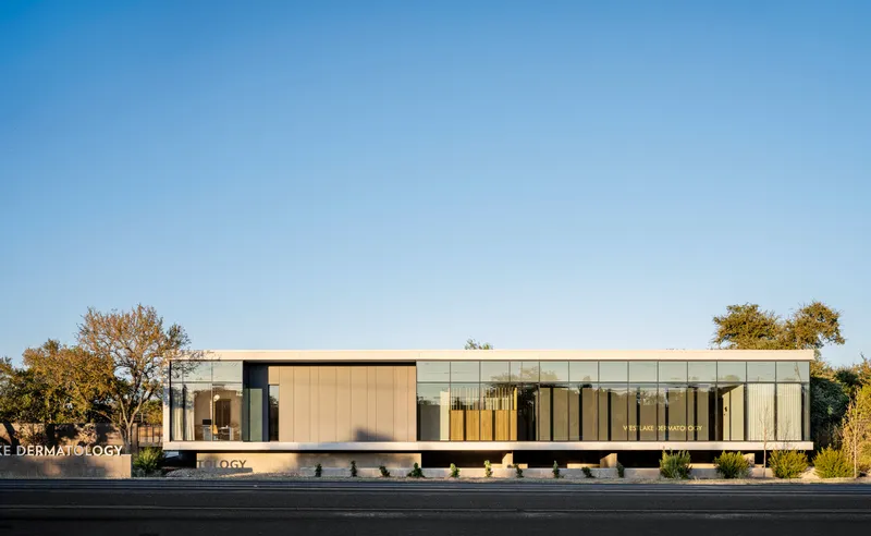
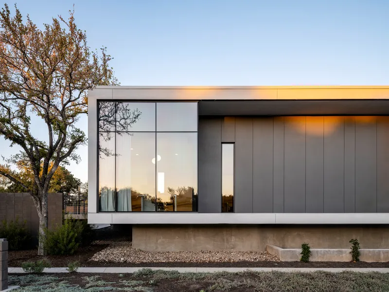
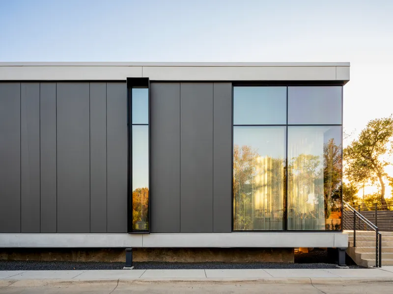
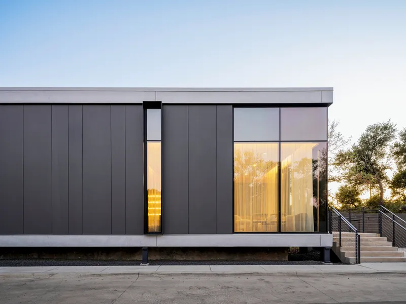
The zinc panels that wrap the building are not applied uniformly. Each elevation presents a different ratio of solid to glass, tuned to its orientation and the activities behind it. The street-facing facade is predominantly opaque, punctuated by narrow vertical slots that read as incisions in the metal skin. These slots are deliberate: they provide exam rooms with a connection to the outdoors while protecting patient privacy.
At the corners, the cladding meets full-height glazing in a clean, almost flush joint that reinforces the reading of the building as a monolithic object selectively peeled open. The flat roof overhang compresses the upper edge, and the absence of visible gutters or trim keeps the profile sharp. It is a vocabulary of restraint, and it works because of its consistency.
The Entrance and the Stone Base
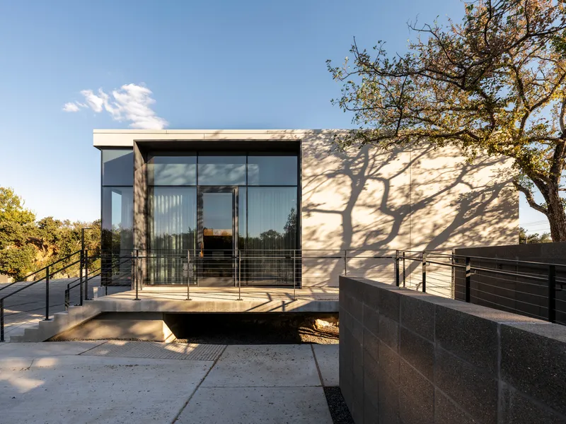
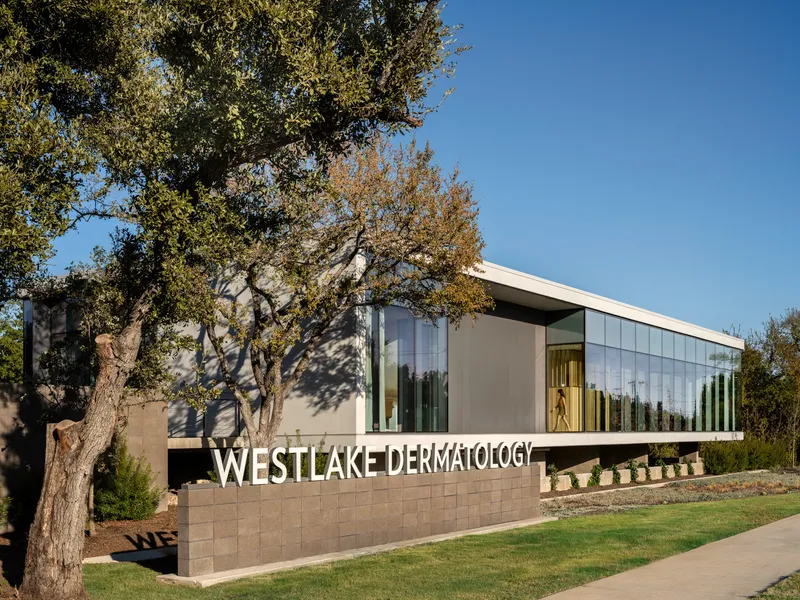
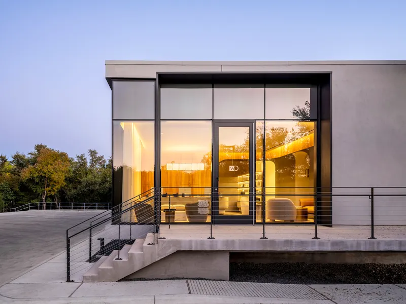
Arrival at the clinic is choreographed through a sequence of landscape, stone, and glass. A stone-clad retaining wall establishes the datum from which the zinc volume launches, and established oak trees frame the approach. The glass entrance facade is set back behind this landscape layer, creating a transitional zone between the public sidewalk and the clinical interior.
At dusk, the entrance becomes a lantern. The illuminated interior, with its timber accent wall and sculptural pendant, is visible through the full-height glazing, transforming the building's public face from opaque to inviting. This shift between daytime reserve and evening warmth is one of the project's more sophisticated qualities, and it reinforces the brand's dual messaging of clinical precision and personal care.
Interior: Warmth Against the Shell
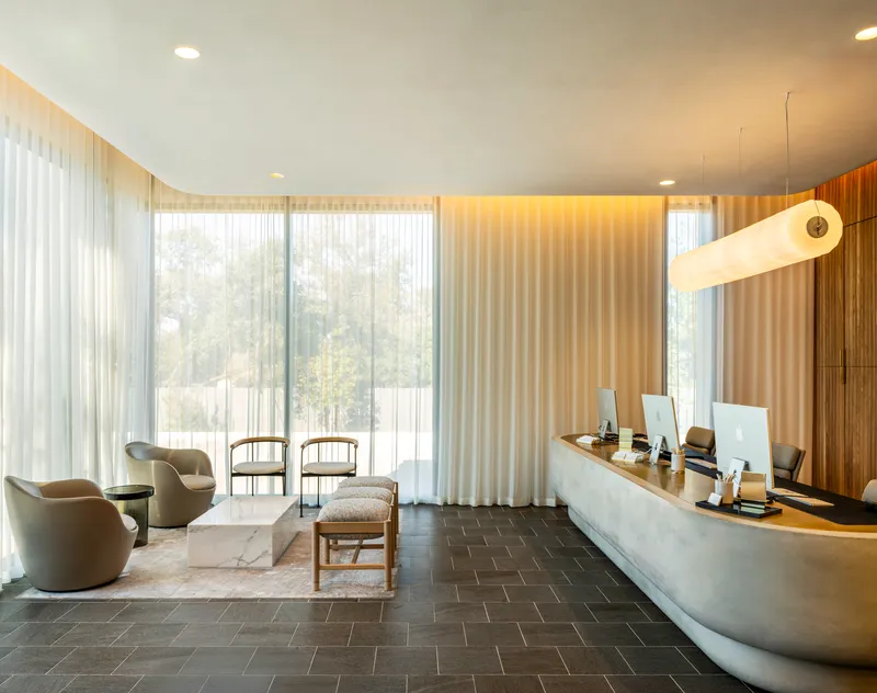
Michael Hsu Office of Architecture handled the interior design, and the contrast with the dark exterior is immediate. The reception area features a curved desk, herringbone tile flooring, and sheer curtains that soften the daylight entering through the glazed facade. A suspended pendant light provides a focal point that is elegant without being clinical. The material palette, warm wood tones set against lighter surfaces, signals comfort in a typology that often defaults to sterile white.
The collaboration between MFA's architectural envelope and Hsu's interior is well coordinated. The daylit circulation paths that lead to exam and treatment rooms are a direct consequence of the facade's window strategy: the narrow vertical slots admit controlled light that maintains comfortable levels without the glare that floor-to-ceiling glass would introduce in a Texas-facing orientation.
The Building at Dusk
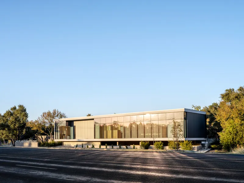
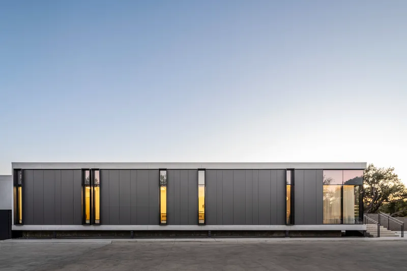
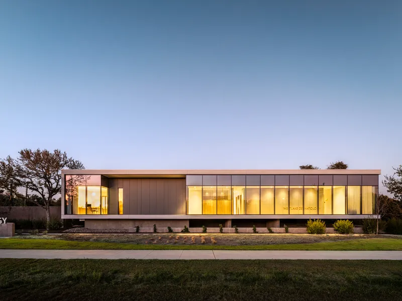
Some buildings reveal their logic most clearly after dark, and this is one of them. At twilight, the narrow vertical windows become glowing lines in the zinc skin, mapping the interior layout onto the exterior. The translucent glazed sections between the dark metal end volumes glow warmly, turning the street-facing facade into a composed rhythm of light and solid. The long roadside elevation, which during the day reads as a restrained bar, becomes a lantern-like object that announces the building's presence without signage or spectacle.
This duality, opaque by day and luminous by night, is not accidental. It is the direct result of the facade's calibrated mix of zinc, glass, and narrow slots. The architects understood that a building on a prominent road needs to perform at speed, from a car, as much as it does at the pace of a patient walking to the door.
Landscape Strategy and Stormwater
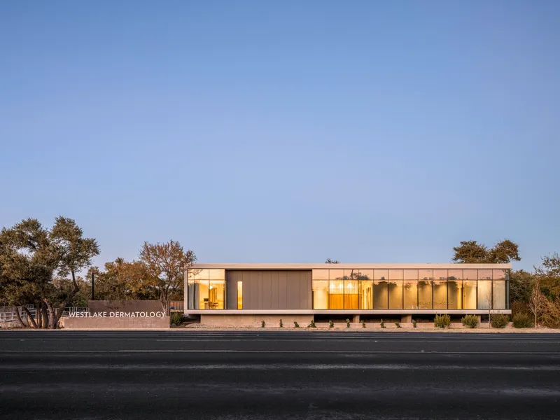
Urban Landforms, the project's landscape architect, worked with the architects to integrate on-site stormwater management and tree preservation into the overall design. The planted slope beneath the cantilevered volume is not decorative filler; it participates in the site's drainage strategy while reinforcing the visual separation between building and ground. Young native trees join the preserved oaks along the Williams Drive frontage, building a green buffer that will mature over time.
The decision to push parking behind the building is the kind of move that sounds obvious in a case study but rarely happens in suburban medical office development, where the default is a sea of asphalt facing the road. Here, the landscape buffer is the first thing you see, and the building sits behind it like a deliberate object in a curated setting.
Plans and Drawings
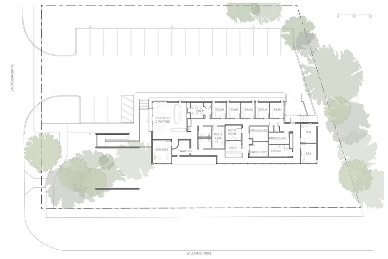
The site plan confirms the clarity of the parti. The rectangular building footprint sits at the front of the lot, with a parking grid organized behind it and trees preserved around the perimeter. The simplicity of the plan is the point: a single bar oriented to the road, with the landscape doing the work of mediating between the public realm and the parking area. There is no formal gymnastics, just a well-placed box that knows what each of its edges is doing.
Why This Project Matters
Suburban medical offices are among the most underdesigned building types in the American landscape. They default to stucco boxes with oversized signage, surrounded by parking, communicating nothing beyond their function. Westlake Dermatology Georgetown is a counter-argument. It proves that a 4,083-square-foot clinic on a commercial road can be a piece of architecture, one that engages its site, responds to its climate, and communicates a brand identity through spatial and material decisions rather than graphics.
Matt Fajkus Architecture's accomplishment here is not in inventing a new typology but in applying genuine design intelligence to a building type that rarely receives it. The facade calibration, the landscape integration, the day-to-night transformation: these are the kinds of moves that accumulate into a building worth looking at twice. For a clinic on Williams Drive in Georgetown, Texas, that is no small thing.
Westlake Dermatology Georgetown by Matt Fajkus Architecture (lead architects: Matt Fajkus, Tony Marco, Sarah Johnson, Shelby Taubenkimmel), with interior design by Michael Hsu Office of Architecture. Georgetown, Texas, United States. 4,083 square feet. Completed 2024. Photography by Leonid Furmansky.
About the Studio
Share Your Own Work on uni.xyz
If projects like this are the kind of work you want to make, uni.xyz is a place to publish your own, find collaborators, and enter design competitions.



Popular Articles
Popular articles from the community

The Earth Pod: 3D Printed Homes for Resilient Refugee Communities
The Earth Pod reimagines refugee housing through 3D printed homes made from clay, combining resilience, self-sufficiency, and rapid shelter.

The Ocean Hive: Sustainable Architecture for a Self-Sufficient Civilization at Sea
The Ocean Hive imagines sustainable architecture at sea, where modular habitats, algae, wave power and ocean waste sustain a growing colony.

Co-Life: Senior Housing Design That Reconnects Older Adults With the City
Co-Life reimagines senior housing design through healing gardens, shared streets, workshops, and a sustainable community across generations.

Co-life: Sustainable Architecture for Age-Friendly Community Living
Co-life reimagines sustainable architecture for seniors through courtyards, rammed earth, shared gardens, and spaces designed for belonging.


Similar Reads
You might also enjoy these articles

Bao Huynh Watercolor Atelier: A Serene Art Retreat in Hội An
Bao Huynh Watercolor Atelier in Hội An blends multifunctional art spaces, sustainable design, local materials, and family-friendly living in a serene environment.

Atelier Macri Concept Store Interior Design by CASE-REAL
Atelier Macri store features a "ko" counter, walnut wood details, cork displays, blending retail, gallery, and seamless customer experiences.

Manuel Vargas Izquierdo Stadium and High-Performance Sports Center: Architectural Excellence in Jalpa de Méndez
The Manuel Vargas Izquierdo Stadium blends sustainable design, inclusive sports facilities, and cultural-inspired architecture, revitalizing Jalpa de Méndez’s public spaces.
KAKR Buluh Awar Hall: Revitalizing Community and Ecology Through Bamboo Architecture
Community built bamboo hall revitalizes Buluh Awar village, empowering youth, restoring ecology, celebrating vernacular craftsmanship through sustainable architecture and culture.


Explore Architecture Competitions
Discover active competitions in this discipline



Challenge to reimagine the Iron Throne


Photograph architecture without architects


Illustrate the lost glory of Angkor Wat - Render Challenge


Design challenge to reuse E-waste
Comments (0)
Please login or sign up to add comments
No comments yet. Be the first to comment!