
Studio Tama Wraps a Pangyo Fashion Store in Chameleon Wood and Chrome
ADSB Andersson Bell's retail outpost at Hyundai Pangyo channels garment craft into a color-shifting architectural interior.


Retail fit-outs for fashion brands tend to fall into two camps: the white-box gallery that disappears behind the product, or the overdesigned spectacle that overwhelms it. Studio Tama's interior for ADSB Andersson Bell at the Hyundai Pangyo department store in South Korea refuses both options. Completed in 2024, the store treats its walls as garments in their own right, finishing wooden panels with chameleon pigments that shift color depending on where you stand. The result is a space that feels alive without screaming for attention.
What makes the project genuinely interesting is the way it borrows from fashion construction rather than simply displaying fashion within a neutral shell. Rivets, slotted metal uprights, adjustable brackets: these are the fasteners and hardware of clothing production scaled up to architecture. Studio Tama uses them not as decorative quotations but as the literal infrastructure that holds the store together, creating a legible thread between the garments on the racks and the walls behind them.
A Storefront That Sets the Tone
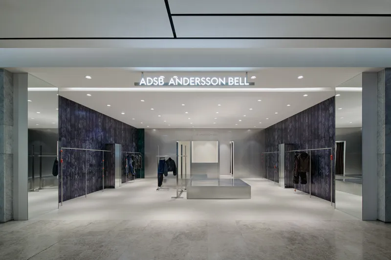
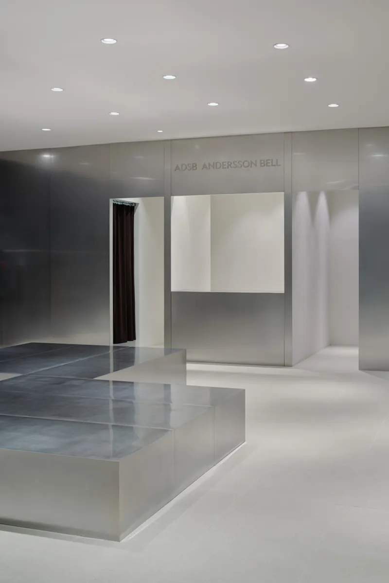
The entrance plays it cool. Metal panels line the front elevation, establishing a rhythm that reads as deliberate restraint. A central mirrored volume sits between dark wood-paneled flanks, pulling the eye inward and compressing the threshold into a moment of transition. Recessed ceiling lights wash the surfaces evenly, keeping the mood low and precise.
Step past the threshold and the corridor narrows. White walls and grey concrete flooring set up a neutral decompression zone before the store's material palette reveals itself. It is a classic retail sequencing trick, controlling anticipation, but Studio Tama executes it with a restraint that gives the deeper spaces real payoff.
Chameleon Panels and Color That Breathes
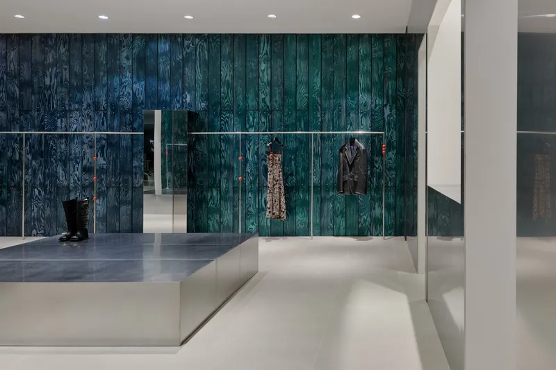
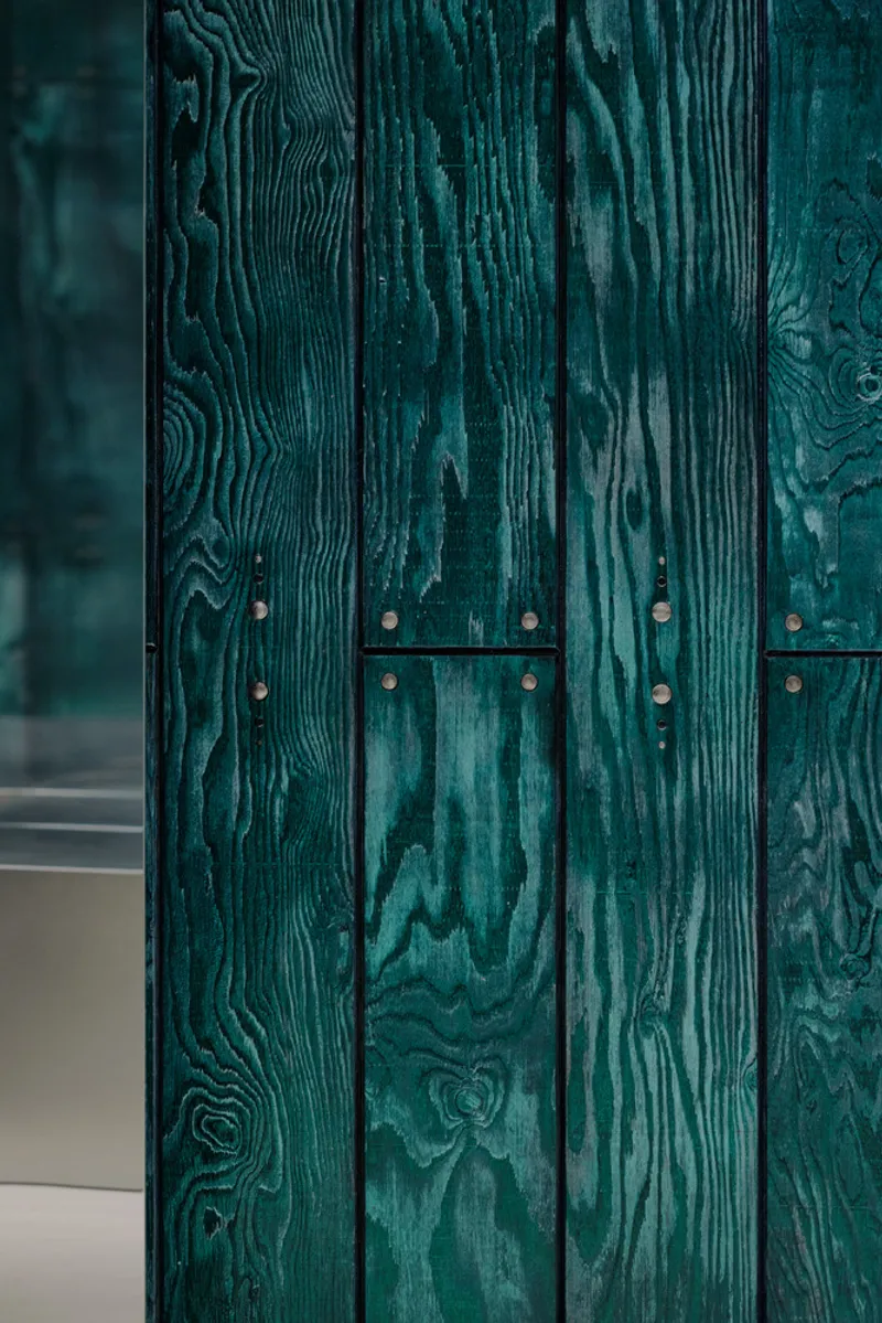
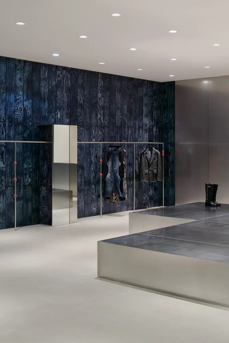
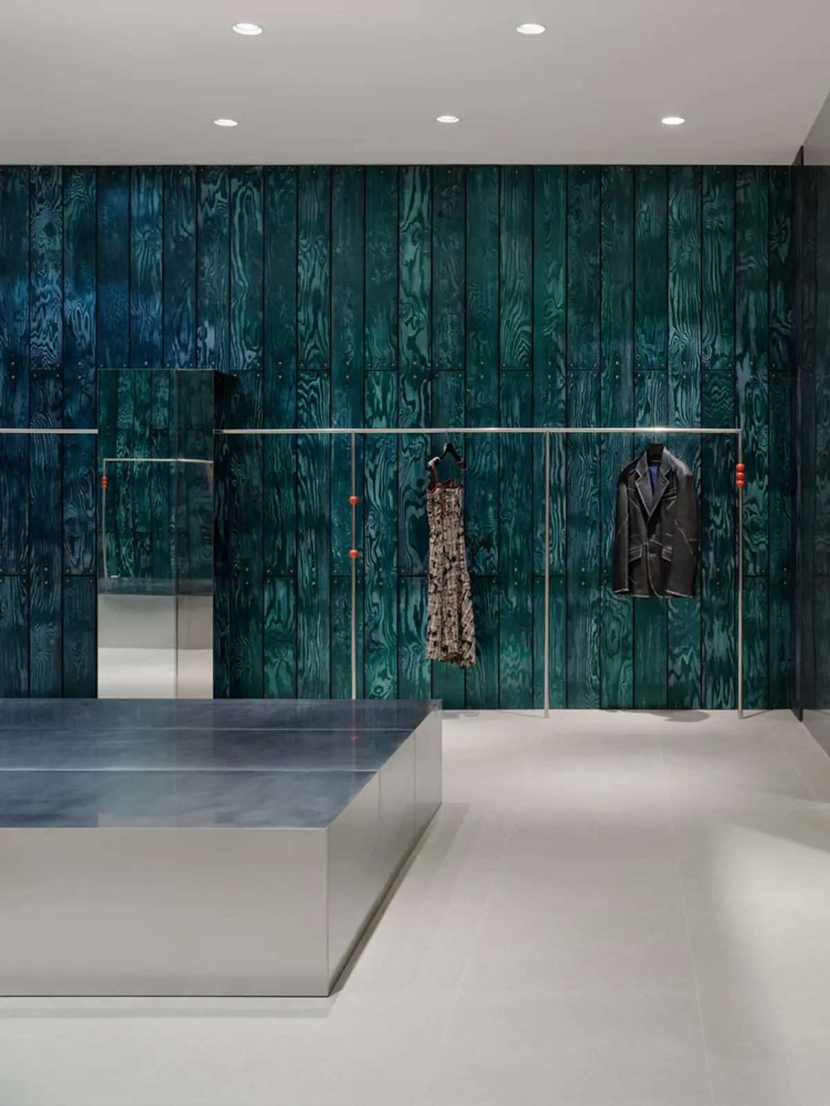
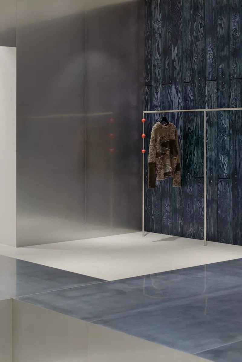
The defining material move is the wooden plywood treated with chameleon pigments. Depending on the angle and ambient light, these panels oscillate between deep teal and a charred blue-brown, lending the walls a quality that feels closer to iridescent fabric than to timber cladding. The wood grain remains visible through the treatment, grounding the effect in something tactile and natural rather than purely synthetic.
Studio Tama lines both sides of the store with these panels, but varies the intensity. Some zones appear almost charred, while others lean into that vivid teal register. The gradient is not painted on; it emerges from the pigment's interaction with light. The effect is subtle enough that most visitors will feel it before they consciously register it, which is precisely the kind of atmospheric design that retail spaces need more of.
Chrome Hardware as Display System and Ornament
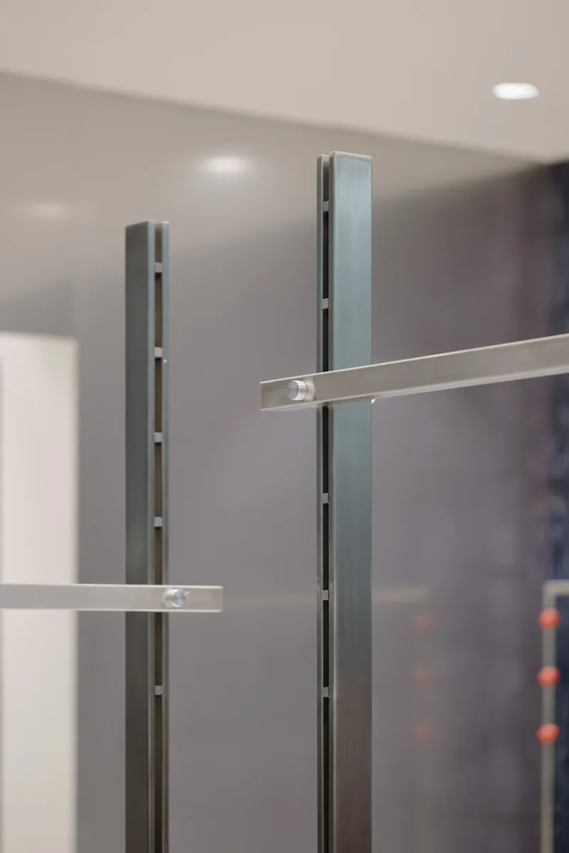
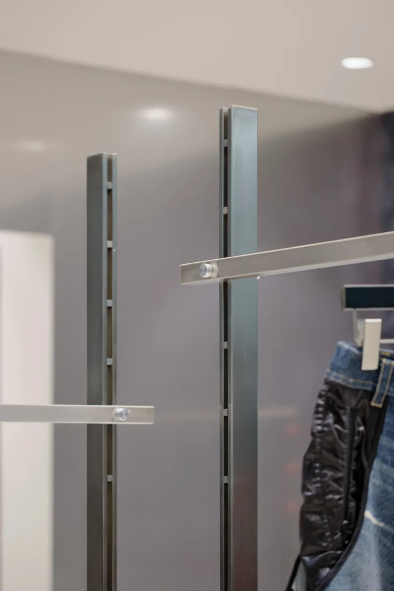
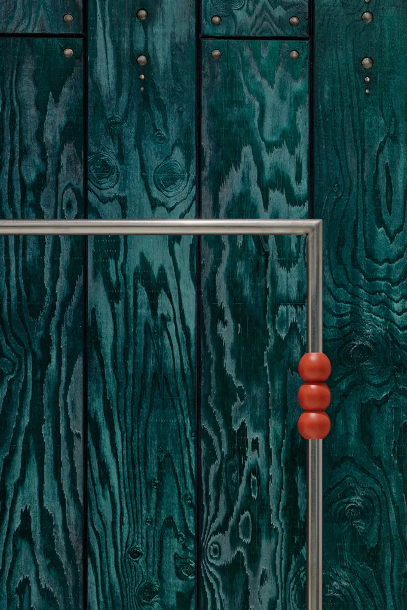
The display infrastructure does double duty. Slotted metal uprights with adjustable horizontal brackets form a modular system that can be reconfigured as collections rotate. The hardware is exposed and celebrated: bolt holes, slot perforations, and chrome rails read as honest industrial elements rather than things to be hidden behind drywall.
Punctuating the chrome framework are orange spherical knobs, small bursts of color that function as endcaps and visual accents. They are playful without being juvenile, referencing the kind of hardware details you might find on a vintage garment or a piece of studio equipment. Against the teal panels, the orange registers as a deliberate complementary contrast, proof that the color strategy here extends well beyond the walls.
Garments and Objects in a Curated Field
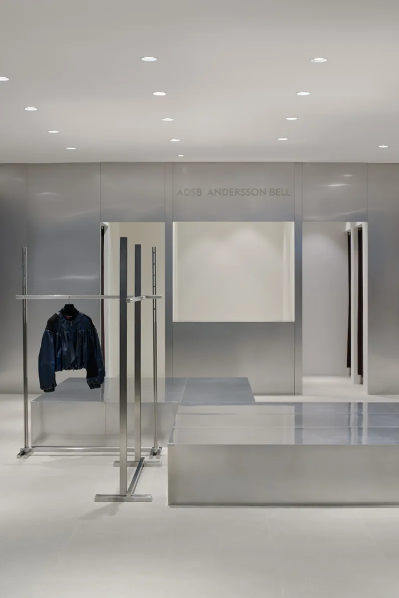
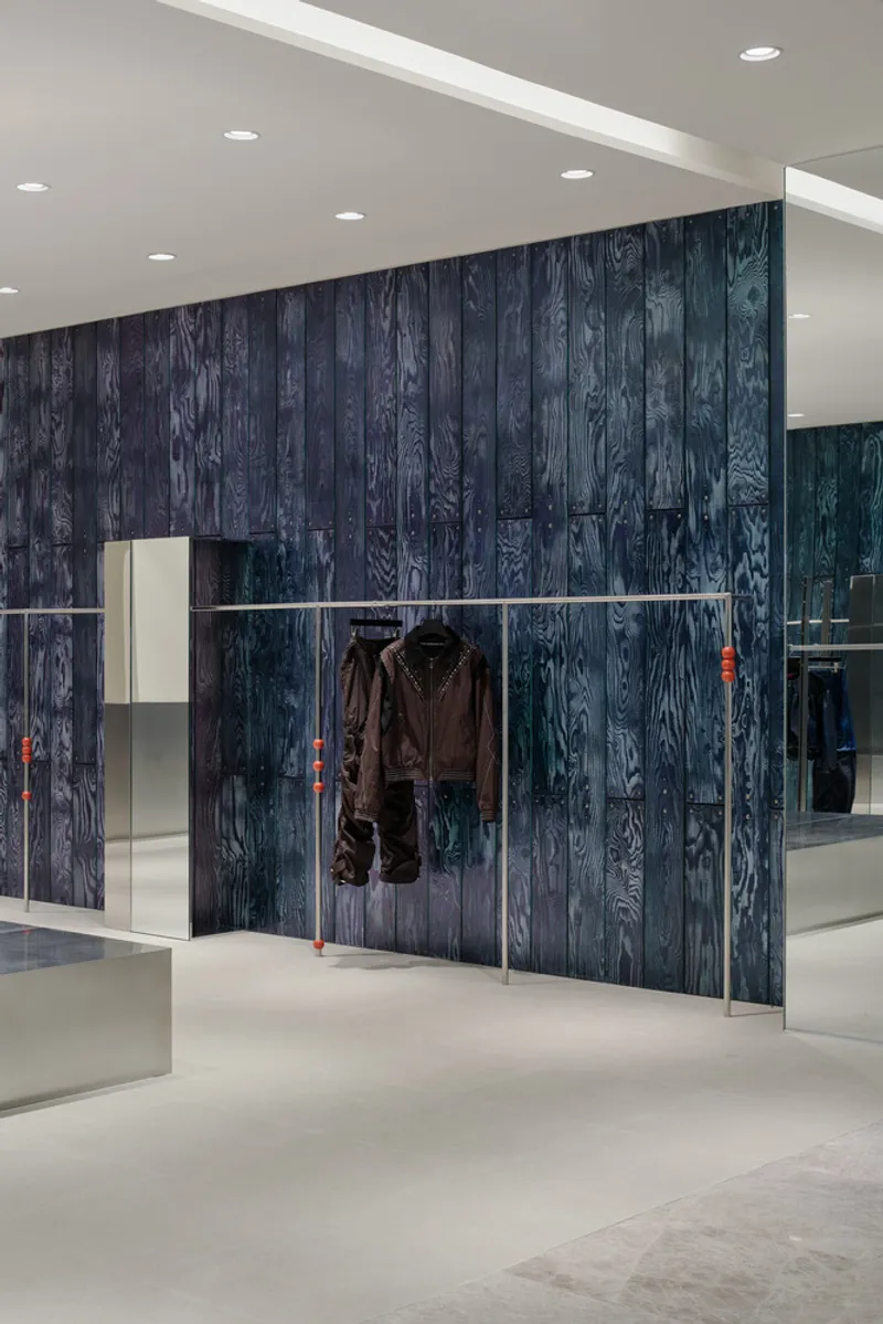
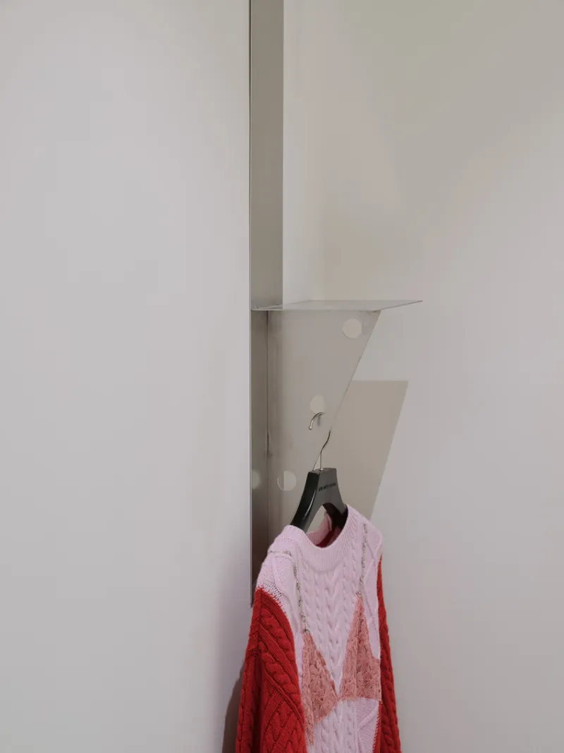
The store resists the density that plagues most fashion retail. Individual jackets hang from freestanding chrome racks or single wall-mounted rails, given breathing room against translucent glass partitions and dark paneled backdrops. A knitted garment in pink and red suspended from a brass hook against a white wall corner could pass for a gallery installation. Studio Tama clearly understands that fewer pieces on display means each one carries more visual weight.
Accessories get similar treatment. A sculptural handbag placed on a white platform beside a translucent partition reads as an object in an exhibition rather than merchandise on a shelf. The lighting, all recessed downlights with no decorative fixtures, reinforces this gallery-like discipline.
Translucent Layers and Mirror Walls
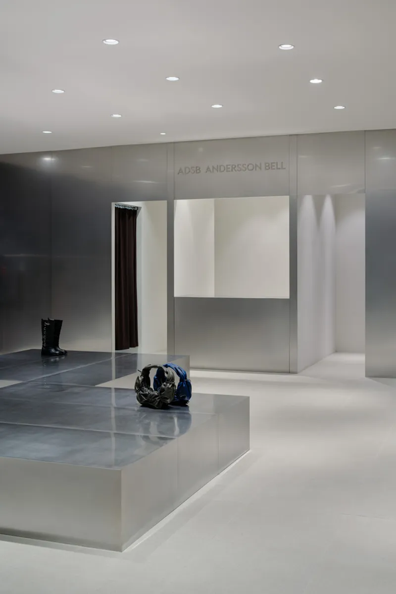
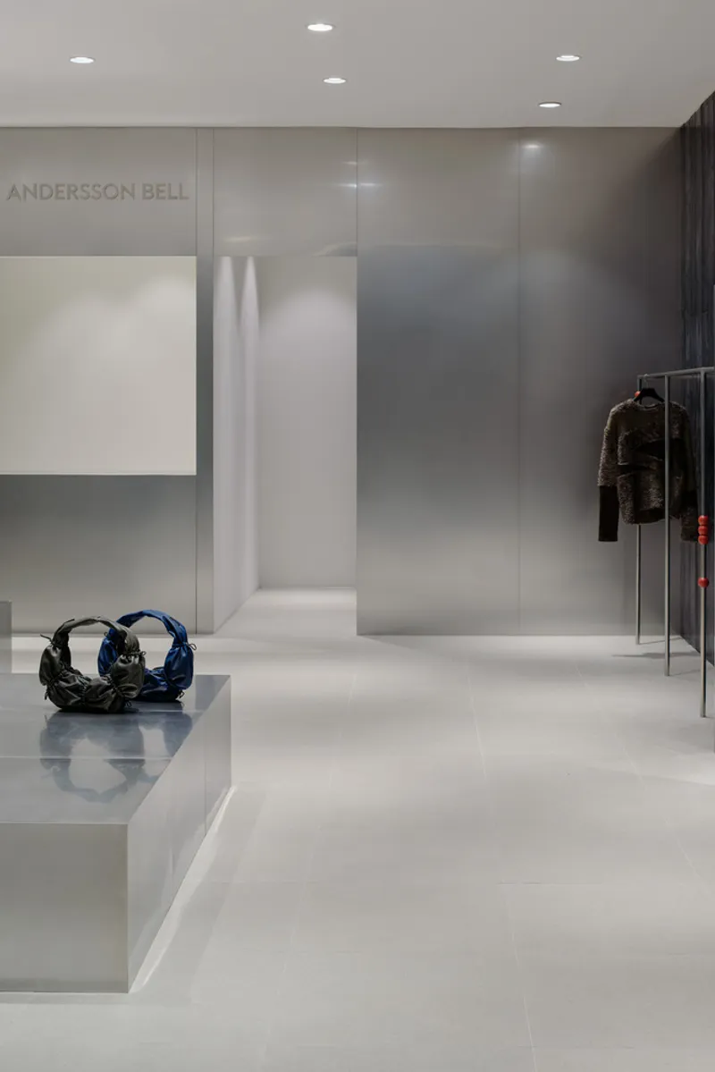
Layered glass partitions introduce depth without division. They allow sightlines to pass through the store while softening the view of adjacent zones, creating a visual texture that changes as you move. Where the translucent panels meet the dark wood paneling, the material contrast becomes especially charged: opacity against transparency, warmth against coolness.
Mirror surfaces, particularly in and around the fitting areas, amplify the chameleon panels' color-shifting effect. Polished metal mirrors sit alongside traditional reflective glass, slightly distorting and multiplying the iridescent surfaces. The spatial impression is one of expansion well beyond the store's actual footprint.
The Dressing Area and Material Joints
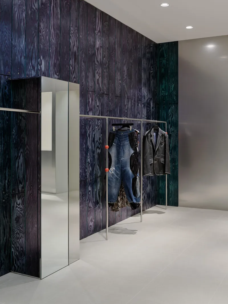
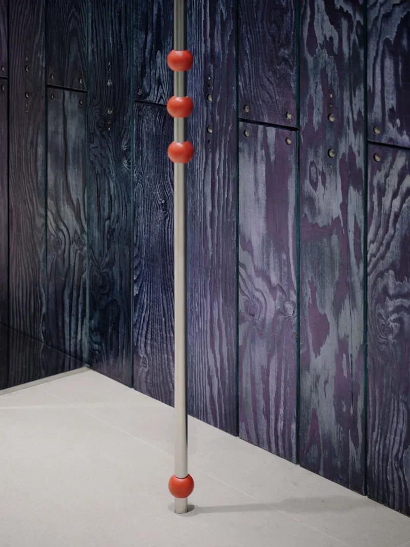
The dressing area continues the material logic rather than breaking from it. Dark woodgrain panels wrap the fitting rooms, with freestanding chrome racks standing in for conventional hooks. Floor-to-ceiling chrome poles accented with the same orange spherical details tie the zone back to the display areas.
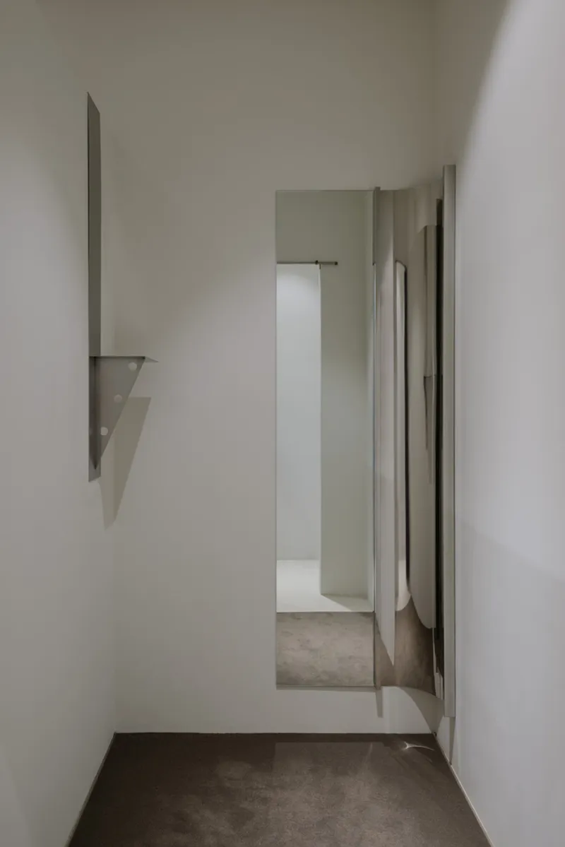
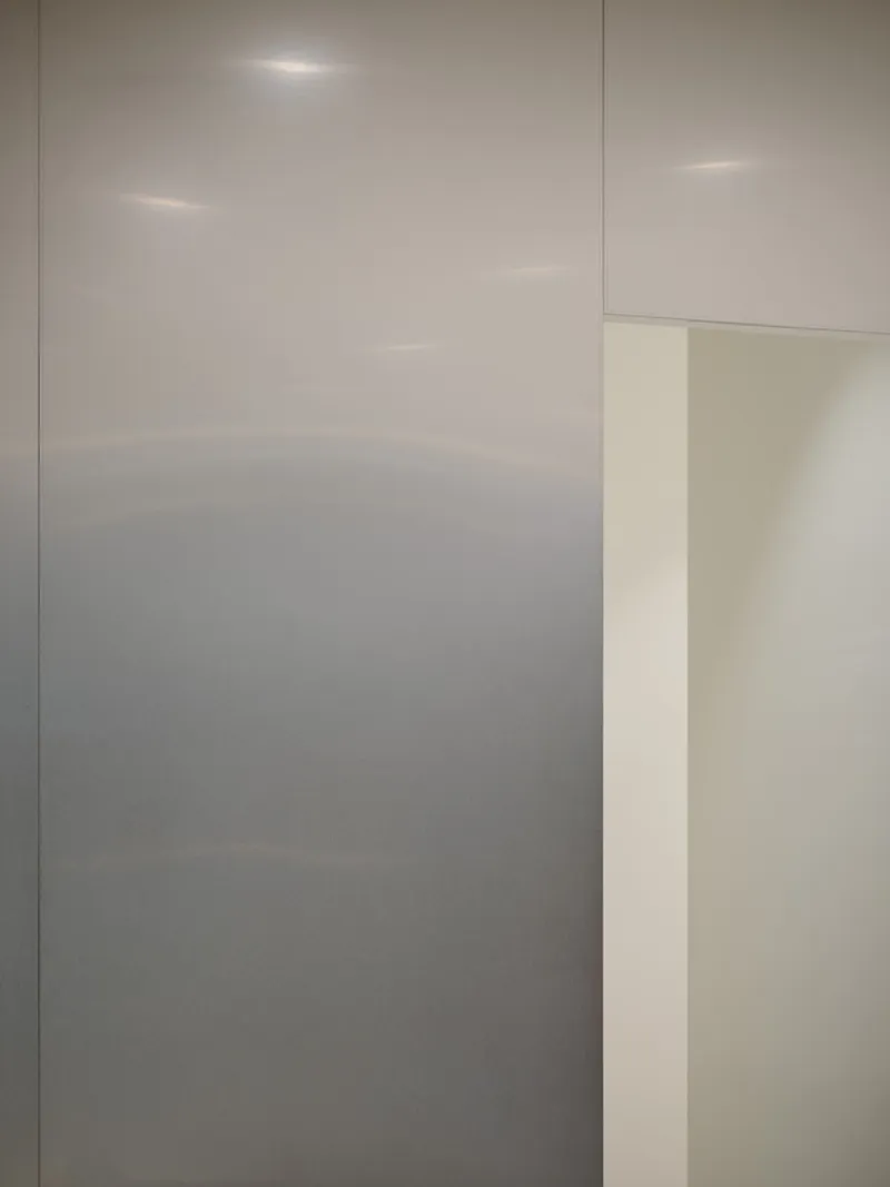
Corners and joints are handled with care. An illuminated white wall corner where two panels meet becomes a small moment of light architecture, while a folded metal bracket protruding from a wall junction exposes the construction logic. These are not details that most shoppers will photograph, but they accumulate into a sense of rigor that separates the project from the typical department-store concession.
Detail Closeups
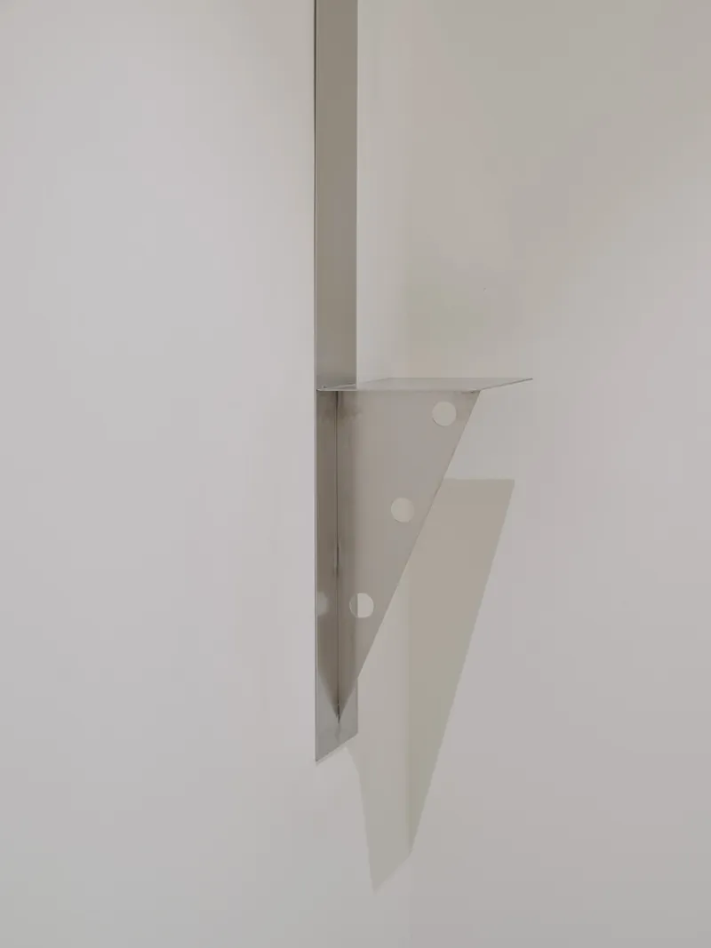
A folded metal bracket with bolt holes, a corner washed in light: Studio Tama treats every junction as a design opportunity. The bolt holes are not cosmetic; they indicate a system designed for disassembly and reconfiguration, an intelligent approach for a retail interior that will likely evolve as the brand's collections change seasonally.
Plans and Drawings
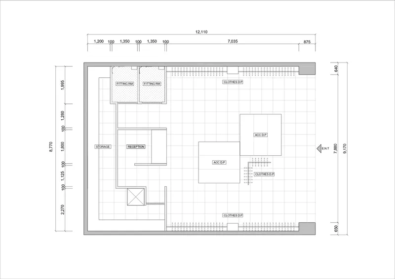
The floor plan reveals a compact but carefully zoned layout. A reception area anchors the entrance, with storage rooms clustered at the back to maximize the public-facing display area. Clothing zones are distributed along both long walls, with the central axis left relatively open to allow cross-views and circulation. The plan confirms what the photographs suggest: this is a space where every square meter earns its keep.
Why This Project Matters
Department-store concessions are usually treated as ephemeral, disposable shells that exist only to frame product. Studio Tama's work for Andersson Bell pushes back against that assumption by investing real material intelligence into a space that could easily have been generic. The chameleon pigment treatment on wood is not a gimmick; it is a considered response to the challenge of making a small retail interior feel dynamic without relying on digital screens or constant visual noise.
More broadly, the project demonstrates that fashion retail can draw from the techniques of its own discipline, borrowing hardware, fastening logic, and textile thinking, without descending into theme-park literalism. The garment and the space share a construction language here, and neither one overwhelms the other. That balance is harder to achieve than it looks, and it is the reason this compact store deserves attention beyond its immediate commercial context.
ADSB Andersson Bell Hyundai Pangyo Store by Studio Tama. Pangyo, South Korea. Completed 2024. Photography by Donggyu Kim.
About the Studio
Share Your Own Work on uni.xyz
If projects like this are the kind of work you want to make, uni.xyz is a place to publish your own, find collaborators, and enter design competitions.


Popular Articles
Popular articles from the community

Tsunami Convergenics: Turning Catastrophic Ocean Forces into Underwater Housing Infrastructure
A speculative underwater settlement off the coast of Onagawa, Japan, treats tsunamis and typhoons as energy sources rather than threats.

Temporary Home for Dogs: A Reversed Zoo Rethinks Animal Shelter Architecture
In Bucharest, a sinuous corridor and freed landscape flip the logic of containment, designing a shelter that works to make itself unnecessary.

The Amber Palace Opera: A Geological Fiction Surfaces on Tallinn's Baltic Waterfront
Pierre Brillard reimagines a Baltic legend as a public landscape, opera house, and waterfront promenade rooted in Tallinn's coastal identity.

Cloaked Colonization: A Mobile Underwater Habitat That Moves Like a Fish
Micah Abaya's shortlisted EHC Pacific entry reimagines ocean settlement as a dispersed network of self-sustaining architectural organisms.

Similar Reads
You might also enjoy these articles


Hodi-Mandai Geram
Project Function: Preservation and revitalization of the Intangible heritage and socio-spatial identity of the Hodi by Housing, Cultural Memory Center, Sacred Grove, landscape, local tourism economy

Olio Towers: A Mid-Rise for Performers That Fuses Housing, Rehearsal, and Stage
Located blocks from Houston's Theater District, this modular tower stacks living units around a central performance atrium.

Oasis: Modular Green Housing Carved into Dhaka's Urban Fabric
A shortlisted Plugin Housing entry reclaims unauthorized settlements in Dhaka with stepped concrete volumes, green roofs, and ventilation-driven design.

Black Hole: A Floating Megastructure for the Post-Physical Era
Emiliano Mazzarotto envisions a spherical, self-scaling arena where e-sports, digital hotels, and holographic stadiums replace traditional public space.

Explore Retail of Tomorrow Competitions
Discover active competitions in this discipline

Challenge to reimagine the Iron Throne

Photograph architecture without architects

Illustrate the lost glory of Angkor Wat - Render Challenge

Design challenge to reuse E-waste
Comments (0)
Please login or sign up to add comments
No comments yet. Be the first to comment!