
Office Winhov Revives a 1967 Arthur Staal Insurance Bank as a Refined Amsterdam Office
On Frederiksplein, a mid-century landmark gets a new facade and an interior that channels the optimism of its original era.


Amsterdam's Frederiksplein is a square that collects eras: canal-ring townhouses, postwar infill, and the occasional building that managed to age with some dignity. Frederiksplein 1 belongs to the last category. Designed in 1967 by the modernist architect Arthur Staal, the former insurance bank occupied a tricky site where the deep lots facing the square meet the narrow parcels of Utrechtsestraat. Office Winhov, led by Uri Gilad and Rick Bruggink, took on the renovation between 2018 and 2022, replacing the facade to meet contemporary sustainability standards while restoring the interior character that half a century of alterations had eroded.
What makes this project worth attention is less a single bold gesture than a careful act of architectural archaeology. Rather than imposing a new identity, Office Winhov used Staal's original building as a design brief: the rhythm of oak wall panels maps onto the structural grid and facade bays, the travertine staircase echoes Staal's material palette, and the furniture references a specifically 1960s sensibility with pieces by Eero Saarinen, Charles and Ray Eames, and Verner Panton. The result is a 4,130 m² office that feels historically grounded without drifting into pastiche.
Two Faces on One Corner
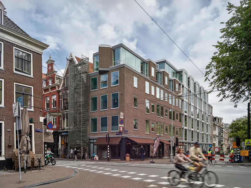

The building reads as two volumes: a deeper block with aluminium-framed bays facing the open square and a smaller corner volume clad in brick that turns the corner onto Utrechtsestraat. This duality is not an invention of the renovation; it traces the original parcellation, which the city aesthetics committee once insisted should follow the outlines of two demolished historical buildings. Office Winhov honored that logic while replacing the entire facade assembly. The new skin alternates bands of pale brick and glazed panels, a pattern that mediates between the residential scale of the canal ring and the civic scale of the square.
From street level, with cyclists streaming past and trees framing the upper stories, the building does not announce itself. That restraint is deliberate: Frederiksplein already has enough competing voices. Here, the facade is calibrated to be a good neighbor.
Oak Walls and a Structural Rhythm


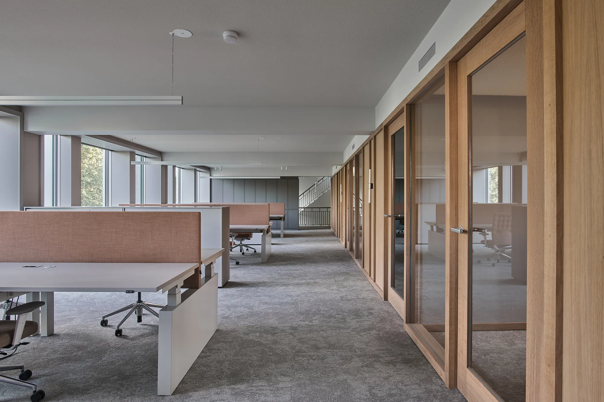
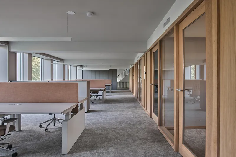
Inside, the design strategy is almost musical. Oak walls, alternating between open and closed panels, run through the office floors in a rhythm that directly corresponds to the building's structural grid and the bays of the new facade. Doors and cupboards are integrated into this oak language, so storage and circulation disappear into the same material system. The effect is a continuous, warm lining that disguises the relatively low ceiling heights and gives each floor a sense of coherence.
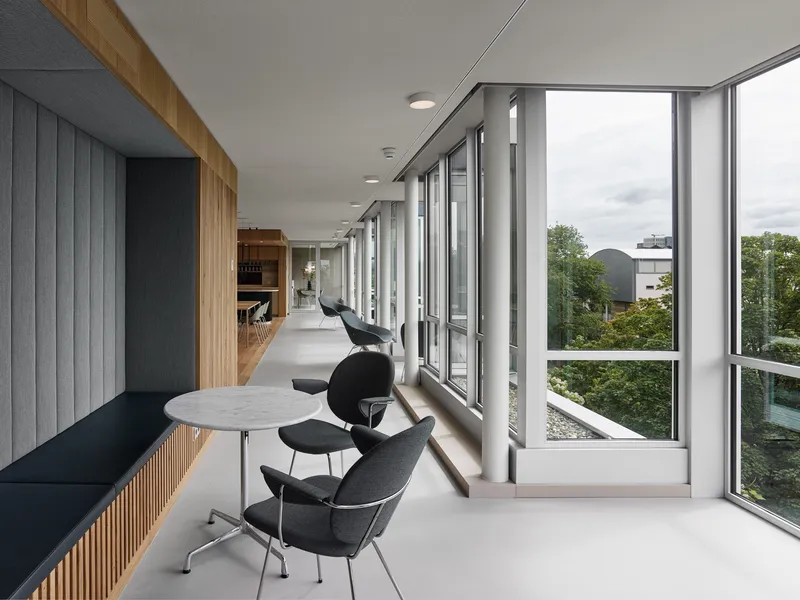
The timber-slatted booths and banquette seating along the corridor offer a quieter counterpoint to the open plan. These semi-enclosed nooks, bathed in lateral light from the full-height glazing, borrow from the atmosphere of a well-kept European dining car. It is the kind of workplace detail that earns loyalty from the people who actually sit there every day.
The Top Floor Restaurant
The top floor houses an office restaurant positioned beneath Arthur Staal's expressive roof finish, one of the few original features that survived the decades intact. Here the sloped ceiling becomes a protagonist, its timber paneling creating a canopy over communal tables and workstations. Floor-to-ceiling windows open onto treetop views that make the dense urban context below feel remote.
Office Winhov resisted the temptation to add a rooftop pavilion or skylight insertion. Instead, they let Staal's ceiling geometry do the work. The central island with its dark fluted panels and bar seating reads as new furniture placed inside an inherited room, a relationship between old envelope and new use that feels genuinely respectful rather than merely polite.
Travertine Staircase as Connective Spine
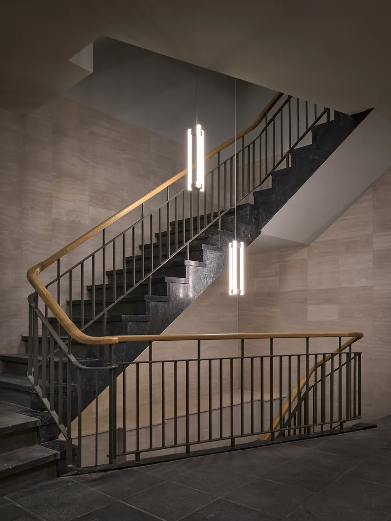
The vertical structure of shafts was chosen to enhance the sense of space on floors where ceiling heights are modest. The staircase, with its dark terrazzo treads, metal railings, and tubular pendant lights, serves as both circulation and spectacle. Travertine, a material Staal himself used, reappears here and on the upper level, binding the renovation to the building's original material DNA.
It is a generous stair, the kind that encourages people to walk rather than wait for the elevator. The pendant lights drop through the double-height void like plumb lines, giving the space a vertical emphasis that counters the horizontal repetition of the office floors above and below.
A Transparent Core and Open Network
The floor plan follows a simple logic: a transparent central core surrounded by an open network of meeting rooms and workstations. Timber-framed glass partitions subdivide the floor without interrupting sightlines or natural light. Ground-level shops occupy the street frontage, keeping the building engaged with the public realm even as the upper stories serve a single tenant.
The choice of a seamless acoustic climate ceiling, Forbo cement-bound cast floors, and Desso carpet creates a layered system of comfort that is felt rather than seen. Office Winhov clearly understood that in a renovation of this size, the invisible technical upgrades (acoustic control, thermal performance, facade sustainability) matter as much as the visible material choices.
Plans and Drawings


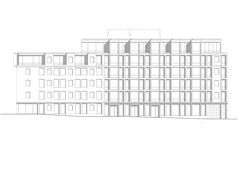


The site plan reveals the building's L-shaped footprint wedged between the open geometry of Frederiksplein and the tight grain of Utrechtsestraat. Floor plans show the progression from commercial ground floor to office levels with rows of workstations, meeting clusters, and, on the upper floor, more generous residential-scaled spaces with kitchen, dining, and terrace areas. Sections cut through five levels and a central stairwell, exposing the repetitive structural bays that give the building its rhythm.
The axonometric sequence is particularly revealing. Four parallel volumes with sawtooth window openings define the deep floor plates; a detached rooftop addition sits above; and the interior partition drawings expose how the room layout weaves through the structural grid. The final axonometric, with its linear building and repetitive room modules flanking a central circulation spine, is almost a diagram of the design philosophy: respect the bones, then furnish with precision.
Why This Project Matters
Postwar office buildings rarely receive the kind of affectionate renovation that prewar landmarks enjoy. They are too recent to be romantic, too old to be efficient, and usually too generic to inspire preservation campaigns. Frederiksplein 1 pushes back against that indifference. By treating Arthur Staal's 1967 design as a source of inspiration rather than an obstacle, Office Winhov demonstrates that mid-century commercial architecture can be upgraded without being gutted. The oak rhythms, the travertine stair, the 1960s furniture references: these are not nostalgic gestures but design decisions that anchor the building in a specific cultural moment.
For Amsterdam, a city increasingly under pressure to densify and modernize its office stock, this renovation suggests a third option between demolition and preservation-as-museum. You can replace the facade, rewire the systems, and still let the original architect have the last word on proportions and materials. That takes confidence, restraint, and a genuine respect for the building you are working inside. Office Winhov has all three.
Frederiksplein 1 Offices by Office Winhov (lead architects Uri Gilad and Rick Bruggink). Amsterdam, The Netherlands. 4,130 m². Completed 2022. Photography by Stefan Müller and Max Hart Nibbrig.
About the Studio
Share Your Own Work on uni.xyz
If projects like this are the kind of work you want to make, uni.xyz is a place to publish your own, find collaborators, and enter design competitions.



Popular Articles
Popular articles from the community

Hill & Cross Opera: Sculptural Opera House Architecture Shaped by Tallinn’s Landscape and Identity
Hill & Cross Opera reimagines opera house architecture in Tallinn through its sculptural hill, civic plaza, glass wave and a luminous cross.
Riyadh For All: Intergenerational Urban Design for Active Aging in Rabat
Riyadh For All reimagines urban design in Rabat with intergenerational co-living, adaptive courtyards, and Moroccan cultural exchange today.

Co-Life: Senior Housing Design That Reconnects Older Adults With the City
Co-Life reimagines senior housing design through healing gardens, shared streets, workshops, and a sustainable community across generations.
EW PARK: Sustainable Architecture Reimagines the Future of Urban Parking
EW PARK reimagines city parking as a modular wooden tower combining automation, solar energy, electric mobility, and adaptable urban design.


Similar Reads
You might also enjoy these articles

Bao Huynh Watercolor Atelier: A Serene Art Retreat in Hội An
Bao Huynh Watercolor Atelier in Hội An blends multifunctional art spaces, sustainable design, local materials, and family-friendly living in a serene environment.

Atelier Macri Concept Store Interior Design by CASE-REAL
Atelier Macri store features a "ko" counter, walnut wood details, cork displays, blending retail, gallery, and seamless customer experiences.

Manuel Vargas Izquierdo Stadium and High-Performance Sports Center: Architectural Excellence in Jalpa de Méndez
The Manuel Vargas Izquierdo Stadium blends sustainable design, inclusive sports facilities, and cultural-inspired architecture, revitalizing Jalpa de Méndez’s public spaces.
KAKR Buluh Awar Hall: Revitalizing Community and Ecology Through Bamboo Architecture
Community built bamboo hall revitalizes Buluh Awar village, empowering youth, restoring ecology, celebrating vernacular craftsmanship through sustainable architecture and culture.


Explore Office Building Competitions
Discover active competitions in this discipline



Challenge to reimagine the Iron Throne


Photograph architecture without architects


Illustrate the lost glory of Angkor Wat - Render Challenge


Design challenge to reuse E-waste
Comments (0)
Please login or sign up to add comments
No comments yet. Be the first to comment!