
A Brick Residence That Treats Density as a Design Tool
CVDB arquitectos wraps 7,100 square meters of student housing around a courtyard in Lisbon, proving that high density and generous living can coexist.
Student housing rarely gets to be architecture with a capital A. Budgets are tight, programs are repetitive, and the pressure to maximize beds per square meter tends to flatten every spatial ambition into a corridor-and-cell diagram. The Ventura Terra University Residence for the University of Lisbon, designed by CVDB arquitectos, accepts that density head on and turns it into a generative constraint. At 7,100 square meters near the Lisbon waterfront, the building packs a significant number of residential units into a compact block, yet it feels more like a small urban quarter than a dormitory.
What makes the project genuinely interesting is how it layers several distinct architectural systems, a buff brick envelope with staggered openings, color-coded timber stairwells, cork and concrete interiors, and a sinuous red rooftop volume, into a single coherent building that never reads as monotonous. Every floor, every corridor, every stairwell has its own chromatic identity, which is not decoration but wayfinding raised to the level of spatial experience. Cristina Veríssimo and Diogo Burnay have designed a building that students can actually navigate by instinct rather than signage.
The Brick Envelope: Pattern Without Repetition
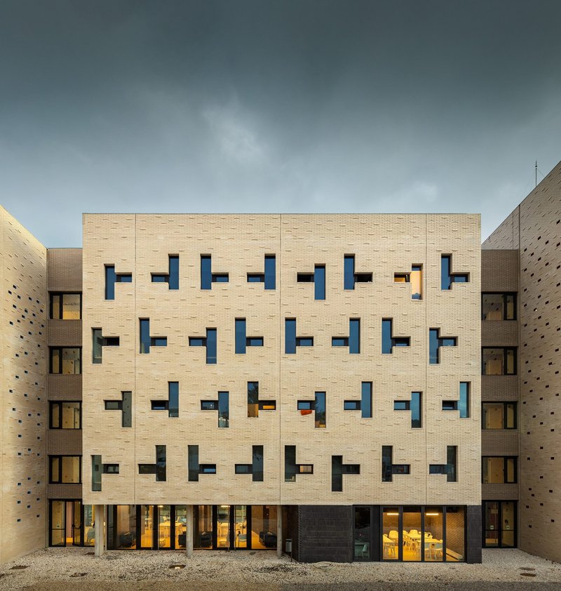
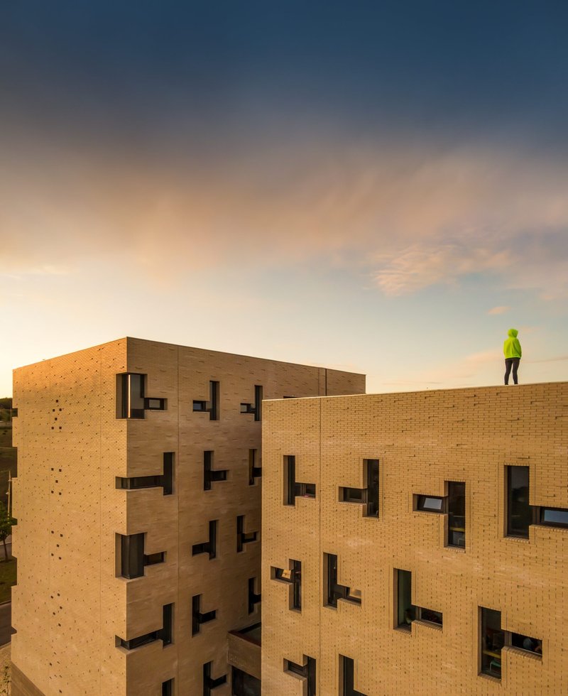
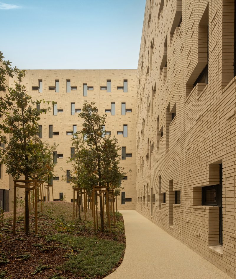
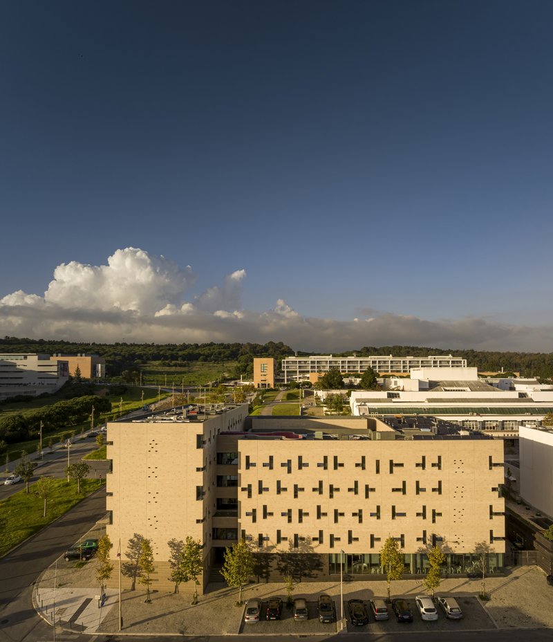
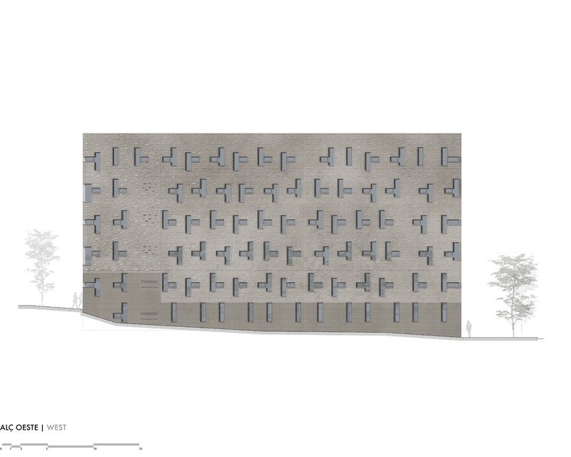
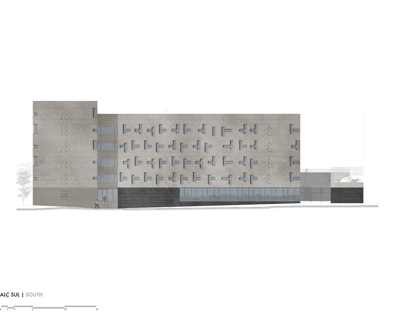
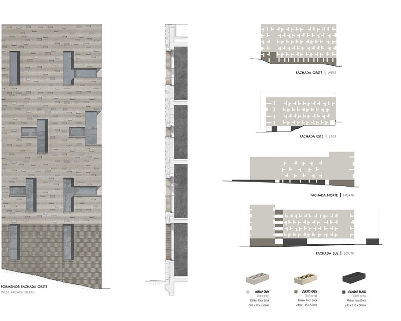
The buff brick facade is the building's most immediately legible move. Window openings are staggered across the surface with an irregular rhythm that avoids the barracks-like repetition typical of institutional housing. Some windows project slightly, others are recessed, and the resulting texture gives the wall a depth that changes character throughout the day as light rakes across it.
The brick itself is warm and pale, well suited to Lisbon's strong sunlight and the surrounding neighborhood's material palette. Rather than a curtain wall or rendered surface, the masonry gives the building a sense of permanence and craft. From a distance, the pattern reads almost as woven fabric. Up close, the dimensional play of the openings becomes clear. It is a single material strategy doing a lot of work: thermal mass, visual interest, durability, and urban presence.
Courtyard as Commons
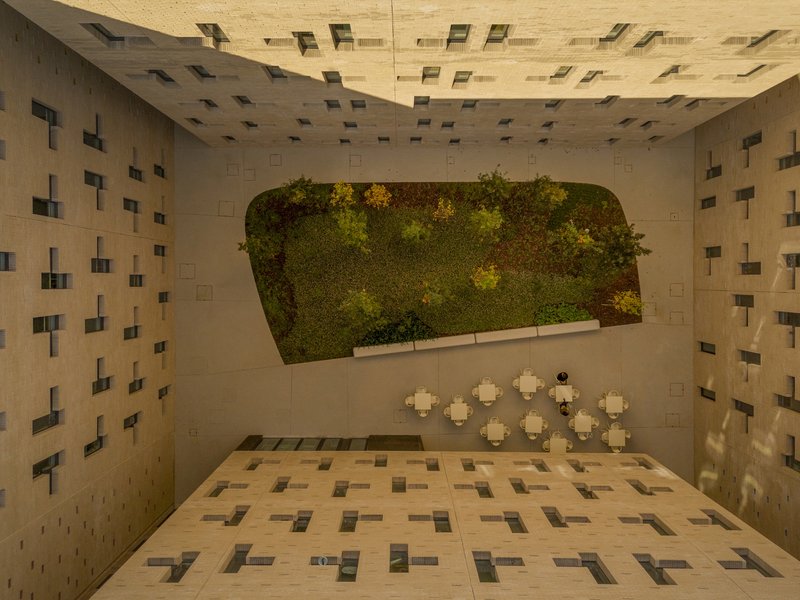
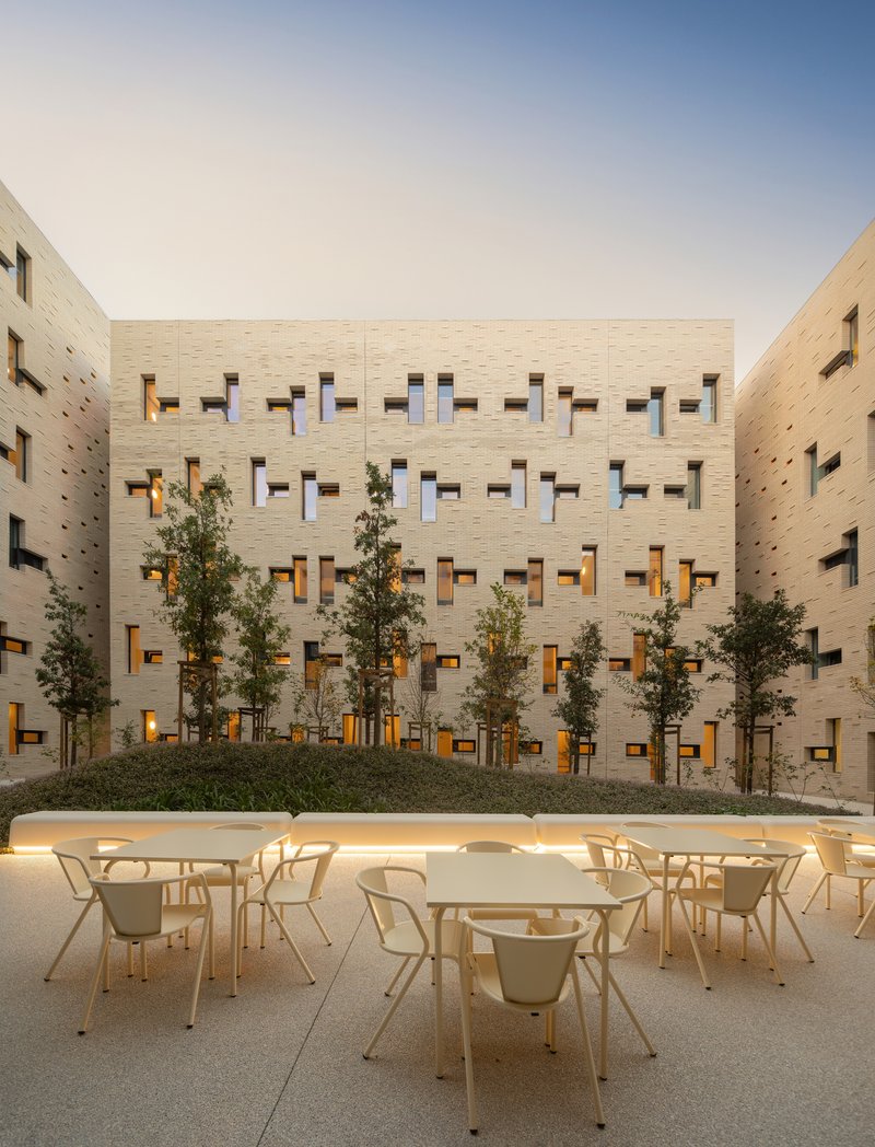
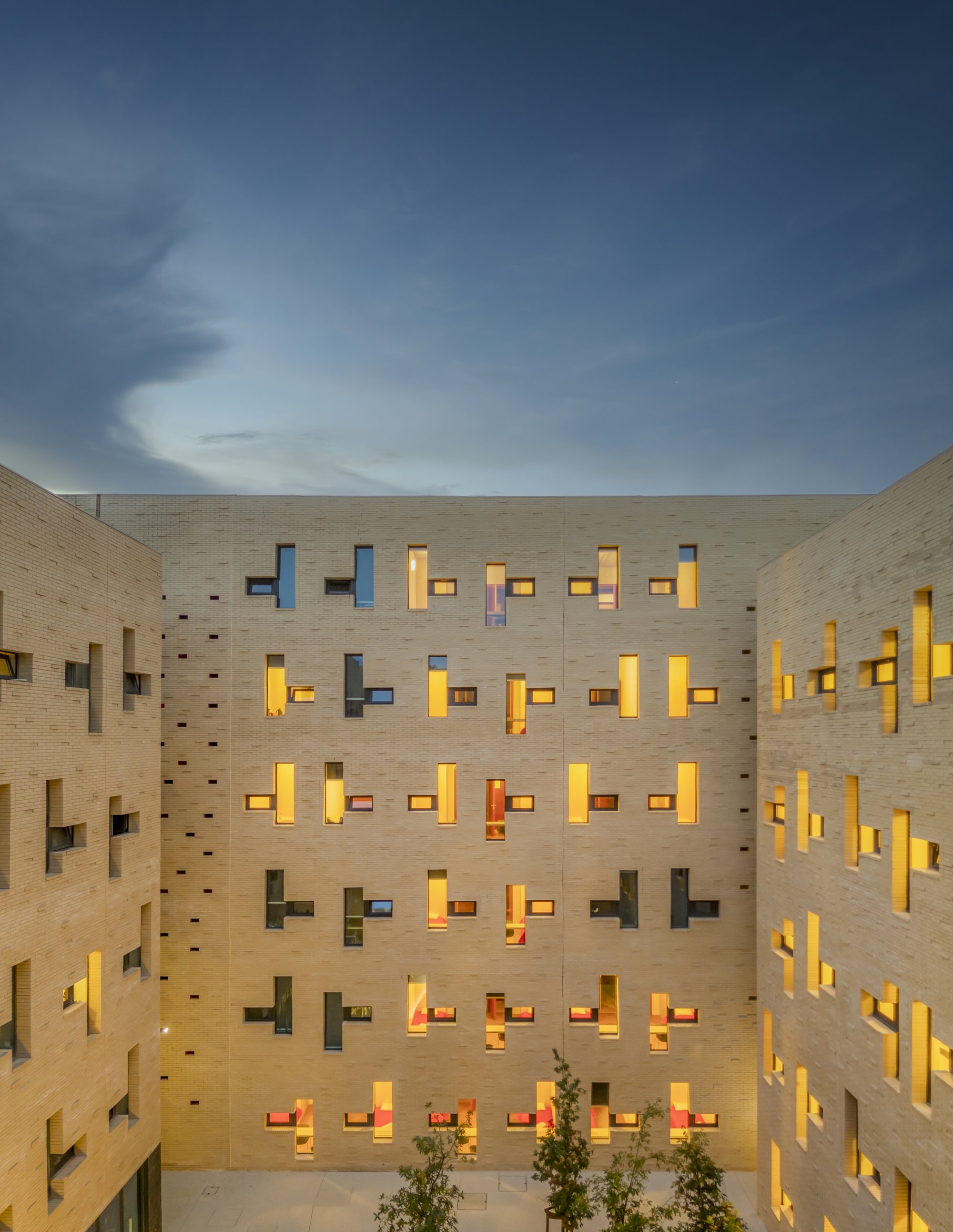
The building wraps around a central courtyard, a typological decision that is as old as Mediterranean architecture itself but rarely deployed this effectively in student housing. The courtyard serves as shared ground: a place to eat, study outdoors, or simply sit under young trees that will, within a few years, turn this space into a genuine garden. A vegetated wall adds green surface area without consuming floor space, and the patterned paving gives the ground plane a design presence that matches the facades above.
From the aerial view, the courtyard reads as a void punched into a solid block, which is precisely the point. It pulls daylight and ventilation deep into the plan, ensuring that corridors and communal spaces along the perimeter receive natural light from both sides. This is density done right: the building achieves its required program not by eliminating shared space but by organizing everything around it.
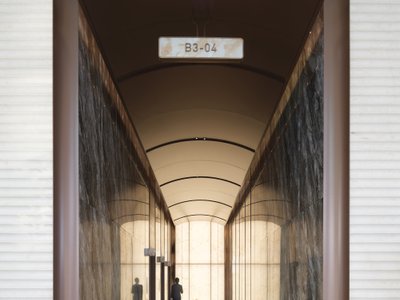
Color as Navigation
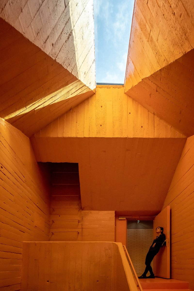
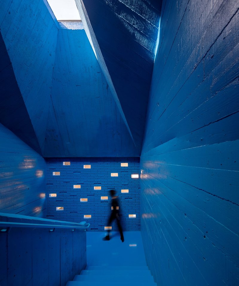
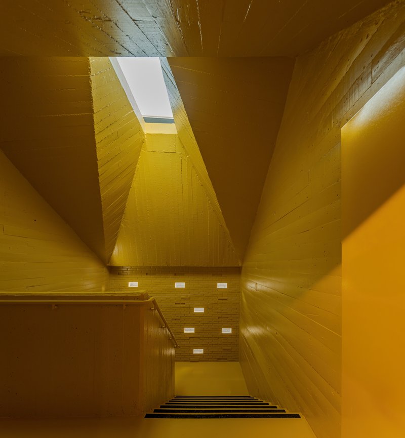
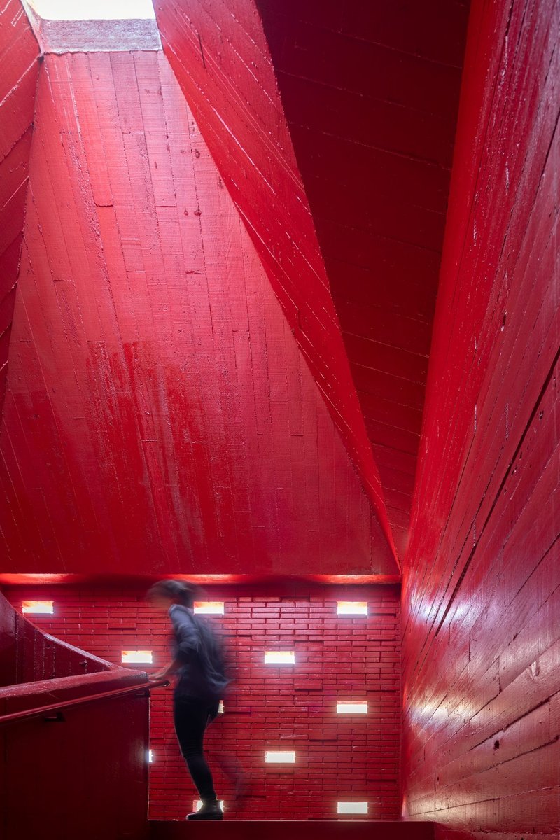
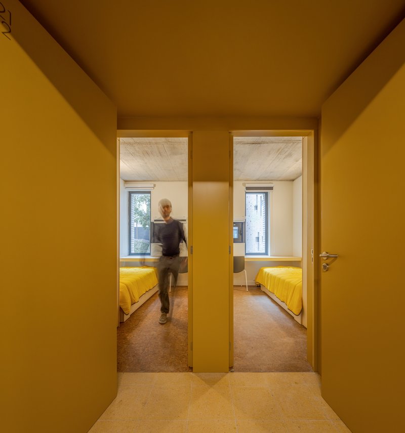
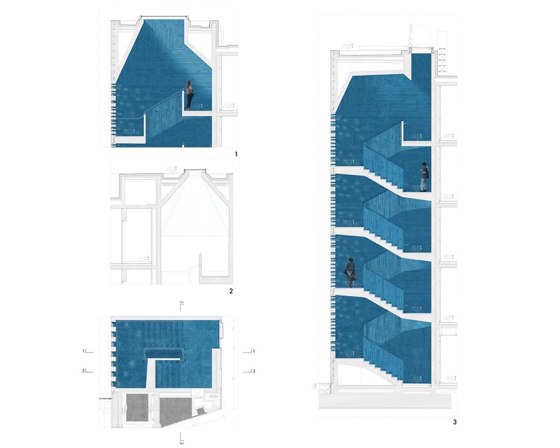
The stairwells are the building's most photogenic feature, and they deserve the attention. Each vertical circulation core is lined in timber and painted a different saturated color: blue, yellow, red, mustard. Skylights at the top flood these shafts with natural light, turning what would otherwise be fire-stair afterthoughts into the most memorable spaces in the building.
More importantly, the color coding is functional. In a building with hundreds of identical rooms, disorientation is a real problem. Here, the color of your stairwell tells you where you are in the plan without requiring a single wayfinding sign. The orange and mustard corridors that bleed out from the stairwells extend this logic horizontally, creating color zones that residents learn intuitively within days of moving in. It is a smart, low-tech solution to a problem that many larger buildings solve with expensive signage systems or, worse, not at all.
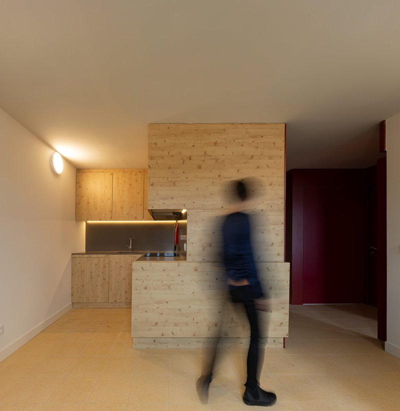
The Student Room: Compact but Considered
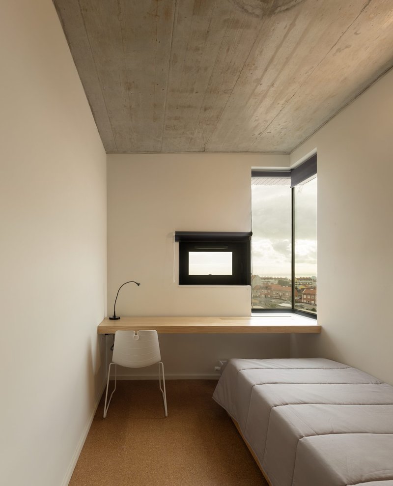
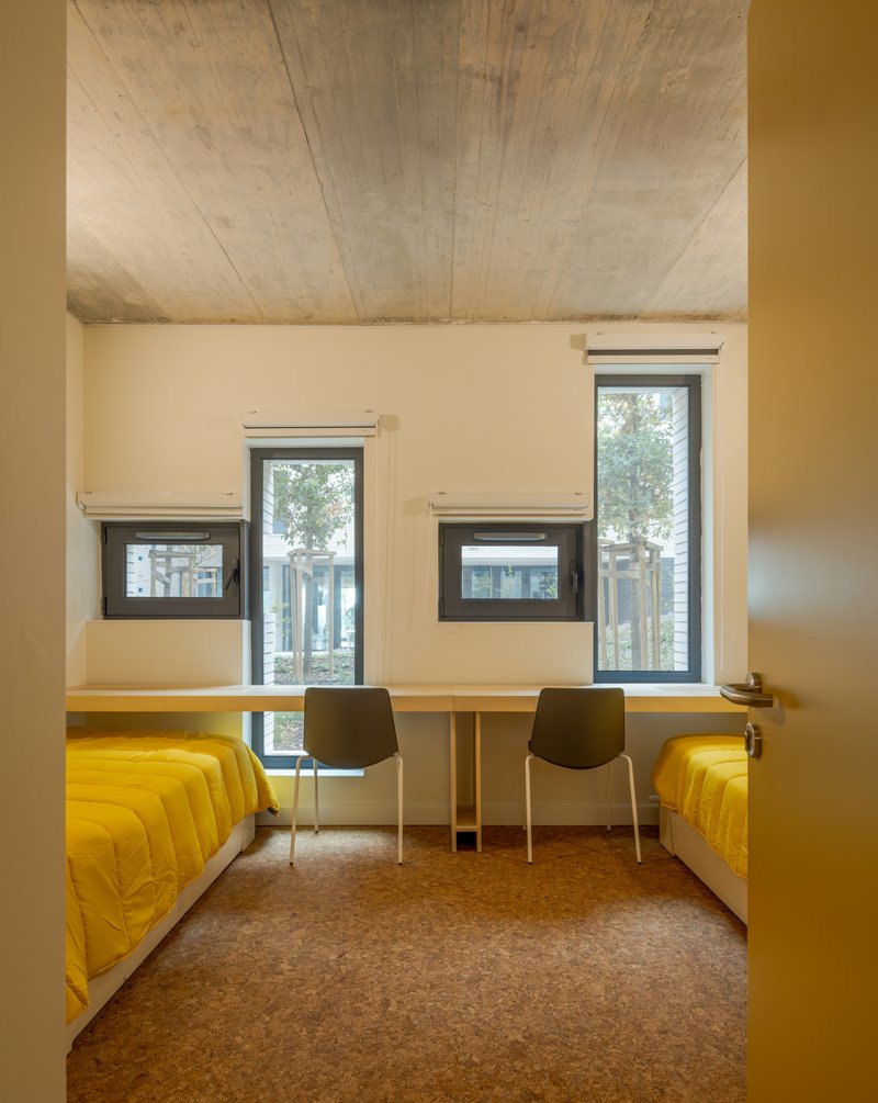
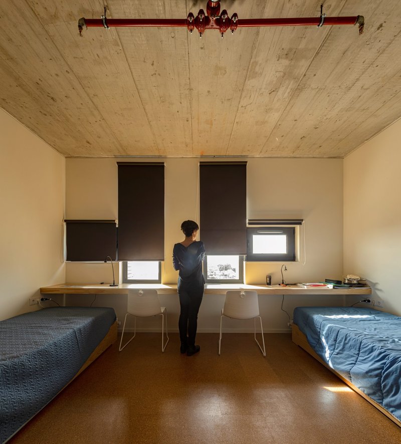
Individual rooms are small, as they should be in this typology, but every surface is doing something. Cork flooring provides warmth underfoot and acoustic dampening. Board-formed concrete ceilings are left exposed, giving the rooms an honest, almost monastic quality. Corner windows in some units open up the room beyond its actual footprint, framing views of the city or courtyard.
The double rooms with their stacked windows and vaulted concrete ceilings are particularly successful. The slight curve of the ceiling lifts the perceived height of the room, a subtle gesture that costs almost nothing in construction but transforms the experience of living in a compact space. Timber desks are integrated into the wall assembly rather than placed as afterthought furniture, which keeps the floor clear and makes a twelve-square-meter room feel usable rather than cramped.
Communal Spaces and Material Warmth
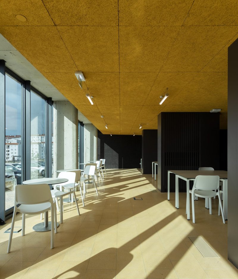
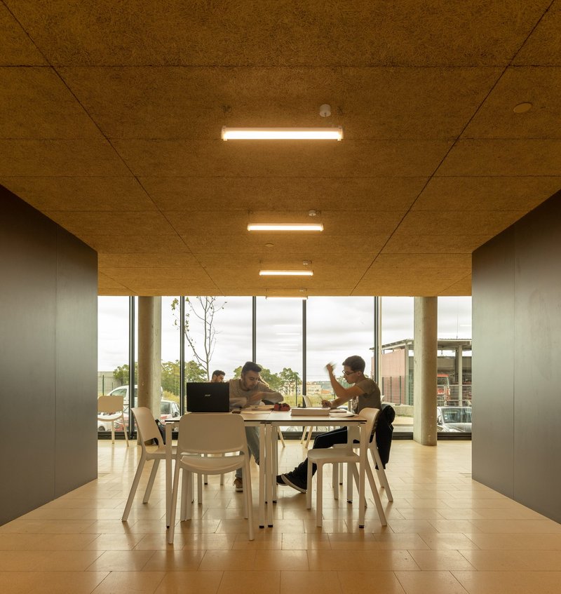
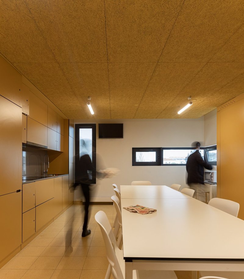
Shared kitchens, dining areas, and lounges are distributed throughout the building rather than consolidated on one floor, a decision that encourages smaller-scale social interaction. The dining spaces feature cork panel ceilings with linear fixtures, creating a warm, acoustically comfortable environment. Yellow acoustic ceiling panels in one dining area bring the building's color language into the communal program.
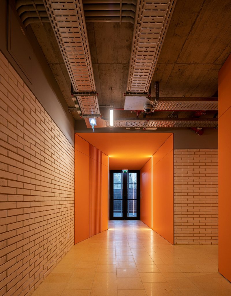
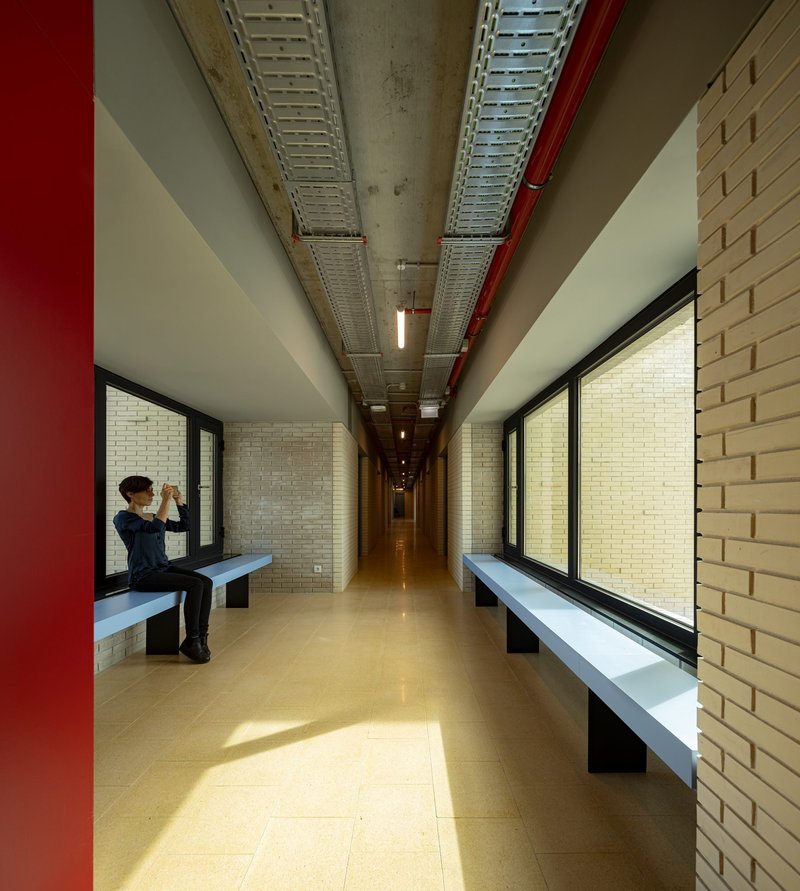
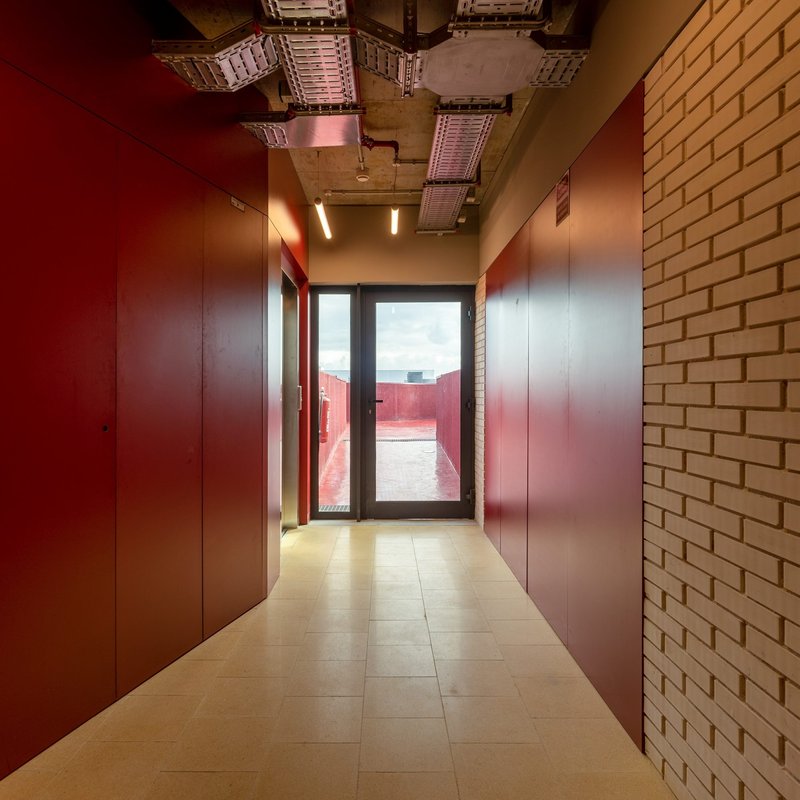
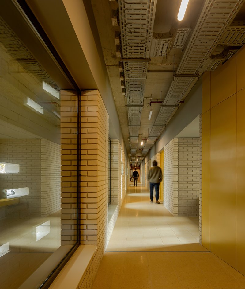
Corridors double as informal gathering spaces. Brick walls extend from the exterior into the interior, providing material continuity and bench seating along the length of the hallways. Exposed ceiling ducts are left visible rather than hidden behind a dropped ceiling, an honest expression of the building's systems that also preserves ceiling height. The maroon wall panels and terracotta tones that appear in some corridors add variety without breaking the overall material coherence.
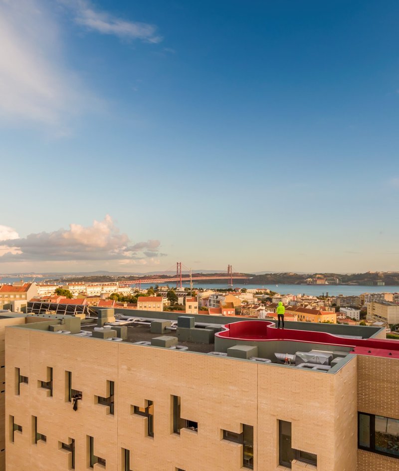
The Red Rooftop and the Lisbon Skyline
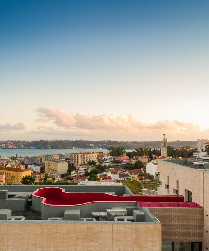
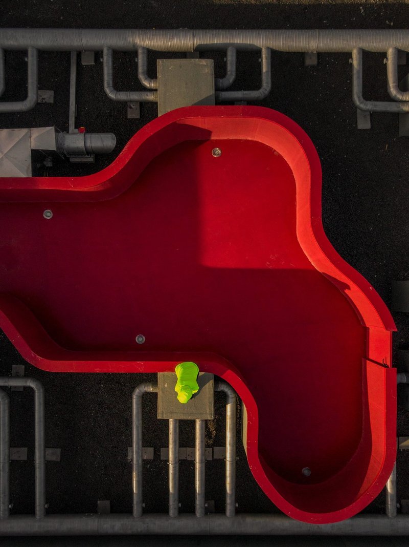
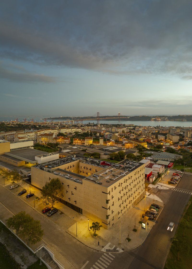
The most unexpected element is the curving red volume that appears on the rooftop. Visible in aerial photographs as a sinuous form against the buff brick, it reads as a communal amenity space, possibly a pool or terrace, that gives the building a fifth-facade identity. From the waterfront, this red shape signals the building's presence in the skyline and distinguishes it from the surrounding fabric.
At sunset, the interplay between the warm brick, the red rooftop, and the Tagus River beyond creates a composition that anchors the building firmly in its Lisbon context. The aerial view confirms how efficiently the block occupies its site: a tight rectangular footprint with the courtyard void, adjacent parking, and direct proximity to the harbor. It is urban housing at its most straightforward and its most effective.
The Facade Up Close

At twilight, the staggered windows become illuminated cells, and the building transforms from a solid masonry object into a lantern. The courtyard view at night is particularly striking: each lit window reveals a different color temperature, a different curtain position, a different life being lived. This is the payoff of the irregular fenestration strategy. By varying the window positions, the architects ensured that no two views from the courtyard are identical, giving the building an animated quality that will only intensify as it is inhabited over time.
Plans and Drawings
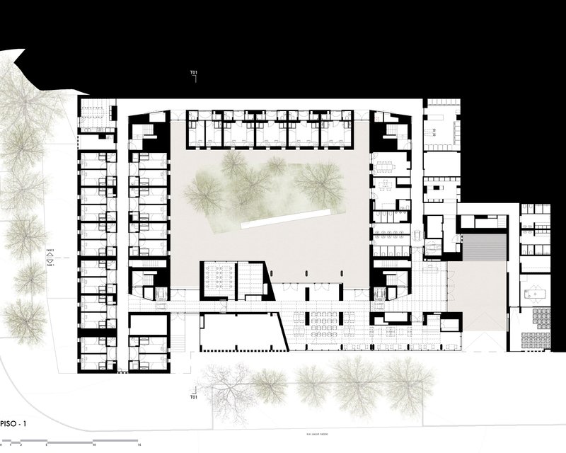
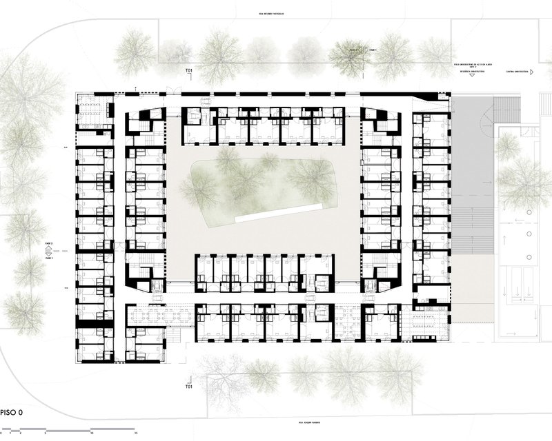
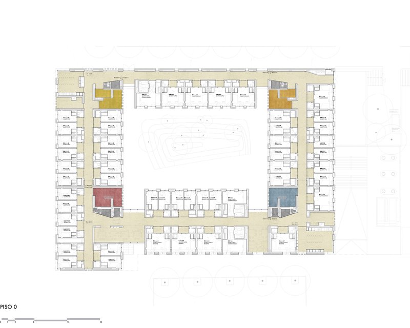
The floor plans reveal the organizational logic clearly: residential units line the perimeter of the courtyard block, with corridors running along the inner edge. Color-coded communal spaces are distributed at intervals, breaking the repetitive rhythm of private rooms. The ground floor accommodates more public program, while upper floors are given over almost entirely to bedrooms and shared kitchens.
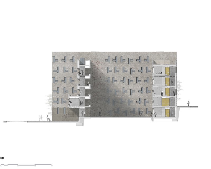
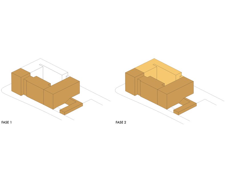
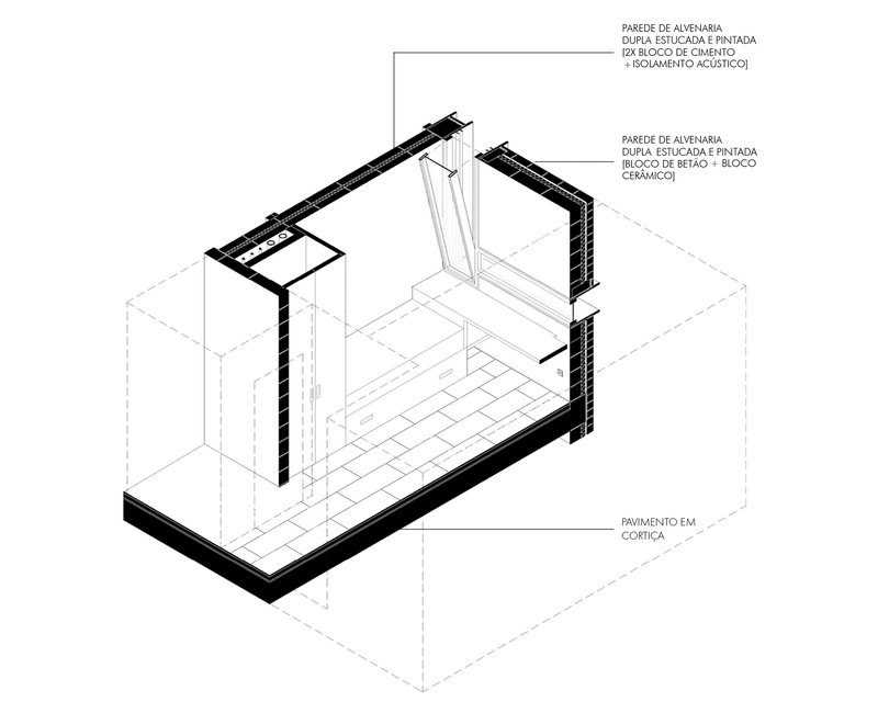
The section drawing is revealing. Stepped terraces on one side and stacked interior volumes on the other show how the building negotiates its site's topography and accommodates program variations without resorting to a single repeated floor plate. The elevation drawings confirm the brick facade's sophistication: what looks irregular from the ground follows a carefully controlled pattern of projecting and recessed openings. The axonometric diagrams illustrate a phased construction strategy, suggesting the project was conceived with the possibility of future expansion. The wall detail section, showing layered masonry with concrete blocks and acoustic insulation over cork flooring, explains how the building achieves its acoustic and thermal performance within a straightforward masonry assembly.
Why This Project Matters
The Ventura Terra University Residence matters because it refuses the false choice between density and quality. Student housing is one of the most constrained building types in architecture: tight budgets, demanding programs, and a client base that will never commission you again. Under those conditions, many firms deliver the minimum. CVDB arquitectos delivered a building that uses color, material, and spatial organization to create genuine architectural identity within severe constraints.
It also matters as a demonstration of how traditional typologies, the courtyard block, the brick facade, the skylit stairwell, can be deployed with contemporary intelligence. Nothing here is nostalgic. The cork ceilings, the exposed ducts, the board-formed concrete are all honest about the building's construction and its era. But the courtyard plan, the masonry weight, and the chromatic wayfinding draw on deep architectural knowledge. In a city like Lisbon, where the pressure for new housing is intense and the risk of generic development is real, this building offers a counter-argument: that density, craft, and institutional ambition can coexist in a single block.
Ventura Terra University Residence, University of Lisbon, designed by CVDB arquitectos (Cristina Veríssimo, Diogo Burnay). Located in Lisboa, Portugal. 7,100 m². Completed 2024. Photography by Fernando Guerra | FG+SG.
About the Studio
Share Your Own Work on uni.xyz
If projects like this are the kind of work you want to make, uni.xyz is a place to publish your own, find collaborators, and enter design competitions.


Popular Articles
Popular articles from the community
Three Architects Stitch a Social Center into a Crumbling Galician Hamlet
In Muimenta, Spain, timber and plywood volumes graft onto granite ruins to anchor a rural revitalization effort.
De la Riva Sherry Homes By Juan Vega Arquitectos
De la Riva Sherry Homes transform a historic winery into unique residences, blending industrial heritage, modern comfort, and community-focused courtyard living.
Bood Design Bureau Splits a Gilan Residence in Two to Let the Forest In
Double Side House negotiates privacy and openness through interlocking concrete volumes and planted courtyards in northern Iran's humid Caspian lowlands.
Guangzhou's Twin Towers Interiors Move Like Water
DuShe Architectural Design shapes the lobbies of a massive Guangzhou transit hub with undulating ceilings and deep geological materiality.
Similar Reads
You might also enjoy these articles
STEM School Mechelen by LAVA Architecten: A Future-Ready Educational Architecture in Belgium
Flexible, sustainable STEM school in Mechelen featuring modular classrooms, acoustic innovation, and energy-efficient design supporting future-focused collaborative learning environments.
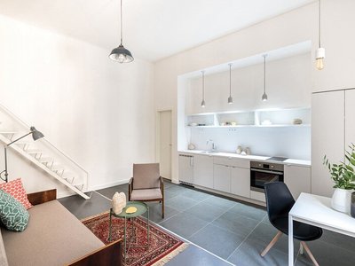
Marvila Apartment Renovation in Lisbon: A Bright Minimalist Attic Transformation by KEMA Studio
Bright attic transformed into minimalist Lisbon apartment with skylights, sustainable materials, open plan layout, and industrial-inspired interior design elements.
20 Most Popular Commercial Architecture Projects of 2025
From sustainable market concepts to heritage factories, the commercial buildings and proposals that drew the most attention on uni.xyz this year.
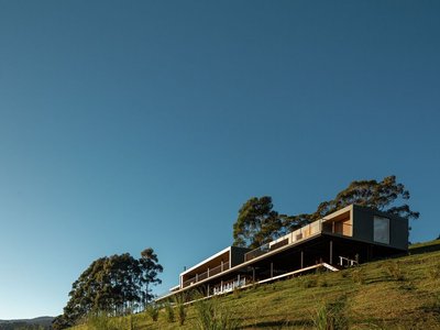
Mantiqueira House by SysHaus and M Magalhães Estúdio
A linear modular house embedded in Serra da Mantiqueira, integrating panoramic views, sustainable prefabrication, minimal terrain impact, and contemporary interiors.


Comments (0)
Please login or sign up to add comments
No comments yet. Be the first to comment!