
Circles as Spatial Strategy in a Shibuya Office
IGArchitects transforms a single-floor Shibuya office into a landscape of curved walnut volumes, ring lights, and soft enclosures that rethink workplace ga
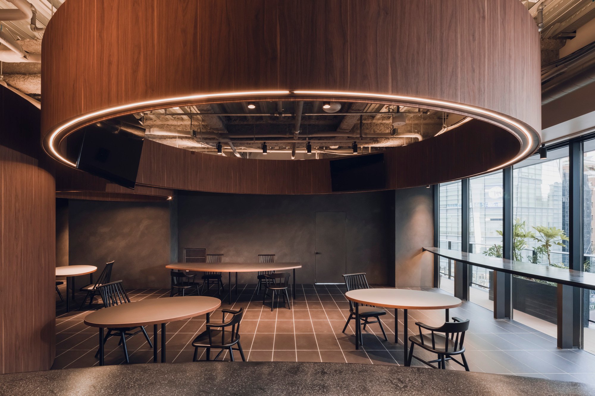
The contemporary office has a problem with the breakroom. It is either an afterthought, a corridor with a fridge, or an over-designed "activation zone" that nobody wants to linger in. IGArchitects' 〇 Office in Shibuya takes a different position entirely: the breakroom is the architecture. Occupying a single 133 square meter floor in a Shibuya office building, the renovation replaces conventional partitioning with a family of curved walnut volumes that create gathering spaces without walls, thresholds without doors, and intimacy without isolation.
What makes the project worth studying is its disciplined commitment to a single geometric idea. The circle, referenced directly in the project's name (〇), is not a decorative motif. It is the organizing principle for plan, section, lighting, seating, and material transition. Every design decision flows from curves, and the result is a space that feels genuinely unlike a typical office interior, even though its program is modest: a place for people to eat, talk, and pause between tasks.
Walnut Volumes as Spatial Anchors
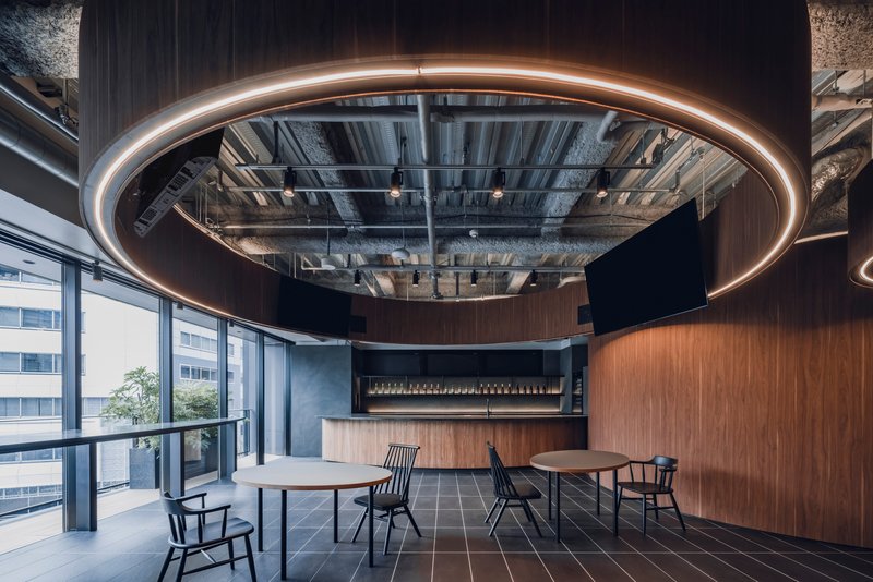
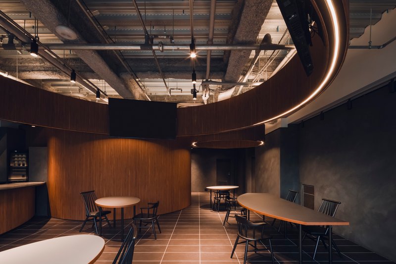
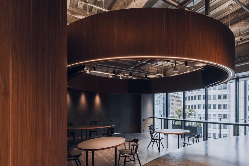
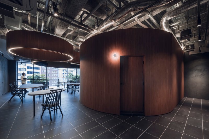
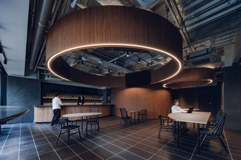
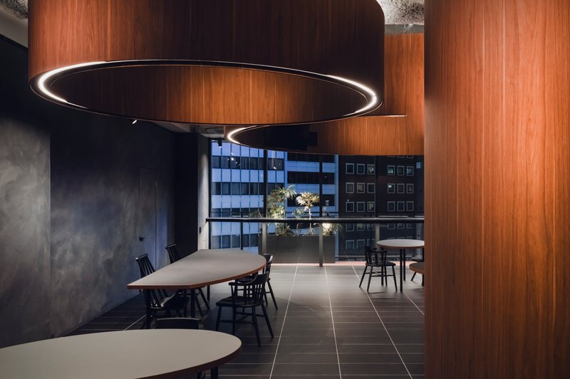
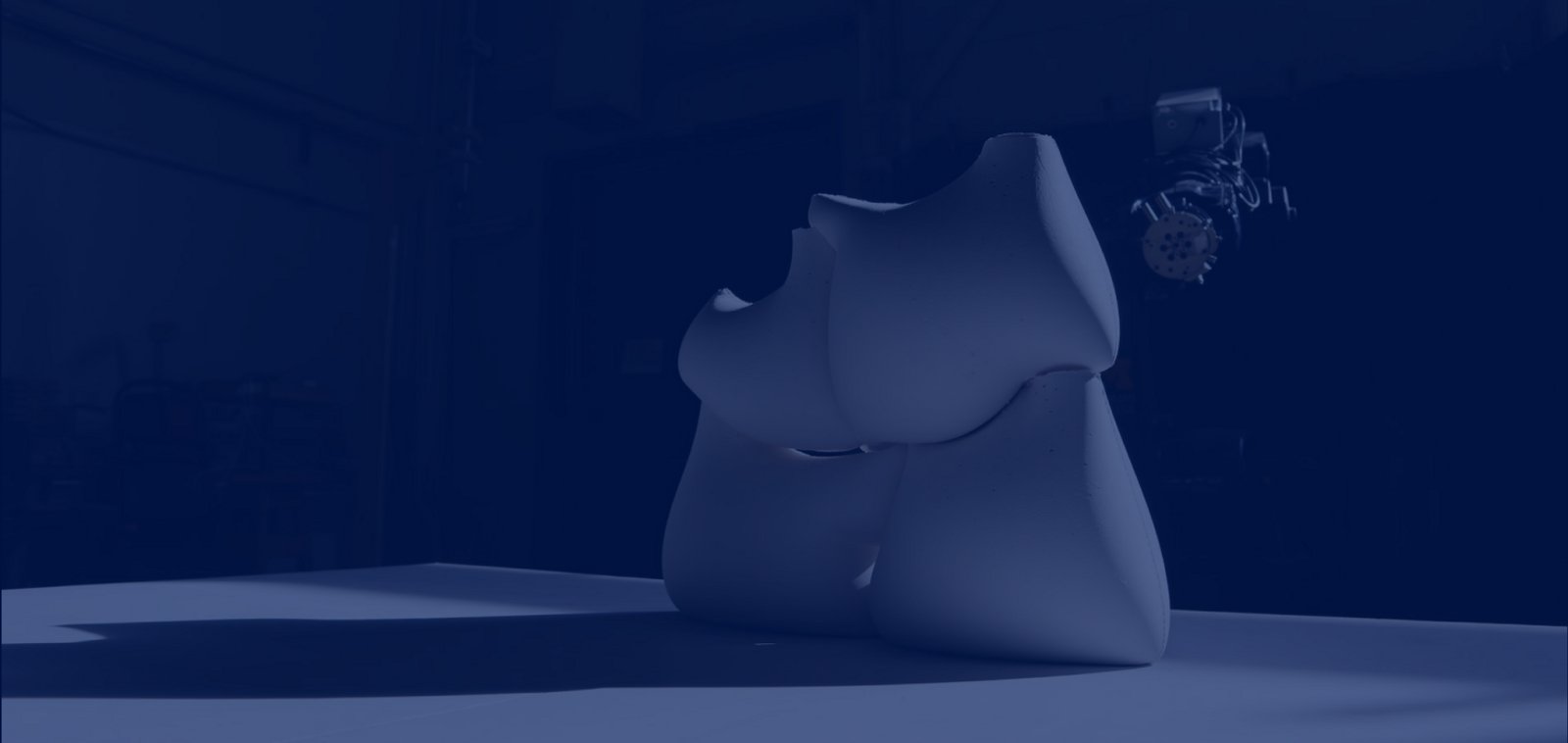
The curved walnut-clad cylinders are the strongest move in the project. They rise from the floor like freestanding furniture scaled up to architecture, creating pockets of space around their perimeters without ever fully enclosing them. The warm timber grain reads as domestic against the raw industrial ceiling above, and that contrast is deliberate. IGArchitects lets the exposed ductwork, concrete beams, and mechanical services remain visible overhead, so the walnut volumes feel like objects placed within a larger shell rather than parts of a continuous interior.
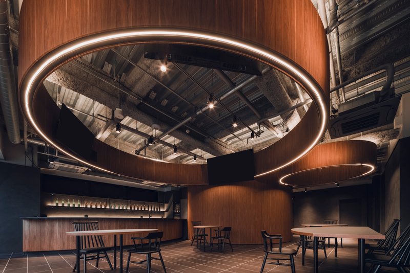
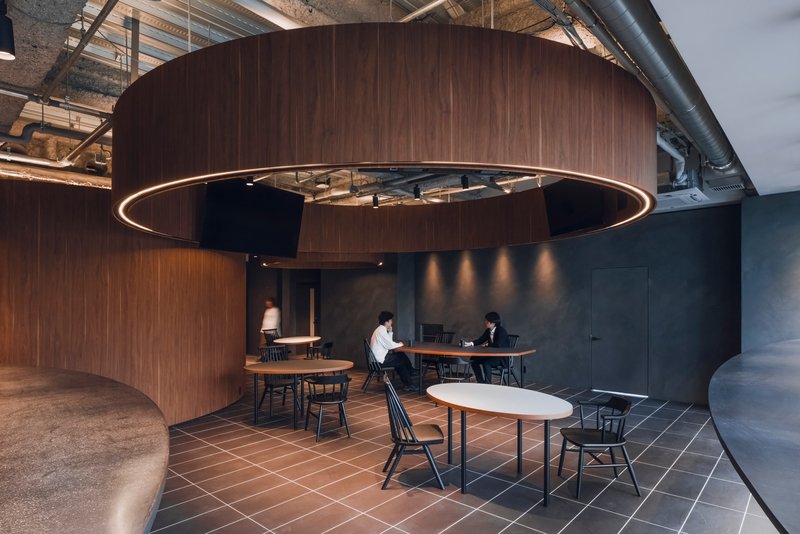
Each cylinder serves a slightly different function. Some frame dining tables. Others contain service counters or seating nooks. But the material and radius remain consistent enough that the ensemble reads as a coherent system, not a collection of one-offs. The circular LED ring lights suspended above each volume reinforce this family resemblance, creating halos that define territory on the ceiling plane the same way the timber defines territory on the floor.
The Mirrored Canopy and Overhead Drama
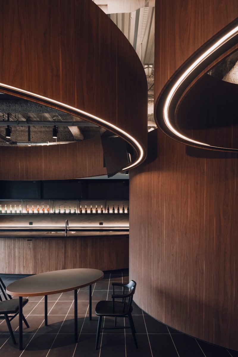
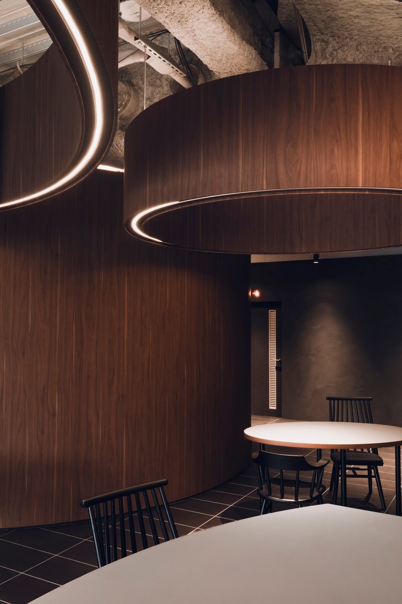
One of the most unexpected details is the mirrored underside of the sweeping wood canopy. Where the walnut surface curls overhead, its soffit becomes reflective, bouncing the exposed services and perimeter glazing back into view from below. The effect is disorienting in the best sense: the ceiling suddenly doubles, and the boundary between the curated timber world and the raw infrastructure above becomes ambiguous.
Concealed linear lighting along the canopy edge reinforces the geometry without competing with the ring pendants. The overlapping curves of timber walls, visible in close-up, show how the volumes are not simple extruded circles but complex, spiraling forms that twist and overlap. There is real craft in the joinery here, and the tight detailing keeps the curves from feeling arbitrary.
The Enclosed Alcove
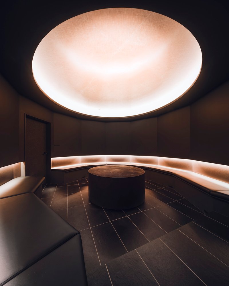
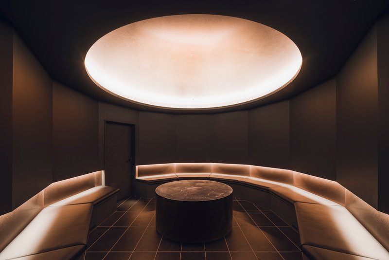
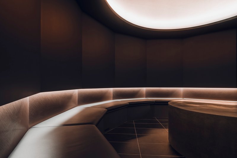
If the open dining areas are the project's public face, the circular alcove is its private counterpart. A fully enclosed room with backlit curved banquettes, a central table, and an illuminated ceiling oculus, this space takes the circle from plan motif to complete environment. The dark finishes and soft integrated lighting shift the mood entirely, creating a space that feels more like a private dining room than an office amenity.
The banquette's base strip lighting and the glowing oculus overhead compress the room's vertical dimension, drawing attention inward. It is a generous space for a small meeting or a quiet lunch, and the contrast with the airy, glazed dining area just outside makes both spaces feel more distinct. The transition from open to enclosed, all achieved through the same curved vocabulary, is one of the project's smartest moments.
Materiality at the Seams
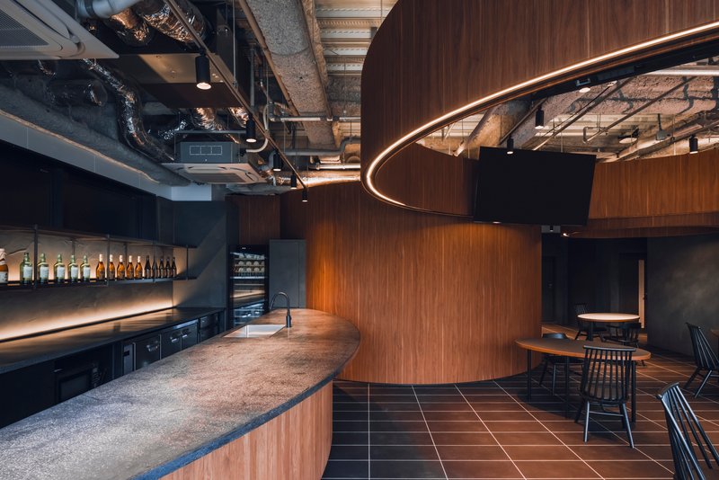
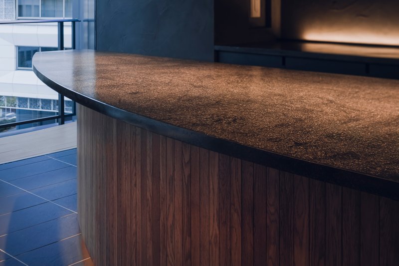
The material palette is restrained but precisely deployed. Dark grey tile flooring runs beneath and around the walnut volumes, establishing a continuous ground plane that feels institutional enough for heavy use but refined enough to complement the timber. Where the tile meets the walnut base cladding, the joint is clean and intentional. A terrazzo-surfaced service counter introduces a third material that bridges the warm wood and cool tile, its aggregated texture lending a tactile quality that neither the smooth veneer nor the matte tile can provide.
The stone counter edge, visible in detail, shows the care taken at these material intersections. The radius of the counter follows the curve of the adjacent walnut volume, so the geometry feels continuous even as the surface changes. These are small decisions, but they accumulate into a sense of spatial coherence that elevates the project beyond a simple interior fit-out.
Light and the Perimeter
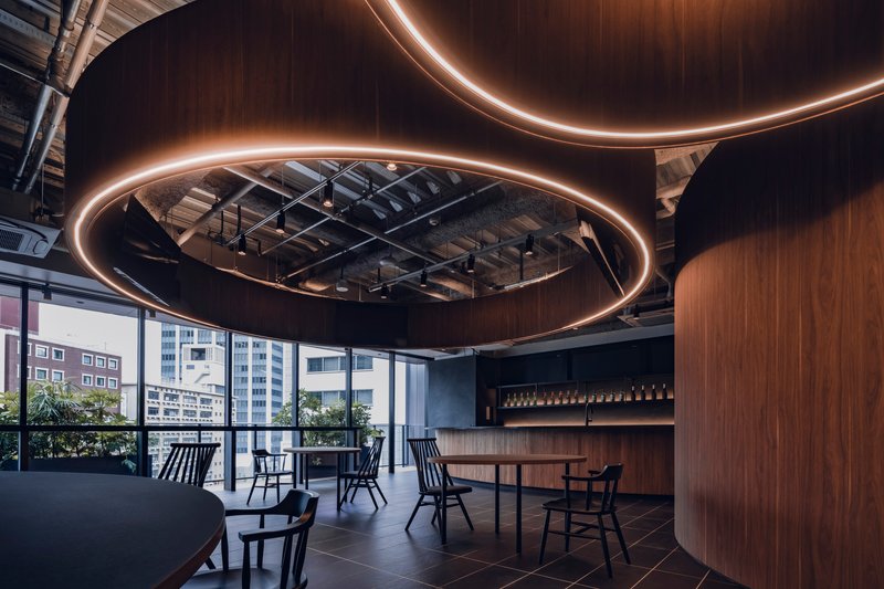
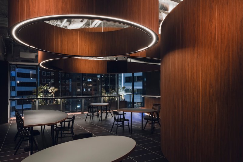
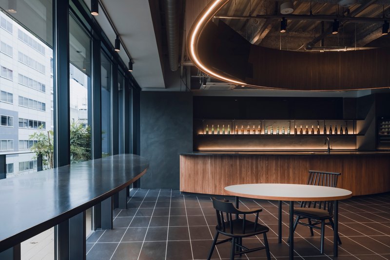
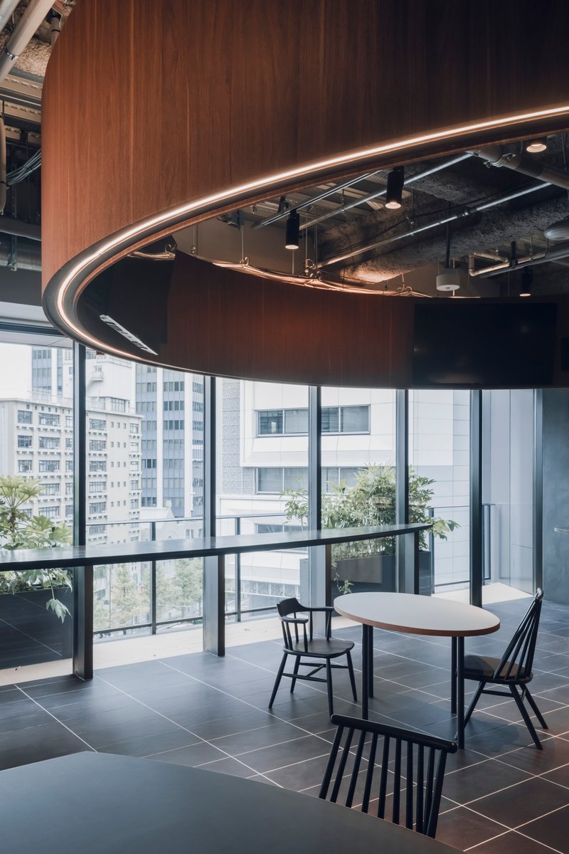
Floor-to-ceiling glazing wraps the perimeter, and IGArchitects wisely keeps the walnut volumes pulled away from the glass. The result is a continuous band of daylight that washes behind and between the curved forms, making them read as freestanding objects rather than wall attachments. In daytime, the exposed structural ceiling catches reflected light from below. At night, the circular LED pendants take over, their warm glow competing with the city lights visible through the glass.
The evening view is particularly effective. The ring lights become the dominant spatial markers, floating above the dining tables like lanterns, while Shibuya's neighboring towers create a layered backdrop of illuminated facades. The terrace planters along the glazed edge add a soft green boundary between inside and outside, a subtle but welcome buffer against the density of the urban context.
Threshold and Movement
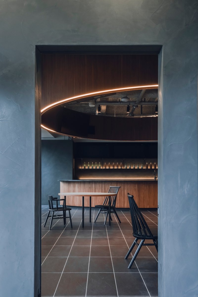
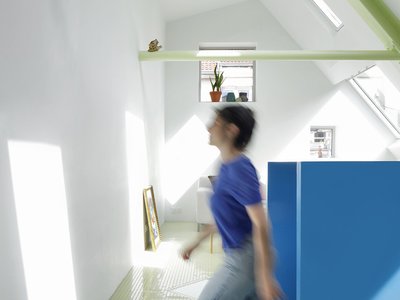
The project's entry sequence is handled through material and framing rather than conventional doors. A textured grey wall frames a doorway that opens onto the dining space beyond, with the curved illuminated canopy immediately visible on axis. The transition from hard corridor to warm, lit interior is abrupt and effective. Inside, the floor material shifts from dark tile to timber, marking zones of activity without physical barriers.
Figures moving through the space, captured in several images, reveal how the curved volumes create natural circulation paths. People drift around the cylinders rather than through them, and the loose, informal seating arrangements encourage the kind of chance encounters that workplace designers constantly chase. What is notable here is that IGArchitects achieves this through geometry and proportion, not through programmatic gimmicks like ping pong tables or beanbag chairs.
Terrace and Urban Context
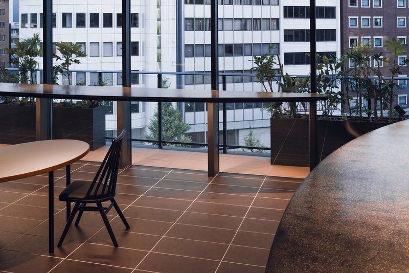
The raised planter boxes along the glazed facade do real work. Grasses and shrubs soften the view toward neighboring tower blocks, and the rooftop greenery visible beyond suggests a Shibuya that is denser and more layered than the typical street-level impression. The terrace is minimal, just planters and glass, but it gives the interior a sense of extension that a single floor office in a dense urban block desperately needs.
Plans and Drawings
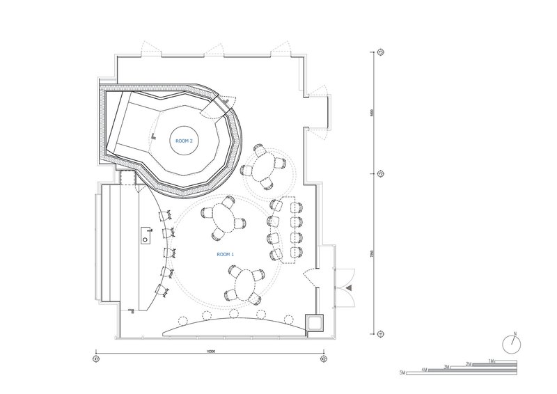
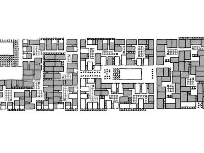
The floor plan confirms what the photographs suggest: the circular volumes are not concentric or symmetrically arranged. They overlap and offset, creating interstitial zones of varying width. The service counter occupies a central position, with tables radiating outward toward the glazed perimeter. The plan reads almost like a cluster of cells, each defined by its own curved wall, with the spaces between them functioning as shared territory. It is a loose, non-hierarchical arrangement that suits the breakroom program well.
Why This Project Matters
〇 Office is a small project with an outsized lesson. At 133 square meters, it proves that a single geometric commitment, pursued rigorously through plan, section, material, and lighting, can transform a routine renovation into a genuinely atmospheric space. The circle here is not a style choice. It is a spatial tool that generates enclosure, movement, and variation from a single formal idea. That kind of discipline is rare in workplace interiors, where the temptation to pile on features usually wins out over coherence.
IGArchitects has also made a quiet argument about what an office breakroom can be. Not a kitchen with tables, not a branded lounge, but a space with its own architectural identity, one worth spending time in for reasons beyond hunger. The walnut volumes, the ring lights, the mirrored canopy: these are not amenities. They are architecture. And in a Shibuya office building, surrounded by towers, that distinction matters more than it might seem.
〇 Office by IGArchitects, Shibuya, Japan. 133 m². Completed 2025. Photography by Ooki Jingu.
About the Studio
Share Your Own Work on uni.xyz
If projects like this are the kind of work you want to make, uni.xyz is a place to publish your own, find collaborators, and enter design competitions.


Popular Articles
Popular articles from the community
BHA Studio Wraps a 2,000-Student Campus in Terracotta Screens and Double-Layered Roofs in Central Vietnam
iSchool Quang Tri in Đông Hà uses perforated brick lattices and rainwater harvesting to keep 17,000 square meters cool and green.
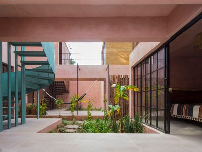
Apaloosa Builds a Forest-Edge Retreat from Compacted Earth and Pink Stucco in Chiapas
Villa Luciérnagas in San Cristóbal de las Casas pairs local earth block construction with rainwater systems and solar energy for Airbnb-ready living.
LIQE arquitectura Wraps a Vigo Old Town Housing Reform in Folding Pine Screens
Perched between castle walls and the historic center, a timber-clad renovation filters estuary light through autoclave-treated slats.
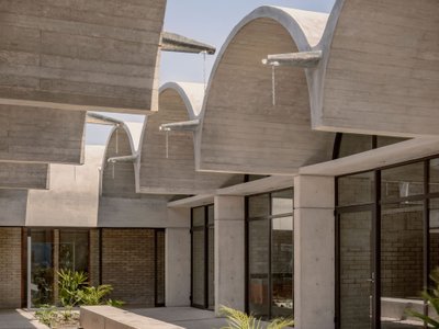
Kiltro Polaris and JC Arquitectura Line Up Six Barrel Vaults for a Health Center in Rural Mexico
A raw concrete clinic in Escárcega, Campeche, uses courtyards between structural bays to ventilate, light, and cool every room naturally.

Similar Reads
You might also enjoy these articles
127af Flips a Tiny Bagnolet Rowhouse Upside Down with a Handcrafted Roof Extension
A 55-square-meter terraced house on the edge of Paris gains a luminous upper living floor through lightweight timber and steel.
1.61 Design Workshop Wraps a 600-Square-Meter Café in Vietnam in Sculptural Burgundy Drama
Reden Café & Bistro pairs a helical staircase, mosaic floors, and deep red interiors to rethink Vietnamese hospitality space.
The Unbound Brain: A School Shaped by Cognitive Architecture
Cylindrical learning pods radiate like neurons from a central cortex, turning the floor plan into a spatial model of human thought.
Revival Vernacular Architecture: Rammed Earth Settlements for the Sahara
A modular desert community in Mauritania that fuses passive cooling techniques with earthen construction and local craftsmanship.

Explore Office Building Competitions
Discover active competitions in this discipline


The Global Benchmark for Architecture Dissertation Awards


Challenge to design luxury tourism on rails


VR headsets Storefront design competition

Designing a staircase for a client
Comments (0)
Please login or sign up to add comments
No comments yet. Be the first to comment!