
Coffee Machine Red: A Replicable Cafe Interior Built from White Tile, Red Glass and Steel
A shortlisted Visualization '20 entry turning white tile, translucent red screens and steel into a cafe system built to travel between locations.


Most cafe chains grow by repeating a logo. Coffee Machine Red proposes something more durable: a spatial kit of white ceramic tile, translucent red partitions and exposed steel that can be carried from one location to the next and still read as a single identity. The interior works as a brand system, with each surface doing part of the work a sign would normally do.
Designed by Сергей Питерский and shortlisted in Visualization '20, the project started from a conversation with the owners of a growing cafe chain who wanted to expand their footprint. Instead of treating the commission as a one-off fit-out, the designer began with research, analysis and typological study. The aim was to define an interior that could adapt to different sites while keeping a strong, recognisable character.
Tiled Booths Under a Field of Hanging Tubes
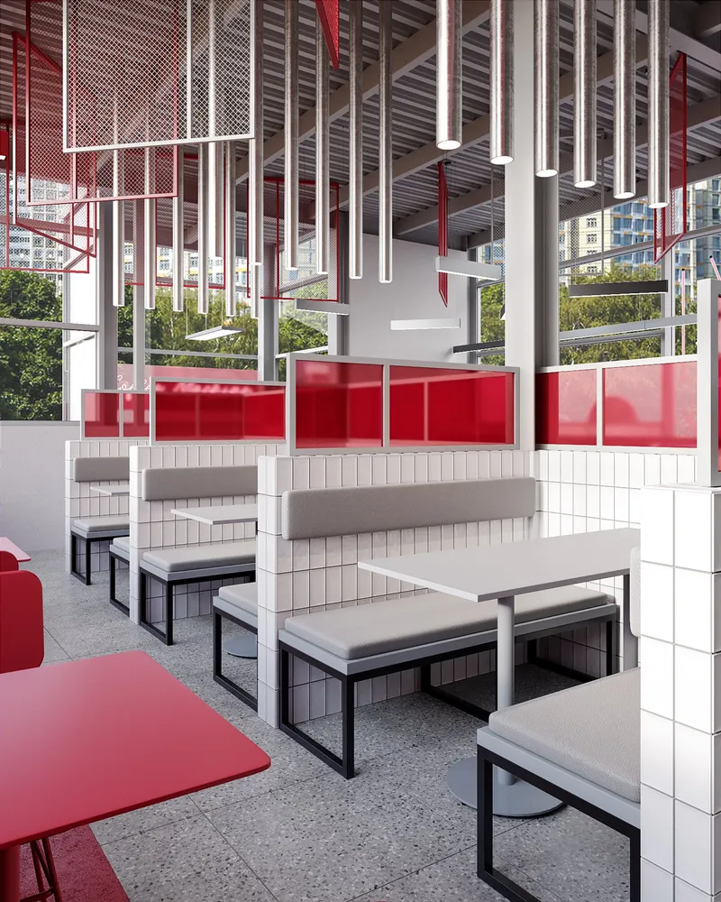
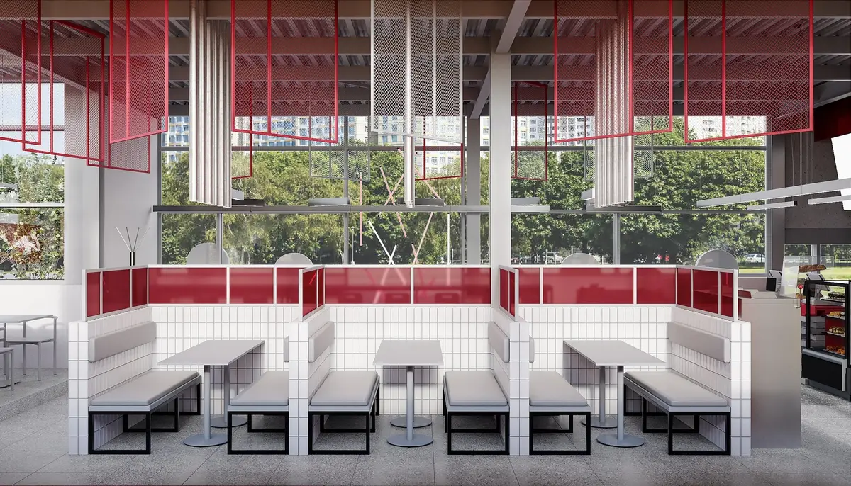
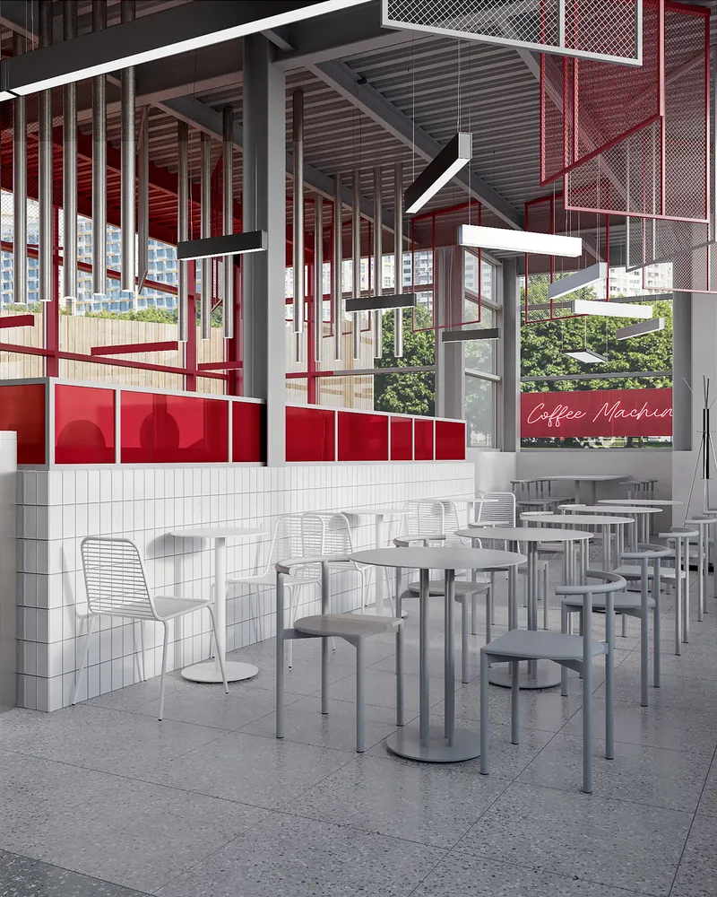
The booth row is the backbone of the scheme. Seating rises directly out of white-tiled bases, so the furniture reads as built architecture and not as loose product dropped into a shell. Grey cushions soften the tile, and red acrylic screens separate each booth without closing it off. Diners keep a view along the whole row, yet each table gets a degree of privacy. The screens act as filters, not walls.
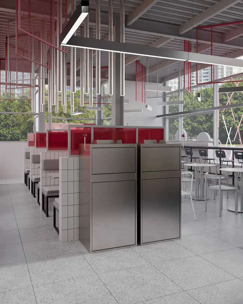
Overhead, suspended cylindrical metal fixtures and long linear lights turn the ceiling into an active layer. The hanging tubes pull the eye upward and make the room feel taller, while the linear lights follow the direction of the seating below. Even the stainless steel waste bins sit within this vocabulary. Placing the booths along the glazing, with trees visible beyond, connects the perimeter seating to the outside and gives the interior depth.
Red Glazing as the Brand Colour, Applied in Thin Layers
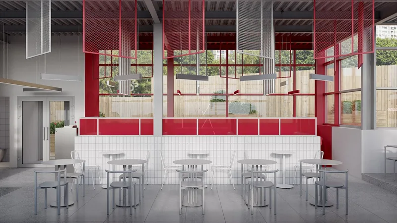
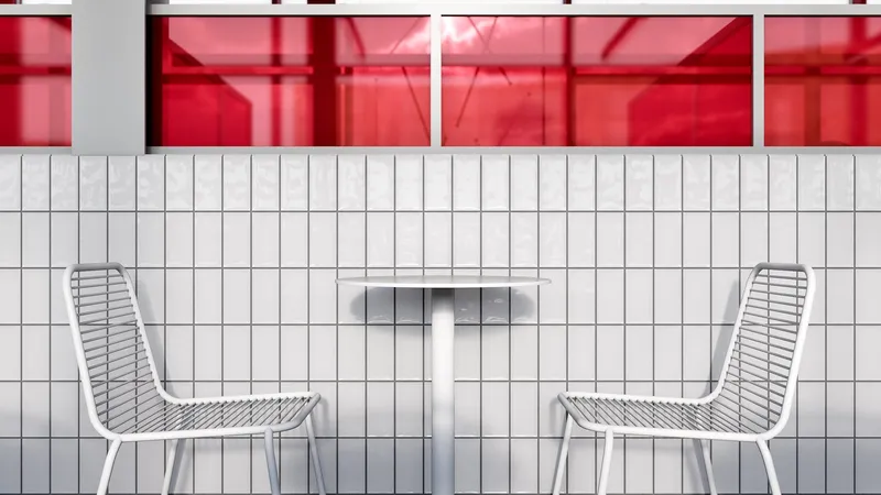
The palette is restrained: white tile as the hygienic, durable base, and red used sparingly enough that it keeps its impact. On the counter, red glazed panels sit on a tiled body. At the window wall, red frames outline the view toward a timber fence. Against the glossy tile wall, red glazing appears again above head height. The colour never fills a whole surface. It arrives as edges, panes and frames, which is why it organises the space without overwhelming it.
The loose furniture follows the same discipline. White wire chairs, round pedestal tables and simple stools stay visually light, so they can be rearranged for different group sizes without disturbing the tiled architecture around them. For a chain, this split matters: the fixed elements carry the identity, and the movable pieces give each location some flexibility.
A Counter Built Like Masonry, a Door Opening onto Timber
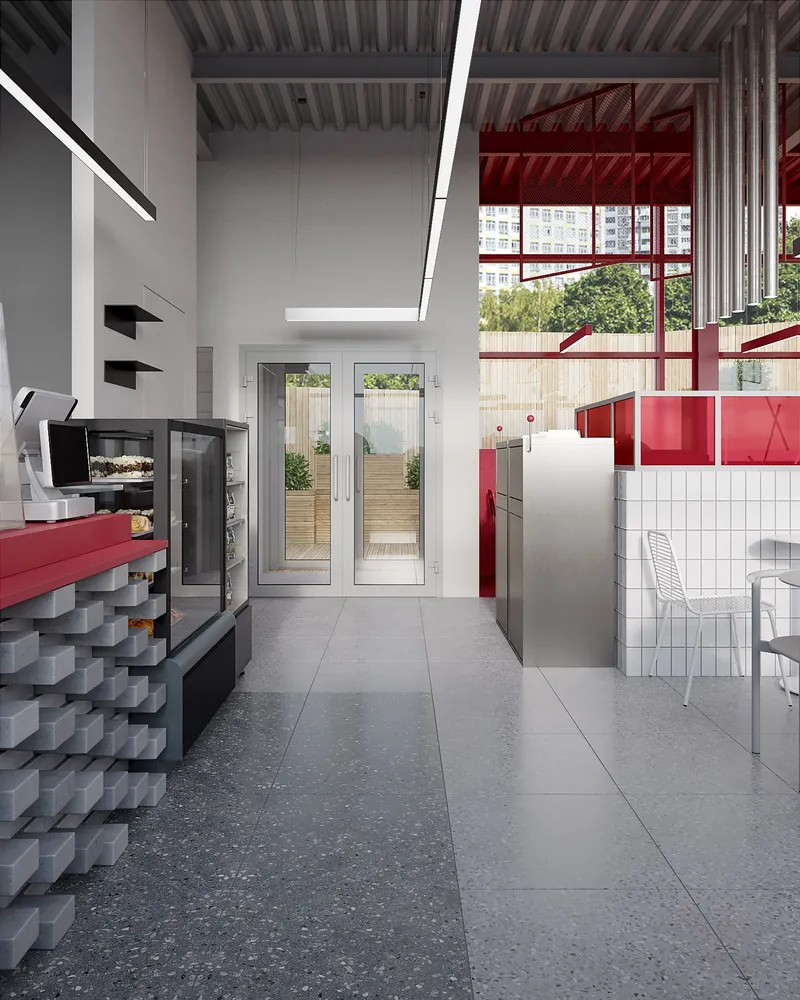
The service counter is made of stacked grey blocks, with a display case set alongside, and a terrazzo floor leads past it toward glazed double doors that open onto a timber deck. Placing service on the main route makes the counter visible and easy to reach, so ordering and circulation support each other instead of competing. The layered seating, with booths, communal tables and perimeter places, gives a range of ways to occupy the room around a central seating island while keeping the circulation paths clear.
Along the booth wall, red mesh frames hover above round grey tables and stools, echoing the rectangular geometry of the seating below. The red Coffee Machine sign is almost redundant by this point; the room has already announced the brand through colour and rhythm. Daylight washes across the tiles and makes the red read as translucent, not flat.
The Washroom Gets the Same Rules as the Dining Room
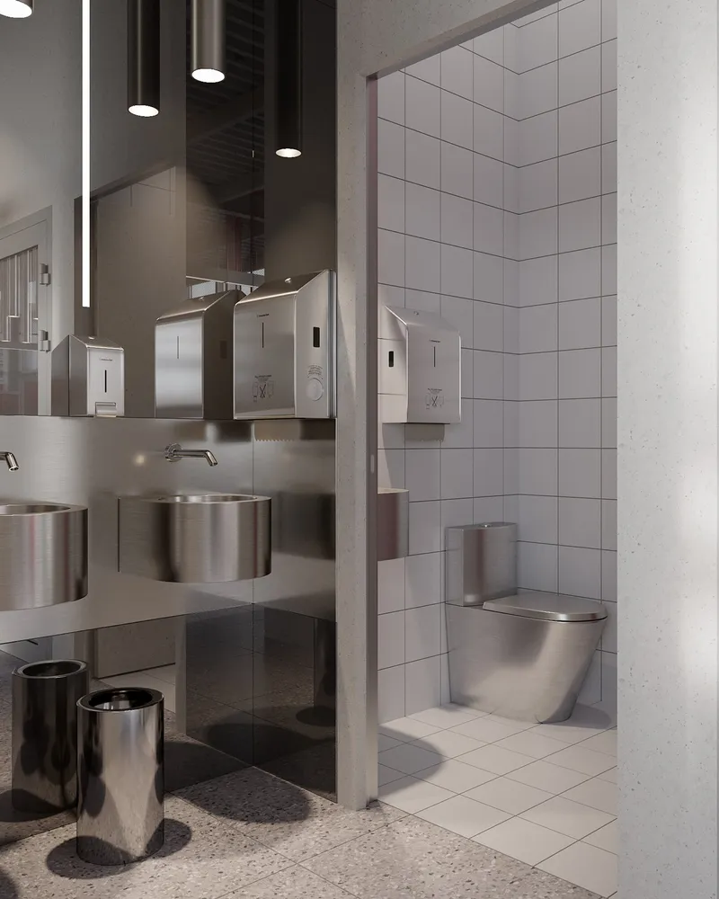
Back-of-house spaces are often where a cafe identity falls apart. Here the washroom uses the same language as the dining room: round stainless steel basins, steel paper towel dispensers and a steel toilet set into a white tiled stall, lit by the same pendant tubes. This consistency is what a replicable system needs. The rules hold in every room, so a customer moving from table to washroom never feels they have crossed into an afterthought.
Why This Project Matters
Coffee Machine Red treats branding as a spatial problem, not a graphic one. By limiting itself to a few materials, white tile, red translucent planes, steel and simple loose furniture, the project shows how a chain can scale without falling into either generic sameness or costly one-off design. The identity lives in proportions, edges and repetition, which can be rebuilt on any site.
It also shows the restraint that commercial interiors often lack. The red works because it is rationed; the ceiling works because it echoes the plan instead of decorating it; the furniture works because it lets the architecture lead. For a visualization competition, the renders are convincing, but the stronger achievement is the logic underneath them: a cafe designed as a system you could actually build again.
View the Full Project
About the Designers
Designer: Сергей Питерский
Enter a Design Competition on uni.xyz
uni.xyz runs architecture and design competitions year-round that reward proposals with spatial conviction and real site intelligence.
Project credits: Coffee Machine Red by Сергей Питерский Visualization '20 (uni.xyz).


Popular Articles
Popular articles from the community


Opera on the Sea: Driftwood Logic Shapes a Timber Opera House on Estonia's Coast
Trevor Orgill's opera house translates the entangled drift of floating timber into a civic building where wood, water, and music converge.

Cloaked Colonization: A Mobile Underwater Habitat That Moves Like a Fish
Micah Abaya's shortlisted EHC Pacific entry reimagines ocean settlement as a dispersed network of self-sustaining architectural organisms.

Manzana Morphosis: Stretching Barcelona's Grid into a Living Landscape for 2050
A radical reworking of the Eixample manzana turns density into a tool for generous public space, vertical ecology, and environmental performance.
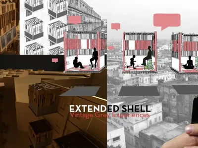
Extended Shell: Retrofitting Kolkata's Balconies as Living Urban Thresholds
A modular retrofit system recovers the social and environmental intelligence of Kolkata's historic verandas for contemporary Park Street residents.

Similar Reads
You might also enjoy these articles

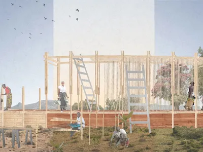
Healing Façade: A Modular Chapel System That Restores Ethiopia's Sacred Forests
Winner of the Eco-Chapel competition, this circular timber façade collects water from air to rebuild soil and reforest degraded Ethiopian landscapes.
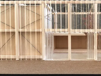
Kaffeebühnen: Where Coffee Shop Architecture Becomes a Civic Stage in Vienna
A linear sequence of timber boxes, transparent shells, and open yards turns the Viennese café tradition into a public performance space.
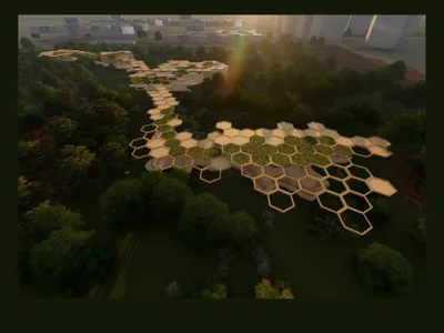
Eco Chapel: A Modular Forest Pavilion That Grows Like the Landscape It Protects
Hexagonal timber modules weave through existing trees, turning a chapel into a living system for prayer, education, and reforestation.


Urban Forest: A Vertical Ecosystem for 5,000 Workers in Singapore's Changi Business Park
Radially stacked pods and layered green decks turn a 7-acre plot into 47 acres of ecological workspace projected for 2040.

Explore Cafe and Restaurant Design Competitions
Discover active competitions in this discipline

Challenge to design luxury tourism on rails

Challenge to reimagine the Iron Throne

Photograph architecture without architects

VR headsets Storefront design competition
Comments (0)
Please login or sign up to add comments
No comments yet. Be the first to comment!