
Dorte Mandrup Builds Copenhagen a Health Center That Feels Like a Village
A timber-lined civic building in Copenhagen uses gabled forms and layered atriums to make healthcare feel like community life.
Healthcare architecture tends to oscillate between two poles: the clinical white box and the hospitality mimic. Dorte Mandrup's Center for Health in Copenhagen lands somewhere more honest. The building reads from the street as a cluster of dark, metal-clad gabled volumes, domestic in silhouette but unmistakably public in scale. Inside, cross-laminated timber wraps every surface, from walls to ceiling beams to stepped seating, producing an interior that smells and feels like a wood workshop. The ambition is clear: replace the anxiety of the waiting room with something closer to the warmth of a neighborhood gathering space.
What makes the project genuinely interesting is its organizational logic. Rather than stacking departments on identical floor plates, Mandrup splits the program into distinct wings joined by a tall, daylit atrium she calls the "heart space." Staff zones and patient zones are legible but never segregated. Movement through the building is always social: you pass kitchens, tiered seating, planted courtyards, and sports halls on your way to a consultation room. The result is a building that treats physical health and civic belonging as the same problem.
A Dark Silhouette on the Block
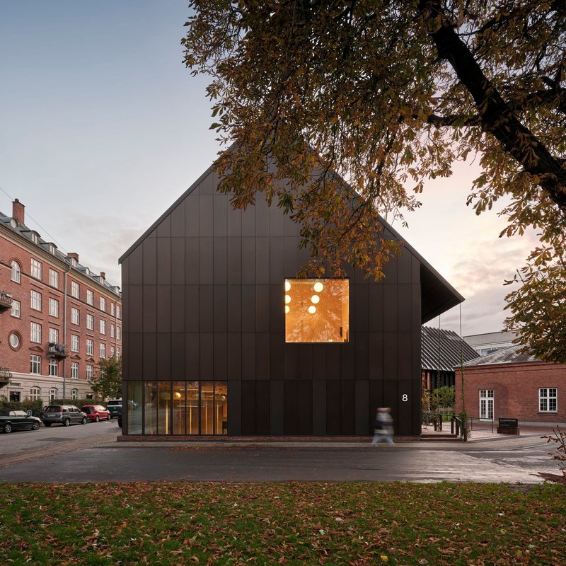
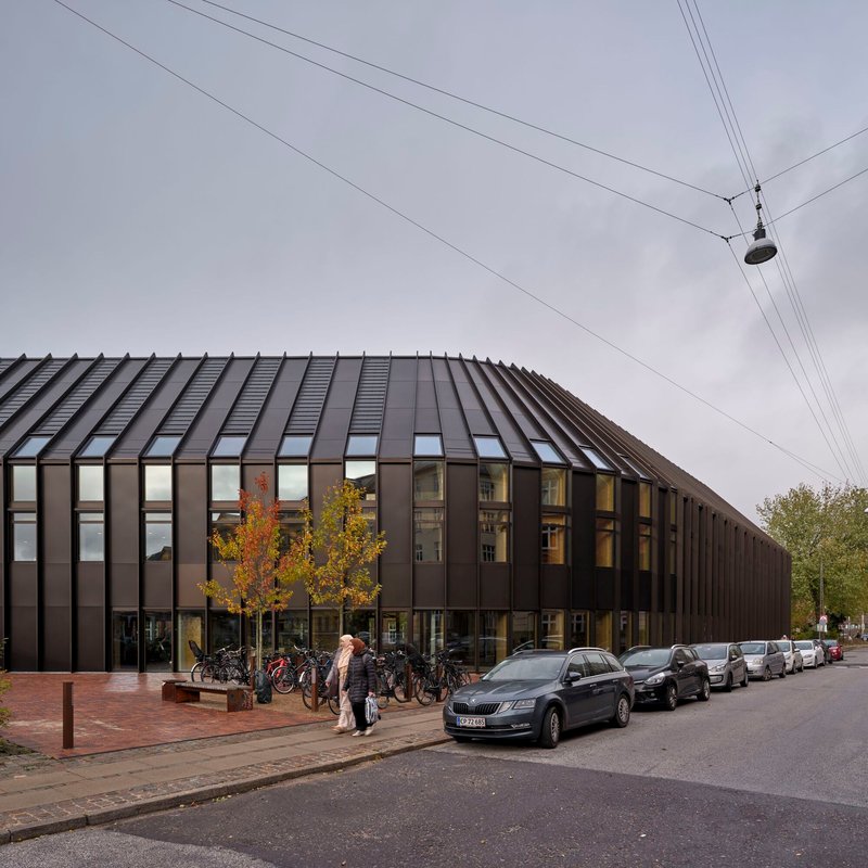
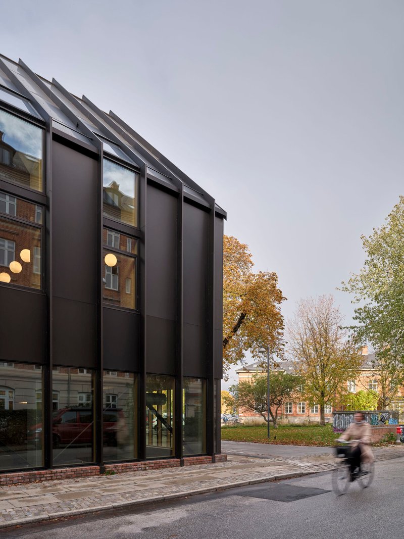
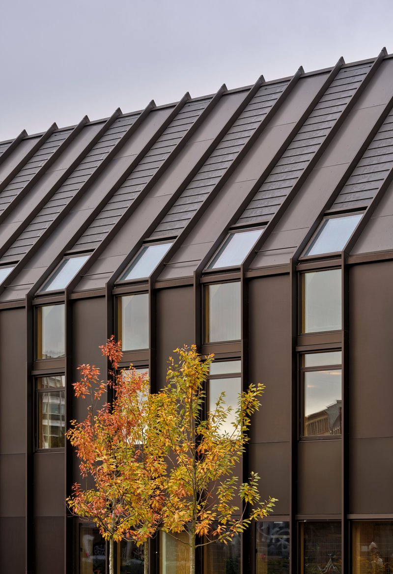
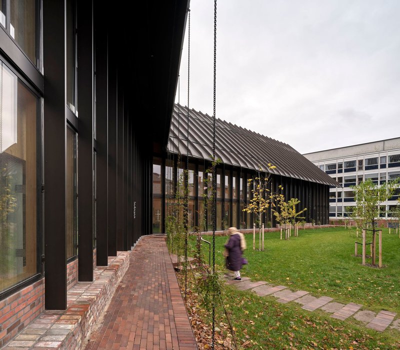
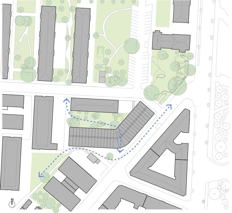
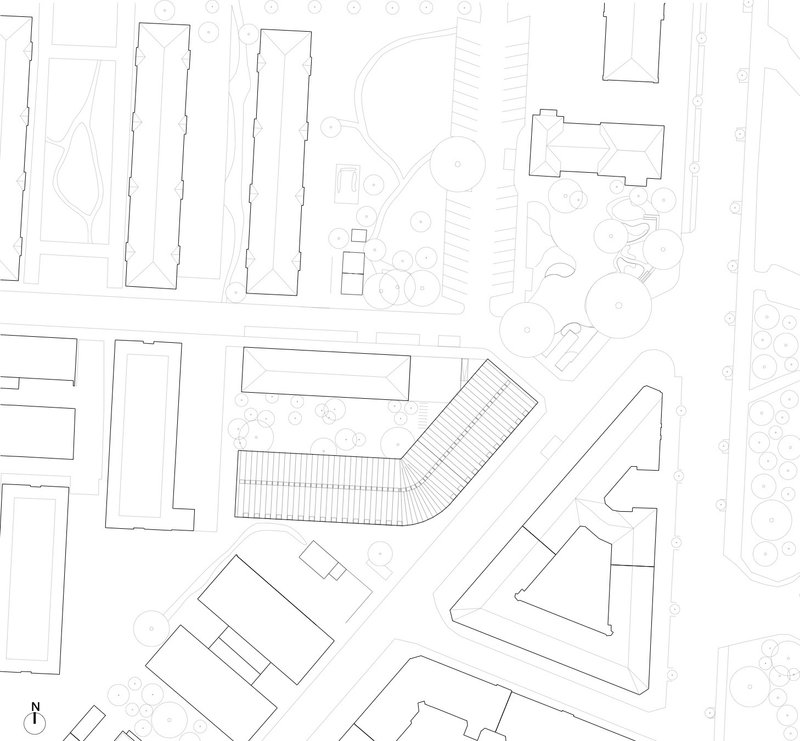
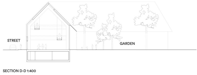
From the street, the Center for Health registers as a row of steep, ribbed metal gables, almost barn-like in their pitch. The dark cladding absorbs light during the day and retreats behind the canopy of surrounding trees, while at dusk the glazed ground level glows outward, signaling openness. The proportions are deliberately contextual: Copenhagen's residential streets are defined by pitched roofs and rhythmic facades, and Mandrup matches that grain without resorting to pastiche.
Vertical glazing strips between the metal panels admit controlled daylight into the upper floors. A cyclist passing the building sees only a quiet, textured surface. It is the kind of facade that rewards a second look but never demands one, a civic neighbor rather than a civic monument.
Sawtooth Roof and Planted Edges
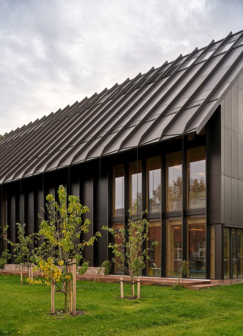
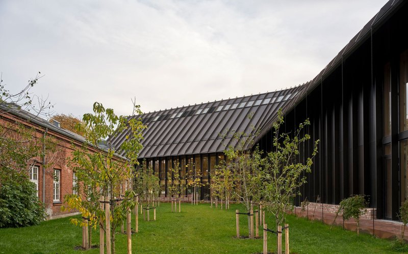
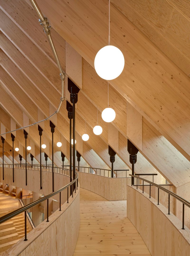
The sawtooth roofline is not just a formal gesture. Each ridge corresponds to a structural bay inside, and the orientation of the glazed faces determines where north light enters the upper floors. From the garden side, the building steps down to meet a low brick outbuilding, softening the transition between the new volume and its residential neighbors. Young trees planted in the surrounding lawn will eventually screen the metal cladding, embedding the building further into its landscape.
Bronze-toned mullions on the glazed facades add a material warmth that bridges the dark roof and the lighter timber interior visible through the glass. The detailing is restrained but consistent: every external surface belongs to the same family of muted metals and natural materials.
Courtyards and Covered Passages
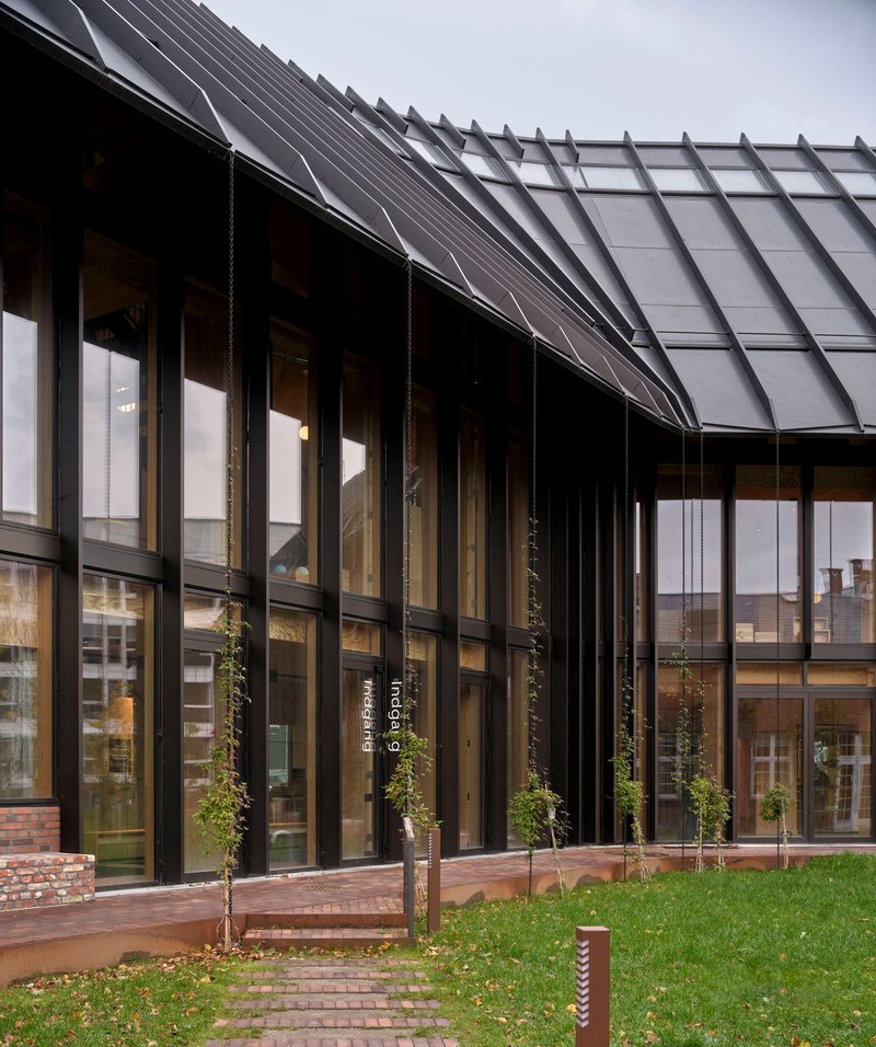
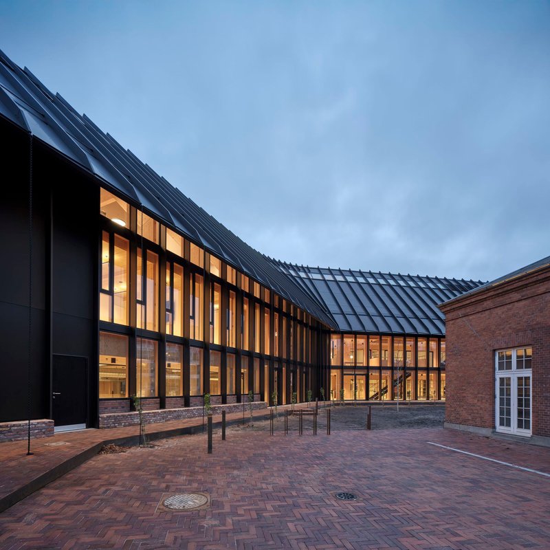
Between the gabled wings, covered walkways and open-air passages create a network of thresholds. Timber decking, brick paving, and young trees mark these in-between zones as places to pause rather than simply pass through. At dusk, the interplay between interior warmth and exterior shadow makes the building feel porous, its edges dissolving into the surrounding plaza.
The brick plaza at the building's entrance acts as a public forecourt, generous enough to host events but intimate enough to avoid the emptiness that plagues many institutional frontages. It is a smart piece of urban design: the building gives ground to the neighborhood before asking anything of it.
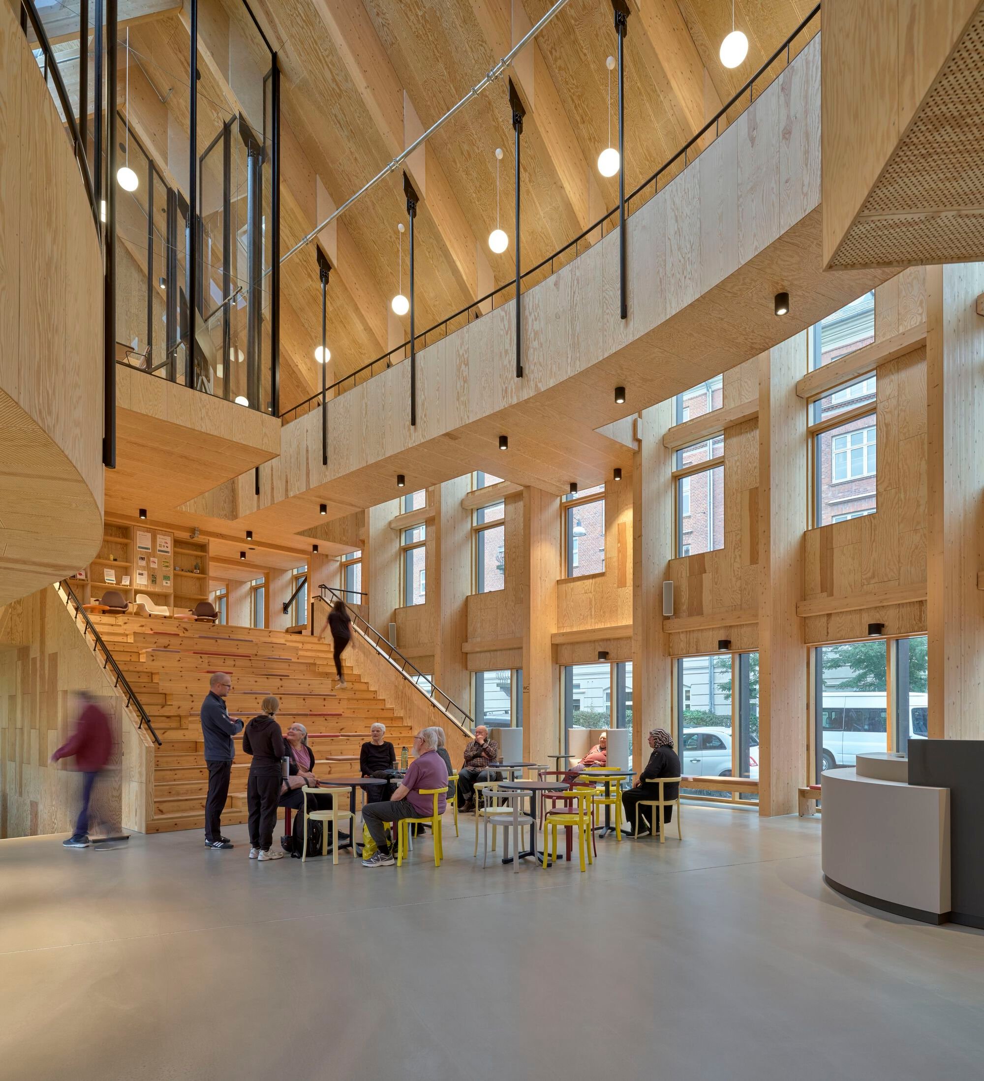
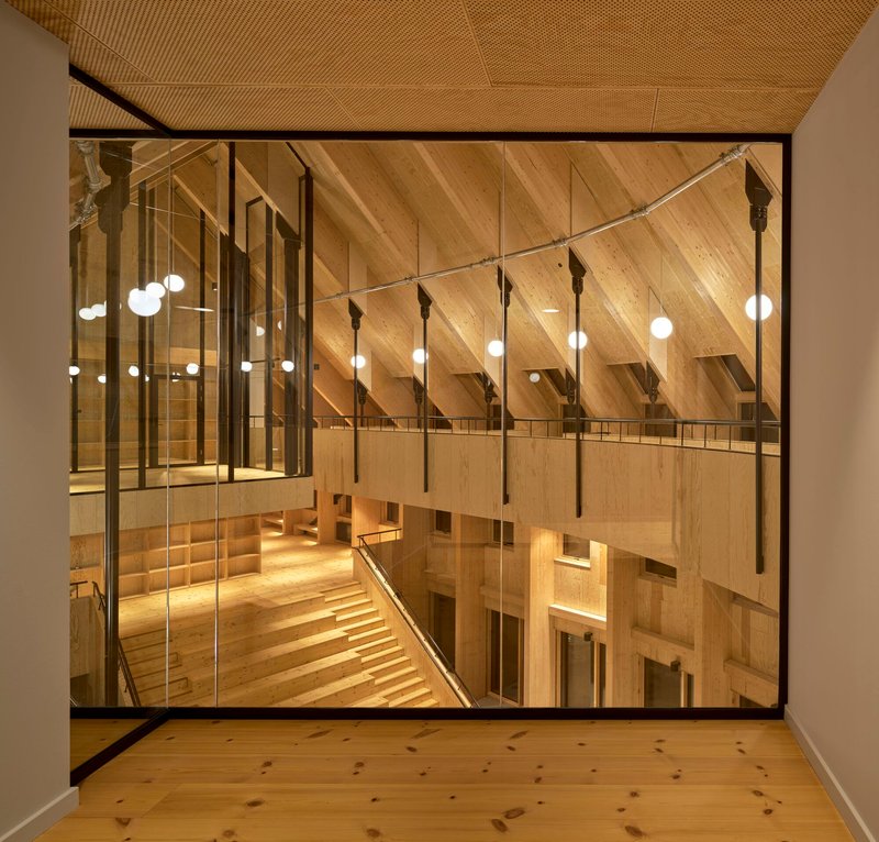
The Heart Space: Timber Atrium as Social Engine
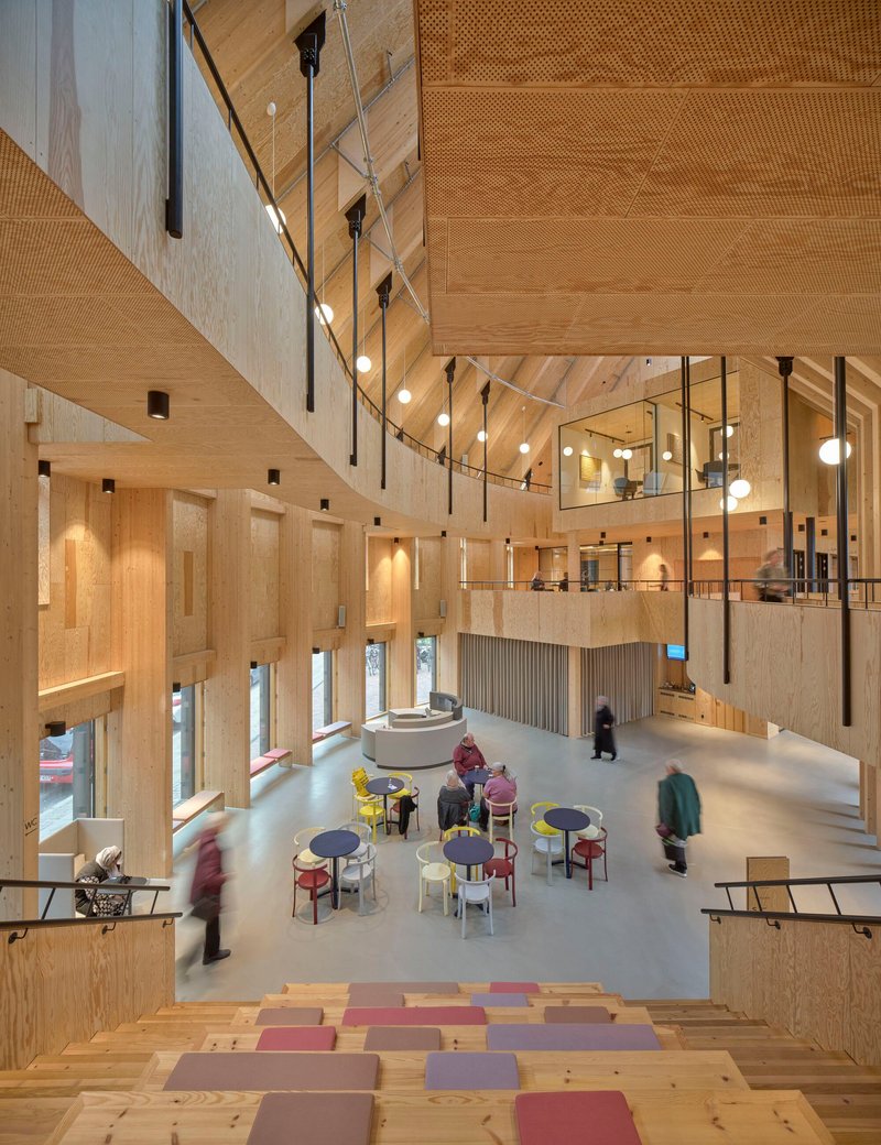
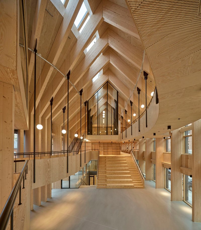
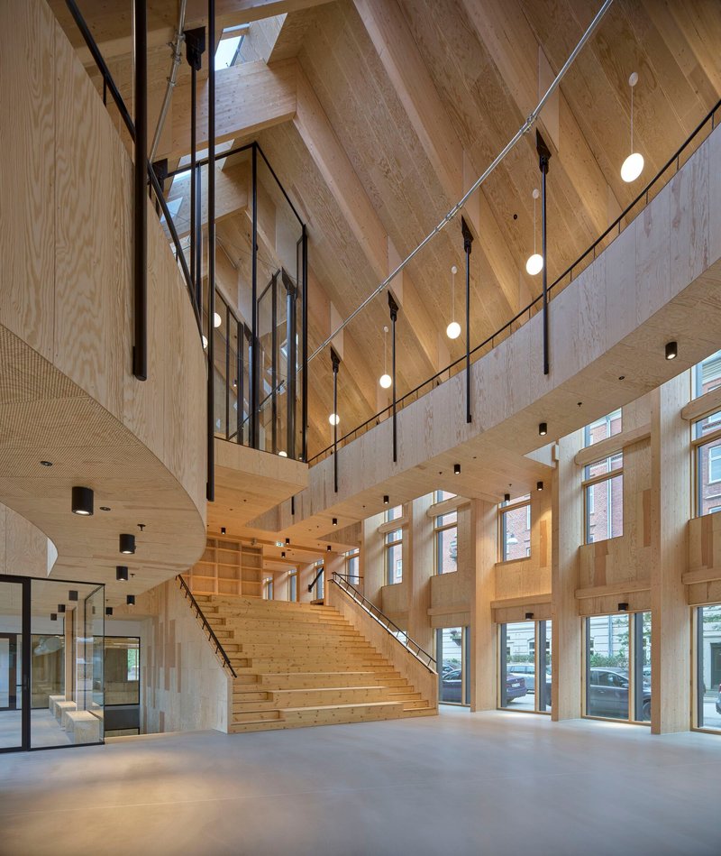
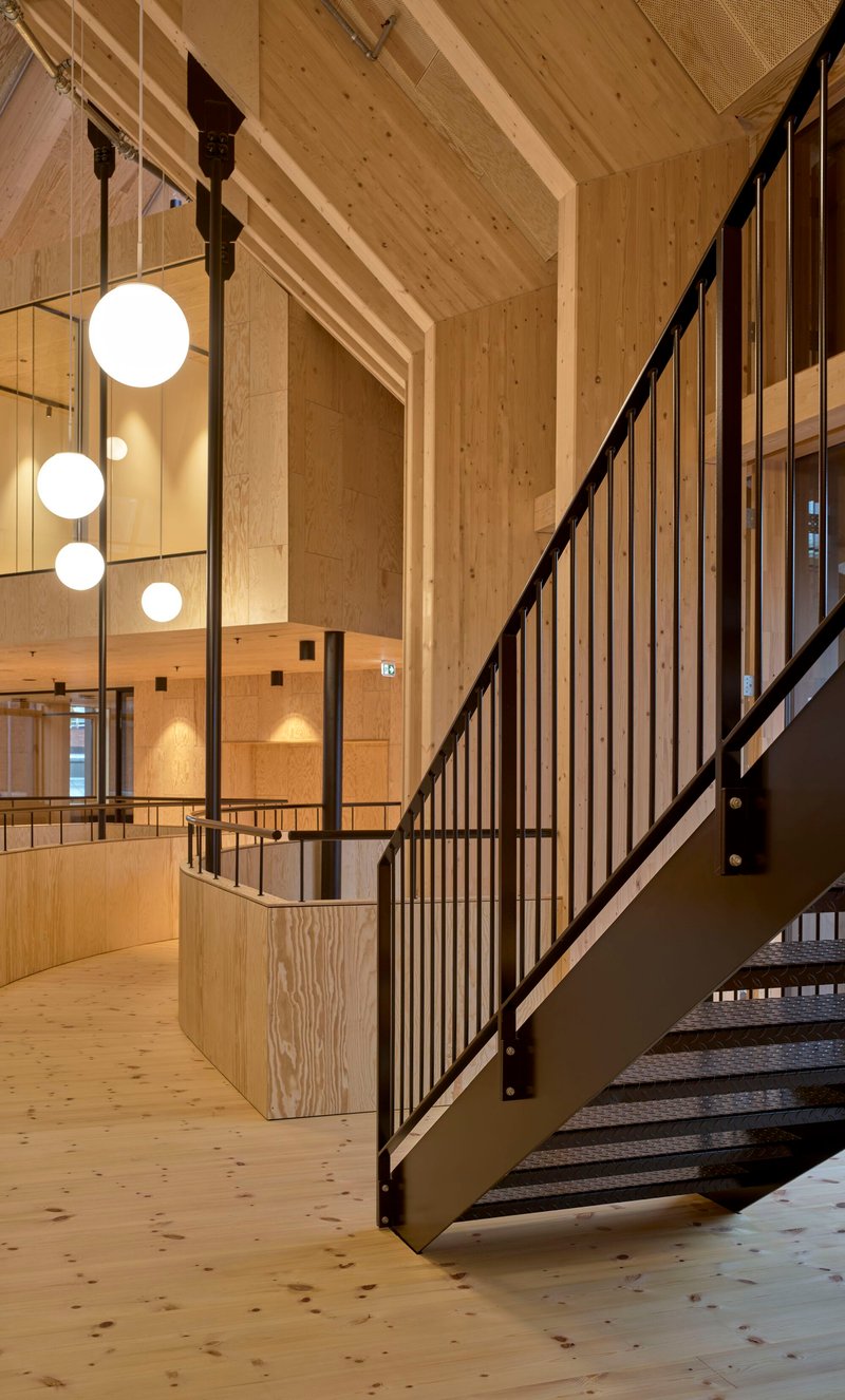
The central atrium is the move that holds everything together. Rising through the full height of the building, it is lined with cross-laminated timber panels and lit from above by the sawtooth roof. A wide staircase doubles as tiered seating, turning vertical circulation into a place to sit, wait, eat, or simply watch other people move through the space. Suspended globe pendants hang on long cables, punctuating the vaulted ceiling like lanterns in a market hall.
The vaulted timber ceiling gives the atrium a scale that feels ecclesiastical without being solemn. The proportions are generous but the materials are familiar: plywood, exposed rafters, simple steel connections. It reads as a workshop or a community hall rather than a hospital lobby, which is precisely the point.
Layered Levels and Casual Circulation
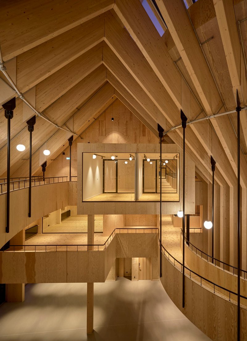
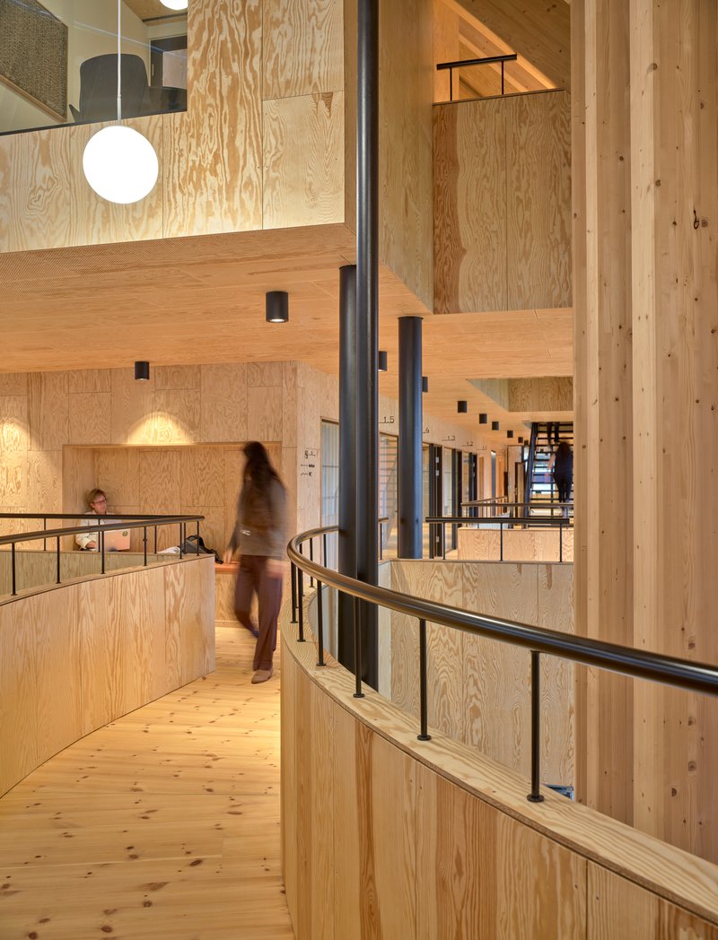
Mezzanines, galleries, and half-levels wrap the atrium on multiple sides, creating a sectional complexity that rewards exploration. Cable railings and black steel balustrades keep sightlines open, so you can always orient yourself relative to the heart space below. The effect is something like a miniature city: layered, visible, full of overlapping activities.
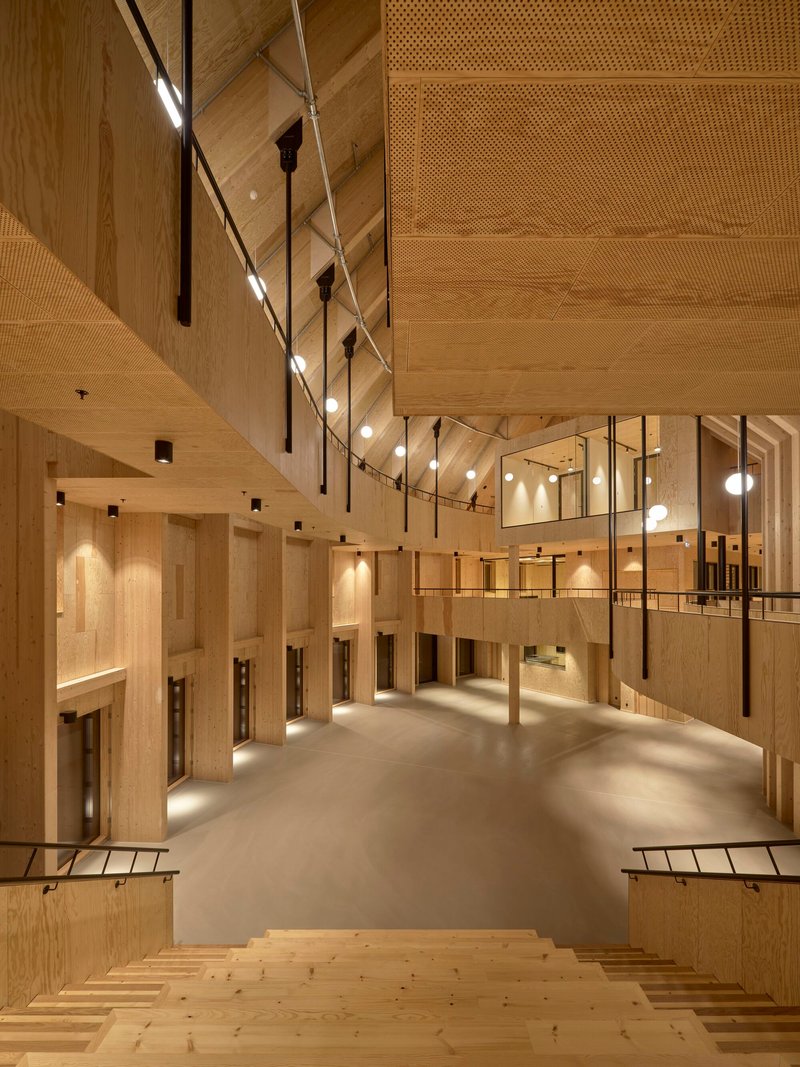
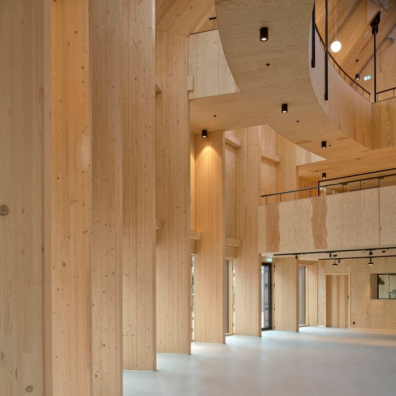
Circulation is deliberately non-hierarchical. Staff and patients share staircases and corridors. Upper-level walkways are wide enough for a conversation, not just a single-file march. The perforated acoustic panels overhead keep noise levels manageable despite the openness, a technical detail that enables the social ambition of the plan.
Stepped Seating and Shared Kitchens
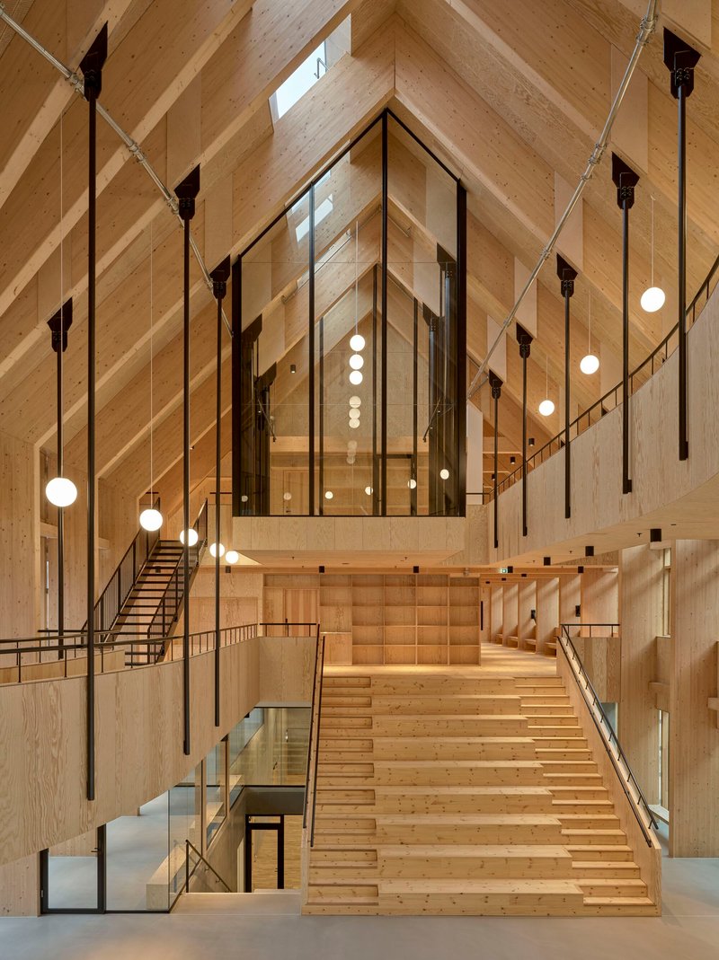
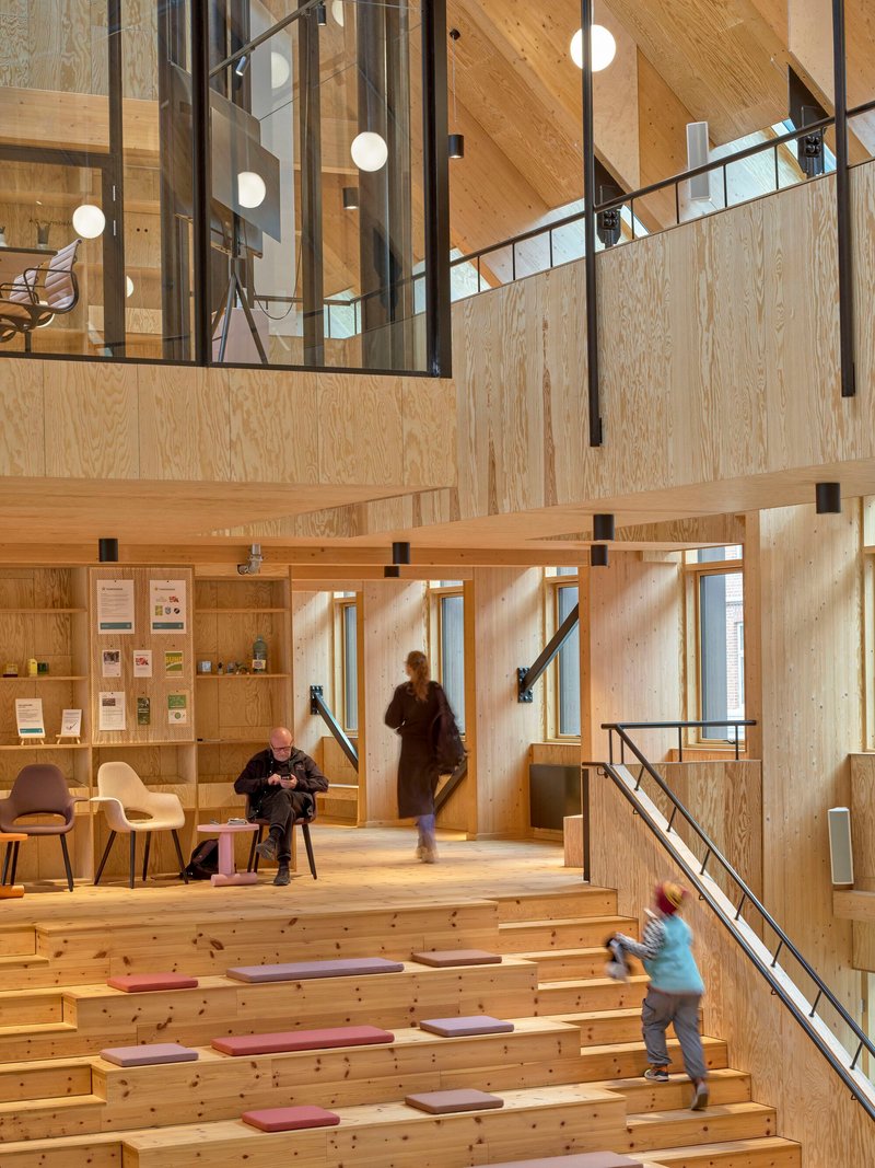
Throughout the building, tiered seating areas and communal kitchens serve as informal gathering points. The stepped amphitheatre under the diagonal timber beams is the most dramatic example: it can host a lecture, a yoga class, or a group of teenagers doing nothing in particular. The plywood benches are robust and unadorned, designed to age gracefully under heavy use.
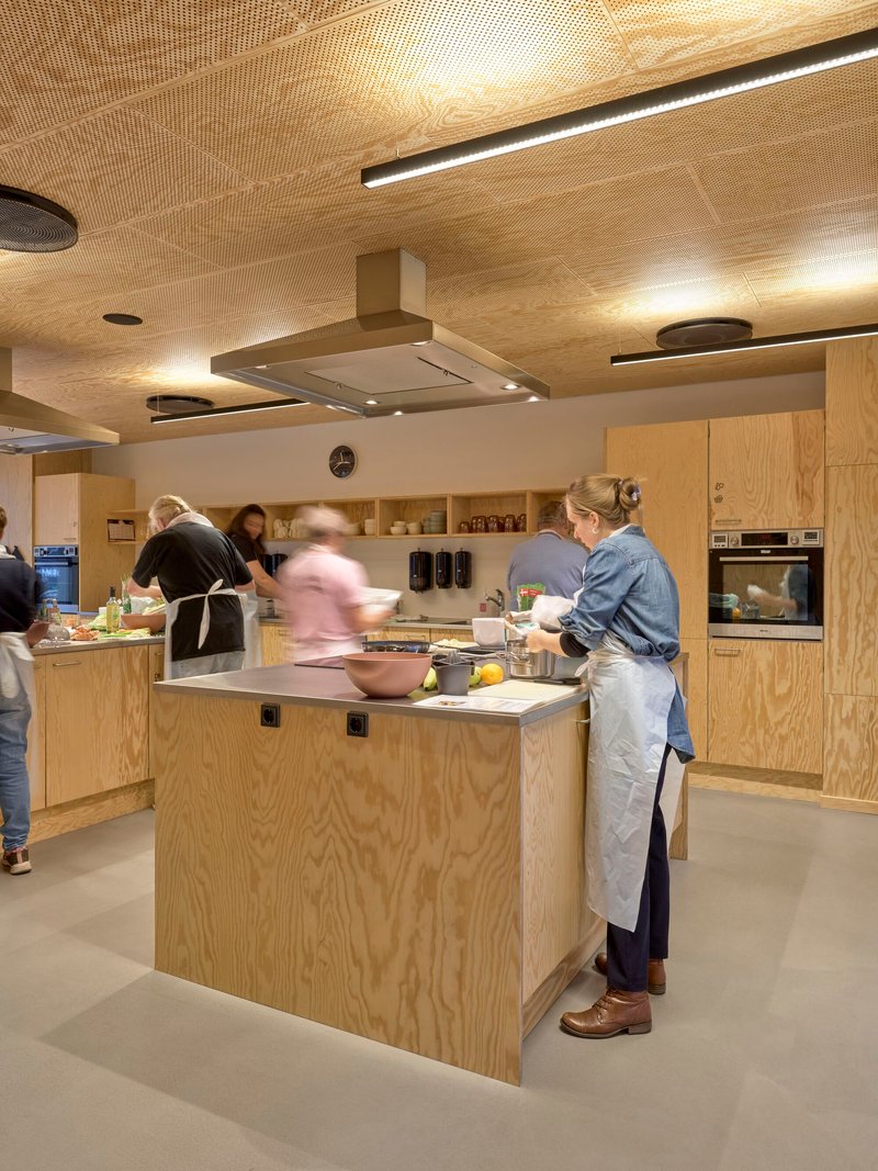
The communal kitchen, with its plywood island and open shelving, is a deliberate provocation against the vending-machine culture of conventional health facilities. Preparing food together is framed as part of the health program, not an afterthought. It is a small but significant design decision that reveals how seriously Mandrup takes the building's social mission.
Sports Halls, Corridors, and Quiet Rooms
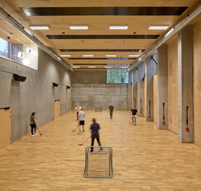
The sports hall is a counterpoint to the timber-lined warmth elsewhere. Board-marked concrete walls give it a raw, tactile quality, and clerestory windows wash the space with even light. It is a room built for impact and sweat, not decoration. The ceiling beams are exposed, and the ductwork is visible, treating function as its own aesthetic.
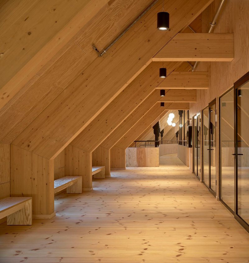
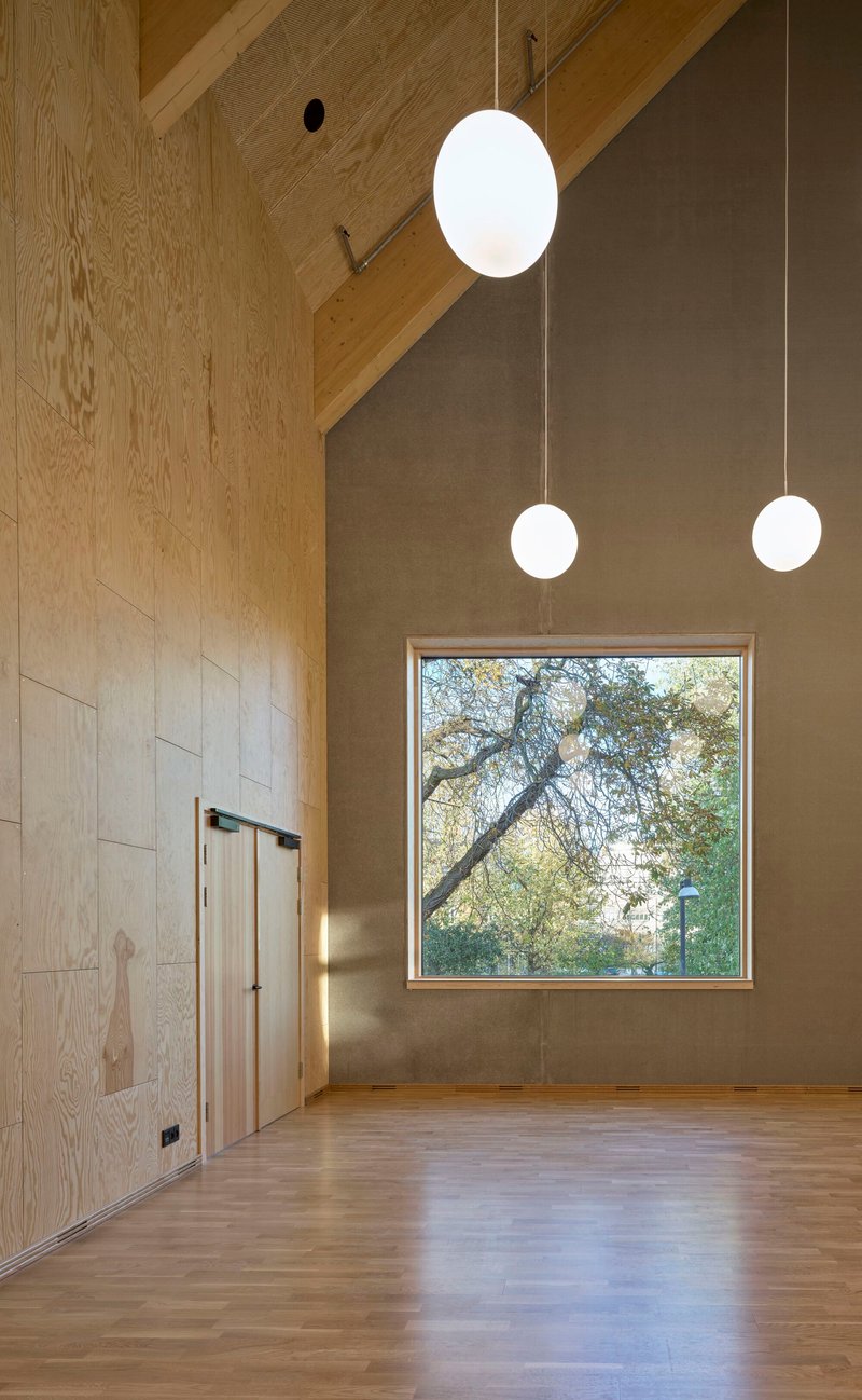
Quieter upper-floor corridors adopt the pitched timber ceiling as their defining feature, with built-in benches and glazed partitions creating alcoves for conversation or solitary waiting. A square window at the end of one double-height room frames a single bare tree, a composed moment of stillness in a building otherwise full of motion.
Staircases as Architecture
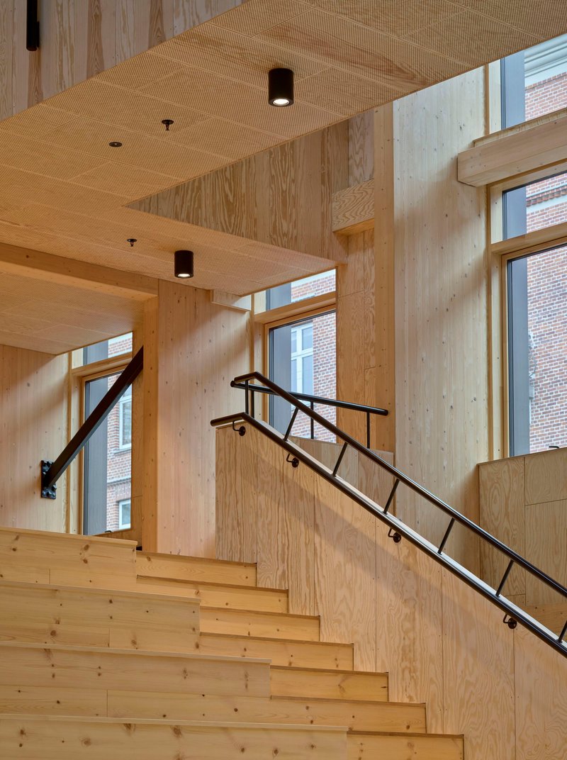
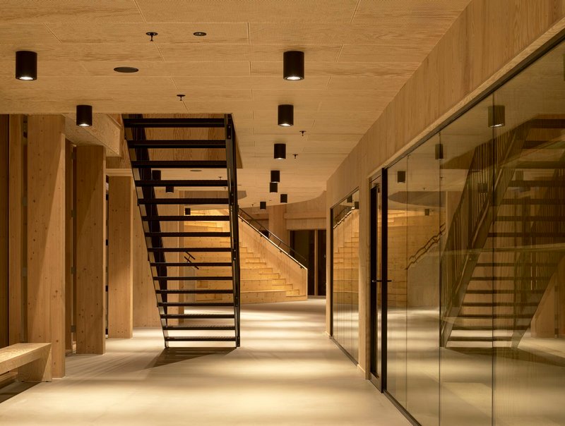
Mandrup treats every staircase as an opportunity rather than an obligation. The wood-clad stair bathed in afternoon sun from tall windows is arguably the most photogenic moment in the building, but it is also the most functional: it connects the ground floor to the upper consultation rooms in a way that encourages walking rather than elevator use. Black metal railings provide a graphic counterpoint to the honey-toned timber, keeping the visual language crisp.
Open-tread steel stairs in the atrium make the building's structure legible. You can see through and across them, which reinforces the sense that every floor belongs to a single interconnected space. Globe pendants descend at each landing, acting as wayfinding markers that are never labeled as such.
Plans and Drawings
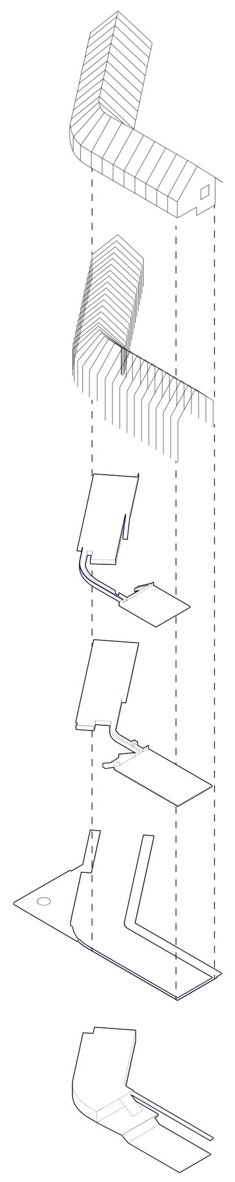
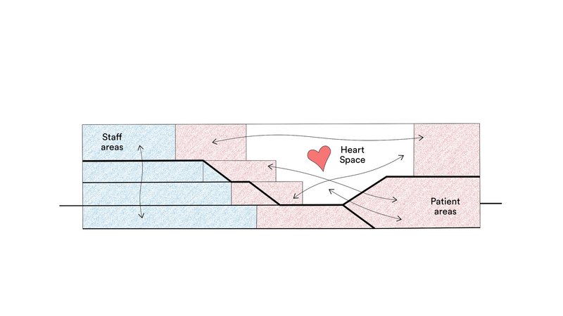
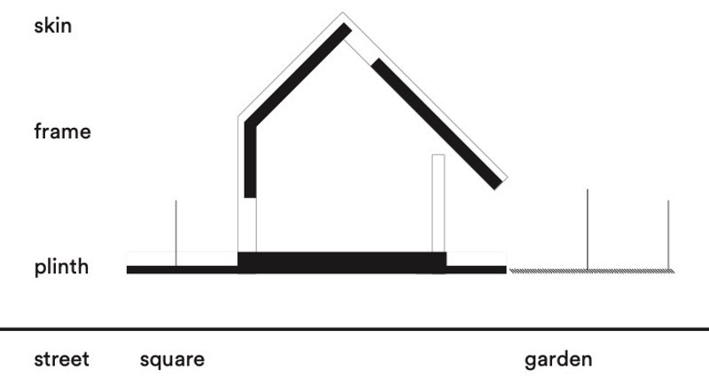
The axonometric drawing pulls the building apart to reveal how the distinct volumes relate to one another: angled wings pivot around the central heart space, each housing a different part of the health program. The accompanying diagram color-codes staff areas in blue and patient areas in pink, making visible the deliberate overlap at the atrium core. A sectional concept sketch labels the building as three layers: plinth, frame, and skin, grounding its formal ambitions in a legible tectonic logic.
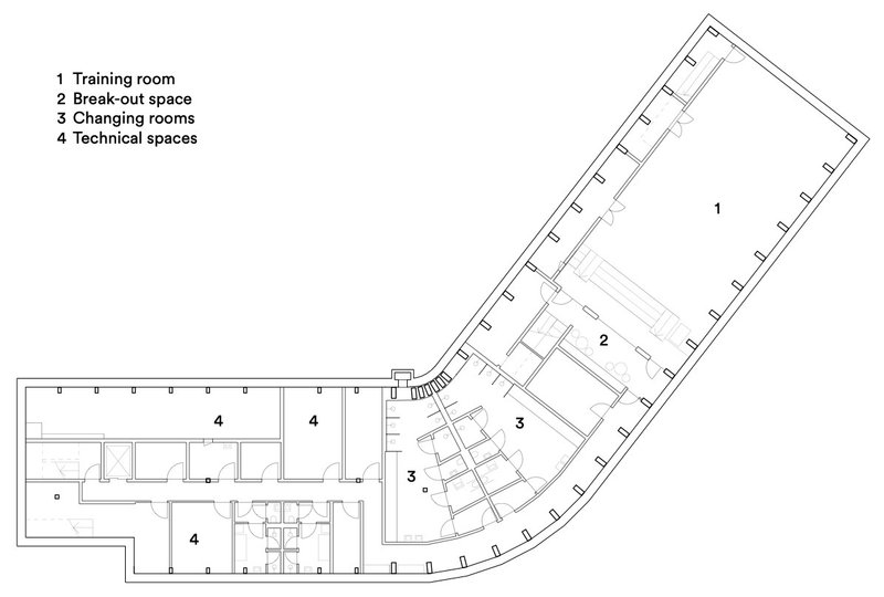
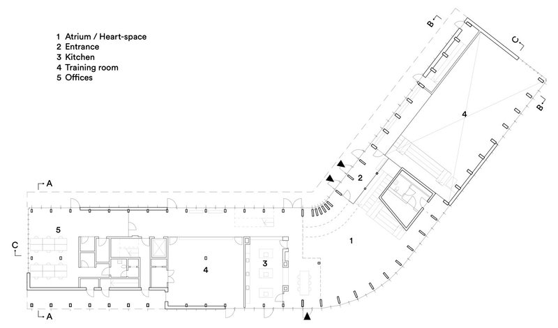
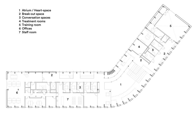
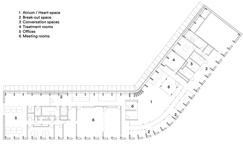
The floor plans across multiple levels show how the angled wings organize clinical rooms, offices, training spaces, and breakout areas around the central atrium. Circulation is never a simple double-loaded corridor; instead, paths curve and widen, creating informal social spaces along the way. The section cut lines on the ground-floor plan hint at the dramatic sectional variety that the building achieves within a relatively compact footprint.
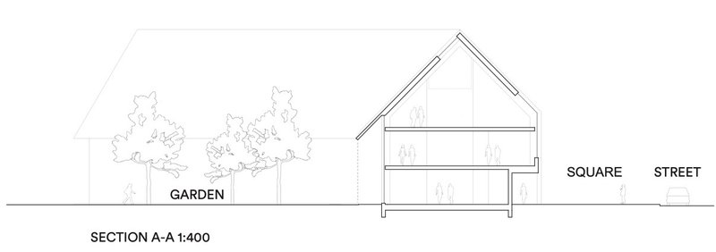
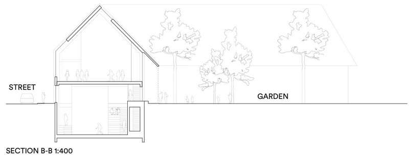
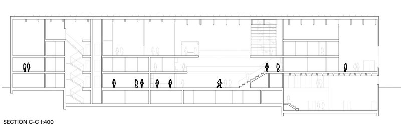
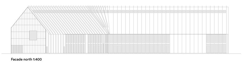
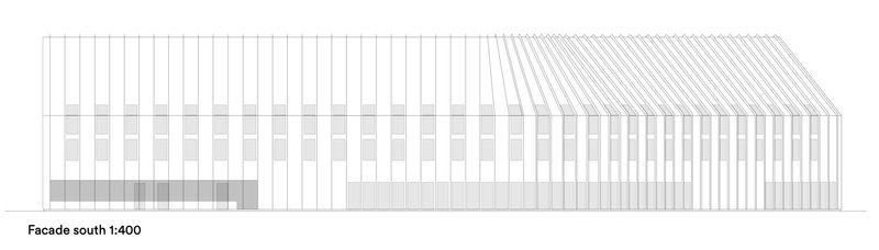
The sections confirm what the interior photographs suggest: the building's split levels, mezzanines, and pitched ceilings create far more spatial variety than the exterior silhouette implies. The longitudinal section through the heart space shows how the stepped seating, upper galleries, and clerestory lighting work together to produce a single, legible public room. The elevations, rendered in restrained line work, show the vertical cladding rhythm and hatched roof detailing that give the facade its disciplined texture.
Why This Project Matters
The Center for Health matters because it refuses to treat healthcare architecture as a purely technical problem. Dorte Mandrup has designed a building where the waiting room is an amphitheatre, the corridor is a gallery, and the kitchen is part of the prescription. Every design decision, from the timber materiality to the split-level section to the planted courtyards, points toward the same conviction: that physical health and social belonging are inseparable, and that architecture has a role to play in both.
It also stands as evidence that civic buildings in residential neighborhoods do not need to shout. The dark gabled volumes defer to Copenhagen's domestic scale while the interior delivers a spatial richness that most public buildings twice its size fail to achieve. If the measure of a health center is whether people want to spend time there even when they are not sick, this one passes the test.
Center for Health by Dorte Mandrup, Copenhagen, Denmark.
About the Studio
Share Your Own Work on uni.xyz
If projects like this are the kind of work you want to make, uni.xyz is a place to publish your own, find collaborators, and enter design competitions.

Popular Articles
Popular articles from the community
Guangzhou's Twin Towers Interiors Move Like Water
DuShe Architectural Design shapes the lobbies of a massive Guangzhou transit hub with undulating ceilings and deep geological materiality.
MAKER architecten Rewire a 1972 Brutalist Dormitory on the VUB Campus as a Living Lab
A modular renovation strategy in Belgium breathes new life into Willy Van Der Meeren's modernist student housing without erasing its concrete bones.
Bood Design Bureau Splits a Gilan Residence in Two to Let the Forest In
Double Side House negotiates privacy and openness through interlocking concrete volumes and planted courtyards in northern Iran's humid Caspian lowlands.
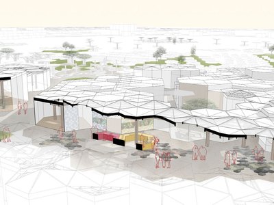
Filtering Space: A Gradual Spatial Experience
From urban intensity to spatial calm.


Similar Reads
You might also enjoy these articles
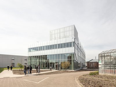
STEM School Mechelen by LAVA Architecten: A Future-Ready Educational Architecture in Belgium
Flexible, sustainable STEM school in Mechelen featuring modular classrooms, acoustic innovation, and energy-efficient design supporting future-focused collaborative learning environments.
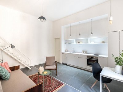
Marvila Apartment Renovation in Lisbon: A Bright Minimalist Attic Transformation by KEMA Studio
Bright attic transformed into minimalist Lisbon apartment with skylights, sustainable materials, open plan layout, and industrial-inspired interior design elements.
20 Most Popular Commercial Architecture Projects of 2025
From sustainable market concepts to heritage factories, the commercial buildings and proposals that drew the most attention on uni.xyz this year.
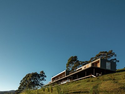
Mantiqueira House by SysHaus and M Magalhães Estúdio
A linear modular house embedded in Serra da Mantiqueira, integrating panoramic views, sustainable prefabrication, minimal terrain impact, and contemporary interiors.


Comments (0)
Please login or sign up to add comments
No comments yet. Be the first to comment!