

Graham Baba Architects Guts a Seattle Fish Processing Plant and Fills It with Light
West Canal Yards transforms a 181,000-square-foot industrial complex on Salmon Bay into a flexible maker and maritime campus.
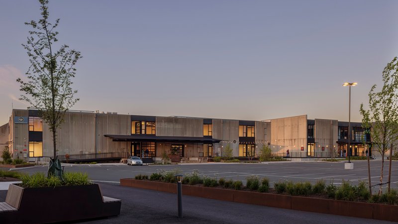
For decades, West Canal Yards processed fish on the banks of Seattle's Ship Canal. Two buildings, one of them housing a 30,000-square-foot freezer, sat behind tilt-up concrete panels that kept the world out and the cold in. Graham Baba Architects saw those same panels as an opportunity: remove select ones, replace them with glass and metal, and let the industrial skeleton do what it was always engineered to do, just for a completely different set of occupants.
What makes the project genuinely interesting is that it refuses to treat adaptive reuse as a cosmetic exercise. The architects describe it not as reuse of buildings but as reuse of place. That distinction matters on a nine-acre site with nearly 1,000 feet of wharf frontage, a complex overlay of shoreline and marine-industrial zoning, and a location wedged between Ballard and Queen Anne that still welcomes Argosy cruise ships at its docks. The design balances immediate tenancy with long-term redevelopment flexibility, treating the entire campus as an evolving organism rather than a finished product.
Surgical Demolition as Design Strategy
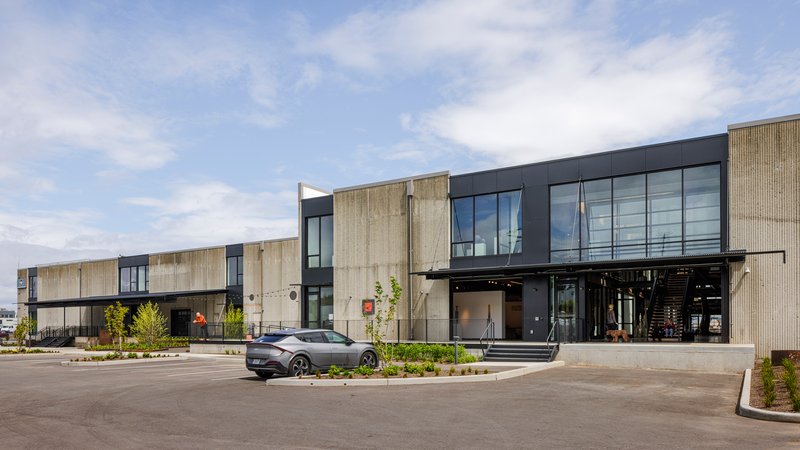
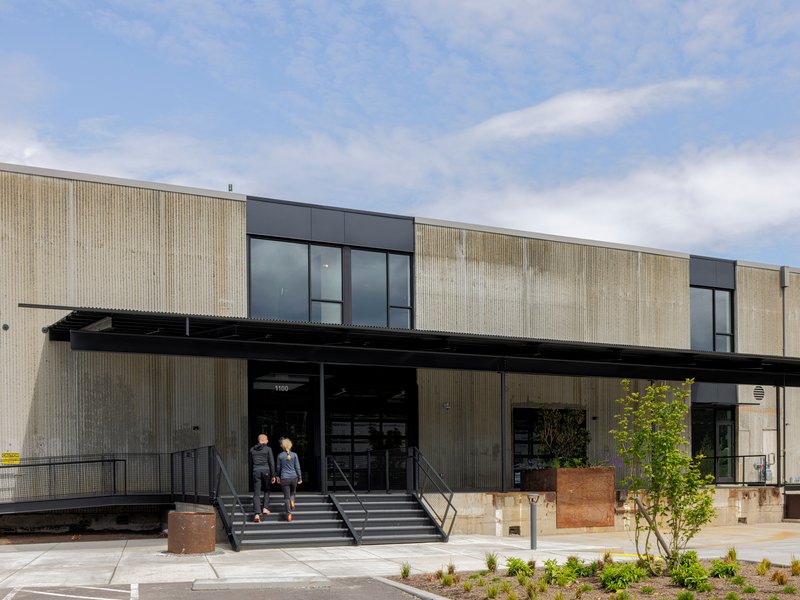
Tilt-up concrete construction is pragmatic, repetitive, and rarely celebrated. Graham Baba treated the existing panels like playing cards, keeping the ones they needed for structure and seismic performance while pulling others out entirely. Twelve hollow-core panels, each 28 feet tall, were salvaged for reuse. Where panels came out, large expanses of glass and metal paneling went in, creating a facade that reads as a dialogue between the building's industrial past and its new openness.
The exterior still signals its origins. Corrugated metal, canopied entries, weathered steel planters: these are not decorative references to industry but continuations of a material vocabulary the building already owned. The restraint is the point. No one walking past will mistake this for a boutique office park, and that honesty serves the neighborhood well.
A Zipper of Light Through the Core
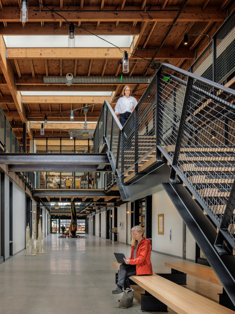
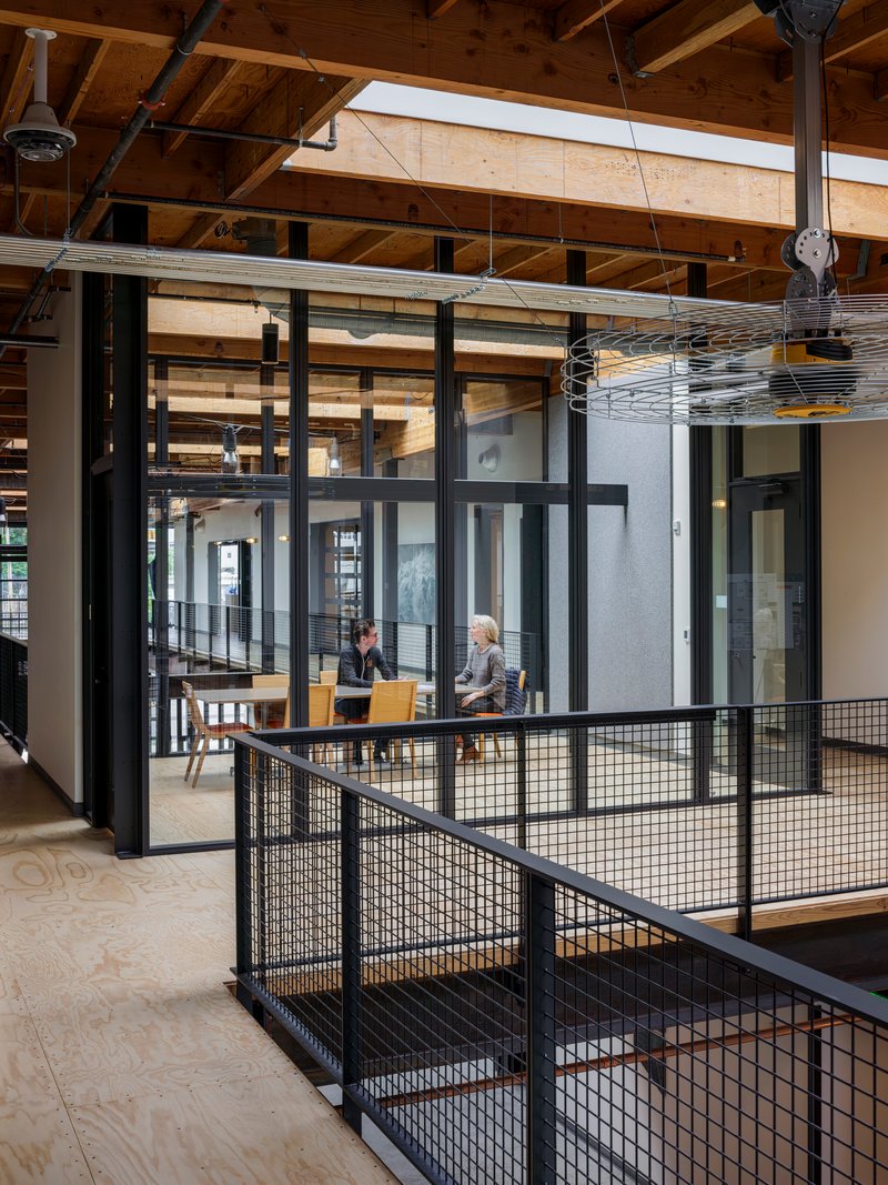
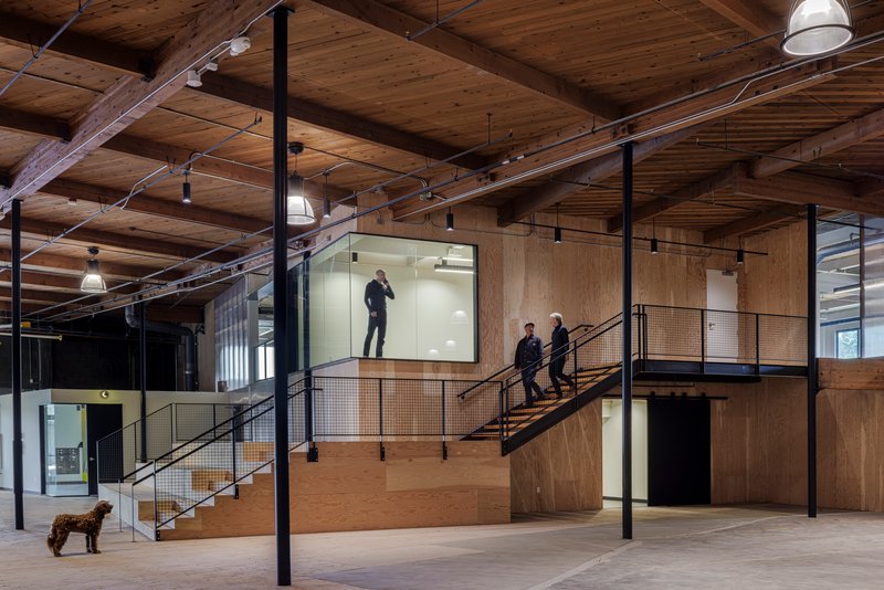
The most dramatic interior move is the central spine of skylights and glass that the architects call a "zipper." It runs through the building's core, pulling daylight deep into what was once a windowless processing facility. Combined with the new glass walls at the perimeter, the effect transforms a 22-foot-tall concrete box into a space that feels closer to a covered market than a repurposed freezer.
Natural light is the cheapest amenity a landlord can offer and the hardest to retrofit. By concentrating the skylights along a central corridor and flanking them with mezzanine-level walkways, the architects created a legible interior geography: you always know where the spine is, and you always know which way the light falls. Galleries, stairwells, and glazed meeting rooms orbit this axis, each catching daylight differently depending on level and orientation.
Steel and Mass Timber Mezzanines
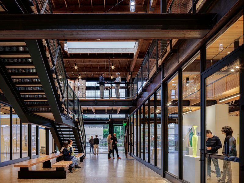
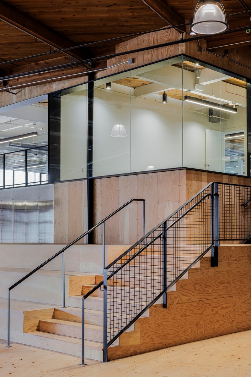
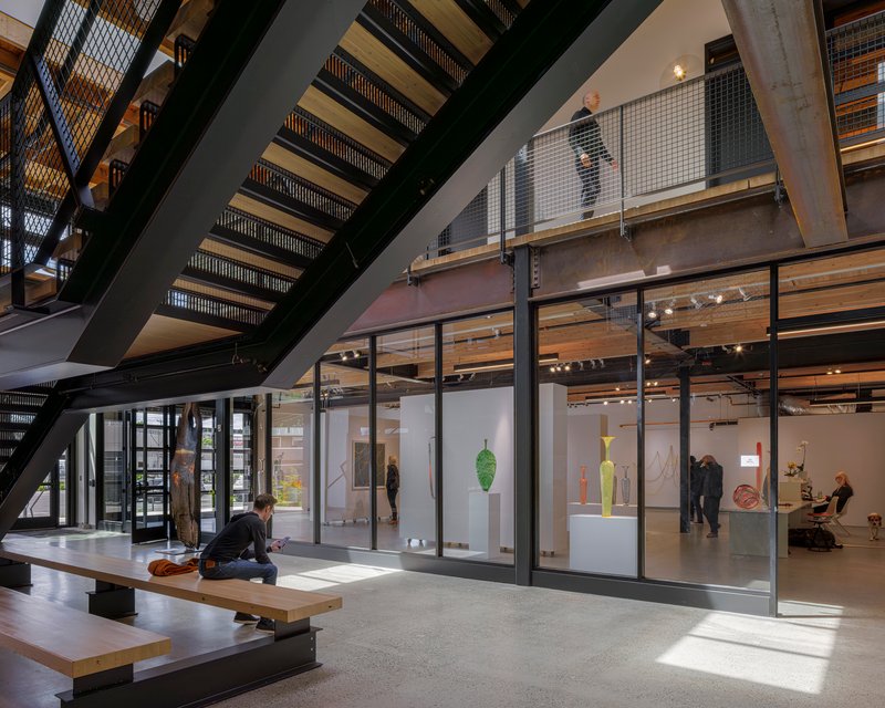
Inserting a second floor into a single-story industrial building is a classic adaptive reuse maneuver, but the execution here is sharper than most. Steel frames and mass timber joists create new mezzanine levels that feel structurally honest: you can see exactly how the new structure lands on the old one. Building 1100 grew from 104,000 to 132,000 square feet through these insertions, gaining usable area without adding a single exterior wall.
The material pairing of steel mesh railings and exposed timber joists establishes a warm, workshop tone throughout. Plywood stair treads, black metal balustrades, and polished concrete floors all sit comfortably within the existing concrete shell. Nothing is precious, nothing demands white gloves, and that looseness is exactly right for a campus aimed at makers and maritime tenants.
Preserved Trees as Vertical Anchors
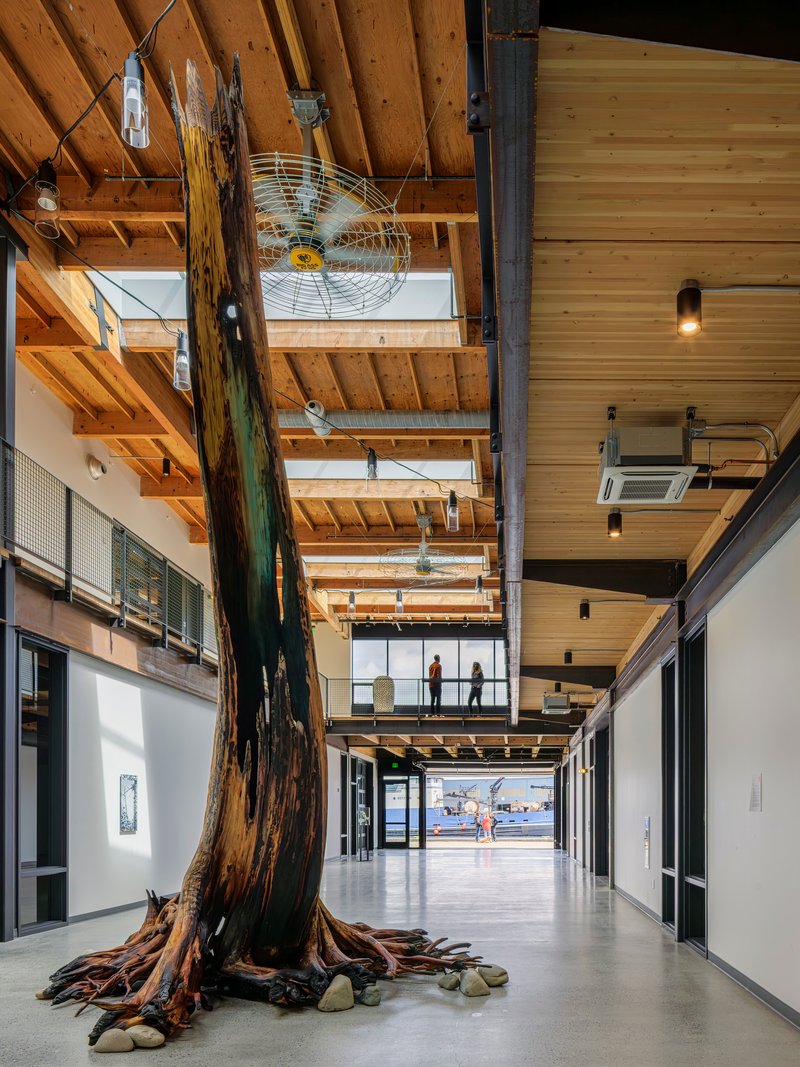
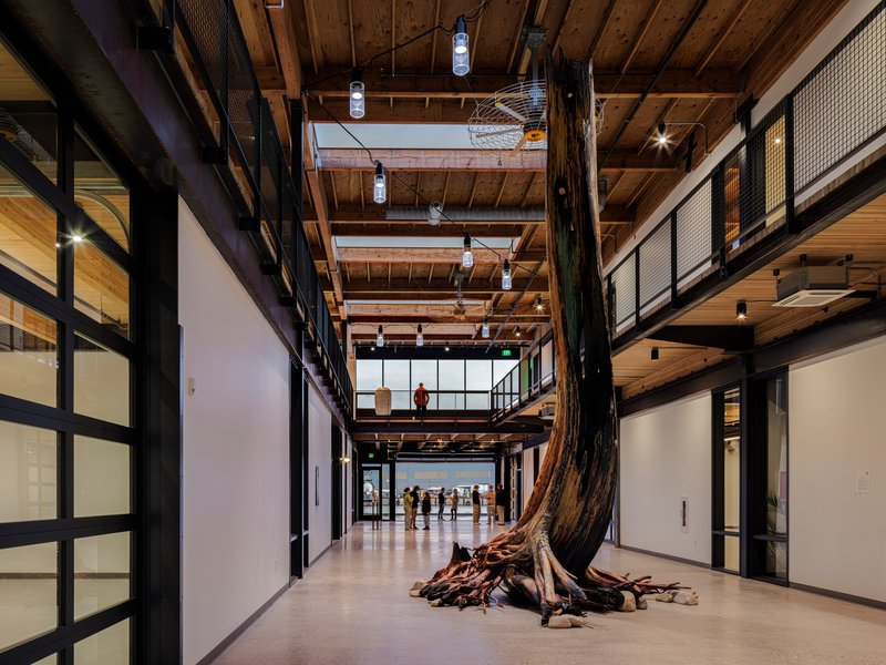
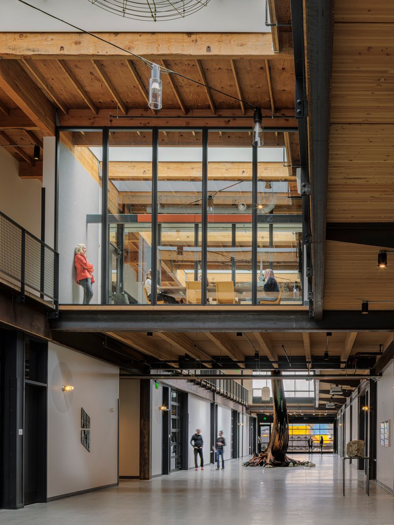
The most unexpected gesture in the building is the preserved tree trunk that runs floor to ceiling in the main corridor, its roots still exposed against the polished concrete. It reads as both artifact and wayfinding device, a vertical anchor in a long horizontal volume. Whether it is a remnant of the site's pre-industrial landscape or a deliberate installation, its presence forces you to slow down in a space designed for efficient circulation.
Moments like this elevate the project above standard spec-office conversion. They signal that the architects were paying attention to what makes a place memorable, not just functional, and that the developer was willing to protect something that generates no rent but generates enormous character.
Tenant Spaces and Shared Amenities
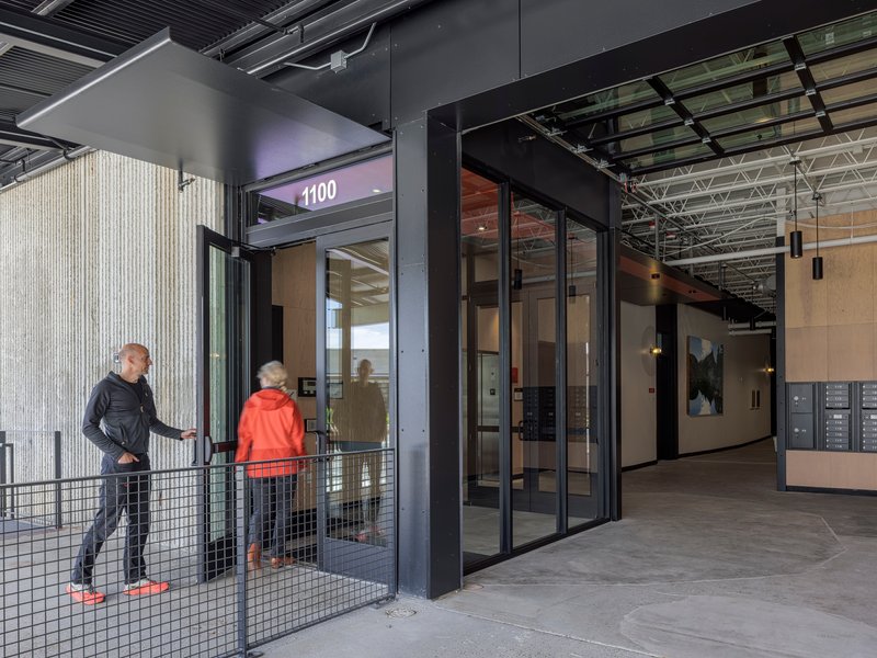
The smaller warehouse and office building houses five large suites, while the main building organizes tenant spaces around the central core. Shared amenities, including a communal kitchen, conference room, fitness facilities, showers, and lockers, cluster near common circulation. The numbered doors and industrial signage reinforce a campus mentality: tenants are neighbors who share infrastructure, not strangers behind locked corridors.
Outside, the site design reimagines what was a parking lot into a pedestrian-focused landscape with a beer garden, shared patio, and large gathering space along the ship canal. Tactical urbanism is the term the architects use, and it captures the provisional spirit well. Weekly neighborhood events and community festivals can take over the same ground that accommodates daily foot traffic. The wharf itself remains active, with larger craft able to dock and cruise ships making periodic use of the moorage. It is a rare project where the landscape program is as hybrid as the building program.
Plans and Drawings
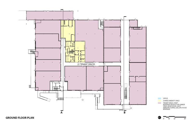
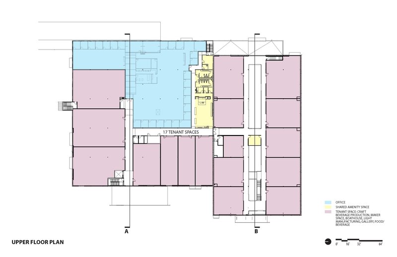
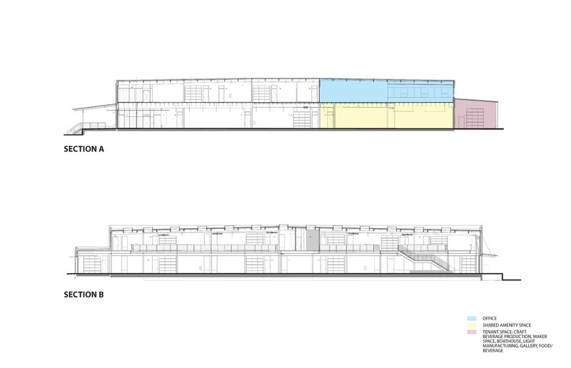
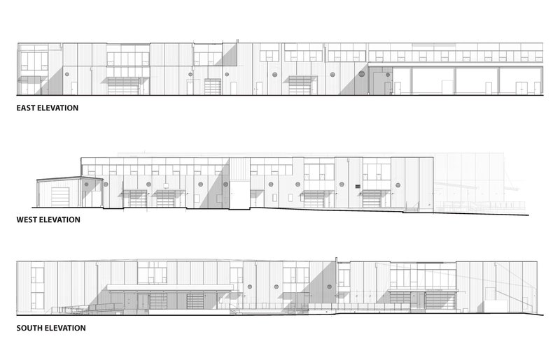
The floor plans reveal how the mezzanine insertions work in section: the ground level maintains large, flexible tenant bays while the upper floor concentrates shared amenities and smaller subdivided spaces. Color-coded programmatic zones in the drawings make legible a strategy that could easily read as chaos in plan. The section cuts are particularly instructive, showing how the 22-foot volume accommodates a full second level while preserving generous ceiling heights on both floors.
The elevation drawings confirm the facade logic. East, west, and south elevations each show the rhythm of retained concrete panels interrupted by new glass and metal openings. Mezzanine volumes and vertical circulation cores register on the exterior as subtle shifts in cladding material and window proportion, giving each facade a specific identity without breaking the building's industrial coherence.
Why This Project Matters
Seattle's waterfront industrial buildings are disappearing under condos and mixed-use towers at a pace that alarms anyone who understands what those structures contribute to a city's economic and cultural resilience. West Canal Yards demonstrates that you can modernize a fish processing plant without erasing it, that tilt-up concrete and shoreline zoning are not obstacles but design parameters worth embracing. Graham Baba's refusal to demolish and rebuild from scratch is both economically shrewd and urbanistically generous.
The deeper lesson is about time. By designing for flexibility rather than finality, the architects have given this nine-acre site room to evolve over decades rather than locking it into a single program. The wharf stays active. The beer garden can become a festival ground. The mezzanines can accommodate tenants who do not yet exist. That kind of patience is rare in development, and it is the quality that will determine whether West Canal Yards becomes a one-cycle renovation or a genuinely durable piece of city.
West Canal Yards by Graham Baba Architects. Located in Seattle, United States. Approximately 181,000 square feet across two buildings on a nine-acre site. Completed in 2025. Photography by Ed Sozinho.
About the Studio
Share Your Own Work on uni.xyz
If projects like this are the kind of work you want to make, uni.xyz is a place to publish your own, find collaborators, and enter design competitions.

Popular Articles
Popular articles from the community
Milan Crossover: Sustainable Architecture for a New Fashion Culture in Milan
Milan Crossover transforms fashion culture through sustainable architecture, linking material libraries, remake studios, and public runways.
Stanton Architects Sculpts a Curving Family Home into Sydney's Inner West Fabric
Five Dock House uses cantilevers, curved concrete, and layered courtyards to carve out privacy on a tight suburban lot in Sydney.
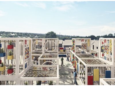
The Faith: Modular Architecture for Play, Learning, and Hope in Kutupalong Refugee Camp
A modular playground architecture project in Bangladesh where play, learning, safety, and hope rebuild childhood inside a refugee camp anew.
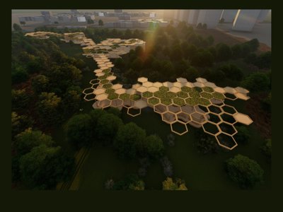
Eco Chapel: A Green Architecture Pavilion Designed in Symbiosis with the Forest
Eco Chapel uses green architecture to weave prayer, learning and reuse into a forest pavilion shaped by modular hexagonal canopies for life.


Similar Reads
You might also enjoy these articles
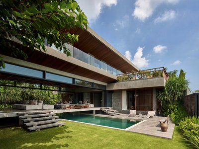
Freebird Residence by Alexis Dornier: A Tropical Modernist Sanctuary in Bali
Floating living pavilion above pool anchors H-shaped tropical villa, blending Japanese minimalism, sustainable strategies, lush landscape, and sculptural interiors.
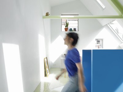
127af Flips a Tiny Bagnolet Rowhouse Upside Down with a Handcrafted Roof Extension
A 55-square-meter terraced house on the edge of Paris gains a luminous upper living floor through lightweight timber and steel.
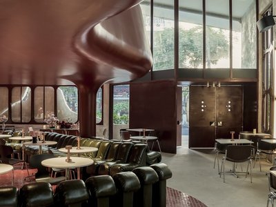
1.61 Design Workshop Wraps a 600-Square-Meter Café in Vietnam in Sculptural Burgundy Drama
Reden Café & Bistro pairs a helical staircase, mosaic floors, and deep red interiors to rethink Vietnamese hospitality space.
The Unbound Brain: A School Shaped by Cognitive Architecture
Cylindrical learning pods radiate like neurons from a central cortex, turning the floor plan into a spatial model of human thought.

Explore Educational Building Competitions
Discover active competitions in this discipline


The Global Benchmark for Architecture Dissertation Awards


Challenge to design public laboratory
Comments (0)
Please login or sign up to add comments
No comments yet. Be the first to comment!