
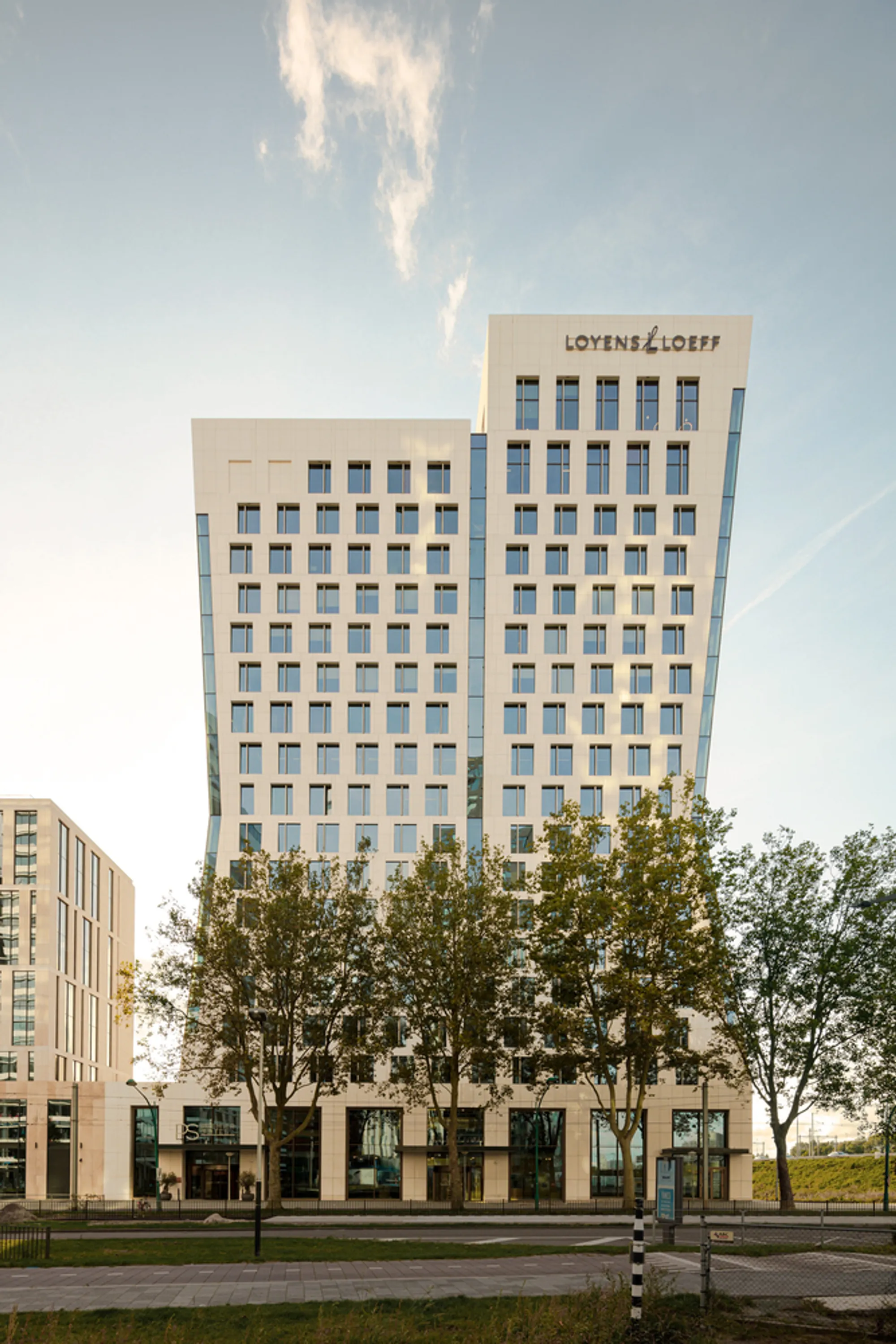
Dam & Partners Architecten Pinches Two Towers into an Hourglass on the Amsterdam Zuidas
A pair of limestone-clad towers with cinched waists redefine mixed-use density along the Dutch capital's busiest business corridor.


Most towers along the Amsterdam Zuidas are extruded rectangles: glass curtain walls, open floor plates, maximum leasable area. The Hourglass Building by Dam & Partners Architecten breaks that logic by making form the primary argument. Two slender volumes splay outward at top and bottom, narrowing at a shared midsection that reads unmistakably as a waist. The silhouette is specific enough to earn the nickname, and for once the name is not marketing hyperbole. It describes the geometry exactly.
What makes the project genuinely interesting, though, is not the profile but what it enables. The pinch creates different floor plate depths at different levels, allowing the building to shift from deep commercial space at the base to shallower residential layouts higher up. The tower's contour is not ornamental; it is a diagram of its own program. That directness is rare in a district where mixed-use ambitions usually hide behind a single facade system and rely on the section drawing to tell the story.
Streetscape and Urban Presence
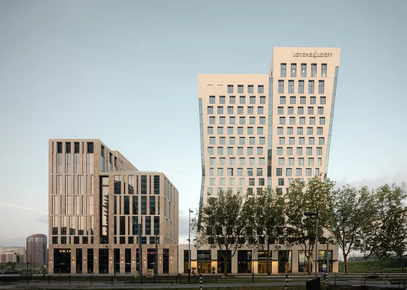
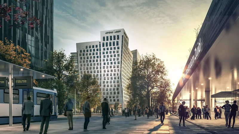
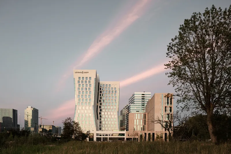
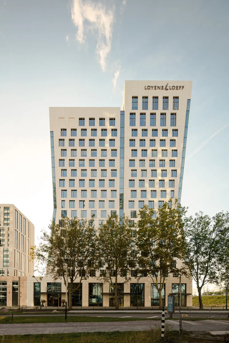
From the street, the twin towers appear as a matched pair, their beige precast panels catching warm light and reading almost monolithically against the Amsterdam sky. Mature trees soften the base, and the canopy of the entrance zone brings the scale down to something a cyclist can relate to. A tram passes at ground level, and the pavement is busy with pedestrians, which means the plinth is doing its job. At dusk, the building holds its composure against a dramatic rainbow in a way that feels almost staged but is simply the reward of a consistent facade system that does not lose coherence at distance.
The Facade as Structural Expression
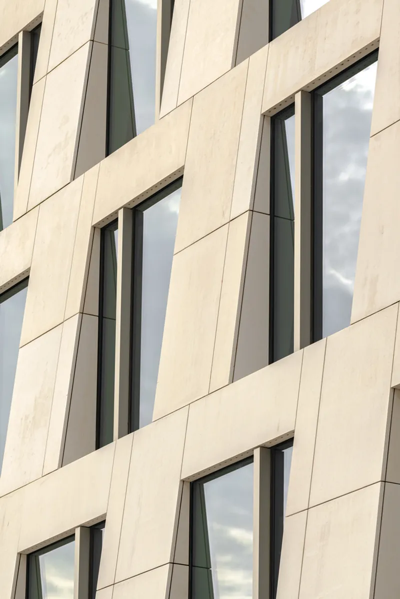
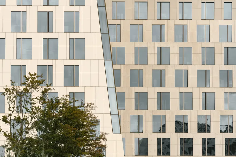
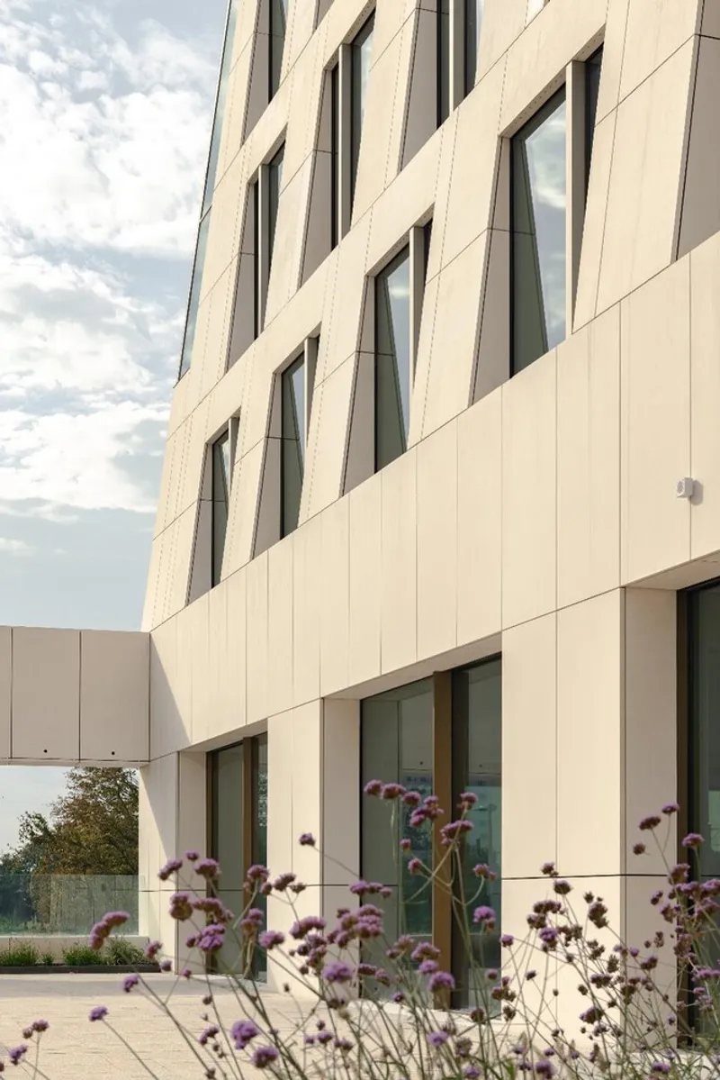
Up close, the limestone panels reveal their real character. Each window is set into an angled recess that catches shadows differently as the sun moves. The result is a surface that is technically repetitive but never visually flat. The canted reveals create a vertical rhythm that elongates each bay and pulls the eye upward, reinforcing the tower's slenderness.
The glazed slots that appear at intervals break the grid just enough to signal something happening behind the wall: a stairwell, a double-height space, a moment of transparency. These interruptions are disciplined. They do not try to be expressive; they mark programmatic shifts honestly. It is a material approach that owes more to masonry tradition than to curtain wall technology, and it gives the building a tactile presence that most Zuidas neighbors lack.
Construction and Prefabrication
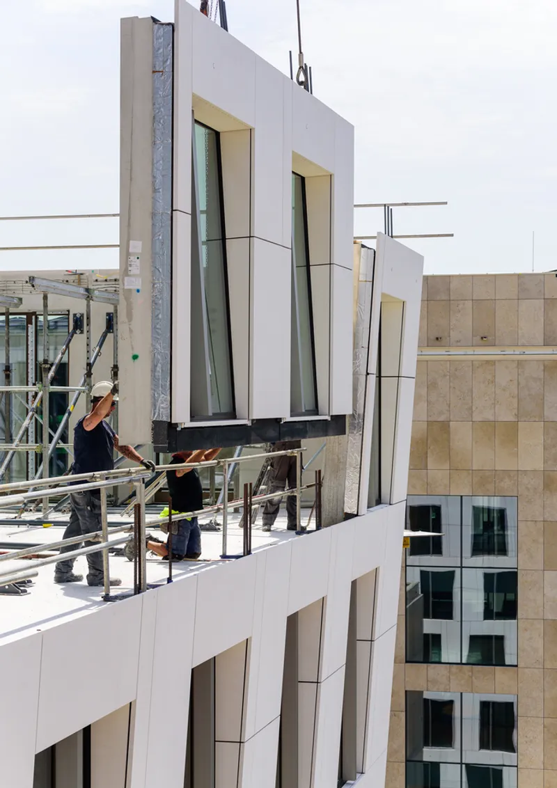
A rooftop construction photograph reveals the logic behind the facade's precision. White prefabricated panels with pre-formed angled window recesses are craned into position, each one a finished piece of architecture arriving on site. The decision to prefabricate was clearly driven by the complexity of the geometry: casting those canted reveals in situ at tower height would be slow and error-prone. Off-site fabrication ensures the tolerances stay tight and the angled surfaces read as intentional rather than approximate.
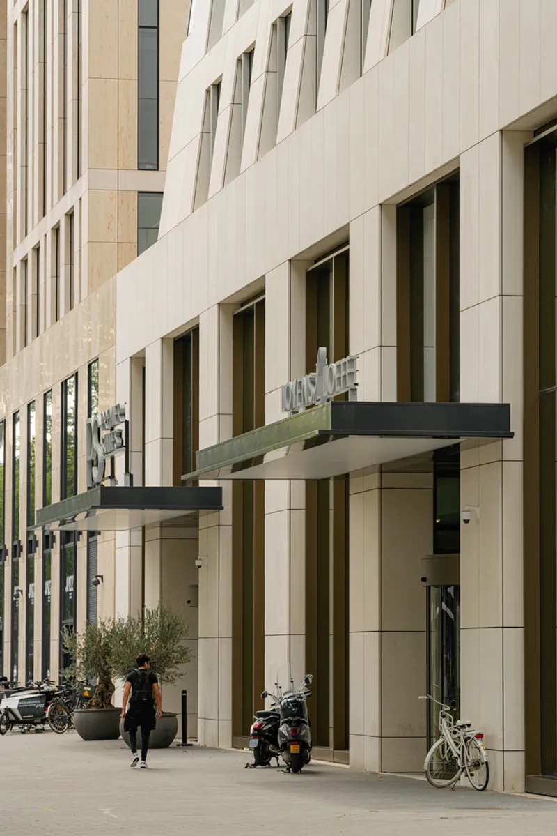
At ground level, the entrance canopies and light-colored cladding panels continue the same material language, extending the tower's identity down to the pavement. Bikes are parked casually beneath the overhang, a reliable indicator that the base feels public and permeable rather than corporate and guarded.
Interior Logic
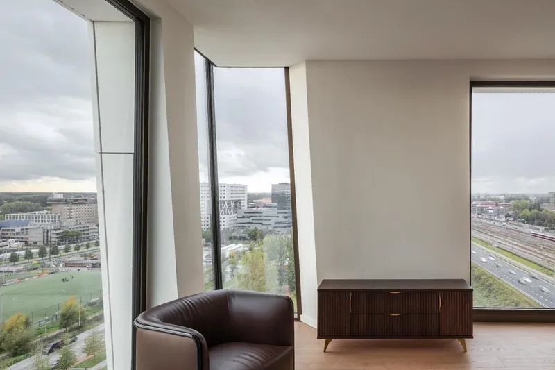
Inside, the canted window bays pay off spatially. A corner unit looks out through floor-to-ceiling glass angled to frame the railway tracks and autumn tree canopy below. The depth of the reveal creates a small niche at the window, a place to stand or sit that is neither fully interior nor fully exterior. It is the kind of spatial bonus that only comes from a thick facade, and it rewards occupants with a relationship to the view that a flat curtain wall cannot provide.
The repetitive window pattern visible from outside translates, on the interior, into a regular cadence of light. Each bay admits a controlled slice of sky, and together they produce an even wash across the floor plate. It is calm and predictable, which is exactly what a workspace or living room needs.
Conceptual Studies
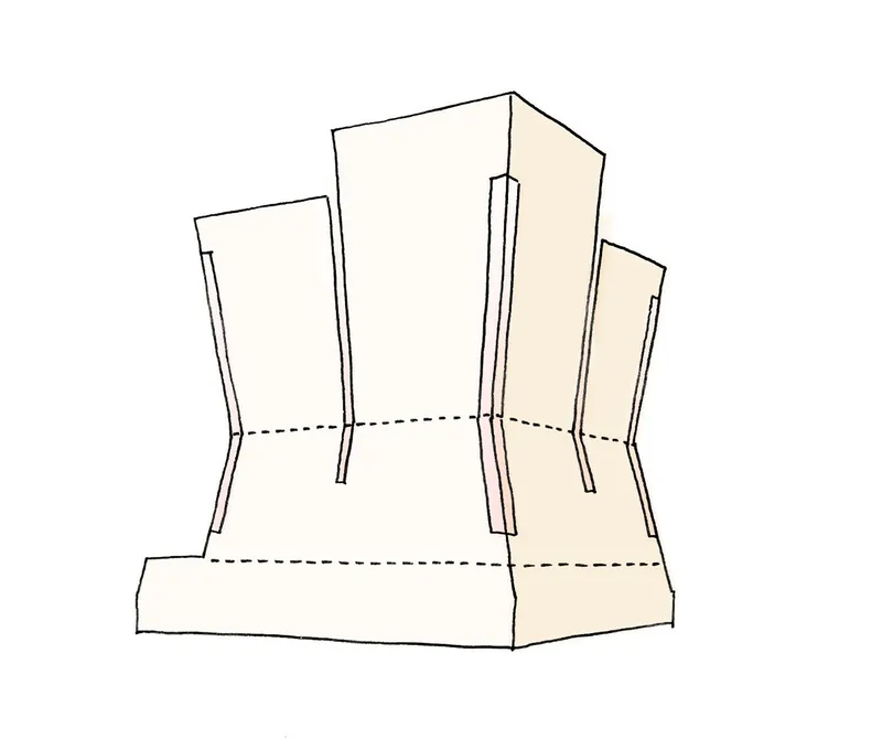
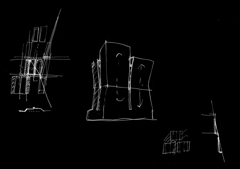
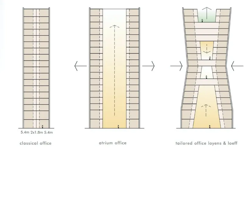
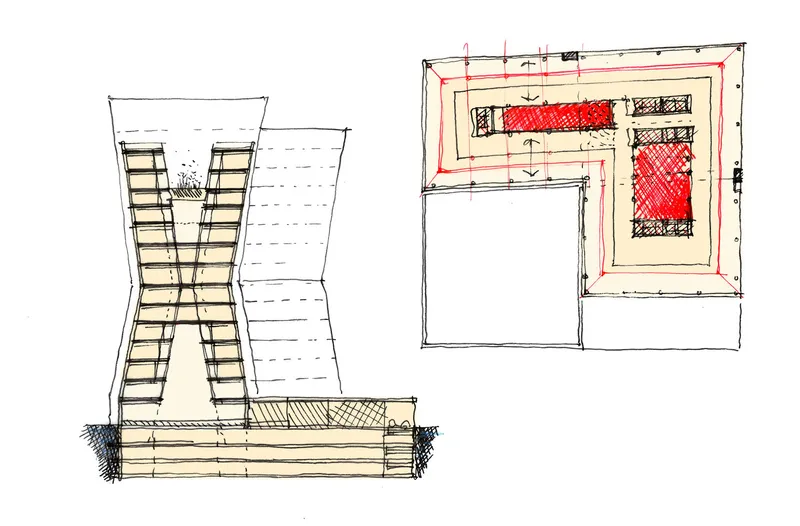
A set of early sketch studies shows the design team testing how three splayed volumes might rise from a shared plinth. The drawings are loose, almost diagrammatic, but they capture the essential move: widening floor plates at the top and bottom, narrowing them at the middle, and letting circulation cores (marked in red) anchor the geometry. A comparative section diagram lays out three office typologies with varying floor plate depths and central atriums, making explicit the link between the tower's profile and its programmatic ambitions.
These sketches are worth studying because they show the hourglass form emerging not from an aesthetic whim but from a systematic comparison of section types. The architects tested how much daylight reaches the center of a deep floor plate versus a narrow one, and the building's shape is the answer to that question.
Plans and Drawings
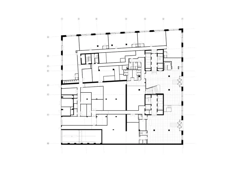
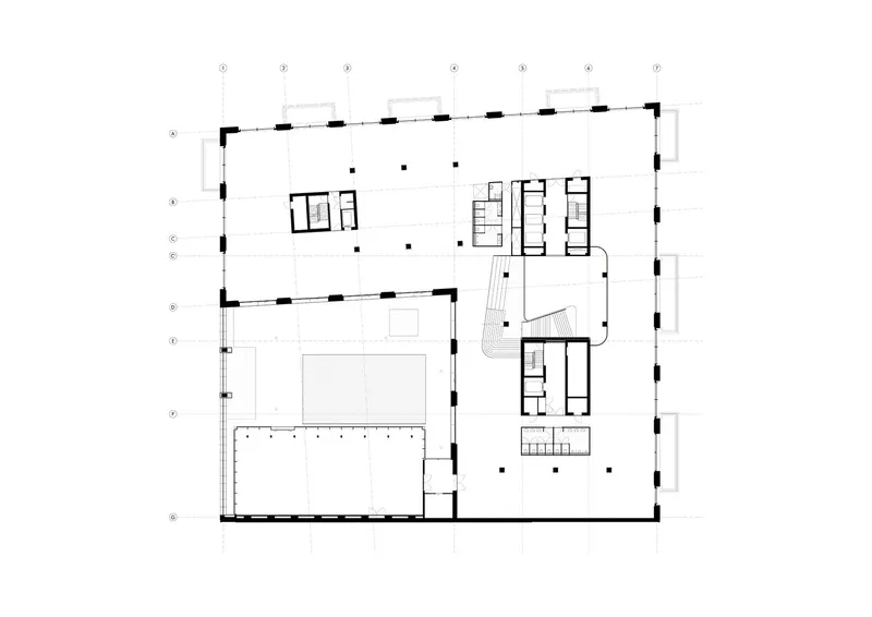
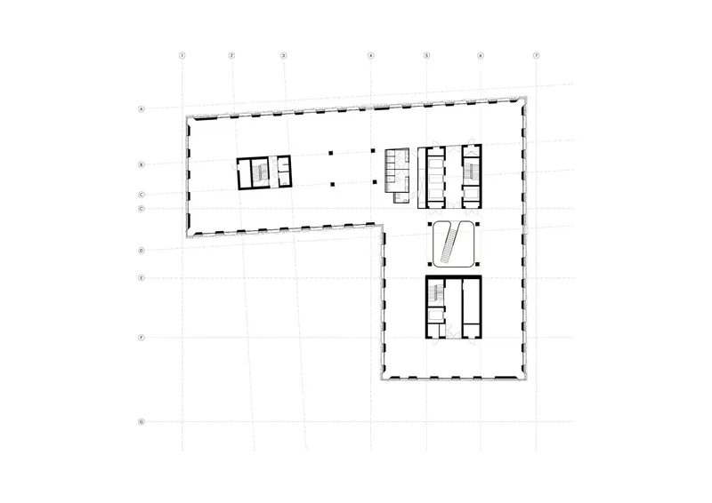
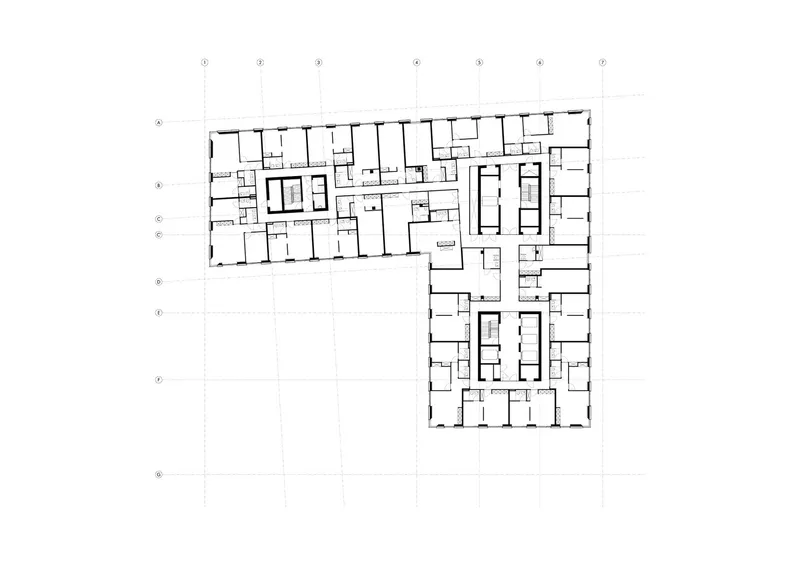
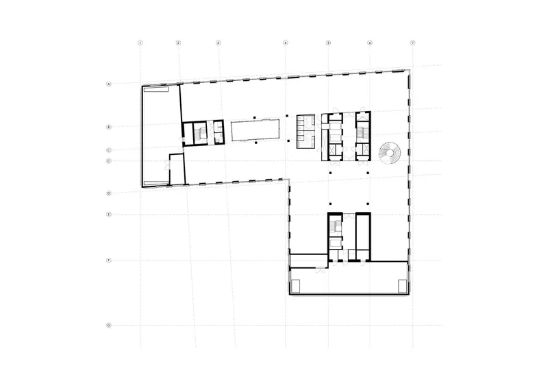
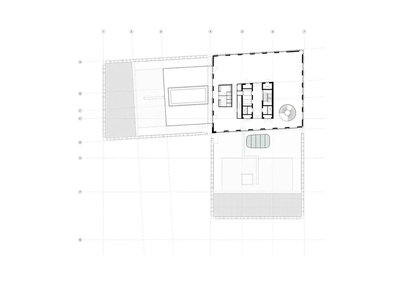
The floor plans trace the building's programmatic gradient clearly. At ground level, rooms organize around a central courtyard with offset wings, creating sheltered outdoor space. The first and second floors show open office clusters connected by stair cores. By the third floor, the plan shifts to residential units lining the perimeter with central circulation and shared amenity spaces. The fourth floor opens up again with workspace and an outdoor terrace at the corner, and the roof plan delivers a pool and planted terrace at the very top.
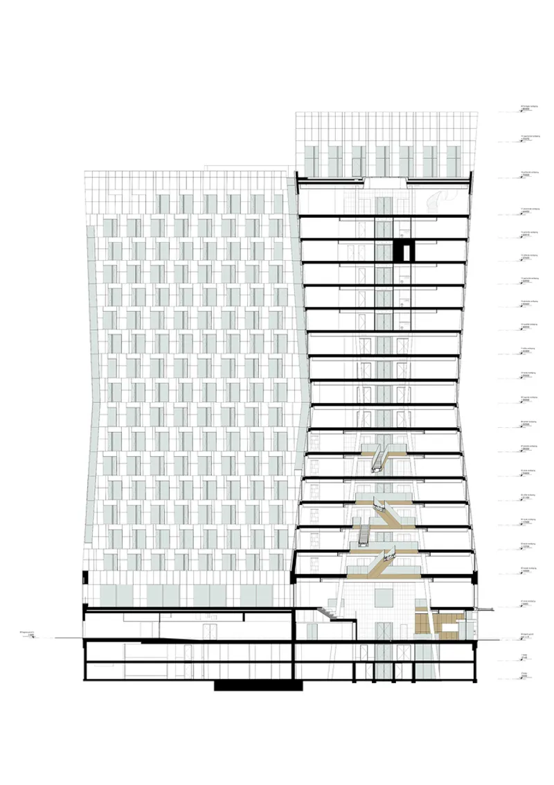
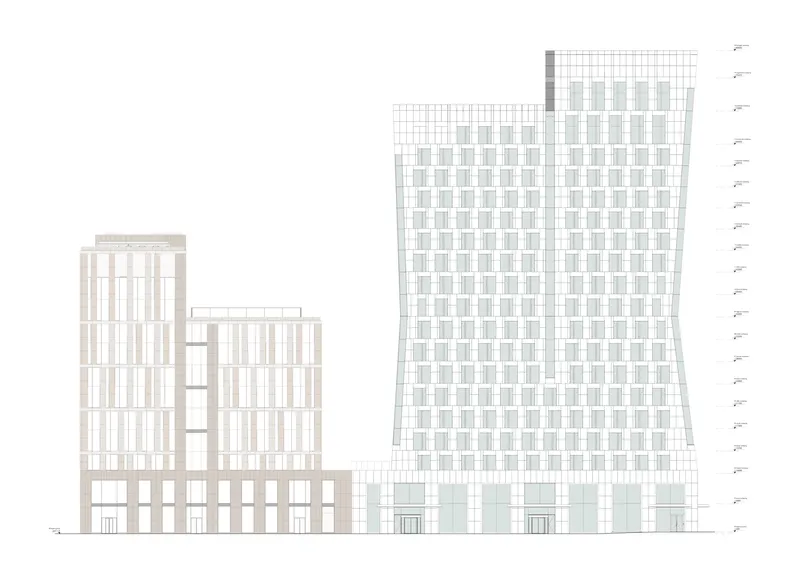
The section drawing confirms what the silhouette promises: repetitive floor plates above a stepped podium, with the tower narrowing and then widening as it rises. The elevation drawing places the slender tower alongside the lower stepped volumes, showing how the vertical window pattern unifies elements of very different scale. Together, these drawings reveal a building that is more carefully calibrated than its simple nickname might suggest.
Why This Project Matters
The Zuidas is Amsterdam's attempt at a global business district, and it often looks the part in the least flattering sense: towers competing for attention with increasingly arbitrary shapes. The Hourglass Building competes too, but its form is earned. The pinched midsection is not a branding exercise; it is a spatial strategy that delivers different floor plate depths for different uses. When the profile of a building can explain its program at a glance, architecture is doing something that no amount of signage or marketing can replicate.
Dam & Partners have also made a material argument that is worth taking seriously. In a district dominated by glass, they chose limestone-clad precast panels with deep window reveals, producing a facade that ages, catches shadow, and rewards a second look. It is a building that insists on being physical in a context that often settles for being merely reflective. That alone makes it one of the more considered additions to the Amsterdam skyline in recent years.
Hourglass Building Amsterdam, designed by Dam & Partners Architecten. Located in Amsterdam, the Netherlands. Photography by Sebastian van Damme.
About the Studio
Share Your Own Work on uni.xyz
If projects like this are the kind of work you want to make, uni.xyz is a place to publish your own, find collaborators, and enter design competitions.




Popular Articles
Popular articles from the community


Co-Life: Senior Housing Design That Reconnects Older Adults With the City
Co-Life reimagines senior housing design through healing gardens, shared streets, workshops, and a sustainable community across generations.
Riyadh For All: Intergenerational Urban Design for Active Aging in Rabat
Riyadh For All reimagines urban design in Rabat with intergenerational co-living, adaptive courtyards, and Moroccan cultural exchange today.
The Musturak Paradise: Senior Living Architecture for a Connected Future in Temara, Morocco
The Musturak Paradise reimagines senior living architecture in Temara via private homes, social spaces, culture, community, and shared care.

The Ocean Hive: Sustainable Architecture for a Self-Sufficient Civilization at Sea
The Ocean Hive imagines sustainable architecture at sea, where modular habitats, algae, wave power and ocean waste sustain a growing colony.


Similar Reads
You might also enjoy these articles


Hodi-Mandai Geram
Project Function: Preservation and revitalization of the Intangible heritage and socio-spatial identity of the Hodi by Housing, Cultural Memory Center, Sacred Grove, landscape, local tourism economy

Olio Towers: A Mid-Rise for Performers That Fuses Housing, Rehearsal, and Stage
Located blocks from Houston's Theater District, this modular tower stacks living units around a central performance atrium.
Oasis: Modular Green Housing Carved into Dhaka's Urban Fabric
A shortlisted Plugin Housing entry reclaims unauthorized settlements in Dhaka with stepped concrete volumes, green roofs, and ventilation-driven design.

Black Hole: A Floating Megastructure for the Post-Physical Era
Emiliano Mazzarotto envisions a spherical, self-scaling arena where e-sports, digital hotels, and holographic stadiums replace traditional public space.

Explore Iconic Building Competitions
Discover active competitions in this discipline



Challenge to reimagine the Iron Throne


Photograph architecture without architects


Illustrate the lost glory of Angkor Wat - Render Challenge


Design challenge to reuse E-waste
Comments (0)
Please login or sign up to add comments
No comments yet. Be the first to comment!