
IF Architecture Fuses a Japanese Konbini and Fast-Casual Restaurant into One Melbourne Storefront
In Cremorne's tech corridor, a 176-square-meter hybrid channels the goshiki color system to zone dining, retail, and takeaway.
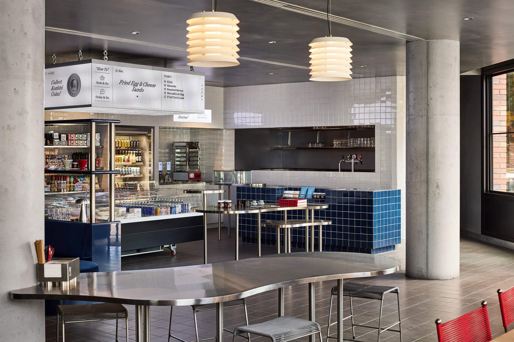
The konbini, Japan's hyper-efficient convenience store, is an architectural typology in its own right: fluorescent, gridded, obsessively organized, and stocked floor to ceiling with things you didn't know you needed. IF Architecture takes that typology and collides it with a fast-casual Japanese restaurant inside a narrow ground-floor unit in Cremorne, Melbourne's tech-company suburb. The result, Suupaa, is a 176-square-meter space that manages to feel like two distinct venues stitched together by a single chromatic logic.
What makes the project genuinely interesting is its commitment to color as spatial infrastructure. Rather than using partitions or level changes to separate dining from retail, IF Architecture deploys the traditional Japanese goshiki system, five colors tied to five elements, as the primary means of zoning. White and stainless steel dominate the convenience-store frontage. Blue tile and upholstery claim the hospitality zone deeper in the plan. Red punctuates everything from venetian blinds to custom chair accents. It is a rigorous, almost diagrammatic approach to a program that could easily have dissolved into visual chaos.
Street Presence and the Red Brick Envelope

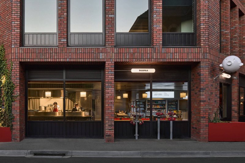
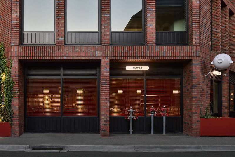
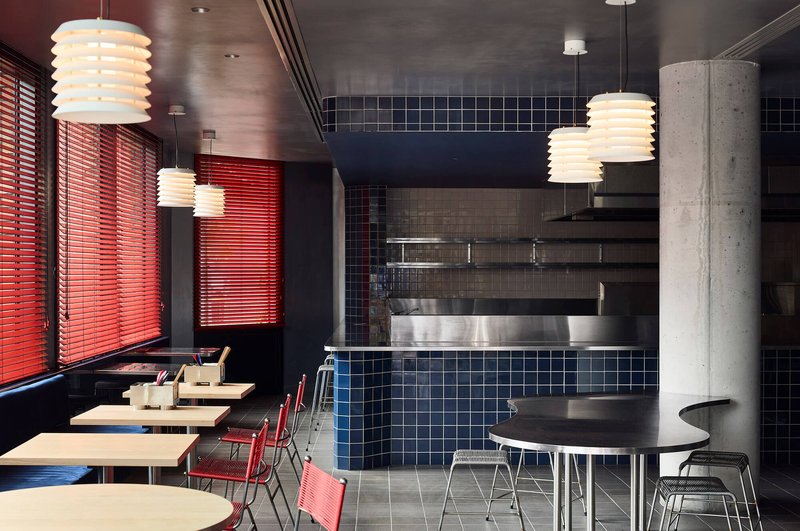
Suupaa occupies the street-level unit of Sixty-five Dover Cremorne, a newly built mixed-use building whose red brick facade provides a restrained, almost industrial backdrop. At dusk the glazed storefront glows against the dark masonry and metal roller shutters, pulling passersby into an interior that reads as far more colorful and specific than the building envelope suggests. Angled signage and planters extend the hospitality zone onto the footpath, a small but deliberate gesture that blurs the line between inside and street.
The weeping willow visible in the streetscape shots adds a softness that counterpoints the utilitarian brick and metal. It is a lucky bit of context, but IF Architecture clearly read the site well, positioning the dining banquettes at the window edge so that filtered green light becomes part of the interior palette.
The White Zone: Retail as Curated Display
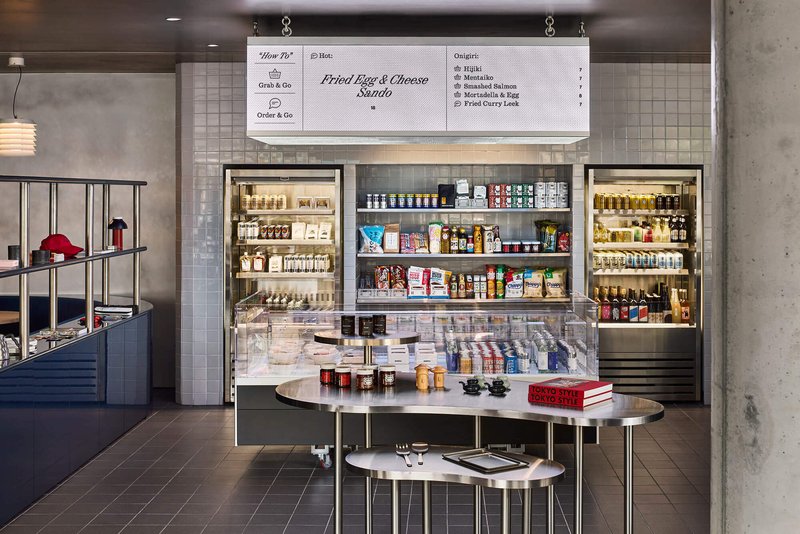
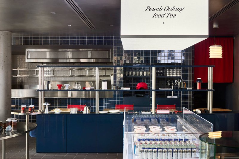
Walk in and you hit the konbini half first. White tile surrounds freestanding shelving units that display packaged Japanese goods in a strict grid, treating modular packaging like curated artefacts rather than supermarket stock. A fluorescent light box overhead washes the central display in even, shadowless illumination, borrowing the relentless brightness of a real Tokyo convenience store without the visual noise.
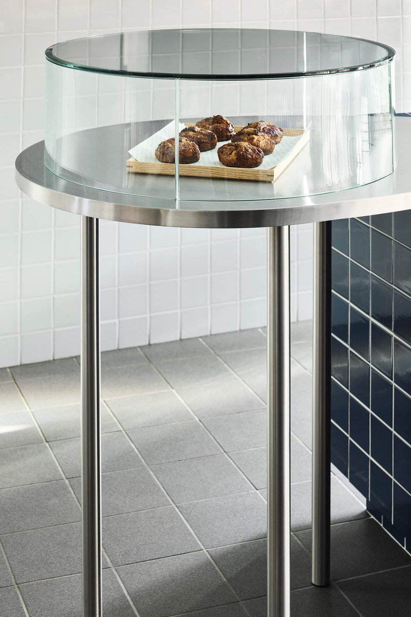
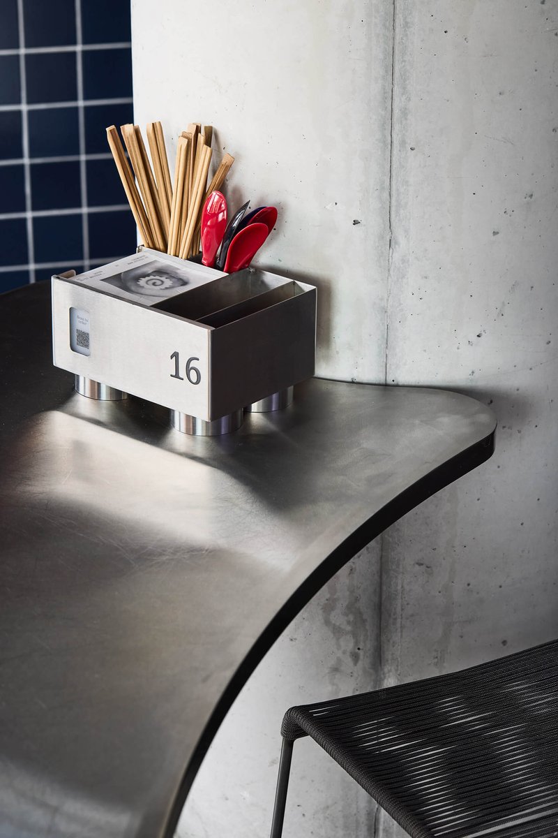
The stainless steel shelving and glass refrigerator case at the service counter reinforce the utilitarian language. A cylindrical glass vitrine on chrome legs sits nearby, an object that could belong in a museum gift shop but here holds snacks. The tiled point-of-sale joinery includes precisely crafted recesses for small items like chopsticks and wasabi, a level of detail that elevates the mundane into something fastidious.
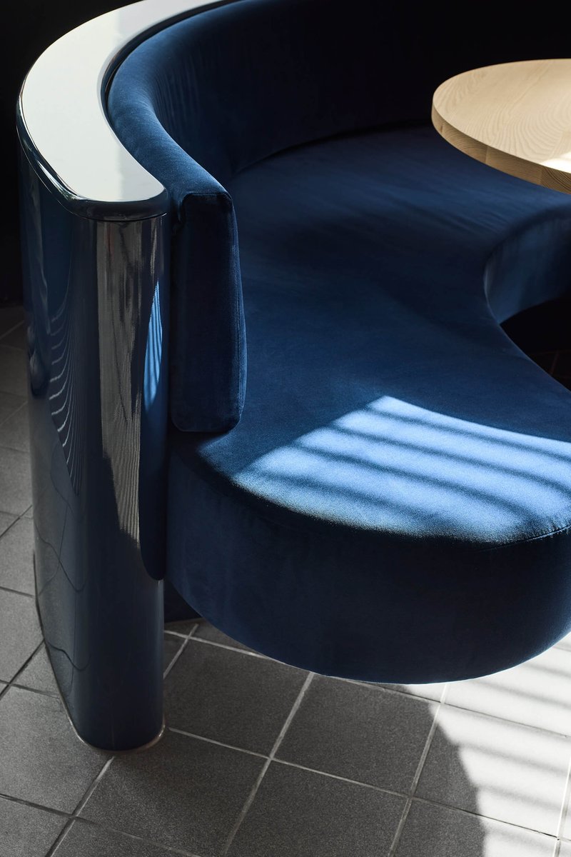
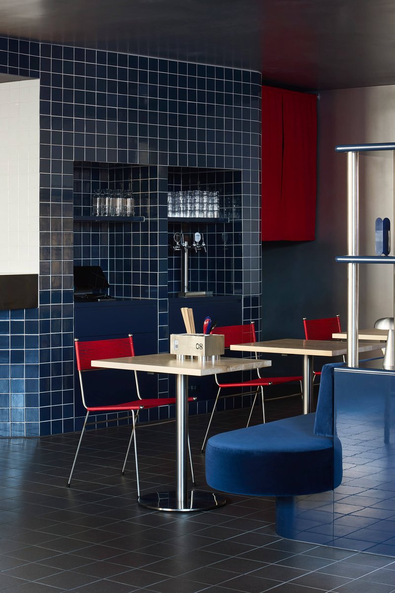
The Blue Zone: Dining with Chromatic Confidence

Move deeper into the plan and white gives way to navy blue. Square tiles clad the counter and walls, banquettes are upholstered in blue velvet and layered fabrics, and the ceiling darkens to create a more intimate register. Custom lanterns replace the fluorescent wash of the retail zone with warmer, directional pools of light. The transition is not abrupt; shelving stocked with Japanese goods acts as a connective tissue between the two zones, so you never lose sight of the konbini DNA.
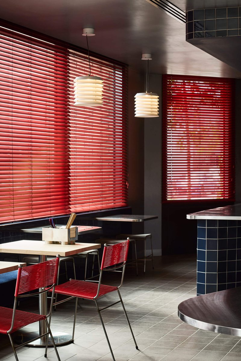
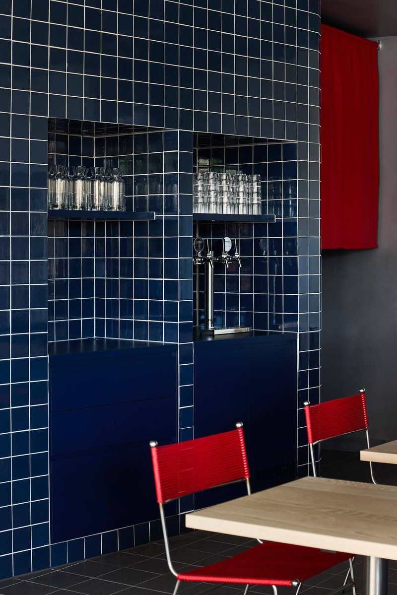
Red venetian blinds filter daylight into warm stripes across the tables and concrete columns. The blinds are doing double duty: controlling glare and injecting a third goshiki color into a predominantly blue room. Custom Meadmore corded chairs with red accents complete the triad. It is a disciplined palette, but it never feels austere because the materials are tactile and the forms are generous, curved banquettes, ribbed pendants, chrome tubing.
Materiality: Stainless Steel Meets Tile and Timber
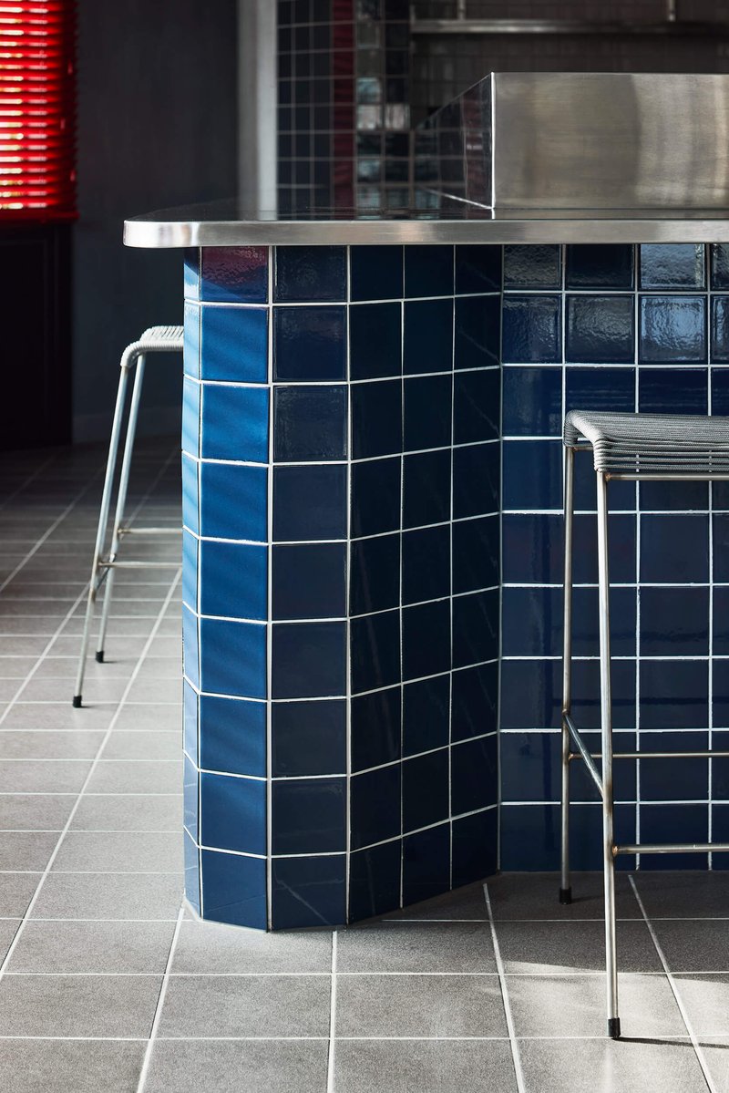
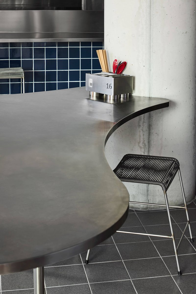
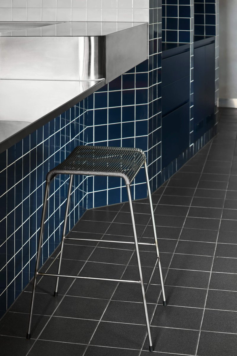
The material strategy is lean but specific. Stainless steel handles the surfaces that need to work hard: freestanding tables designed to be removed for events, kitchen-facing counters, and shelving rails. Timber appears in the banquette finishes, adding warmth where you sit. Navy square tile does the heavy lifting on vertical surfaces, its glossy finish bouncing light in the dining zone while creating a visual anchor for the service counter.
The curved counter edge where stainless steel meets blue tile is one of the cleanest details in the project. The radius is tight enough to feel deliberate but generous enough to avoid preciousness. A wire mesh stool tucked against it shows how the furniture was selected to complement the architecture's vocabulary of metal, grid, and curve.
Self-Serve, Takeaway, and Operational Flexibility
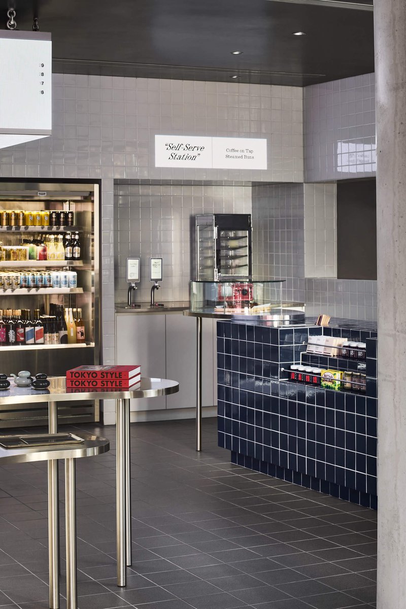
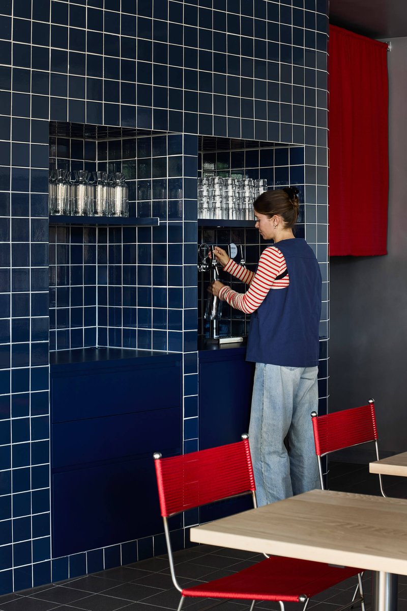
Suupaa's hybrid program demands operational flexibility that most restaurant fitouts never confront. A self-serve station with a navy-tiled counter sits between the retail and dining zones, serving both dine-in and grab-and-go customers. A chrome tap set into a recessed tile niche allows staff to prepare beverages without blocking circulation. These are not afterthoughts; they are spatial commitments baked into the plan from the outset.
The freestanding stainless steel tables are perhaps the most pragmatic design decision. They can be pulled out entirely to clear the floor for events, transforming the restaurant into something closer to a gallery or pop-up space. Shelving on casters follows the same logic: nothing is permanently fixed that doesn't need to be.
Texture and Light at the Seating Edge
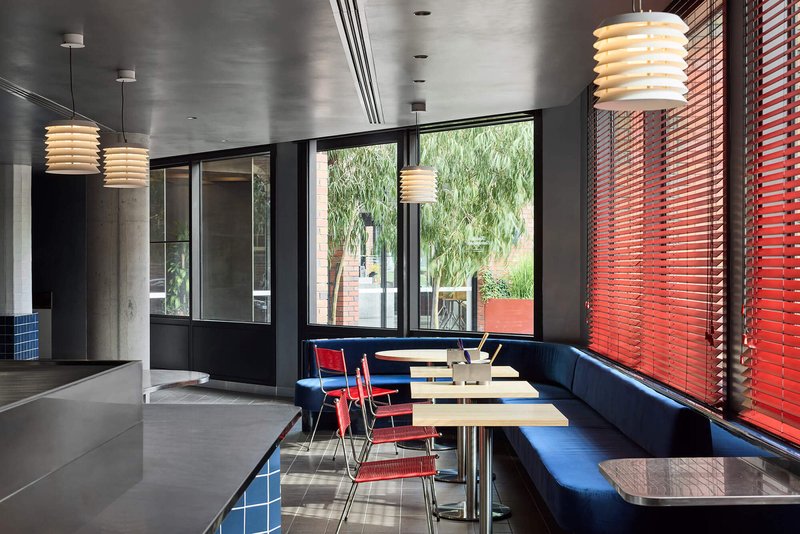
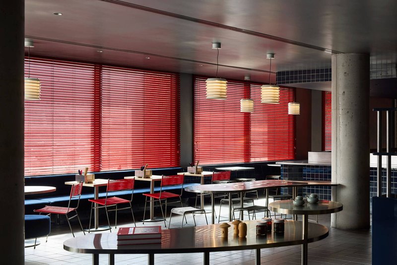
The window-side banquettes are where the project is most photogenic, but they also reveal the care taken with light. Afternoon sun through the red venetian blinds throws striped shadows across the grey tile floor and blue velvet upholstery, producing a color interaction that shifts throughout the day. Exposed concrete columns catch the same striped light, their raw surface a foil to the saturated finishes around them.
Chrome tubular legs on the navy velvet seating pick up ambient reflections. It is a small thing, but in a space this compact every surface is doing work. The material choices never feel random; they build toward a specific atmosphere that sits somewhere between a Showa-era kissaten and a contemporary Melbourne wine bar.
Shelving as Architecture
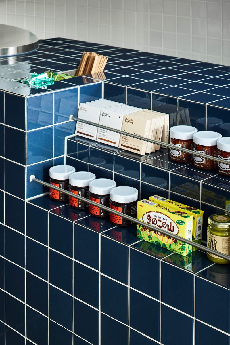
Clear acrylic shelves mounted on blue tile walls hold packaged goods and glass jars, turning inventory into interior decoration. The merchandising follows a strict grid that frames each package as an individual object. This is the konbini principle distilled: organization is not merely functional, it is the aesthetic itself. The white-grouted blue tile behind each shelf amplifies the sense of order, making even a tube of wasabi look considered.
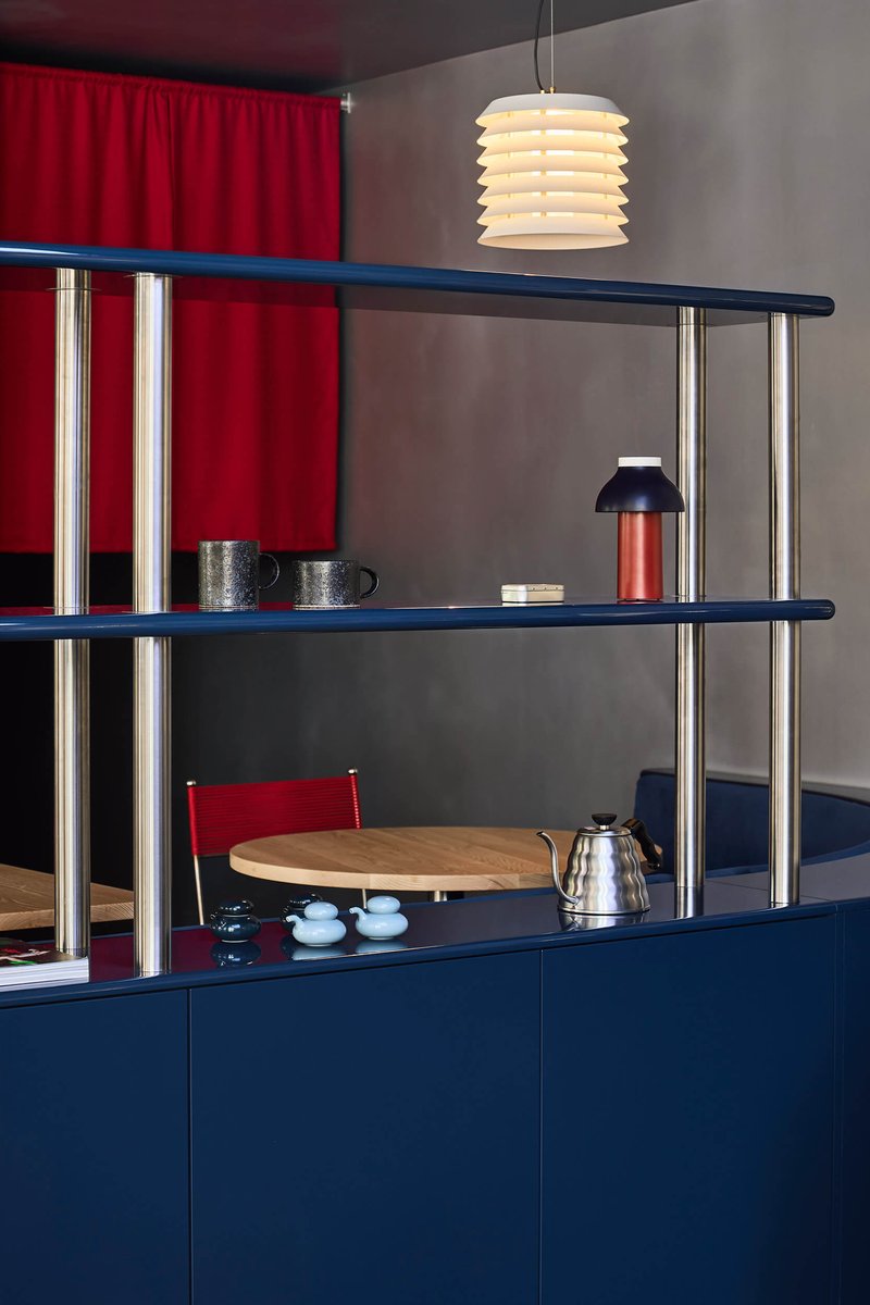
Chrome tube shelving with navy blue surfaces and a red curtain behind creates a secondary display moment deeper in the dining zone. The shelving systems across the project are not identical; they vary in material and mounting to suit their context, but they share a modular discipline that holds the whole interior together.
Plans and Drawings
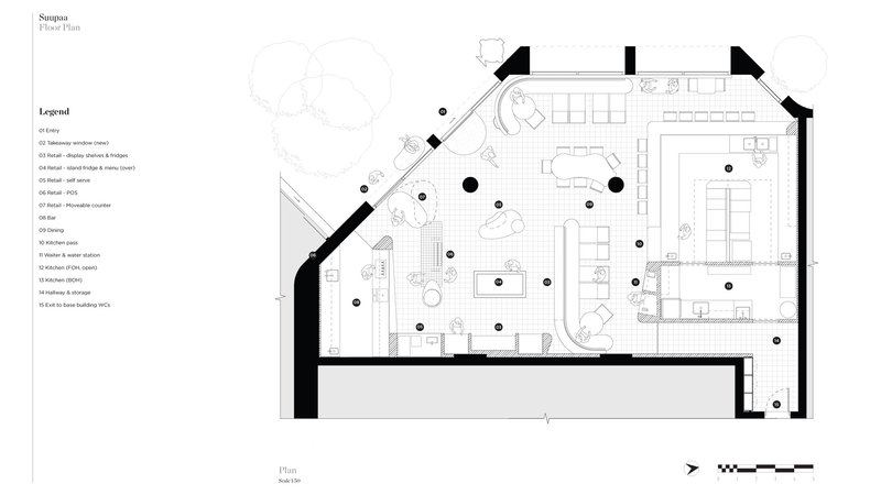
The floor plan reveals angled perimeter walls that the design exploits rather than fights. The dining and retail counter areas are organized along two primary axes that correspond to the building's geometry, with the self-serve and takeaway zones acting as hinges between them. In a space of only 176 square meters, the plan demonstrates how much program IF Architecture has packed in without making the room feel compressed.
Why This Project Matters
Hospitality design often defaults to one of two modes: the pristine white-box café or the moody, dark-palette bar. Suupaa refuses both by grounding its entire spatial strategy in a cultural reference, the goshiki color system, that is rigorous enough to organize two competing programs under one roof. The konbini and the restaurant share materials, furniture logic, and chromatic rules, so the hybrid never feels like two half-baked ideas forced together.
IF Architecture's achievement here is not just aesthetic. It is operational. Every design decision, from caster-mounted shelving to removable tables to recessed chopstick niches, serves the reality of running a business that sells both a $4 onigiri and a plated dinner. That kind of specificity, where architecture solves problems that a mood board never could, is what separates a good fitout from a project worth studying.
Suupaa Restaurant and Convenience Store by IF Architecture. Located in Cremorne, Melbourne, Australia. 176 m². Completed 2025. Photography by Sharyn Cairns.
About the Studio
Share Your Own Work on uni.xyz
If projects like this are the kind of work you want to make, uni.xyz is a place to publish your own, find collaborators, and enter design competitions.


Popular Articles
Popular articles from the community
Kookmin University and one-aftr Build a 12 m² Pavilion of Gaps in Seoul
Pavilion TEUM reinterprets the traditional Korean Daecheong as a compact wooden room of triangular voids in a Seoul plaza.
WUWU Atelier and ADINJU Rebuild an Ancestral Home in Guangdong with Quiet Brick Precision
In rural Heyuan, a 440-square-meter renovation trades spectacle for craft, turning local brick into an architecture of restrained belonging.
Kanisavaran Office Turns a Central Courtyard into a Light Engine on the Plains of Damavand
Shahrzad Villa in Tehran's Seyedabad plains uses a classical courtyard typology to orchestrate natural light, ventilation, and mountain views.
Taller MACAA Weaves Adobe Lodging into the Sacred Valley at 3,100 Meters Above Sea Level
Dormis Donata bridges permanent and temporary inhabitation through earthen construction in the agricultural highlands of Taray, Peru.

Similar Reads
You might also enjoy these articles
STEM School Mechelen by LAVA Architecten: A Future-Ready Educational Architecture in Belgium
Flexible, sustainable STEM school in Mechelen featuring modular classrooms, acoustic innovation, and energy-efficient design supporting future-focused collaborative learning environments.
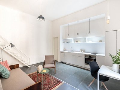
Marvila Apartment Renovation in Lisbon: A Bright Minimalist Attic Transformation by KEMA Studio
Bright attic transformed into minimalist Lisbon apartment with skylights, sustainable materials, open plan layout, and industrial-inspired interior design elements.
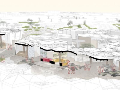
20 Most Popular Commercial Architecture Projects of 2025
From sustainable market concepts to heritage factories, the commercial buildings and proposals that drew the most attention on uni.xyz this year.
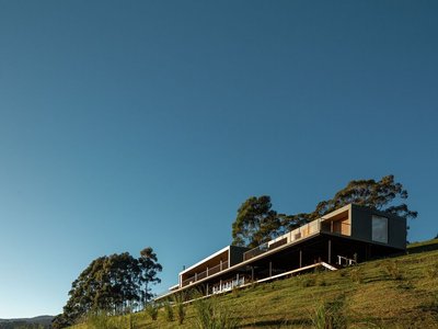
Mantiqueira House by SysHaus and M Magalhães Estúdio
A linear modular house embedded in Serra da Mantiqueira, integrating panoramic views, sustainable prefabrication, minimal terrain impact, and contemporary interiors.


Comments (0)
Please login or sign up to add comments
No comments yet. Be the first to comment!