
LRARCHITECTES Packs a Full Life into 56 Square Meters on a Namur Side Street
A compact black house in Jambes, Belgium, trades rural sprawl for urban density without sacrificing light, greenery, or ambition.
Fifty-six square meters is roughly the size of a generous one-bedroom apartment, yet LRARCHITECTES has managed to build an entire house within that footprint on a tight urban lot in Jambes, a district just across the Meuse from central Namur. The DL House was born from a specific conviction: its owner chose to leave a sprawling, energy-inefficient rural home and resettle closer to the city, accepting the constraints of a small infill site as the price of a smaller environmental footprint.
What makes this project genuinely interesting is not its size but the refusal to treat compactness as deprivation. The house is a vertical black volume slotted between older brick neighbors, clad in corrugated metal that reads as both industrial and precise. Behind it, a terraced landscape designed by Atelier Paysage climbs upward in planted tiers, turning what would otherwise be a rear service wall into a cascading garden. The result is a home that feels both rigorous and generous, proof that downsizing can be an act of design rather than resignation.
The Street Presence: Black Metal Among Brick
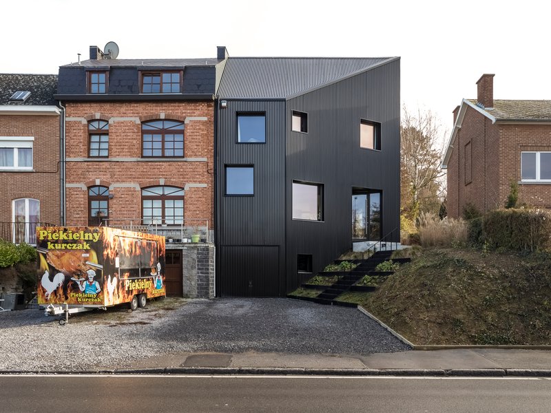
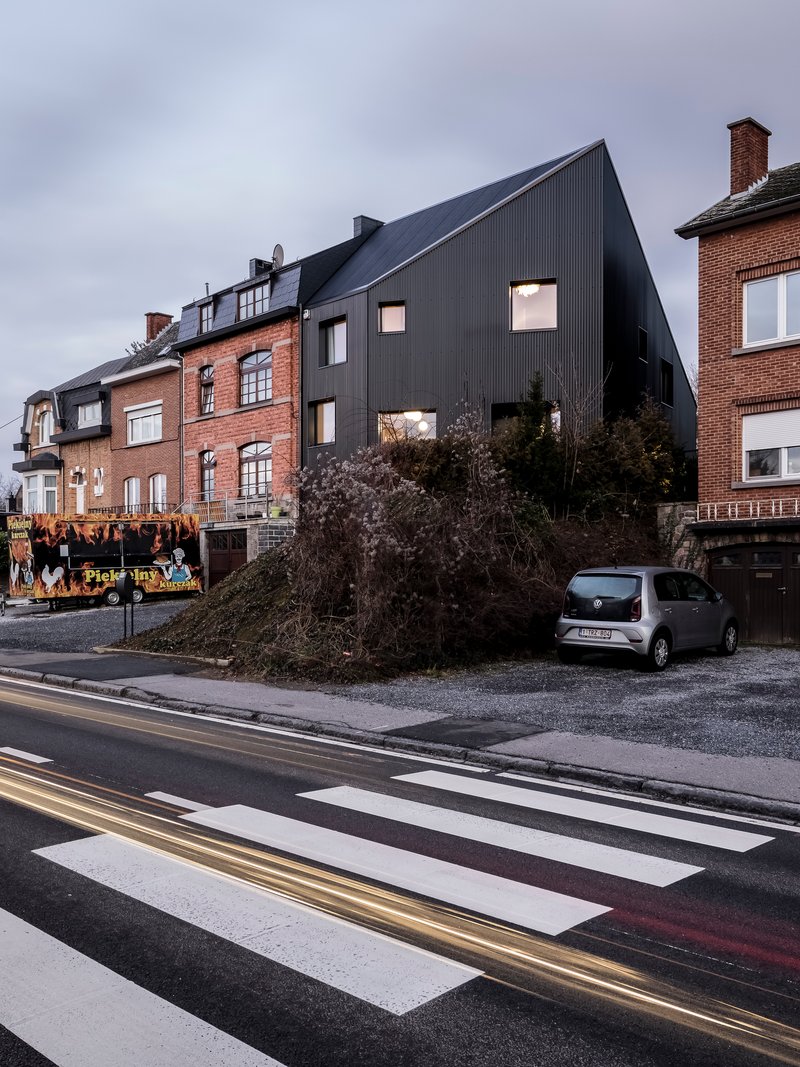
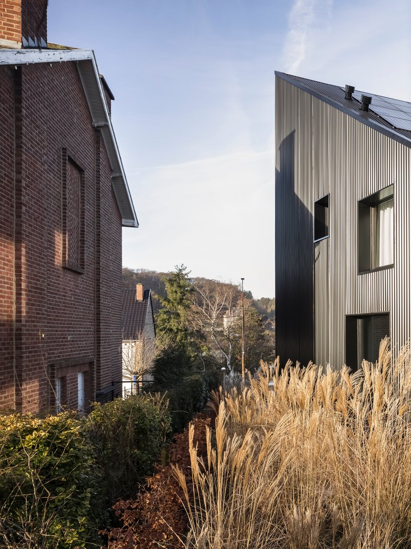
From the street, the DL House announces itself without shouting. Its dark corrugated cladding contrasts sharply with the warm brick facades on either side, yet the building's massing stays disciplined, rising only slightly above the roofline of its neighbors. There is no cantilever, no geometric bravado. The facade is essentially a flat plane with punched openings, and the restraint is what makes it effective. The corrugation catches light along its vertical ribs, giving the surface a shifting texture that softens what could otherwise be a monolithic wall.
A food truck parked in front of the house in one image underscores the ordinariness of the street. The building does not demand a cleared forecourt or a curated approach. It belongs to the neighborhood without mimicking it, a quality that too many infill houses fail to achieve.
Terraced Landscape as Rear Architecture
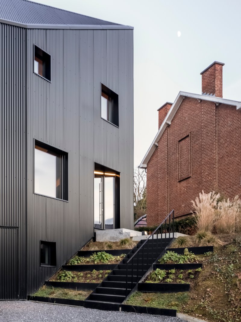
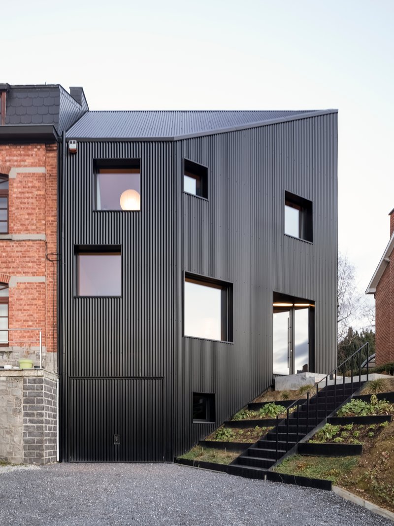
The rear of the house is where the project's ecological ambitions become spatial. Instead of a conventional backyard, a series of planted terraces climbs upward along a black steel staircase, integrating ornamental grasses and perennials into the building's section. The landscape, credited to Atelier Paysage, is not an afterthought tacked onto a leftover strip of ground. It operates as a second facade, providing privacy, stormwater absorption, and a visual depth that extends the sensation of living space well beyond the building's walls.
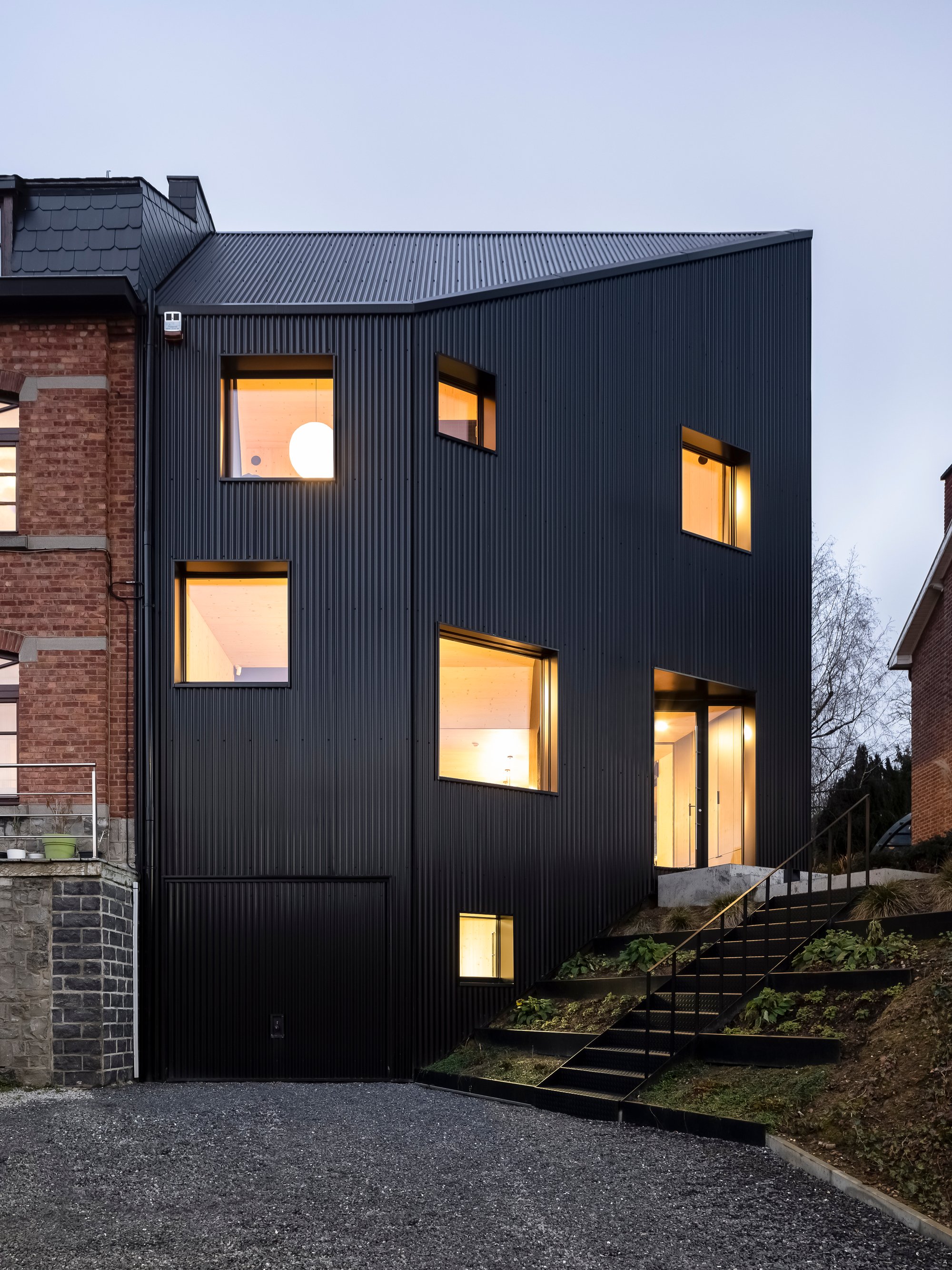
The vertical corrugated cladding wraps around to this side as well, creating continuity between the street face and the garden face. Punched window openings punctuate the metal surface, framing views into the greenery at multiple levels. It is a smart inversion: the public side is opaque and reserved, while the private side opens into layered vegetation.
Light at Dusk: Windows as Lanterns

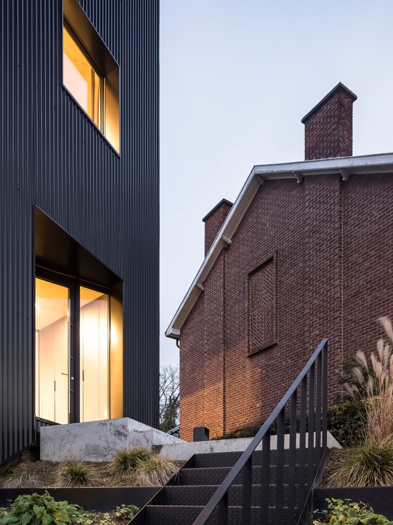
At dusk, the scattered window openings transform the facade from a closed metal screen into a constellation of warm light. The effect is almost lantern-like, with each aperture revealing a slice of the interior: a timber ceiling here, a bookshelf there. The concrete threshold at ground level glows softly beside ornamental grasses, collapsing the boundary between house and planted landscape.
The placement of these openings looks deliberately non-rhythmic, sized and positioned according to interior needs rather than an imposed grid. That irregularity gives the facade a composure that a symmetrical arrangement would lack. It suggests that every window was fought for, that each one earns its place by serving light or view or ventilation where it matters most.
Interior: Timber, Concrete, and Careful Proportion
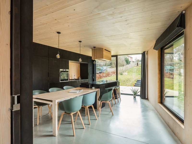
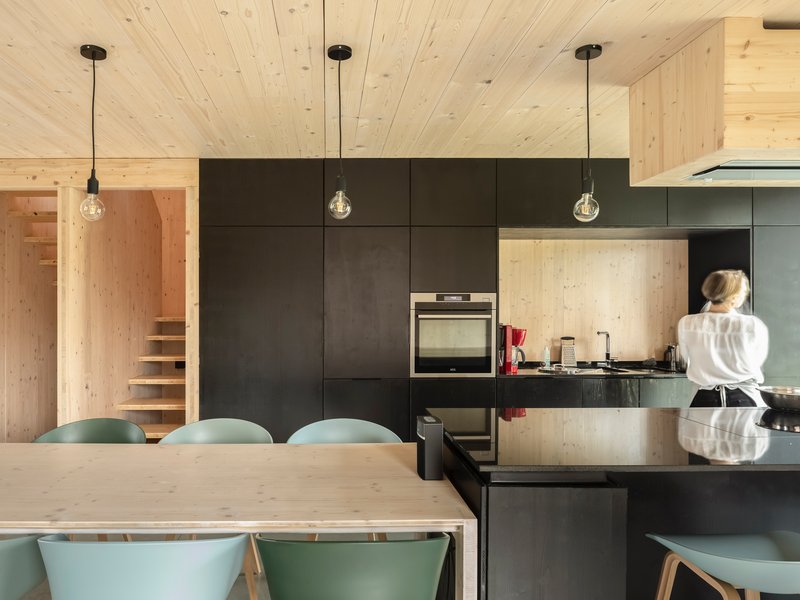
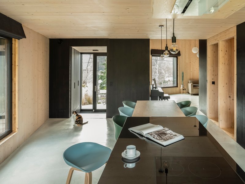
Inside, the material palette is restrained to three essentials: pale timber for ceilings and stair linings, polished concrete for the floor, and black steel for cabinetry and framing. The open-plan dining and kitchen area reads as considerably larger than its measured area thanks to floor-to-ceiling glazing on the garden side, which pulls the planted terraces into the room as borrowed landscape. A cat sitting in a patch of winter sunlight tells you everything about the quality of southern exposure in this space.
The kitchen's dark steel cabinets and the timber panels flanking the stair create a tonal rhythm: dark, light, dark. It keeps the eye moving through a compact plan without clutter. There is nothing extraneous. The staircase, visible through and beyond the kitchen, serves as both circulation and visual release, a vertical slot of light-colored wood that signals the section's ambition even from ground level.
Vertical Living: The Staircase as Spine
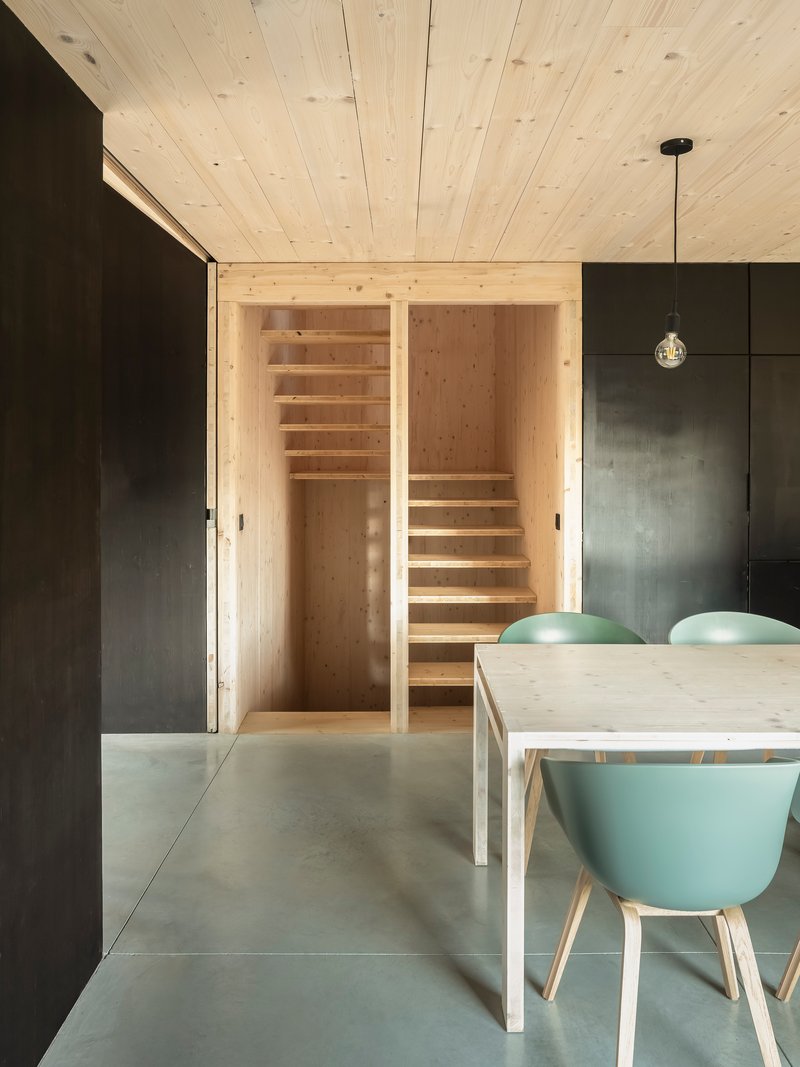
With only 56 square meters of footprint, the house necessarily stacks its program vertically, and the timber staircase becomes the building's organizational spine. Framed by a black metal doorway, it ascends through a light wood-lined volume that functions as a kind of internal light well. The contrast between the dark steel threshold and the pale timber beyond is theatrical in the best sense: it marks the transition from the communal ground floor to the private upper levels with a single architectural gesture.
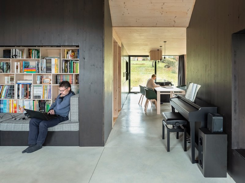
An interior vignette shows two occupants comfortably absorbed in separate activities, one reading by a bookshelf, the other working at a desk, separated by a concrete wall that provides acoustic and visual privacy without closing off sightlines entirely. In a house this small, the ability to be alone together is not a luxury; it is a design requirement, and LRARCHITECTES has clearly treated it as such.
Plans and Drawings
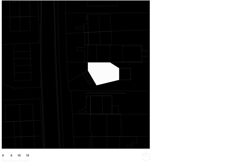
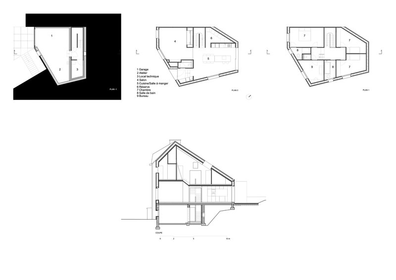
The site plan reveals a pentagonal footprint, an irregular geometry dictated by the angled lot lines of the surrounding urban blocks. Rather than fighting the site's shape, the architects absorbed it into the plan, letting the walls follow property boundaries and concentrating the interior effort on maximizing usable area within that given envelope. It is a practical move, but it also gives the house its distinctive section: an angled volume that creates unexpected ceiling heights and diagonal sightlines.
The floor plans and section drawing confirm the multi-level strategy. The house steps through at least three levels within its compact envelope, distributing living, sleeping, and working spaces vertically. The section shows how the terraced landscape at the rear corresponds to the interior split levels, reinforcing the idea that inside and outside are part of a single continuous topography.
Why This Project Matters
The DL House makes a case that is easy to state and hard to build: that moving from rural to urban, from large to small, from inefficient to efficient can produce architecture that is actually better to live in than what was left behind. At 56 square meters, this is one of the smallest completed houses we have featured, yet nothing about it reads as a compromise or a demonstration of minimalist asceticism. It is simply a well-made house that takes its constraints seriously and converts them into spatial richness.
For architects working on infill sites across European cities, the project offers several transferable lessons: the value of a terraced landscape in lieu of a conventional garden, the power of a disciplined material palette to expand perceived space, and the importance of treating the section as the primary design tool when the footprint is fixed. LRARCHITECTES has delivered something modest in scale and serious in intent, which is exactly the kind of architecture the current moment demands.
DL House by LRARCHITECTES, with landscape design by Atelier Paysage. Located in Jambes, Namur, Belgium. 56 m². Completed in 2017. Photography by Maxime Vermeulen.
About the Studio
Share Your Own Work on uni.xyz
If projects like this are the kind of work you want to make, uni.xyz is a place to publish your own, find collaborators, and enter design competitions.


Popular Articles
Popular articles from the community
MIDW Casts a Pavilion Roof from the Earth Itself at the 2025 Osaka Expo
On a fragile reclaimed island, excavated soil becomes formwork for a concrete canopy that will eventually disappear into wisteria.
Atelier LAI Scatters a Timber Resort Across a Terraced Anhui Valley
Nanshan Junning Resort uses wood joinery and topographic sensitivity to settle 6,700 square meters into a ten-meter slope near Hefei.
Sam Crawford Architects Anchors a Sports Pavilion in 10,000 Years of Indigenous History
A V-shaped brick and steel pavilion in southwest Sydney translates ancient clay ovens and gathering traditions into civic architecture.
OUJ Rewires a 72-Square-Meter Taipei Apartment for Multigenerational Living After the Pandemic
Inside a 40-year-old public housing block, plywood volumes and translucent screens turn three cramped bedrooms into a flexible family home.


Similar Reads
You might also enjoy these articles
127af Flips a Tiny Bagnolet Rowhouse Upside Down with a Handcrafted Roof Extension
A 55-square-meter terraced house on the edge of Paris gains a luminous upper living floor through lightweight timber and steel.
1.61 Design Workshop Wraps a 600-Square-Meter Café in Vietnam in Sculptural Burgundy Drama
Reden Café & Bistro pairs a helical staircase, mosaic floors, and deep red interiors to rethink Vietnamese hospitality space.
The Unbound Brain: A School Shaped by Cognitive Architecture
Cylindrical learning pods radiate like neurons from a central cortex, turning the floor plan into a spatial model of human thought.
Revival Vernacular Architecture: Rammed Earth Settlements for the Sahara
A modular desert community in Mauritania that fuses passive cooling techniques with earthen construction and local craftsmanship.


Explore Landscape Design Competitions
Discover active competitions in this discipline


The Global Benchmark for Architecture Dissertation Awards

Challenge to design mud housing for contemporary communities
Comments (0)
Please login or sign up to add comments
No comments yet. Be the first to comment!