
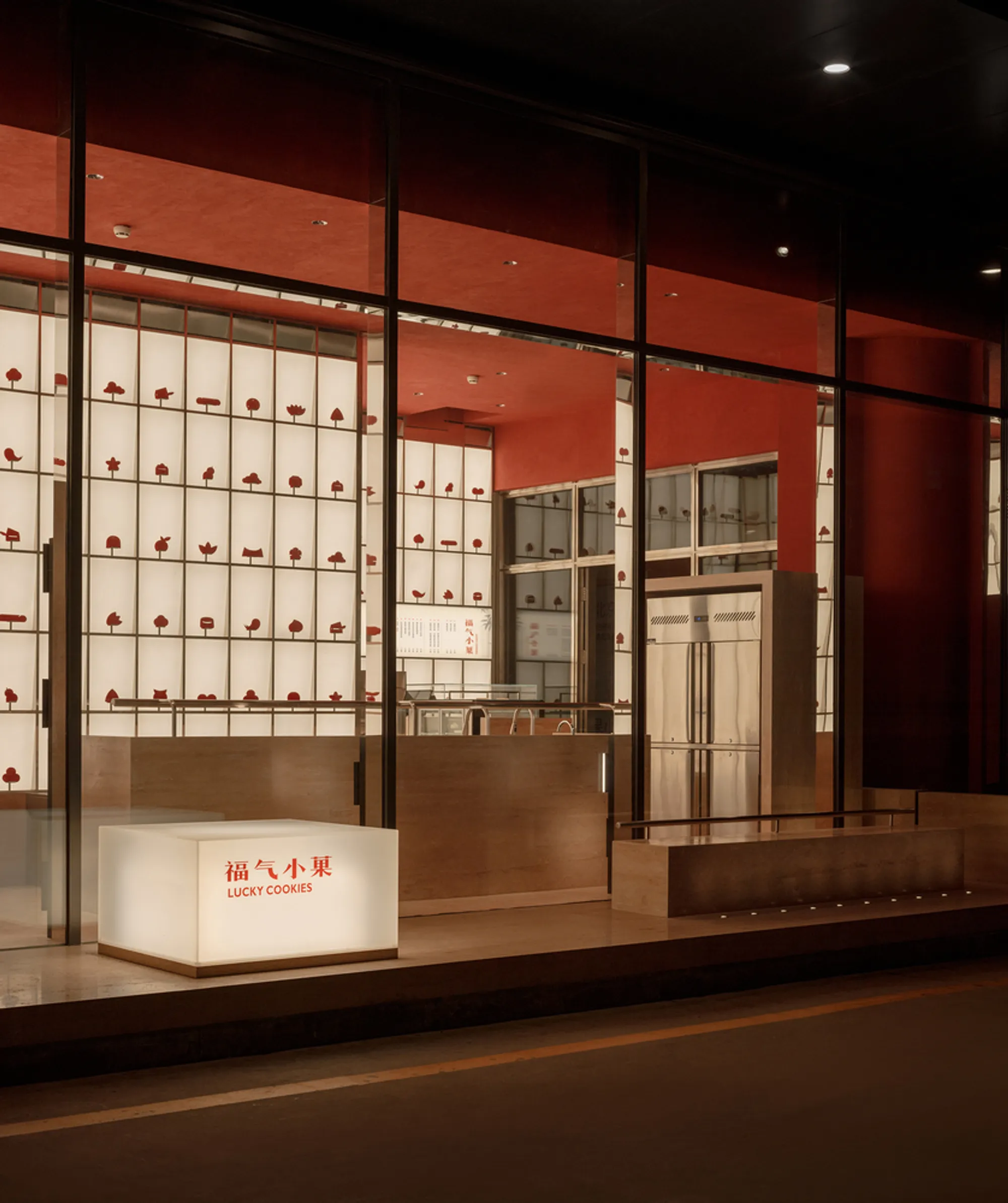
Studio NOR Turns 37 Square Meters into a Glowing Pastry Theater in Beijing's Longfu Building
A bakery where the kitchen takes center stage, 243 magnetic lightboxes line the walls, and rock-shaped furniture dissolves every boundary.


Most bakeries put the pastries up front and the kitchen in back. Lucky Cookies does the opposite. In its narrow storefront on the ground floor of Beijing's Longfu Building, Studio NOR gave three quarters of the 37-square-meter floor plan to the baking kitchen, turning the entire shop into a live display window where the making of traditional Chinese pastries is the main attraction. With a depth of less than three meters and a ceiling height of 5.7 meters, the proportions read almost like a vitrine: tall, shallow, and fully glazed.
What makes the project genuinely compelling is not just its smallness but the specificity of the responses to that smallness. A 15-meter light screen of 243 prefabricated, magnetically attached lightboxes lines the upper wall, counteracting the reflections on the north-facing glass curtain wall. A family of sculptural "rock" forms, all in the same material, serves as counter, bench, display case, equipment shed, and signage, blurring the line between inside and outside. The result is a space that feels bigger than it is, more public than it should be, and far more considered than most interiors ten times its size.
The Kitchen as Storefront
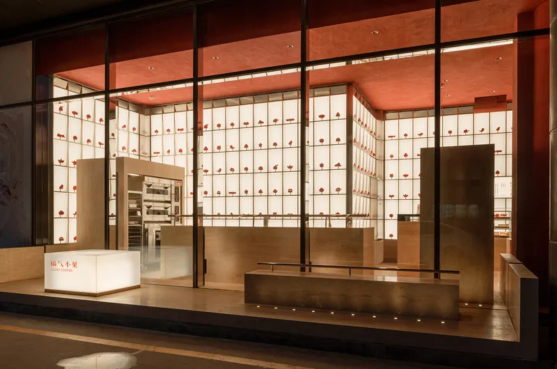
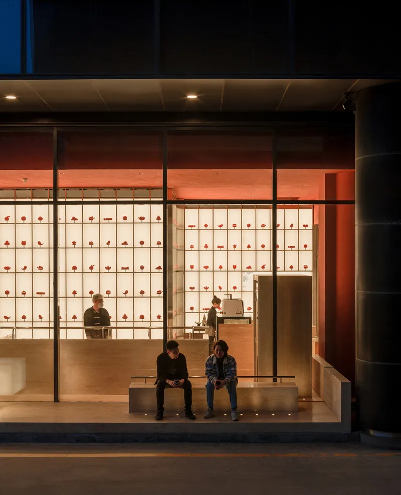
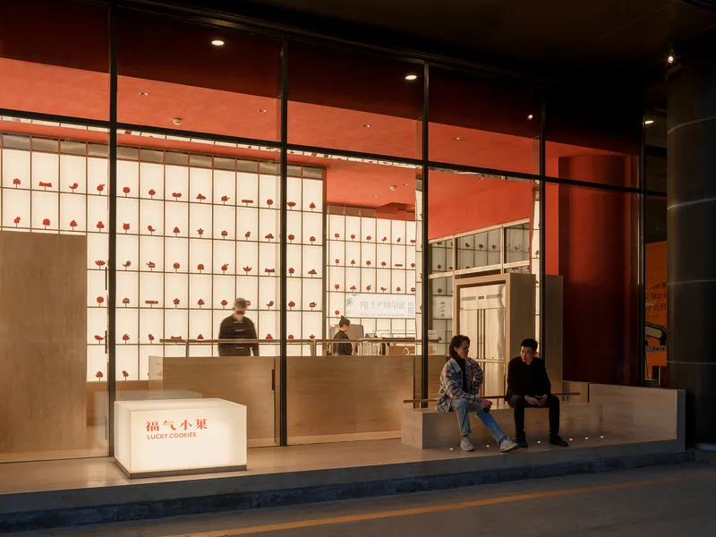
Because the baking kitchen occupies the majority of the floor area, the street-facing facade becomes less a retail window and more an observation wall. Passersby on the sidewalk look through full-height glass directly into the working kitchen. The pastry display and cashier sit near the entrance on the corridor side of the Longfu Building, almost as an afterthought. Studio NOR understood that in a space this tight, the spectacle of production is the product. The decision to flip the conventional retail plan is not just pragmatic; it gives the brand a visual identity that no signage could match.
At dusk, the effect amplifies. The warm interior glow turns the entire storefront into a lantern, and customers seated on the timber bench at the threshold become part of the display. There is no separation between the act of buying, the act of making, and the act of watching.
Dissolving the Glass Boundary
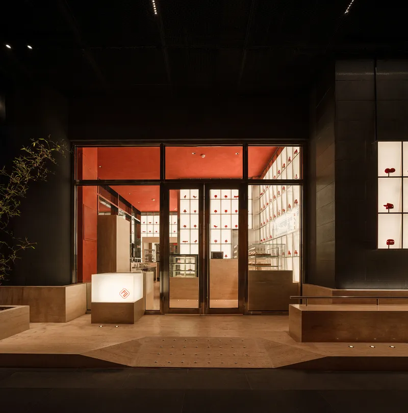
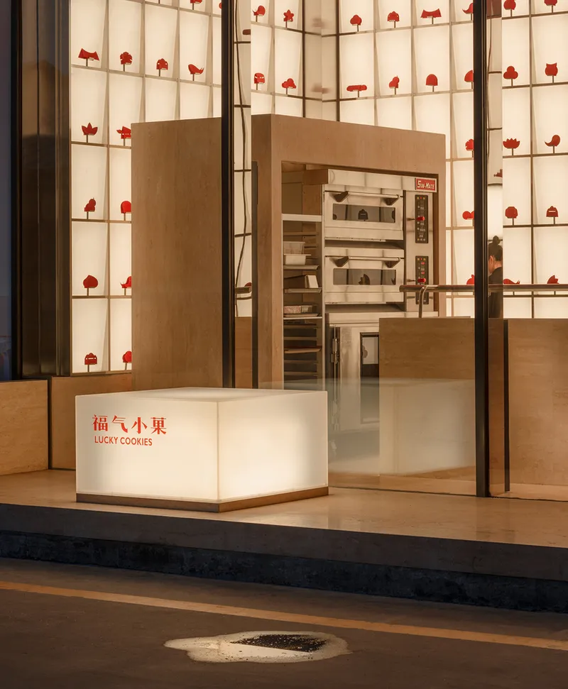
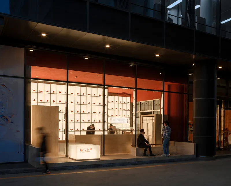
Modifying the existing glass curtain wall was off the table, so Studio NOR worked around it. A 150mm travertine platform raises the interior finished floor and extends seamlessly to the seating area in the building's interior corridor. On the exterior side, a matching platform at the same height was introduced, and the curtain wall's bottom frame was concealed with stainless-steel mirrors. The glass is still there, but its visual weight nearly disappears. The bakery's interior reads as if it overflows onto the sidewalk.
The effect is subtle and difficult to photograph, which is precisely why it works in person. You step onto the platform outside and the floor material doesn't change. The threshold dissolves. For a shop that measures less than three meters deep, this borrowed territory is critical. It is the difference between feeling cramped and feeling like you've entered a space with generosity.
Isomorphic Rocks: Furniture That Blurs Edges
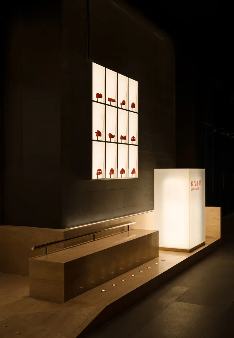
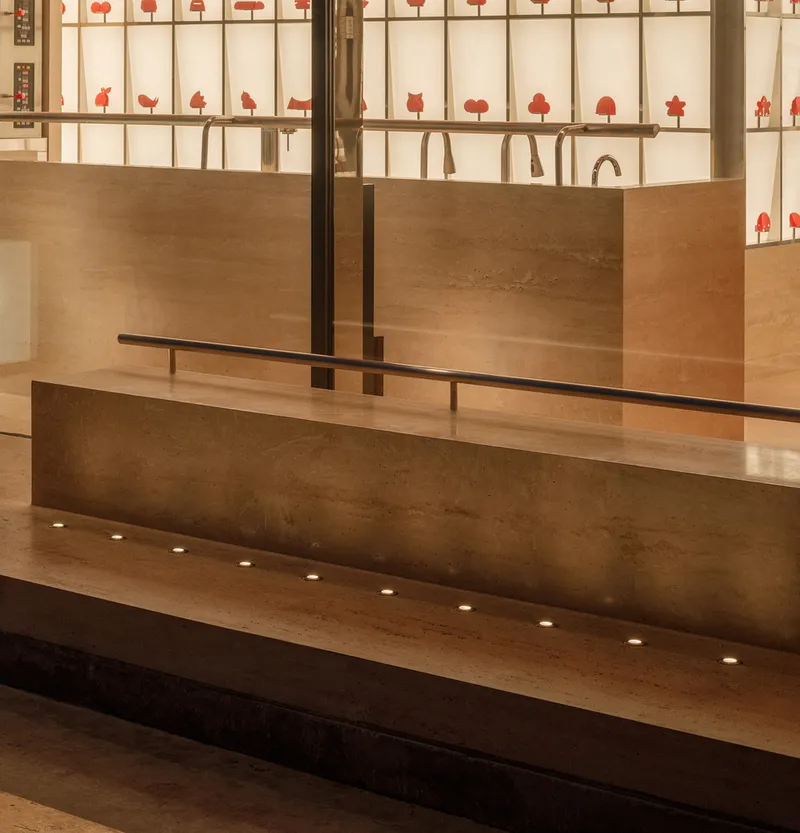
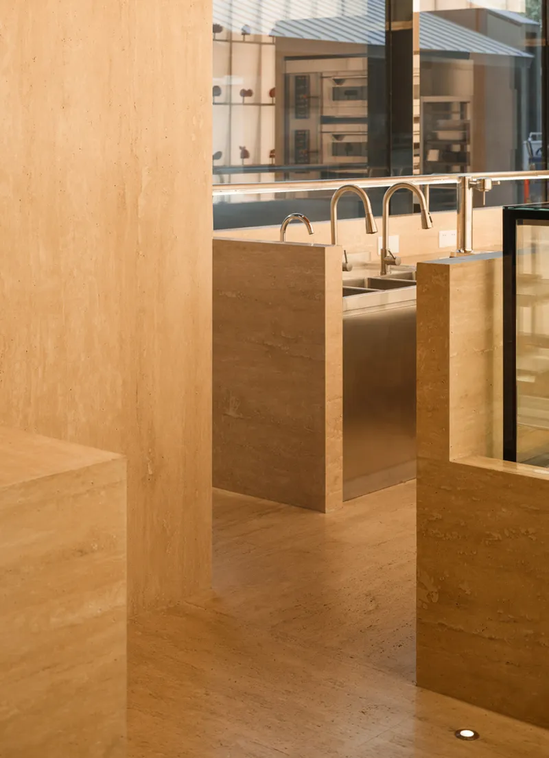
Studio NOR designed a family of sculptural volumes they call "rocks," all sharing the same material palette and a soft, organic geometry. These forms do radically different jobs: one is an equipment shed, another a preparation table, another a cashier counter, another a bench, another a display case, another a lightbox sign, and one even holds a bamboo planter. Because they look and feel identical, they erase the usual visual hierarchy between furniture types. The counter is the bench is the planter is the sign.
The strategy is more than aesthetic consistency. By extending these isomorphic elements from the interior through the glazing line to the corridor and exterior seating, the rocks stitch inside and outside into one continuous field. The site boundary, already thin, becomes almost meaningless. In a 37-square-meter project, that extra perceptual space is everything.
243 Lightboxes and the Paper-Cut Pastries
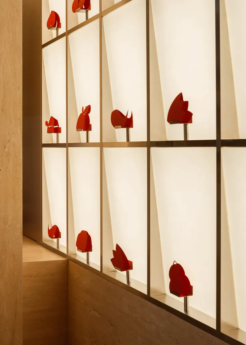
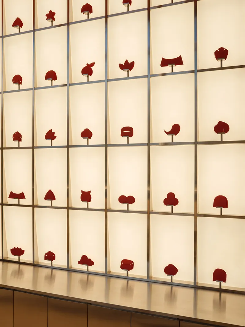
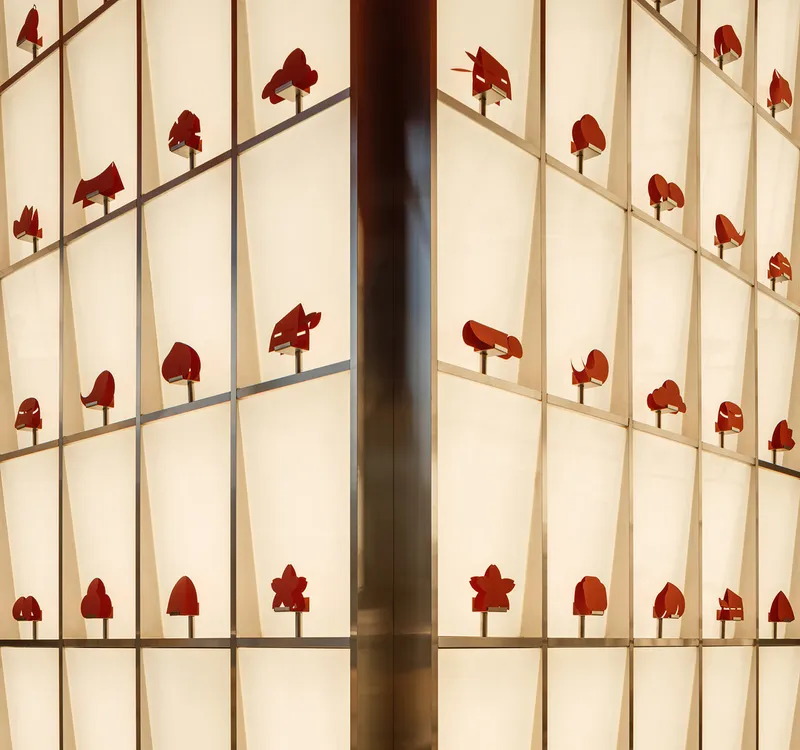
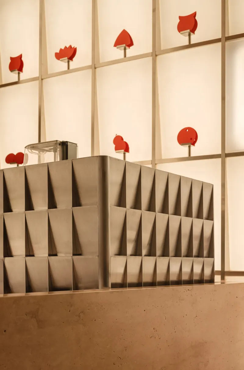
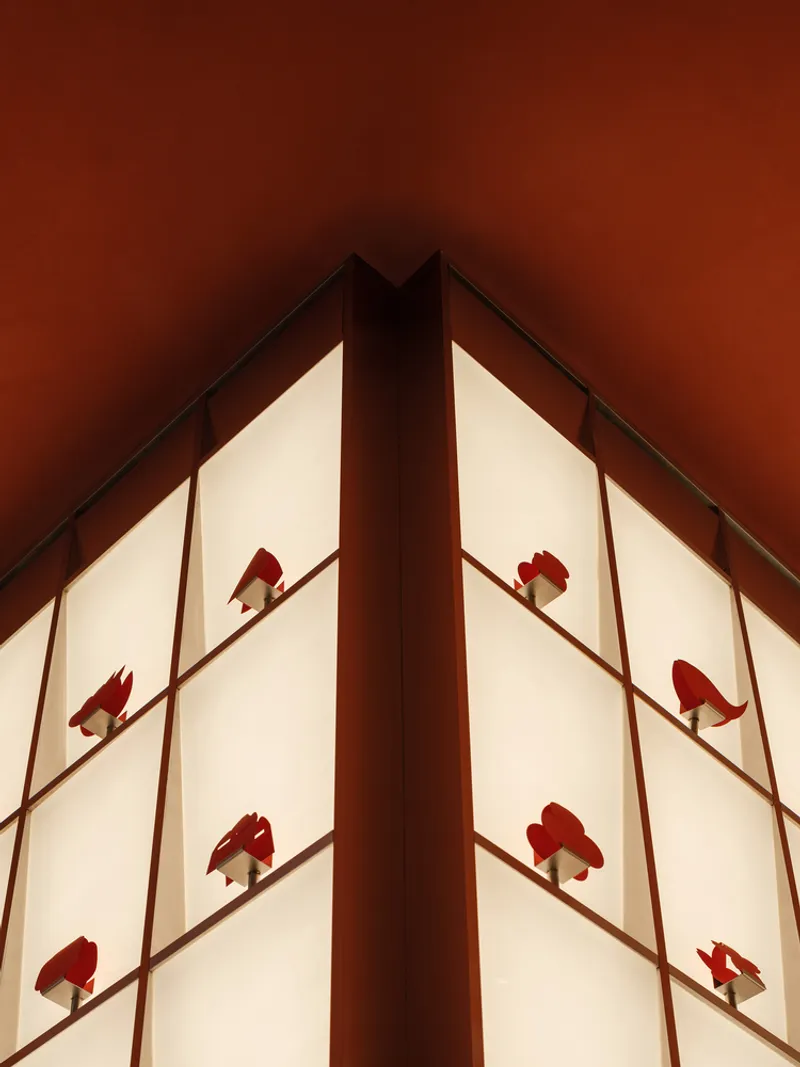
The 15-meter light screen is the project's most immediately striking element. Composed of 243 prefabricated modular lightboxes mounted on a stainless-steel grid, it fills the vertical dimension that the shallow floor plan cannot. Each box connects magnetically, making replacement and reconfiguration simple. The faces of the lightboxes are slightly inclined inward, creating small brackets where laser-cut silhouettes of actual pastries are displayed, casting red shadows across the translucent panels.
The silhouettes are derived from real pastry profiles, a quiet nod to the traditional Chinese craft the bakery specializes in. The light screen does double duty: it advertises the product vocabulary without conventional signage, and it counteracts the reflections that a north-facing glass facade would otherwise produce. On a practical level, the magnetic attachment system means the bakery can swap out seasonal motifs without calling in a contractor. On a perceptual level, the wall glows like a paper lantern, pulling depth out of the narrowest possible section.
Nighttime Presence
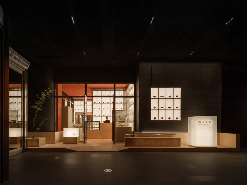
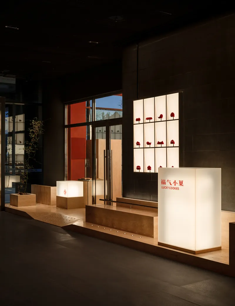

A shop this small lives or dies by its streetscape presence, and Studio NOR clearly designed for the nighttime reading. After dark, the full-height glazing turns the bakery into a lit stage set against the darker Longfu Building facade. The orange glow of the lightbox wall, the warm timber tones of the counters, and the recessed floor lighting at the platform edge all conspire to make the storefront unmissable from a considerable distance. It reads less like a bakery and more like a gallery installation.
The illuminated signage cube at the threshold, visible in several views, anchors the composition at eye level while the light screen commands the vertical. The layering of light sources, from floor uplight to backlit wall to pendant fixtures, creates a depth that the physical section alone cannot deliver.
Material Detailing and Craft
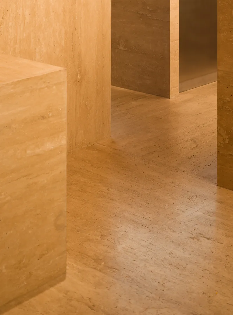

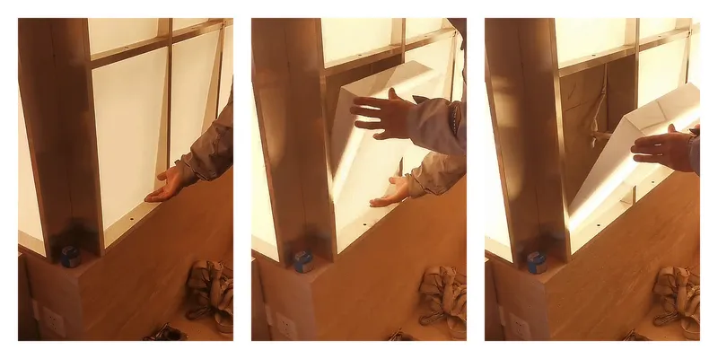
The material palette is deliberately restrained: timber joinery, terrazzo flooring, travertine platforms, brass tap fixtures, and stainless steel for the lightbox grid. Nothing shouts. The timber counter edges meet the terrazzo floor with clean, shadow-gap detailing, and the brass faucets at the service counter have the warmth of a domestic kitchen rather than a commercial fitout. A triptych of detail images shows a hinged timber panel that swings open to reveal an illuminated niche, a small gesture that rewards close inspection and suggests the architects cared as much about tactile surprise as they did about the big spatial moves.
Afternoon sunlight falling across the timber column and counter highlights the grain and the careful joinery. For a project that could easily have been dominated by the spectacle of the lightbox wall, these quieter moments keep the space grounded and human-scaled.
Facade Readings by Day

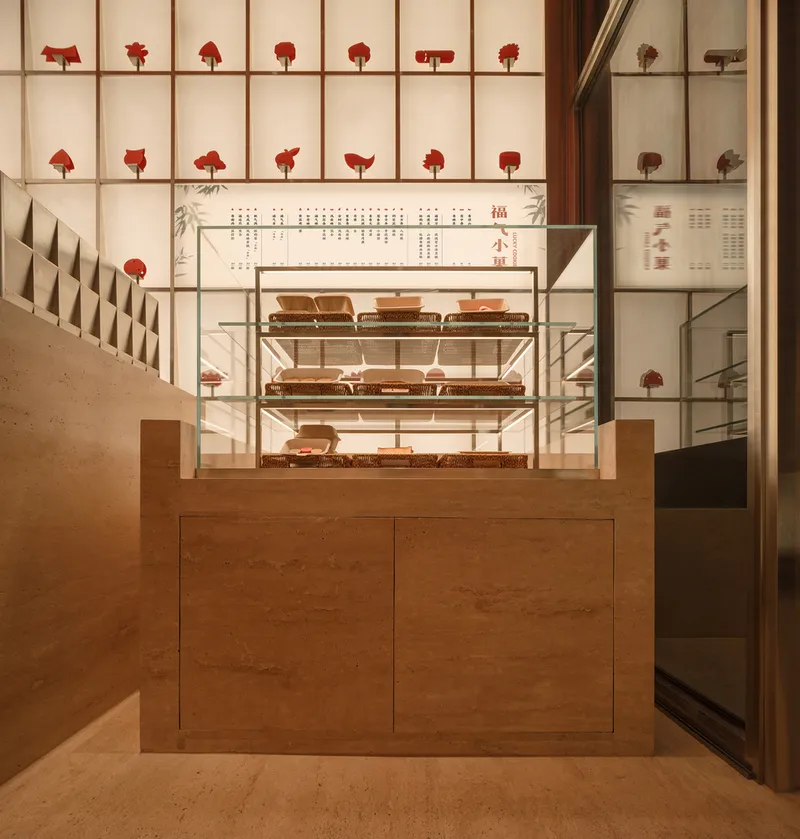
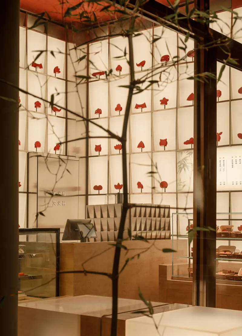
In daylight, the dynamic shifts. The light screen dims relative to the ambient brightness, and the glass facade picks up reflections of tree branches and passing pedestrians. The interior reads differently: the timber counter and glass display case in front of the backlit grid wall look more like a curated retail environment than a nocturnal lantern. The terrazzo floor catches natural light, and the red pastry silhouettes on the wall grid pop against the softer daytime glow of the translucent panels.
Studio NOR's decision to orient the design around a north-facing facade paid off here. North light is consistent and diffused, so the bakery never contends with harsh direct sun that would wash out the light screen or create uncomfortable glare through the full-height glass. The design is calibrated to its orientation, not fighting it.
Plans and Drawings

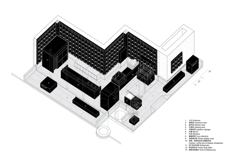


The floor plan confirms the radical allocation: the kitchen dominates, occupying roughly three quarters of the L-shaped layout, while the customer-facing pastry display and cashier are compressed into the remaining quarter near the corridor entrance. The axonometric drawing reveals the perforated wall system and the spatial relationship between the freestanding rock volumes. An isometric diagram labels each individual furniture piece, showing how they share formal DNA while serving distinct functions. The icon chart at the bottom catalogs the 25 pastry silhouettes used in the lightbox display, each derived from actual product shapes.
What the drawings make clear is how precisely the spatial strategy was choreographed. The freestanding volumes are not casually placed; they define circulation, frame views through the glass, and create micro-zones within a floor plate that barely qualifies as a room. Every element earns its presence.
Why This Project Matters
Lucky Cookies Bakery is a case study in turning constraints into identity. A depth of less than three meters, a fixed glass curtain wall, and a program dominated by kitchen equipment would paralyze most designers. Studio NOR treated each limitation as a design generator: the shallow depth became a display window, the tall section became a light screen, the kitchen became the storefront, and the boundary between inside and outside became negotiable. The 243 magnetic lightboxes alone represent a level of prototyping and fabrication commitment that you rarely see in a 37-square-meter retail fitout.
More broadly, the project demonstrates that small commercial interiors deserve the same rigor and invention as larger commissions. The isomorphic furniture system, the calibrated lighting strategy, the material restraint, and the spatial borrowing from adjacent corridors all reflect genuine architectural thinking rather than interior decoration. In a city saturated with bakery brands competing for attention, Lucky Cookies earned its presence through design intelligence, not marketing budget. That is the kind of project worth paying attention to.
Lucky Cookies Bakery by Studio NOR. Located in Longfu Building, Beijing, China. 37 square meters. Completed 2022. Photography by Songkai Liu.
About the Studio
Share Your Own Work on uni.xyz
If projects like this are the kind of work you want to make, uni.xyz is a place to publish your own, find collaborators, and enter design competitions.



Popular Articles
Popular articles from the community


Conexión: Biophilic Design Reimagines High-Rise Living in Hong Kong
Conexión reimagines high-rise living in Hong Kong through biophilic design, green facades, shared spaces, daylight, water and nature within.

Co-life: Sustainable Architecture for Age-Friendly Community Living
Co-life reimagines sustainable architecture for seniors through courtyards, rammed earth, shared gardens, and spaces designed for belonging.
AL-JANNAH: Sustainable Architecture and Permaculture for Afghan Widows
AL-JANNAH uses sustainable architecture and permaculture to create resilient oasis of housing, learning, work and renewal for Afghan widows.
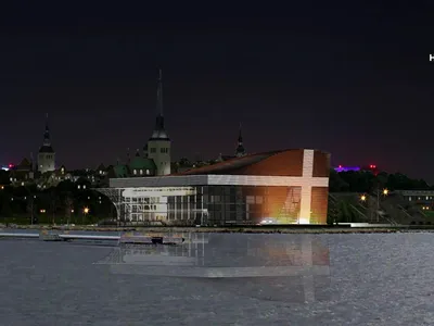
Hill & Cross Opera: Sculptural Opera House Architecture Shaped by Tallinn’s Landscape and Identity
Hill & Cross Opera reimagines opera house architecture in Tallinn through its sculptural hill, civic plaza, glass wave and a luminous cross.


Similar Reads
You might also enjoy these articles

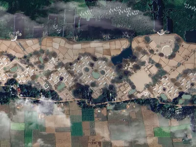
Hodi-Mandai Geram
Project Function: Preservation and revitalization of the Intangible heritage and socio-spatial identity of the Hodi by Housing, Cultural Memory Center, Sacred Grove, landscape, local tourism economy

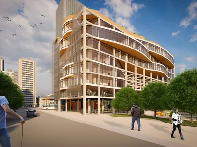
Olio Towers: A Mid-Rise for Performers That Fuses Housing, Rehearsal, and Stage
Located blocks from Houston's Theater District, this modular tower stacks living units around a central performance atrium.
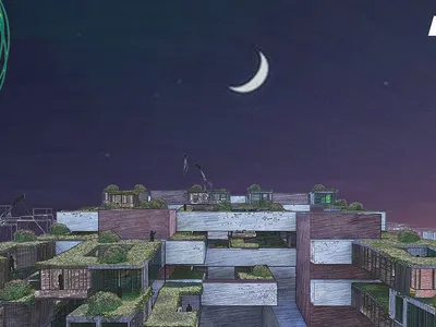
Oasis: Modular Green Housing Carved into Dhaka's Urban Fabric
A shortlisted Plugin Housing entry reclaims unauthorized settlements in Dhaka with stepped concrete volumes, green roofs, and ventilation-driven design.

Black Hole: A Floating Megastructure for the Post-Physical Era
Emiliano Mazzarotto envisions a spherical, self-scaling arena where e-sports, digital hotels, and holographic stadiums replace traditional public space.


Explore Architecture Competitions
Discover active competitions in this discipline



Challenge to reimagine the Iron Throne


Photograph architecture without architects


Illustrate the lost glory of Angkor Wat - Render Challenge

Design challenge to reuse E-waste
Comments (0)
Please login or sign up to add comments
No comments yet. Be the first to comment!