
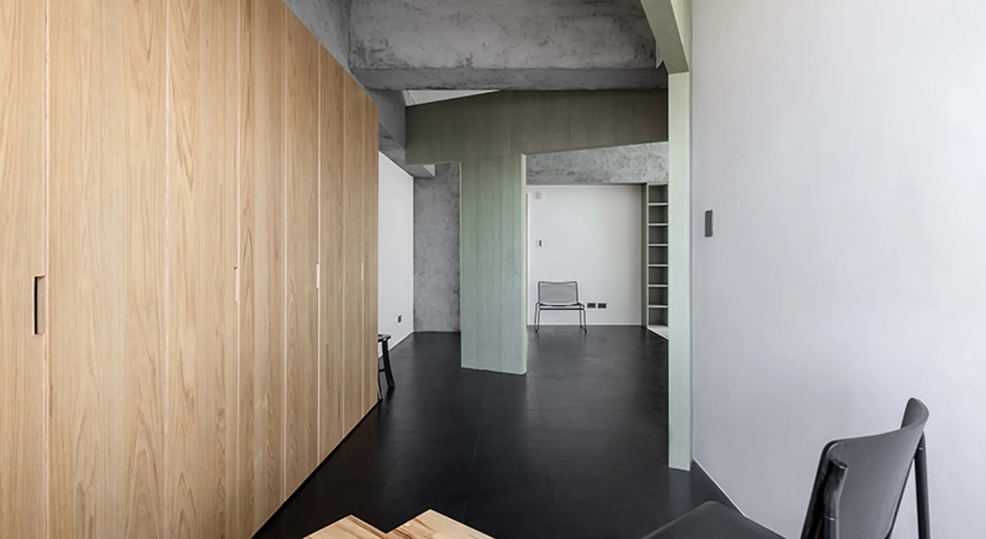
Metrics Architecture Studio Carves a Solo Suite from a Two-Bedroom Flat in Southern Taiwan
An angled volume rewires a 55-square-meter apartment in southern Taiwan, trading partition walls for a single fluid sequence.


Most apartment renovations begin with a brief to add rooms. This one did the opposite. Metrics Architecture Studio took a standard two-bedroom flat in southern Taiwan and collapsed its program into a single occupant's daily orbit: sleeping, cooking, working, bathing. The result, completed in 2021, is a 55-square-meter interior where every surface performs double duty and every sightline has been carefully calibrated to make a small space feel genuinely expansive.
What makes Flat for One worth studying is the method. Rather than gutting the plan and starting over, the architects inserted one angled volume that acts as spine, room divider, and storage wall simultaneously. The move reorients circulation away from the apartment's original corridor logic and replaces it with a sequence of framed views that unfold diagonally. It is a project about geometry doing the work that square footage cannot.
The Angled Insert
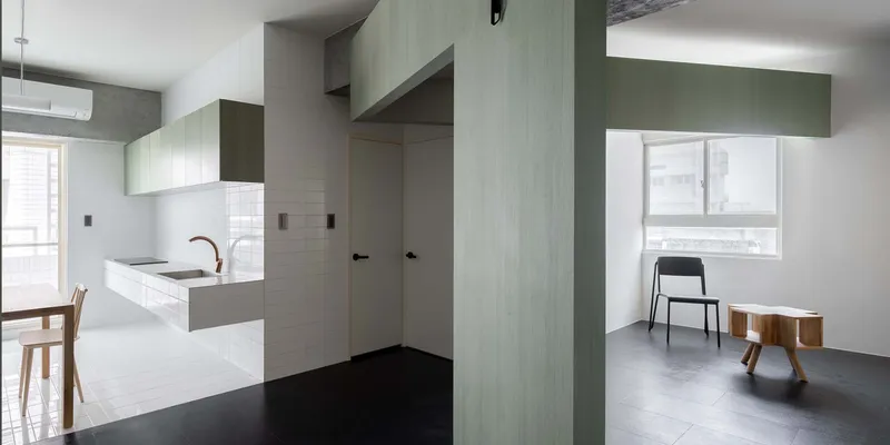
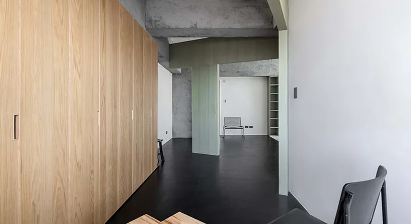

The defining gesture is a pale green paneled partition that cuts through the plan on an angle. It does not align with any existing wall, and that deliberate misalignment generates a series of wedge-shaped zones rather than boxy rooms. Walk along the timber storage wall on one side and the corridor telescopes into a triangular ceiling vault; look through the partition from the kitchen and the living zone opens up on a diagonal axis that makes 55 square meters read as something considerably larger.
The vault detail in the hallway is particularly telling. Instead of simply dropping a flat ceiling, the architects pinched the volume upward into a crisp triangular section. It transforms a pass-through into a moment, something you notice and remember. That kind of spatial generosity, squeezed from an economy of means, is the hallmark of a well-executed small apartment.
Material Palette: Concrete, Timber, Green
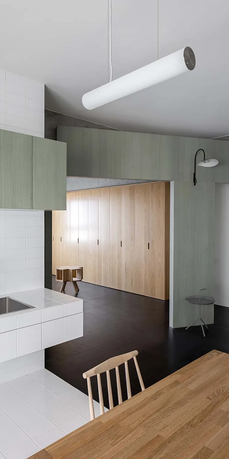

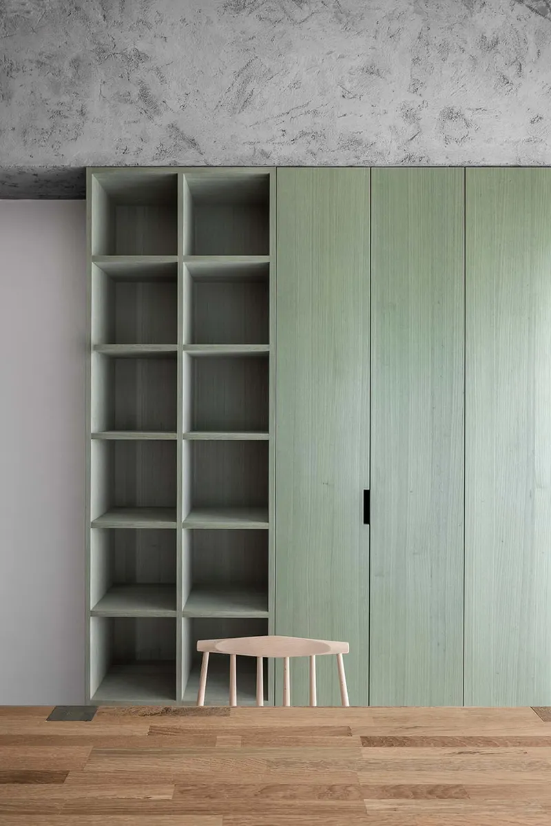
Three materials carry the entire interior. The existing concrete structure is left exposed overhead, its beams and ceiling slab providing a raw, cool backdrop. Against it, warm timber surfaces line the storage walls and furniture: wardrobes, shelving, the dining table. And then there is the pale green cabinetry and partition panels, a color just saturated enough to register as a deliberate choice without tipping into decoration.
The restraint pays off. Because the palette is so limited, each junction between materials becomes legible. The edge where the timber table meets the white tile floor and the black resin surface reads almost like a detail drawing brought to life. You can follow the logic of the apartment through its seams rather than its walls.
Kitchen and Living as a Single Field
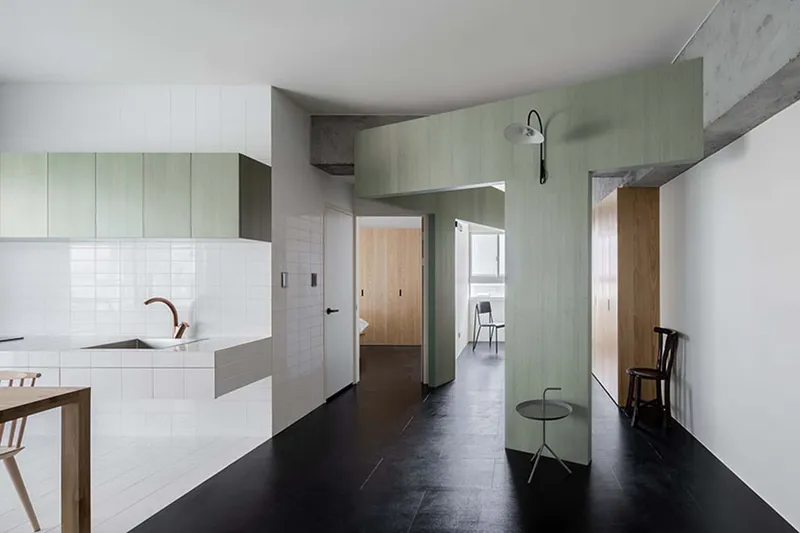
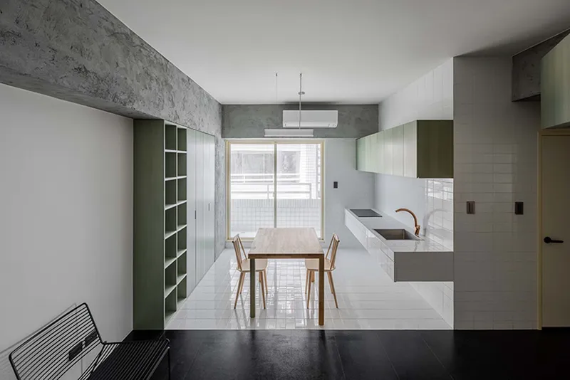

The kitchen island, clad in white with a generous countertop, anchors the social half of the apartment. It sits beneath the exposed concrete beams, flanked by the pale green cabinetry on one side and a white tile backsplash on the other. There is no formal dining room. Instead, a timber table doubles as workspace and eating surface, pushed against the concrete wall where open shelving keeps everyday objects within arm's reach.
Framing matters here. The view through the doorway in image six uses what appears to be a marble portal surround to stage the transition from one zone to another. It is a small luxury in a project that is otherwise quite spartan, and it signals that this is a threshold worth crossing, not just a gap in a wall. The architects understand that for a solo occupant, the rituals of daily life benefit from spatial punctuation.
Bedroom and Storage Wall

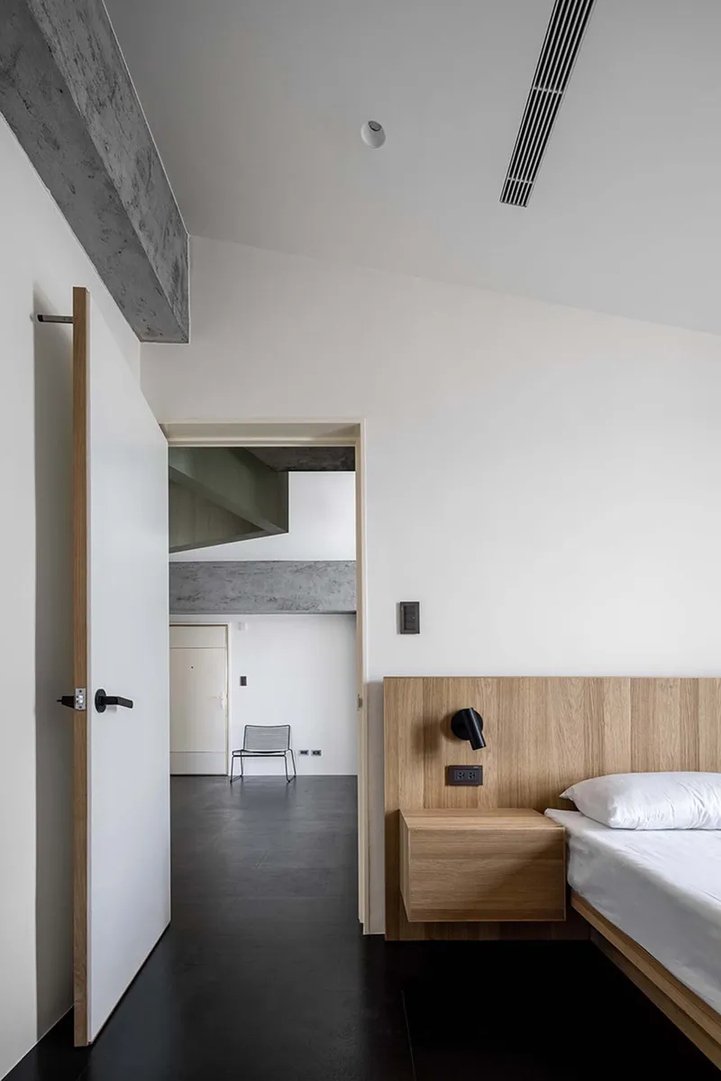
The bedroom is pared to its essentials: a timber platform bed, natural light, and a view through the doorway back into the connected spaces. There is no door visible in the photographs, which suggests the architects treated the sleeping area as an extension of the sequence rather than a sealed room. The storage wall continues here as a full-height timber element, maintaining continuity with the rest of the apartment.
For a flat designed around one person, this openness makes sense. Privacy from others is not a concern. What matters instead is the relationship between rest and activity, and the architecture mediates that through depth of view rather than closure.
Bathroom

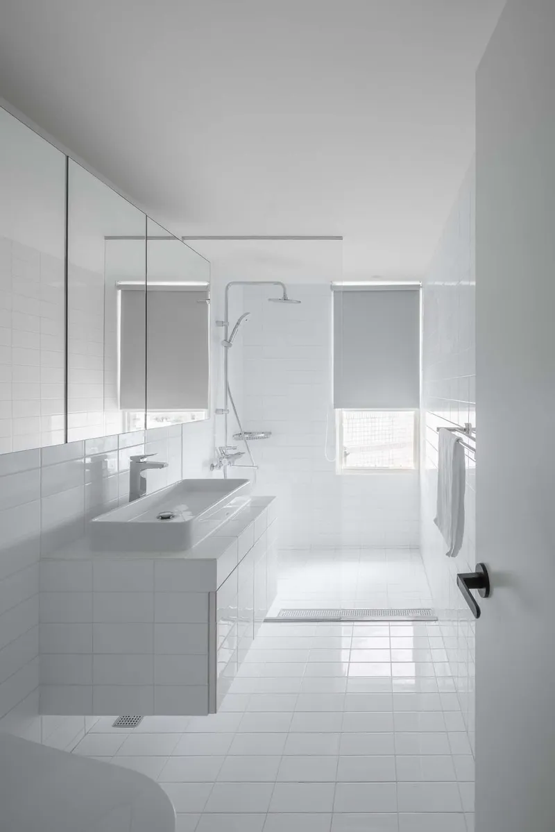
The bathroom follows the same logic of material clarity: white tile from floor to ceiling, a floating vanity, and a glass shower partition that keeps the room feeling continuous. Translucent blinds over the windows soften the daylight without blocking it. It is a clean, unfussy space, and its simplicity feels earned rather than lazy because every decision elsewhere in the apartment has been so precisely considered.
Details and Junctions
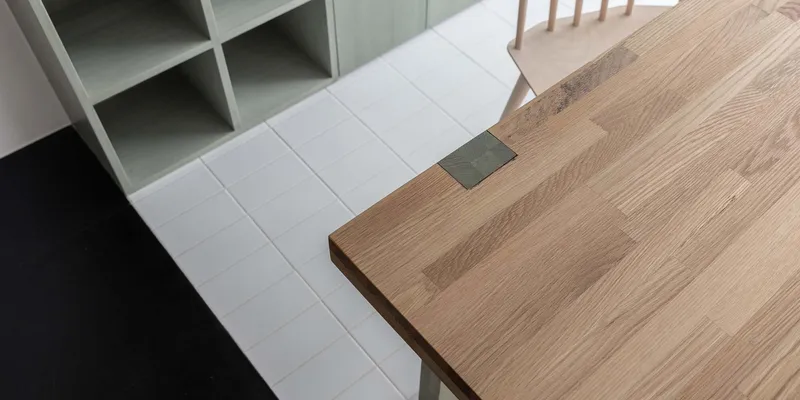
The close-up of the timber table edge meeting two different floor finishes tells you a lot about how this project was assembled. The black resin flooring in the living zone gives way to white tile in the kitchen, and the timber element bridges both without a conventional transition strip. It is the kind of detail that separates a considered renovation from a contractor-led refit. Similarly, the tubular pendant light hanging in front of the timber wardrobe wall is a deliberate object placed to catch the eye at the end of a sightline, not just a fixture screwed into a ceiling.
Plans and Drawings

The floor plan confirms what the photographs suggest: the angled volume is the organizational engine of the entire apartment. It generates a planted courtyard-like void at the heart of the plan, pulling light and air into what would otherwise be a deep, landlocked interior. The rooms fan out from this pivot point rather than lining up along a corridor. It is a simple move on paper, but its spatial consequences ripple through every room.
Why This Project Matters
Flat for One is a reminder that small apartment design does not have to mean clever storage hacks and fold-down furniture. The real opportunity in a compact space is geometric: how you orient walls, where you place thresholds, and what you let the eye travel through. Metrics Architecture Studio found a way to make 55 square meters feel generous without adding a single square meter, and they did it with one angled line drawn through an existing plan.
The project also speaks to a growing demographic reality. Solo living is on the rise across East Asia and globally, and the housing stock was not designed for it. Converting a two-bedroom apartment into a one-person suite is not a downgrade; it is a recalibration. When done with this level of care, the result is a home that fits its occupant like tailored clothing, with nothing wasted and nothing missing.
Flat for One by Metrics Architecture Studio. Located in southern Taiwan. 55 m². Completed in 2021. Photography by Yucen Zhao.
About the Studio
Share Your Own Work on uni.xyz
If projects like this are the kind of work you want to make, uni.xyz is a place to publish your own, find collaborators, and enter design competitions.




Popular Articles
Popular articles from the community

The Musturak Paradise: Senior Living Architecture for a Connected Future in Temara, Morocco
The Musturak Paradise reimagines senior living architecture in Temara via private homes, social spaces, culture, community, and shared care.
The Earth Pod: 3D Printed Homes for Resilient Refugee Communities
The Earth Pod reimagines refugee housing through 3D printed homes made from clay, combining resilience, self-sufficiency, and rapid shelter.

Co-Life: Senior Housing Design That Reconnects Older Adults With the City
Co-Life reimagines senior housing design through healing gardens, shared streets, workshops, and a sustainable community across generations.
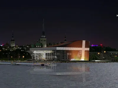
Hill & Cross Opera: Sculptural Opera House Architecture Shaped by Tallinn’s Landscape and Identity
Hill & Cross Opera reimagines opera house architecture in Tallinn through its sculptural hill, civic plaza, glass wave and a luminous cross.

Similar Reads
You might also enjoy these articles

Bao Huynh Watercolor Atelier: A Serene Art Retreat in Hội An
Bao Huynh Watercolor Atelier in Hội An blends multifunctional art spaces, sustainable design, local materials, and family-friendly living in a serene environment.

Atelier Macri Concept Store Interior Design by CASE-REAL
Atelier Macri store features a "ko" counter, walnut wood details, cork displays, blending retail, gallery, and seamless customer experiences.

Manuel Vargas Izquierdo Stadium and High-Performance Sports Center: Architectural Excellence in Jalpa de Méndez
The Manuel Vargas Izquierdo Stadium blends sustainable design, inclusive sports facilities, and cultural-inspired architecture, revitalizing Jalpa de Méndez’s public spaces.

KAKR Buluh Awar Hall: Revitalizing Community and Ecology Through Bamboo Architecture
Community built bamboo hall revitalizes Buluh Awar village, empowering youth, restoring ecology, celebrating vernacular craftsmanship through sustainable architecture and culture.


Explore Architecture Competitions
Discover active competitions in this discipline



Challenge to reimagine the Iron Throne


Photograph architecture without architects


Illustrate the lost glory of Angkor Wat - Render Challenge


Design challenge to reuse E-waste
Comments (0)
Please login or sign up to add comments
No comments yet. Be the first to comment!