
Minuspluse Design Threads a 64 m² Tainan Townhouse into a Sequential Retail Journey
Human Haus TN peels back layers of a traditional shophouse in Tainan to reveal brick, timber, and a courtyard at its core.

Tainan's traditional townhouses are spatial instruments. Narrow, deep, and sequenced around courtyards, they regulate light, air, and social threshold with a precision that most contemporary retail fit-outs ignore entirely. Minuspluse Design, led by Yu-Hsuan Chu and Yu-Chen Chang, took one of these instruments and chose not to silence it. Human Haus TN, completed in 2023, converts a 64 m² townhouse into a clothing store that operates less like a shop and more like a slow walk through compressed time.
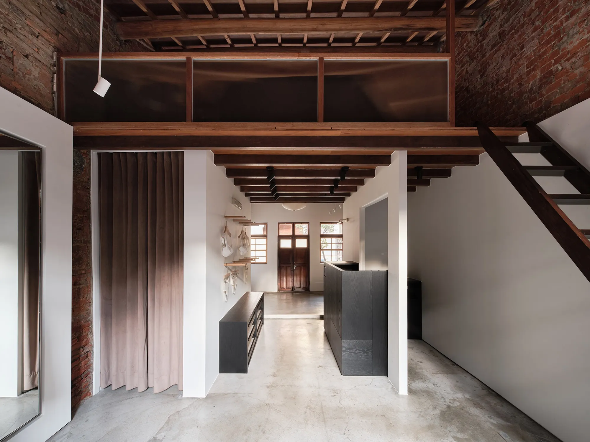
What makes this project worth studying is not the adaptive reuse label, which has become a reflexive badge of virtue, but the method. The architects selectively removed ceilings and partitions to expose an original timber roof structure and brick walls, then inserted crisp white volumes and black display units that read as a second, contemporary layer. The result is a building that holds two eras in suspension: the townhouse's proportional logic and material warmth on one side, a controlled minimalism on the other. Retail becomes an excuse for architecture, and the customer's path from street to courtyard becomes the real product.
Reading the Threshold
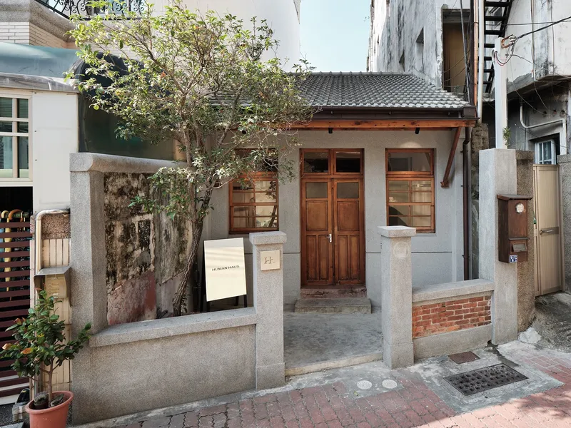

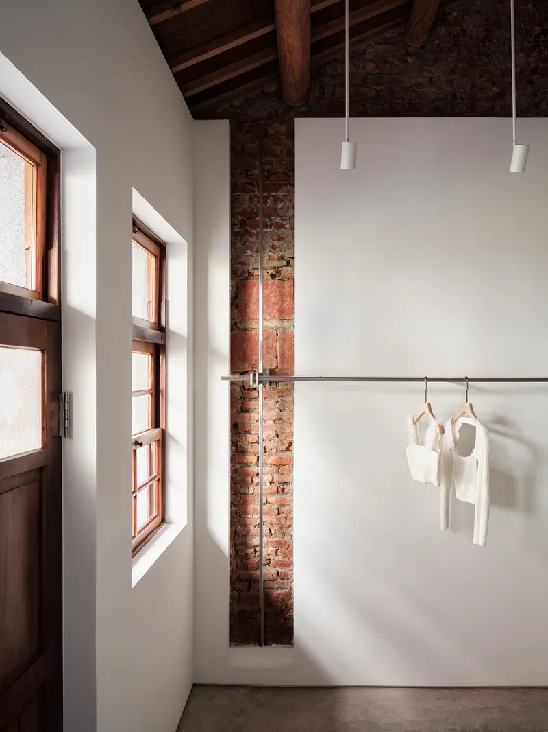
From the street, the shopfront is disarming. A low-scale facade of concrete, timber, and tile sits quietly under climbing vines, offering no glass curtain wall, no logo scale warfare. It reads as a house that happens to have its door open. Step inside and the entry space reveals exposed timber ceiling rafters, a reclaimed brick column, and a white paper lantern that glows like a soft anchor. The deep window reveals beside the brick column frame daylight as though it were a material in itself, thickening the sense of transition between public sidewalk and interior world.
This front threshold is the most choreographed moment in the project. It tells the visitor, without signage or instruction, to slow down. The proportions compress. The ceiling is close. The light is warm but indirect. It is a classic shophouse move, and Minuspluse Design trusts it completely rather than replacing it with a contemporary gesture.
Structure as Surface
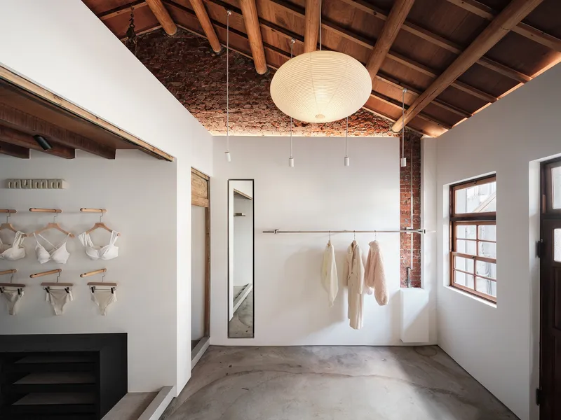
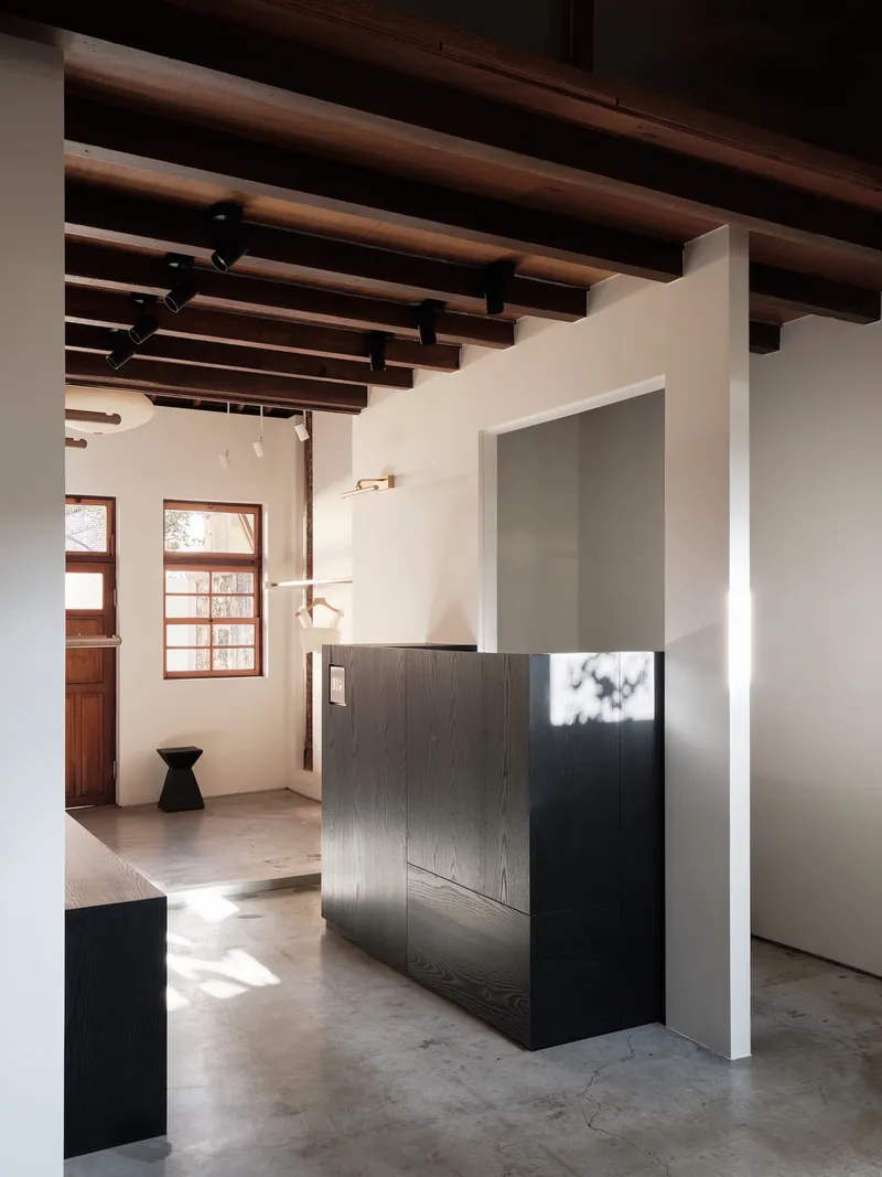
Throughout the interior, the original timber ceiling structure carries the design. Joists and rafters are left exposed, their patina untouched, their rhythm dictating where pendant lights drop and where the eye pauses. In one room, a black display cabinet sits beneath this timber canopy like a piece of furniture that knows its place. A wooden door beyond suggests further depth. Morning sunlight enters through apertures and washes across the concrete floor, reinforcing the building's east-west orientation.
The decision to keep structure visible is not decorative nostalgia. It anchors the spatial proportions. Without these timber ceilings, the narrow rooms would feel like corridors. With them, each bay has a specific character defined by its framing, its span, its grain.
Retail Without Spectacle
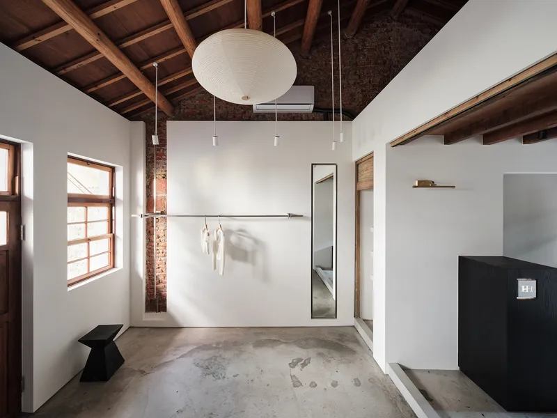

The retail function is handled with extreme restraint. Wall-mounted clothing rails, a few black display units, and nothing more. In one room, a single rail casts soft shadows against an exposed brick column and concrete floor. The garments become part of the composition rather than the dominant event. Looking deeper through the axial view, white volumes frame the sequence toward a sunlit courtyard at the rear, with exposed timber beams overhead and black fixtures providing the only contrast.
There is a growing tendency in retail design to treat the space as a content machine, every surface optimized for a camera angle. Minuspluse Design goes in the opposite direction. The architecture is the experience. The merchandise occupies it without demanding attention. For a 64 m² shop, this discipline is notable.
The Double Height and the Mezzanine
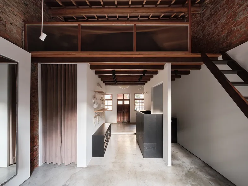
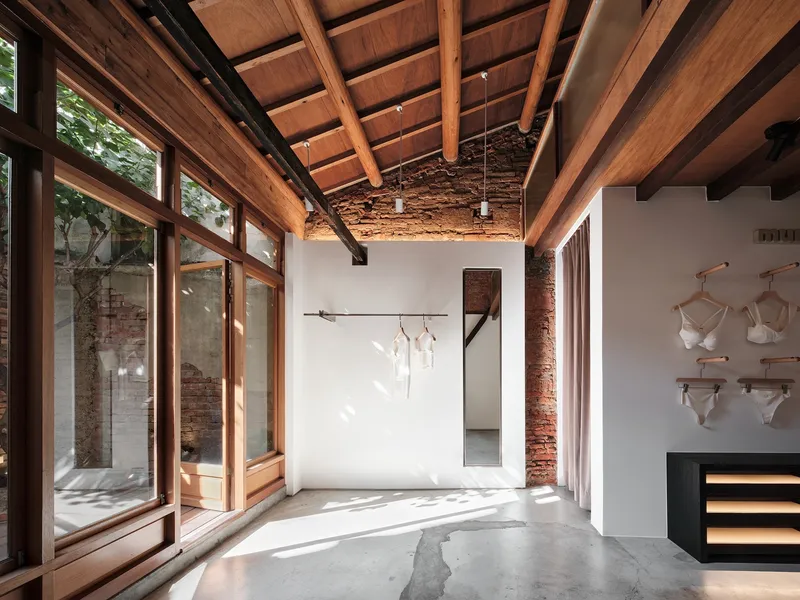
The spatial climax of the project is a double-height volume with a mezzanine stair, exposed brick walls, and clerestory windows that pour light down through the timber ceiling structure. This is where the architects' selective demolition pays off most dramatically. By removing the original ceiling in this zone, they unlock a vertical dimension that the townhouse typology rarely reveals. The brick walls, now fully exposed from floor to roof, become geological, registering layers of construction, patching, and age.
A timber-framed glazed partition opens onto the courtyard beyond, framing a view of dappled afternoon light filtering through vegetation. The transition from the compressed entry to this expanded, luminous room is the essential architectural move. It rewards the visitor who walks the full length of the building, turning the shopping trip into a genuine spatial event.
The Courtyard Core
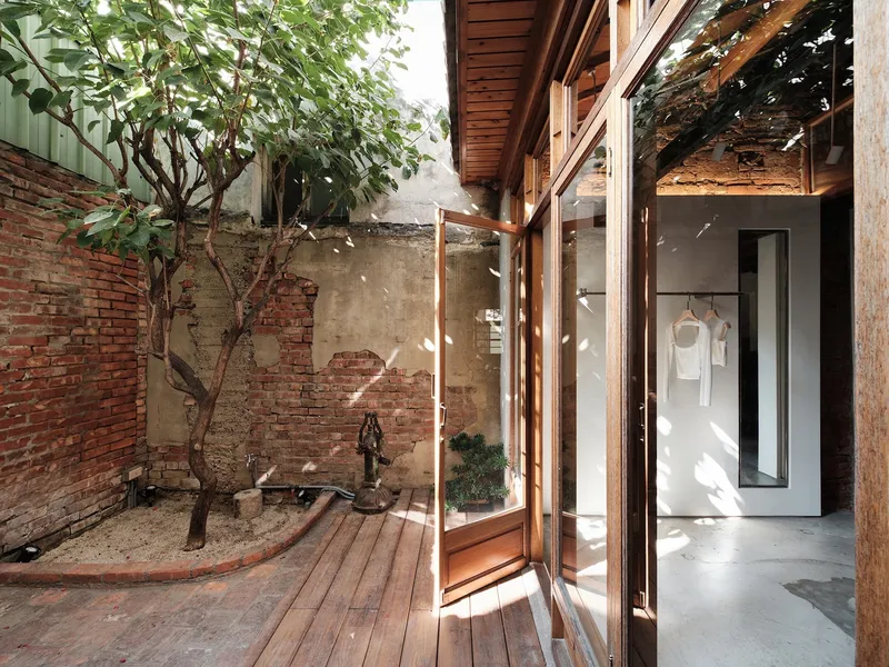
At the heart of the plan sits the interior courtyard: timber decking, reclaimed brick walls, and a young tree casting dappled shadows across the ground. It is the traditional townhouse's environmental engine, pulling air and light into the deep plan. Minuspluse Design kept it intact and arguably made it the most important room in the store. No merchandise here. Just a tree, some shadows, and a pause in the commercial sequence.
The courtyard also serves as a passive climate strategy, introducing natural ventilation and daylight at the narrowest point of the floor plan. In Tainan's subtropical climate, this is not a luxury. It is the reason the typology existed in the first place. By preserving and emphasizing it, the architects connect their retail intervention to a centuries-old logic of environmental design.
Plans and Drawings
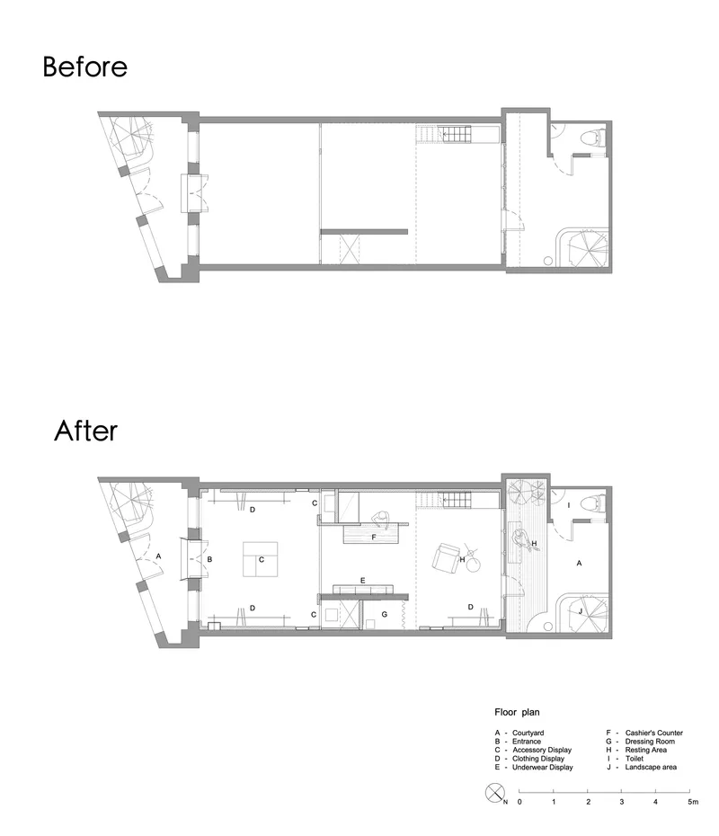
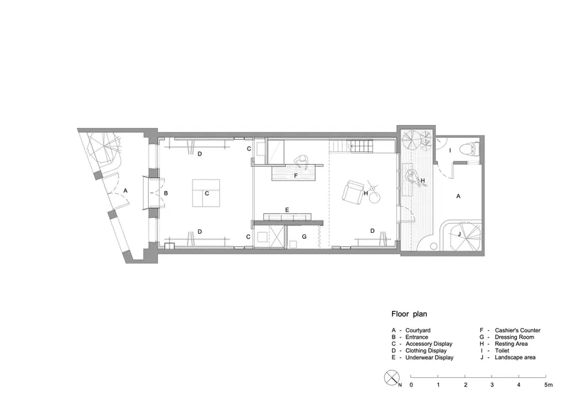
The before-and-after floor plan reveals the scope of the intervention. The original layout, typical of Tainan's narrow infill lots, was a series of enclosed rooms stacked along a single axis. The redesign opens lateral connections, removes redundant partitions, and recenters the plan around the courtyard. The labeled program drawing shows how the architects organized the 64 m² into a clear sequence: front threshold, display zones, courtyard, and rear service area. The narrow footprint demanded that every square meter carry spatial meaning, and the plans confirm that nothing here is leftover space.
Why This Project Matters
Human Haus TN is a small project with an outsized lesson. It demonstrates that adaptive reuse of vernacular buildings does not require grand gestures, signature materials, or ironic contrasts. It requires listening. The original townhouse already knew how to manage light, sequence, and climate. The architects' job was to reveal those capacities, insert a precise contemporary layer, and get out of the way. In a market saturated with retail interiors that scream for Instagram attention, this one whispers.
It also matters as a model for working within extreme constraints. Sixty-four square meters is a single parking space in some developments. Within that footprint, Minuspluse Design created a double-height room, a courtyard, a mezzanine, and a complete retail program that feels neither cramped nor cluttered. The project proves that density and dignity are not mutually exclusive, and that the traditional townhouse, often dismissed as obsolete, remains one of the most spatially intelligent building types available to designers willing to learn from it.
Human Haus TN, designed by Minuspluse Design (lead architects Yu-Hsuan Chu, Yu-Chen Chang). Tainan, Taiwan. 64 m². Completed 2023. Photography by Suiyu Studio.
About the Studio
Share Your Own Work on uni.xyz
If projects like this are the kind of work you want to make, uni.xyz is a place to publish your own, find collaborators, and enter design competitions.




Popular Articles
Popular articles from the community


Pangolin Can Help Mining: Biomimicry Architecture for an Asteroid Mining Habitat
Pangolin Can Help Mining explores biomimicry architecture through a modular 3D-printed habitat designed for asteroid mining and future life.

How Henri Picq's 1889 Paris Pavilion Traveled 11,000 Kilometers to Become Santiago's Artequín Museum
A prefabricated iron and glass pavilion built for the Paris Universal Exposition found a second life as a children's art museum in Chile.
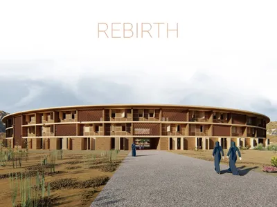
REBIRTH: Sustainable Architecture Shaped by Community, Resilience and Renewal
REBIRTH uses sustainable architecture, circular design, local materials and shared spaces to restore community, dignity and hope for widows.
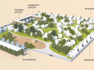
Garden of Hope: Sustainable Architecture for a Resilient Community in Qandahar
Garden of Hope reimagines sustainable architecture as secure, organic community where women rebuild lives through housing, work, and nature.


Similar Reads
You might also enjoy these articles

Bao Huynh Watercolor Atelier: A Serene Art Retreat in Hội An
Bao Huynh Watercolor Atelier in Hội An blends multifunctional art spaces, sustainable design, local materials, and family-friendly living in a serene environment.

Atelier Macri Concept Store Interior Design by CASE-REAL
Atelier Macri store features a "ko" counter, walnut wood details, cork displays, blending retail, gallery, and seamless customer experiences.

Manuel Vargas Izquierdo Stadium and High-Performance Sports Center: Architectural Excellence in Jalpa de Méndez
The Manuel Vargas Izquierdo Stadium blends sustainable design, inclusive sports facilities, and cultural-inspired architecture, revitalizing Jalpa de Méndez’s public spaces.
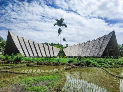
KAKR Buluh Awar Hall: Revitalizing Community and Ecology Through Bamboo Architecture
Community built bamboo hall revitalizes Buluh Awar village, empowering youth, restoring ecology, celebrating vernacular craftsmanship through sustainable architecture and culture.






Comments (0)
Please login or sign up to add comments
No comments yet. Be the first to comment!