
SUMMARY Builds Four Prefabricated Kindergartens Across Lisbon in Just Thirteen Months
A modular concrete system gives Lisbon a replicable, color-coded kindergarten identity while keeping construction fast and waste low.
Most architecture competitions ask for one building. Lisbon's municipality asked for a system. In 2023, SUMMARY delivered four kindergartens simultaneously across different neighborhoods, all built from the same kit of prefabricated reinforced concrete U-modules, all assembled on site in a matter of days, and all finished within thirteen months. The combined program covers 2,660 square meters, distributed across four constrained urban plots. That speed and economy alone would be noteworthy. What makes the project genuinely interesting is that it refuses to look like fast, cheap construction.
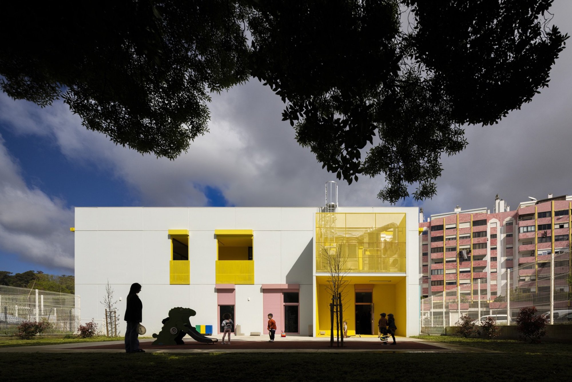
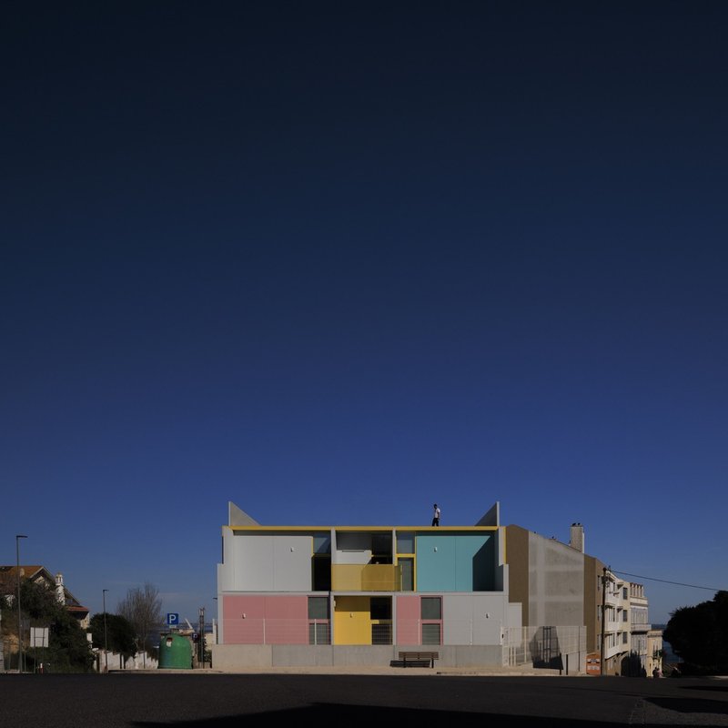
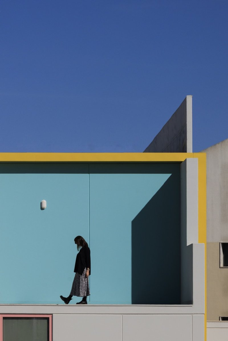
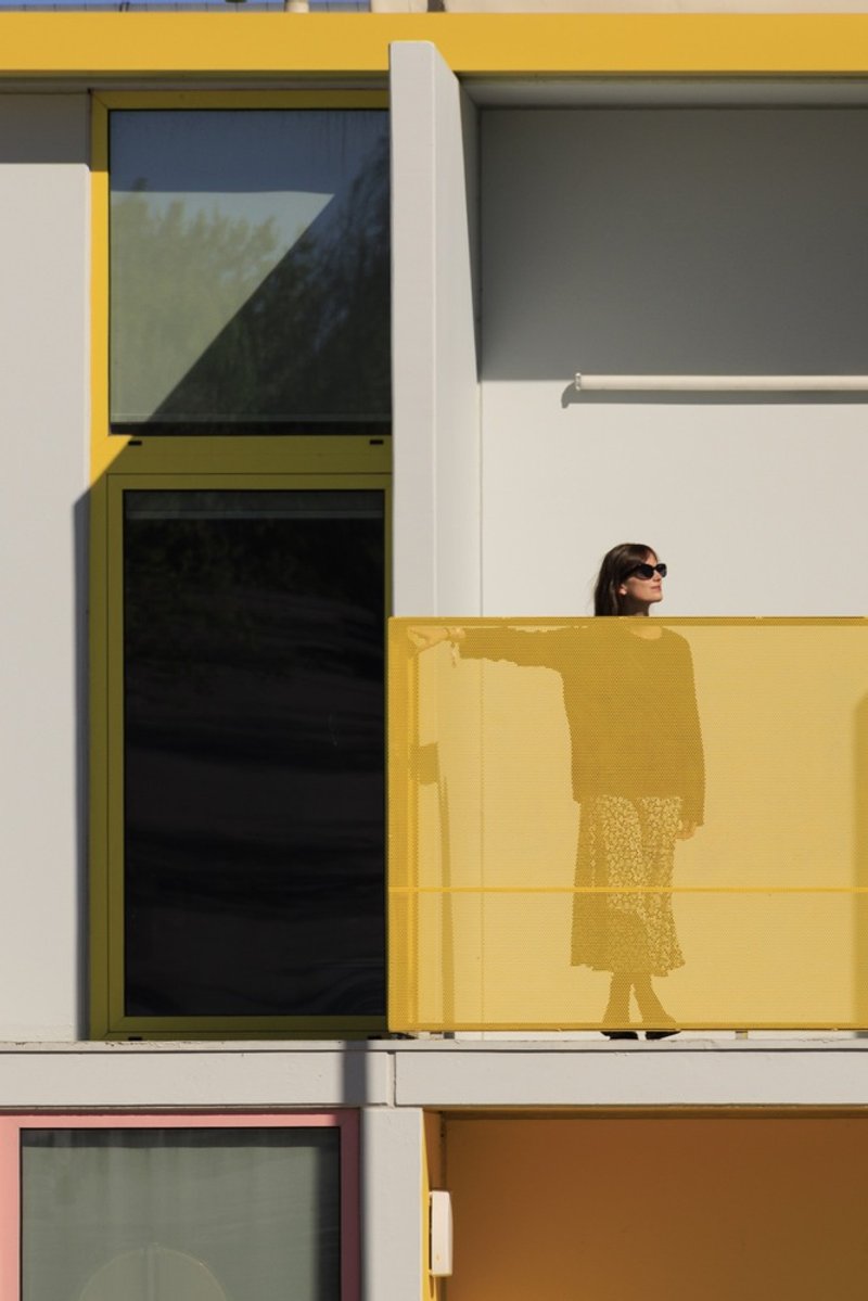
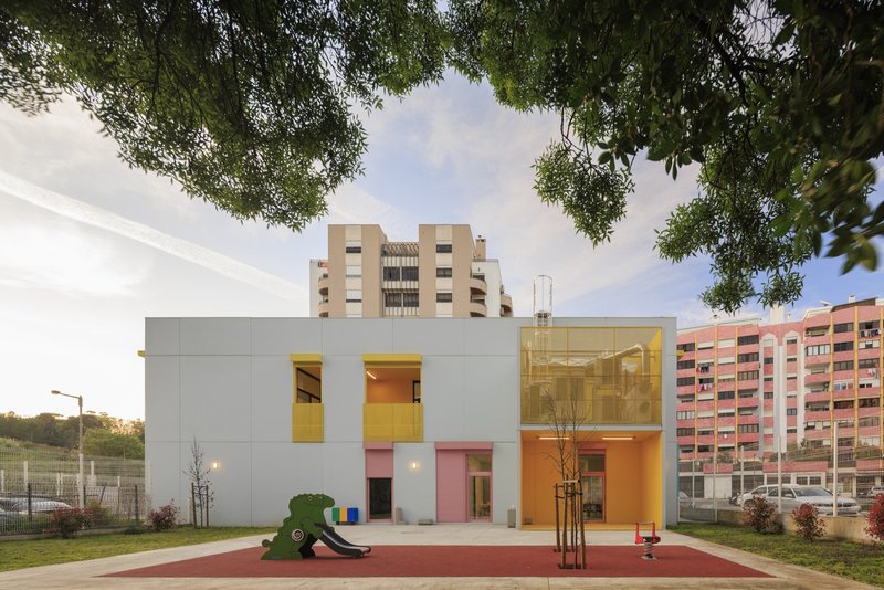
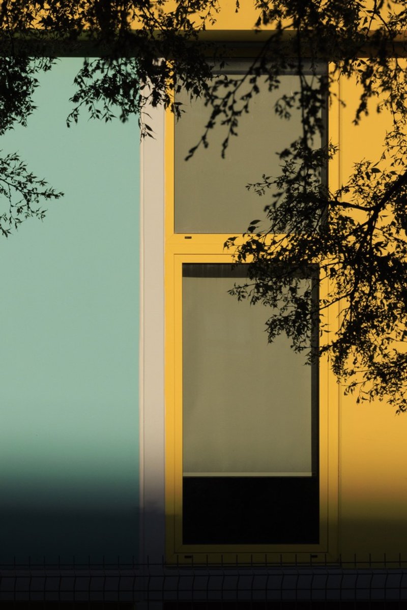
The key design decision is legibility. Every module is visible from the outside: joints are exposed, overlaps are expressed, and the color coding of facade panels makes each structural bay readable at a glance. Yellow, pink, turquoise, and cream panels are applied in different combinations at each site, giving the four buildings a shared family resemblance without collapsing into sameness. The result is a set of kindergartens that children can identify from the street, that adults can navigate intuitively, and that the city can replicate without diminishing returns.
A Tectonic System You Can Read from the Sidewalk
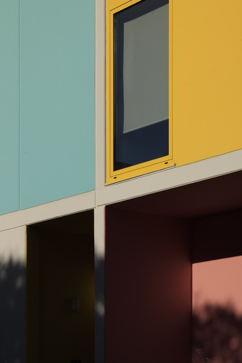
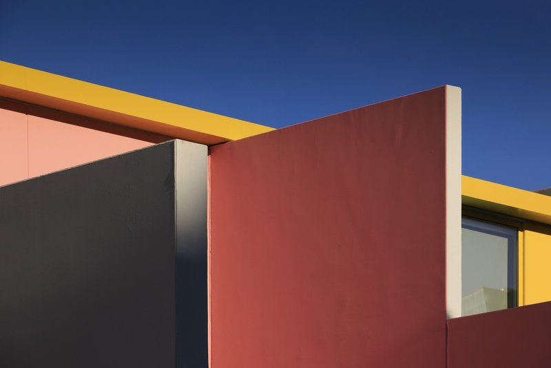
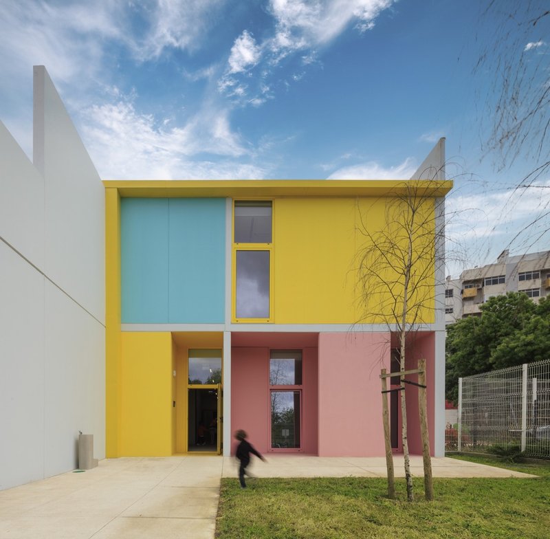
SUMMARY treats the modular concrete frame as a compositional tool rather than something to hide behind cladding. The U-shaped modules overlap and interlock, and their seams are left frankly visible. Facade panels in pastel tones slot into this grid, turning a structural diagram into a street presence. Up close, the meeting of a pale blue panel, a yellow window frame, and a terracotta wall feels almost painterly. The architecture communicates how it was made, and it does so in a language accessible to a four-year-old.
That directness is not incidental. The competition brief demanded durability and low maintenance, which pointed toward concrete, but also a recognizable identity that could unify buildings scattered across very different neighborhoods. Color and tectonic expression solve both problems at once: the material will last decades, and the palette makes the buildings unmistakable.
Color as Urban Signal
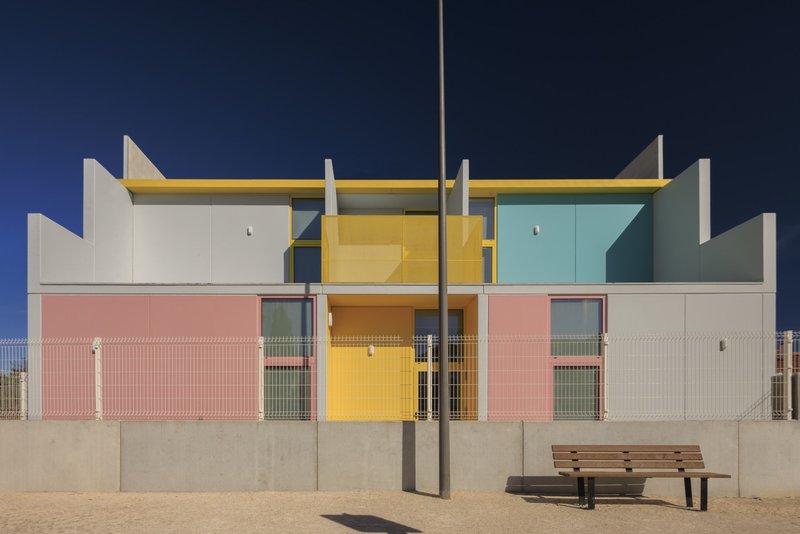
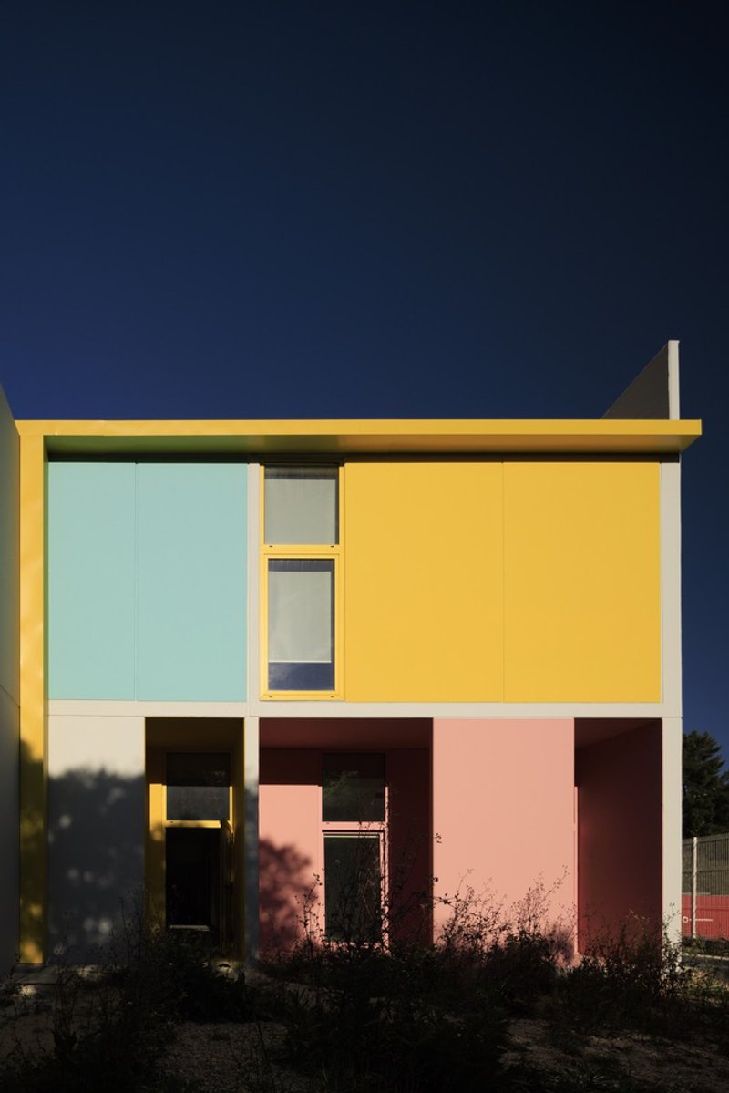
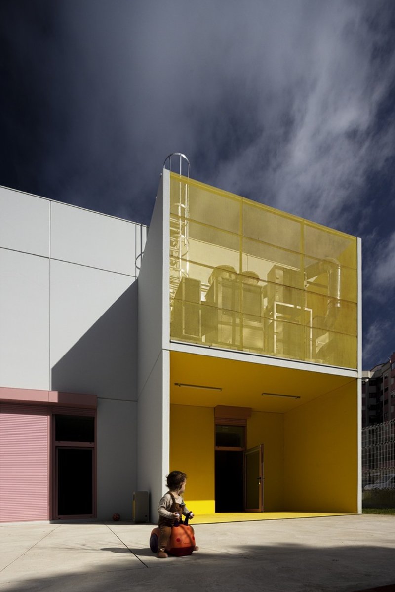
The facades cycle through yellow, pink, turquoise, and grey with a consistency that reads as a brand. Pink roller shutters below turquoise upper panels, a yellow cantilever glowing against a deep blue dusk sky, pastel geometries lining a sidewalk: these are buildings that announce themselves to the neighborhood. For institutions serving young children, that visibility matters. Parents locate them instantly; kids recognize them from a distance.
Color also differentiates the sites from each other. While the structural module and floor plan logic remain constant, each kindergarten wears its own combination, calibrated to its street context. The standardized system absorbs variation without losing coherence.
Ground Floor: Thresholds Between Inside and Out
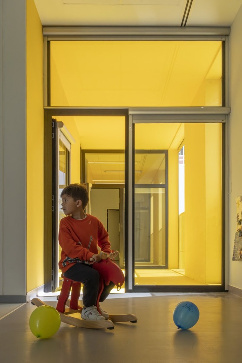
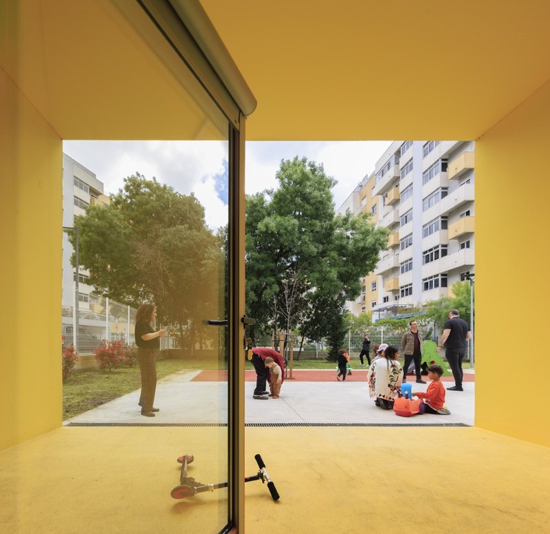
The ground level is designed as a series of thresholds. Cantilevered volumes create covered entries wide enough for a child to ride a toy horse from indoor floor to outdoor pavement without encountering a step change in scale. Translucent glazing above these recesses filters daylight into soft bands. The transition from grey exterior paving to warm yellow interior surfaces is gentle and legible, inviting children outward rather than confining them.
Kitchens, administrative offices, and technical spaces occupy the ground floor alongside classrooms, keeping the service program close to arrivals. Every room has direct access to the outside, either to a playground or, on the upper level, through terraces. The circulation spine running through the center of the building is straight and linear, giving staff sightlines across the full plan.
Upper Terraces and the Vertical Section
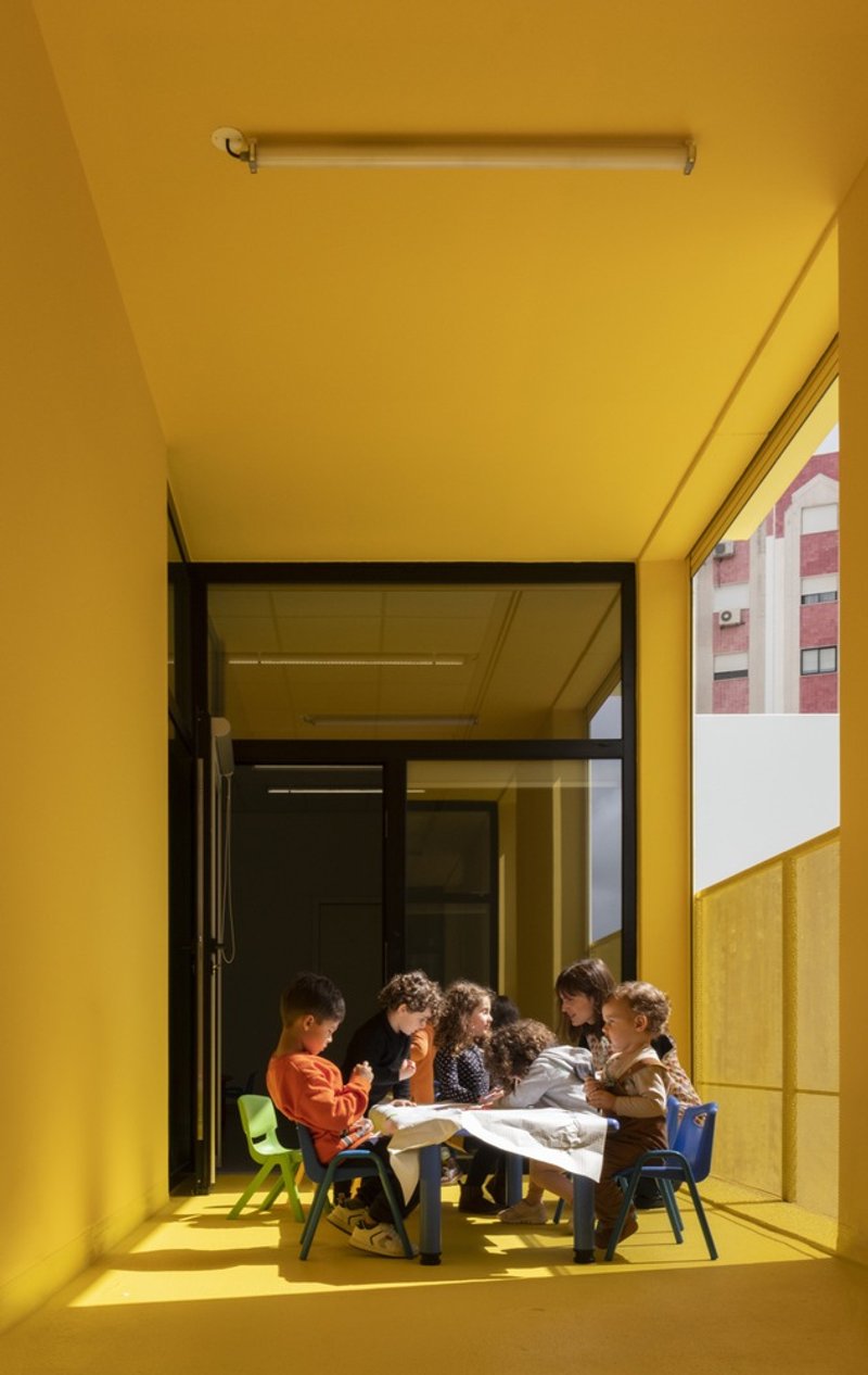
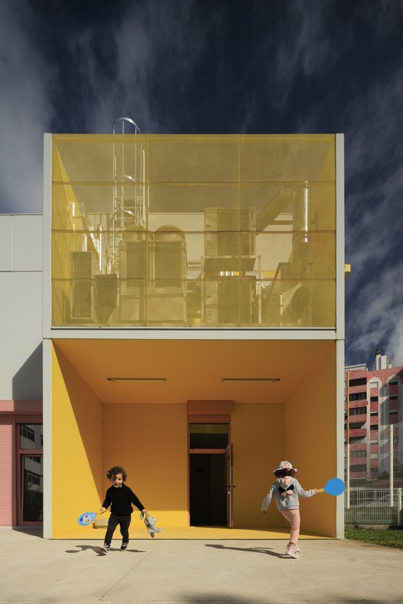
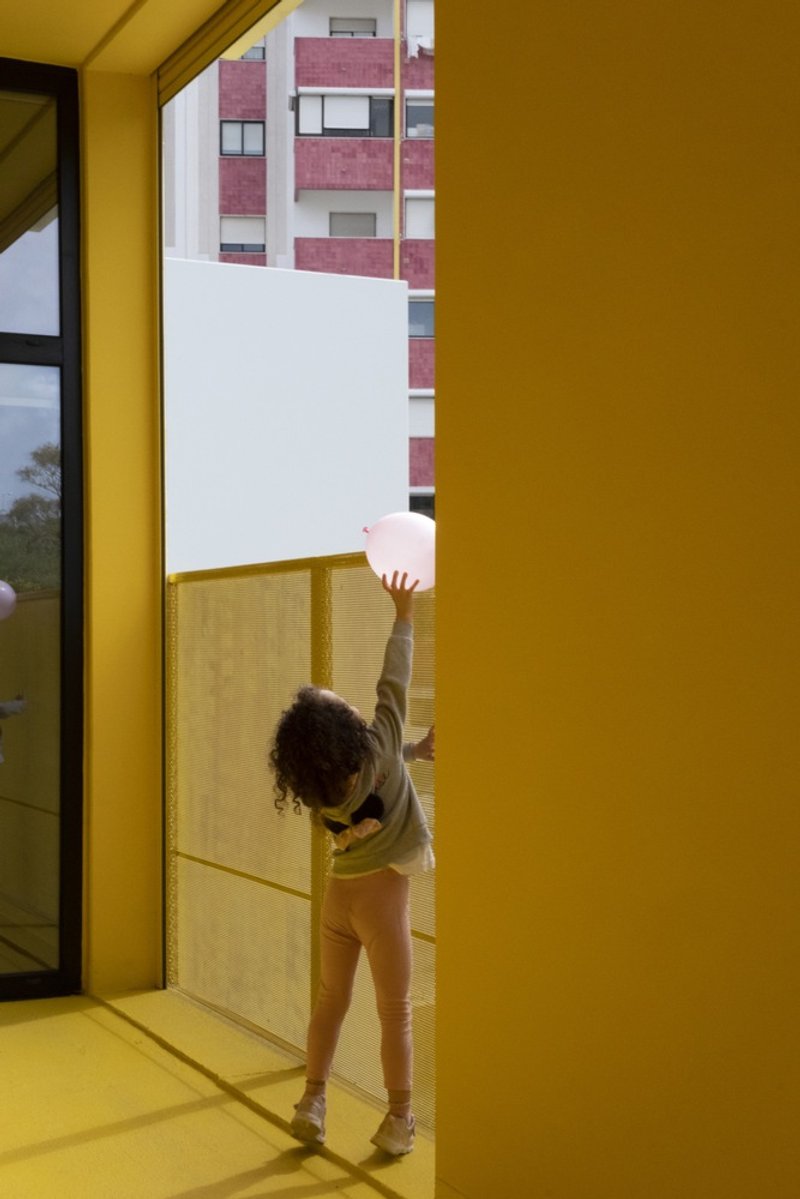
Stacking the program onto two floors is not just a way to save footprint on tight urban lots. It creates a rooftop landscape of terraces that give upper-floor classrooms their own outdoor rooms. Yellow parapets with perforated screens let children look out over the neighborhood while remaining safely enclosed. On bright days, these terraces function as open-air extensions of the classrooms, with low tables and seating pulled outside.
The two-story section also maximizes ground-level playground area, a critical consideration on plots where every square meter counts. The compact massing pushes the building's footprint inward, freeing the perimeter for gardens, paved play surfaces, and planting.
Interiors Calibrated for Small Bodies
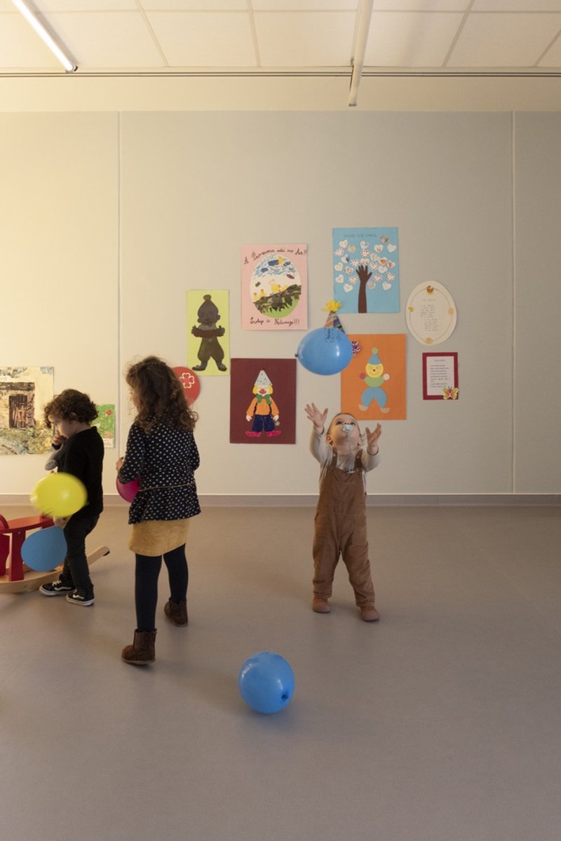
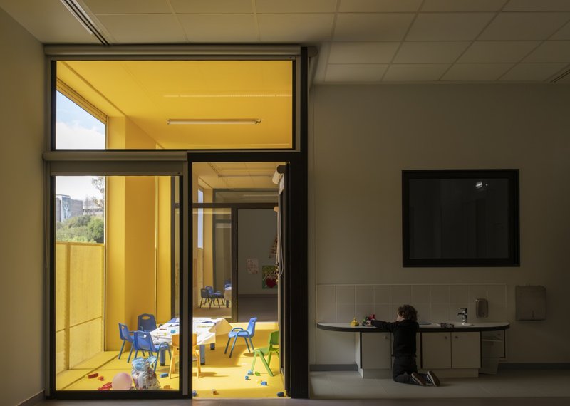
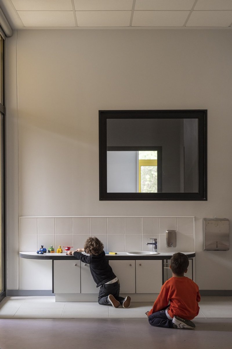
Inside, the palette shifts to white walls, natural light, and splashes of yellow. Classrooms are generous but not cavernous, scaled to groups of children working at low tables or chasing balloons across a tiled floor. Black-framed glass doors between rooms allow supervision across multiple spaces without requiring open plans. A white-tiled room with a square window at child height turns a simple washroom into a space with its own quiet character.
The central corridor doubles as the HVAC spine. Ducts run through the side walls of this corridor, keeping mechanical systems organized and accessible without intruding into classrooms. It is a pragmatic decision that also simplifies maintenance across all four buildings, since the same configuration repeats identically at every site.
The Garden as Infrastructure
Landscape is treated with the same systematic rigor as the buildings. Plant species were selected for climate adaptability, low water demand, and the absence of allergenic properties. Vegetative cover across most exterior surfaces enhances soil permeability, managing stormwater without additional engineered systems. Non-slip paving accommodates wheeled toys. The result is a series of gardens that feel generous despite their modest dimensions.
From upper-floor windows, the view out includes mature trees, neighboring residential buildings, and families gathering on the lawn. The kindergartens sit within the city rather than walling themselves off from it. That porosity is intentional: children see the world they will eventually join, framed by the yellow geometry of their own building.
Night Readings and the Illuminated Module
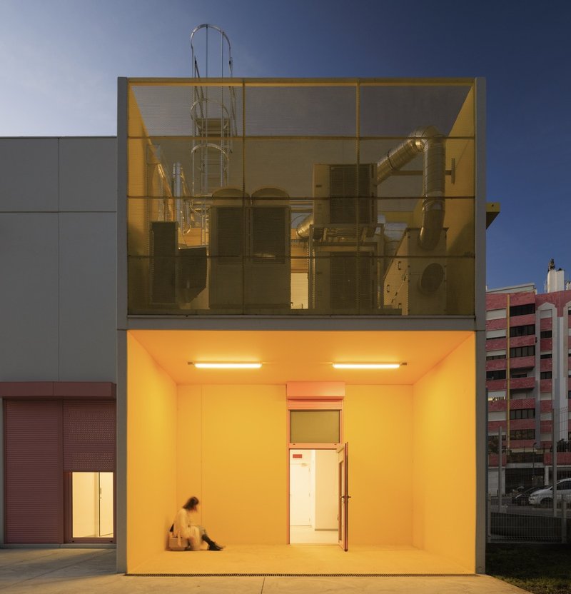
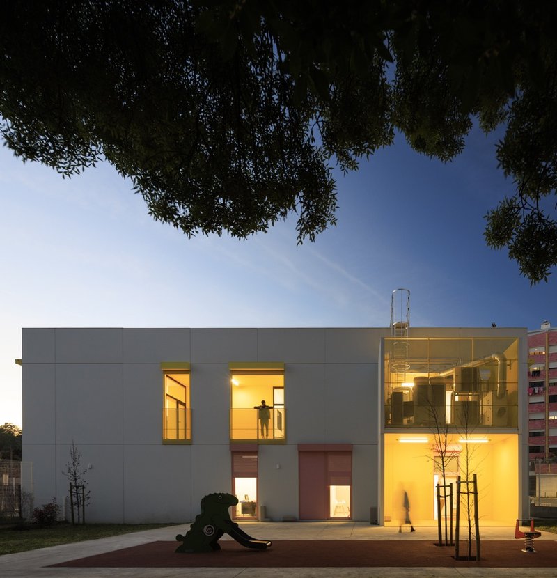
At dusk, the buildings transform. Yellow-lit interiors glow through floor-to-ceiling glass, turning each module into a lantern. Exposed ductwork visible through the glazing gives the evening elevation an almost industrial honesty, a reminder that these are working buildings with systems on display. Grey panel cladding and illuminated openings create a graphic composition that reads well from the street, reinforcing the kindergarten's presence in the neighborhood after hours.
Plans and Drawings
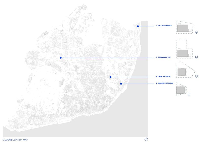
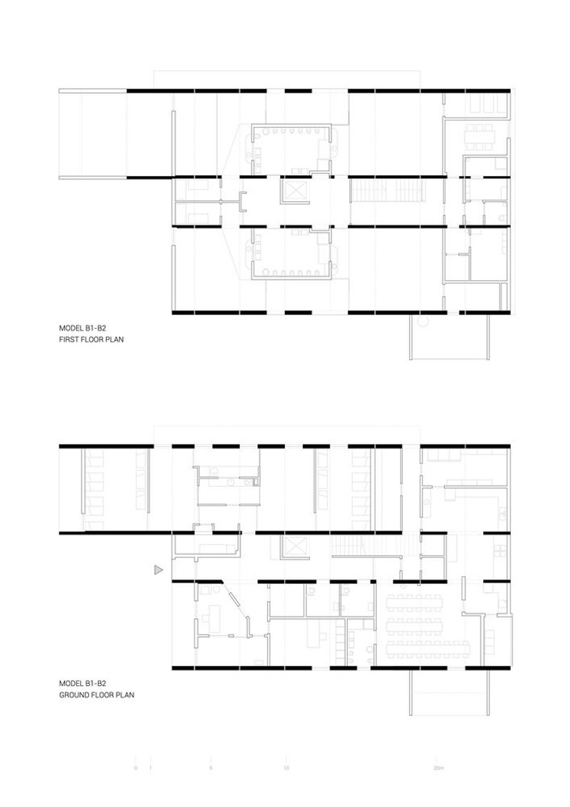
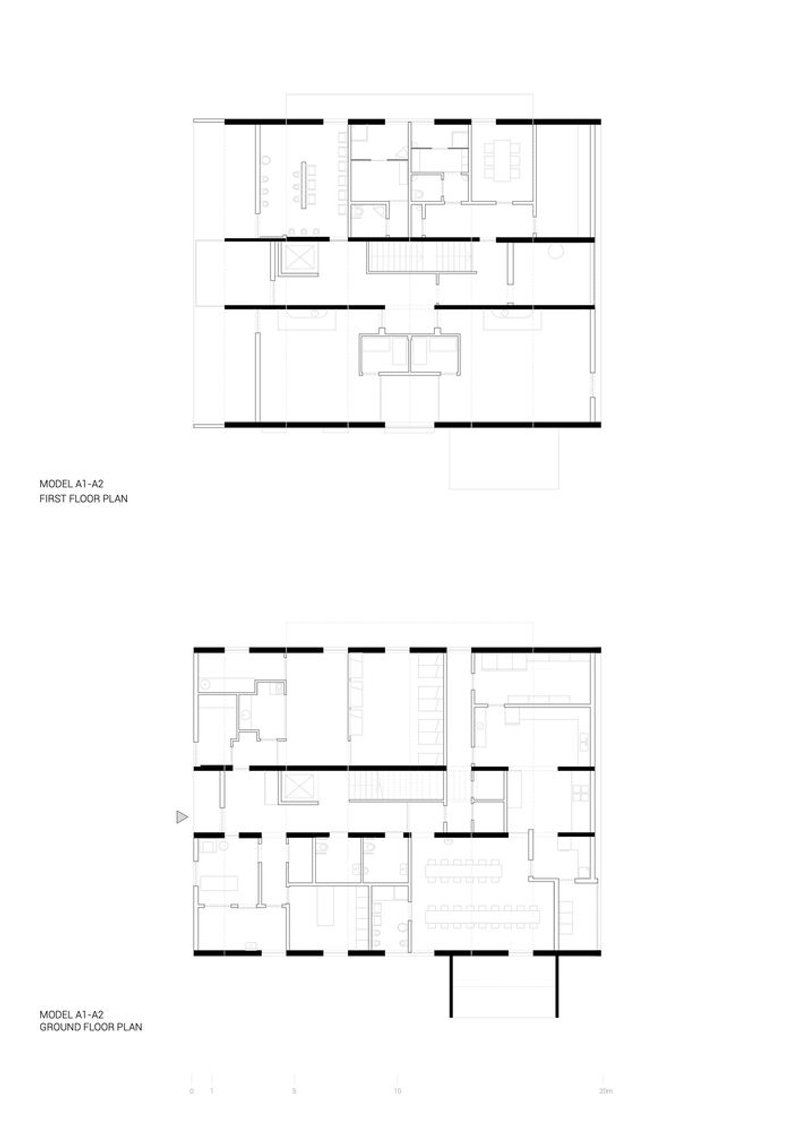
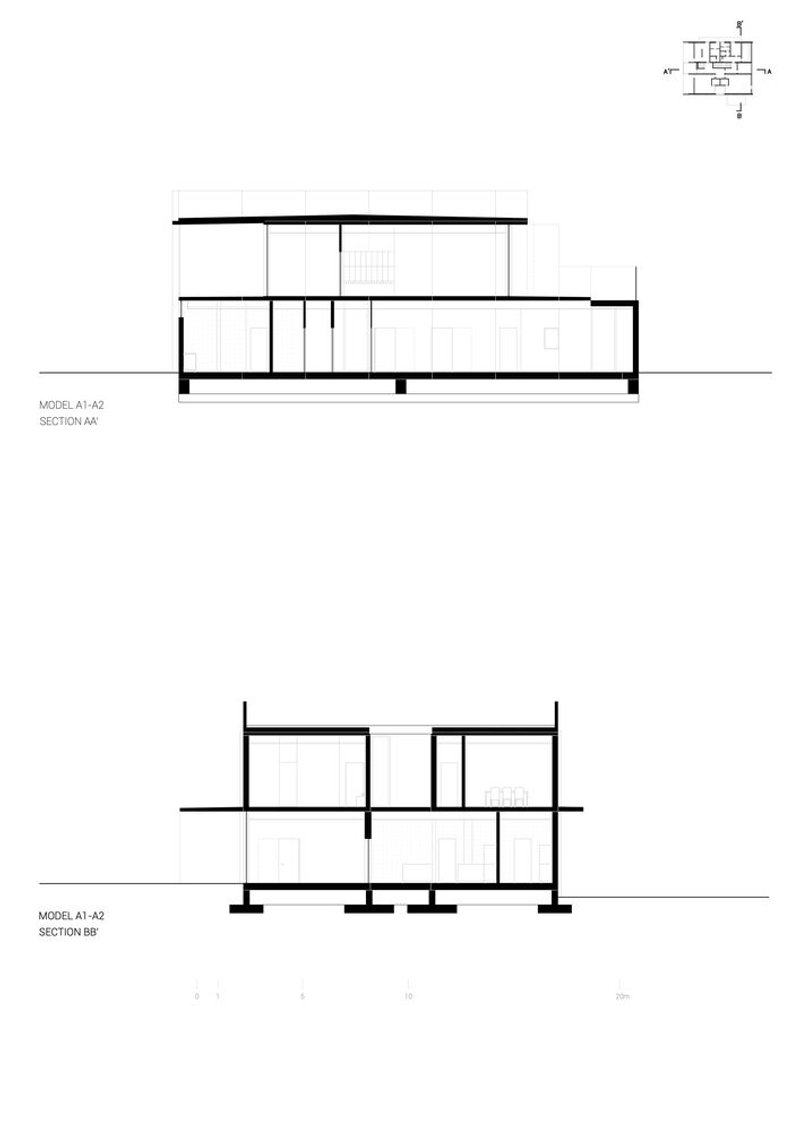
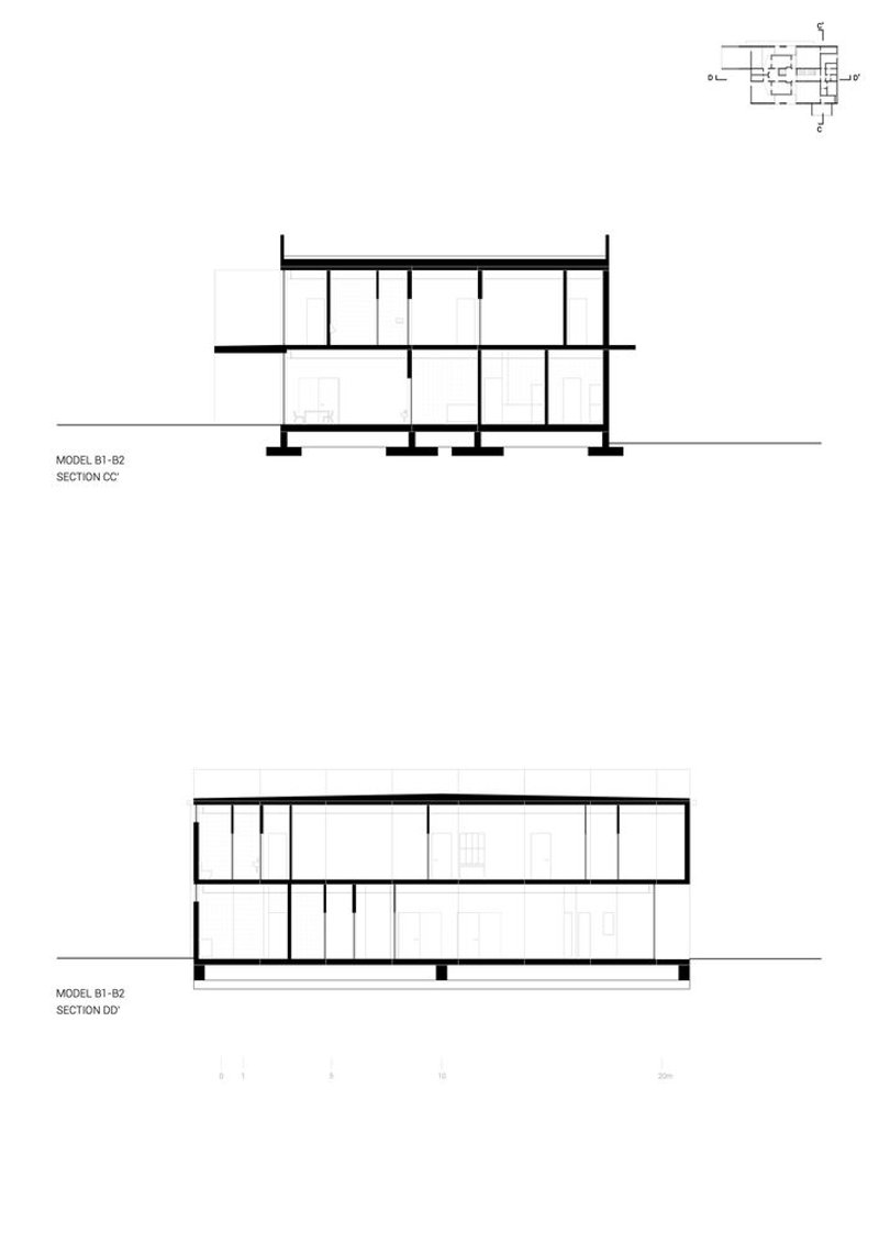
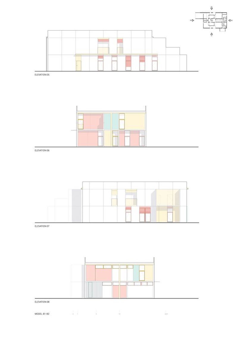
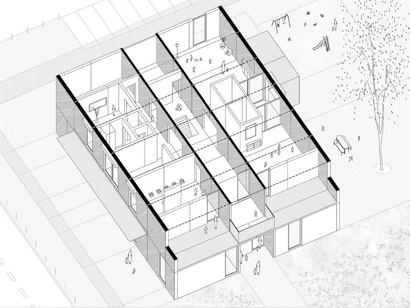
The location map reveals just how dispersed the four sites are across Lisbon, underscoring the logistical ambition of building them simultaneously. Floor plans confirm the mirrored U-module arrangement flanking a central corridor, with classrooms on both levels and service spaces concentrated at ground level. Sections show the modest floor-to-ceiling heights appropriate for young children, while the generous double-height of the circulation spine provides spatial relief.
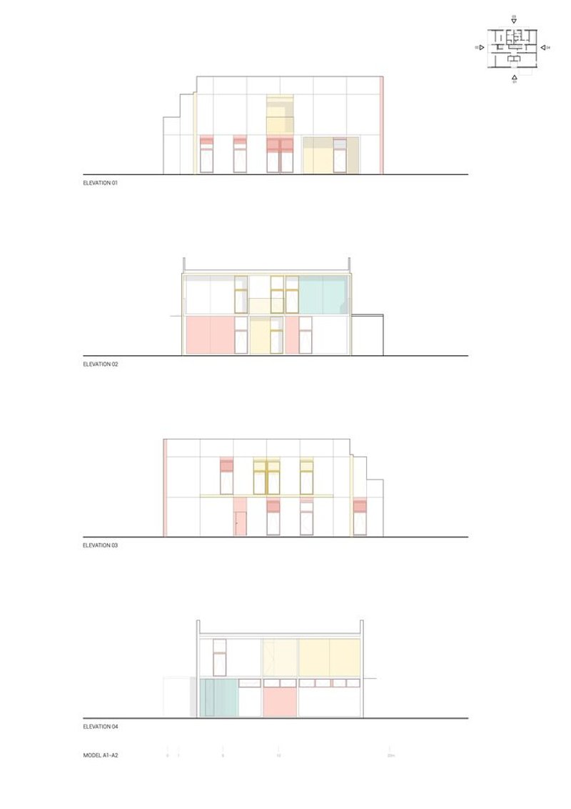
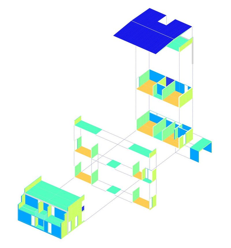
Elevation drawings are perhaps the most revealing documents. They show how the colored panel system wraps each facade differently while maintaining the same proportional logic. The exploded axonometric makes the kit-of-parts strategy explicit: floor levels and roof lift apart to reveal room divisions, stairways, and rooftop terraces, each drawn with the clarity of an assembly manual. There is no ambiguity about how these buildings go together, and that transparency is the project's strongest argument for replication.
Why This Project Matters
Prefabrication in public architecture tends to promise more than it delivers. Cost savings arrive but identity disappears, or the system proves too rigid to accommodate real site conditions. SUMMARY's kindergartens avoid both traps. The concrete U-module is simple enough to mass-produce and assemble quickly, but its tectonic expression and color palette generate a genuine architectural character. Four buildings, thirteen months, 2,660 square meters: the numbers are compelling, but so is the experience of a child sitting under a yellow cantilever, watching balloons drift across a threshold between inside and out.
The project also raises a productive question for other cities. Lisbon's municipality used a competition to produce not a singular monument but a repeatable system with built-in identity. That model, where design quality is embedded in the system rather than applied project by project, is one of the most effective ways to scale public infrastructure without sacrificing architecture. If the next round of kindergartens uses the same modules in new color combinations on new sites, the system will have proved its real worth: architecture that improves with repetition.
Modular Kindergartens in Lisbon by SUMMARY. Lisbon, Portugal. 2,660 m². Completed 2023. Engineering: FTS, Technical Solutions. Prefabrication and Assembly: Farcimar, Soluções em Pré-Fabricados de Betão.
About the Studio
Share Your Own Work on uni.xyz
If projects like this are the kind of work you want to make, uni.xyz is a place to publish your own, find collaborators, and enter design competitions.


Popular Articles
Popular articles from the community
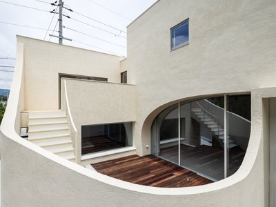
boq architekti Fits a Gabled Family House onto a Tiny Moravian Hillside Plot with No Room for a Garden
A 115 square meter home in South Moravia trades a garden for a rooftop terrace and a fully glazed facade facing the village below.
20 Most Popular Furniture Design Projects of 2025
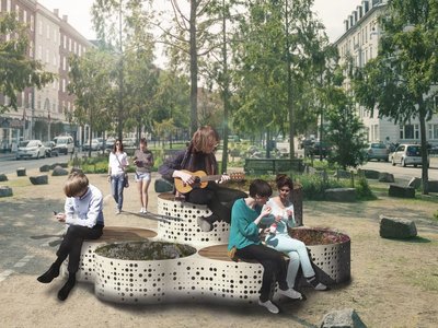
Modular street systems, parametric benches, and insect hotels: the furniture design projects that captivated architects on uni.xyz in 2025.
Daisuke Ibano and Ryosuke Fujii Shape an Osaka Family Home Around Spline Curves and Forest Views
On a triangular plot left empty since the 1970 Expo, a looping timber-and-stucco house in Osaka opens every room to the adjacent woods.
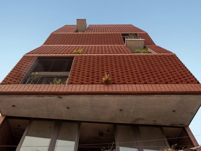
H&P Architects Stack a Vertical River of Brick and Greenery in Hanoi
A perforated terracotta tower in Dong Anh channels water, light, and air through eight staggered levels of domestic life.
Similar Reads
You might also enjoy these articles
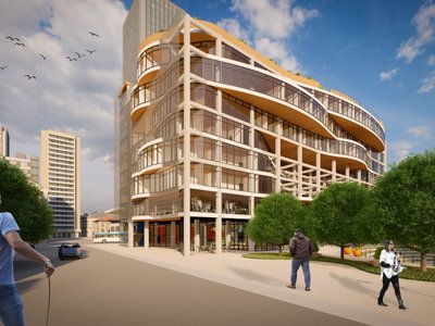
Olio Towers: A Mid-Rise for Performers That Fuses Housing, Rehearsal, and Stage
Located blocks from Houston's Theater District, this modular tower stacks living units around a central performance atrium.
Oasis: Modular Green Housing Carved into Dhaka's Urban Fabric
A shortlisted Plugin Housing entry reclaims unauthorized settlements in Dhaka with stepped concrete volumes, green roofs, and ventilation-driven design.

Black Hole: A Floating Megastructure for the Post-Physical Era
Emiliano Mazzarotto envisions a spherical, self-scaling arena where e-sports, digital hotels, and holographic stadiums replace traditional public space.
Compact & Sustainable Living in Piraeus: A Four-Level Family Home Built Around Light and Air
A narrow townhouse in one of Greece's densest port cities uses a central atrium and passive strategies to house three generations under one roof.

Explore Architecture Competitions
Discover active competitions in this discipline


The International Standard for Design Portfolios


The Global Benchmark for Architecture Dissertation Awards


The Global Benchmark for Graduation Excellence


Challenge to reimagine the Iron Throne
Comments (0)
Please login or sign up to add comments
No comments yet. Be the first to comment!