
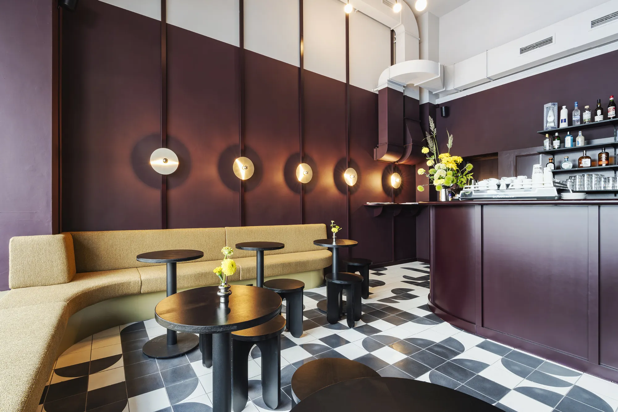
pfeffermint AG Folds the Geometry of a Piadina into a 35 m² Zürich Bar
La Piada brings matte aubergine walls, vintage car colors, and a circle-and-semicircle motif to a tiny piadina spot in Kreis 1.


A piadina is a flatbread folded in half: a circle becomes a semicircle. That simple geometric fact drives every design decision inside La Piada, a 35 m² piadina bar on Uraniastrasse in Zürich's Kreis 1. pfeffermint AG, led by Britta Hagen and Nicole Imhof, took this food-as-form premise and ran it through every surface, from the floor pattern to custom stackable stools to the circular pendant lights that punctuate the interior. The result is a space where branding and architecture are genuinely indistinguishable.
At just 35 square meters, the project sits in a category that many firms treat as decoration work. What makes La Piada worth studying is its refusal to treat smallness as a limitation. The high ceilings give the room vertical air, and a single dominant color, a matte aubergine inspired by vintage car finishes, pulls every element into coherence. There is no clutter of competing ideas. One material palette, one geometric language, one atmosphere.
Aubergine as Architecture
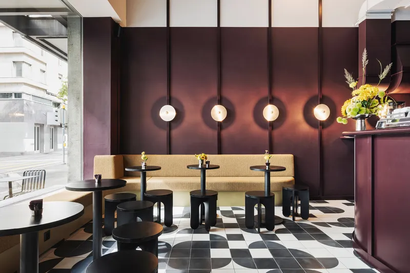
The matte aubergine paneling wraps the walls and cabinetry with the consistency of a theater set, but nothing here reads as stage dressing. The color is dense enough to absorb light without making the room feel oppressive, and it gains warmth from the softly textured surfaces and subtle metallic accents that pfeffermint threads through the joinery. Against this backdrop, the circular pendant lights read almost like full moons, their glow softened against a backdrop that could easily swallow weaker lighting choices.
Choosing a single saturating color for a 35 m² interior is a risk. Too much, and you get a novelty that exhausts after the first visit. Here the material variety within the aubergine register, from paneled wall dividers to smooth cabinetry faces, keeps the palette alive without fragmenting it. The checkerboard floor provides the necessary visual break: its geometric rhythm gives the eye somewhere to land that isn't the dominant hue.
Circles, Semicircles, and the Floor That Tells the Story
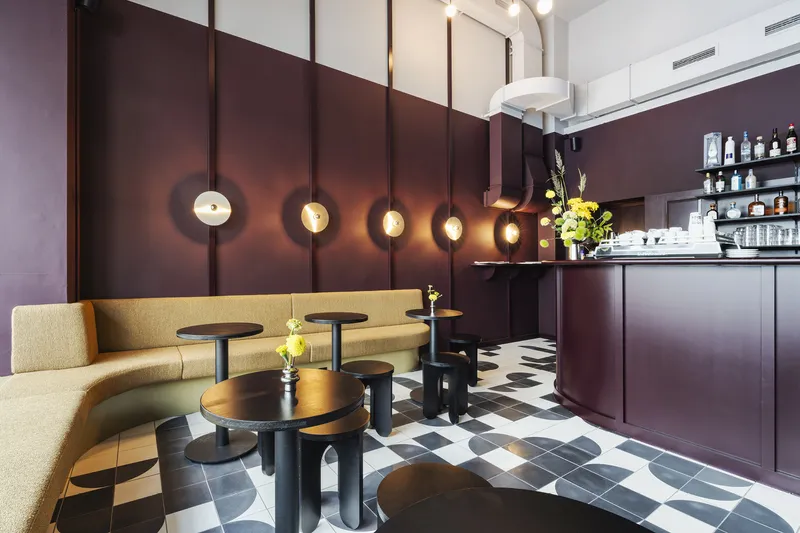
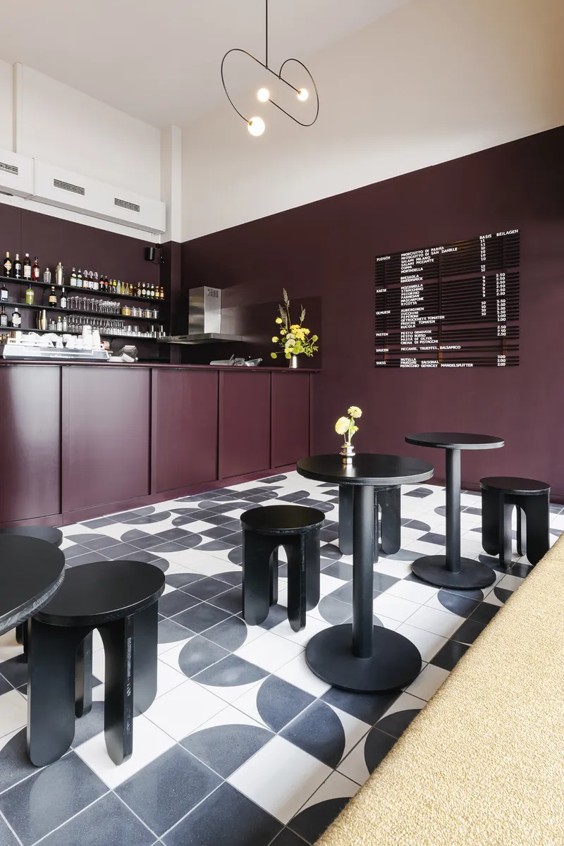
The floor pattern is the project's most legible conceptual move. Circles folded into semicircles tile across the ground plane, translating the piadina's form into a repeating graphic motif. It could be gimmicky in lesser hands, but the pattern's restraint, limited to two tones and a disciplined geometry, keeps it on the right side of wit. The same logic reappears in the custom-designed stackable stools, whose profiles echo the circular and semicircular vocabulary.
The curved banquette seating picks up the motif at a larger scale, its rounded partitions carving the narrow room into intimate zones without closing them off. Circular pendant lights, mounted at even intervals along the paneled wall dividers, reinforce the system overhead. Every element is drawn from the same family of shapes, yet none of it feels forced. The design reads as a coherent language rather than a theme park.
The Street Edge
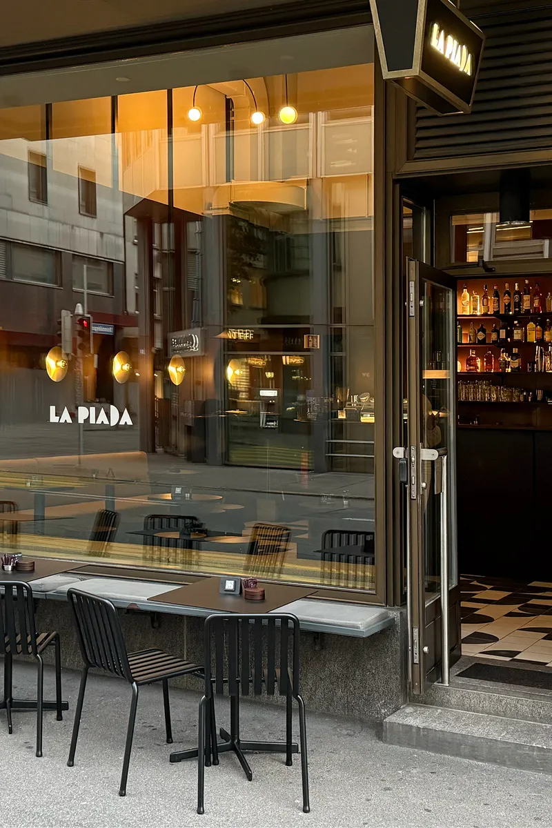
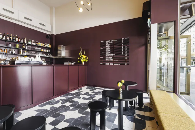
Photographed at dusk, the fully glazed street facade turns the interior into a lantern for the sidewalk. The open door frames the service counter at the back, pulling the eye along the checkered floor and into the aubergine interior. For a bar this small, visibility from the street is existential, not decorative. The facade does its job without signage theatrics: the color and warmth inside are the advertisement.
The relationship between Uraniastrasse's urban grain and this tiny, jewel-toned interior creates a productive contrast. Zürich's Kreis 1 is dense and commercial, full of neutral shopfronts that blend into the stone. La Piada's saturated interior, visible through the glass, functions as a micro-event on the block. It doesn't shout, but it doesn't need to.
Working Within 35 Square Meters
The plan is essentially a single room: counter on one side, banquette seating on the other, with a shelved bar display at the far wall. The high ceilings do genuine spatial work here, stretching the volume vertically so the compact footprint never feels compressed. The counter's clean profile and the wall-mounted menu board keep the service zone uncluttered, and the stacking stools were clearly designed with operational pragmatism in mind. When the room needs to breathe, furniture can be cleared in minutes.
Projects at this scale demand absolute precision. Every centimeter of counter depth, every millimeter of banquette curve, has consequences for circulation and comfort. What pfeffermint achieves is a room that feels considered but not cramped, where two people can pass each other without awkwardness and a group can settle into the banquette without feeling like they are sitting in a corridor.
Plans and Drawings
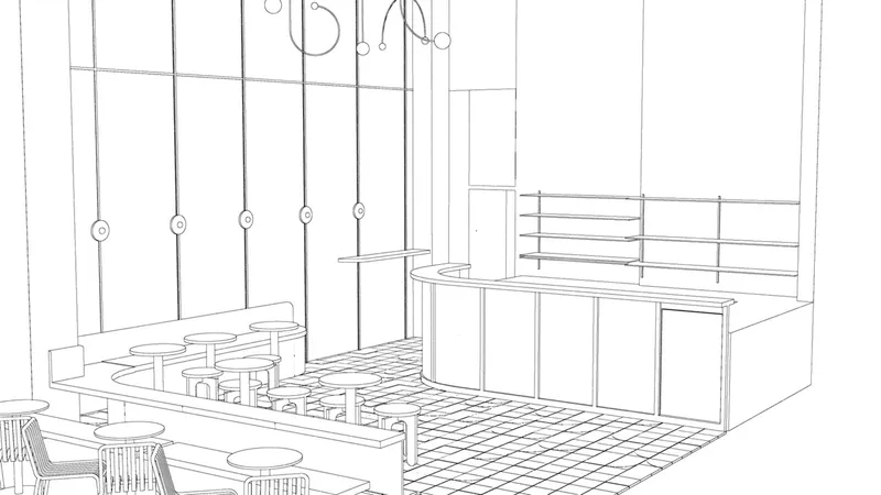
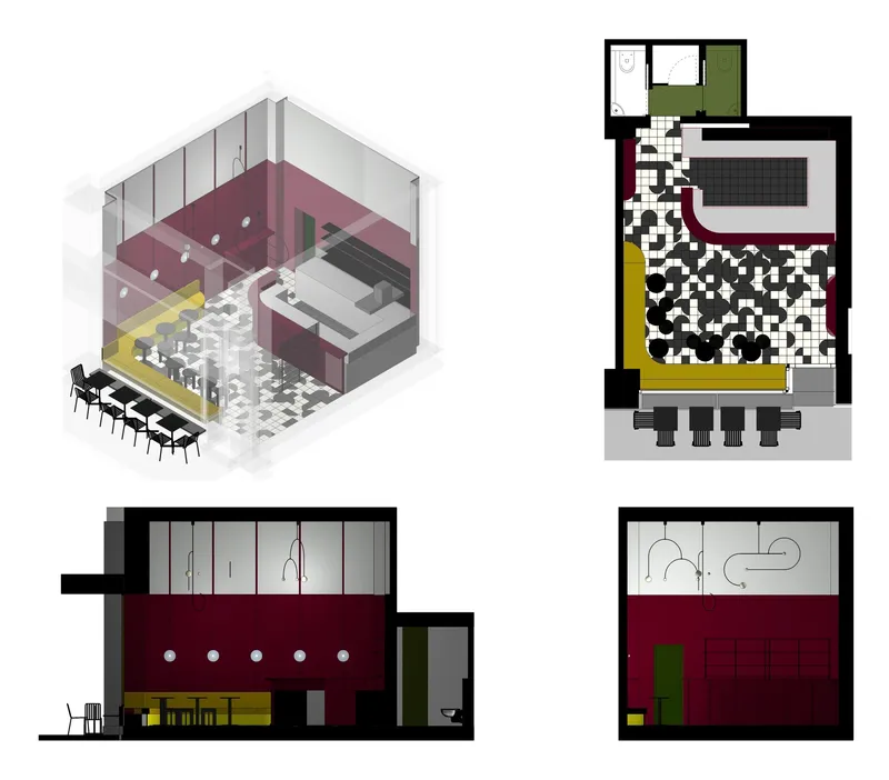
The perspective line drawing reveals the clarity of the layout: a linear procession from entrance to counter, with the banquette zone carved out to the side. The isometric cutaway and paired elevations confirm how tightly the design elements are orchestrated. Wall paneling, lighting placement, and furniture profiles are all locked to the same grid. The floor plan, in particular, shows how the semicircular floor pattern tiles neatly into the room's rectangular footprint, resolving what could have been a geometric conflict into an elegant fit.
Why This Project Matters
Small hospitality interiors are everywhere, and most of them are forgettable. What separates La Piada is its discipline. pfeffermint AG took a single observation about the food being served, that a piadina is a folded circle, and built an entire spatial and graphic identity from it without irony or overstatement. The color, the geometry, the furniture, the floor: everything belongs to a single argument. That kind of coherence is rare at any scale, and rarer still at 35 square meters.
The project also makes a quiet case for interior design as a legitimate site of architectural thinking. There is no new structure here, no facade to compose, no site strategy to defend. The intellectual work is entirely internal: material, color, proportion, and the translation of a concept into spatial experience. When the work is this precise, the distinction between interior design and architecture starts to feel like a bureaucratic formality rather than a meaningful boundary.
La Piada, designed by pfeffermint AG (Britta Hagen, Nicole Imhof). Uraniastrasse 31, Zürich, Switzerland. 35 m². Completed 2025. Photography by Nadine Kägi.
About the Studio
Share Your Own Work on uni.xyz
If projects like this are the kind of work you want to make, uni.xyz is a place to publish your own, find collaborators, and enter design competitions.




Popular Articles
Popular articles from the community


Co-life: Sustainable Architecture for Age-Friendly Community Living
Co-life reimagines sustainable architecture for seniors through courtyards, rammed earth, shared gardens, and spaces designed for belonging.
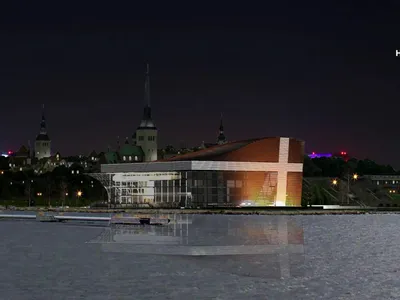
Hill & Cross Opera: Sculptural Opera House Architecture Shaped by Tallinn’s Landscape and Identity
Hill & Cross Opera reimagines opera house architecture in Tallinn through its sculptural hill, civic plaza, glass wave and a luminous cross.

The Ocean Hive: Sustainable Architecture for a Self-Sufficient Civilization at Sea
The Ocean Hive imagines sustainable architecture at sea, where modular habitats, algae, wave power and ocean waste sustain a growing colony.

Play: Fragments of Their World
Familiar architecture becomes modular playground design, creating safe spaces where displaced children can learn, connect, imagine and play.

Similar Reads
You might also enjoy these articles

Bao Huynh Watercolor Atelier: A Serene Art Retreat in Hội An
Bao Huynh Watercolor Atelier in Hội An blends multifunctional art spaces, sustainable design, local materials, and family-friendly living in a serene environment.

Atelier Macri Concept Store Interior Design by CASE-REAL
Atelier Macri store features a "ko" counter, walnut wood details, cork displays, blending retail, gallery, and seamless customer experiences.

Manuel Vargas Izquierdo Stadium and High-Performance Sports Center: Architectural Excellence in Jalpa de Méndez
The Manuel Vargas Izquierdo Stadium blends sustainable design, inclusive sports facilities, and cultural-inspired architecture, revitalizing Jalpa de Méndez’s public spaces.

KAKR Buluh Awar Hall: Revitalizing Community and Ecology Through Bamboo Architecture
Community built bamboo hall revitalizes Buluh Awar village, empowering youth, restoring ecology, celebrating vernacular craftsmanship through sustainable architecture and culture.


Explore Commercial Buildings Competitions
Discover active competitions in this discipline


Challenge to design luxury tourism on rails


VR headsets Storefront design competition

Designing a staircase for a client
Comments (0)
Please login or sign up to add comments
No comments yet. Be the first to comment!