
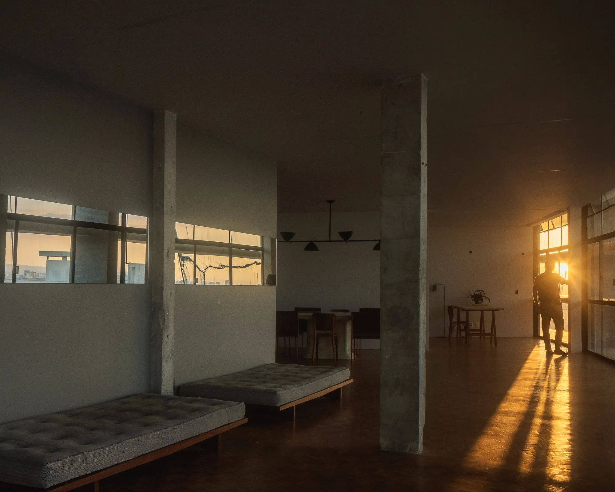
Sabiá Arquitetos and Trema Arquitetura Merge Two Units Inside Niemeyer's Copan into a 340 m² Apartment
A sweeping renovation along Block D's curved facade reclaims 24 meters of São Paulo skyline inside one of Latin America's most iconic buildings.


Oscar Niemeyer's Copan Building on Avenida Ipiranga is one of those structures that tolerates no neutral opinions. It is enormous, sinuous, and deeply municipal, a concrete fact of central São Paulo since 1966. So when Sabiá Arquitetos and Trema Arquitetura took on the task of combining two neighboring three-bedroom apartments in Block D into a single 340 m² residence, they were working inside a building that already has a strong personality. The question was not how to impose a new one, but how to let the original architecture breathe at domestic scale.
The answer, completed in 2022 under lead architects Beatriz Marques, Nilton Suenaga, and Raphael Souza, is a renovation that treats the curved facade as its organizing principle. By demolishing the dividing wall between the two units and opening up bedrooms adjacent to the living rooms, the team produced a single social space that runs the full 24-meter length of the facade's arc. The result is an apartment where the city is never out of frame, and where Copan's signature brise-soleil becomes not just a building element but the defining interior texture.
The Curve as Floor Plan
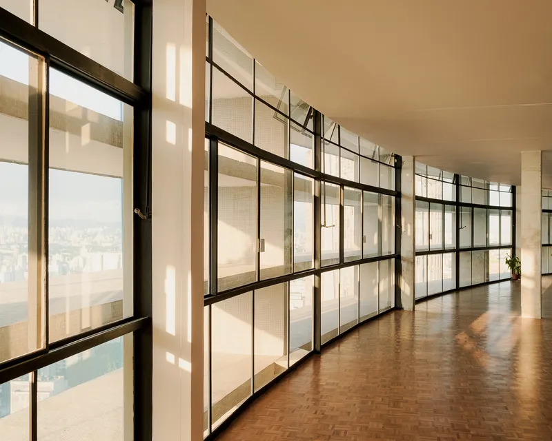
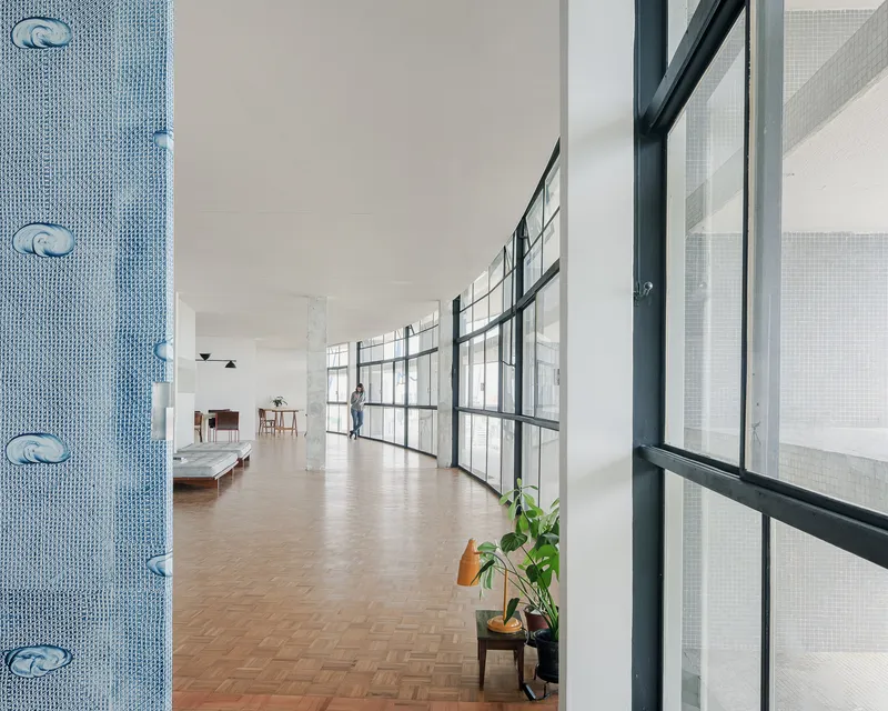
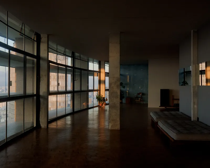
Walk through the apartment and you are always following the curve. The steel-framed partition walls that line the facade side reinforce the arc rather than breaking it, creating a continuous corridor of filtered daylight that connects one end of the unit to the other. It is a spatial experience closer to a gallery promenade than a typical apartment hallway, and it gives the 340 square meters a sense of distance that a rectilinear plan of the same area would never achieve.
Copan's exposed concrete columns punctuate this curve at regular intervals, standing like landmarks within the open plan. The architects wisely left them visible rather than boxing them in, so the building's structural logic remains legible even in a space that has been substantially reconfigured. You always know you are inside Niemeyer's grid, even as the domestic program unfolds around it.
Living Along 24 Meters of Facade
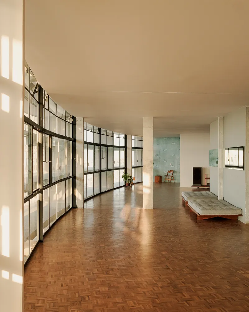
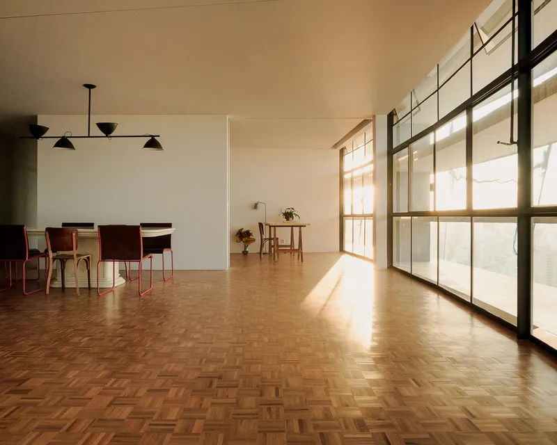
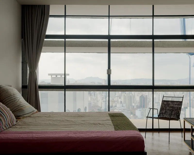
The demolition of the party wall and adjacent bedroom partitions is the single biggest move in this project, and it pays off in the social spaces. The living and dining areas now flow without interruption along the full sweep of the curved glazing, with afternoon sunlight pouring through the steel-framed windows and pooling across herringbone parquet. The low bench along the facade wall suggests the architects understood that people would want to sit close to the glass and simply look out at the city.
High-floor views toward the Serra da Cantareira mountain range give the interior a horizon line that most urban apartments can only dream of. A woven lounge chair, dark curtains, and minimal furnishing keep the foreground quiet. The city does the heavy lifting as decor.
Materiality: Terrazzo, Timber, and Honest Color
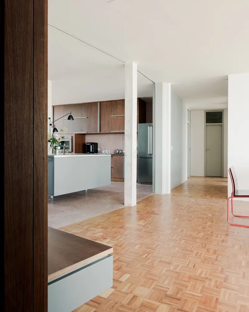
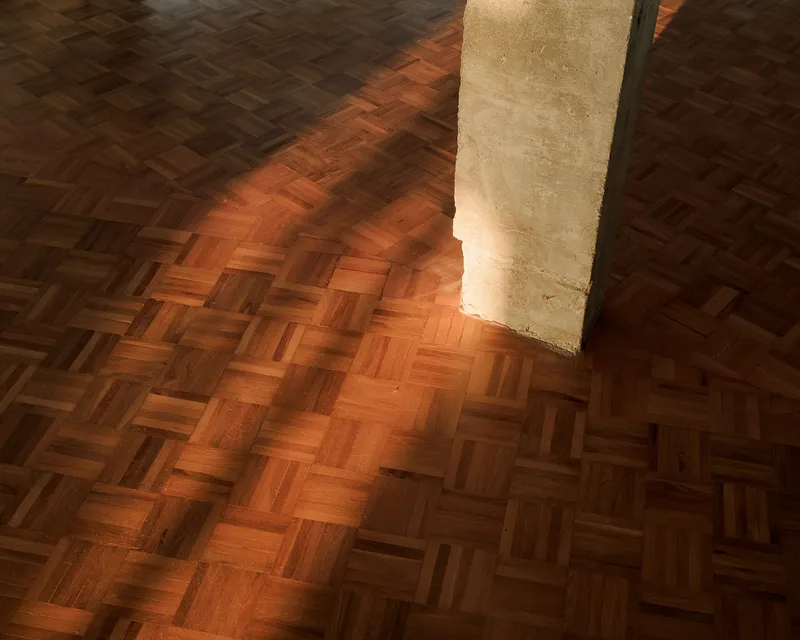
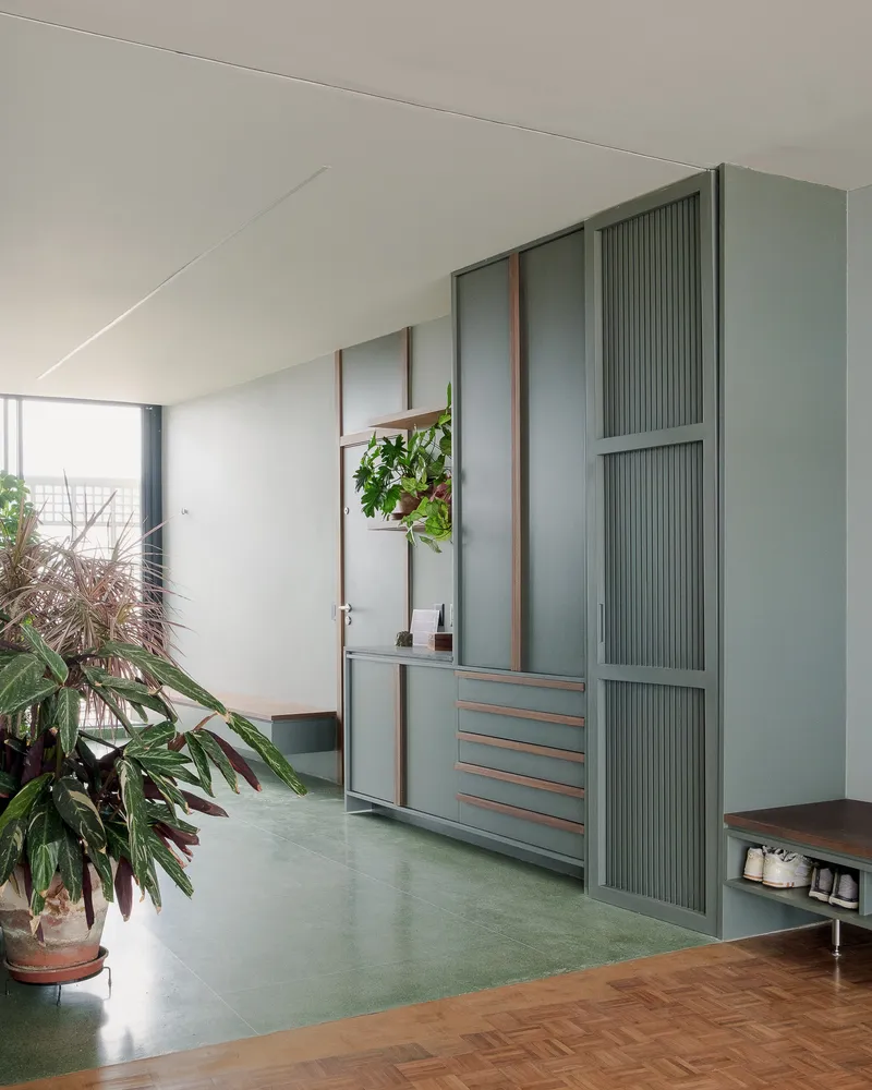
The floor finish plan is almost as deliberate as the spatial plan. Herringbone parquet claims the living and sleeping zones, while green terrazzo by Casa Franceza marks the service and wet areas. The transition between the two is clean and unmediated, a material threshold that does the work a wall would have done in the original layout. You know when you have moved from social space to kitchen without a door ever closing.
Built-in cabinetry in fluted green panels and timber frames lines the corridors, providing generous storage without reducing the sense of openness. The green is specific and confident, not quite sage, not quite olive, the kind of color decision that only works when applied with conviction. It recurs in the terrazzo, the lacquered kitchen cabinetry, and the bathroom surfaces, tying the entire apartment together without making it feel monotone.
The Kitchen as Central Fact
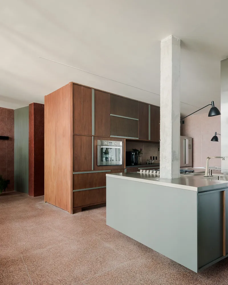
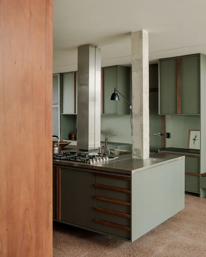
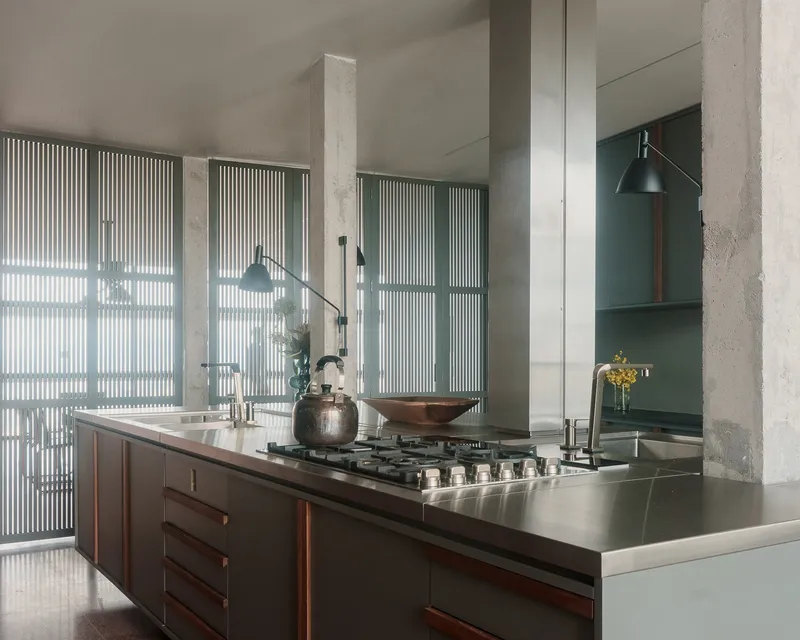
The kitchen occupies the junction between the two former units, anchored by an exposed concrete column that lands squarely on the island. Rather than fighting the column, the design treats it as a found object, letting it divide the cooktop from the prep surface while supporting pendant lights on either side. It is a pragmatic and visually effective solution that turns a structural constraint into the room's focal point.
Timber veneer cabinetry on one wall contrasts with green lacquered panels on the other, and stainless steel countertops provide a commercial edge that keeps the space from feeling too precious. The kitchen reads as both a working room and a social anchor, open on all sides to the living areas and the facade beyond.
Screens, Filters, and Controlled Light
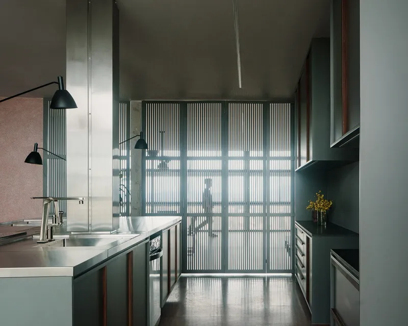
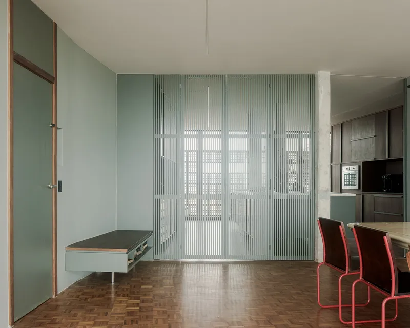
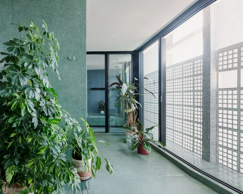
Copan's brise-soleil already modulates the western sun before it hits the glass, but inside the apartment a secondary layer of filtration continues the work. Fluted glass partitions cast striped shadows across polished floors, translucent glass block screens diffuse corridor light, and ribbed metal panels create veils between zones. Each filter is different in material but consistent in intent: to slow the light down, to give it texture, to make the 24-meter interior feel varied rather than uniform.
The architects also placed a mirror on the circulation core wall opposite the facade, creating new vanishing points that extend the perceived depth of the apartment and frame the urban landscape in unexpected reflections. It is a small move with outsized spatial impact.
Bathrooms and Private Rooms: Color Declares Territory
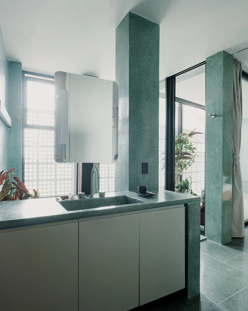
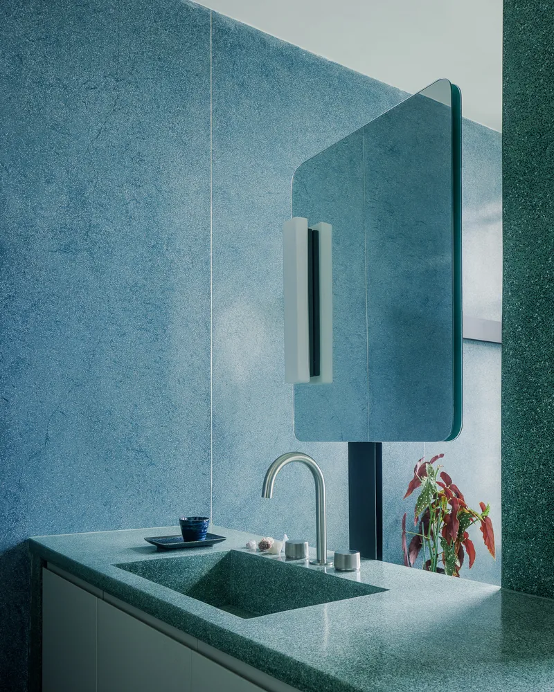
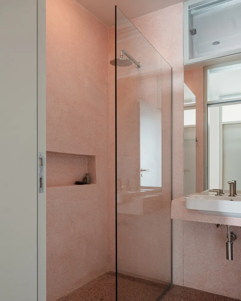
If the social spaces belong to the city view, the bathrooms belong to color. Green terrazzo, blue mosaic tile with fish motifs, and pink terrazzo each claim a separate wet room, giving every bathroom a distinct character without resorting to wildly different design languages. The material palette is cohesive enough that moving from one bathroom to the next feels like changing chapters in the same book, not switching to a different novel.
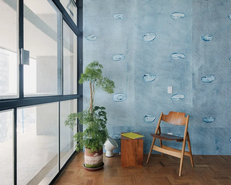
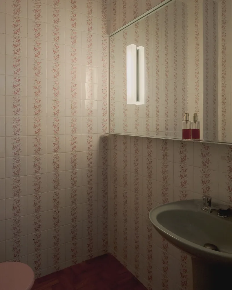
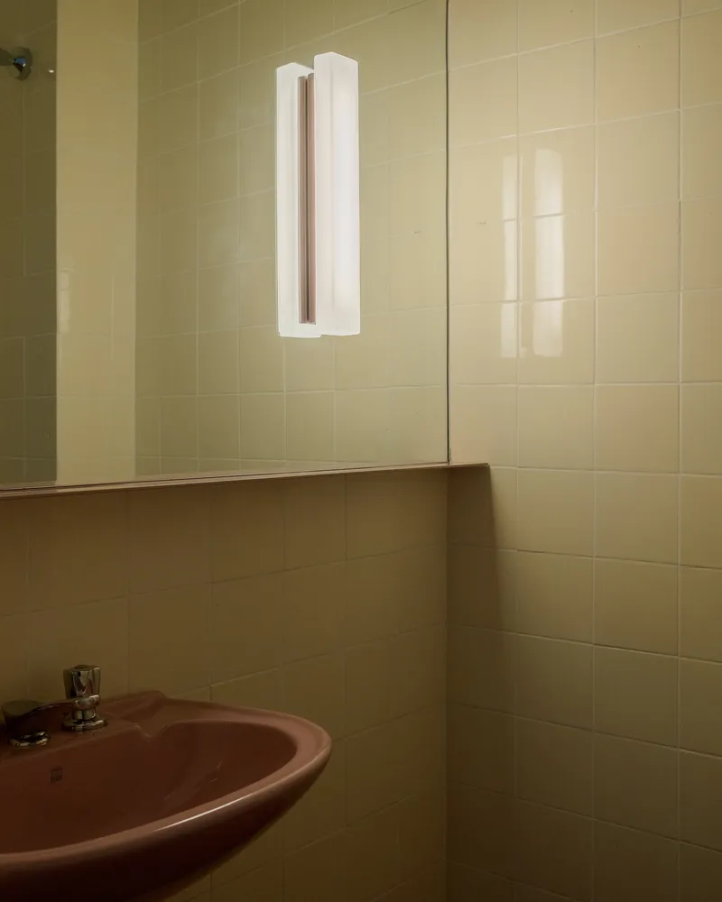
The blue mosaic room, with its fish tiles and steel-framed window overlooking the cityscape, feels like a recovered fragment of mid-century São Paulo, the kind of detail that Niemeyer's contemporaries might have included in the original fit-out. The floral-patterned powder room and the yellow-tiled corner with its pink basin push further into decorative territory, but always with restraint in form if not in hue.
Evening, and the City Takes Over
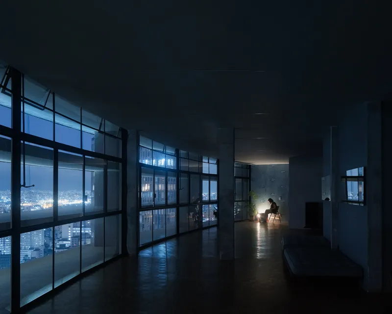
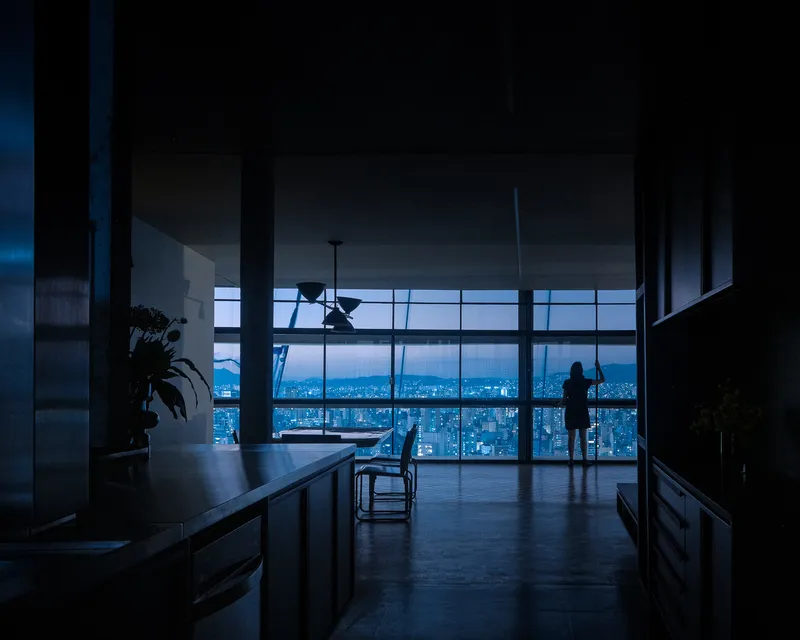
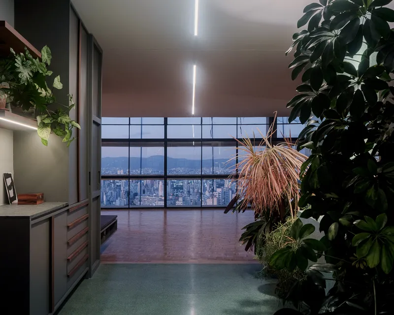
The apartment changes character entirely after dark. During the day the brise-soleil and interior screens domesticate the sun; at night the glass becomes a portal to the illuminated grid of central São Paulo. The golden-hour and twilight photographs reveal an interior where warm artificial light, hanging plants, and the distant glow of the city merge into a single atmospheric register. A figure seated beside a floor lamp near the glass facade at night is not merely occupying a room but inhabiting a vantage point.
It is worth noting how few objects clutter the space. The architects and their clients appear to have understood that the apartment's luxury is spatial, not material. The most expensive thing here is the view, and the most intelligent design decision was to remove everything that stood between the occupant and 24 meters of it.
Plans and Drawings
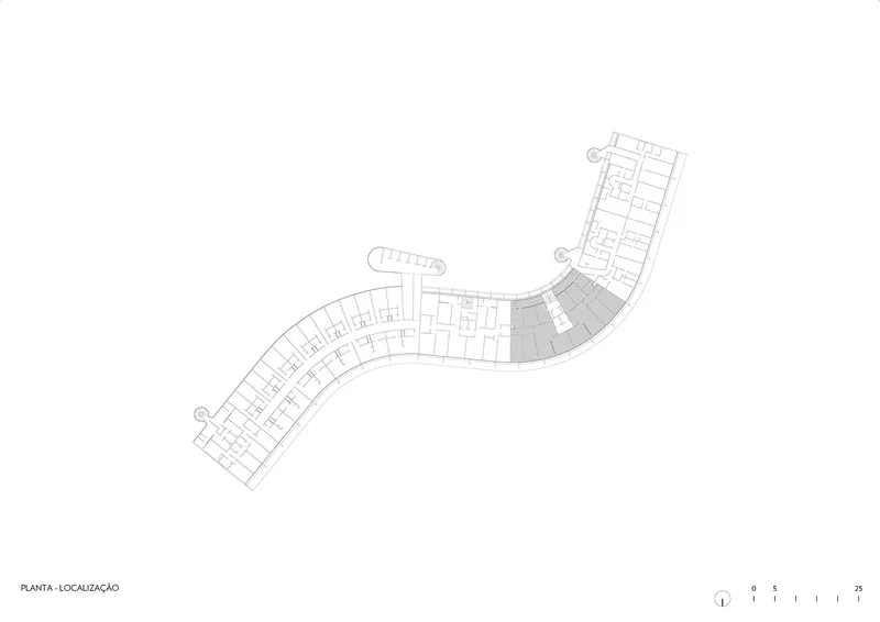
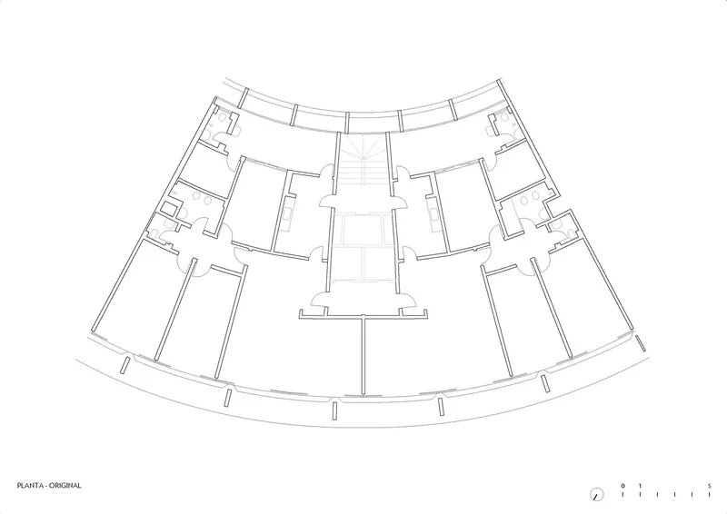
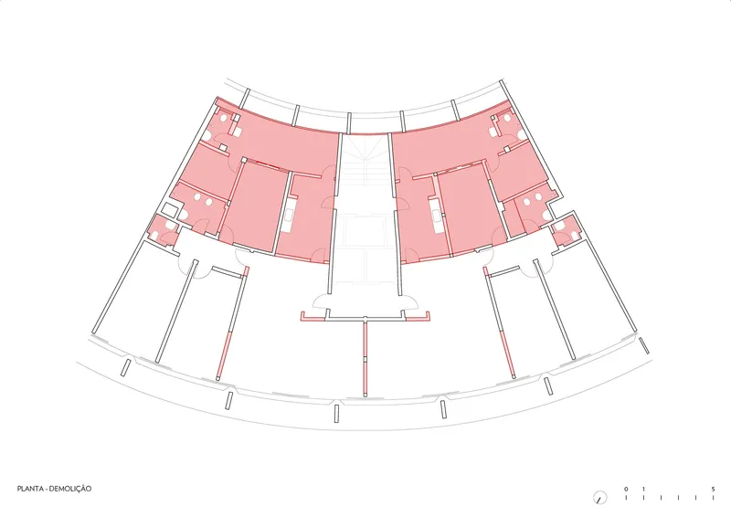
The site plan reveals the full sweep of Copan's curved bar and the apartment's position within Block D. The original floor plan shows the two separate three-bedroom units with their compartmentalized layouts, while the demolition plan highlights in pink just how much interior partition was removed. The extent of the demolition is striking: nearly every non-structural wall adjacent to the facade is gone, leaving only the perimeter columns and the central circulation core.
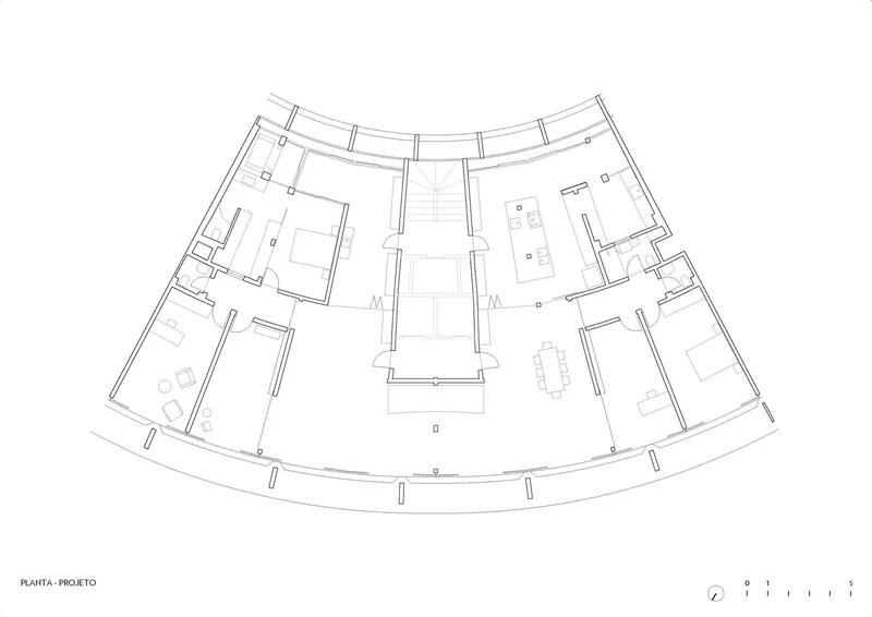
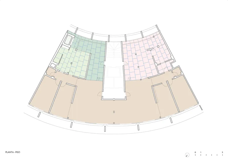
The reconfigured plan makes the strategy legible at a glance. Social spaces claim the entire facade, bedrooms occupy the quieter interior positions, and the kitchen sits at the hinge point between the two former units. The floor finishes plan, with its color-coded material zones, confirms how precisely the architects used surface treatment to define program. Parquet, terrazzo, and tile each correspond to distinct domestic territories, a discipline that keeps the open plan from feeling undifferentiated.
Why This Project Matters
Renovating inside a landmark building is a negotiation with history. Do too little and the result feels timid; do too much and you erase the qualities that made the building significant in the first place. Sabiá Arquitetos and Trema Arquitetura found a productive middle ground by treating Copan's structure and facade as non-negotiable givens and then removing almost everything else. The exposed columns, the curved glazing, and the brise-soleil become the primary interior elements, while the new insertions (millwork, glass partitions, terrazzo surfaces) serve as a complementary layer that adds domestic warmth without competing with Niemeyer's concrete frame.
The project also makes a case for unit combination as a legitimate form of adaptive reuse. Rather than subdividing or converting to commercial use, the merger of two standard apartments into a single generous one unlocks spatial qualities that the original floor plan could never have offered. The 24-meter curved social space is not just larger; it is categorically different in its relationship to the building and the city. In a structure as specific as Copan, that kind of revelation is worth the effort.
Copan D Apartment, São Paulo, Brazil. Designed by Sabiá Arquitetos (Beatriz Marques, Nilton Suenaga) and Trema Arquitetura (Raphael Souza). 340 m². Completed 2022. Photography by Pedro Kok.
About the Studio
Share Your Own Work on uni.xyz
If projects like this are the kind of work you want to make, uni.xyz is a place to publish your own, find collaborators, and enter design competitions.




Popular Articles
Popular articles from the community


Co-life: Sustainable Architecture for Age-Friendly Community Living
Co-life reimagines sustainable architecture for seniors through courtyards, rammed earth, shared gardens, and spaces designed for belonging.

The Ocean Hive: Sustainable Architecture for a Self-Sufficient Civilization at Sea
The Ocean Hive imagines sustainable architecture at sea, where modular habitats, algae, wave power and ocean waste sustain a growing colony.
Hill & Cross Opera: Sculptural Opera House Architecture Shaped by Tallinn’s Landscape and Identity
Hill & Cross Opera reimagines opera house architecture in Tallinn through its sculptural hill, civic plaza, glass wave and a luminous cross.

Co-Life: Senior Housing Design That Reconnects Older Adults With the City
Co-Life reimagines senior housing design through healing gardens, shared streets, workshops, and a sustainable community across generations.


Similar Reads
You might also enjoy these articles

Bao Huynh Watercolor Atelier: A Serene Art Retreat in Hội An
Bao Huynh Watercolor Atelier in Hội An blends multifunctional art spaces, sustainable design, local materials, and family-friendly living in a serene environment.

Atelier Macri Concept Store Interior Design by CASE-REAL
Atelier Macri store features a "ko" counter, walnut wood details, cork displays, blending retail, gallery, and seamless customer experiences.

Manuel Vargas Izquierdo Stadium and High-Performance Sports Center: Architectural Excellence in Jalpa de Méndez
The Manuel Vargas Izquierdo Stadium blends sustainable design, inclusive sports facilities, and cultural-inspired architecture, revitalizing Jalpa de Méndez’s public spaces.

KAKR Buluh Awar Hall: Revitalizing Community and Ecology Through Bamboo Architecture
Community built bamboo hall revitalizes Buluh Awar village, empowering youth, restoring ecology, celebrating vernacular craftsmanship through sustainable architecture and culture.


Explore Apartment Competitions
Discover active competitions in this discipline



Challenge to reimagine the Iron Throne


Photograph architecture without architects


Illustrate the lost glory of Angkor Wat - Render Challenge


Design challenge to reuse E-waste
Comments (0)
Please login or sign up to add comments
No comments yet. Be the first to comment!