
space+craft Reshapes a 37 m² Bangkok Dental Clinic into a Soft, Curvilinear Interior
Resmile Dental Wellness rethinks clinical architecture through continuous curved surfaces and deliberate spatial compression in Bangkok.
Dental clinics are among the most functionally rigid interiors an architect can take on. Every square meter must account for hygiene protocols, equipment clearances, patient circulation, and staff workflow. At 37 square meters, Resmile Dental Wellness in Bangkok leaves almost no room for error, let alone for spatial generosity. Yet space+craft, under lead architects Noppachai Akayapisud and Sathika Jienjaroonsri, have produced an interior that treats constraint as a creative engine rather than an obstacle.
What makes this project worth studying is not the fact that it looks good. Plenty of clinics look good. The real proposition is that curvature here is not decorative but organizational. Every wall, partition, and ceiling plane bends in service of a spatial idea: eliminating the visual sharpness and institutional rigidity that patients associate with clinical dread. In a footprint barely larger than a studio apartment, the designers have managed to nest a reception area, treatment rooms, a product display zone, sanitary facilities, and storage without any of them feeling like afterthoughts.
Curvature as Spatial Strategy
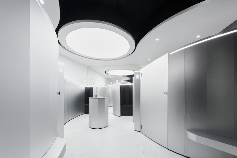
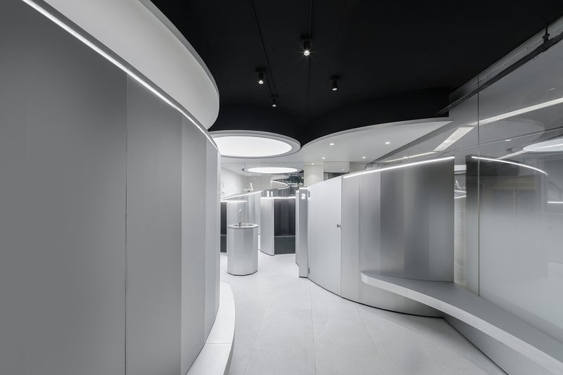
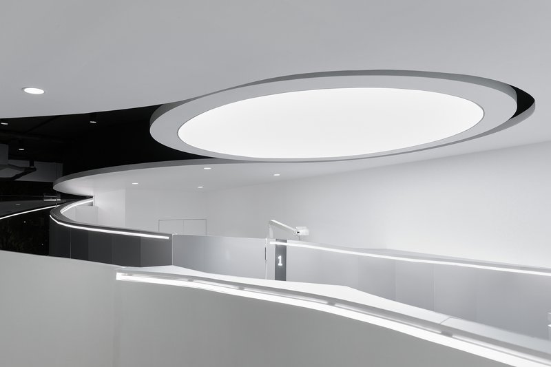
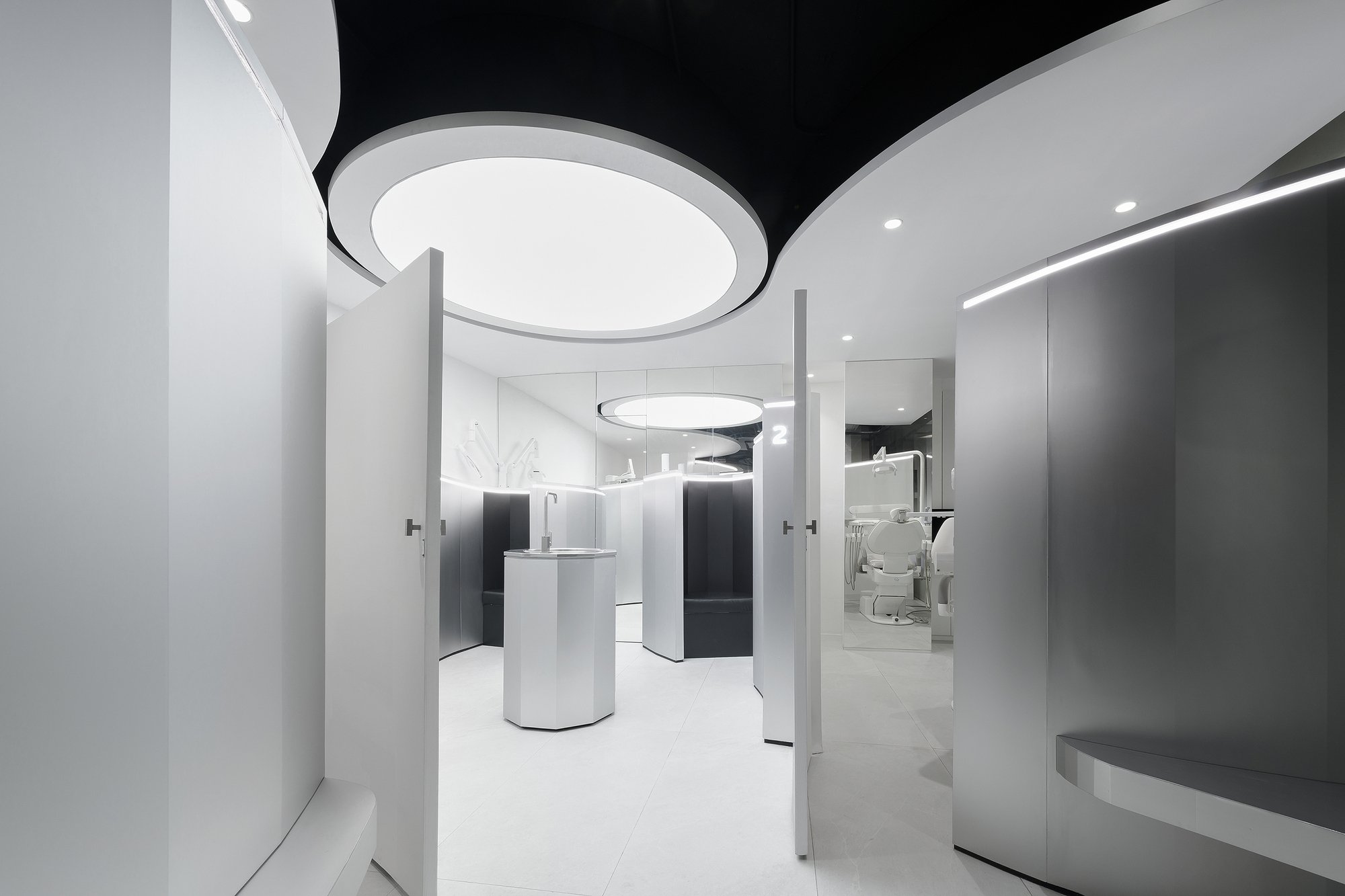
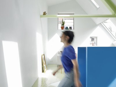
The first thing you register upon entering is the absence of right angles. White curved walls wrap the perimeter and interior partitions alike, creating a continuous visual flow that makes the 37 square meters feel far less cramped than they should. A cylindrical reception desk sits at the center of the entry zone, its form echoing the language of the walls around it. Overhead, circular ceiling coffers with recessed lighting reinforce the geometry without hammering it.
This is not a building that needs curvature for its program. Straight walls would have been cheaper and simpler to detail. The decision to go curvilinear is a deliberate interrogation of what a clinical space owes its occupants beyond function. By softening every edge, the architects lower the psychological temperature of the room before a patient ever sits in a chair.
The Ceiling as a Second Ground Plane
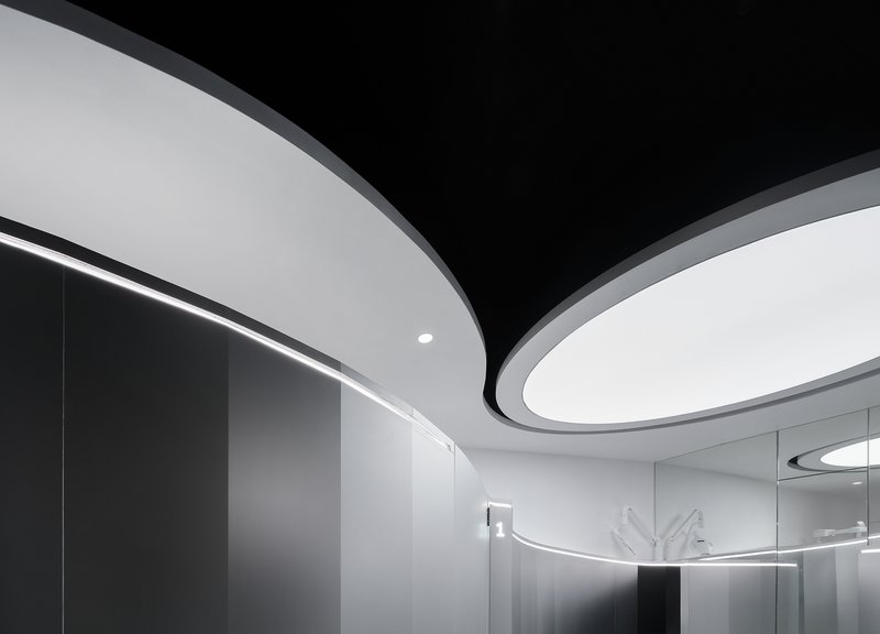
In a space this compact, the ceiling does enormous work. The designers split it into two registers: a smooth white layer of curved coffers that drops down to define zones, and a black upper plane that absorbs the exposed mechanical systems above. Elliptical and circular light fixtures are embedded at the junctions, creating moments of visual relief that pull your eye upward and away from the density of the plan.
The black ceiling band running through the corridor and above the wet areas is a smart move. It compresses the vertical dimension just enough to make the white zones feel more generous by contrast. In dental treatment rooms where patients spend long minutes staring upward, what the ceiling looks like is not a secondary concern. It is the primary view.
Treatment Rooms and the Problem of Intimacy
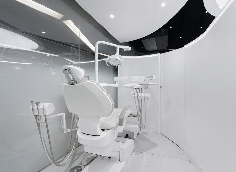
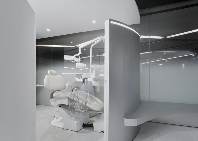
The treatment stations are where the design faces its hardest test. A dental chair, an articulating overhead lamp, an equipment arm, and a patient all need to coexist within a very tight envelope. The architects respond with curved partitions and glazed walls that separate without isolating. One treatment room backs onto a mirrored surface, doubling the perceived depth and lending the station a sense of spaciousness that would otherwise be impossible.
There is an interesting tension here between openness and enclosure. The glazed treatment room allows visual connection to the rest of the clinic, which benefits staff supervision and wayfinding. But for the patient in the chair, the curved ceiling coffer overhead creates a sense of containment, almost a cocoon. The architects are managing two experiences simultaneously: the practitioner's need for operational clarity and the patient's need for psychological comfort.
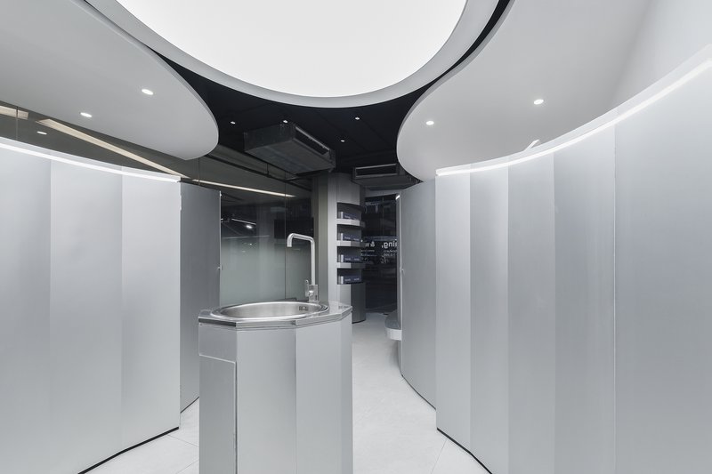
Detailing the Wet Zones
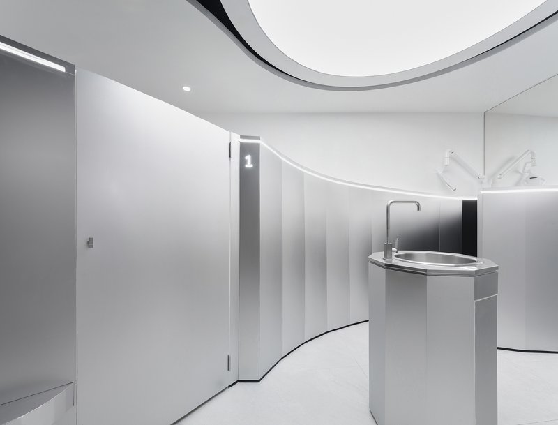
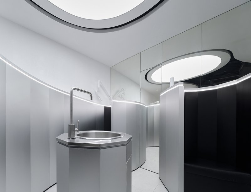
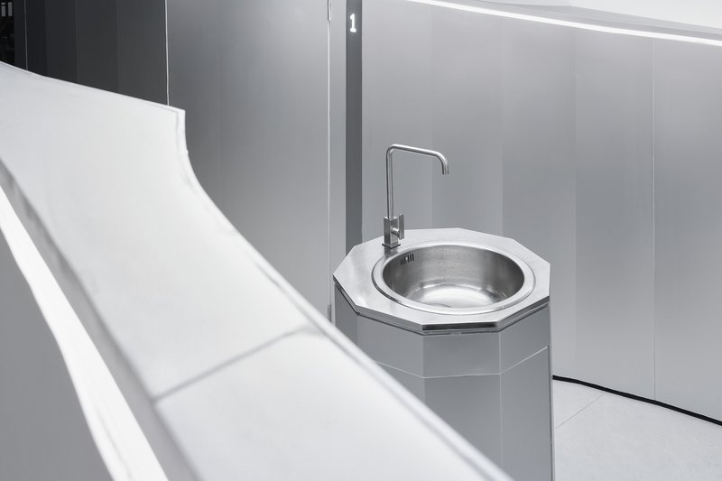
The sanitary areas receive the same curvilinear treatment as the rest of the clinic, with cylindrical handwashing stations and octagonal basins that resist the utilitarian aesthetic common to healthcare washrooms. The octagonal sink basin, with its brushed metal bowl set against grey wall panels, is a small detail that punches above its weight. It signals that the design intent does not relax the moment you step away from the public-facing spaces.
Hygiene in a dental clinic is non-negotiable, and the material choices here reflect that: smooth, wipe-clean surfaces dominate, with minimal joints and no ledges where dust or moisture could accumulate. The curved cabinetry beneath the handwashing unit hides storage in a form that reads as furniture rather than clinical infrastructure.
Display and Brand Identity
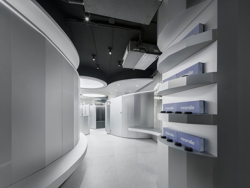

A grey wall panel near the entry houses product display shelves with branded boxes, a reminder that contemporary dental clinics are often retail environments as much as they are treatment spaces. The shelving is recessed and minimal, letting the packaging do the talking. Nearby, cylindrical display podiums on the floor echo the reception desk form and function as low pedestals for featured products.
The integration of retail into such a small footprint is handled without it feeling forced. The display elements share the same formal vocabulary as the rest of the clinic, so they register as part of the architecture rather than as bolt-on merchandising. For a wellness brand, this continuity between environment and product is essential to the customer's perception of coherence and care.
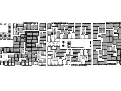
Plans and Drawings
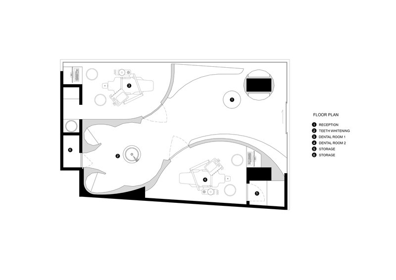
The floor plan reveals how the curved walls are not arbitrary but serve as zone dividers that route circulation through the clinic in a looping path. Reception, treatment rooms, wet areas, and storage are distributed around a compact core, with no dead-end corridors. At 37 square meters, every wall curve either separates a program or directs movement. The plan confirms what the photographs suggest: nothing here is ornamental.
Why This Project Matters
Resmile Dental Wellness matters because it takes the most constrained version of a healthcare brief and treats it as an architectural problem rather than a fit-out exercise. At 37 square meters, most firms would default to efficient rectilinear planning and call it a day. The decision by space+craft to commit fully to curvilinear geometry, from the plan to the ceiling to the sink basins, demonstrates that spatial quality is not a function of size. It is a function of intention.
The project also contributes to a growing body of work that questions the inherited aesthetic of clinical spaces. Anxiety about dental visits is real and widespread, and the built environment is one of its triggers. By eliminating sharp corners, institutional lighting, and exposed function, the architects offer an alternative model: a clinic that calms before any treatment begins. That is not a soft ambition. It is a design argument with real consequences for how healthcare environments are commissioned and experienced.
Resmile Dental Wellness, designed by space+craft, led by Noppachai Akayapisud and Sathika Jienjaroonsri. Bangkok, Thailand. 37 m². Completed 2025. Photography by Panoramic Studio.
About the Studio
Share Your Own Work on uni.xyz
If projects like this are the kind of work you want to make, uni.xyz is a place to publish your own, find collaborators, and enter design competitions.


Popular Articles
Popular articles from the community
Twobytwo Architecture Studio Towers a Blackened Ski Cabin Above the Trees in Golden, BC
A compact three-storey lookout in the Kootenay mountains trades square footage for 14-foot ceilings and Columbia River Valley views.
Three Studios Build 200 Affordable Units for Tulum's Displaced Hospitality Workers
Casa Selva embeds dark concrete housing blocks into Yucatán rainforest, offering dignified shelter to those priced out by the tourism they serve.
BAST Slots a Four-Story Glass House into a Narrow Gap Between Toulouse Townhouses
In the dense Bonnefoy district, a stepped infill building merges home and office while preserving a majestic hackberry tree.

Cyber Oyster: A Visionary Adaptive Reuse Architecture Project Transforming Abandoned Oil Rigs Through Oyster Bionics
An adaptive reuse architecture concept transforming abandoned offshore oil platforms into self-healing marine ecosystems inspired by oyster bionics.


Similar Reads
You might also enjoy these articles
127af Flips a Tiny Bagnolet Rowhouse Upside Down with a Handcrafted Roof Extension
A 55-square-meter terraced house on the edge of Paris gains a luminous upper living floor through lightweight timber and steel.
1.61 Design Workshop Wraps a 600-Square-Meter Café in Vietnam in Sculptural Burgundy Drama
Reden Café & Bistro pairs a helical staircase, mosaic floors, and deep red interiors to rethink Vietnamese hospitality space.
The Unbound Brain: A School Shaped by Cognitive Architecture
Cylindrical learning pods radiate like neurons from a central cortex, turning the floor plan into a spatial model of human thought.
Revival Vernacular Architecture: Rammed Earth Settlements for the Sahara
A modular desert community in Mauritania that fuses passive cooling techniques with earthen construction and local craftsmanship.


Explore Public Building Competitions
Discover active competitions in this discipline


The Global Benchmark for Architecture Dissertation Awards


Challenge to design locus for the upliftment of human rights


Challenge to design a learning and healing center


Challenge to re-imagine a department store in present times
Comments (0)
Please login or sign up to add comments
No comments yet. Be the first to comment!