

2BOOKS Design Turns a 40-Year-Old Taipei Apartment into a Symmetrical Live-Work Sanctuary
A 76-square-meter renovation in central Taipei uses walnut, stainless steel, and a mirrored portal to stretch light and calm through a compact plan.


Most apartment renovations in Taipei's older residential blocks chase the same goal: tear down walls, add recessed lighting, and hope for the best. 2BOOKS Design took a more disciplined path with the Chang Residence, a 76-square-meter flat in a building over four decades old. Lead designer Jeff Weng started by restoring a balcony that a previous owner had enclosed, an act of subtraction rather than addition, and then organized the entire plan around a strict bilateral symmetry that makes the apartment read as something closer to a small gallery than a cramped condo.
What makes the project worth studying is the tension between its formal rigor and its material warmth. The public zone is anchored by a pair of exposed load-bearing columns that most designers would drywall over. Here they become the hinge of an axial composition, flanked by walnut-clad doorways and punctuated by a large circular portal that functions as both mirror and window. The result is an apartment that feels ordered without feeling rigid, and generous without gaining a single square meter.
Symmetry as Spatial Strategy

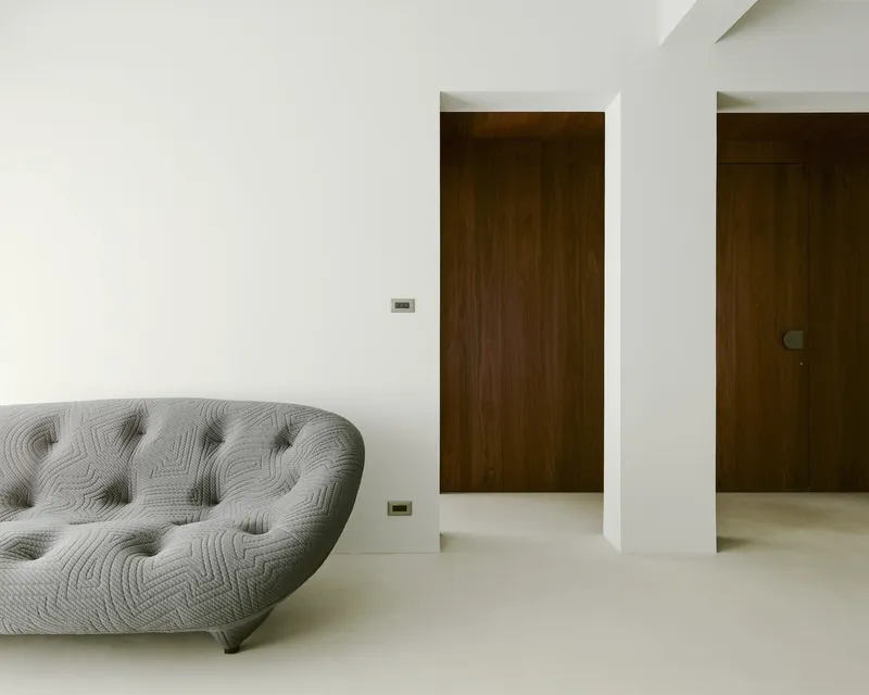
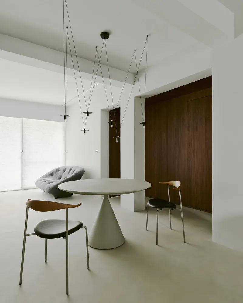
The square footprint of the apartment is the starting point for everything. Rather than carving it into an ad hoc sequence of rooms, 2BOOKS mirrors the plan across a central axis that runs from the front windows through the dining table and into the private zones beyond. Two walnut-framed doorways sit at equal intervals on either side, and the coffered ceiling reinforces the grid above. Structural beams that might otherwise feel oppressive are painted white and integrated into the coffering, turning a liability into a rhythmic overhead pattern.
The effect on the tufted grey sofa wall is telling. Two identical walnut openings recede into the background like a perspective exercise, pulling the eye deep into the plan and making the room feel substantially longer than its modest dimensions suggest. Symmetry here is not decoration; it is the primary tool for expanding perceived space.
The Circular Portal and the Problem of Light

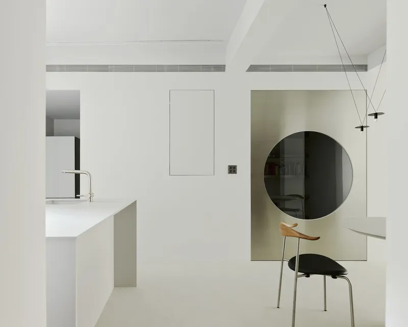
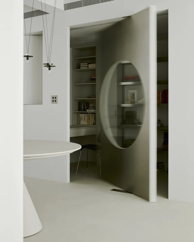
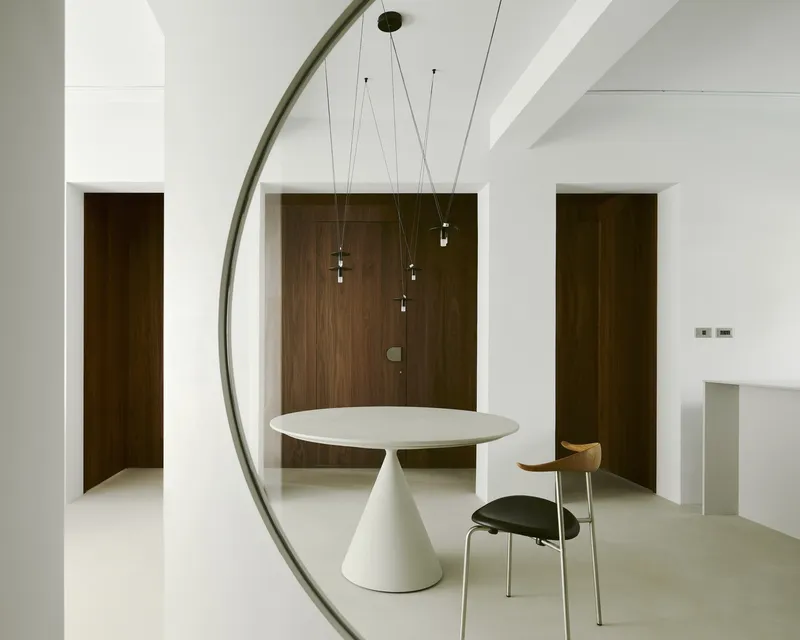
The apartment draws daylight from front and back windows, but neighboring buildings limit what actually arrives. 2BOOKS addressed this with a partition wall that contains a large circular opening filled with tinted glass, a kind of moon gate translated into residential interiors. When viewed from the dining area it operates as a mirror, reflecting the bookshelves and pendant lights behind the viewer. From the study side, it becomes a borrowed-light window that connects the workspace to the brighter public zone.
Stainless steel door leaves positioned near the center of the plan scatter what light does penetrate, bouncing it sideways across grey polished floors. The palette is deliberately restrained so that every reflective surface can do its job. Cool greys, white plaster, and the occasional metallic sheen work together as a light-distribution system rather than a color scheme.
Walnut Warmth Against a Cool Shell
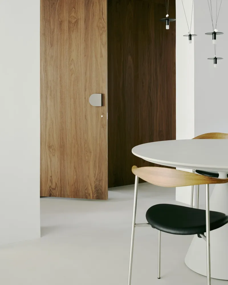
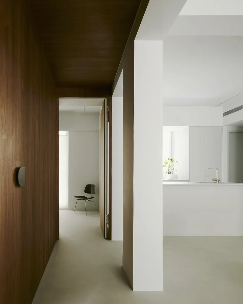

If the public zone is defined by grey and white, the corridor to the private rooms shifts into a different register entirely. Walnut veneer wraps the walls and ceiling in a continuous timber skin, compressing the hallway into a warm, cocoon-like transition. The material contrast is immediate and physical: you feel it as you step from polished concrete onto timber-clad territory.
The walnut is doing double duty. It conceals the bedroom and bathroom entrances behind flush panels, minimizing visual interruptions in the corridor, while its grain and color soften what could otherwise be a fairly austere interior. White columns peek through the timber surround like structural punctuation, a reminder that the building's bones are still present even as the surface language changes.
Living and Working in 76 Square Meters


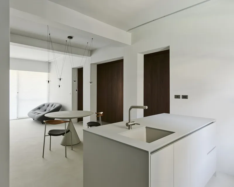
The Chang Residence doubles as a studio for its owner, and that programmatic overlap shaped the plan as much as any aesthetic ambition. What would typically be a second living room becomes a home office nook with a floating desk, wall-mounted cabinet, and narrow window that provides task lighting without sacrificing wall storage. The circular portal separates this workspace from the dining area just enough to signal a change in activity, without the acoustic or spatial penalty of a full partition.
The kitchen island, finished in pale stone with an integrated sink, faces the dining table across an uninterrupted sightline. Removing the walls between kitchen, dining, and living was a predictable move, but 2BOOKS earned the open plan by leaving the structural columns exposed and letting them define zones. The columns act as invisible walls: you read the boundary without hitting one.
The Dining Table as Centerpiece
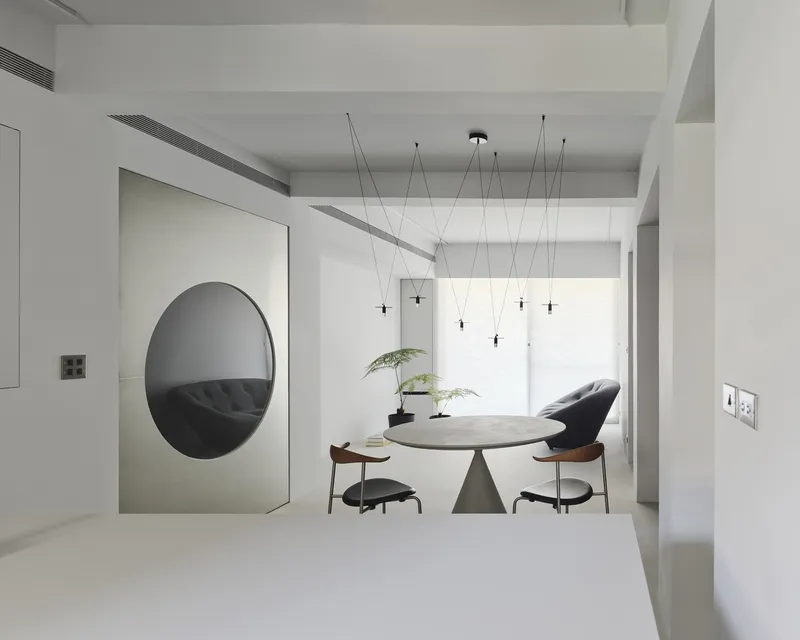
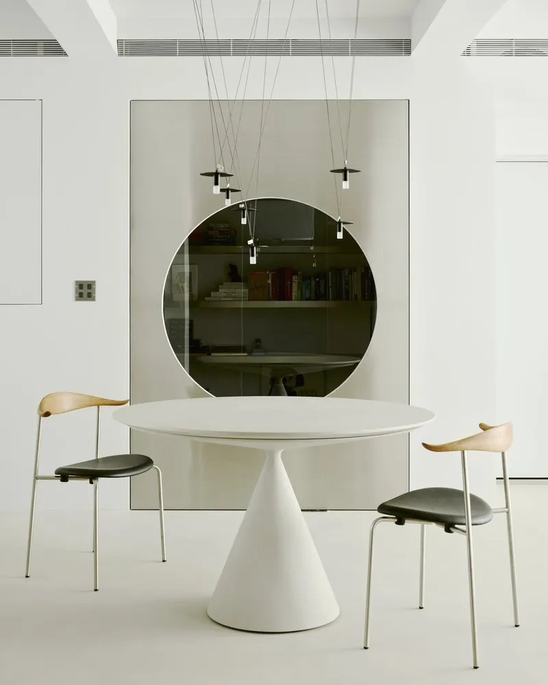
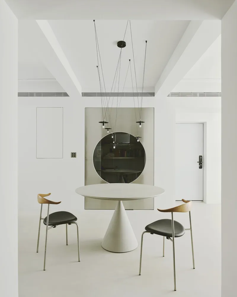
A conical pedestal table sits precisely on the plan's axis, and the architects clearly designed around it. Wire pendant lights descend from the coffered ceiling in a tight cluster, marking the table as the gravitational center of the apartment. The circular mirror behind it amplifies the composition, reflecting shelves and light fixtures in a visual loop that makes the room feel like it extends in every direction.
The table's white base echoes the white columns and ceiling, while its dark top picks up the walnut tones of the surrounding doors. It is a small detail, but it demonstrates the level of material coordination running through the project. Nothing here feels selected from a catalog; everything participates in the larger symmetrical narrative.
Private Rooms and Considered Restraint

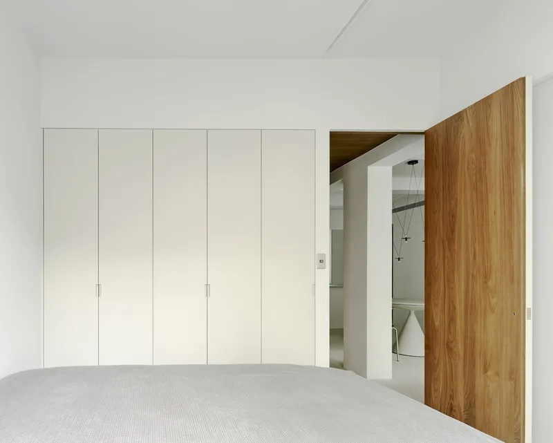

The bedroom retreats into quiet. Flush white wardrobe panels line one wall, a clerestory window introduces soft daylight from above, and grey bedding keeps the color story muted. A timber door opens to the living space, maintaining the material dialogue between public and private, but the room itself is deliberately plain. After the formal intensity of the main axis, the bedroom's simplicity registers as relief.
The bathroom matches this restraint with polished concrete floors, a floating double vanity, and a freestanding tub tucked against the far wall. A mirrored medicine cabinet stretches the room visually, borrowing the same reflective strategy deployed in the public zone. The materials are harder here, more utilitarian, but the spatial discipline remains consistent. Every surface earns its place.
Plans and Drawings
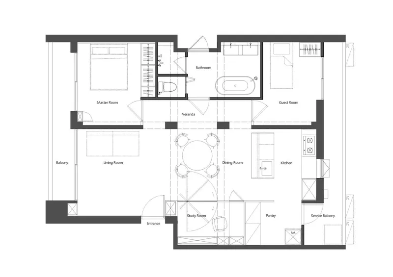
The floor plan confirms what the photographs suggest: a nearly square footprint divided by a central axis with public spaces at the front and private rooms at the rear. The two structural columns appear clearly as the pivot between zones, with the circular portal occupying the partition wall between dining and study. Reading the plan, you can trace how every symmetrical move in the photographs maps to a deliberate geometric decision on paper.
Why This Project Matters
Small apartment renovations rarely generate ideas that travel beyond their own walls. The Chang Residence is an exception because its central proposition, that bilateral symmetry can replace raw square footage as a way to make compact spaces feel generous, is both specific enough to be tested and general enough to be applied elsewhere. In a city where 76 square meters is a generous allocation, 2BOOKS proved that the arrangement of space matters more than the quantity of it.
The project also demonstrates how material restraint amplifies spatial effects. By limiting the palette to walnut, stainless steel, grey plaster, and white paint, the architects ensured that every reflective surface, every timber panel, every circular opening does measurable work. There is no decorative surplus here, only elements that redirect light, define boundaries, or signal transitions. It is a renovation that feels complete not because it adds everything, but because it includes nothing it does not need.
The Chang Residence by 2BOOKS Design, led by Jeff Weng with construction supervision by Lina Lin. Located in central Taipei, Taiwan. 76 square meters. Photography by Studio Millspace.
About the Studio
Share Your Own Work on uni.xyz
If projects like this are the kind of work you want to make, uni.xyz is a place to publish your own, find collaborators, and enter design competitions.




Popular Articles
Popular articles from the community

Riyadh For All: Intergenerational Urban Design for Active Aging in Rabat
Riyadh For All reimagines urban design in Rabat with intergenerational co-living, adaptive courtyards, and Moroccan cultural exchange today.
The Musturak Paradise: Senior Living Architecture for a Connected Future in Temara, Morocco
The Musturak Paradise reimagines senior living architecture in Temara via private homes, social spaces, culture, community, and shared care.
The Earth Pod: 3D Printed Homes for Resilient Refugee Communities
The Earth Pod reimagines refugee housing through 3D printed homes made from clay, combining resilience, self-sufficiency, and rapid shelter.

Lunar Spiral: Space Architecture Shaped by the Mathematics of the Universe
Lunar Spiral reimagines space architecture through Fibonacci geometry, lunar regolith, levitating habitats, and self-sustaining Moon living.

Similar Reads
You might also enjoy these articles


Hodi-Mandai Geram
Project Function: Preservation and revitalization of the Intangible heritage and socio-spatial identity of the Hodi by Housing, Cultural Memory Center, Sacred Grove, landscape, local tourism economy

Olio Towers: A Mid-Rise for Performers That Fuses Housing, Rehearsal, and Stage
Located blocks from Houston's Theater District, this modular tower stacks living units around a central performance atrium.
Oasis: Modular Green Housing Carved into Dhaka's Urban Fabric
A shortlisted Plugin Housing entry reclaims unauthorized settlements in Dhaka with stepped concrete volumes, green roofs, and ventilation-driven design.

Black Hole: A Floating Megastructure for the Post-Physical Era
Emiliano Mazzarotto envisions a spherical, self-scaling arena where e-sports, digital hotels, and holographic stadiums replace traditional public space.


Explore Architecture Competitions
Discover active competitions in this discipline



Challenge to reimagine the Iron Throne


Photograph architecture without architects


Illustrate the lost glory of Angkor Wat - Render Challenge


Design challenge to reuse E-waste
Comments (0)
Please login or sign up to add comments
No comments yet. Be the first to comment!