
Guudpin Design Wraps a Taipei Bakery Around a Living Tree and the Number Three
Peckish Bakery in Taipei's Minsheng neighborhood fuses mosaic arches, orange-pink hues, and Dutch art into a 123 square meter community hub.


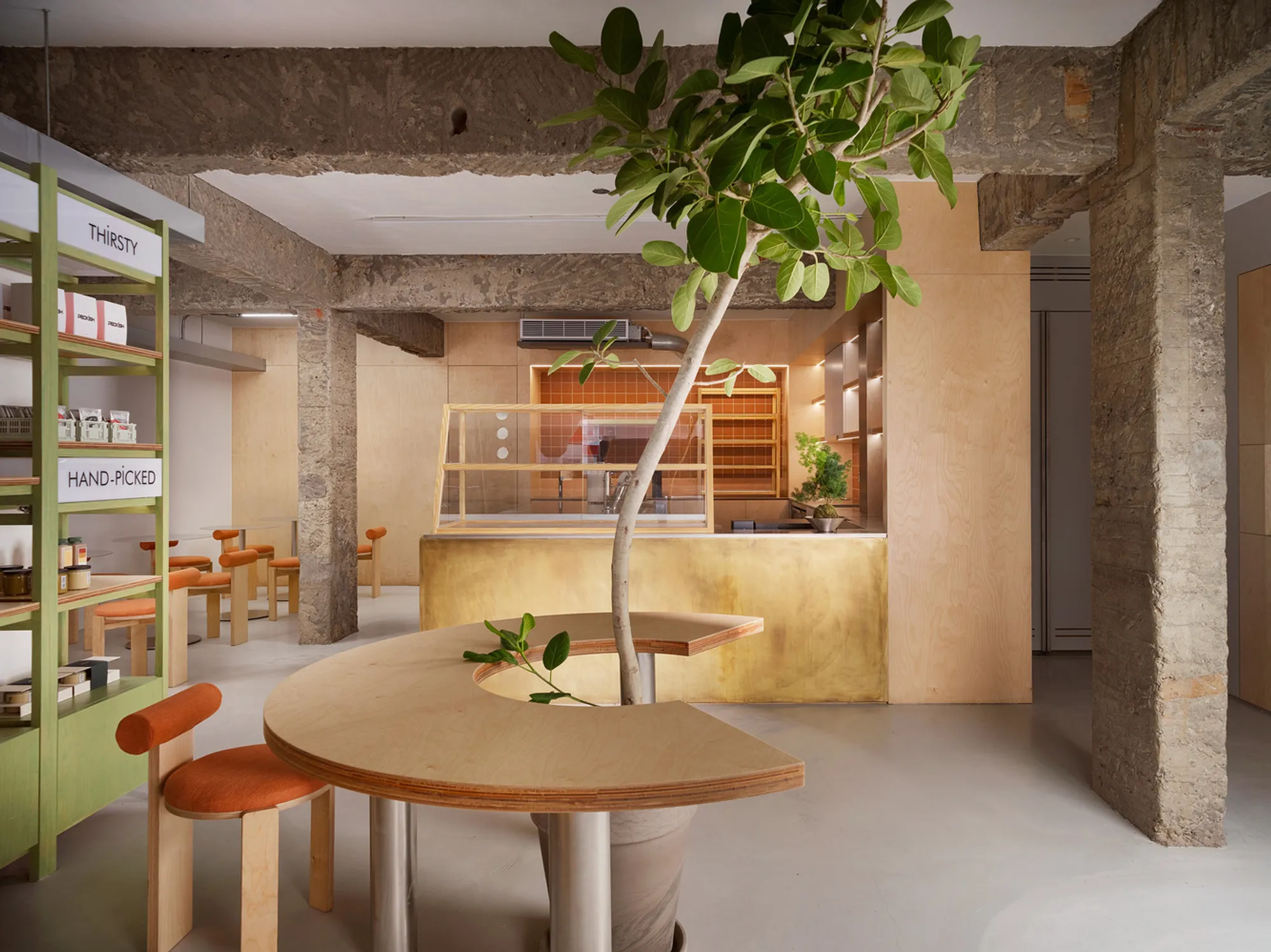
A tree grows through a polished floor. Orange stools huddle beneath stone beams that predate the bakery by decades. A disco ball sits on a green shelf above a gradient terracotta wall, catching light and scattering it across the room. Peckish Bakery, the third outpost of Taipei's Ivette Cafe family, is not a renovation that erases the past. It is a project that treats the past as raw material, shaping something unmistakably contemporary out of cement, red brick, and an old apartment's stubborn bones.
Designed by guudpin design under lead architect Pin Yun Chiu, the 123 square meter space in Taipei's Minsheng neighborhood is organized around a quietly obsessive motif: the number three. It appears in door handles, triangular chair geometries, tripod legs, and the grouping of art pieces by Dutch collective Rotganzen. The motif is never labored or literal. It functions more like a rhythmic pulse underneath decisions about furniture, color, and spatial sequence, giving the bakery an internal logic that rewards repeat visits.
Keeping the Arches, Losing the Ceiling
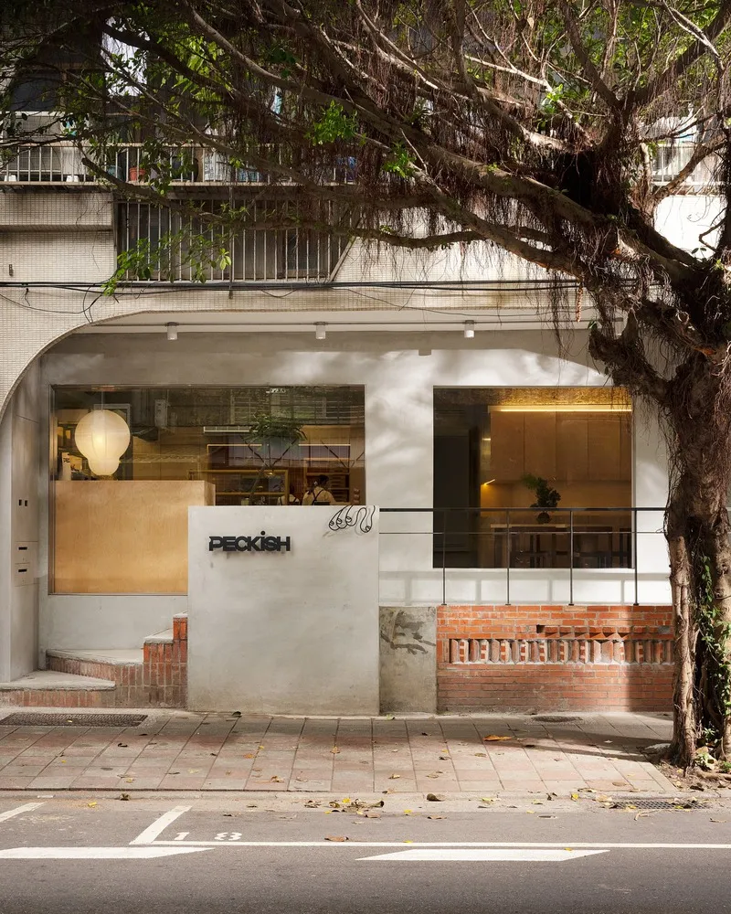
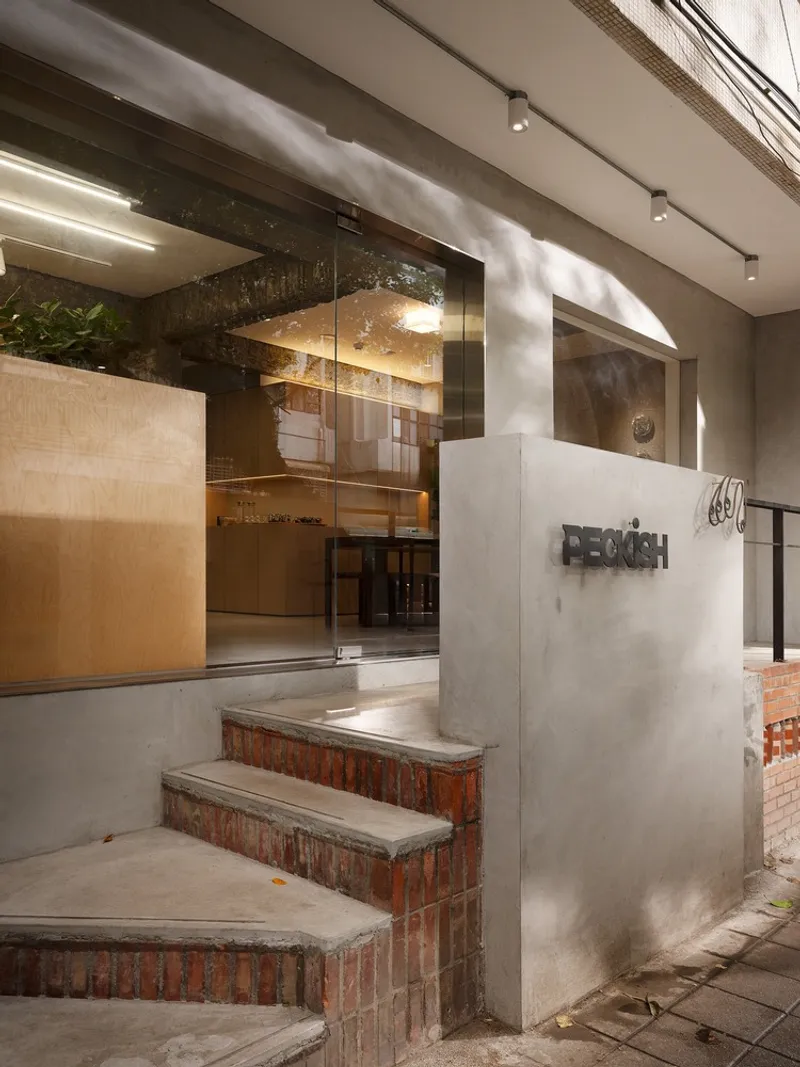
The street facade is the project's handshake with the neighborhood. Guudpin preserved the building's mosaic-patterned arched exterior, a detail typical of older Taipei apartment blocks, and let it do the talking. No signage screams for attention. Brick and concrete steps rise to glass doors beneath exposed ceiling ducts, a threshold that telegraphs exactly what you will find inside: honesty about materials and a refusal to conceal structure.
The original storefront had a low ceiling, the kind that can turn any room into a compression chamber. Rather than fight this with structural gymnastics, Chiu's team painted interior walls in bright tones to offset the oppressive height, then left beams and ductwork exposed overhead. The result is a space that reads as taller than it actually is, because the eye travels upward along raw surfaces rather than hitting a flat, featureless plane.
The Tree at the Center
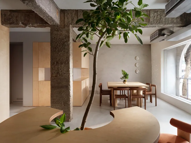
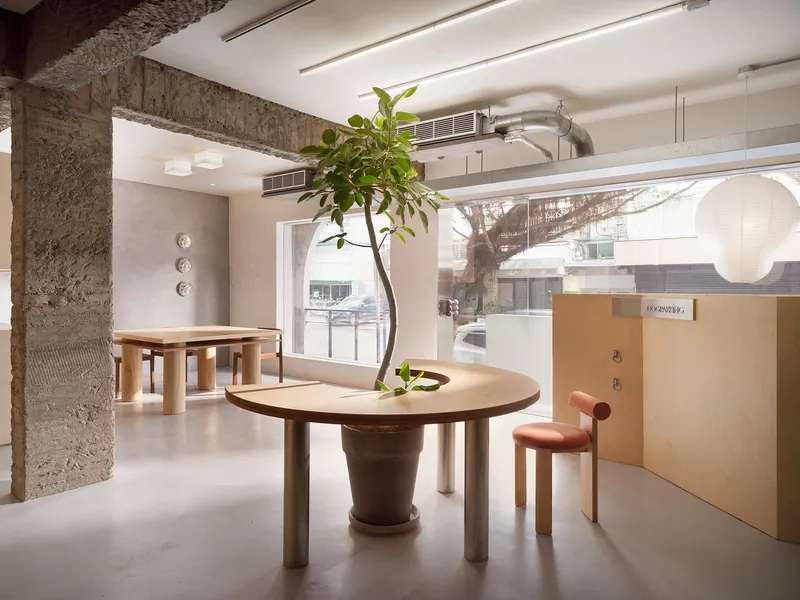
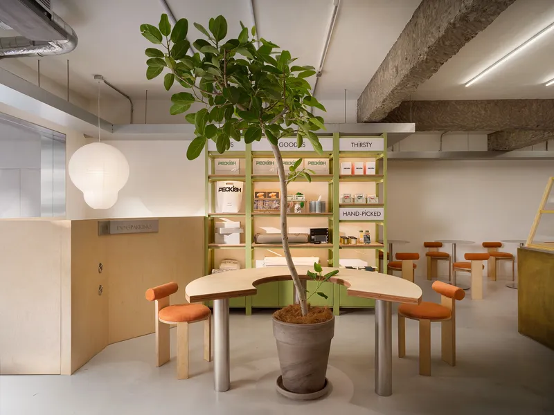
A potted tree rises through a circular cutout in the polished floor, and almost everything in the bakery orbits it. A curved communal table wraps around the trunk. Daylight pours through the storefront window and washes the leaves. The tree is not decorative filler. It is the spatial anchor, the element that holds the open plan together and gives customers an intuitive sense of where they are relative to the entrance, the counter, and the seating zones.
The move is simple, even obvious, yet it works because the rest of the plan respects it. Furniture radiates outward. Sightlines converge on the canopy. In a compact 123 square meter footprint, this kind of focal clarity prevents the space from feeling cluttered, even when every seat is taken.
Orange, Green, and the Brand's Double Identity
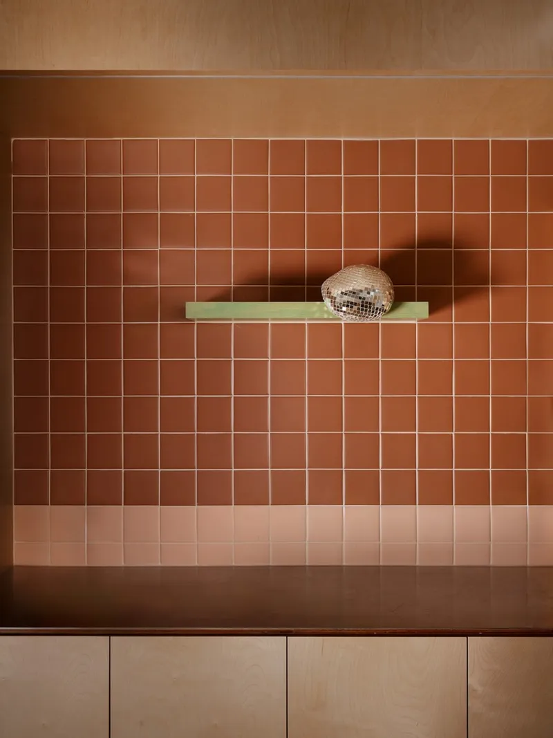
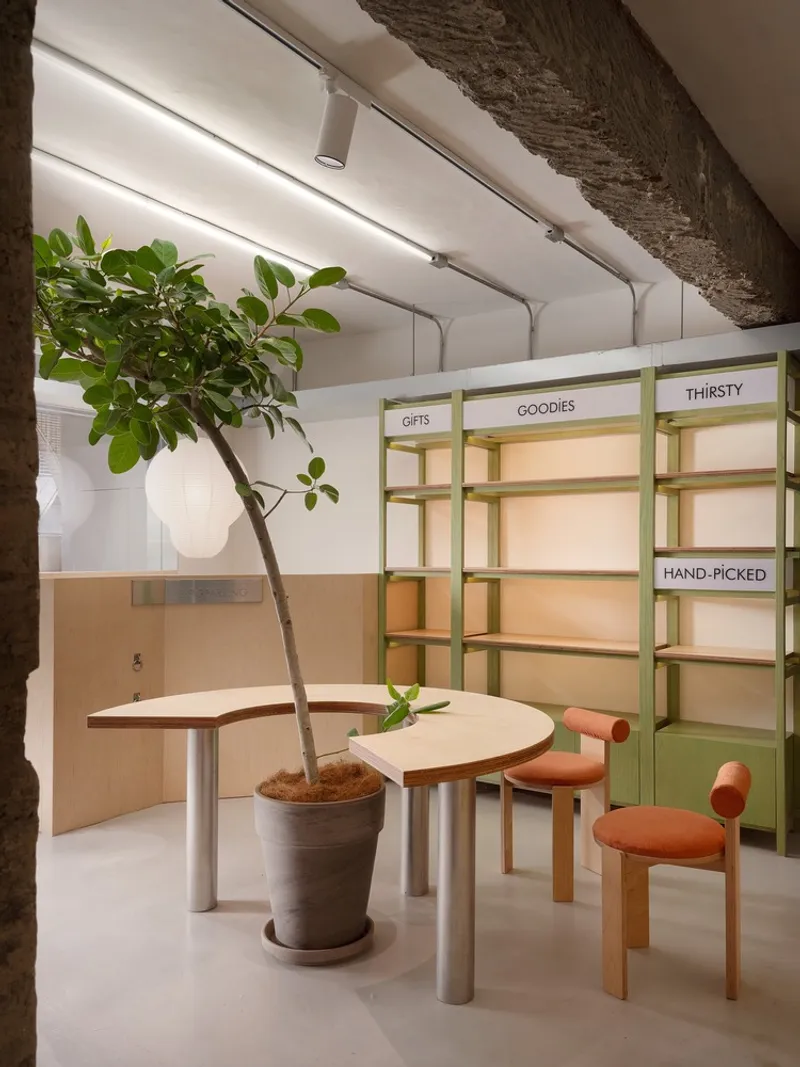
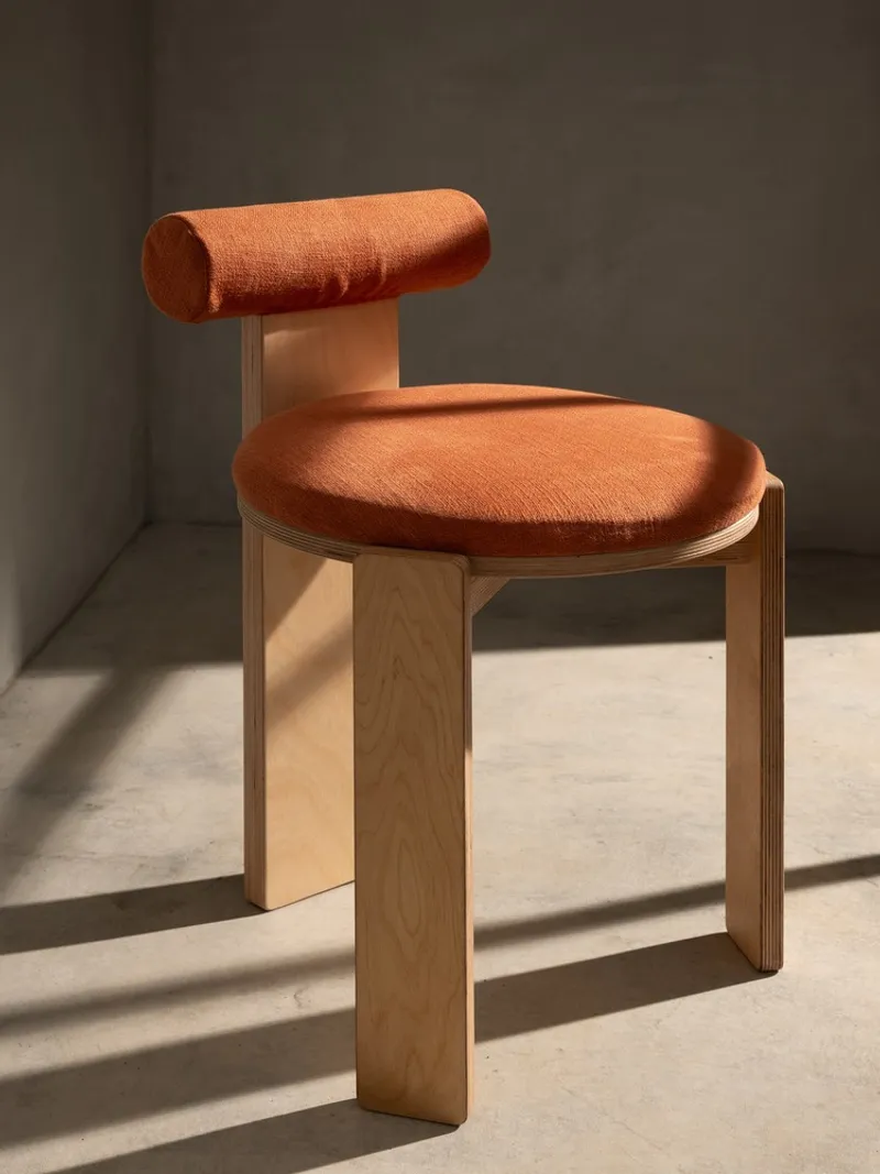
Peckish exists under the umbrella of Ivette Cafe, and the color strategy makes the relationship legible without collapsing the two brands into one. Ivette's signature green appears in floating shelves and display units. Peckish's distinctive orange-pink saturates the upholstered stools, chair frames, and a gradient terracotta tile wall that shifts tone from warm to warmer as it climbs. The two palettes coexist without competing, a quiet act of brand architecture expressed in pigment rather than logos.
The gradient tile wall deserves particular attention. It is not a backsplash in the utilitarian sense. It is a surface that changes character with the light, reading as muted terracotta in the morning and glowing amber by evening. Paired with the green shelf and the reflective disco ball sculpture by Rotganzen, it creates a vignette that is equal parts bakery and gallery.
Stone, Concrete, and the Texture of Memory
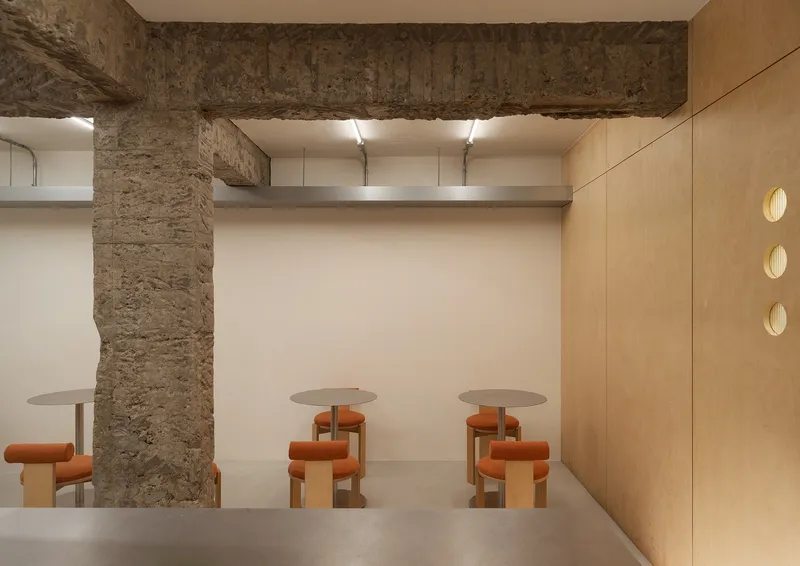
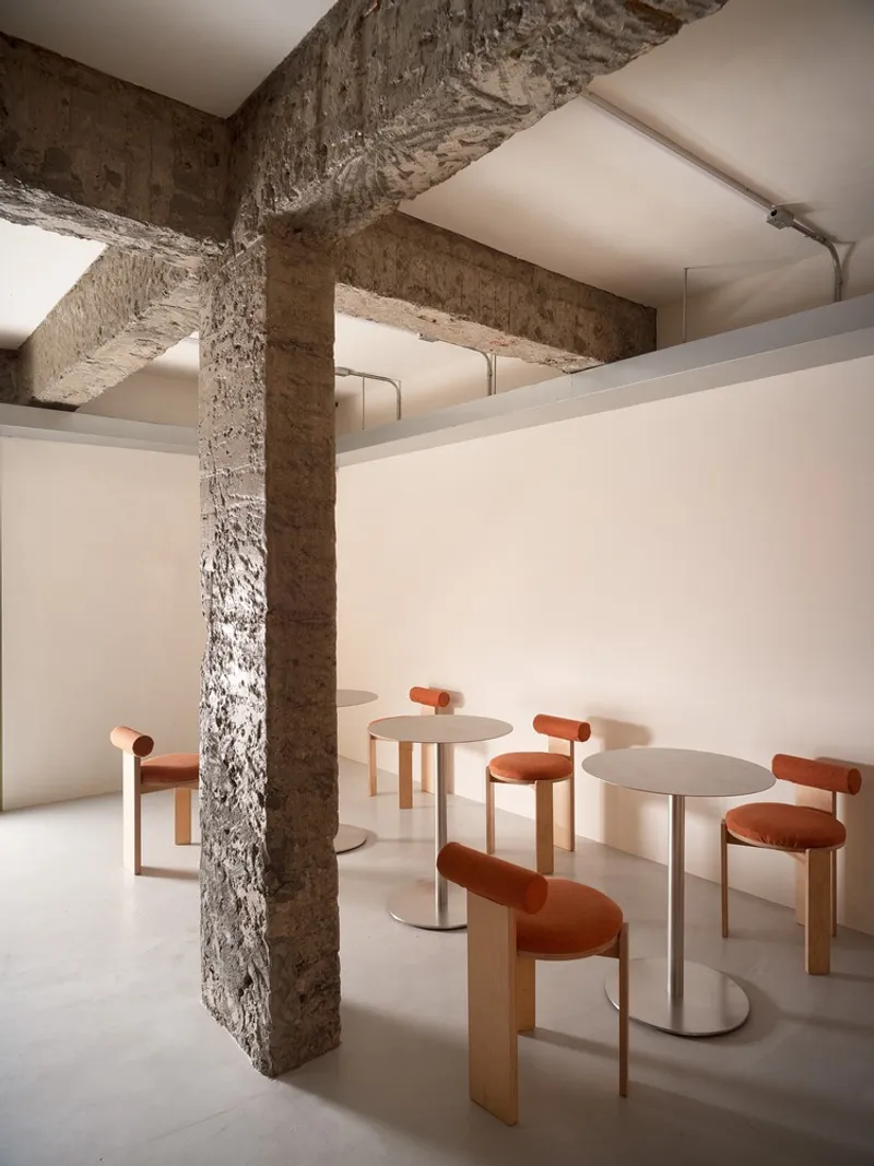
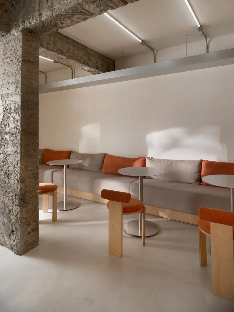
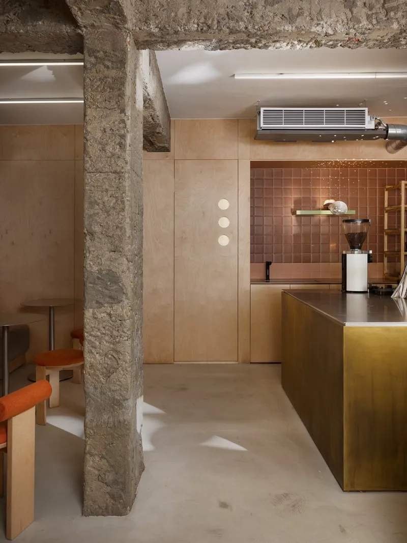
Exposed stone columns and beams run through the dining area, carrying the weight of the old apartment structure into full view. Guudpin did not clad them, sand them smooth, or paint them white. They remain rough, pitted, and visibly aged, and the new elements placed against them gain sharpness by contrast. Orange cushions on banquette seating pop against the grey mass of a concrete column. Round pedestal tables with clean geometries sit beneath stone lintels that sag with decades of compression.
The material honesty is not performative. These are everyday materials, cement and red brick, the same substances that built the Minsheng neighborhood's apartment blocks. Using them without disguise is a way of saying that the bakery belongs here, that it is not a transplant from a different design culture but a continuation of the local one.
The Counter and the Kitchen
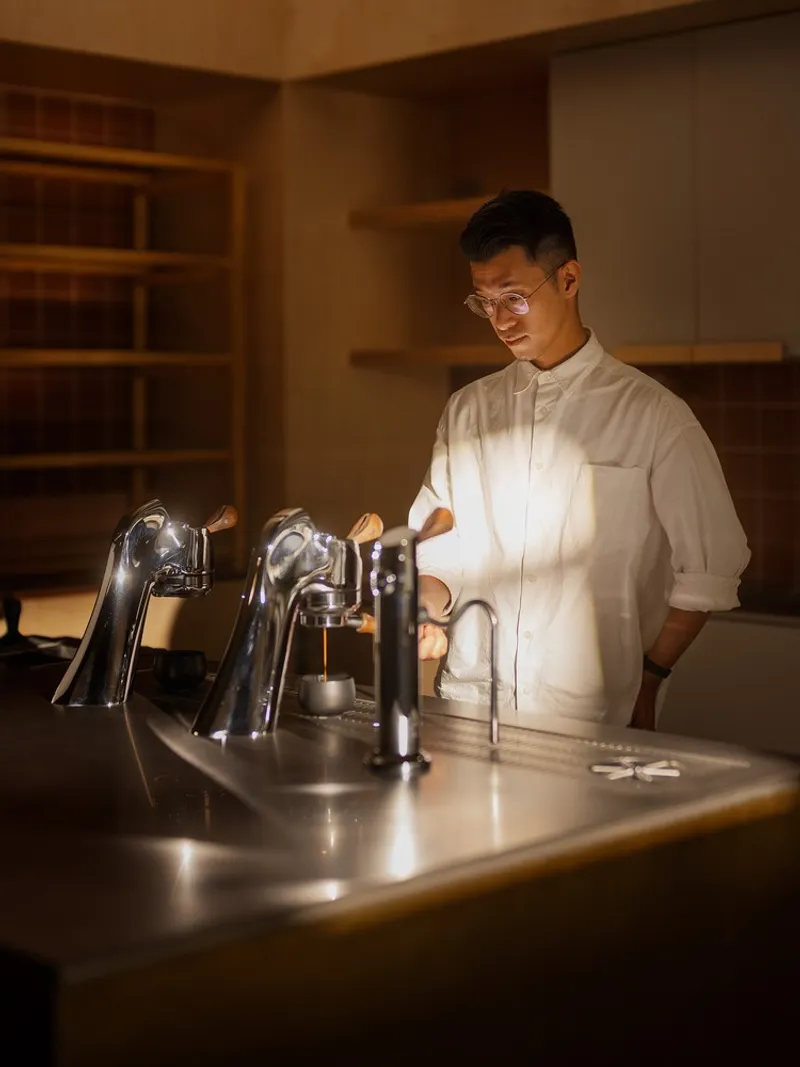
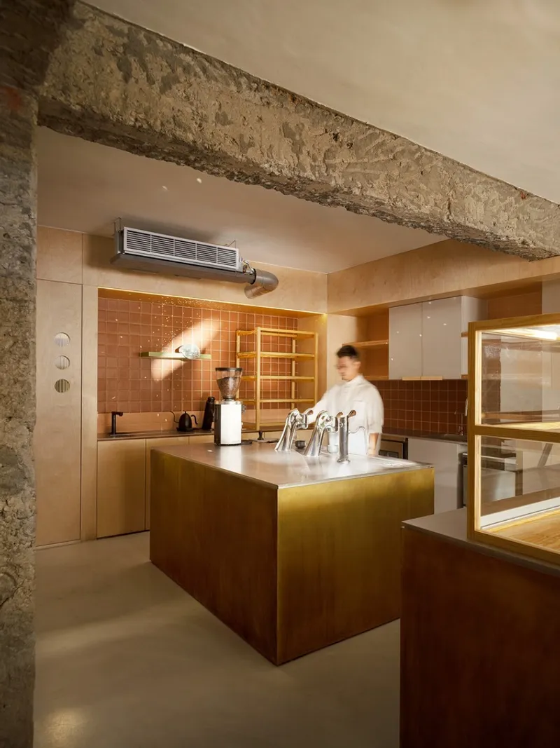
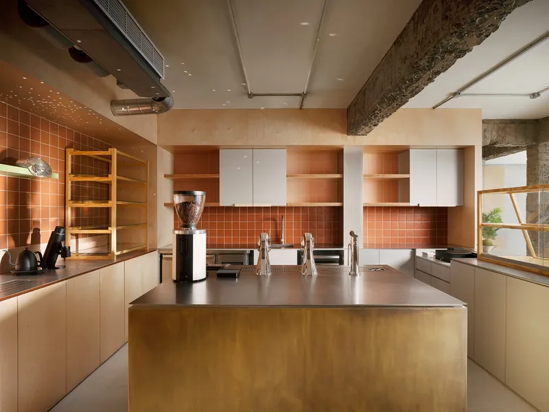
The service zone is where Peckish shifts from lounge to working bakery. A stainless steel espresso counter glows under warm ambient light, its industrial surface reflecting the barista's movements. Behind it, the kitchen features a brass island and terracotta tile backsplash that ties back to the dining room's palette. Exposed concrete beams overhead and steel ductwork are left unapologetic, reinforcing the idea that making food is labor and the space should reflect that.
What is smart about the arrangement is how the freestanding plywood service counter mediates between front and back of house. It stands beside an exposed stone column on polished concrete flooring, acting as a soft barrier rather than a hard wall. Customers can watch bread being prepared without feeling like they are intruding. The kitchen breathes into the dining room, and the dining room breathes back.
Custom Furniture and the Logic of Three
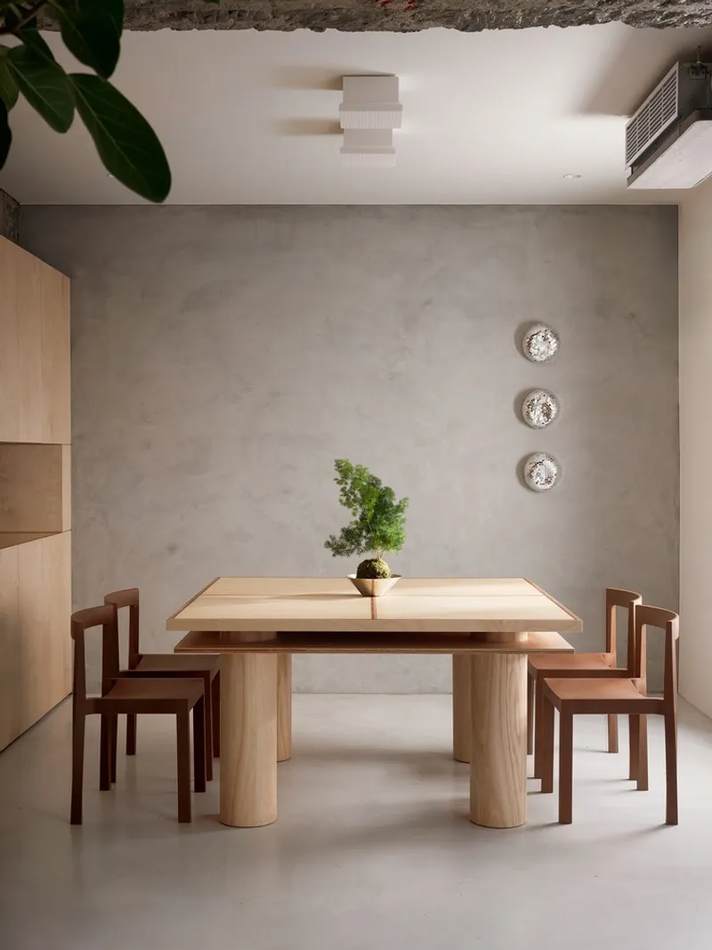
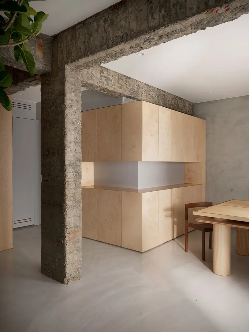
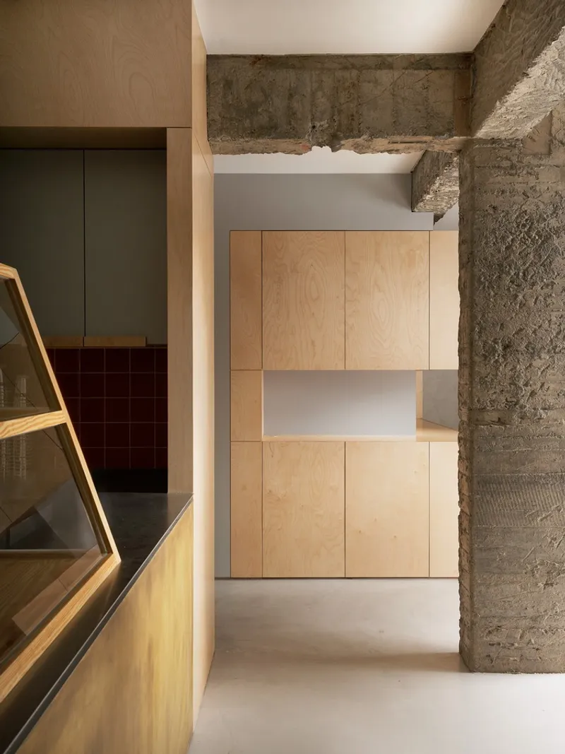
Custom-made pieces carry the project's conceptual motif into the furniture scale. A timber dining table with cylindrical legs sits against a grey plastered wall with three circular wall sconces arranged in a deliberate cluster. Chairs feature curved backrests and triangular geometries in their frames. The plywood cabinetry, visible from multiple angles, uses a material vocabulary distinct from the stone and concrete of the shell, establishing a clear hierarchy between old structure and new intervention.
The number three could easily become gimmicky. It does not, because the motif is embedded in proportional relationships rather than stamped onto surfaces. You feel it in the rhythm of the sconces, the triangulation of a chair leg, the grouping of Rotganzen's four collectible art pieces (four, notably, not three, which keeps the system from becoming rigid). The discipline is in knowing when to follow the rule and when to break it.
Light, Art, and Atmosphere After Dark
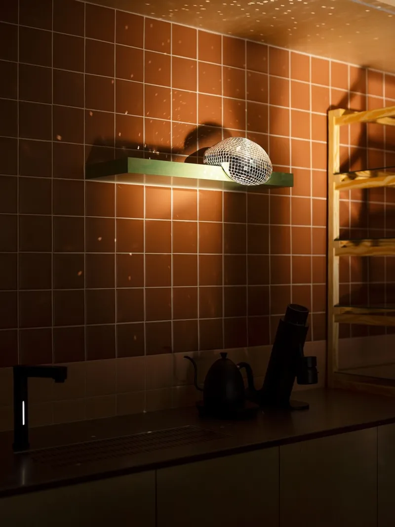
The bakery transforms at night. Special lighting enhances the reflective surfaces of Rotganzen's artworks, casting shimmering silver patterns across walls and ceilings. The gradient terracotta backsplash deepens in hue. The green shelves become more saturated. The evening version of Peckish is warmer, more intimate, and more clearly indebted to its art collection than the daytime version, which is brighter and more dominated by the tree and the streetscape.
The passage from exposed concrete beams through plywood built-in cabinetry illustrates how Guudpin sequenced the interior: rough to refined, structural to domestic, public to semi-private. Moving through the bakery is a series of small discoveries rather than a single reveal at the door.
Plans and Drawings
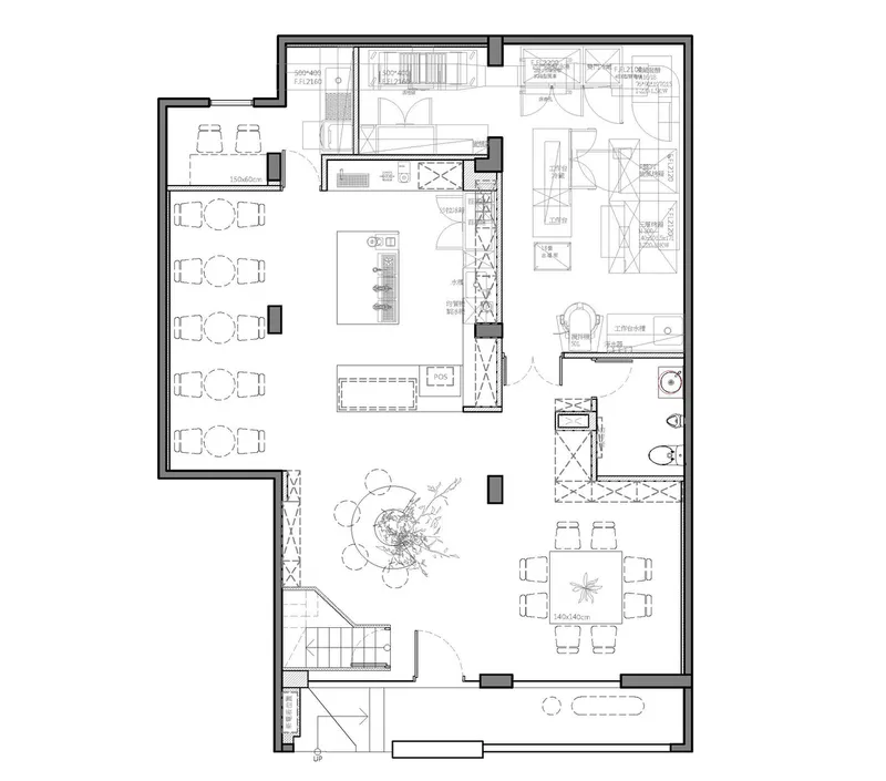
The floor plan makes the spatial strategy legible. The central tree anchors the open dining area, with kitchen and service zones pushed to one side and a compact bathroom tucked into the rear. The layout follows the original apartment's footprint, working with existing walls rather than demolishing them. The result is a plan that reads as organic and slightly irregular, which is precisely what gives the bakery its character. Straight geometries would have erased the history that Guudpin was determined to keep.
Why This Project Matters
Bakery design has become one of the most competitive arenas in commercial interior architecture, particularly in East Asian cities where cafe culture drives foot traffic and brand identity. Most entries in the genre rely on novelty: unusual materials, Instagram-ready moments, or exaggerated scale. Peckish Bakery succeeds by doing the opposite. It is restrained where it counts, expressive where it matters, and rooted in a neighborhood that it clearly respects.
Guudpin's achievement is in managing multiple registers at once: brand identity and neighborhood identity, preservation and intervention, art curation and food service. The motif of three gives the project internal coherence without turning it into a theme park. The tree gives it a living center. And the rough stone columns remind everyone that this building had a life before Peckish arrived, and it will have one after. That kind of temporal humility is rare in retail design, and it is what elevates a 123 square meter bakery into something worth studying.
Peckish Bakery by guudpin design. Minsheng neighborhood, Taipei, Taiwan. 123 m². Completed 2024. Photography by wgh_photo.
About the Studio
Share Your Own Work on uni.xyz
If projects like this are the kind of work you want to make, uni.xyz is a place to publish your own, find collaborators, and enter design competitions.


Popular Articles
Popular articles from the community

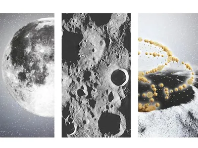
Lunar Spiral: Space Architecture Shaped by the Mathematics of the Universe
Lunar Spiral reimagines space architecture through Fibonacci geometry, lunar regolith, levitating habitats, and self-sustaining Moon living.
Riyadh For All: Intergenerational Urban Design for Active Aging in Rabat
Riyadh For All reimagines urban design in Rabat with intergenerational co-living, adaptive courtyards, and Moroccan cultural exchange today.
The Earth Pod: 3D Printed Homes for Resilient Refugee Communities
The Earth Pod reimagines refugee housing through 3D printed homes made from clay, combining resilience, self-sufficiency, and rapid shelter.
Hill & Cross Opera: Sculptural Opera House Architecture Shaped by Tallinn’s Landscape and Identity
Hill & Cross Opera reimagines opera house architecture in Tallinn through its sculptural hill, civic plaza, glass wave and a luminous cross.


Similar Reads
You might also enjoy these articles

Hodi-Mandai Geram
Project Function: Preservation and revitalization of the Intangible heritage and socio-spatial identity of the Hodi by Housing, Cultural Memory Center, Sacred Grove, landscape, local tourism economy

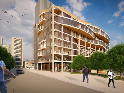
Olio Towers: A Mid-Rise for Performers That Fuses Housing, Rehearsal, and Stage
Located blocks from Houston's Theater District, this modular tower stacks living units around a central performance atrium.
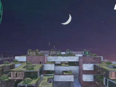
Oasis: Modular Green Housing Carved into Dhaka's Urban Fabric
A shortlisted Plugin Housing entry reclaims unauthorized settlements in Dhaka with stepped concrete volumes, green roofs, and ventilation-driven design.

Black Hole: A Floating Megastructure for the Post-Physical Era
Emiliano Mazzarotto envisions a spherical, self-scaling arena where e-sports, digital hotels, and holographic stadiums replace traditional public space.


Explore Architecture Competitions
Discover active competitions in this discipline



Challenge to reimagine the Iron Throne


Photograph architecture without architects


Illustrate the lost glory of Angkor Wat - Render Challenge


Design challenge to reuse E-waste
Comments (0)
Please login or sign up to add comments
No comments yet. Be the first to comment!