

Aether Architects and Archigress Insert a Freestanding Gallery Inside a Shenzhen Railway Warehouse
Apelron Contemporary turns a dark storage shed along the Qingshuihe Railway Relics into a layered, light-filled exhibition space.
The simplest description of Apelron Contemporary is also the most radical: nothing new touches the old roof. Designed by Aether Architects and Archigress under the lead of Huang Zelin, this 320 square meter gallery occupies a former railway warehouse in Shenzhen's Qingshuihe Railway Relics, a strip of industrial memory wedged between active tracks and a busy urban road. The original structure was engineered to carry only its own corrugated metal canopy. Adding any load to it was off the table, so the architects did something counterintuitive: they built an entirely new architecture beneath the existing one, letting both systems coexist without ever becoming structurally dependent.
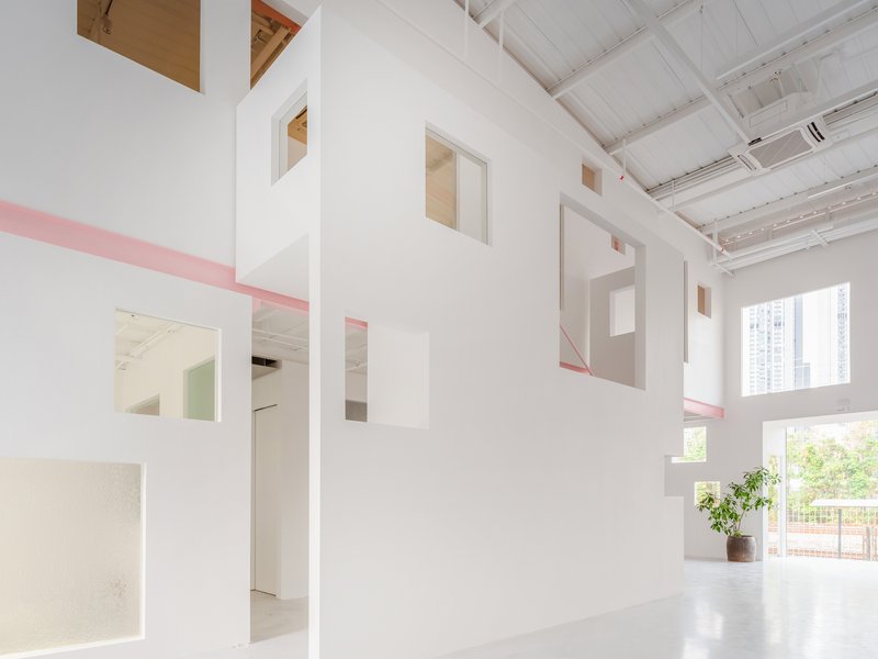
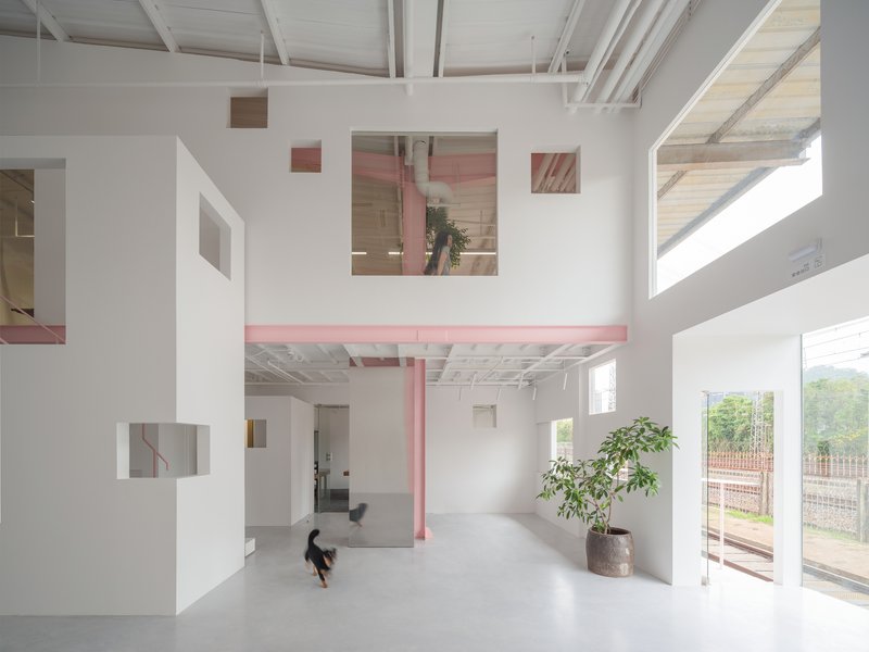
What makes the project worth studying is not just that constraint but how it becomes a spatial proposition. Rather than a single inserted box, the design deploys what the team calls a "structural cluster," a constellation of independent walls, stairs, rooms, and mezzanines that stand on their own foundations under the warehouse roof. Each element is free to be opaque, translucent, or fully glazed depending on what it needs to do for light, privacy, or view. The result is an interior that reads less like a renovated shed and more like a small city of white volumes threaded together by pink steel and natural daylight.
Between the Tracks and the Road
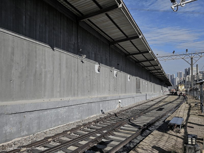
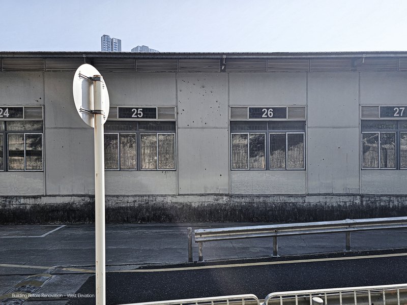
The site is defined by two linear forces: the railway to one side and the roadway to the other. Before the intervention, the warehouse was a long concrete wall running parallel to the tracks, anonymous and closed off. Early images of the existing structure show numbered bays, horizontal ventilation grilles, and a wet concrete floor inside. The building offered nothing to either the pedestrian or the train passenger. It was pure utility.
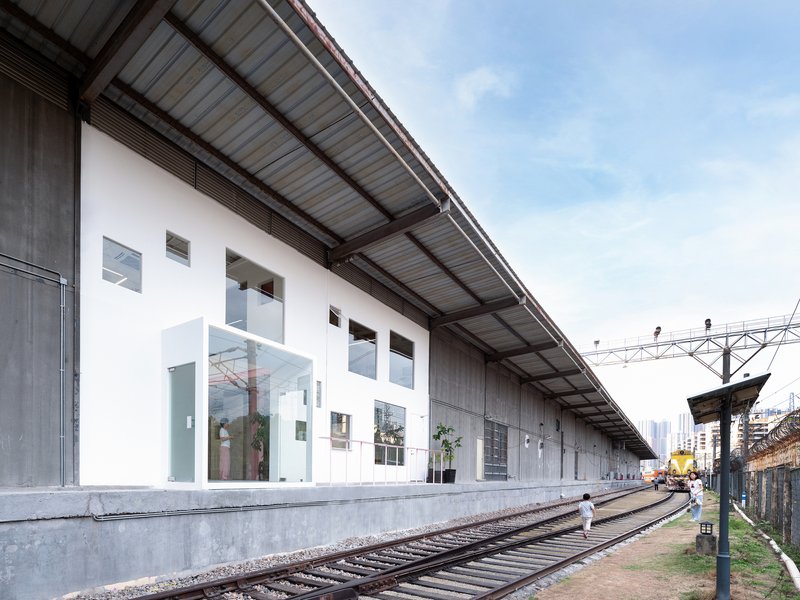
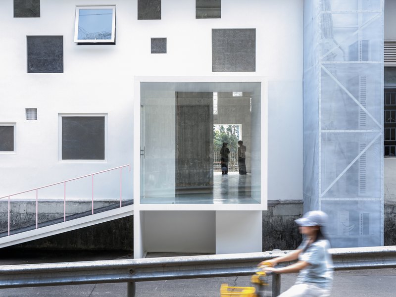
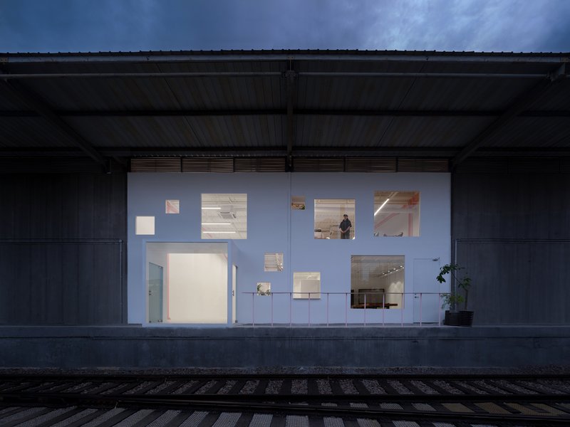
The architects exploit this linearity rather than fighting it. The new white facade slides beneath the corrugated metal canopy, asserting itself through a constellation of irregularly placed windows rather than a single grand gesture. Seen from the railway platform, the building becomes a long, perforated screen. From the street, it signals entry through a recessed glass vestibule. The infrastructure that once made the site hostile now provides the gallery's defining character: a sense of passage, of being caught between two kinds of urban motion.
A Facade of Calculated Openings
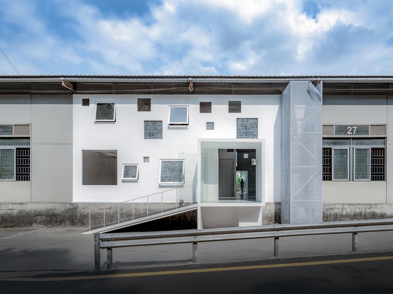
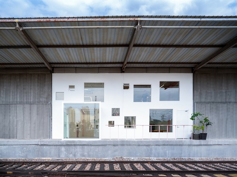
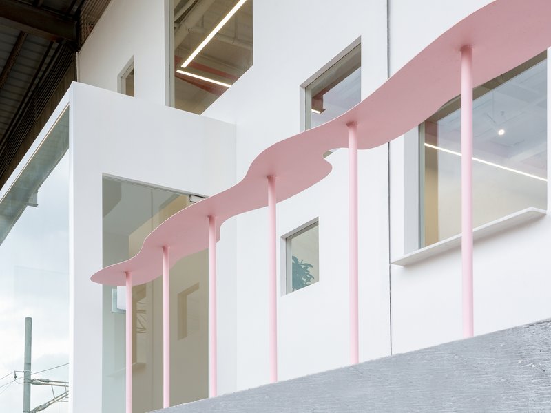
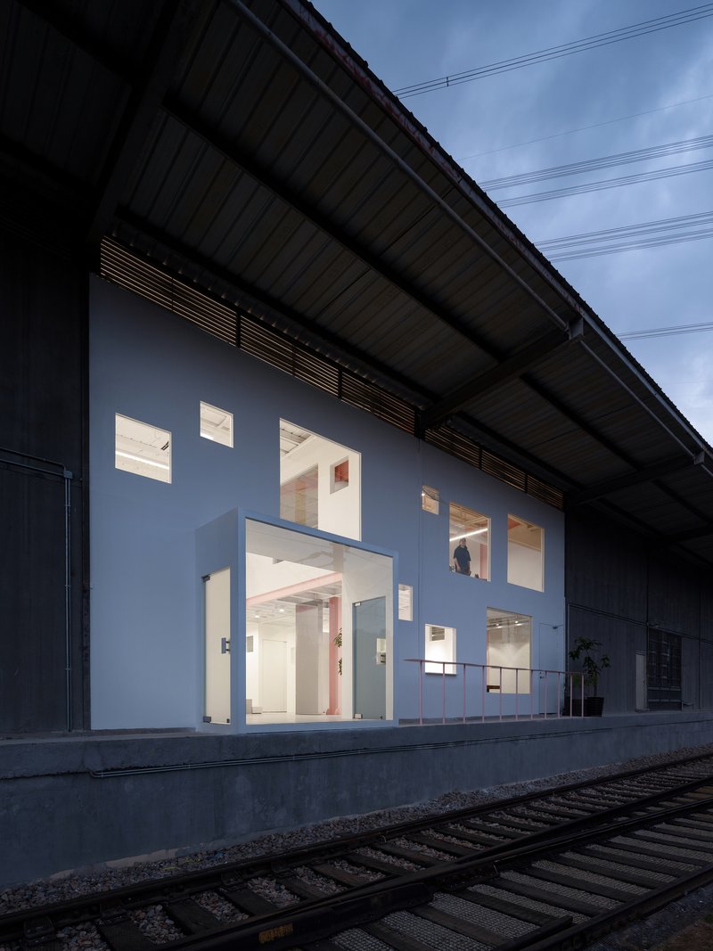
The street-facing elevation is the project's public face, and it earns attention through restraint. Square and rectangular windows are scattered across the white plane in a pattern that looks casual until you realize each opening is calibrated for a specific interior condition. Some are clear glass framing views of foliage and infrastructure; others are translucent, admitting light while maintaining privacy for exhibition walls behind. The pink undulating canopy that appears at one end adds a note of playfulness, supported by slender pink columns that preview the steel palette inside.
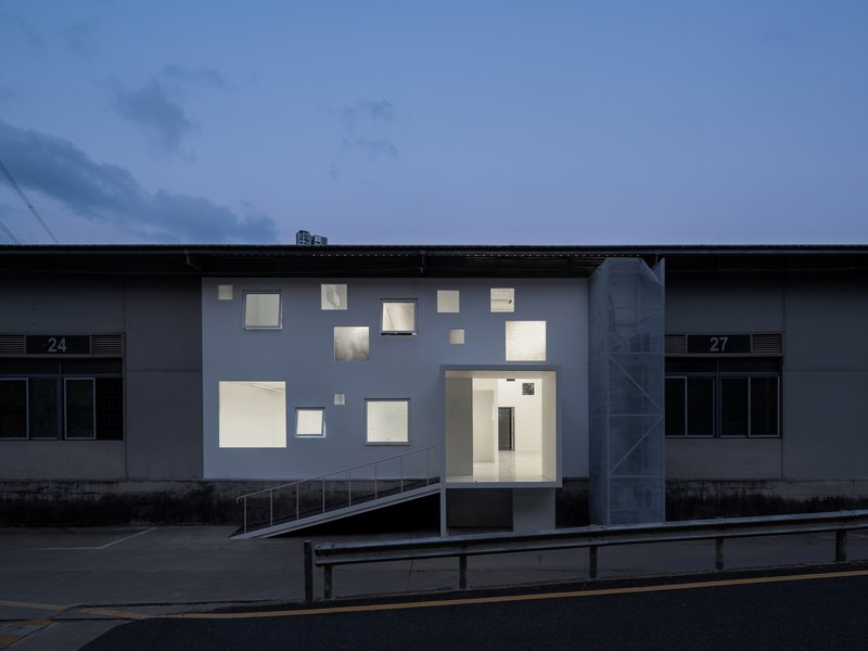
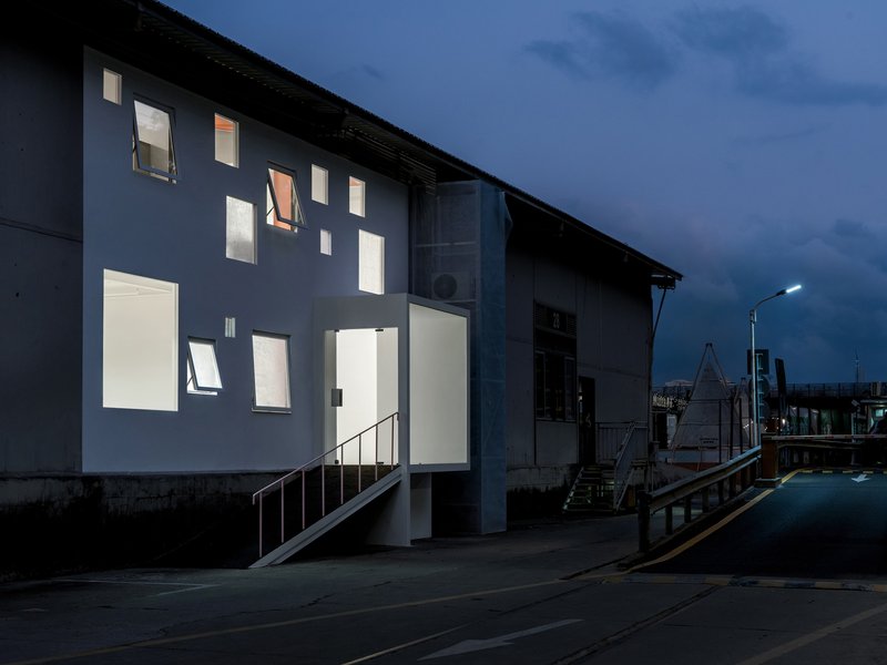
At dusk the strategy pays off fully. The windows glow warm against the darkening sky, turning the facade into a lantern. Where the old warehouse concealed its contents, the new gallery broadcasts a sense of openness and activity. The exterior metal stair tucked to one side hints that there is more program above, drawing the eye upward along the building's two-story section.
Structural Independence as Spatial Strategy
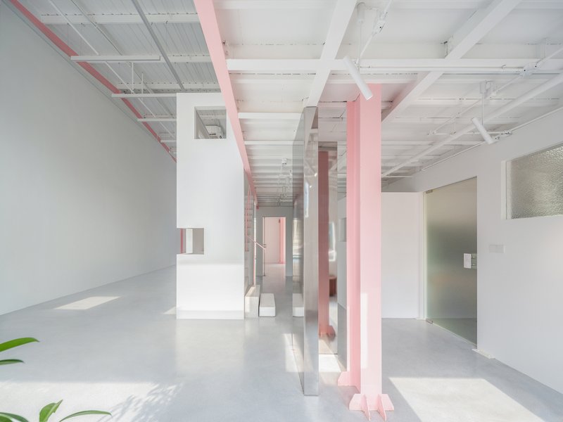
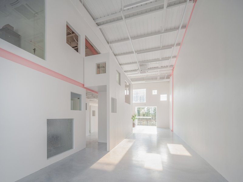
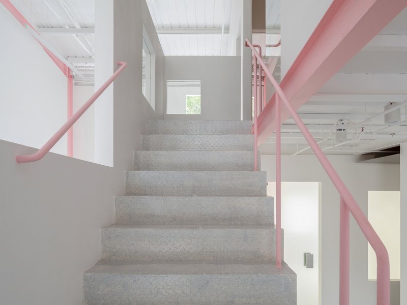
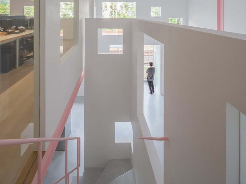
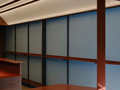
Step inside and the logic of the structural cluster becomes immediately legible. White partition walls rise to varying heights beneath the exposed ceiling joists of the original warehouse. None of them reaches the roof. Pink steel beams span overhead, connecting the new volumes to each other but never to the host structure. The effect is a series of rooms that feel simultaneously enclosed and open, their upper edges dissolving into the shared volume of the warehouse canopy above.
The pink steel is more than a color choice. It marks every structural member that belongs to the new insertion, making the two systems visually distinct. Original timber joists and corrugated roofing stay muted; new beams, columns, handrails, and walkways announce themselves in pink. This chromatic coding turns a technical constraint into an architectural narrative. You can always tell what is old and what is new without a plaque explaining it.
Light Through Layers
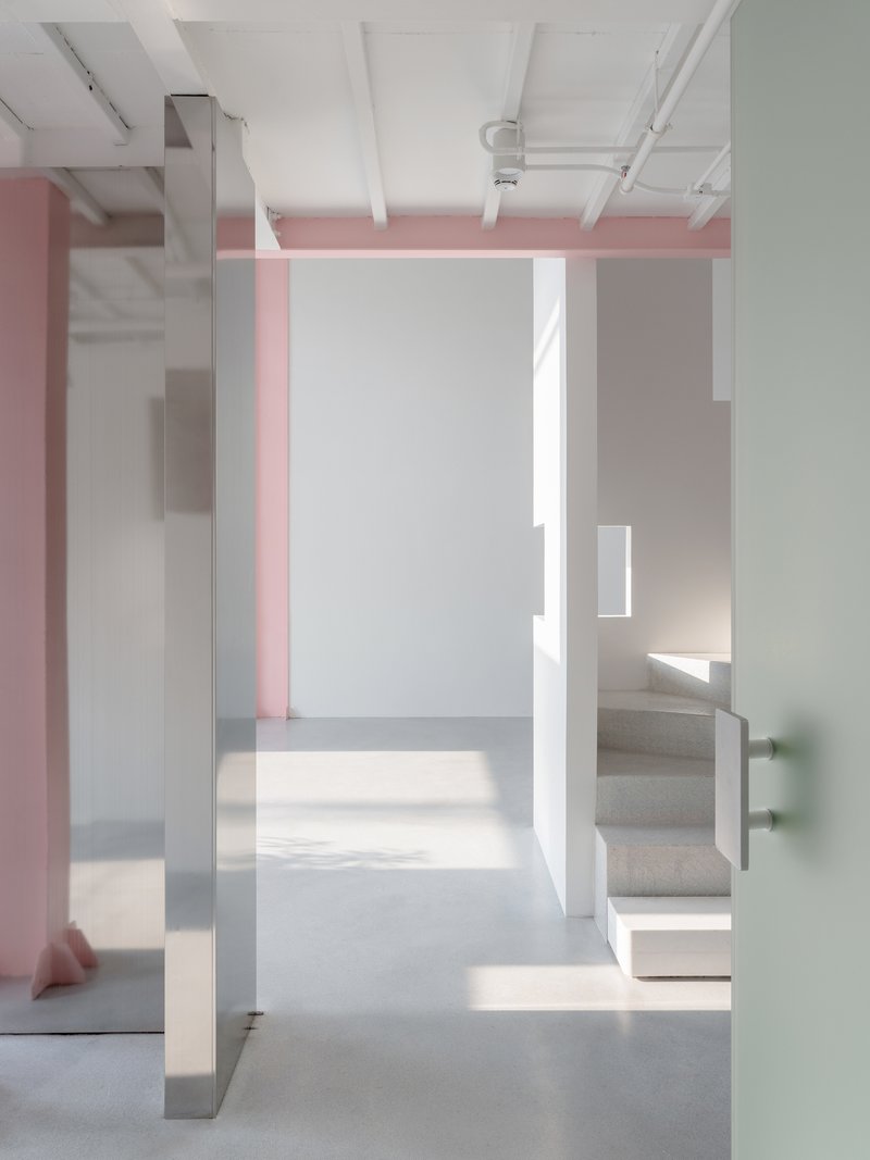
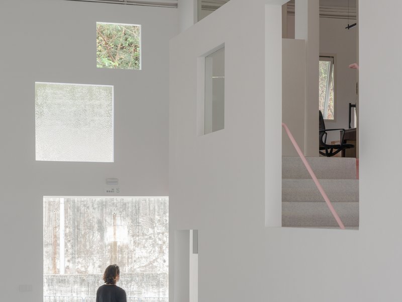
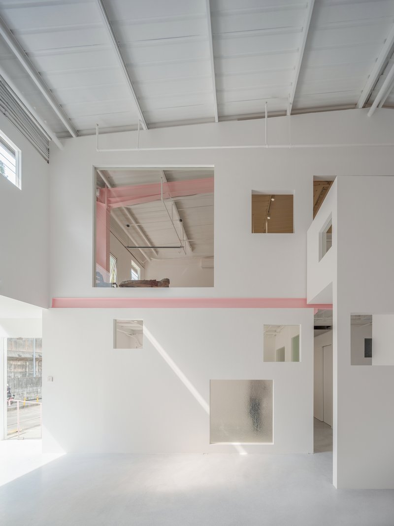
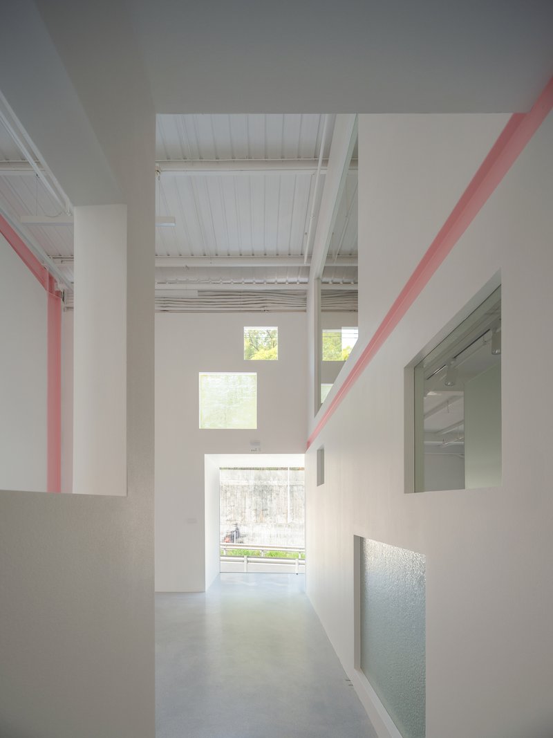
The original warehouse was dark. Natural light entered only at the east and west facades, and the deep floor plate ensured that the center was perpetually dim. The architects solve this not by cutting new skylights, which would mean loading the roof, but by choreographing transparency within the inserted walls themselves. Openings at various scales allow daylight to pass through multiple layers of partition, bouncing deeper into the plan with each successive surface.
In one sequence, three vertically stacked windows combine translucent and clear glass to filter views of winter trees outside. In another, a sawtooth profile in the ceiling joists catches eastern light and reflects it down onto the gallery floor, where geometric shadows move across polished concrete throughout the day. The interplay between opacity and transparency gives the space a cinematic quality: every few steps the light shifts, a new frame opens, and the relationship between inside and outside recalibrates.
Circulation as Architecture
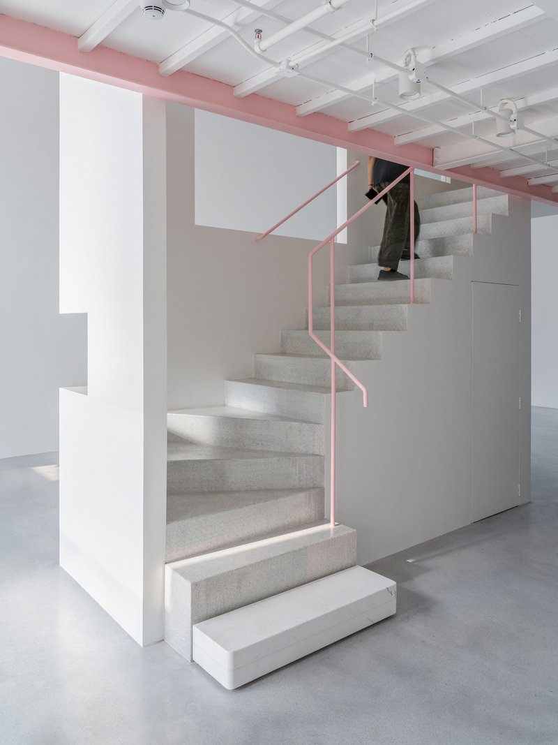
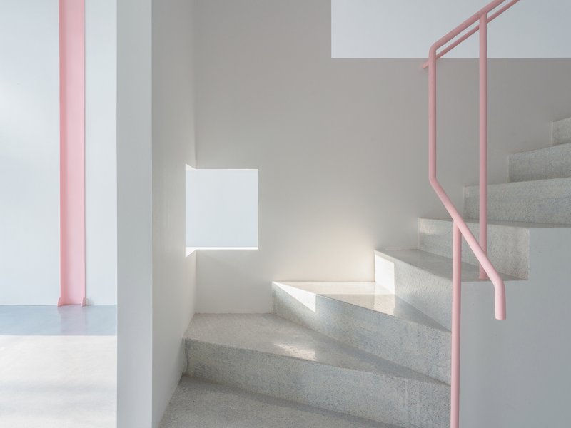
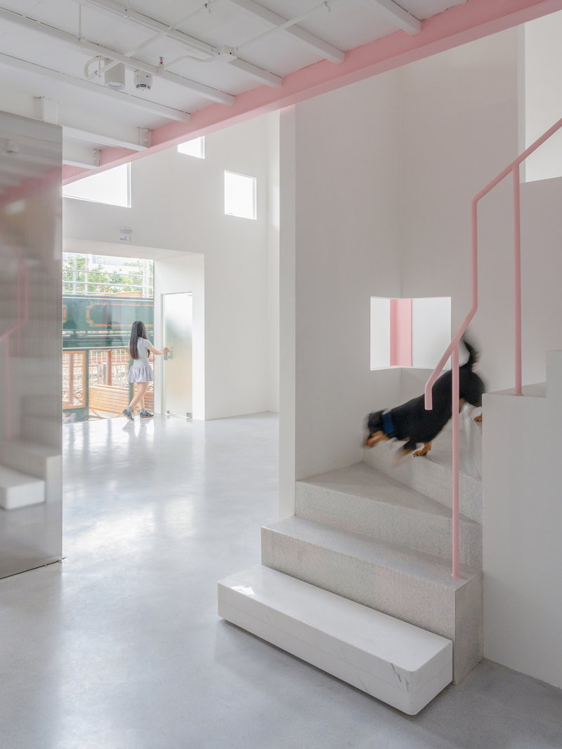
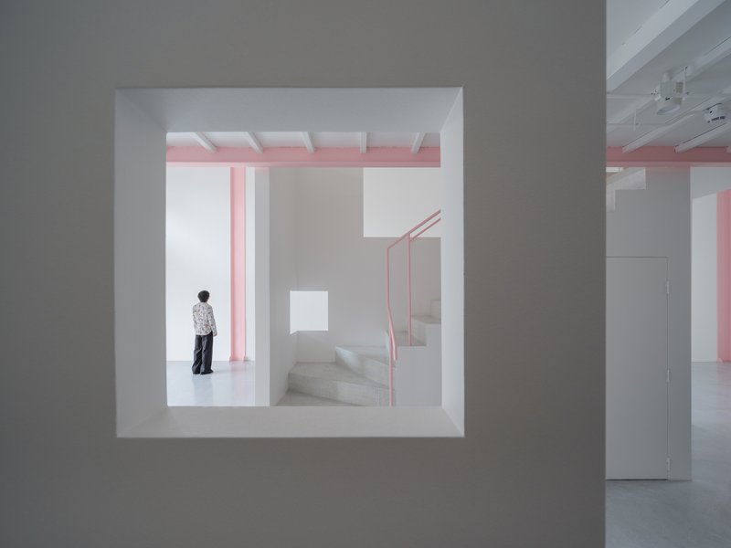
Because each staircase, walkway, and mezzanine is structurally independent, circulation becomes a design element with real presence. The terrazzo stairs with pink tubular handrails are objects in their own right, not just connectors between floors. They occupy the gallery volume as sculptures might, casting shadows and creating sightlines that change as visitors move through them.
A pink steel walkway at the mezzanine level bridges between white volumes, offering elevated views back down into the double-height hall below. The stairwells are generous enough to pause in, and sunlight enters through adjacent windows to make the act of ascending feel deliberate rather than transactional. These moments of vertical movement are where the gallery's spatial ambition is most concentrated: looking up through the pink railings toward the slatted ceiling, you understand the full depth of the inserted system.
Framing the Infrastructure
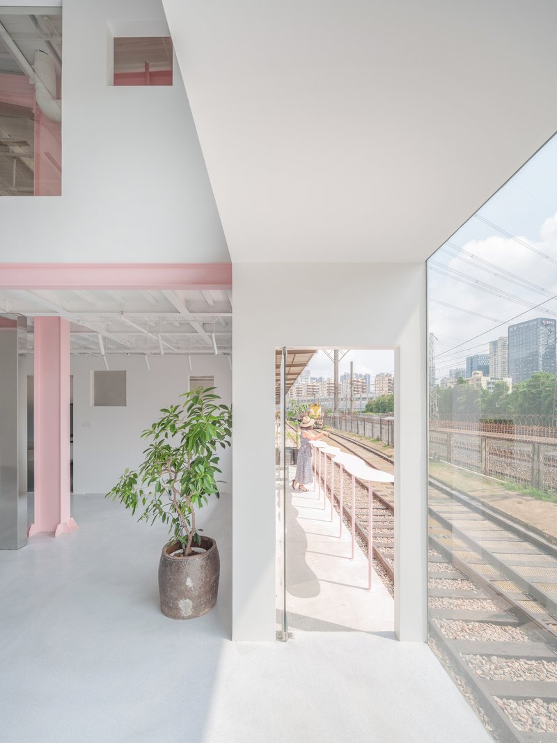
One of the project's smartest moves is the way it treats its industrial context not as a problem but as exhibition content. From an upper-level balcony, visitors look out directly over the railway tracks. A potted tree in the foreground domesticates the view without sentimentalizing it. Through corridor windows, green foliage and pink diagonal beams overlap, collapsing the distance between the controlled gallery interior and the unruly city beyond.
The openings are scaled and positioned so that infrastructure, trains, overhead wires, the road, becomes part of the visual experience of the gallery. Architecture here functions as a reframing device: familiar urban conditions look different when seen through a carefully cut square in a white wall. The building does not isolate art from the city; it argues that the city is already part of the show.
Before the Intervention
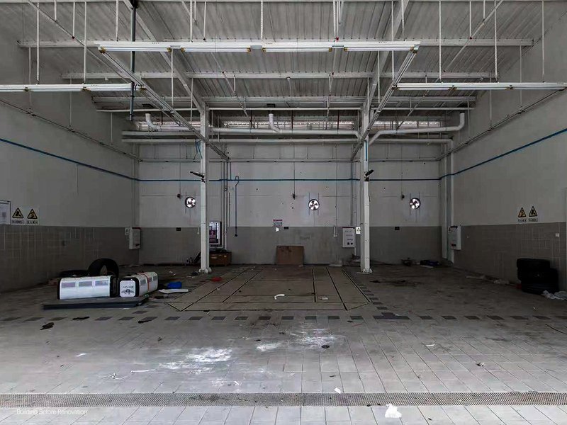
The existing warehouse images are a useful corrective to any romanticized reading of industrial heritage. This was not a picturesque ruin. It was a concrete wall with numbered bays, duct-lined ceilings, and a wet floor. The transformation required not nostalgia but invention. The architects preserved the shell because its structural limitations demanded a creative response, not because the shell itself was beautiful. That distinction matters: the project's value lies in what was made possible by constraint, not in the aesthetic of decay.
Plans and Drawings
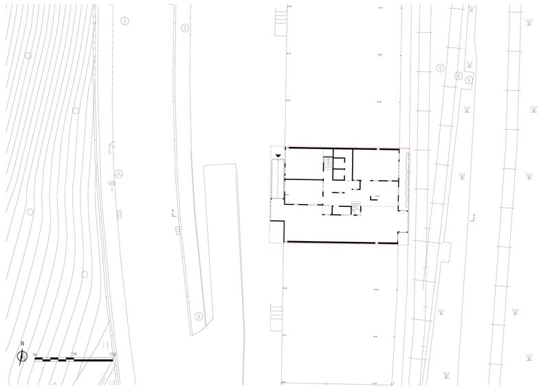
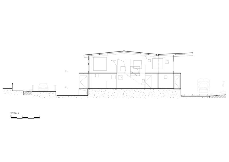
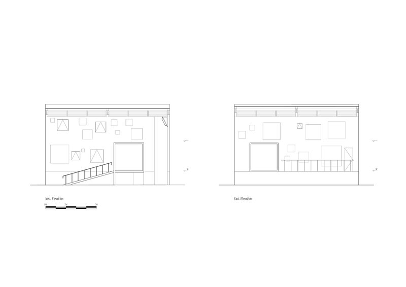
The site plan confirms the linear logic: the building is a long bar pinched between the rail corridor and the street, with access points at strategic intervals. The section drawing reveals the two-story insertion sitting well below the pitched roof, the gap between new walls and old canopy clearly visible. East and west elevation drawings document the window choreography, showing how the varied sizes and positions correspond to interior conditions on both floors.
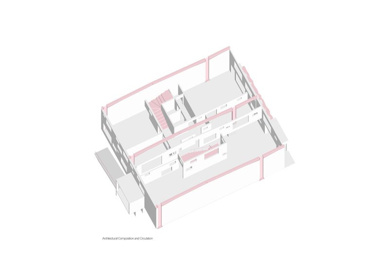
The axonometric is the most revealing drawing. It strips away the warehouse shell to expose the pink structural frame and white partition walls as a freestanding composition. Seen this way, the cluster reads almost like a village of small buildings gathered under a shared umbrella. The independence of each element is unmistakable, and the collective effect, spatial richness from structural autonomy, becomes legible in a single image.
Why This Project Matters
Adaptive reuse projects often celebrate the existing structure as the hero. Apelron Contemporary flips that script. Here the old building is a given, a constraint to work around rather than a feature to celebrate. The real architecture is the new insertion, and its quality comes from the discipline of never touching what was already there. That self-imposed rule generates everything interesting about the project: the layered transparencies, the pink steel coding, the constellation of freestanding rooms.
For designers working with weak existing structures, underfunded heritage buildings, or sites where demolition is politically impossible, the structural cluster offers a genuinely transferable idea. It proves that you can build a spatially ambitious interior without relying on the host building for anything beyond shelter. In a city like Shenzhen, where industrial heritage is being reconsidered at scale, Aether Architects and Archigress have produced a project that is less a restoration than a demonstration: architecture can be generous, precise, and structurally autonomous all at once.
Apelron Contemporary by Aether Architects and Archigress. Lead architect: Huang Zelin. Shenzhen, China. 320 m², completed 2026. Photography by Chao Zhang.
About the Studio
Share Your Own Work on uni.xyz
If projects like this are the kind of work you want to make, uni.xyz is a place to publish your own, find collaborators, and enter design competitions.


Popular Articles
Popular articles from the community
CRACK: Winery Architecture Carved Into the Landscape
CRACK reimagines winery architecture as a buried path through vineyard terrain, linking production, tasting, lodging, landscape and culture.
Kerry Kounnapis Packs 800 Daily Coffees into a 43-Square-Metre Melbourne Laneway Bar
Palace Coffee channels Pellegrini's and European standing bars through oxide-red steel and spotted gum timber in a Ridgway Place sliver.
Reincarnation Weaves a Three-Story Retreat into the Green Landscape of Rural Bangladesh
Ara Manor in Narsingdi dissolves the line between domestic architecture and its lush surroundings through screens, courtyards, and planted rooftops.
The Faith: Modular Architecture for Play, Learning, and Hope in Kutupalong Refugee Camp
A modular playground architecture project in Bangladesh where play, learning, safety, and hope rebuild childhood inside a refugee camp anew.


Similar Reads
You might also enjoy these articles
Freebird Residence by Alexis Dornier: A Tropical Modernist Sanctuary in Bali
Floating living pavilion above pool anchors H-shaped tropical villa, blending Japanese minimalism, sustainable strategies, lush landscape, and sculptural interiors.
127af Flips a Tiny Bagnolet Rowhouse Upside Down with a Handcrafted Roof Extension
A 55-square-meter terraced house on the edge of Paris gains a luminous upper living floor through lightweight timber and steel.
1.61 Design Workshop Wraps a 600-Square-Meter Café in Vietnam in Sculptural Burgundy Drama
Reden Café & Bistro pairs a helical staircase, mosaic floors, and deep red interiors to rethink Vietnamese hospitality space.
The Unbound Brain: A School Shaped by Cognitive Architecture
Cylindrical learning pods radiate like neurons from a central cortex, turning the floor plan into a spatial model of human thought.


Comments (0)
Please login or sign up to add comments
No comments yet. Be the first to comment!