
ALL U RE Turns a 1920s Sofia Building Into Concrete
I/O architects strip a century-old textile shop back to its bones, then dress it in raw concrete for a menswear store that treats retail as architecture.
There is a particular tension that comes from putting expensive clothing inside a space that looks like it was poured yesterday and abandoned a decade ago. ALL U RE, a 220 square meter menswear store in Sofia's historic center, occupies a 1920s building that once sold textiles. I/O architects, led by Viara Jeliazkova and Georgi Katov, have stripped the structure back to its aggregate and rebuilt the interior as a sequence of concrete volumes, circular floor voids, and carefully calibrated artificial light. The result is a retail space that refuses to behave like one.
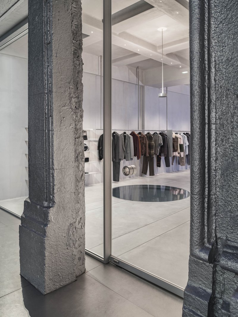
What makes this project worth attention is not the concrete itself, which has become a reliable shorthand for "serious design" in commercial interiors. It is the way the architects have organized the plan around two circular display zones and a split-level section that drops the entrance below street grade, turning the act of entering a shop into a spatial event. The building's century-old bones, its arched openings, stone pilasters, and brick facade, are left visible but not celebrated. They are context, not decoration.
The Storefront as Threshold
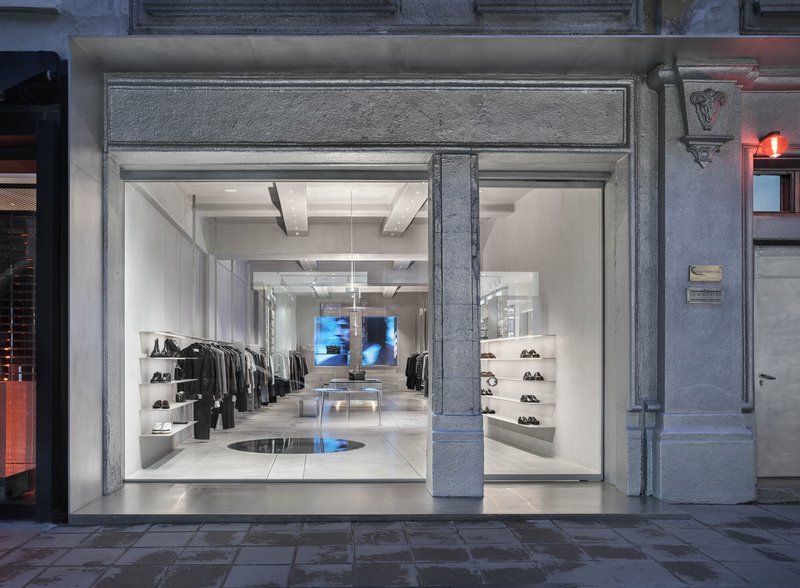

The street presence of ALL U RE works on two registers. At dusk, red neon washes the exposed concrete columns along the exterior, giving the facade an almost cinematic edge. By day, the glass storefront reads differently: weathered stone pilasters frame the view in, while an arched brick opening behind the glass reveals the building's original structure. The contrast between the rawness of the old fabric and the precision of the new glazing is sharp and deliberate.
A figure in pink passing by the arched brick facade becomes, inadvertently, the store's best advertisement. The transparency is total, but the split-level entry means you see down into the space rather than straight through it. That downward glance changes everything about how you read the interior from outside.
Concrete as Wardrobe
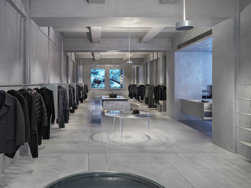
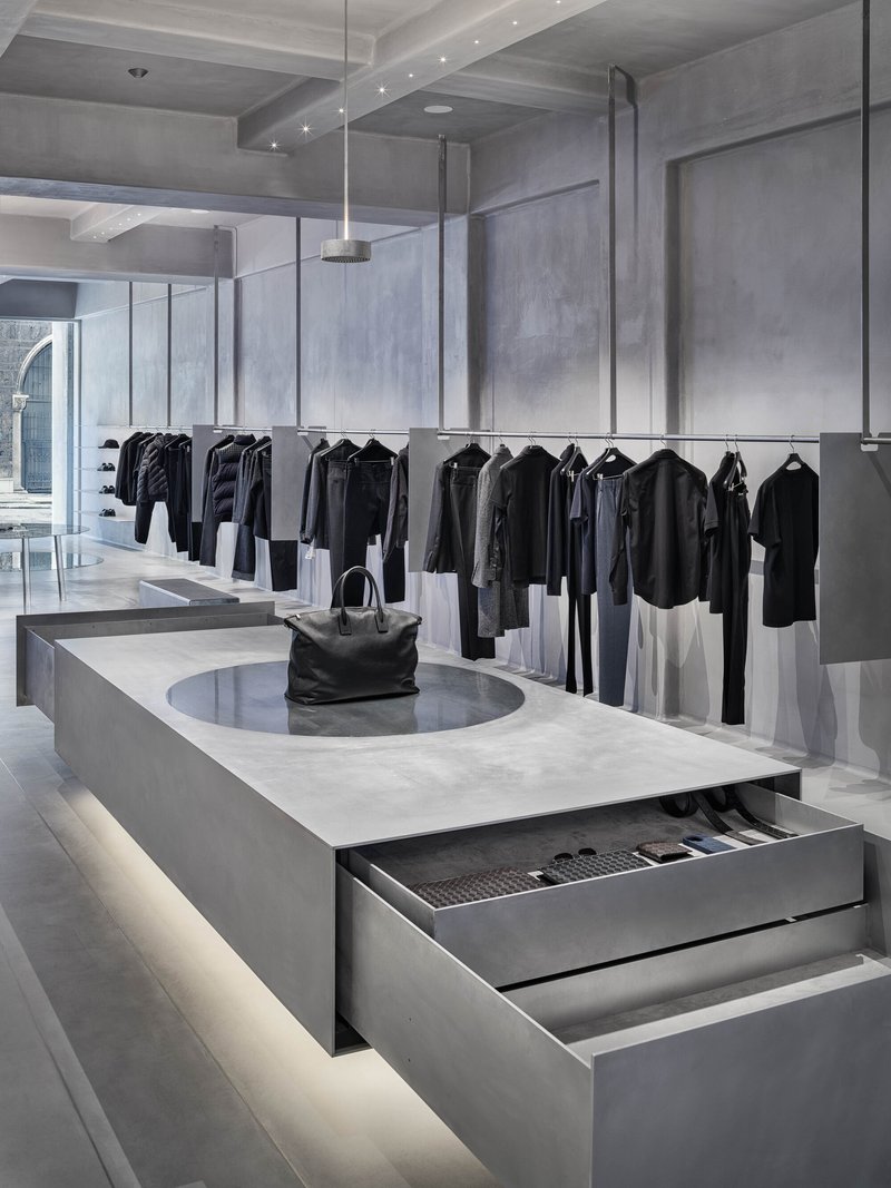
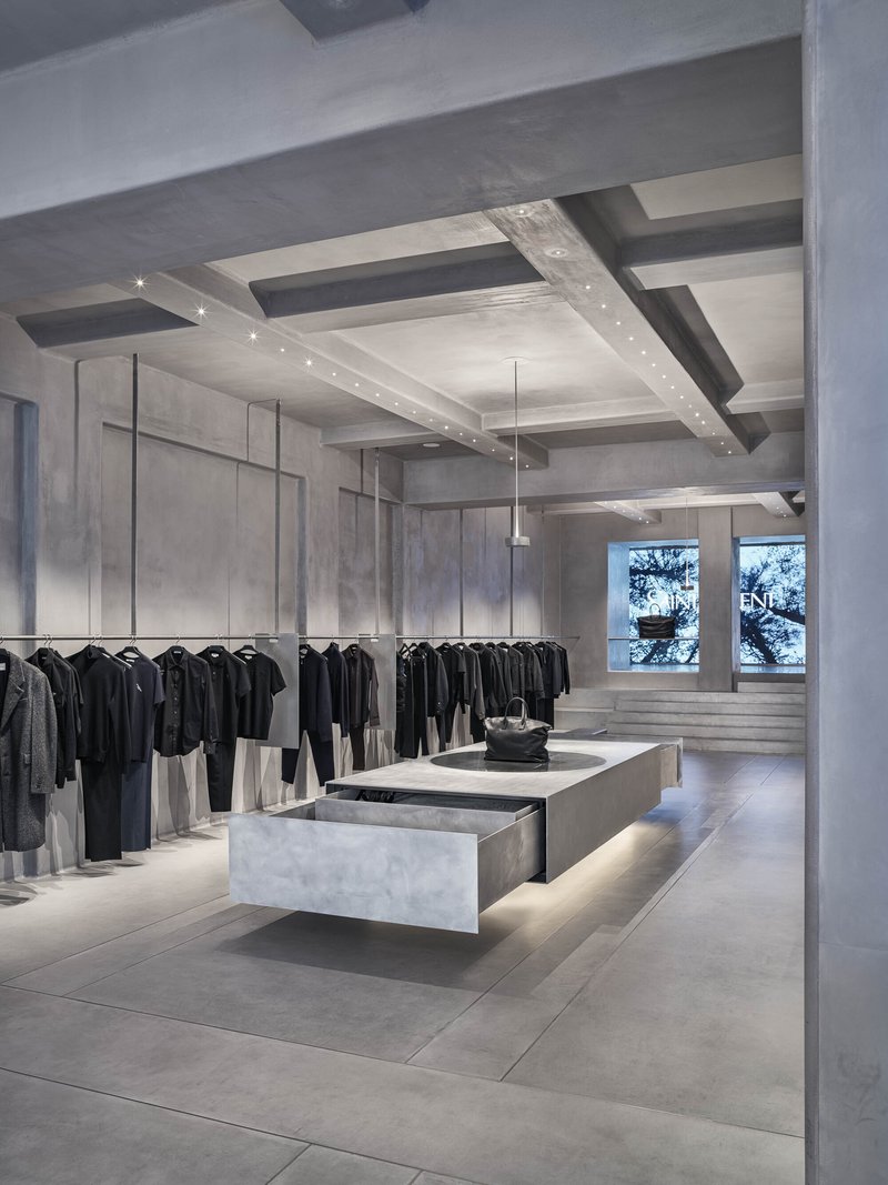
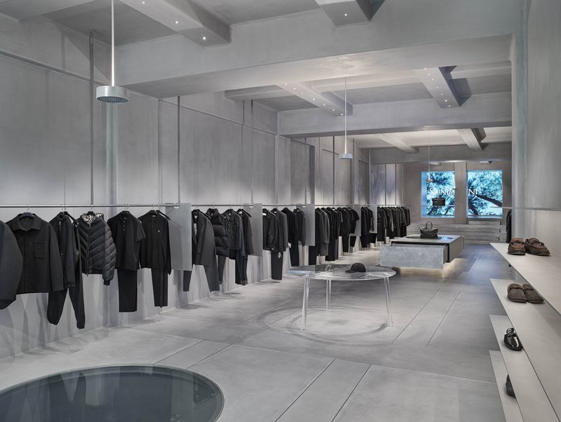
Inside, concrete does everything. Beams are exposed overhead in a coffered pattern, display counters are formed from the same material with open drawers cut directly into solid blocks, and the ceiling alternates between polished surfaces and rough shuttered textures. The coffered ceiling above the retail floor, visible through windows overlooking trees, brings a civic scale to what is essentially a boutique. It feels less like a shop and more like a gallery that happens to sell jackets.
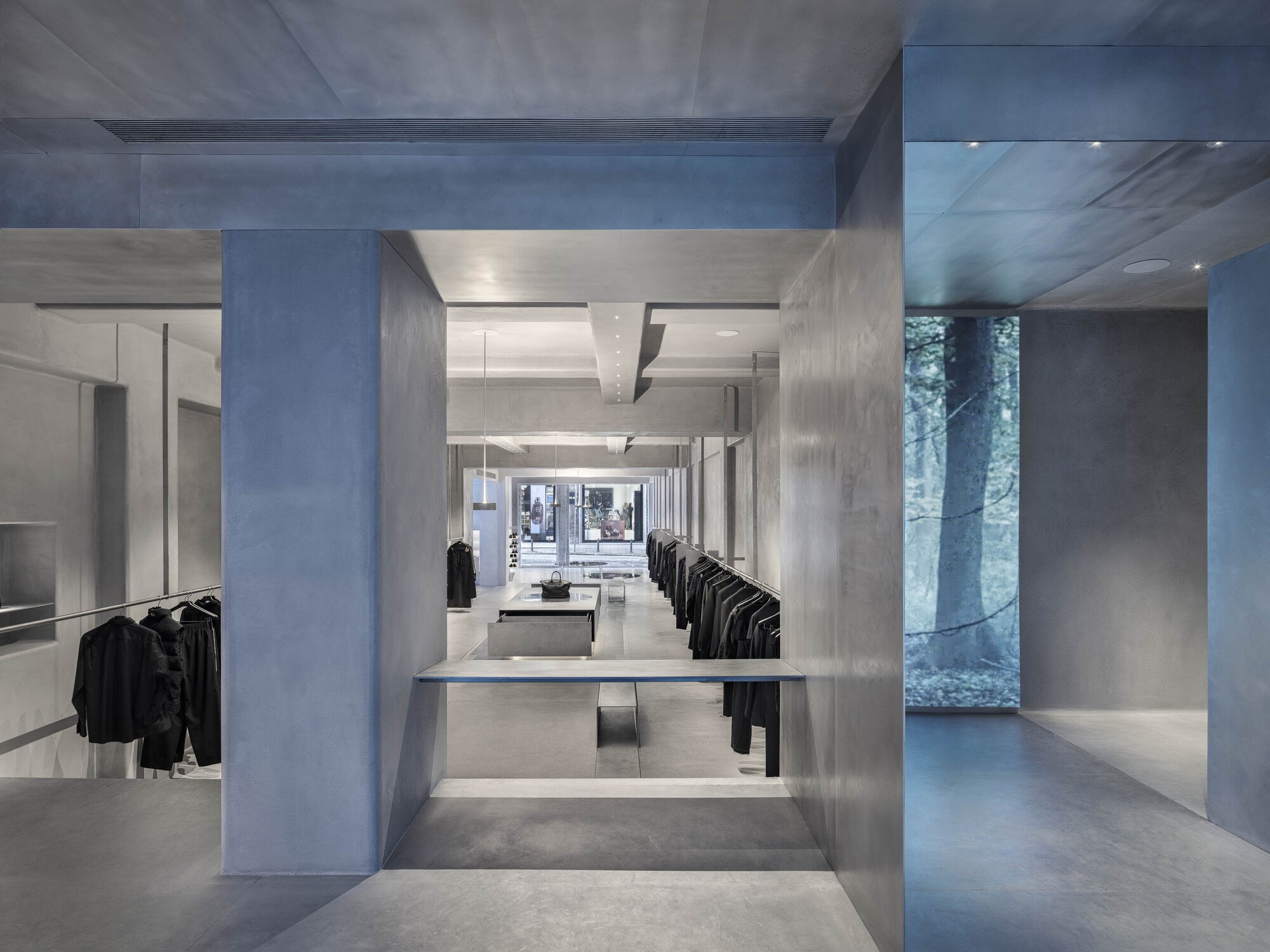
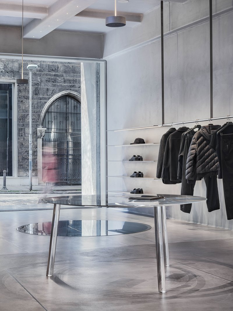
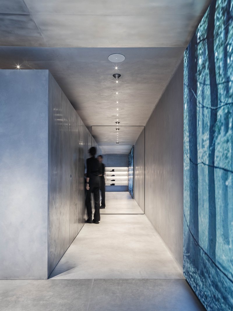
The circular floor insets, visible beneath pendant lighting, are the plan's signature gesture. They create zones of focus without walls, drawing the eye down while the racks of clothing occupy the periphery. The concrete display counter with its open drawer is a detail worth noting: storage is not hidden but integrated into the sculptural logic of the furniture. Nothing is applied. Everything is formed.
The Long View
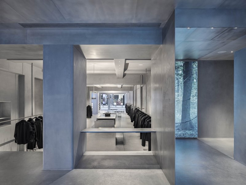
The plan is elongated, and I/O architects lean into that linearity. A concrete portal frames a deep perspective through the store, with recessed display tables pulling you forward and clothing racks arranged on glass dividers that maintain sight lines. The corridor beyond continues the concrete language, its polished ceiling and recessed spotlights compressing the space vertically while a graphic wall panel at the far end provides a visual full stop.
Glass dividers do the heavy lifting here. They separate zones without interrupting the spatial continuity, and they let natural light from the tree-facing windows penetrate deep into the plan. The circular floor openings reappear in this view, reinforcing the idea that the floor itself is a display system, not just a surface to walk on.
Atmosphere and Artifice
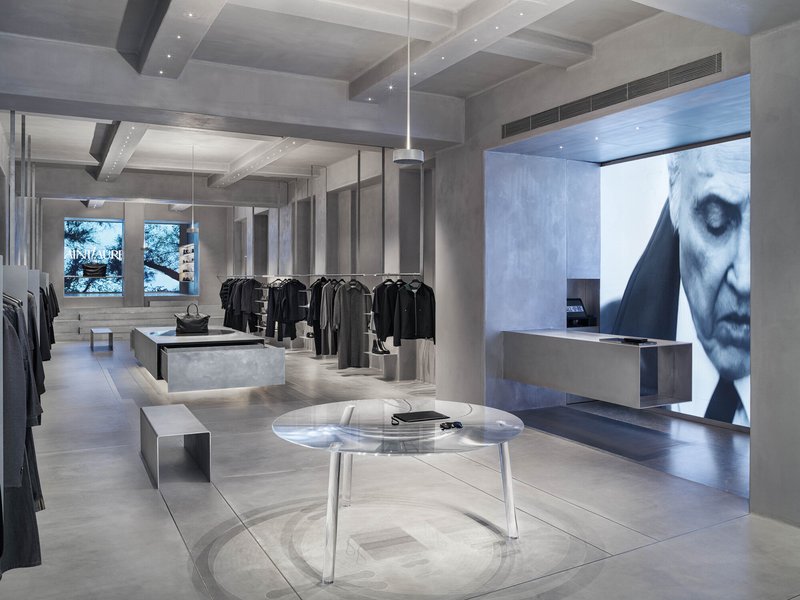
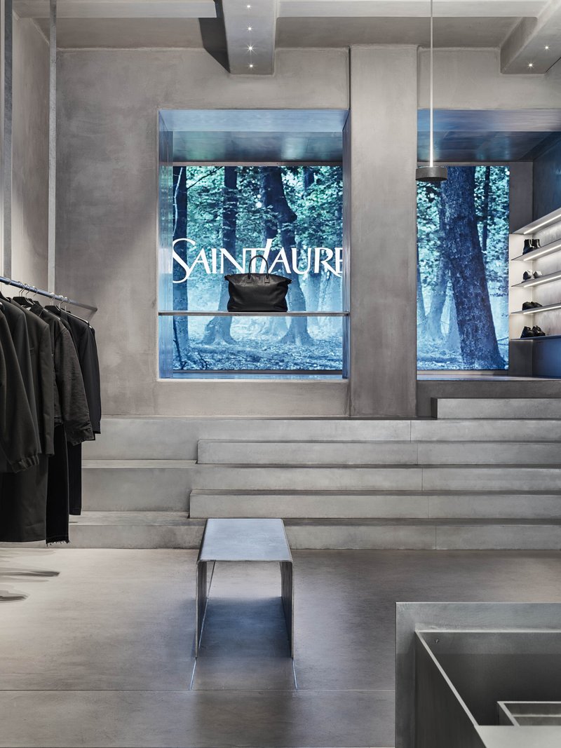
A backlit screen with projected imagery adds the only overtly digital element to the interior. Positioned behind the clothing racks, it turns the rear wall into a mutable surface, somewhere between a window and a billboard. The architects resist making this a focal point; it is one layer among many. A display window at the top of concrete steps offers a forest view through the storefront glass, collapsing the distinction between merchandise and landscape.
The charcoal-painted column beside a glass door threshold is a telling detail. It signals the transition from exterior to interior without fanfare, a moment of material honesty that sets the tone for everything inside. There are no grand gestures at the entrance, just a shift in surface temperature.
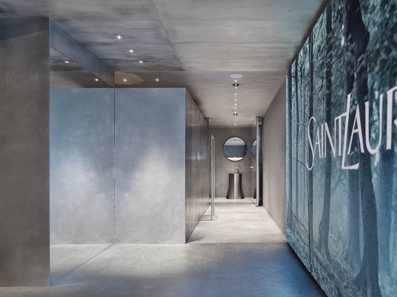
Fitting Rooms and Material Contrasts
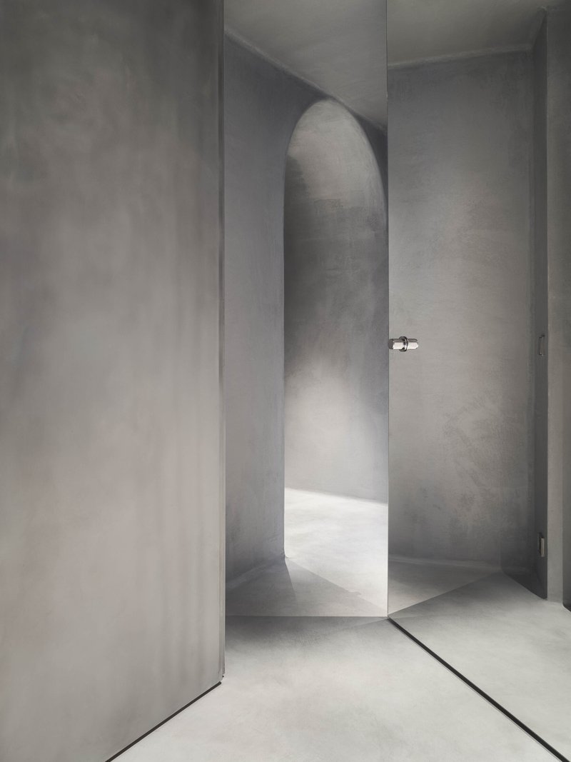
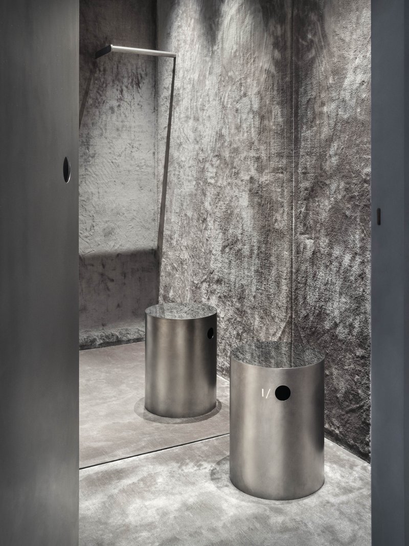
The back of house is where the architects allow themselves a softer register. An arched passageway in smooth plaster, complete with a chrome door handle catching natural light, introduces a gentleness that the main retail floor deliberately avoids. The fitting room entrance deploys textured silver wall panels and two cylindrical steel seating elements, a material palette that reads as industrial but feels surprisingly intimate at close range.
A narrow corridor with polished concrete walls and a figure captured in motion completes the sequence. The suspended ceiling lights here are lower and warmer, pulling the scale down to something personal. It is a smart move: the public space is monumental, and the private space is human. The transition between the two is the real design.
Plans and Drawings
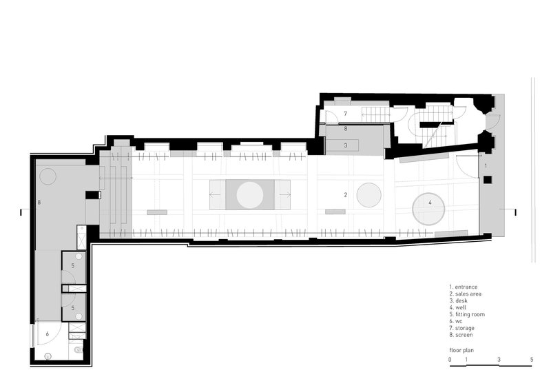
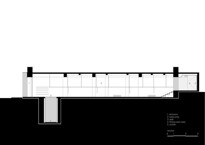
The floor plan confirms what the photographs suggest: an elongated space organized around two circular display zones, with a rear staircase connecting to secondary levels. The section drawing is more revealing, showing a split-level interior with a sunken entrance that drops visitors below street grade and a mezzanine storage volume above. That section cut explains the store's spatial drama. The sense of compression and release you feel moving through the space is not accidental; it is engineered into the topography of the floor itself.
Why This Project Matters
Retail design too often splits into two camps: the white-box gallery approach that treats clothing as art objects, and the maximalist branding exercise that treats architecture as wallpaper. ALL U RE does neither. I/O architects have made a space where the architecture is the brand identity, where the material logic of exposed concrete, circular floor voids, and split-level topography creates an atmosphere that no graphic designer could replicate. The 1920s building is not restored or fetishized; it is absorbed into a new spatial argument.
At 220 square meters, this is a modest footprint for such an ambitious interior. The lesson here is about sectional thinking. By dropping the entry and compressing corridors while opening up the main retail volume with coffered ceilings and deep perspectives, the architects make the space feel three times its size. For a city like Sofia, where historic commercial buildings are frequently gutted and filled with generic interiors, this project sets a standard: respect the bones, but build something new inside them.
ALL U RE Menswear Store by I/O architects (Viara Jeliazkova, Georgi Katov). Sofia, Bulgaria. 220 m². Completed 2025.
About the Studio
Share Your Own Work on uni.xyz
If projects like this are the kind of work you want to make, uni.xyz is a place to publish your own, find collaborators, and enter design competitions.


Popular Articles
Popular articles from the community

GGR Architectes Anchors a New Neighborhood in Frouzins with a Brick and Timber School Complex
A cruciform plan of terracotta brick and exposed wood frames four courtyards for 140 students outside Toulouse, France.
Cro&Co Architecture Builds a 150-Meter Tower on Top of a Seven-Lane Highway in La Défense
Trinity Tower reimagines the office high-rise as a bioclimatic organism threaded with terraces, trees, and public ground in Paris's business district.
The Heart of Milano: Slow Fashion Architecture for a New Circular Culture
The Heart of Milano turns slow fashion architecture into a civic landmark where learning, making, sharing, and circular culture meets daily.
Noue Studio Organizes a Swiss Restaurant Around a Single Concrete Wall
In Granges-Paccot, Switzerland, a 216-square-meter renovation turns raw materials and a central spine into a legible dining experience.


Similar Reads
You might also enjoy these articles
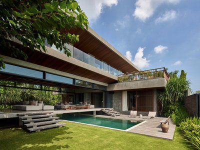
Freebird Residence by Alexis Dornier: A Tropical Modernist Sanctuary in Bali
Floating living pavilion above pool anchors H-shaped tropical villa, blending Japanese minimalism, sustainable strategies, lush landscape, and sculptural interiors.
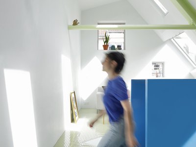
127af Flips a Tiny Bagnolet Rowhouse Upside Down with a Handcrafted Roof Extension
A 55-square-meter terraced house on the edge of Paris gains a luminous upper living floor through lightweight timber and steel.
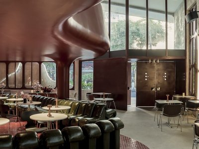
1.61 Design Workshop Wraps a 600-Square-Meter Café in Vietnam in Sculptural Burgundy Drama
Reden Café & Bistro pairs a helical staircase, mosaic floors, and deep red interiors to rethink Vietnamese hospitality space.
The Unbound Brain: A School Shaped by Cognitive Architecture
Cylindrical learning pods radiate like neurons from a central cortex, turning the floor plan into a spatial model of human thought.
Explore Commercial Buildings Competitions
Discover active competitions in this discipline


The Global Benchmark for Architecture Dissertation Awards


Challenge to design luxury tourism on rails


VR headsets Storefront design competition

Designing a staircase for a client
Comments (0)
Please login or sign up to add comments
No comments yet. Be the first to comment!