
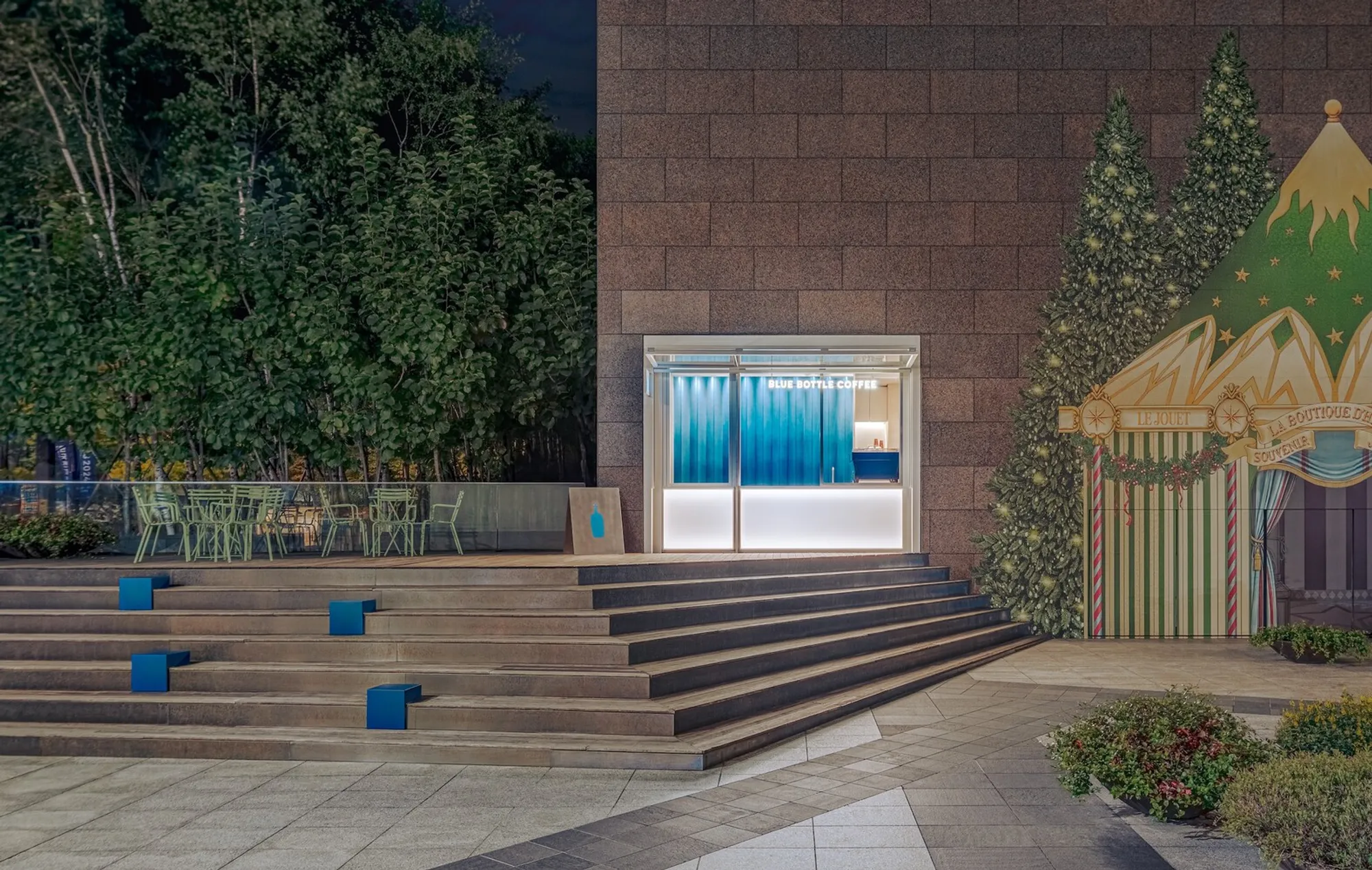
one-aftr Turns a 17-Square-Meter Seoul Kiosk into a Glowing Urban Beacon for Blue Bottle
A compact café in Seoul's Samseong district channels the spirit of Blue Bottle's San Francisco origins through a folding glass facade and blue gradient wal


Seventeen square meters is barely enough room for a parking space, let alone a café that needs to embody one of specialty coffee's most recognizable brands. Yet one-aftr has managed exactly that with Blue Bottle's Samseong location in Seoul, completed in 2024. Sited where the brand once operated its first Korean pop-up, the kiosk condenses counter service, brand identity, and genuine street presence into a glass box no larger than a studio apartment's living room. The result is less a café and more a piece of illuminated urban furniture, one that shifts character completely between day and night.
What makes the project worth studying is the precision with which a single architectural move, a folding shutter facade, solves nearly every problem the brief posed. Open, it creates a canopy and signals activity. Closed, it turns the kiosk into a softly glowing lantern. The lesson here is not about minimalism for its own sake but about economy of means: how one mechanism, one material gradient, and one well-considered deck can generate a public experience far larger than the floor plan would suggest.
The Folding Facade
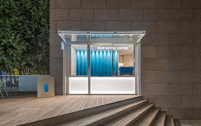
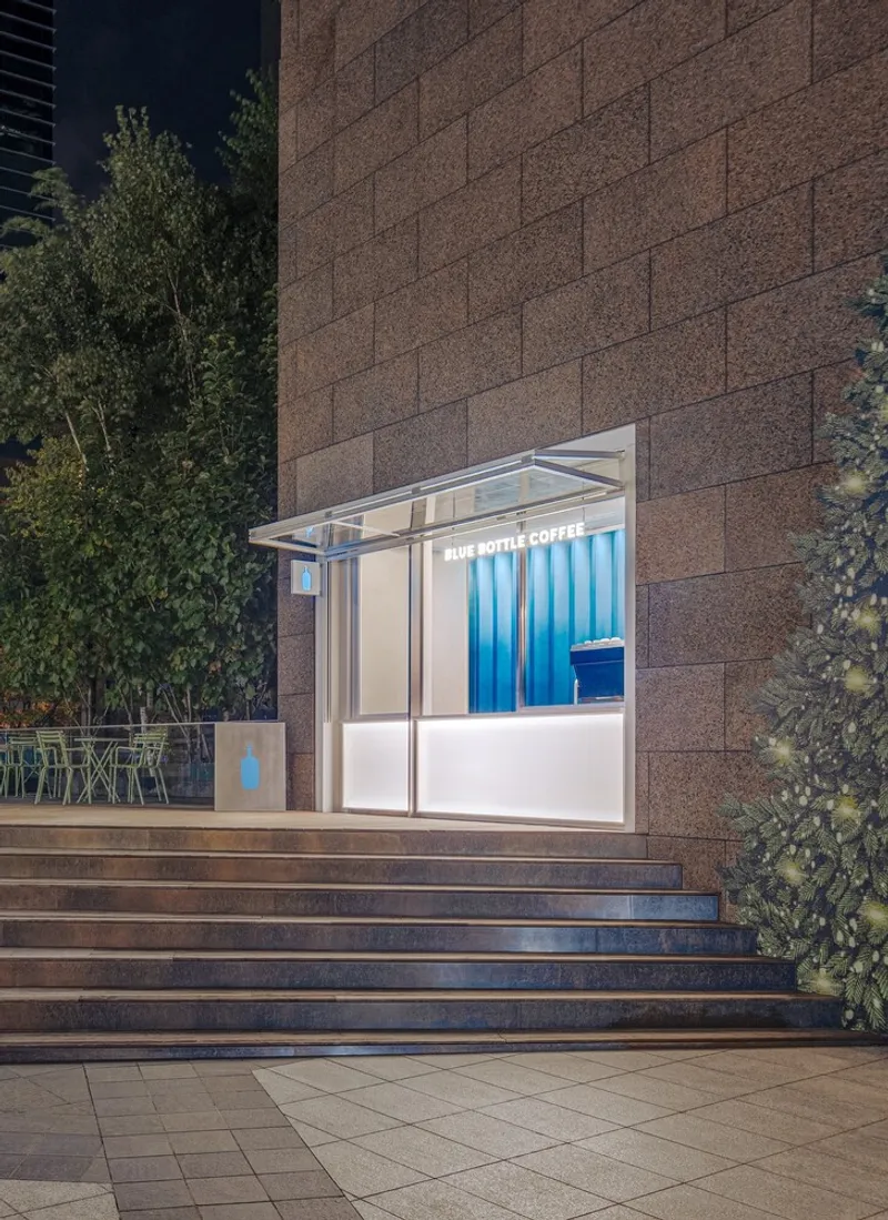
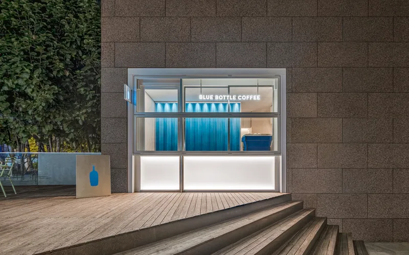
The shutter is the building. When the aluminum-framed panels fold upward during service hours, the entire front face of the kiosk dissolves, turning the interior into a walk-up counter open to the sidewalk. The canopy formed by the raised panels provides just enough shelter to create a threshold zone, somewhere between inside and outside, where customers can linger without blocking foot traffic. Against the existing brown masonry wall behind, the glass-and-metal box reads as a precise insertion rather than an addition.
When closed, the translucent lower panels glow from internal lighting, while the upper glazing keeps the interior partially visible. The café never goes dark; it simply shifts register, from active counter to luminous object. It is a genuinely smart dual-state facade, and one-aftr deserves credit for not overcomplicating it with additional kinetic elements or decorative layers.
Blue Gradient as Brand Architecture
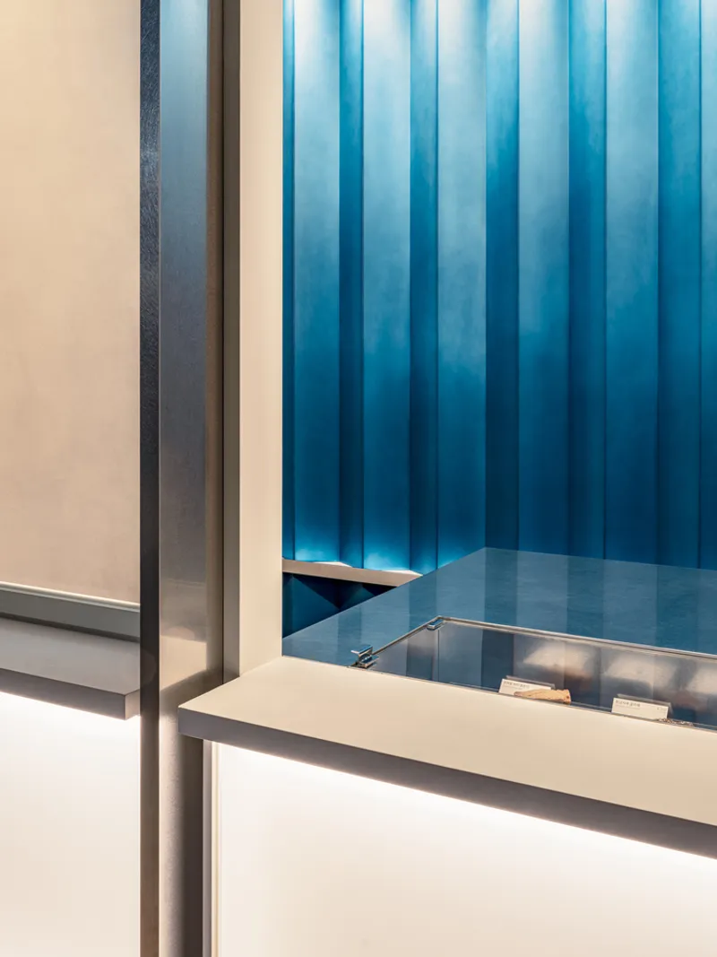
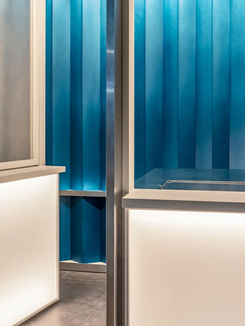
Inside, the dominant gesture is a blue gradient wall made from vertical panels, likely acrylic or metal, that transitions from deep blue at the base to lighter tones above. It is the only moment of saturated color in an otherwise neutral palette of white counters and slim steel framing. The gradient does double duty: it anchors the service bar as a visual focal point, and it translates Blue Bottle's brand identity into an architectural material rather than a graphic appliqué. You recognize the brand without needing to see a logo.
The white counter that runs along the base of this wall is deliberately understated, thin enough to feel like a shelf rather than a barrier. Paired with the slender metal framing visible throughout the interior, the effect is one of deliberate lightness. Nothing competes with the blue wall, and nothing needs to.
Canopy and Frame Details
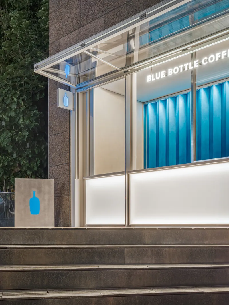
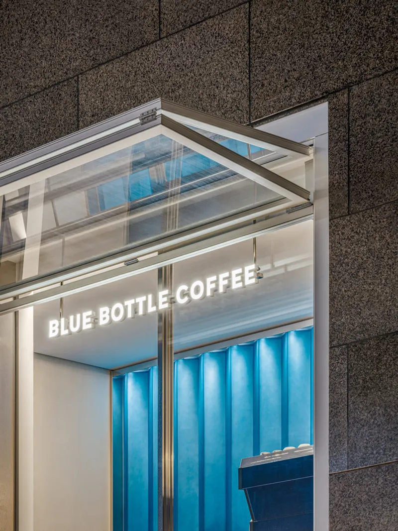
Close-up, the kiosk reveals careful detailing in its aluminum framing and glazed canopy. The joints are clean, the profiles are slender, and the signage is integrated into the structure rather than bolted on as an afterthought. The illuminated base that runs beneath the counter line adds a floating quality to the whole assembly, lifting the box off the ground plane just enough to suggest impermanence. For a kiosk that occupies a historically significant pop-up site, that sense of lightness is thematically appropriate: the architecture acknowledges its own temporary lineage.
The Stepped Timber Deck
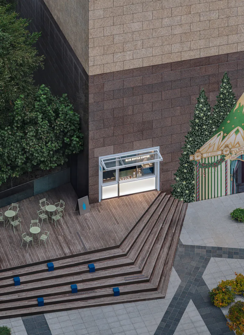
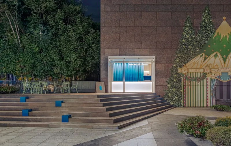
If the folding facade is the primary architectural move, the timber deck is the secondary one, and arguably the more generous. Stepping down from the kiosk in broad terraces punctuated by blue cube accents, the deck creates an informal amphitheater of sorts, a place to sit, gather, or simply pass through. At night, the combination of the glowing kiosk and the warm timber creates a genuinely inviting public zone in a district otherwise dominated by corporate lobbies and retail frontages.
The blue cubes scattered across the steps serve as seating, wayfinding markers, and brand touchpoints simultaneously. They are a small detail, but they extend the interior's blue identity outward into the landscape, stitching the kiosk to its surroundings rather than letting it sit as an isolated object.
Night Presence
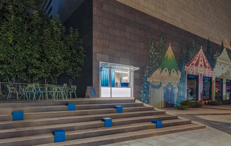
The project's strongest images are its evening shots, and that is not accidental. one-aftr clearly designed for the nocturnal condition as much as the daytime one. Flanked by planted trees and decorative tent structures that hint at the site's event-oriented programming, the kiosk becomes a lantern set within a landscaped clearing. Warm light washes the timber deck while the blue interior glows through the glass, creating a color temperature contrast that reads clearly from a distance.
For a brand that trades on calm and craft, this kind of quiet luminosity is far more effective than a backlit sign. The architecture does the marketing.
Plans and Drawings
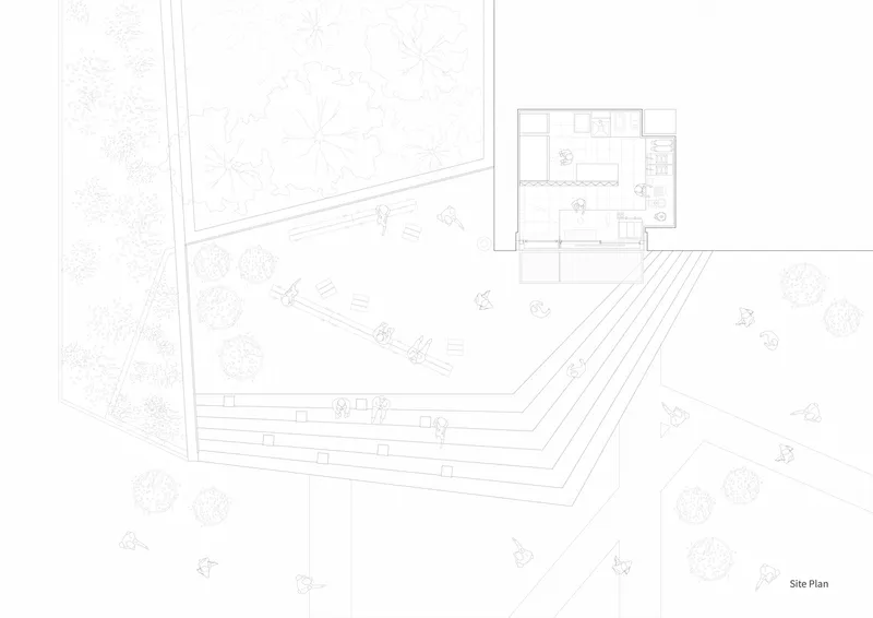
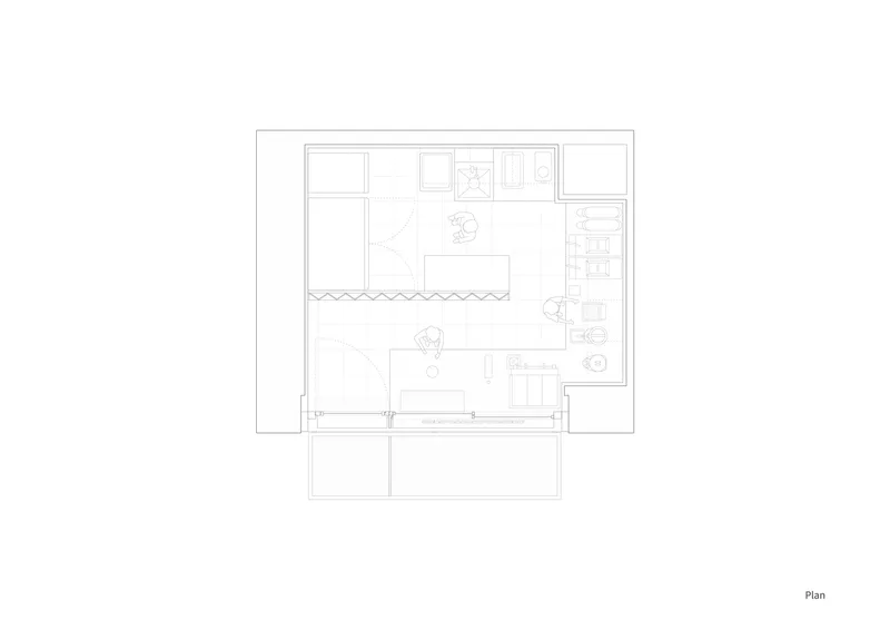
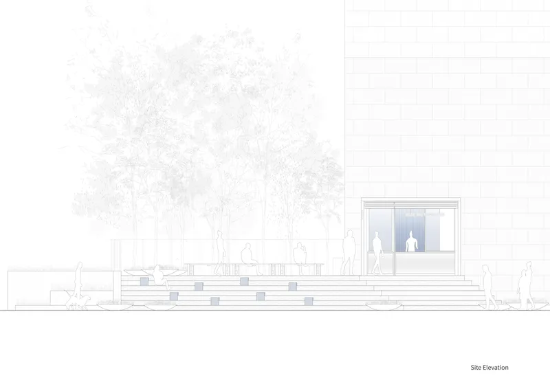
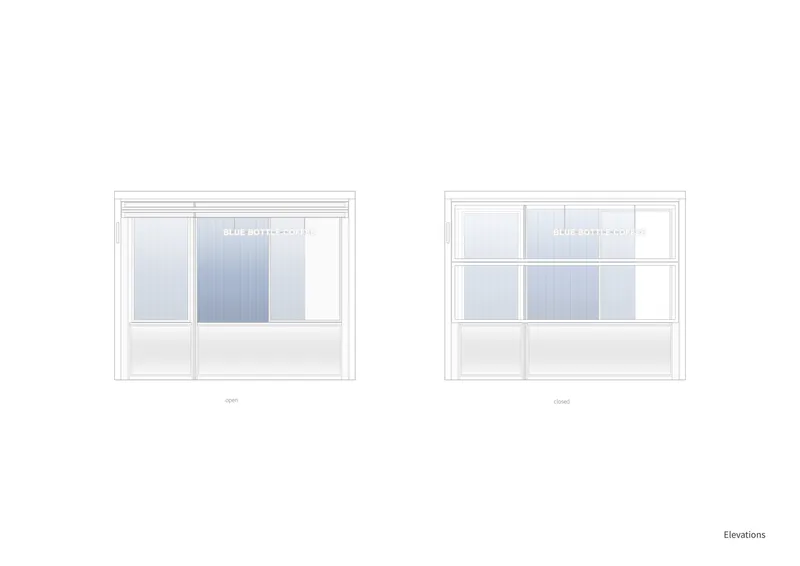
The site plan and floor plan confirm the extreme compactness of the operation: a single service counter occupies most of the interior, with the remaining area devoted to equipment and a narrow circulation zone. The site elevation drawing shows how the stepped plaza mediates between the kiosk and the surrounding grade, with human figures providing a useful sense of scale. The elevation studies of the two window configurations, open and closed, document the folding shutter's transformation clearly. What the drawings make most apparent is how much of the project's spatial generosity comes from the landscape, not the building itself. The kiosk's footprint is almost incidental; the terraced deck and surrounding planting do the heavy lifting in terms of public space.
Why This Project Matters
The Blue Bottle Samseong Café is a case study in doing more with less, not in the aspirational Instagram sense but in the genuinely architectural sense of extracting maximum spatial and experiential value from a minimal footprint. one-aftr understood that a 17-square-meter box cannot create atmosphere on its own, so they designed everything around it, the deck, the lighting, the shutter mechanism, to amplify its presence. The result is a project that punches well above its size class.
More broadly, the project offers a useful model for branded micro-architecture in dense Asian cities. Rather than defaulting to signage and surface decoration, one-aftr embedded the brand into spatial decisions: the gradient wall, the blue cubes, the luminous enclosure. It is branding through architecture rather than branding applied to architecture, and the distinction matters. If specialty coffee chains are going to keep multiplying across Seoul's commercial districts, this is the standard they should be held to.
Blue Bottle Samseong Café, designed by one-aftr, Seoul, South Korea. 17 m². Completed 2024. Photography by Jang Mi.
About the Studio
Share Your Own Work on uni.xyz
If projects like this are the kind of work you want to make, uni.xyz is a place to publish your own, find collaborators, and enter design competitions.



Popular Articles
Popular articles from the community

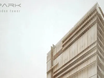
EW PARK: Sustainable Architecture Reimagines the Future of Urban Parking
EW PARK reimagines city parking as a modular wooden tower combining automation, solar energy, electric mobility, and adaptable urban design.

Co-Life: Senior Housing Design That Reconnects Older Adults With the City
Co-Life reimagines senior housing design through healing gardens, shared streets, workshops, and a sustainable community across generations.
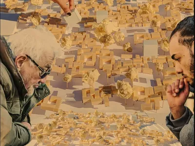
Riyadh For All: Intergenerational Urban Design for Active Aging in Rabat
Riyadh For All reimagines urban design in Rabat with intergenerational co-living, adaptive courtyards, and Moroccan cultural exchange today.
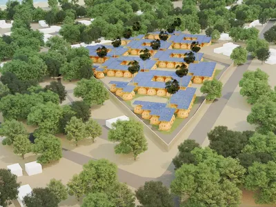
The Earth Pod: 3D Printed Homes for Resilient Refugee Communities
The Earth Pod reimagines refugee housing through 3D printed homes made from clay, combining resilience, self-sufficiency, and rapid shelter.
Similar Reads
You might also enjoy these articles

Hodi-Mandai Geram
Project Function: Preservation and revitalization of the Intangible heritage and socio-spatial identity of the Hodi by Housing, Cultural Memory Center, Sacred Grove, landscape, local tourism economy

Olio Towers: A Mid-Rise for Performers That Fuses Housing, Rehearsal, and Stage
Located blocks from Houston's Theater District, this modular tower stacks living units around a central performance atrium.
Oasis: Modular Green Housing Carved into Dhaka's Urban Fabric
A shortlisted Plugin Housing entry reclaims unauthorized settlements in Dhaka with stepped concrete volumes, green roofs, and ventilation-driven design.

Black Hole: A Floating Megastructure for the Post-Physical Era
Emiliano Mazzarotto envisions a spherical, self-scaling arena where e-sports, digital hotels, and holographic stadiums replace traditional public space.
Explore Architecture Competitions
Discover active competitions in this discipline



Challenge to reimagine the Iron Throne


Photograph architecture without architects

Illustrate the lost glory of Angkor Wat - Render Challenge

Design challenge to reuse E-waste
Comments (0)
Please login or sign up to add comments
No comments yet. Be the first to comment!