

B&O Store: Framed Listening Rooms Turn a Narrow Shop into an Immersive Audio Showroom
A shortlisted Interiors '20 entry that slices a long, narrow store into framed listening rooms, letting sound, not shelving, set the pace of retail.


You cannot judge a speaker by looking at it. That simple truth sits at the centre of the B&O Store, a compact retail interior that refuses to behave like a sales floor. Instead of lining products along walls and waiting for customers to point, the project builds a sequence of places to stop, test and listen, so that the space itself does the work of explaining why the product matters.
Designed by Justyna Dmytryk, the project was shortlisted in Interiors '20 on uni.xyz. The brief she sets herself is tight: a long, narrow shop with a limited footprint, and a brand known for precision, sound quality and restrained product design. Her answer treats the store as showroom, gallery and point of sale at once, organised through zoning, a controlled material palette and a deliberate path from the street to the counter.
A Long, Narrow Plan Read as a Sequence of Pauses
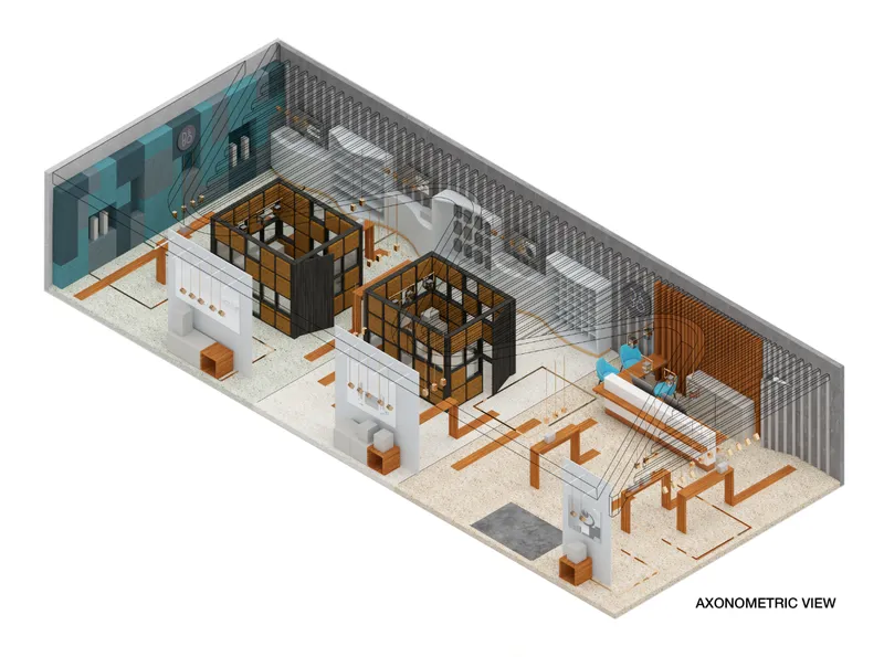
The axonometric makes the strategy legible at a glance. The shell is long and slim, the kind of plan that usually ends up as a corridor of shelving. Dmytryk resists that by placing two framed glass cubes within the length of the room, with white display walls along the edges and a reception counter with blue chairs further in. Product display, consultation points, acoustic demonstration spaces and service each get their own territory without walls chopping the room apart.
What stands out is how the layout encourages movement without forcing it. A visitor can enter, pause at a display, step into a more focused demonstration zone and only then reach the counter. Linear circulation keeps the narrow space from feeling congested, while the cubes act as anchors that break the length into readable episodes. It is a sensible move for a small store: rhythm replaces square metres.
Blue Tile Walls as a Backdrop for Technology

The interior elevation shows a blue tiled wall lit by pendant lights, with framed displays and a timber table set in front of it. The palette across the project combines grey concrete textures, warm timber, blue panels, white surfaces and black linear framing, and this drawing shows how those parts work together. The blue gives depth and a contemporary lifestyle tone, the timber softens the technical character of the products, and the framed displays keep each object isolated enough to be studied.
This is brand communication through proportion and contrast rather than decoration. Nothing on the wall competes with the products. The standing figure in the drawing is a useful reminder of scale: displays sit at eye level, the table invites people closer, and the pendants pull attention down to the surface where the product rests.
A Shopfront That Starts the Demonstration on the Pavement

The street elevation is a glazed shopfront with an entry door, display windows and a timber pedestal visible behind the glass. One figure stands at the pedestal while another looks on. The drawing suggests the experience begins before anyone crosses the threshold: the glazing turns the first display zone into a stage that passers-by can read from outside.
For a compact store this transparency matters. The facade is the only real advertising surface it has, and Dmytryk uses it to show the store's main idea, a single product given space and a person engaging with it, rather than a crowded window of stock.
Patchwork Tiles, Niches and the Brand Mark

A second interior elevation adds variation: a patchwork blue tile wall carrying a round logo, recessed display niches and more pendant lights. The patchwork breaks up what could have been a flat field of colour, giving the wall a crafted texture that recalls the warmth the timber brings elsewhere. Recessing the niches into the wall keeps products flush with the architecture, so the wall reads as a single composed surface instead of a rack.
The logo is the one overt brand gesture, and it is placed with restraint. The rest of the identity is carried by the materials, which suits a brand associated with minimalism. The wall works as a backdrop, a sign and a display at once.
Glass Cubes as Rooms for Listening

The floor plan confirms the zoning: two glass cube rooms set within the store, timber display benches, a reception counter and marked elevation directions linking plan to drawings. The cubes are the project's most important idea. Audio products need more than visual inspection; they need acoustic demonstration, personal attention and a setting where a listener can concentrate. Semi-enclosed rooms provide that intimacy without cutting the visitor off from the rest of the shop.
The glass keeps sightlines open, so the store still reads as one space and staff can see the whole floor from the counter. The timber benches between the cubes give the interstitial areas a purpose, holding products for casual browsing before a customer commits to a focused session inside a room.
Why This Project Matters
Retail interiors increasingly have to justify why a customer should visit at all when the same product can be bought online. The B&O Store answers with a clear argument: the shop is valuable because it offers something a screen cannot, namely the chance to hear the product in a calm, well-proportioned setting. Every planning decision, from the glazed facade to the framed listening rooms, follows from that premise.
The project also shows how much a constrained footprint can carry when the zoning is disciplined. Dmytryk does not try to make the narrow plan feel bigger; she makes it feel sequenced, with each zone given a distinct role and the palette of concrete, timber, blue and white holding it together. For designers working on small commercial spaces, it is a useful model of letting the experience of the product shape the room.
View the Full Project
About the Designers
Designer: Justyna Dmytryk
Enter a Design Competition on uni.xyz
uni.xyz runs architecture and design competitions year-round that reward proposals with spatial conviction and real site intelligence.
Project credits: B&O Store by Justyna Dmytryk Interiors '20 (uni.xyz).


Popular Articles
Popular articles from the community


Singing Woman: An Opera House That Performs Before the Curtain Rises
Ovidiu Cristian Pavel's conceptual opera house translates Estonia's choral identity into a sculpted waterfront landmark facing the Baltic Sea.

Manzana Morphosis: Stretching Barcelona's Grid into a Living Landscape for 2050
A radical reworking of the Eixample manzana turns density into a tool for generous public space, vertical ecology, and environmental performance.
Tsunami Convergenics: Turning Catastrophic Ocean Forces into Underwater Housing Infrastructure
A speculative underwater settlement off the coast of Onagawa, Japan, treats tsunamis and typhoons as energy sources rather than threats.

Opera on the Sea: Driftwood Logic Shapes a Timber Opera House on Estonia's Coast
Trevor Orgill's opera house translates the entangled drift of floating timber into a civic building where wood, water, and music converge.

Similar Reads
You might also enjoy these articles

Healing Façade: A Modular Chapel System That Restores Ethiopia's Sacred Forests
Winner of the Eco-Chapel competition, this circular timber façade collects water from air to rebuild soil and reforest degraded Ethiopian landscapes.
Kaffeebühnen: Where Coffee Shop Architecture Becomes a Civic Stage in Vienna
A linear sequence of timber boxes, transparent shells, and open yards turns the Viennese café tradition into a public performance space.
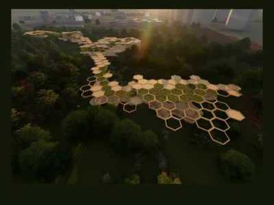
Eco Chapel: A Modular Forest Pavilion That Grows Like the Landscape It Protects
Hexagonal timber modules weave through existing trees, turning a chapel into a living system for prayer, education, and reforestation.


Urban Forest: A Vertical Ecosystem for 5,000 Workers in Singapore's Changi Business Park
Radially stacked pods and layered green decks turn a 7-acre plot into 47 acres of ecological workspace projected for 2040.

Explore Architecture Competitions
Discover active competitions in this discipline

Challenge to reimagine the Iron Throne

Photograph architecture without architects

Illustrate the lost glory of Angkor Wat - Render Challenge

Design challenge to reuse E-waste
Comments (0)
Please login or sign up to add comments
No comments yet. Be the first to comment!