
FREYA Architects Strips a Belgrade Storefront Back to Raw Concrete for a Youth-Driven Eatery
TT Eatery occupies 60 square meters in Belgrade's historic Dorćol neighborhood, pairing exposed structure with bold color to fuel a fast food concept.


Most small restaurant fitouts try to conceal the bones of the buildings they inhabit. FREYA Architects, led by chief architect Kristina Koivistoinen-Khatlamadzhiyan, took the opposite path for TT Eatery in Belgrade's Stari Grad and Dorćol neighborhoods. They gutted a 60-square-meter ground floor unit in a residential building, stripped it to its exposed concrete ceiling and rough plaster, and then decided not to fix most of what they found. The imperfections became the interior.
What makes TT Eatery genuinely interesting is the alignment between its design logic and its business logic. The client wanted junk food and fast food pitched at teenagers from nearby schools and colleges. FREYA responded with a concept rooted in what they call "democracy and accessibility," which in material terms translates to leaving surfaces deliberately unfinished and deploying two bold, complementary colors, yellow and blue, as a kind of graphic shorthand for youth and freshness. The result is a space that feels thrown together on purpose, an interior that treats rawness as a legitimate finish rather than a sign of an incomplete budget.
Exposing the Skeleton
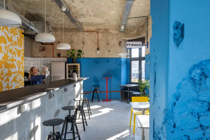

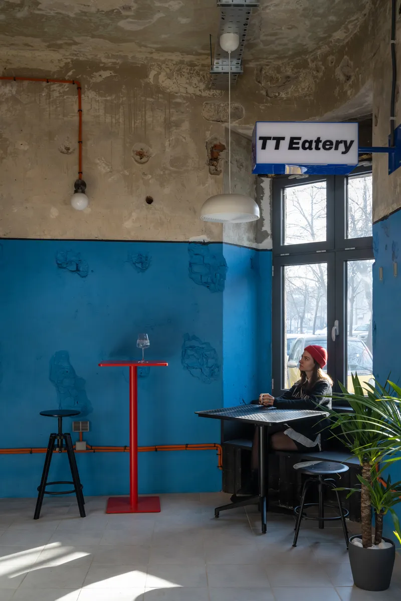
The ceiling is the most assertive surface in the room. Concrete slabs, exposed ductwork, and conduit run overhead without any attempt at concealment. In places, old plaster clings to the slab in patches, creating a distressed texture that would cost a fortune to fabricate and here was simply revealed. Pendant lights hang from long drops, drawing the eye down from the rough overhead plane to the tables below.
There is a clear hierarchy at work: the ceiling is chaotic and industrial, the walls are transitional, and the floor plane, covered in grey and cream tiles, is calm. That gradient keeps the space from feeling oppressive despite its small footprint and heavy materiality.
Yellow and Blue as a System
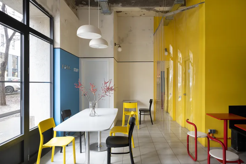
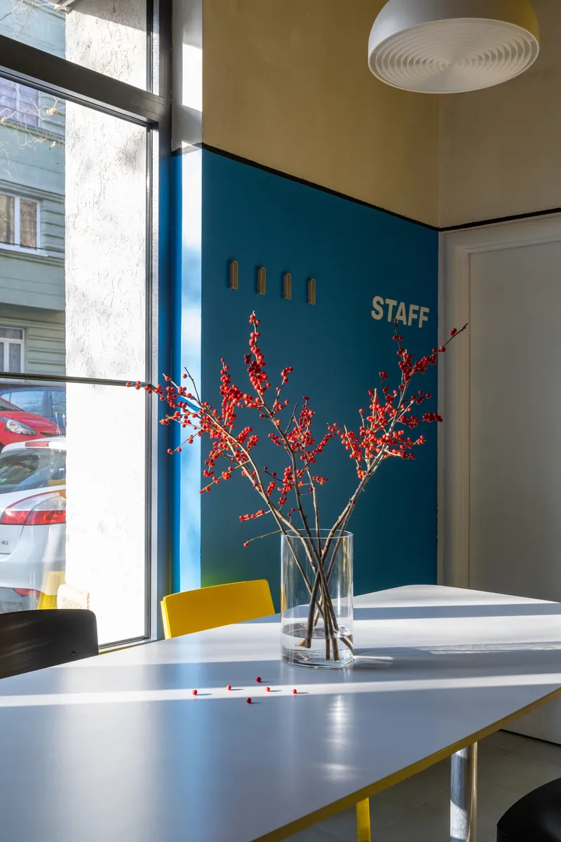
The color strategy is simple but disciplined. Lower wall sections are painted in alternating bands of yellow and blue, creating a wainscoting effect that wraps the room. Blue dominates the service areas, particularly the wall behind the counter where staff instructions are printed directly on the surface. Yellow takes over in the dining zones, appearing on chairs, curtain panels, and the glossy glass partitions that divide the space.
The two colors never mix into green. They remain distinct, operating as complementary signals: blue for function, yellow for energy. It is a palette that reads immediately and requires no explanation, which is exactly the point for a space designed to be understood in the time it takes to order a burger.
The Yellow Partition
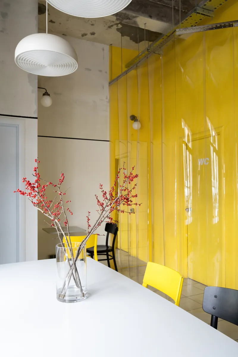
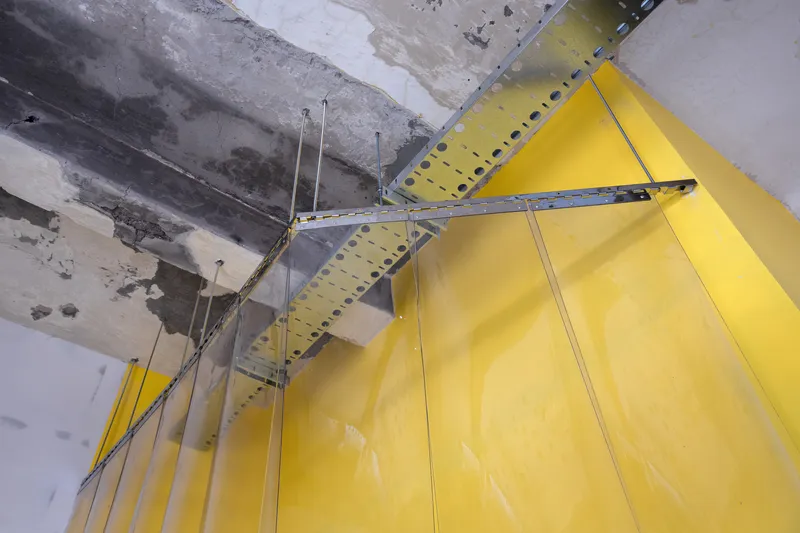

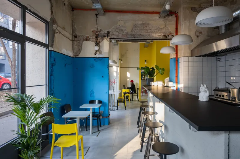
The most distinctive architectural element is a curved yellow glass partition wall that divides the dining area. Suspended from the concrete ceiling with visible metal brackets and rods, it hovers above the floor and catches light from the street-facing windows. The translucent surface creates a warm amber glow on the tables nearby, softening the otherwise industrial atmosphere.
This partition does real spatial work. In a 60-square-meter room, you cannot build full-height walls without destroying the sense of openness, but you also cannot leave the space as a single undifferentiated box. The suspended curtain-wall achieves both separation and continuity, giving diners a sense of enclosure without cutting off sightlines to the counter or the entrance.
The Service Counter
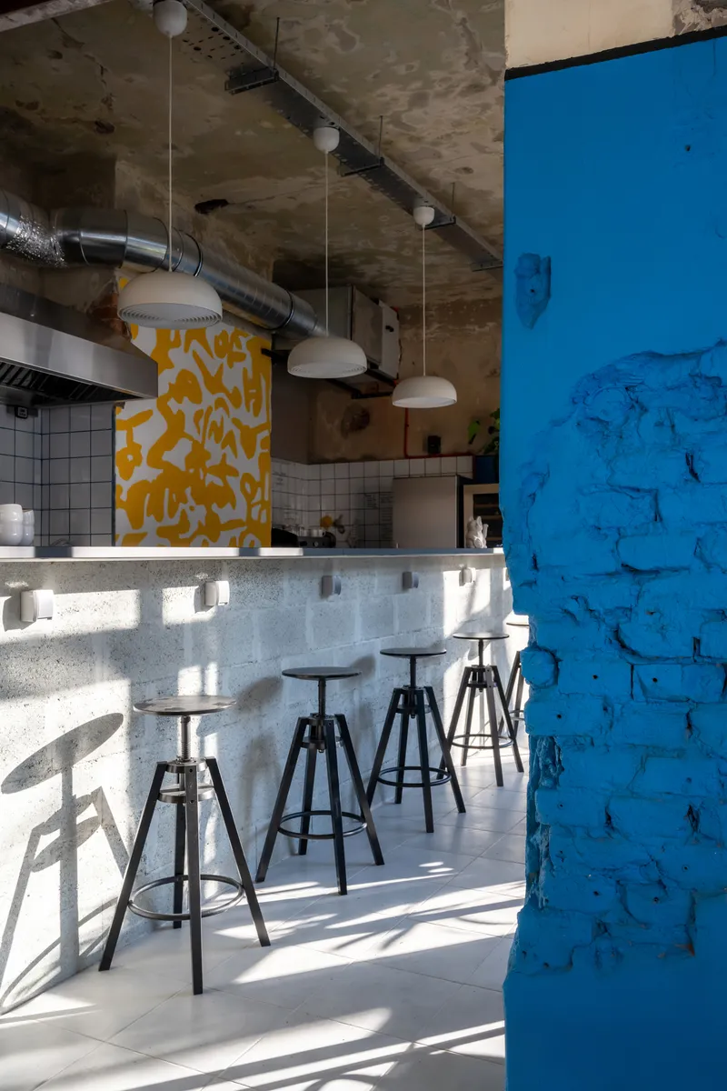
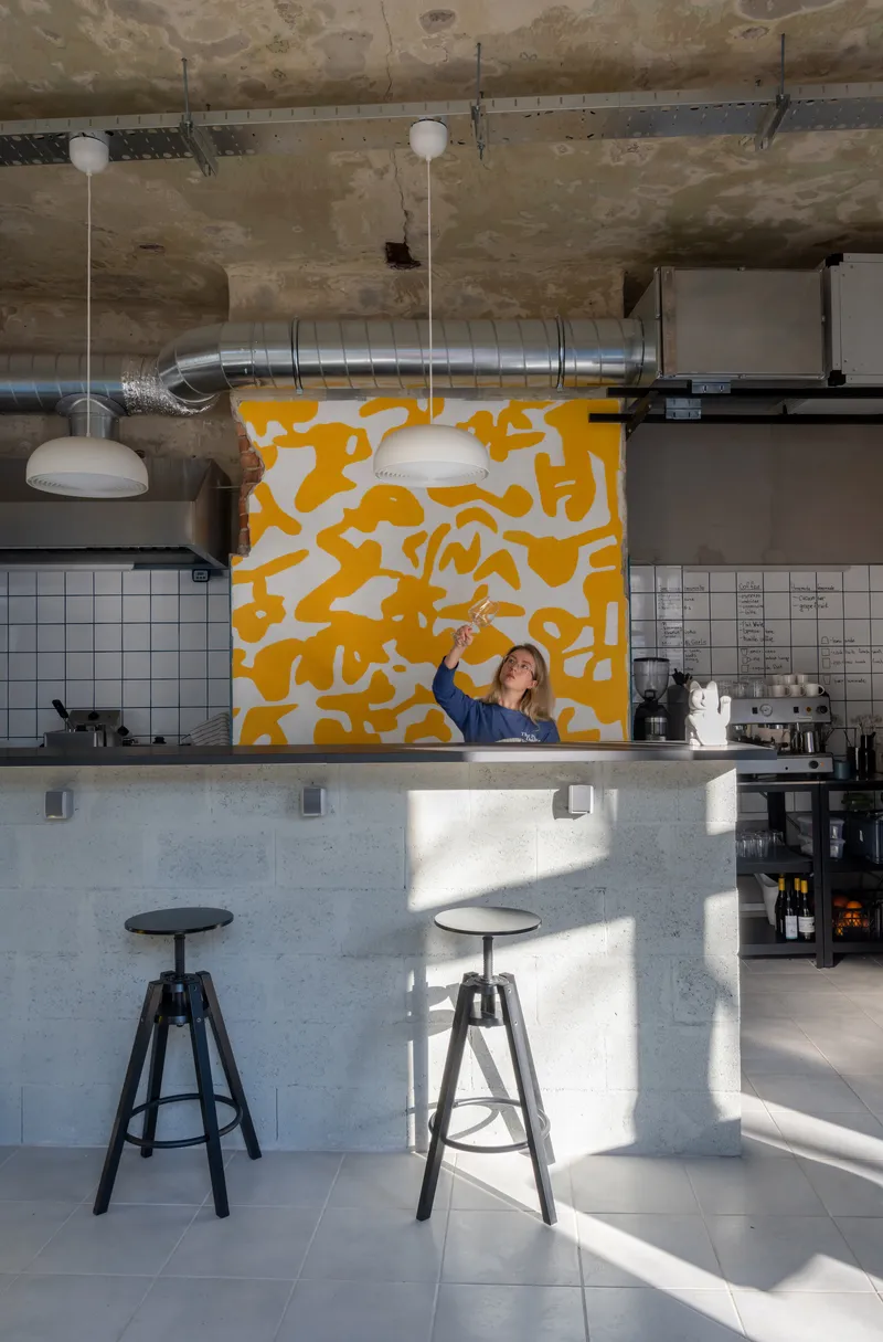
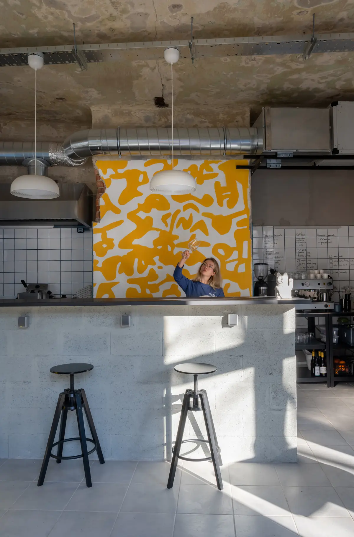
The counter zone anchors one end of the plan. White subway tiles provide a clean, hygienic backsplash against the raw concrete, while adjustable metal stools line the bar-height counter for solo diners. Afternoon sun pours through the front glazing and rakes across the counter surface, turning a utilitarian food-service station into something photogenic.
The contrast between the white tile, the distressed ceiling above it, and the yellow patterned wall panel behind the stools captures the project's entire philosophy in a single frame: clean where hygiene demands it, rough everywhere else, colorful as a matter of principle.
Seating and Street Life

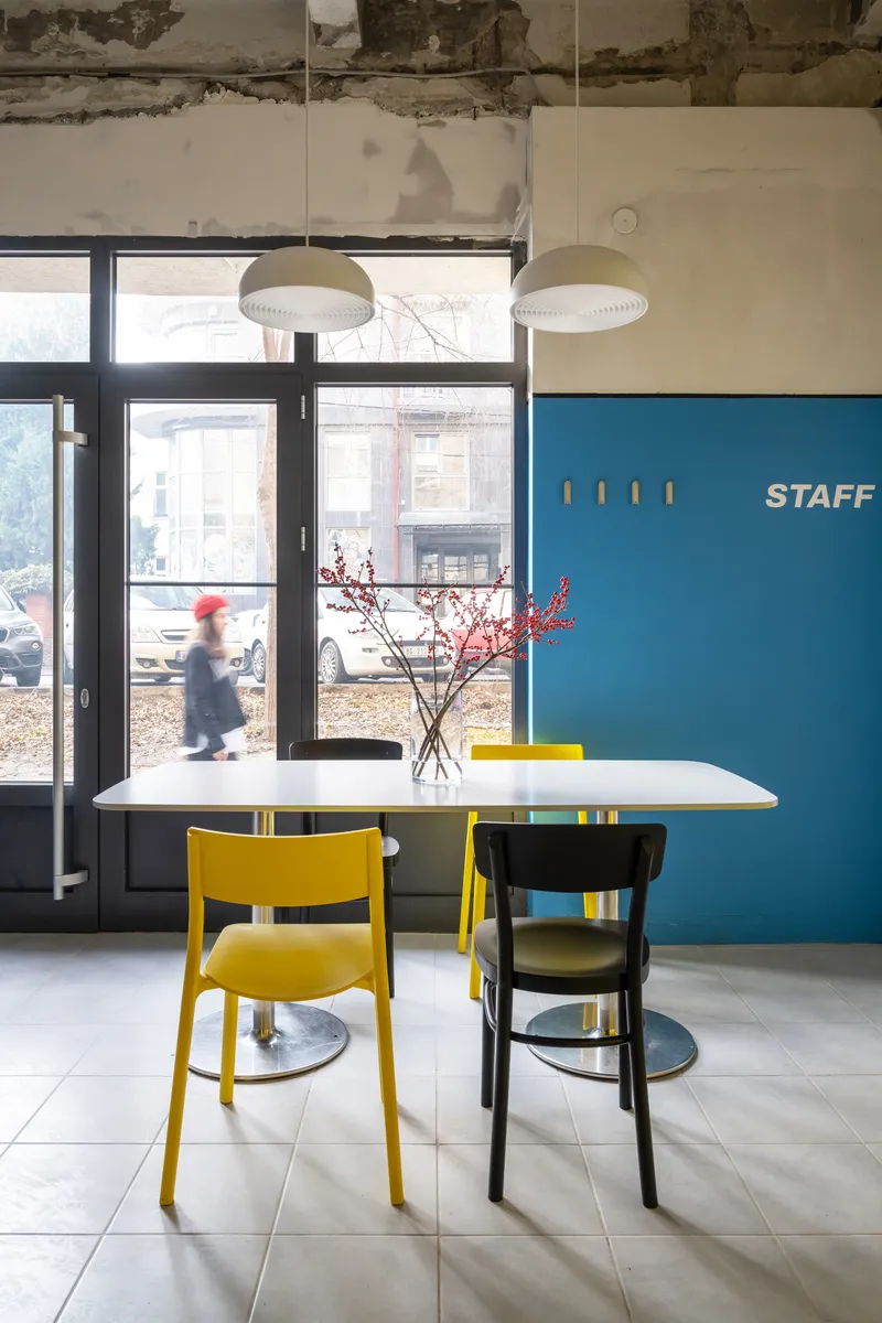
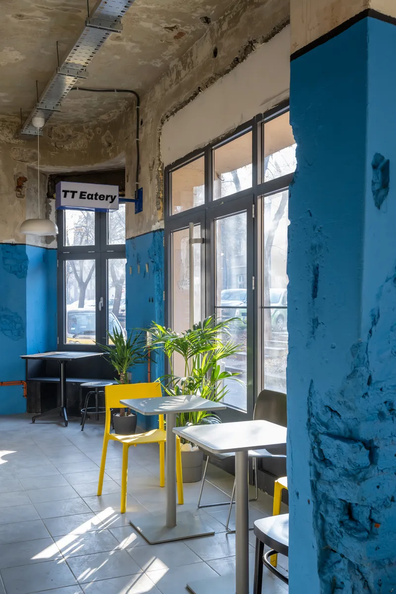
Full-height, black-framed windows connect the interior to the sidewalk. Tables cluster along the glazing, and potted palms and small plants soften the transition between the urban street and the raw interior. The chairs are a deliberate mix: yellow, red, and black tubular steel pieces that feel collected rather than coordinated. This variety reinforces the informal, democratic tone of the space.
In several images, figures walk past or sit at tables in streaming daylight, their presence casual and unhurried. The space clearly works as intended, a place where lingering feels natural despite the fast food program. That tension between speed of service and slowness of atmosphere is one of the project's quiet successes.
Details and Atmosphere

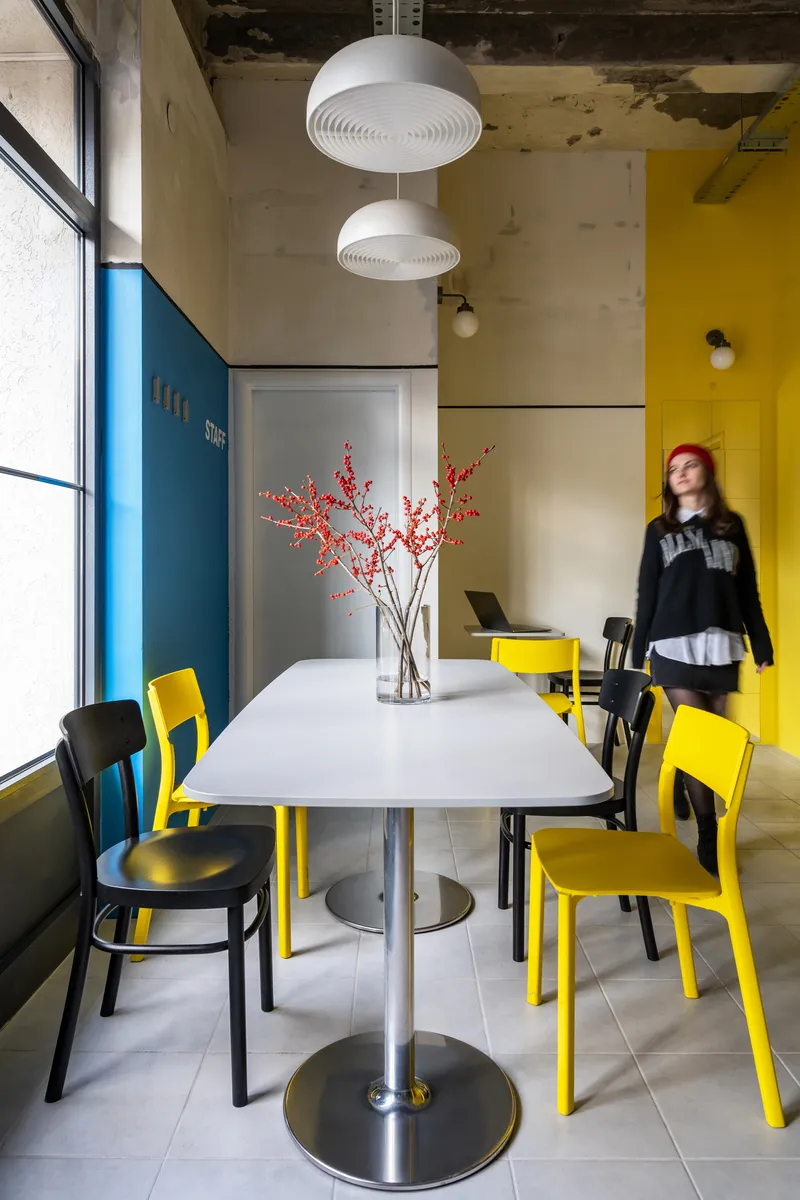
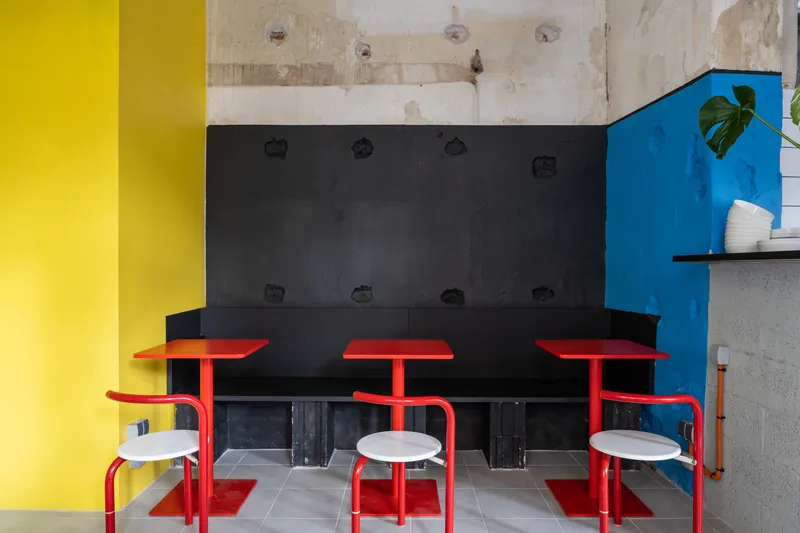
Corner seating nooks use translucent yellow curtains to create semi-private zones. Red tubular steel seating with banquette benches lines one wall against a black panel, introducing a third accent color that prevents the yellow-blue binary from becoming monotonous. Glass vases with red-berried branches appear on several tables, a small styling touch that grounds the otherwise industrial setting in something organic.
The pendant disc lights, hung in pairs, provide warm pools of illumination that counteract the cool grey of the concrete. At night, these fixtures would transform the atmosphere from sun-drenched industrial to something warmer and more intimate, extending the eatery's usefulness beyond afternoon school hours.
Plans and Drawings


The floor plan reveals the simplicity of the spatial arrangement: two connected rooms organized around the service counter, with seating distributed along the perimeter and the yellow partition carving a loose third zone in the center. The view through the yellow-framed glass partition toward the dining area shows how this division registers in practice, filtering light and color without blocking movement.
Why This Project Matters
TT Eatery matters because it treats a tiny fast food outlet with the same conceptual rigor that bigger practices reserve for museums and houses. FREYA Architects did not just decorate a room; they developed a coherent thesis about materials, color, and audience, and then executed it with consistency across every surface and detail. The decision to leave the ceiling exposed and the walls imperfect was not laziness or budget constraint dressed up as intention. It was a deliberate match between the informality of the food program and the honesty of the architecture.
For a 60-square-meter space in a residential building, the project also demonstrates how much spatial complexity you can achieve with partitions, color zoning, and careful furniture placement. There are no structural gymnastics, no exotic materials, and no elaborate detailing. What there is, instead, is a clear idea executed well: strip back, paint boldly, divide softly, and let the light do the rest. That is a lesson with far wider application than a single Belgrade eatery.
TT Eatery by FREYA Architects (Chief Architect: Kristina Koivistoinen-Khatlamadzhiyan). Located in Belgrade, Serbia. 60 m². Completed in 2022. Photography by Ilya Ivanov.
About the Studio
Share Your Own Work on uni.xyz
If projects like this are the kind of work you want to make, uni.xyz is a place to publish your own, find collaborators, and enter design competitions.


Popular Articles
Popular articles from the community


The Amber Palace Opera: A Geological Fiction Surfaces on Tallinn's Baltic Waterfront
Pierre Brillard reimagines a Baltic legend as a public landscape, opera house, and waterfront promenade rooted in Tallinn's coastal identity.

Singing Woman: An Opera House That Performs Before the Curtain Rises
Ovidiu Cristian Pavel's conceptual opera house translates Estonia's choral identity into a sculpted waterfront landmark facing the Baltic Sea.
Tsunami Convergenics: Turning Catastrophic Ocean Forces into Underwater Housing Infrastructure
A speculative underwater settlement off the coast of Onagawa, Japan, treats tsunamis and typhoons as energy sources rather than threats.

Manzana Morphosis: Stretching Barcelona's Grid into a Living Landscape for 2050
A radical reworking of the Eixample manzana turns density into a tool for generous public space, vertical ecology, and environmental performance.

Similar Reads
You might also enjoy these articles

Pixel Gardens: One Repeated Module Stacked Into a Terraced Social Housing Tower for Famagusta
Salem Bader's shortlisted housing tower builds a vertical neighbourhood from one repeated module, offsetting units to carve terraces, light and air.

Bao Huynh Watercolor Atelier: A Serene Art Retreat in Hội An
Bao Huynh Watercolor Atelier in Hội An blends multifunctional art spaces, sustainable design, local materials, and family-friendly living in a serene environment.

Atelier Macri Concept Store Interior Design by CASE-REAL
Atelier Macri store features a "ko" counter, walnut wood details, cork displays, blending retail, gallery, and seamless customer experiences.

Manuel Vargas Izquierdo Stadium and High-Performance Sports Center: Architectural Excellence in Jalpa de Méndez
The Manuel Vargas Izquierdo Stadium blends sustainable design, inclusive sports facilities, and cultural-inspired architecture, revitalizing Jalpa de Méndez’s public spaces.

Explore Dining Competitions
Discover active competitions in this discipline

Challenge to design luxury tourism on rails

VR headsets Storefront design competition

Designing a staircase for a client
Comments (0)
Please login or sign up to add comments
No comments yet. Be the first to comment!