
BLOCO Arquitetos Peels Back Decades of Finishes to Reveal a 1960s São Paulo Apartment's Hidden Skeleton
A 230-square-meter renovation in Higienópolis strips plaster and false ceilings to expose solid brick, concrete beams, and original ipê flooring.


The Cuiabá building in São Paulo's Higienópolis neighborhood was completed in the early 1960s by architect Rubens Camargo Monteiro, a figure whose career intersected with the construction of Oscar Niemeyer's OCA pavilion at Ibirapuera Park. That lineage matters. The bones of this 230-square-meter apartment carry the formal confidence of mid-century Brazilian modernism, but by the time BLOCO Arquitetos arrived, those bones had been buried under layers of plaster, a false ceiling, and a compartmentalized plan that sealed the kitchen behind a pantry and split the social area with a central vestibule.
What makes the 2023 renovation genuinely interesting is not the stripping itself but the judgment calls behind it. The architects discovered that the apartment's ceiling was effectively a double slab: a thin finishing layer with no structural role concealing a grid of concrete beams above. Removing that layer was a low-risk, high-reward move that transformed every room's proportions overnight. The same logic applied to the perimeter walls, where plaster came off to reveal solid brick, and to the ipê hardwood floor, whose double herringbone pattern had survived decades of use. Rather than importing a new material palette, BLOCO used what was already there, adding only on-site terrazzo for kitchen surfaces and sliding doors to reconnect rooms that should never have been separated.
The Ceiling as Architecture
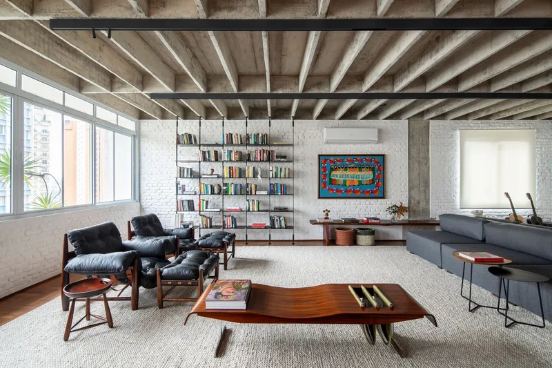
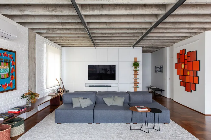
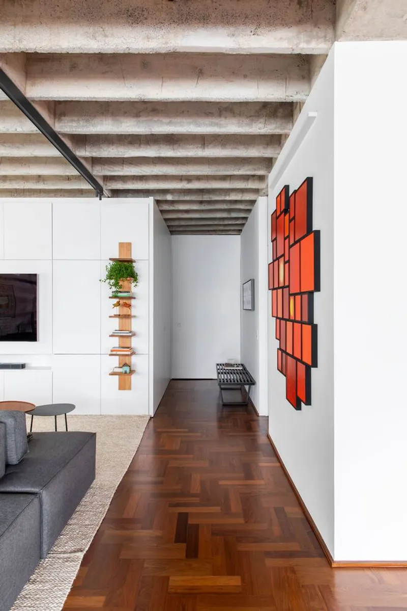
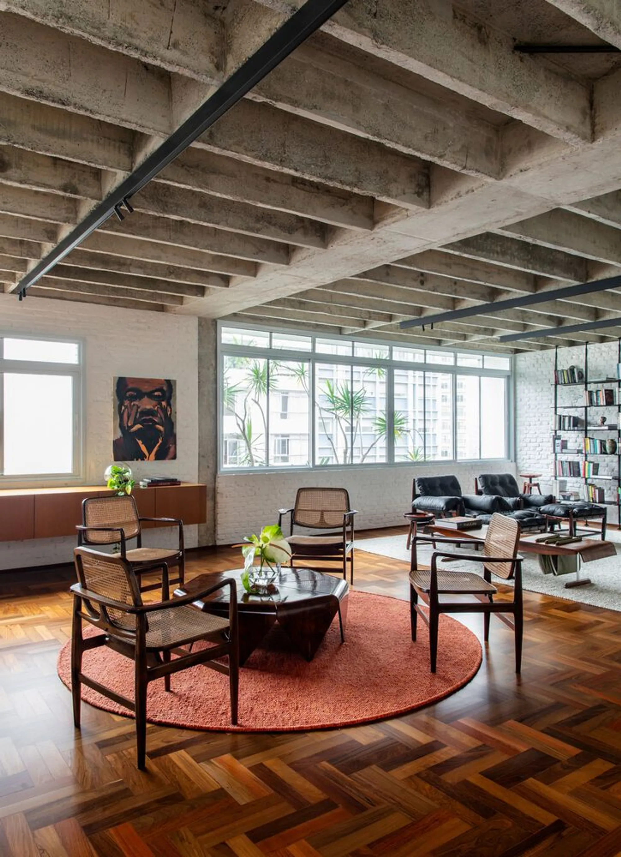
Once the non-structural ceiling layer came off, the apartment's character shifted from polite mid-century flat to something closer to a converted industrial loft. The exposed concrete joists run in tight parallel lines, their rhythm lending directional force to every room they span. In the living areas, where floor-to-ceiling windows flood the space with light, the beams cast subtle shadow patterns that change through the day. The architects chose not to paint or treat the concrete, letting its raw grey serve as the dominant overhead surface. That decision anchors the entire material strategy: everything below the ceiling line, from white-painted brick to warm ipê, reads as a lighter counterpoint.
The structural grid also provided a ready-made organizational logic. Service runs and a metal track for lighting tuck between the beams without looking like afterthoughts. It is a reminder that the best renovation discoveries are not decorative; they solve problems of integration that would otherwise require new soffits and bulkheads.
Brick, Paint, and Selective Exposure
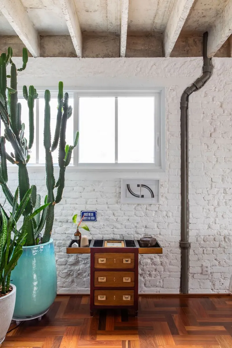
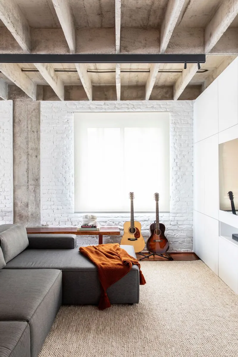
Not every exposed surface was left raw. The perimeter walls, once stripped of plaster, revealed solid brick whose texture varies from course to course. In some rooms, notably the workspace corner and the window alcove, the brick was painted white to keep the palette cohesive while preserving the tactile quality of the masonry. In other zones, such as the main living room, a warmer finish allows the brick to register more assertively. The selective approach avoids the trap of total exposure, where every surface screams "authentic" and nothing recedes.
The window alcove is a particularly successful moment. Two acoustic guitars rest on a ledge framed by painted brick and topped by exposed beams, a quiet domestic tableau that would read entirely differently against flat drywall. The thickness of the original masonry becomes visible here, turning what could be a thin window frame into a substantial architectural niche.
Opening the Plan Without Losing Definition
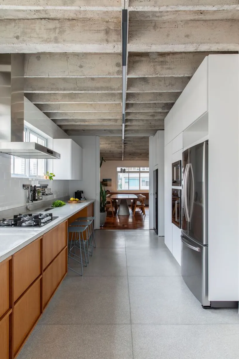
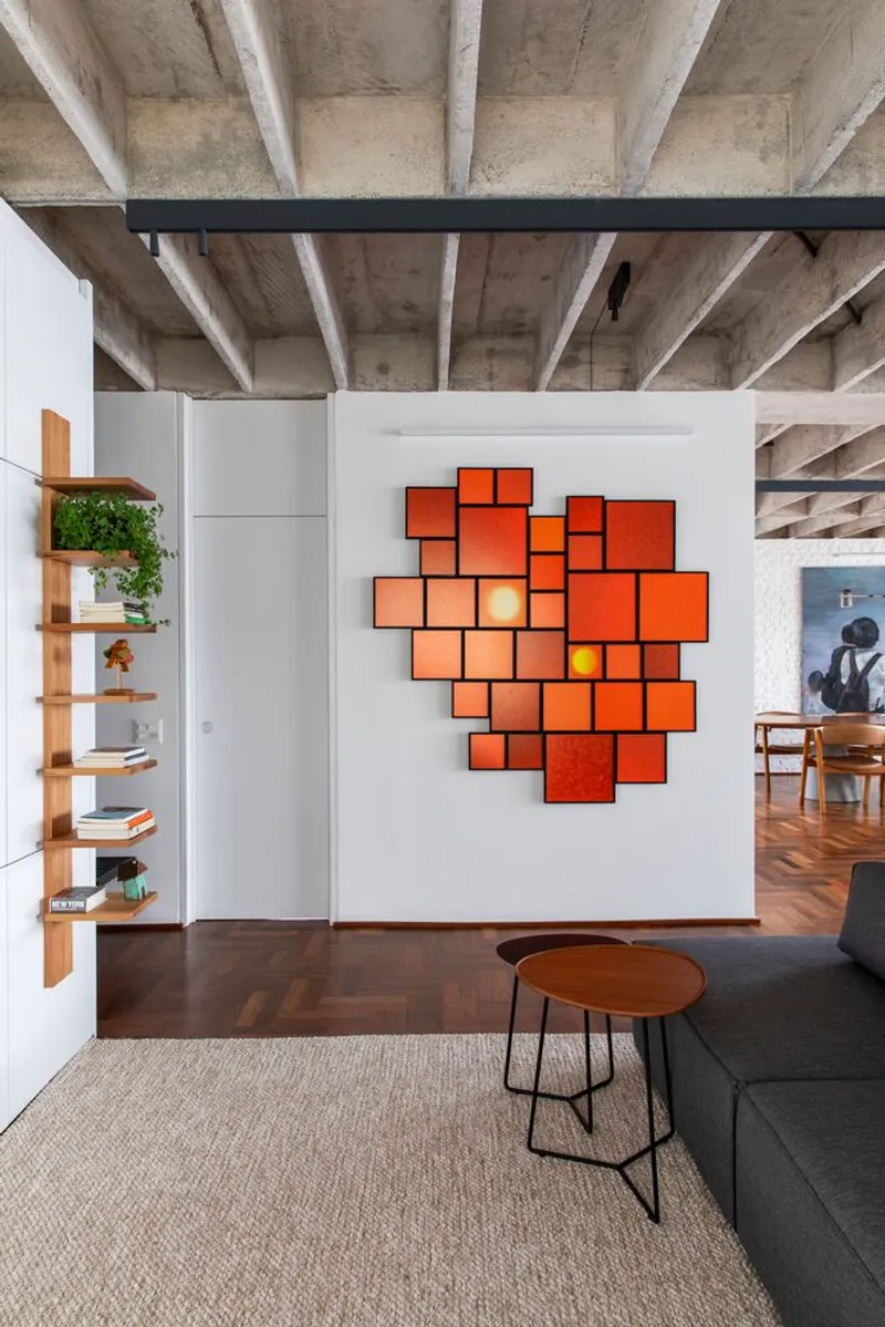
The original layout was a sequence of sealed rooms: a pantry sat between the kitchen and living room, a central vestibule chopped the social area in half, and two bedrooms consumed floor area that the new owners did not need. BLOCO removed one bedroom and the pantry to create a TV room and a kitchen that opens to the dining area through sliding doors. A second bedroom was absorbed into an enlarged suite. The result is a plan that flows without becoming formless.
The galley kitchen, visible through to the dining zone, benefits enormously from borrowed light and the visual continuity of the beam grid overhead. Terrazzo countertops, fabricated on-site, introduce a new material that holds its own against the concrete and brick without competing. The sliding doors are the key device: they allow the kitchen to be open for entertaining or closed for cooking without the commitment of a fixed wall. It is a modest element that does heavy programmatic lifting.
Furnishing with Brazilian Design Heritage
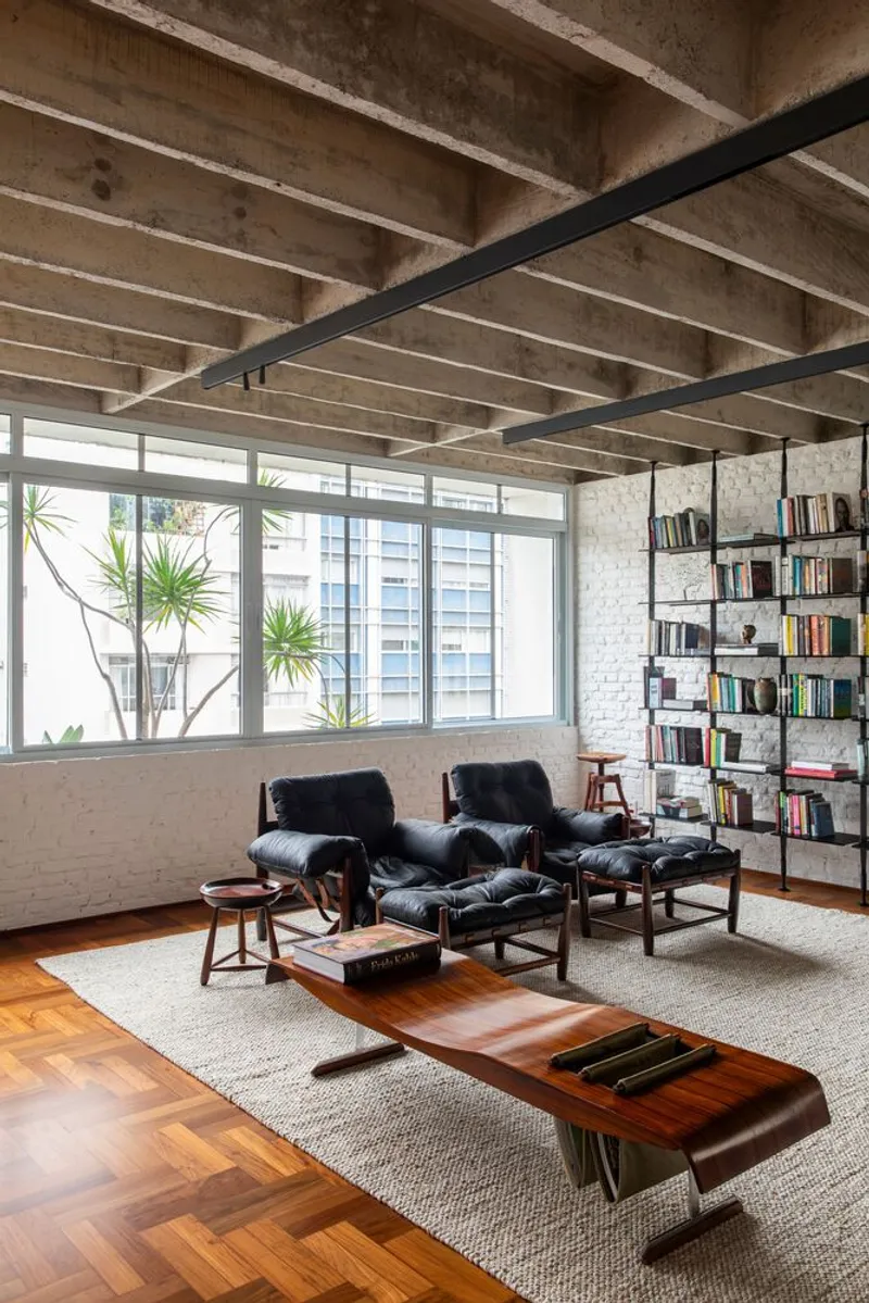
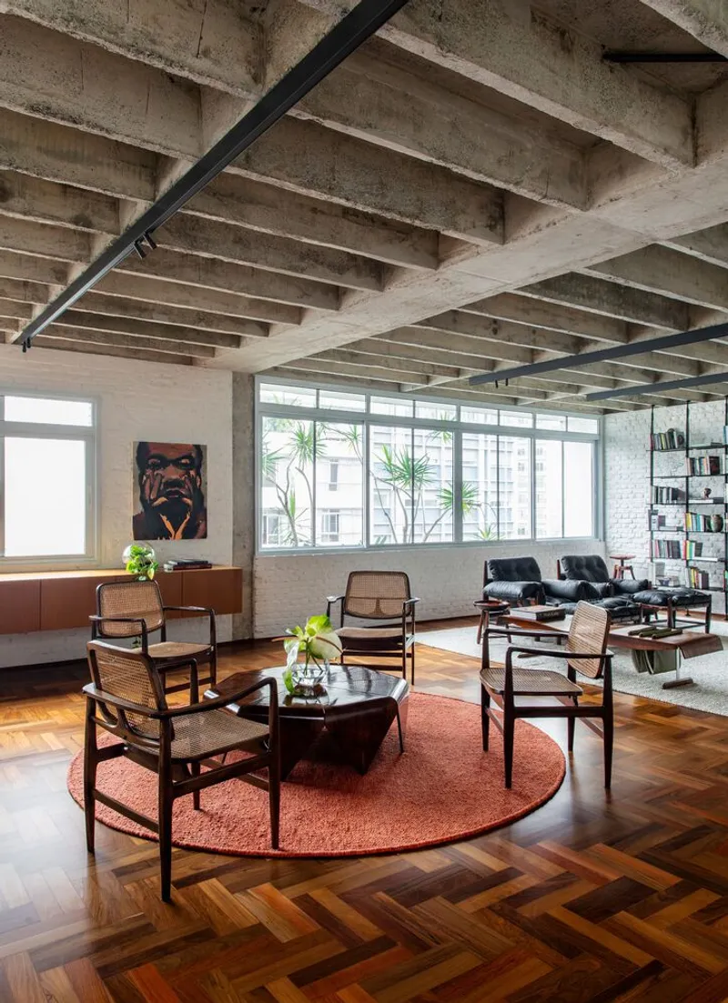
The furniture selection is not incidental. Pieces by Sérgio Rodrigues, Jean Gillon, and Jorge Zalszupin populate the living areas, grounding the apartment in the same mid-century Brazilian design tradition as the building itself. Leather lounge chairs sit beneath the concrete beams with an ease that suggests they were always there. Cane-back dining chairs on a rust-colored circular rug bring warmth to the open living area without cluttering it.
The choice to pair these furnishings with the stripped-back architecture is more than styling. It argues that the apartment's identity is not a single era frozen in time but a continuous conversation between generations of Brazilian making. The original structure, the preserved flooring, and the furniture all share a material honesty: wood that looks like wood, leather that creases, concrete that shows its formwork.
The Private Rooms: Restraint Over Spectacle
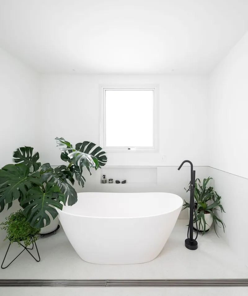
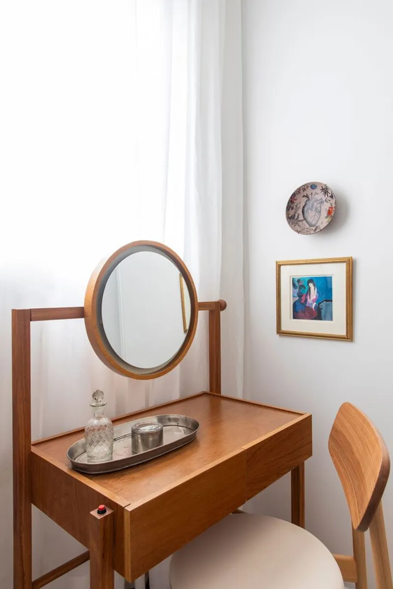
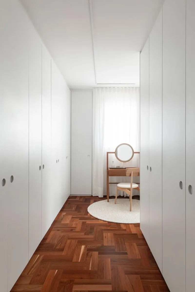
The enlarged suite and bathroom pull back from the exposed-material intensity of the social spaces. A freestanding bathtub sits beneath a square window flanked by potted monstera plants, a composition that relies on symmetry and natural light rather than material drama. The timber vanity table with its oval mirror occupies a similarly quiet register: white walls, sheer curtains, and a narrow window that filters the São Paulo sun.
The restraint is deliberate. After the assertive textures of the living areas, the private rooms offer a sensory cooldown. It is a spatial sequence that many apartment renovations get wrong, either maintaining the same pitch throughout or treating bedrooms as afterthoughts. Here, the shift in tone feels intentional and earned.
Why This Project Matters
The Higienópolis apartment is a case study in renovation as subtraction. BLOCO Arquitetos did not impose a new architectural language on the unit; they removed the layers that obscured the one already present. The false ceiling, the plaster, the unnecessary partitions: each was a later accretion that diminished the clarity of Rubens Camargo Monteiro's original structure. By peeling them away and adding only terrazzo and sliding doors, the architects achieved a transformation that feels both radical and inevitable.
More broadly, the project demonstrates that sustainability in renovation does not require conspicuous green technology. Preserving ipê flooring, reusing exposed brick, and revealing rather than replacing structural elements kept material waste low while producing an interior with more character than any new-build specification sheet could deliver. In a city where mid-century apartment buildings are routinely gutted and resurfaced, this is a persuasive argument for looking harder at what is already there.
Higienópolis Apartment Renovation by BLOCO Arquitetos. Located in the Higienópolis neighborhood, São Paulo, Brazil. 230 m². Completed in 2023. Photography by Maíra Acayaba.
About the Studio
Share Your Own Work on uni.xyz
If projects like this are the kind of work you want to make, uni.xyz is a place to publish your own, find collaborators, and enter design competitions.




Popular Articles
Popular articles from the community


AL-JANNAH: Sustainable Architecture and Permaculture for Afghan Widows
AL-JANNAH uses sustainable architecture and permaculture to create resilient oasis of housing, learning, work and renewal for Afghan widows.

Co-Life: Senior Housing Design That Reconnects Older Adults With the City
Co-Life reimagines senior housing design through healing gardens, shared streets, workshops, and a sustainable community across generations.

The Ocean Hive: Sustainable Architecture for a Self-Sufficient Civilization at Sea
The Ocean Hive imagines sustainable architecture at sea, where modular habitats, algae, wave power and ocean waste sustain a growing colony.

Co-life: Sustainable Architecture for Age-Friendly Community Living
Co-life reimagines sustainable architecture for seniors through courtyards, rammed earth, shared gardens, and spaces designed for belonging.


Similar Reads
You might also enjoy these articles


Hodi-Mandai Geram
Project Function: Preservation and revitalization of the Intangible heritage and socio-spatial identity of the Hodi by Housing, Cultural Memory Center, Sacred Grove, landscape, local tourism economy

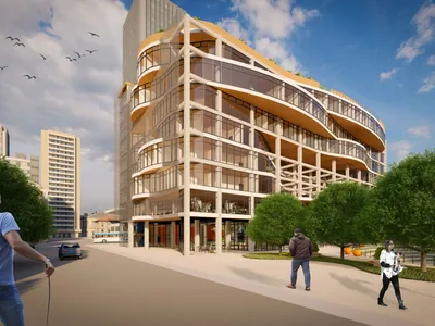
Olio Towers: A Mid-Rise for Performers That Fuses Housing, Rehearsal, and Stage
Located blocks from Houston's Theater District, this modular tower stacks living units around a central performance atrium.

Oasis: Modular Green Housing Carved into Dhaka's Urban Fabric
A shortlisted Plugin Housing entry reclaims unauthorized settlements in Dhaka with stepped concrete volumes, green roofs, and ventilation-driven design.

Black Hole: A Floating Megastructure for the Post-Physical Era
Emiliano Mazzarotto envisions a spherical, self-scaling arena where e-sports, digital hotels, and holographic stadiums replace traditional public space.


Explore Housing Competitions
Discover active competitions in this discipline



Challenge to reimagine the Iron Throne


Photograph architecture without architects


Illustrate the lost glory of Angkor Wat - Render Challenge


Design challenge to reuse E-waste
Comments (0)
Please login or sign up to add comments
No comments yet. Be the first to comment!