
idArchitekt.innen Convert a 1978 Lakeside Office Building in Zollikon into a Kindergarten with a Steel Penthouse
A commercial block on the shore of Lake Zurich gains a new life as a kindergarten through free-plan interiors and a bold rooftop extension.


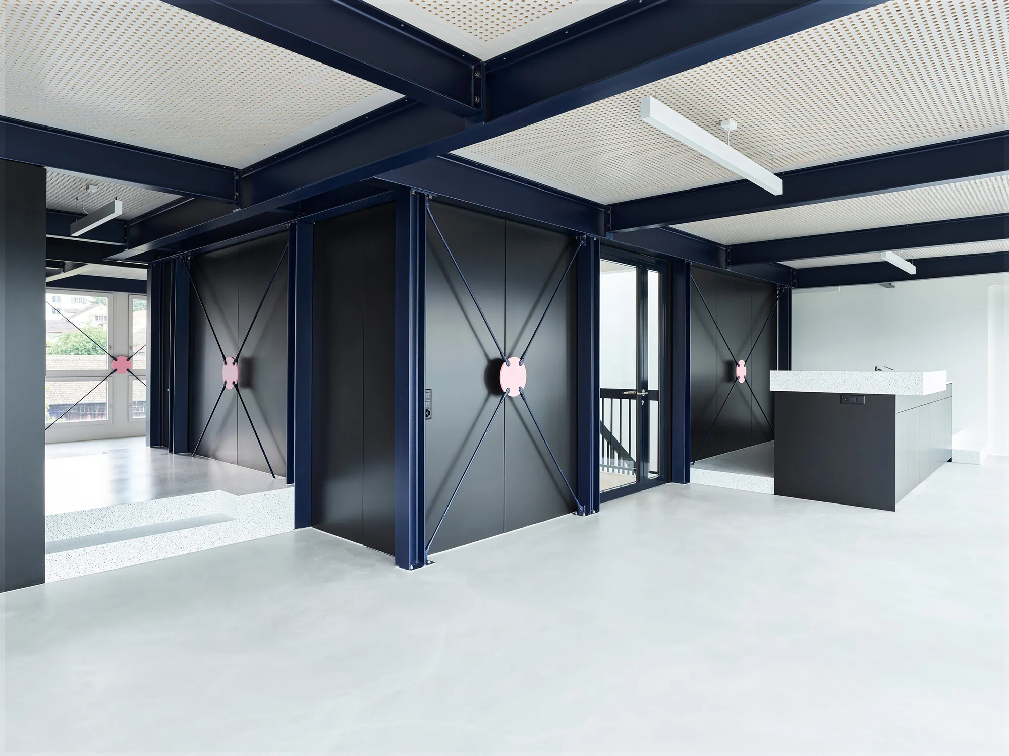
Converting a commercial building into a kindergarten is not just a change of program; it is a change of disposition. The 1978 office block on Seestrasse in Zollikon, wedged between a lakeshore road and railway tracks, was designed for adults who sit still. idArchitekt.innen had to make it work for children who do not. Their answer is an interior that refuses fixed rooms in favor of a continuously reconfigurable floor plan, where full-height swing and sliding doors open to 180 degrees to let spaces merge or separate at will. Side rooms along the facade fold shut into compact chambers, zoning the open plan without ever sealing it off.
The building also gains a full storey. A steel-framed penthouse sits atop the existing concrete structure, picking up the rhythm and proportions of the original facade so precisely that the addition reads as a logical continuation rather than an afterthought. The west side of this new volume steps back from the building envelope, opening up a generous terrace with views over Lake Zurich. Below, the interiors play with a deliberate tension between raw infrastructure (exposed steel beams, concrete soffits) and the soft textures a kindergarten needs (terrazzo floors, curved partitions, bright cabinetry). It is adaptive reuse that takes the "adaptive" part seriously.
A Penthouse That Extends the Logic of the Base

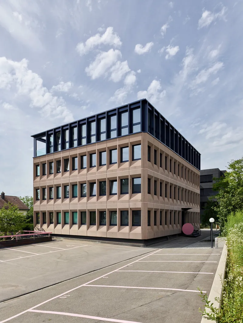
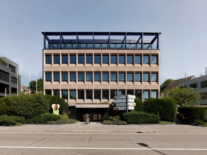
The most visible intervention is the rooftop extension: a black steel and glass volume that crowns the original terracotta-clad structure. The shift from concrete construction to steel is legible from the street, yet the proportional rhythm of the existing facade carries through into the new storey, maintaining the tripartite reading of base, main body, and attic that defined the 1978 design. The dark horizontal band at the roofline draws a firm line between old and new without being hostile to either.
On the west elevation, the penthouse pulls back from the primary structure. The resulting setback creates a terrace that doubles as an outdoor play area with lake views, a resource no kindergarten would want to waste. It is a smart move: the building gains square footage on top while giving back usable open space at exactly the level where it matters most.
The Free Plan as a Pedagogical Tool
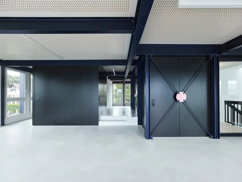
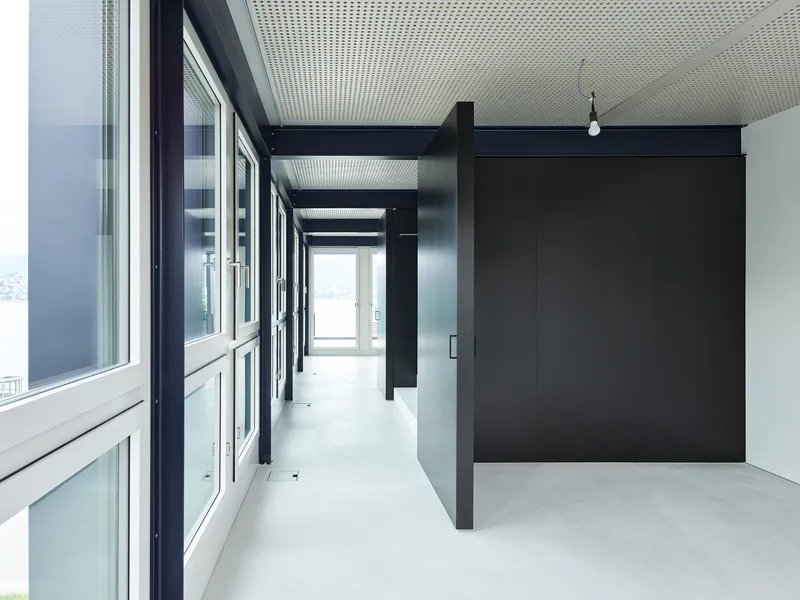
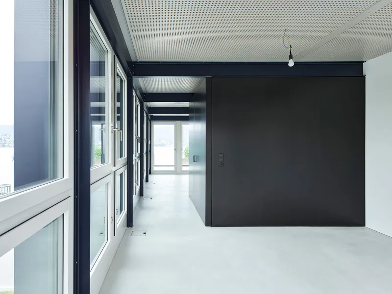
The interior strategy borrows directly from the "plan libre" tradition, and it does so for practical reasons, not nostalgic ones. A kindergarten needs the flexibility to host group activities one hour and quiet reading corners the next. idArchitekt.innen deliver this through room-height folding partitions in dark metal that pivot open to create flowing space along the facade and around the circulation core. Close them, and you get a series of intimate, acoustically separated chambers.
The perforated ceiling panels, visible throughout, serve a dual purpose: they absorb sound in a space occupied by small children, and they filter daylight from the glazed perimeter into the deeper plan. The exposed steel columns and beams give the space a legibility that children can understand intuitively. Structure is visible, thresholds are clear, and the boundaries of each room are something you can physically operate, not just walk through.
Corridors That Refuse to Be Residual

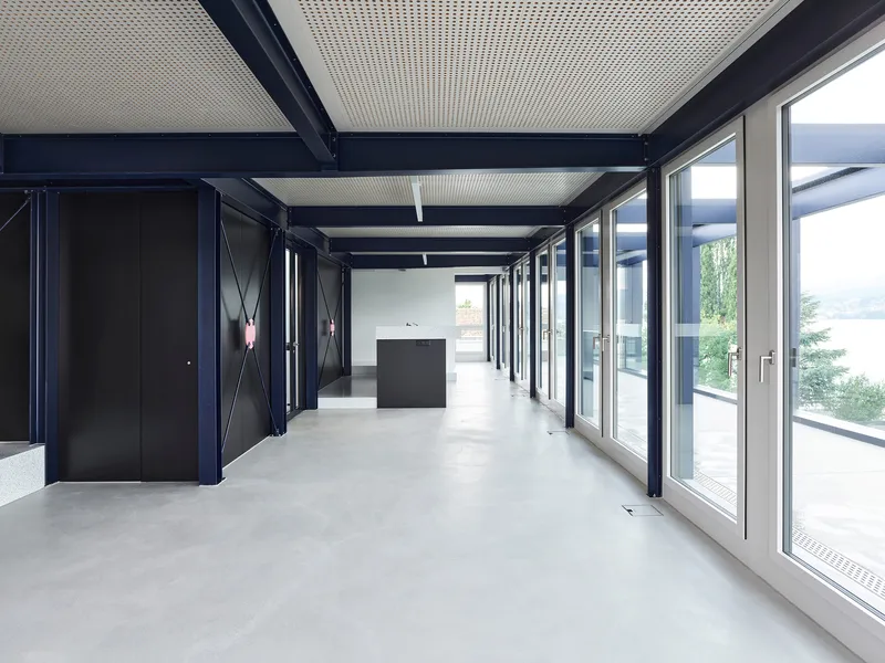

In most conversions, corridors are the leftover space, the connective tissue nobody designs. Here, the circulation routes are among the most considered spaces in the building. One corridor runs along a fully glazed facade, flanked by exposed steel beams overhead and a freestanding dark reception desk below. Another uses continuous strip lighting against perforated wall panels to create a sense of direction without signage. Herringbone parquet appears in some passages, shifting underfoot texture to signal a change in zone.
The access core has been spatially extended as part of the renovation, and freestanding wet rooms connect to it via what the architects describe as an "acrylic stone topography." The result is that the core is not a dead zone but an active spine from which program radiates outward toward the facade. For a kindergarten, where supervision lines and wayfinding matter enormously, this is a decisive choice.
Material Honesty Meets Playful Detail
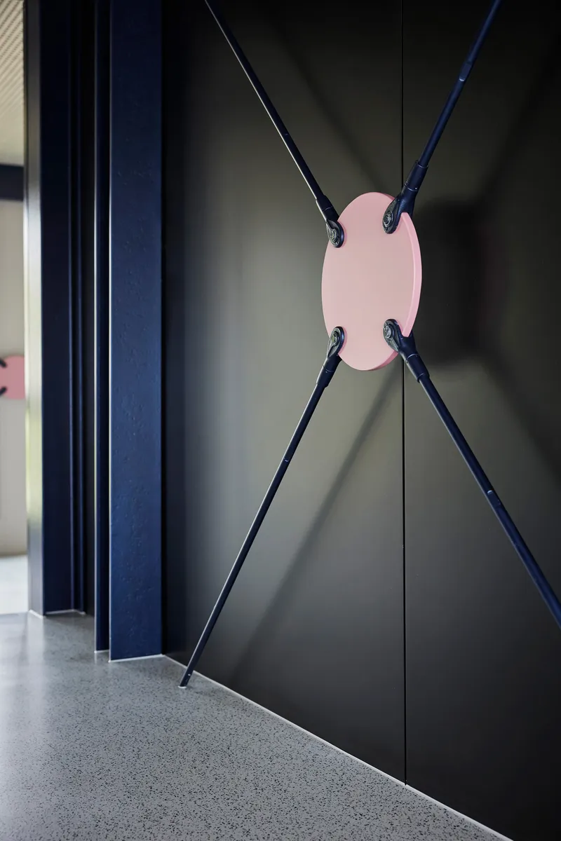


The detail language is where the project reveals its sense of humor. Cable-braced metal partitions feature a pink center plate at the junction of diagonal steel rods, turning a structural connection into a decorative moment. Doors carry the same cross-bracing pattern with circular pink handles that reference the node detail at a smaller scale. These are serious construction elements styled with a lightness appropriate for the building's new occupants.
Terrazzo steps leading to restrooms, Kerrock solid surface panels in wet areas, and Innovus fiberboard in cabinetry create a material palette that is robust enough for a kindergarten while maintaining visual warmth. The terrazzo in particular works hard: it appears on floors, countertops, and stair treads, providing a continuous surface that is easy to clean and difficult to damage.
Color and Curve in the Lower Floors
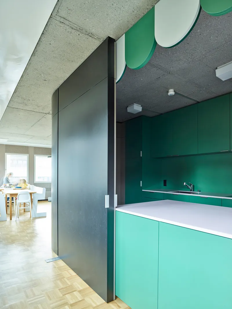


Not every space follows the black steel and terrazzo vocabulary of the upper floors. On the lower levels, the palette shifts to greens, mints, and blues. A kitchenette with green and mint cabinets sits beneath an exposed concrete soffit with a scalloped green detail that softens the ceiling edge. Elsewhere, a curved dark partition wall meets blue speckled flooring under a circular pendant light, creating a nook that feels enclosed without being claustrophobic.
These moments of color and curvature do important work. They differentiate zones within the open plan at a scale children can perceive. A three-year-old may not read a sign, but they will remember the blue room or the green kitchen. The architects have embedded a wayfinding system into the material choices themselves.
Functional Rooms: Kitchen, Bathroom, Threshold
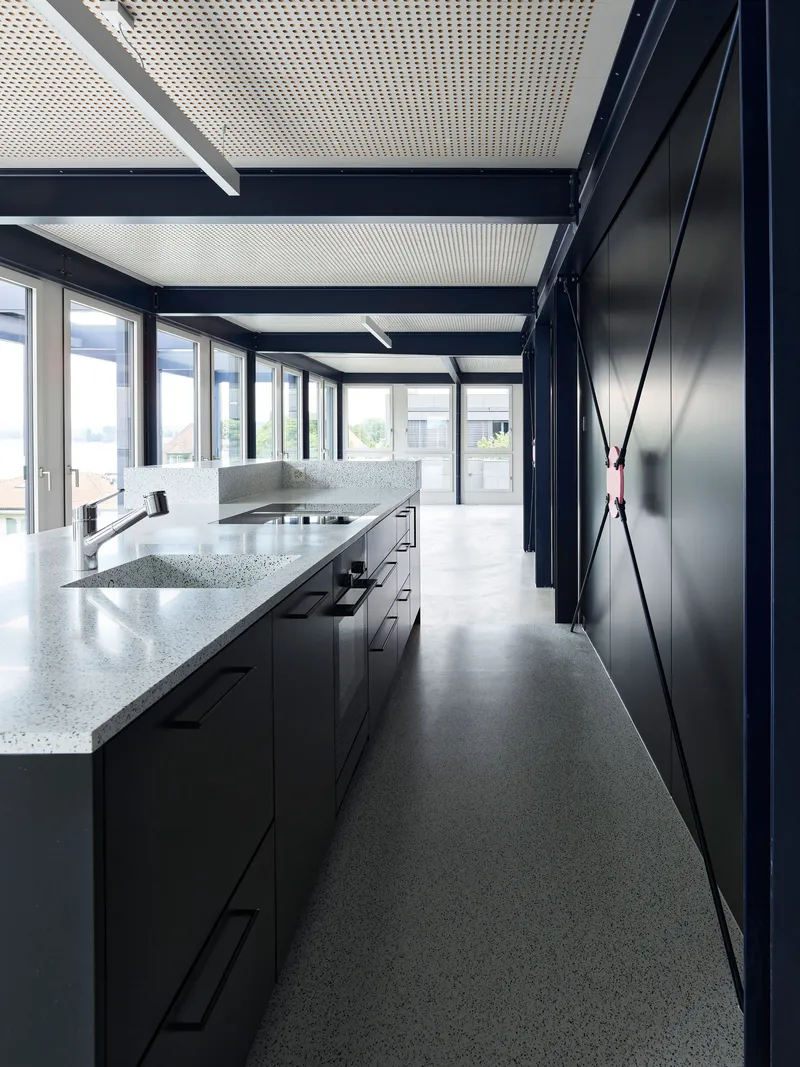
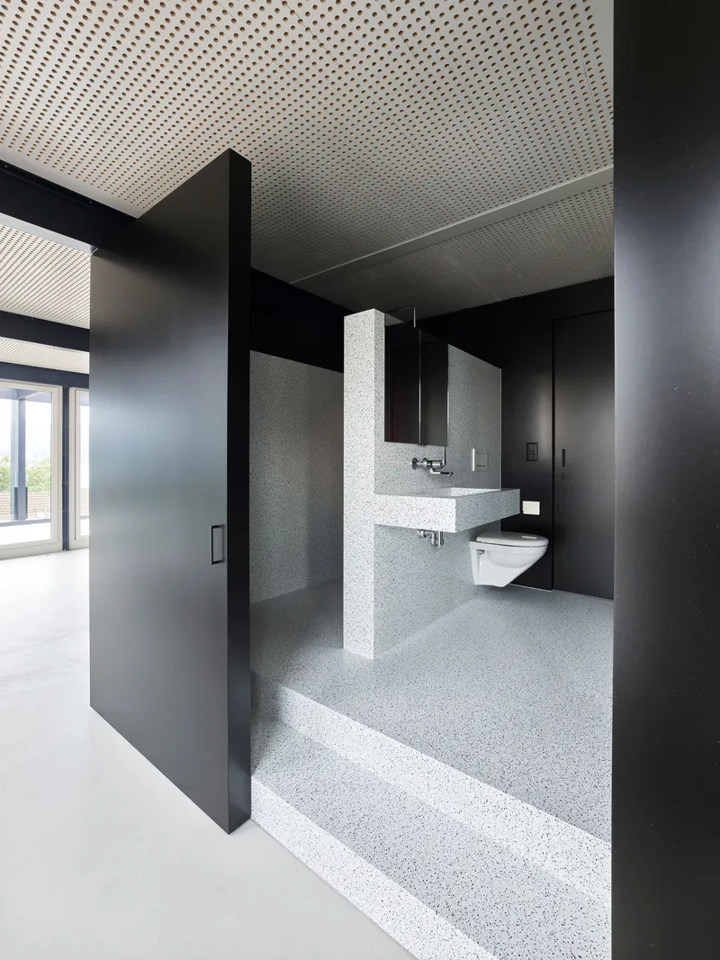
The kitchen features black cabinets with terrazzo countertops framed by exposed steel beams and perforated ceiling panels. It is a room designed for supervised cooking activities, not just food preparation, with clear sightlines and durable surfaces. The bathroom, similarly, uses wall-hung fixtures and dark metal partition framing that keeps the space legible and easy to maintain.
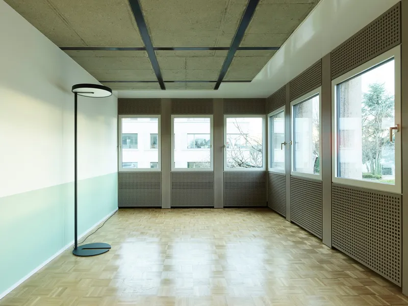
A room with perforated radiator covers below windows, parquet flooring, and a concrete ceiling with steel beams shows the quieter side of the conversion. Not every space needs to perform. Some just need to be warm, well-lit, and proportioned for children who are smaller than the building was originally designed for. The radiator covers do double duty as low ledges, bringing the window sill down to a height a child can lean on.
Plans and Drawings


The isometric drawing reveals the spatial strategy most clearly: a glazed perimeter wraps interior volumes that sit free of the facade, maintaining the continuous circulation loop along the building's edge. The mountain context behind the building reminds us that this is not a generic suburban site but a very specific condition between lake, road, and Alps. The elevation drawing confirms the proportional discipline of the extension, showing how the dark horizontal band at the roofline mediates between the existing four-storey facade and the new steel-framed attic.
Why This Project Matters
Kindergarten design too often defaults to primary-colored boxes or Scandinavian minimalism. The ZAW Conversion does neither. It takes the bones of a commercial building from the late 1970s and turns them into an asset: the column grid becomes the framework for a free plan, the generous floor-to-ceiling heights allow for perforated ceilings and exposed structure, and the existing facade rhythm gives the rooftop extension its visual authority. The conversion proves that adaptive reuse is not just environmentally responsible; it can produce spatial qualities that new construction rarely achieves.
More importantly, the project demonstrates that designing for children does not mean dumbing down the architecture. The cable-braced partitions, the terrazzo topography connecting wet rooms to the core, the 180-degree pivot doors: these are sophisticated architectural moves that happen to work brilliantly for a kindergarten because they prioritize flexibility, legibility, and tactile experience. idArchitekt.innen have made a building that respects its young occupants by giving them real architecture, not a theme park.
ZAW Conversion by idArchitekt.innen, Zollikon, Switzerland. Completed 2022. Photographs by Markus Bertschi Fotografie.
About the Studio
Share Your Own Work on uni.xyz
If projects like this are the kind of work you want to make, uni.xyz is a place to publish your own, find collaborators, and enter design competitions.




Popular Articles
Popular articles from the community

Hill & Cross Opera: Sculptural Opera House Architecture Shaped by Tallinn’s Landscape and Identity
Hill & Cross Opera reimagines opera house architecture in Tallinn through its sculptural hill, civic plaza, glass wave and a luminous cross.
The Musturak Paradise: Senior Living Architecture for a Connected Future in Temara, Morocco
The Musturak Paradise reimagines senior living architecture in Temara via private homes, social spaces, culture, community, and shared care.

Co-Life: Senior Housing Design That Reconnects Older Adults With the City
Co-Life reimagines senior housing design through healing gardens, shared streets, workshops, and a sustainable community across generations.

Co-life: Sustainable Architecture for Age-Friendly Community Living
Co-life reimagines sustainable architecture for seniors through courtyards, rammed earth, shared gardens, and spaces designed for belonging.
Similar Reads
You might also enjoy these articles

Bao Huynh Watercolor Atelier: A Serene Art Retreat in Hội An
Bao Huynh Watercolor Atelier in Hội An blends multifunctional art spaces, sustainable design, local materials, and family-friendly living in a serene environment.

Atelier Macri Concept Store Interior Design by CASE-REAL
Atelier Macri store features a "ko" counter, walnut wood details, cork displays, blending retail, gallery, and seamless customer experiences.

Manuel Vargas Izquierdo Stadium and High-Performance Sports Center: Architectural Excellence in Jalpa de Méndez
The Manuel Vargas Izquierdo Stadium blends sustainable design, inclusive sports facilities, and cultural-inspired architecture, revitalizing Jalpa de Méndez’s public spaces.
KAKR Buluh Awar Hall: Revitalizing Community and Ecology Through Bamboo Architecture
Community built bamboo hall revitalizes Buluh Awar village, empowering youth, restoring ecology, celebrating vernacular craftsmanship through sustainable architecture and culture.


Explore Architecture Competitions
Discover active competitions in this discipline



Challenge to reimagine the Iron Throne


Photograph architecture without architects


Illustrate the lost glory of Angkor Wat - Render Challenge


Design challenge to reuse E-waste
Comments (0)
Please login or sign up to add comments
No comments yet. Be the first to comment!