
Jean Verville Turns a Forgotten Lot in Longueuil into a Glass Dental Clinic Rooted in Biophilia
A 2,574 square meter dental complex in Vieux-Longueuil dissolves the boundary between clinical precision and the green landscape of Catherine-Primot Park.


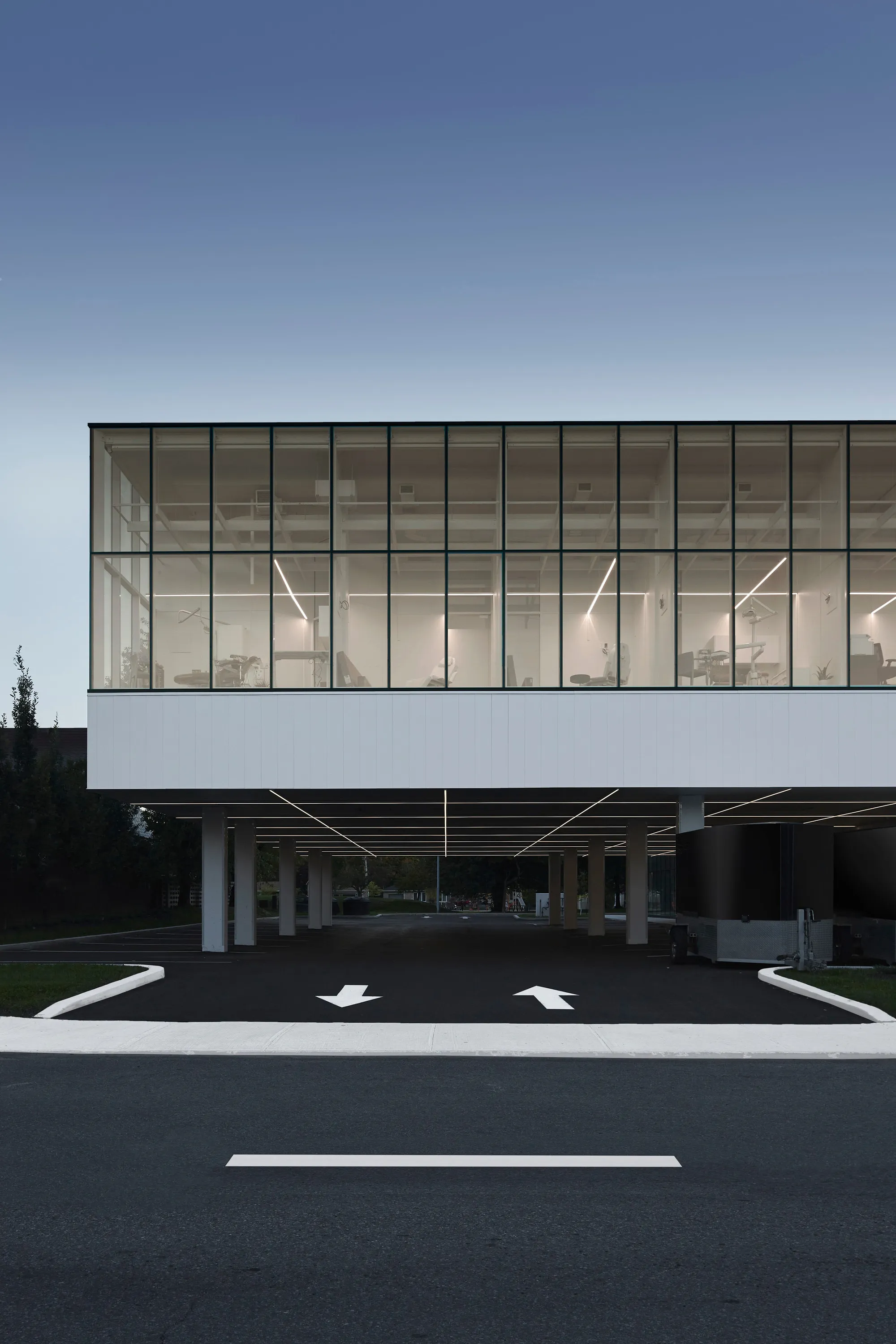
A dental clinic is not the building type that typically inspires architectural ambition. Most are beige, windowless, and deliberately forgettable. So when Studio Jean Verville architectes was commissioned to build a 2,574 square meter dental complex on a long-neglected parcel at the entrance to Vieux-Longueuil, the opportunity was to challenge everything the typology assumes about interiority, enclosure, and patient comfort. The result is a building that is almost entirely transparent, a lantern of ultra-clear glass and white steel that treats natural light and the proximity of trees not as distractions from clinical work but as the very foundation of it.
Jean Verville's design philosophy here, described as biophilic and guided by 'minimal means for maximum effects,' produces a building whose organizing logic is the frame. Structural, acoustic, and luminous frames overlap and repeat, creating a rhythmic grid that reads clearly from both inside and out. By day, the curtain wall dissolves, reflecting the green canopy of adjacent Catherine-Primot Park back onto itself in a conciliatory mirror effect. By night, the illuminated volume becomes a civic marker, a beacon delineating where Longueuil's residential fabric gives way to its commercial core. The 35 treatment spaces housed within are all oriented toward the landscape, a radical inversion of the typical dental office that puts patients staring at a ceiling tile.
A Civic Lantern at the Edge of Vieux-Longueuil
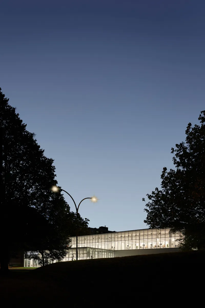


The nocturnal identity of this building is arguably its strongest urban gesture. When illuminated, the gridded glass volume becomes a glowing signal, anchoring a transitional zone that had lacked definition for years. The structural mullions read as a dark lattice against warm interior light, giving the facade a lantern quality that is both inviting and precise. Traffic passes along the street, trees frame the view, and the building holds its ground quietly.
The decision to build on a site that had been left uncultivated for many years carries its own significance. Rather than fortifying the parcel with something opaque and inward-looking, Verville chose maximum permeability. The building does not wall itself off from the park or the street. It absorbs both into its visual field, multiplying images of green spaces and neighboring buildings across its reflective surfaces. The architecture announces itself without shouting.
Glass Walls and the Mirror of the Park
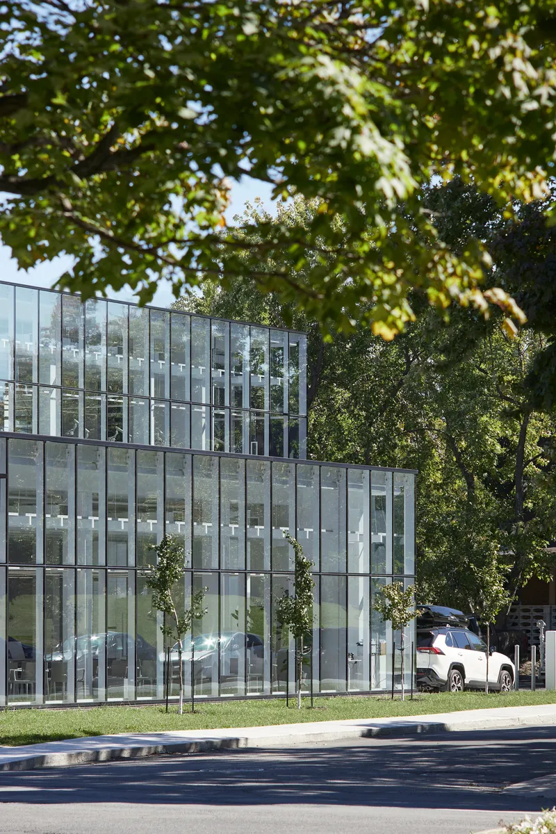
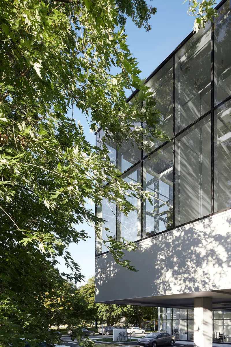
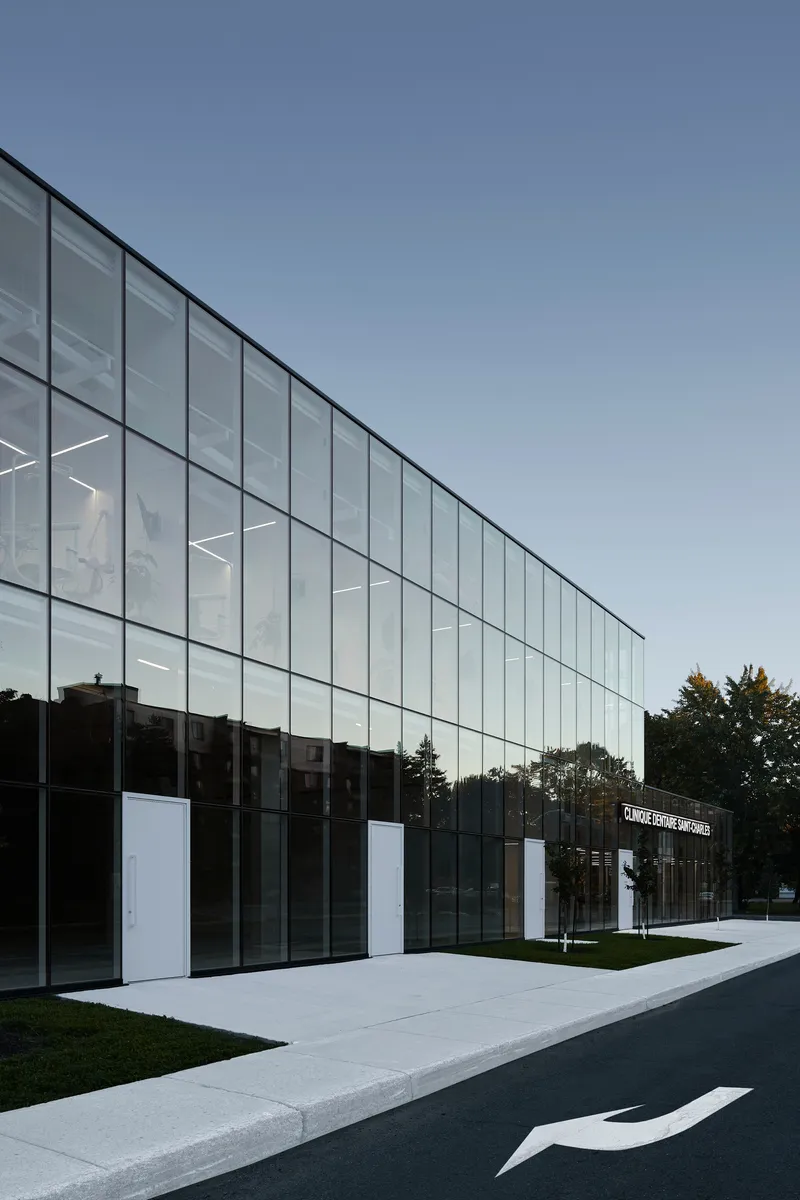
In daylight, the curtain wall performs a different trick. Ultra-clear glass with high-performance low-emissivity film allows the facade to oscillate between transparency and reflection depending on the angle and the hour. Mature trees cast dappled shadows across the white stucco base, and the vertical mullions create a fine-grained rhythm that prevents the glass surface from feeling like a blank corporate slab. The facade is gridded but not rigid; it reads as woven.
The relationship with Catherine-Primot Park is deliberate and specific. Young saplings planted along the lawn edge will eventually mature into a layered screen that softens the building's presence on the street. The landscape strategy is patient, designed to evolve over time so that the architecture becomes increasingly embedded in its green context rather than standing apart from it.
The Ground Plane and Thresholds
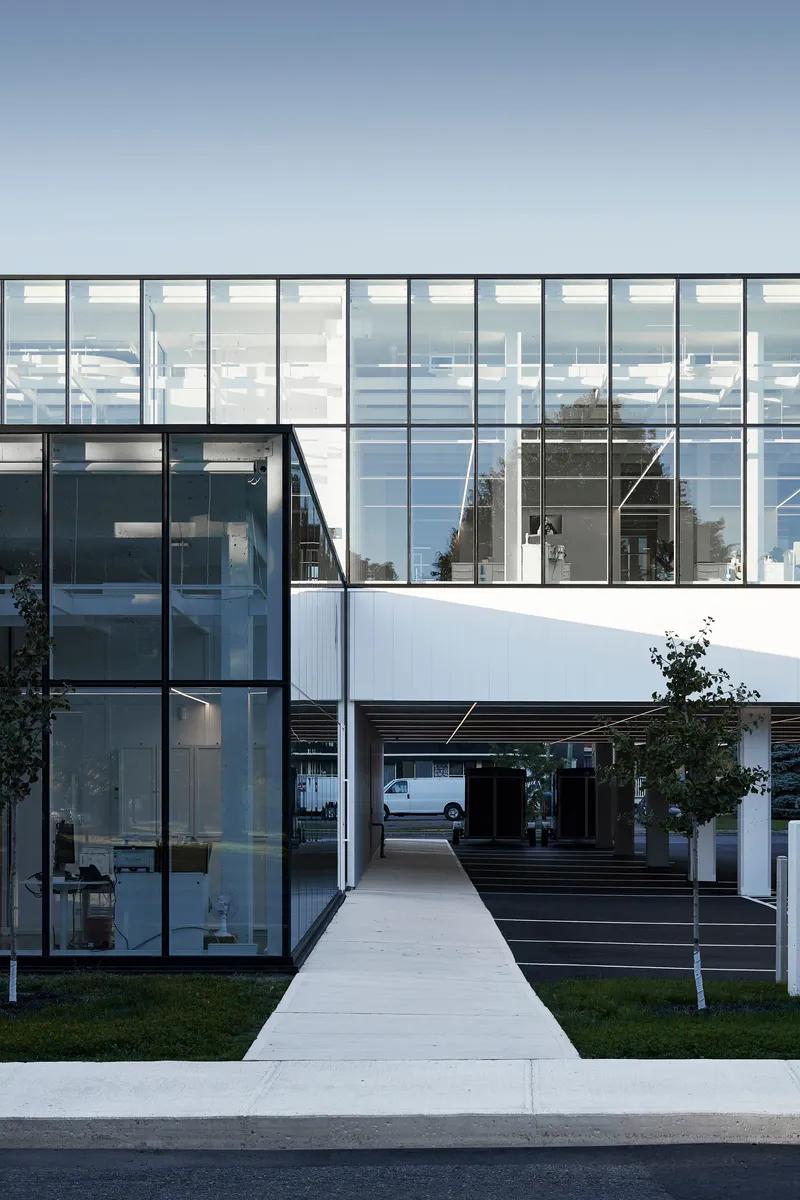
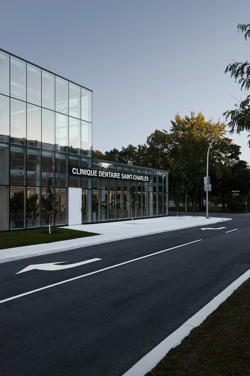
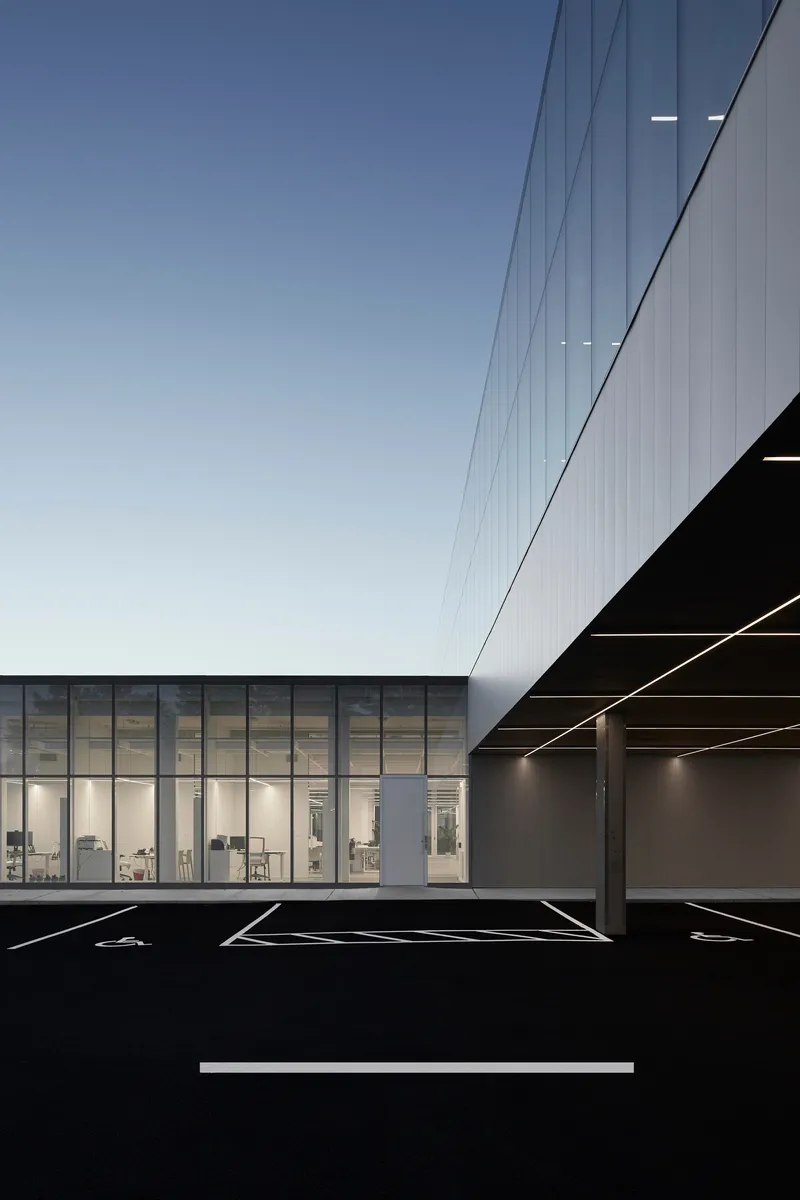
Approaching the building at ground level reveals a more nuanced material palette than the all-glass impression suggests from a distance. A timber-clad volume sits adjacent to the glazed walls, and a concrete pathway leads between them, compressing the visitor's experience before the interior opens up. The soffit above the recessed parking area is corrugated metal, utilitarian and honest, meeting the glass curtain wall with a clean joint that communicates structural confidence.
The cantilevered upper volume hovering over the parking zone is a smart spatial move. It shelters arriving patients while also asserting that the building's program extends beyond its footprint, claiming the threshold zone as inhabitable architecture rather than leftover space. White columns below are slender enough to feel provisional, keeping the ground plane open and navigable.
Structural Poetry: The White Frame
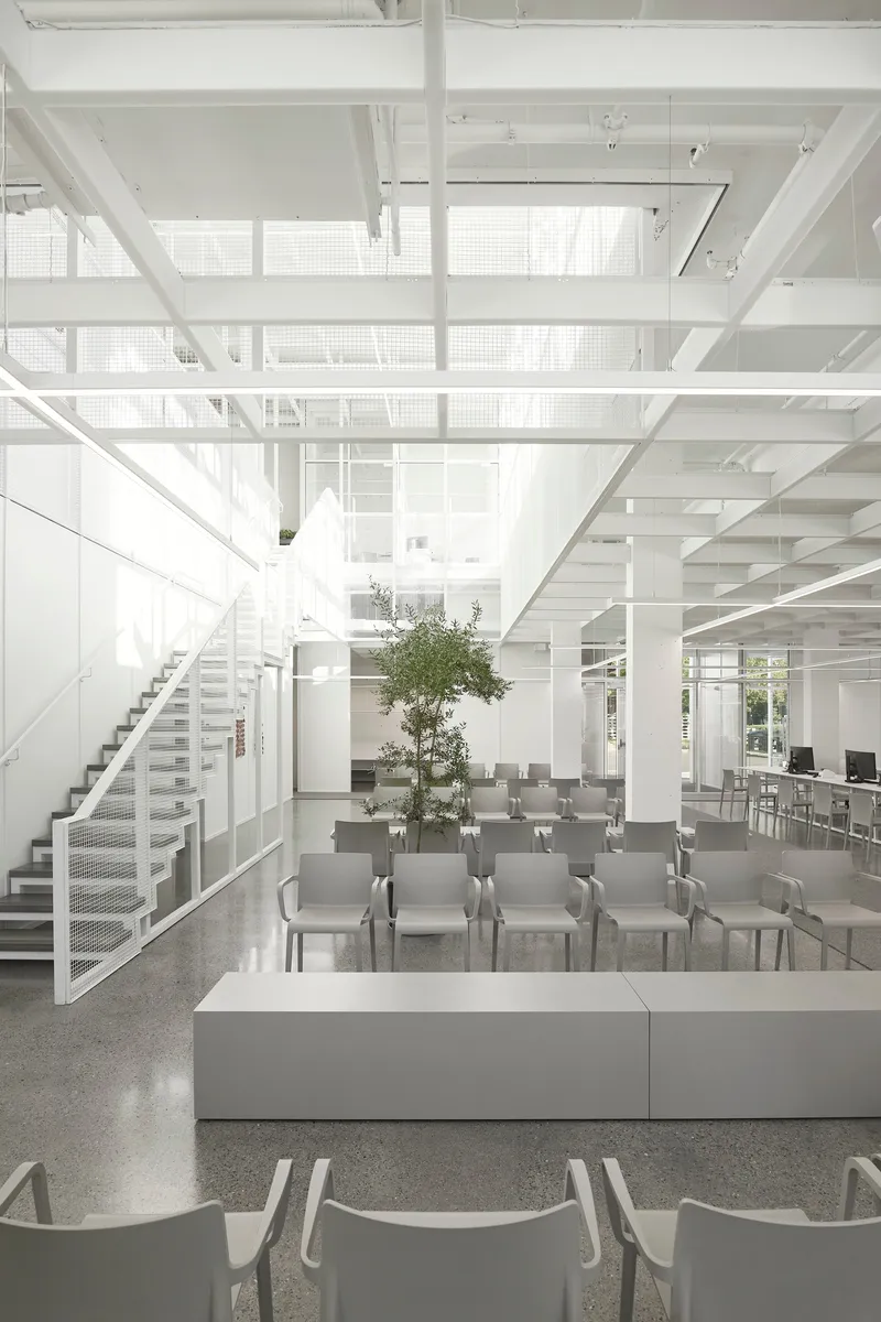
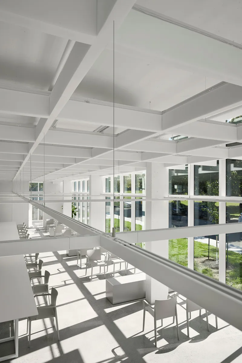
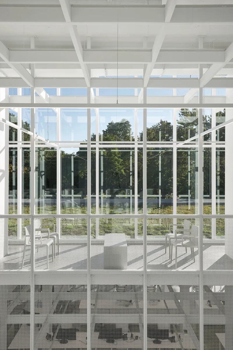
Inside, the building's skeleton becomes its primary ornament. White steel frames, coffered ceiling beams, and perforated metal mezzanine floors layer over one another to produce what Verville calls 'shadow games evocative of nature's abundance.' This is not decoration applied after the fact. The shadows are a direct consequence of the structural order, shifting throughout the day as the sun moves across the fully glazed envelope. The effect is kaleidoscopic but controlled.
The double-height volumes are key. By opening the section vertically in strategic locations, Verville creates spatial relief within a program that could easily have become a monotonous sequence of treatment rooms. The glass-railed mezzanine allows views across and through the building, reinforcing the biophilic principle that occupants should always have access to daylight, distant views, and an awareness of natural cycles.
Treatment Rooms Facing the Trees
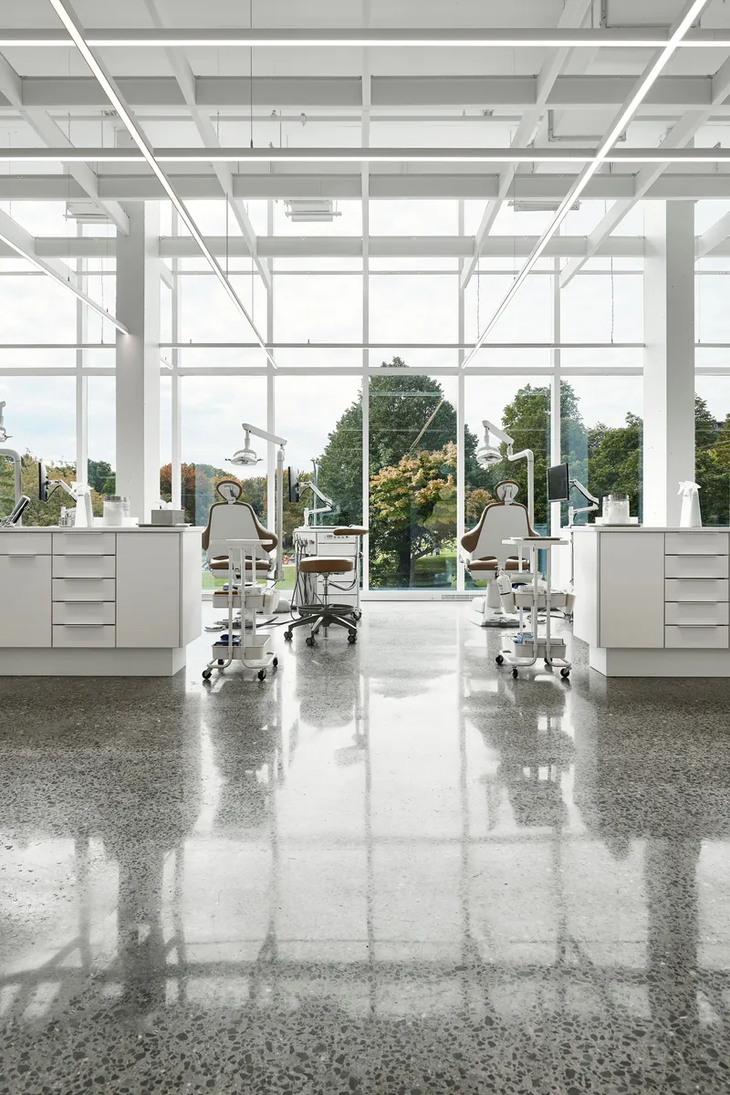

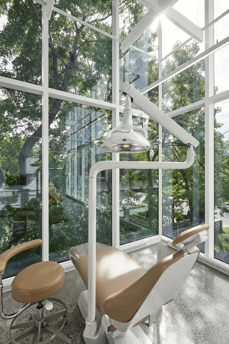
The most radical move here is placing 35 dental treatment stations directly against the glass curtain wall. Patients recline in tan vinyl chairs and look out at green foliage rather than acoustic ceiling panels. The argument is straightforward: if biophilic design reduces stress and improves healing outcomes in hospitals, it should do the same in a dental clinic. The equipment is state of the art, and every station is fully accessible, but the spatial experience is closer to a garden pavilion than a medical office.
Privacy, the obvious concern with floor-to-ceiling glass in a healthcare setting, is managed through the depth of the plan. Treatment zones are set back from the facade, and the structural grid provides a sense of enclosure without actual walls. The white steel columns act as visual screens that filter sightlines from the street without blocking natural light. It is a calibrated balance that could have gone wrong easily but reads here as generous rather than exposed.
Light, Shadow, and Interior Circulation

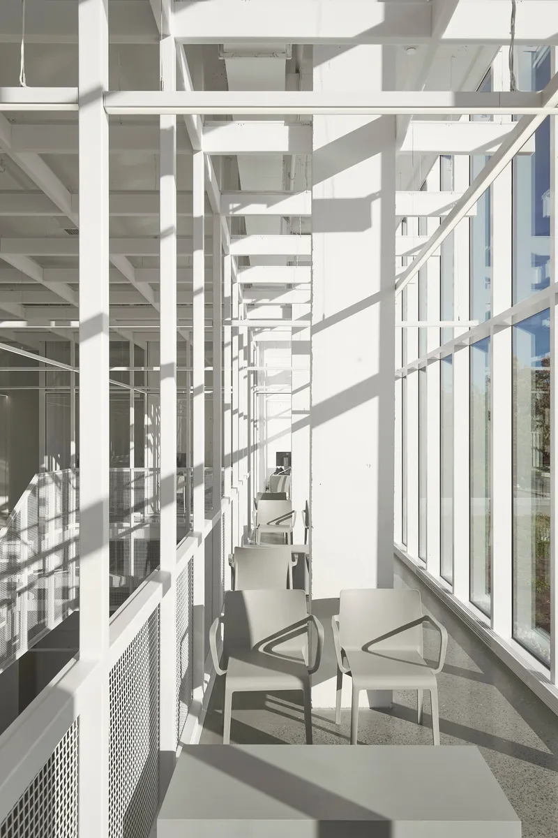

The interplay between the waffle slab ceiling and the floor-to-ceiling glazing generates some of the building's most photogenic moments. Geometric shadow patterns fall across polished concrete and terrazzo floors, shifting slowly enough to register as natural phenomena rather than architectural gimmicks. The narrow corridors along the glazed facade use perforated metal balustrades to fracture light further, creating a layered depth of illumination that gives even the most utilitarian circulation spaces a sense of event.
The terrazzo-floored central spine is the organizational backbone of the plan, a long aisle flanked by white columns and linear lighting that connects all program zones. This is deliberately legible: patients and staff always know where they are in the building because the landscape is always visible. Wayfinding becomes intuitive when the exterior is never more than a glance away.
Vertical Moments: Stairs and Atrium
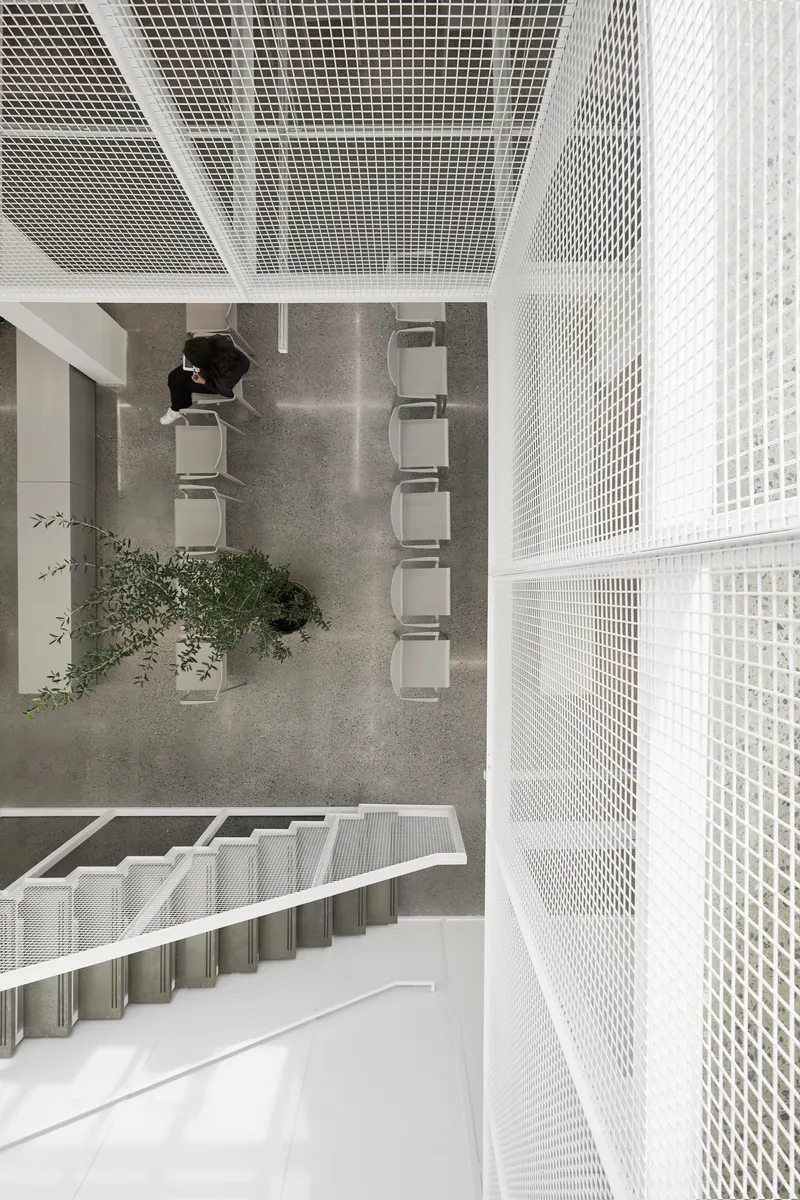

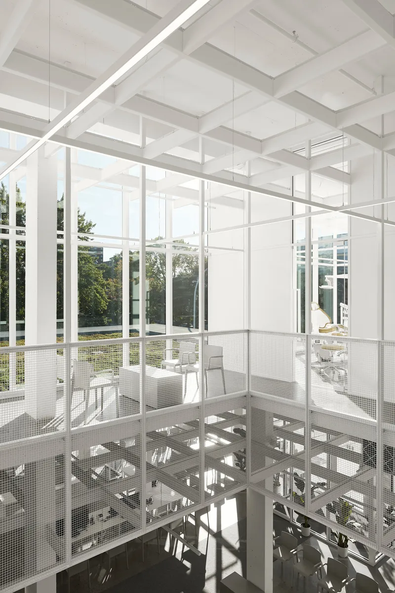
The multi-story atrium, viewed from above, reveals the precision of the perforated metal detailing. White balustrades dissolve into a field of tiny openings, maintaining visual transparency across levels while providing safety. An olive tree in the foreground of the stair enclosure anchors the biophilic narrative in a tangible way: living plants are not decorative afterthoughts but embedded elements of the spatial sequence.
The stair itself is simple, white steel and open risers, but its placement within the double-height glazed volume turns a functional connection into a moment of spectacle. Looking down through the perforated metal floor, the garden beyond the curtain wall appears through multiple layers of material. The building reads as a stack of transparent veils rather than a solid mass.
Plans and Drawings
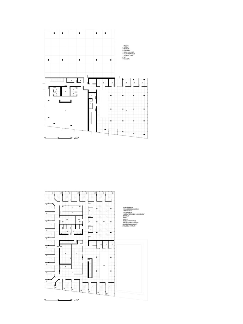
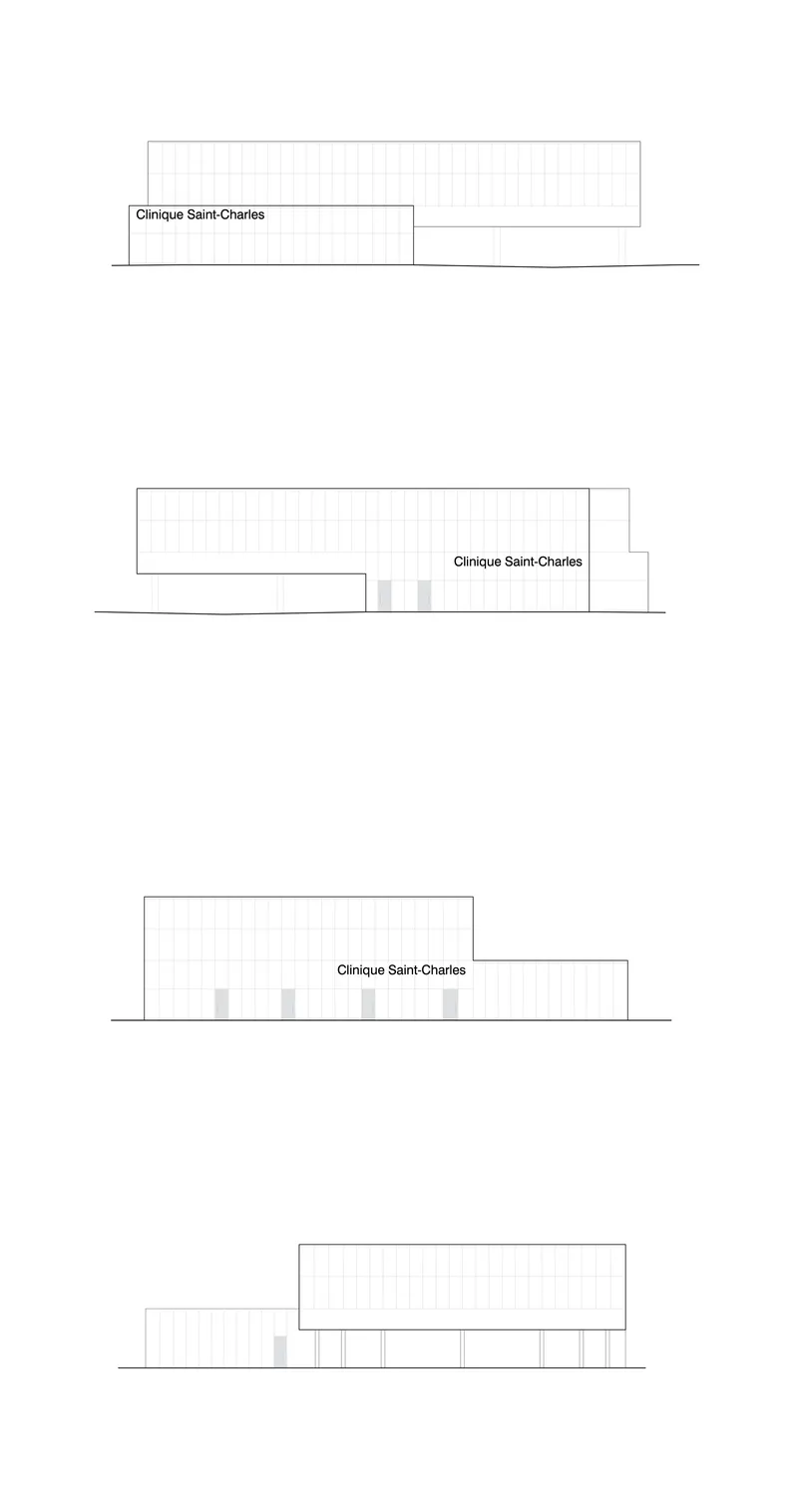
The floor plans confirm what the experience suggests: enclosed rooms are pushed to one edge of the plan, freeing the glazed perimeter for open treatment and circulation zones. This strategy maximizes the daylight dividend and ensures that the most occupied spaces receive the most generous views. The elevations reveal a low-rise building whose gridded facade and recessed entrance give it a civic presence that belies its healthcare function. The proportions are careful, the horizontal datum lines consistent, and the entry sequence compressed to make the double-height interior feel more expansive by contrast.
Why This Project Matters
The St-Charles Dental Clinic matters because it refuses the premise that medical buildings must prioritize interiority over connection. Jean Verville has taken a program typically defined by anxiety and sensory deprivation and reframed it around daylight, vegetation, and visual generosity. The biophilic concept is not applied as a superficial layer of potted plants and nature photography; it is embedded in the structural logic, the orientation of every treatment chair, and the transparency of the envelope. The building argues that healing environments do not require isolation from the world. They require more of it.
On a broader level, this project demonstrates that civic ambition is not exclusive to museums, libraries, or concert halls. A dental clinic on a forgotten lot in Longueuil has no obvious claim to architectural significance, yet Verville has produced a building that serves as a neighborhood landmark, a gateway marker, and a case study in how transparency and structural rhythm can elevate the ordinary into something quietly remarkable. When the profession debates whether design quality matters in everyday building types, this project answers emphatically.
St-Charles Dental Clinic by Studio Jean Verville architectes, lead architect Jean Verville. Located in Longueuil, Canada. 2,574 m². Completed in 2022. Photography by Maxime Brouillet.
About the Studio
Share Your Own Work on uni.xyz
If projects like this are the kind of work you want to make, uni.xyz is a place to publish your own, find collaborators, and enter design competitions.


Popular Articles
Popular articles from the community


The Ocean Hive: Sustainable Architecture for a Self-Sufficient Civilization at Sea
The Ocean Hive imagines sustainable architecture at sea, where modular habitats, algae, wave power and ocean waste sustain a growing colony.
AL-JANNAH: Sustainable Architecture and Permaculture for Afghan Widows
AL-JANNAH uses sustainable architecture and permaculture to create resilient oasis of housing, learning, work and renewal for Afghan widows.
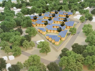
The Earth Pod: 3D Printed Homes for Resilient Refugee Communities
The Earth Pod reimagines refugee housing through 3D printed homes made from clay, combining resilience, self-sufficiency, and rapid shelter.
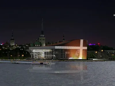
Hill & Cross Opera: Sculptural Opera House Architecture Shaped by Tallinn’s Landscape and Identity
Hill & Cross Opera reimagines opera house architecture in Tallinn through its sculptural hill, civic plaza, glass wave and a luminous cross.

Similar Reads
You might also enjoy these articles

Bao Huynh Watercolor Atelier: A Serene Art Retreat in Hội An
Bao Huynh Watercolor Atelier in Hội An blends multifunctional art spaces, sustainable design, local materials, and family-friendly living in a serene environment.

Atelier Macri Concept Store Interior Design by CASE-REAL
Atelier Macri store features a "ko" counter, walnut wood details, cork displays, blending retail, gallery, and seamless customer experiences.

Manuel Vargas Izquierdo Stadium and High-Performance Sports Center: Architectural Excellence in Jalpa de Méndez
The Manuel Vargas Izquierdo Stadium blends sustainable design, inclusive sports facilities, and cultural-inspired architecture, revitalizing Jalpa de Méndez’s public spaces.
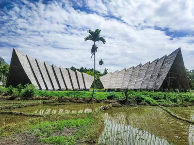
KAKR Buluh Awar Hall: Revitalizing Community and Ecology Through Bamboo Architecture
Community built bamboo hall revitalizes Buluh Awar village, empowering youth, restoring ecology, celebrating vernacular craftsmanship through sustainable architecture and culture.
Explore Public Building Competitions
Discover active competitions in this discipline



Challenge to design locus for the upliftment of human rights


Challenge to reimagine the Iron Throne


Photograph architecture without architects


Illustrate the lost glory of Angkor Wat - Render Challenge
Comments (0)
Please login or sign up to add comments
No comments yet. Be the first to comment!