

Sukchulmok Studio Layers Brick, Timber, and Light into a Seoul Bakery and Café
An adaptive reuse project in Yongsan-gu turns a modest corner building into a material study of warmth, texture, and filtered daylight.


Seoul's Yongsan-gu district is evolving fast, and the buildings that survive the churn tend to do so because someone decided they were worth more than their lot value. Sukchulmok studio made that bet with an existing corner structure, stripping it back and rebuilding it as a bakery and café that treats materiality as its primary spatial tool. The result is a building that feels layered in the literal sense: perforated brick screens, translucent panels, corrugated metal, exposed concrete, and timber slat ceilings all stack and overlap, each surface filtering light and attention in a different way.
What makes the project genuinely interesting is not the adaptive reuse label, which gets stamped on too many projects that barely qualify. It is the deliberate mismatch of registers. The ground level is warm, domestic, almost greenhouse-like with its potted palms and curved terrazzo counters. The upper levels are rawer, more industrial, with exposed concrete columns and perforated brick that throws dappled light across bare floors. The building shifts mood as you move through it, and the transitions feel earned rather than styled.
A Corner Building That Reads Differently on Every Face
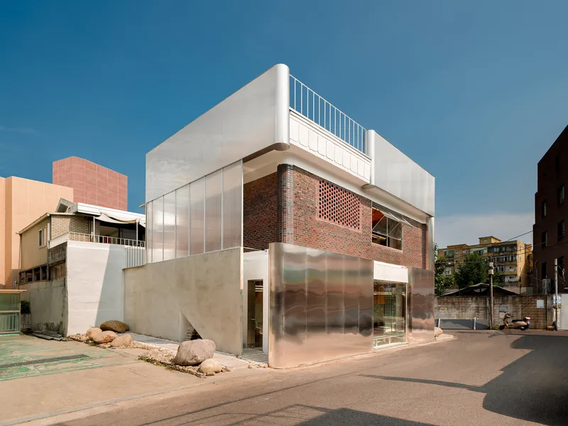
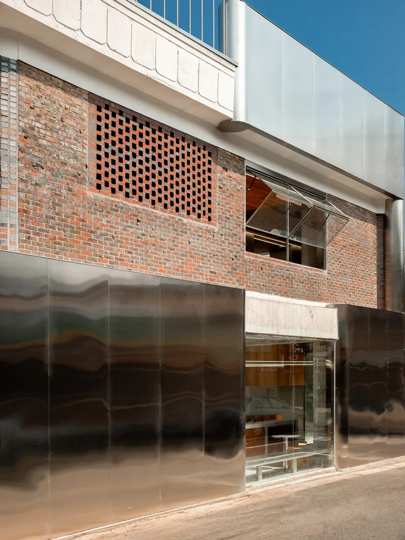
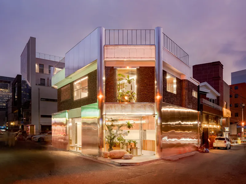
The exterior is an exercise in controlled asymmetry. No two facades offer the same composition. One side presents a white stucco base with a triangular entrance cut beside boulders and gravel, a deliberately rough threshold. Turn the corner and the building becomes a reflective steel surface capped by perforated brickwork. At dusk, the translucent upper panels glow from within, and the whole structure reads as a lantern sitting atop a heavier masonry base.
Sukchulmok studio resists the temptation to unify the facades under a single material logic. Instead, each elevation responds to its street condition: the busier side gets the reflective steel panel that deflects attention, while the quieter corner invites closer inspection through the brick screen. It is a small building that manages to feel complex without becoming fussy.
Perforated Brick as Light Filter and Spatial Boundary
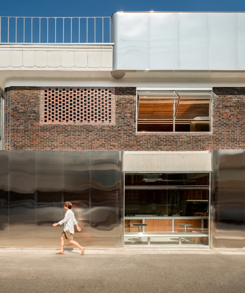
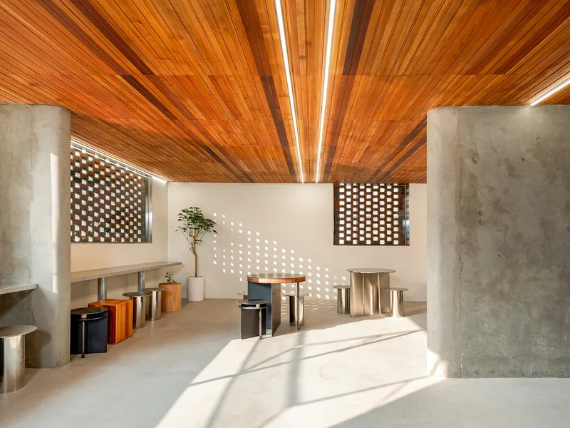
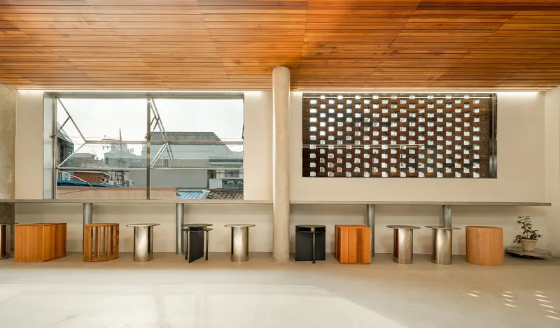
The perforated brick screen is the building's signature move. It appears on the exterior as a textured band, but its real power is felt inside, where it casts a shifting pattern of dappled light across the polished concrete floor. The effect is atmospheric without being decorative. The brick functions simultaneously as a privacy screen, a ventilation layer, and a way to modulate the quality of daylight entering the interior.
Paired with large glazed openings and built-in seating, the brick screen creates zones of light and shadow that change throughout the day. The seated areas along the perforated wall feel enclosed without being closed off. You are aware of the street, but the street is abstracted into light and movement rather than noise and signage. It is a straightforward tectonic decision that pays dividends in spatial experience.
The Terrazzo Counter and Ground Floor Warmth
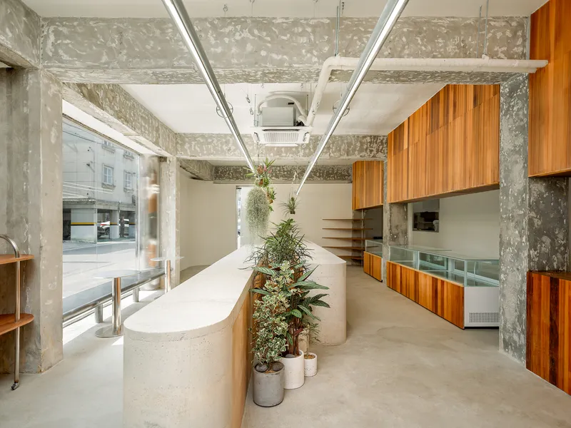
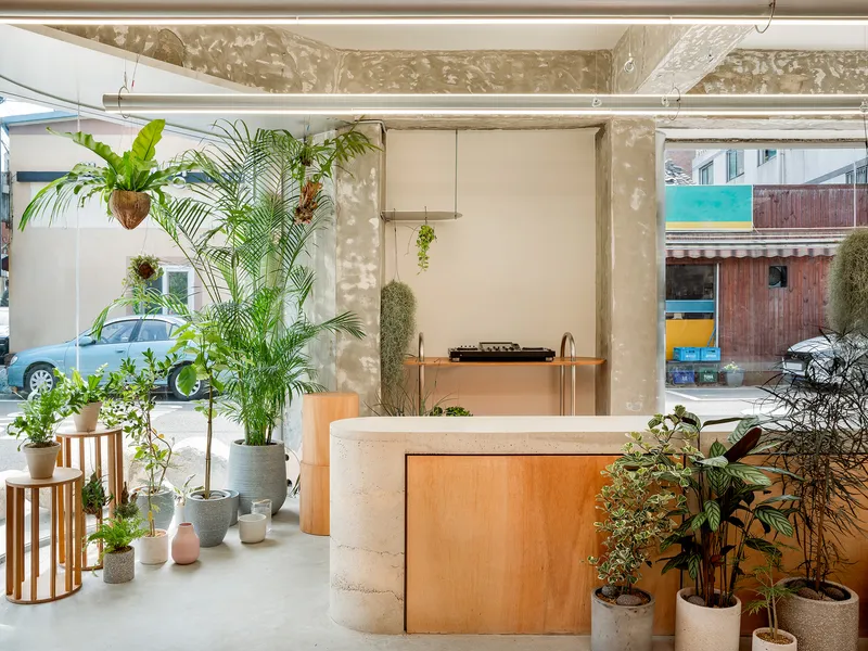
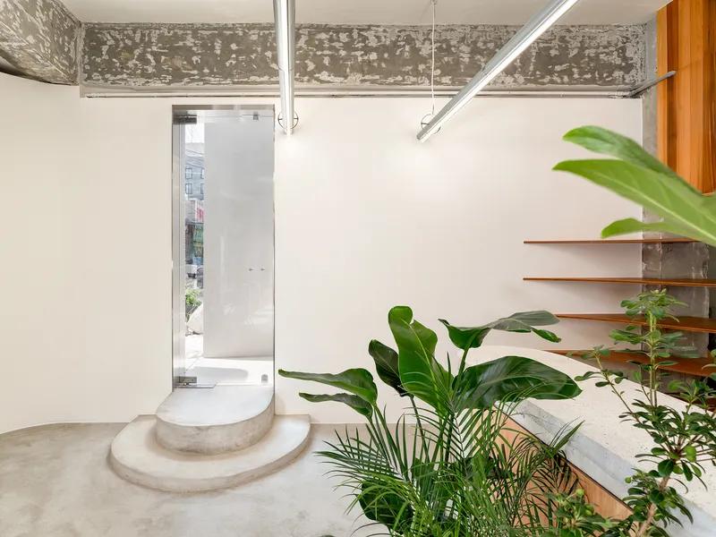
At street level, a curved terrazzo counter anchors the bakery's interior. The curve is generous, sweeping through the open plan and drawing customers along its edge from entrance to service point. Terrazzo steps at the entrance continue the material upward, blurring the threshold between sidewalk and interior. Tropical plants in large white planters line the approach, turning the entry sequence into something closer to a garden path than a commercial doorway.
The palette down here is warmer and softer than the upper levels. Timber cabinetry, hanging plants, and the terrazzo's speckled surface give the ground floor a tactile richness that invites lingering. The concrete structure is still exposed overhead, but it recedes behind the botanical clutter and the warmth of the millwork. It is a smart calibration: the bakery needs to feel welcoming at eye level, even as the architecture above it stays deliberately tough.
Timber Ceilings and the Upper Rooms
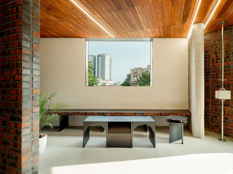
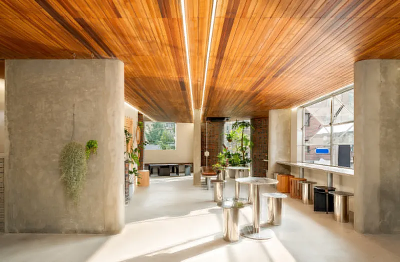
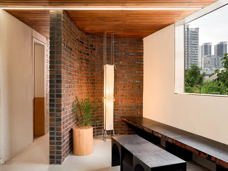
Move upstairs and the mood shifts. Timber slat ceilings radiate outward from exposed concrete columns, creating a warm canopy over seating areas that feel more contemplative than the bustling bakery below. Brick walls reappear in their unperforated form, providing a rougher backdrop. Picture windows frame views over urban rooftops, and the steel table and minimal furnishings let the materials do the talking.
The radiating timber pattern is worth noting. Rather than running slats in a single direction, Sukchulmok studio fans them outward from structural points, which gives the ceiling a dynamic geometry that draws your eye toward the columns. It is a detail that rewards attention without demanding it, and it reinforces the sense that every surface in this building has been considered as part of a larger spatial composition.
Interior Atmosphere: Plants, Concrete, and Filtered Light
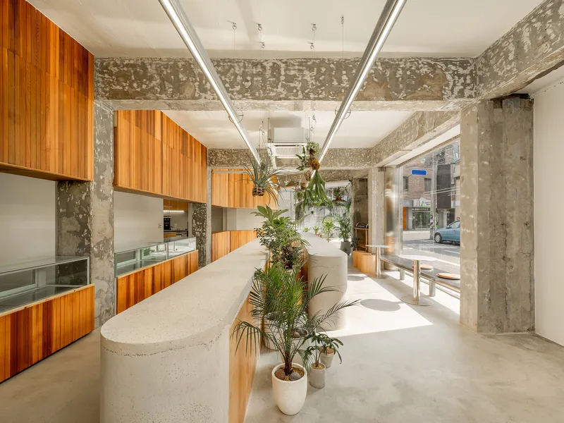
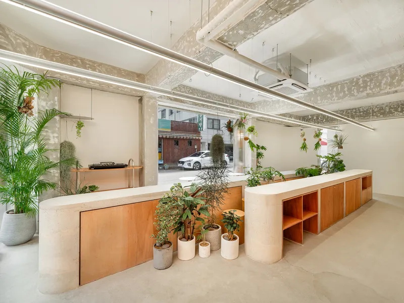
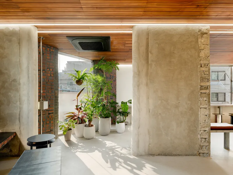
The interiors lean heavily on the contrast between heavy concrete structure and soft botanical elements. Potted palms in white cylindrical planters appear throughout, sometimes clustered beneath timber ceilings, sometimes framing the glazed storefront. The planting is not incidental; it functions as a spatial divider and a softening agent, breaking up the open plan into zones without walls.
Exposed concrete beams and columns are left raw, their formwork texture visible. Against this roughness, the timber cabinetry and hanging plants introduce a domesticity that keeps the café from feeling like a gallery or a co-working space. The balance is well struck. The building is clearly a commercial interior, but it has the layered informality of a place where someone has been accumulating objects and plants over time, even though the whole thing was designed in one shot.
Street Thresholds and the Entry Sequence
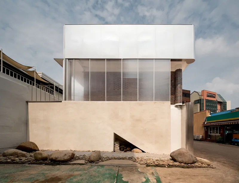
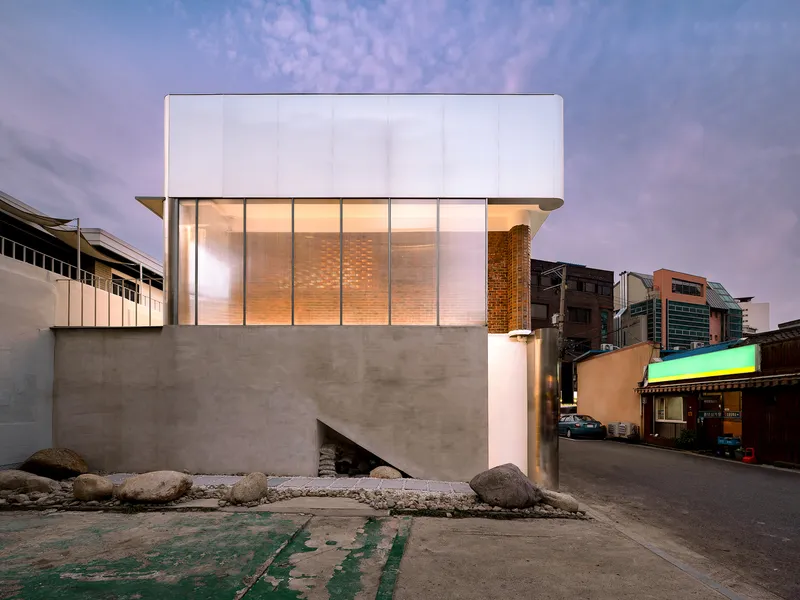
The entrance sequence is deliberately unconventional. A triangular opening cut into the white stucco base sits beside boulders and gravel, materials that feel imported from a landscape project rather than a commercial fit-out. At night, the translucent upper volume and timber screens glow, pulling attention upward and making the modest entrance feel like a threshold into something larger than its footprint suggests.
Sukchulmok studio clearly understands that in a dense urban context, the moment of arrival matters as much as the interior it leads to. The boulders, the gravel, the angular cut: all of it slows you down and signals that this is not a standard storefront. It is a small piece of choreography, but in a neighborhood where every ground floor is competing for foot traffic, that moment of friction is a valuable differentiator.
Plans and Drawings
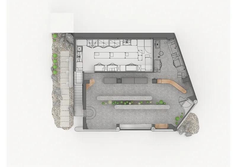
The floor plan reveals the logic that the photographs only hint at. The curved terrazzo counter sweeps through the open retail space, directing circulation from the corner entrance toward the service area. Seating wraps along the perforated brick wall, and corner planting beds anchor the plan's geometry. The open layout is deceptively simple; what gives it character is the way the curved counter introduces a non-orthogonal flow through an otherwise rectangular footprint.
Why This Project Matters
Adaptive reuse in Seoul's rapidly developing neighborhoods often means little more than a cosmetic refresh behind a preserved facade. Sukchulmok studio goes further by treating the existing structure as a starting point for a genuine material investigation. The perforated brick, the layered facades, the shifting interior moods: none of this is applied decoration. It grows out of decisions about light, structure, and street relationship that take the existing building seriously as a found condition.
The broader lesson here is about how much spatial richness a small commercial project can carry when the architect refuses to flatten it into a single aesthetic. Every floor of this building feels different. Every facade tells a different story. And yet the whole thing coheres because the material palette is disciplined and the structural logic is legible throughout. In a city where bakeries and cafés are both commercial ventures and social infrastructure, this kind of architectural ambition is not a luxury. It is an investment in the quality of daily life.
Layers of Space: Adaptive Reuse of Sukchulmok Bakery and Café, by Sukchulmok studio, Yongsan-gu, Seoul, South Korea. Photography by Hong Seokgyu.
About the Studio
Share Your Own Work on uni.xyz
If projects like this are the kind of work you want to make, uni.xyz is a place to publish your own, find collaborators, and enter design competitions.



Popular Articles
Popular articles from the community


Co-life: Sustainable Architecture for Age-Friendly Community Living
Co-life reimagines sustainable architecture for seniors through courtyards, rammed earth, shared gardens, and spaces designed for belonging.

Play: Fragments of Their World
Familiar architecture becomes modular playground design, creating safe spaces where displaced children can learn, connect, imagine and play.

Lunar Spiral: Space Architecture Shaped by the Mathematics of the Universe
Lunar Spiral reimagines space architecture through Fibonacci geometry, lunar regolith, levitating habitats, and self-sustaining Moon living.

The Ocean Hive: Sustainable Architecture for a Self-Sufficient Civilization at Sea
The Ocean Hive imagines sustainable architecture at sea, where modular habitats, algae, wave power and ocean waste sustain a growing colony.

Similar Reads
You might also enjoy these articles


Hodi-Mandai Geram
Project Function: Preservation and revitalization of the Intangible heritage and socio-spatial identity of the Hodi by Housing, Cultural Memory Center, Sacred Grove, landscape, local tourism economy

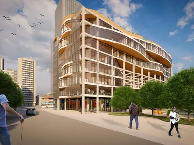
Olio Towers: A Mid-Rise for Performers That Fuses Housing, Rehearsal, and Stage
Located blocks from Houston's Theater District, this modular tower stacks living units around a central performance atrium.
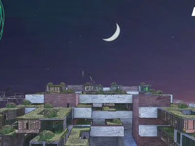
Oasis: Modular Green Housing Carved into Dhaka's Urban Fabric
A shortlisted Plugin Housing entry reclaims unauthorized settlements in Dhaka with stepped concrete volumes, green roofs, and ventilation-driven design.

Black Hole: A Floating Megastructure for the Post-Physical Era
Emiliano Mazzarotto envisions a spherical, self-scaling arena where e-sports, digital hotels, and holographic stadiums replace traditional public space.


Explore Interior Design Competitions
Discover active competitions in this discipline


Challenge to design luxury tourism on rails


Challenge to reimagine the Iron Throne


Photograph architecture without architects


VR headsets Storefront design competition
Comments (0)
Please login or sign up to add comments
No comments yet. Be the first to comment!