
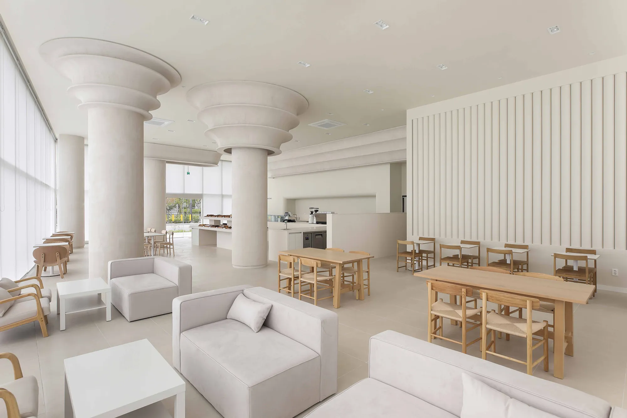
Design Studio Maoom Shapes a South Korean Bakery Around Lantern-Like Columns and Layered Light
HORONG Bakery in Godeok New Town uses stepped column capitals and translucent screens to craft 326 square meters of calm.


A bakery is, at its core, a place where simple ingredients become something nourishing. Design Studio Maoom took that premise literally when designing HORONG Bakery in Godeok New Town, South Korea: strip everything back to elemental forms, then let light and material do the rest. The 326-square-meter interior is organized around a series of fluted cylindrical columns whose capitals bloom outward in concentric stepped rings, turning what could be ordinary structural elements into the defining spatial gesture of the entire project.
The name "horong" refers to a small traditional Korean lantern, and the reference is more structural than decorative. Each column capital radiates outward like the glow of a candle, softening the boundary between ceiling and column, solid and void. It is a genuinely inventive detail, and it gives the bakery an architectural identity that no amount of branding or furniture selection could achieve on its own. The real story here is how a single repeated element, scaled and lit with care, can turn a commercial fit-out into a space worth remembering.
Columns as Characters
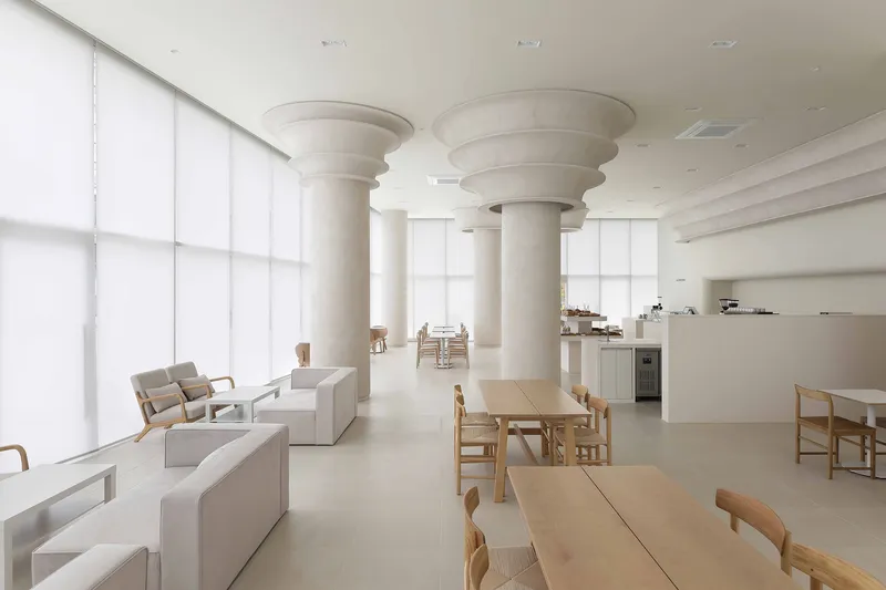
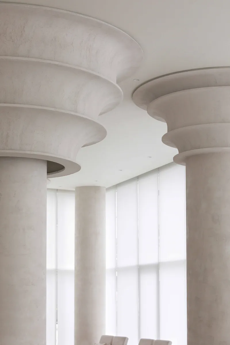
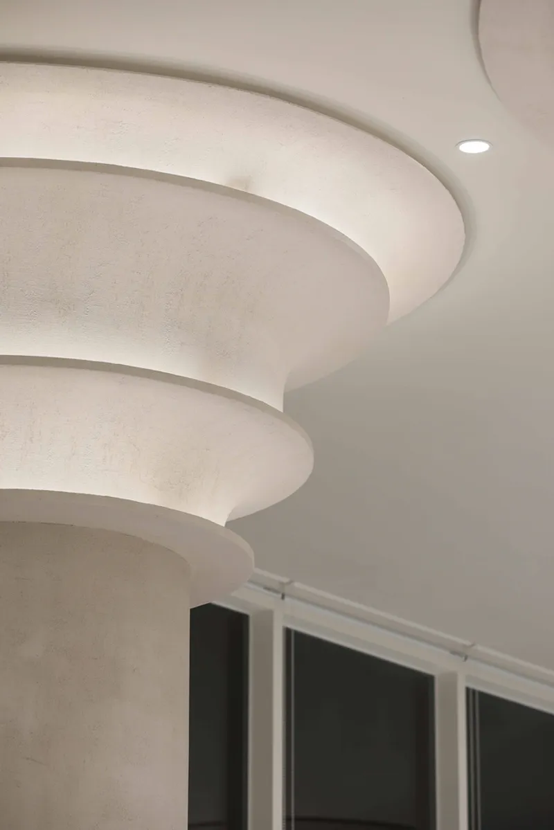
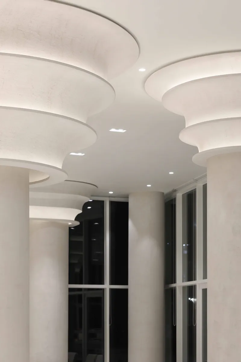
The fluted columns at HORONG are the most immediate thing you notice, and the most rewarding thing to keep looking at. Their shafts are vertically ribbed in white plaster, giving them a tactile softness despite their scale. But the capitals are where the invention happens: concentric stepped discs expand outward toward the ceiling plane, creating a layered, almost geological quality. The detail recalls Art Deco or classical orders, yet feels contemporary because the execution is so restrained. There is no ornamentation beyond the geometry itself.
The perspective section drawing reveals that these capitals are built around steel pipe cores, which means the stepped rings are non-structural cladding. That matters because it tells us the entire visual language of the interior is essentially an applied system, one that could, in principle, be adapted to any column grid. It is a smart move for a commercial project: the architecture does not depend on custom engineering, just on precise millwork and a clear idea.
Light as Material
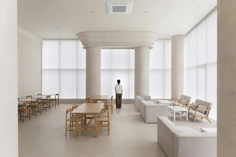
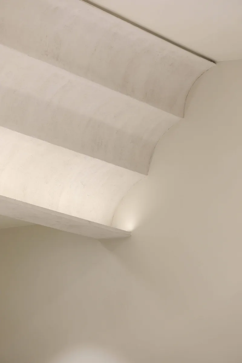
Floor-to-ceiling translucent panels along the facade wash the interior with diffused daylight, eliminating hard shadows and giving the white plaster surfaces a consistent, almost luminous quality. A recessed linear skylight slot runs along the ceiling beams, adding a secondary layer of controlled illumination that sharpens the profile of each stepped capital from above. The result is an interior that reads as uniformly calm during the day but shifts character entirely at night.
After dark, the concentric rings of the column capitals catch recessed lighting and become the dominant visual element, glowing against the flat white soffit. The glazed facade inverts its role, turning from a light source into a mirror that doubles the column rhythm in reflection. The lantern metaphor that gives the bakery its name stops being figurative and becomes something you can actually see from the street.
The Night Presence
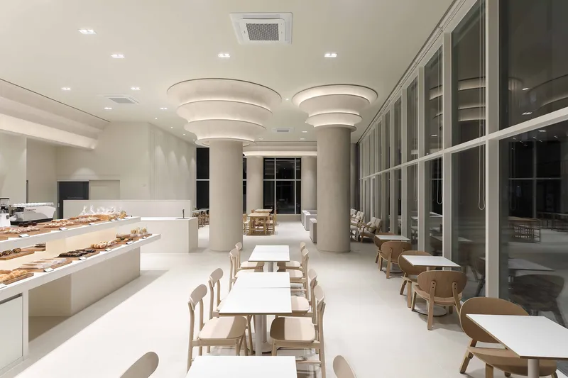
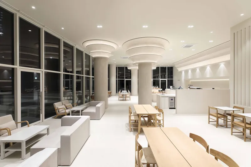
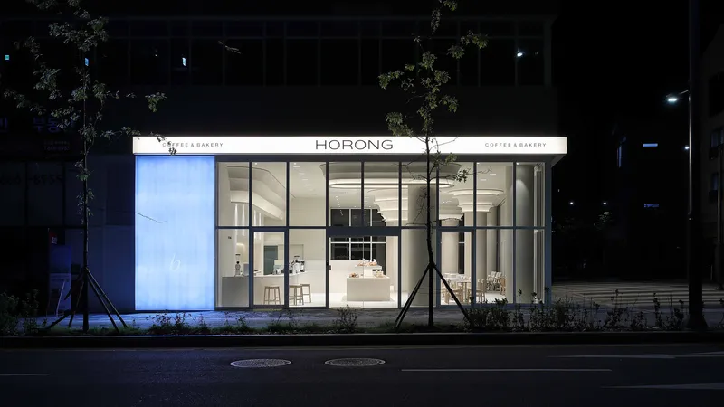
Many hospitality interiors are designed to photograph well in daylight and then hope for the best once the sun sets. HORONG is clearly designed for both conditions. The evening views through the fully glazed storefront are the strongest images in the project: the stepped capitals read as a sequence of halos suspended in a warm, amber-toned interior, visible across the paved plaza and framed by young trees. The bakery becomes a neighborhood lantern in a very direct sense, signaling warmth and activity without relying on signage or neon.
The outdoor plaza, with its low planting and simple paving, is kept deliberately plain. It functions as negative space, ensuring the interior glow is the only visual event at street level. That restraint takes confidence, particularly in a new town development where commercial tenants typically compete for attention.
Counter and Display
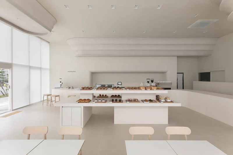
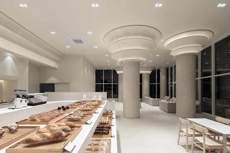
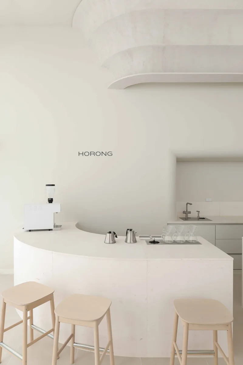
The bakery counter is a long, gently curved form in white plaster, its surface smooth and unbroken except for the glass display cases that present bread and pastries at eye level. Above, the stepped ceiling beams provide rhythm and overhead scale without lowering the apparent ceiling height. The counter is positioned to be the first thing visible from the entrance, anchoring the commercial function of the space so that everything else can remain looser and more domestic in feel.
A secondary coffee bar tucks against one of the columns, with timber stools arranged beneath a tiered capital that acts almost like a canopy. The brewing equipment is exposed but not showcased; it sits in the composition as another functional element alongside the columns and screens. Design Studio Maoom treats the service areas with the same spatial care as the seating zones, which is rarer than it should be.
Seating and Texture
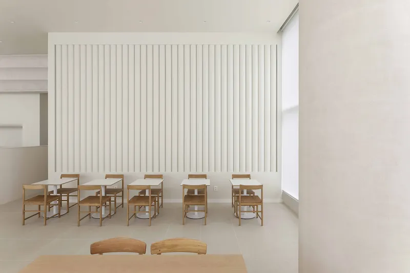
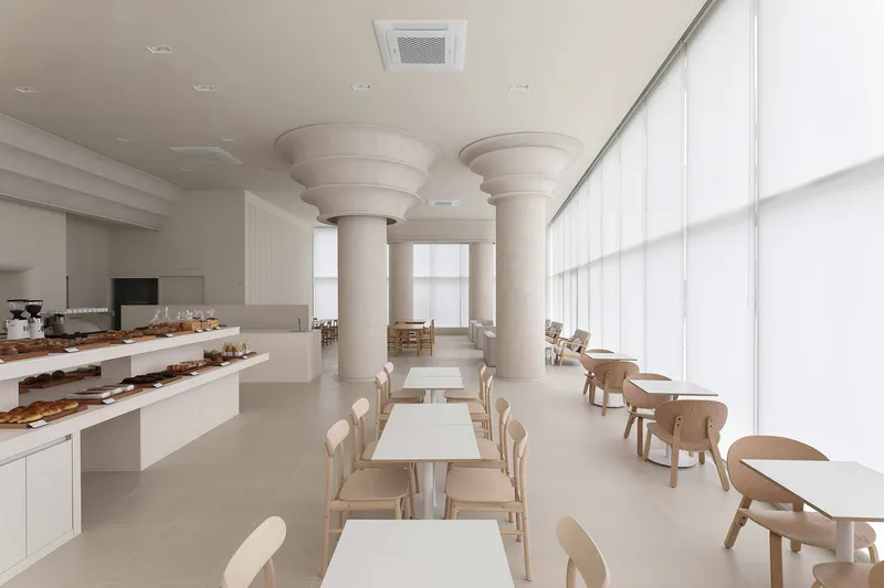
Timber chairs and tables, warm in tone and simple in profile, are clustered in small groupings throughout the space. A vertical white slat partition creates a semi-private zone along one wall, filtering sightlines without enclosing the area. The material palette is narrow: white plaster, pale timber, and the translucent fabric of the window screens. There are no accent colors, no feature walls, no contrasting metals. The discipline is total, and it works because the column capitals provide all the visual complexity the eye needs.
What keeps the space from feeling sterile is the quality of the surfaces. Close-up, the plaster has a matte, slightly textured finish. The timber grain is visible and warm. The ceiling beams, though precisely formed, have a handmade quality in the way they step outward. These tactile moments accumulate and make the bakery feel inhabited rather than rendered.
Plans and Drawings
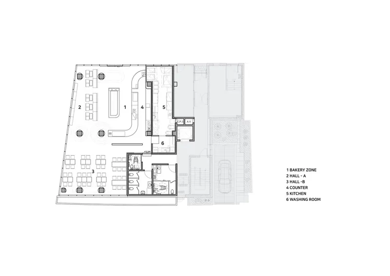
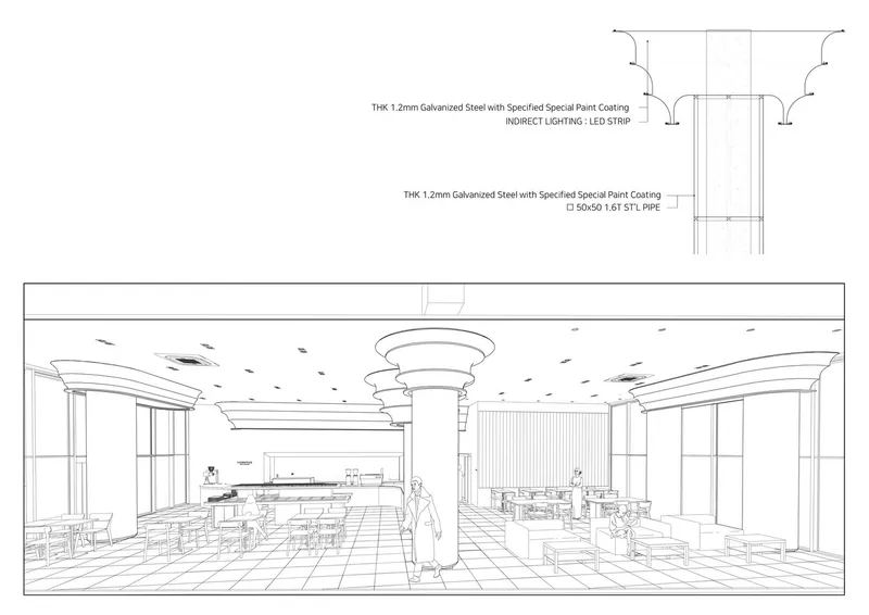
The floor plan reveals a straightforward commercial layout: the bakery display and kitchen occupy one side, seating fills the column grid on the other, and service rooms line the back wall. An exterior courtyard appears at the rear, though the photographs do not show it. The spatial clarity of the plan is notable. There are no maze-like corridors or forced circulation paths; you enter, you see the bread, you choose where to sit.
The perspective section drawing is the most revealing document. It confirms that the stepped capitals are constructed around steel pipe columns, with the concentric rings acting as cladding. A detail callout isolates the pipe-to-ring connection, showing how the geometry is achieved practically. The drawing also makes clear just how much of the ceiling plane is occupied by the radiating capitals: they nearly touch each other, transforming the soffit into a continuous landscape of overlapping circles.
Why This Project Matters
HORONG Bakery demonstrates that a commercial interior does not need a large material budget or complex spatial gymnastics to produce architecture worth discussing. One rigorously developed detail, the stepped column capital, gives the entire 326-square-meter space its identity. Design Studio Maoom understood that repetition and light could do the work that variety and novelty usually attempt, and the result is a space that feels calm, specific, and complete.
In the context of South Korea's rapidly expanding new towns, where commercial fit-outs tend toward trend-driven aesthetics with short shelf lives, HORONG offers a different proposition. Its forms are abstract enough to outlast any particular style cycle, and its construction system is pragmatic enough to build. The bakery asks a useful question for designers working at this scale: what if you committed fully to a single architectural idea and trusted it to carry the whole room?
HORONG Bakery, designed by Design Studio Maoom, Godeok New Town, South Korea. 326 m². Completed 2023. Photography by Sungkee jin (soulgraph photography).
About the Studio
Share Your Own Work on uni.xyz
If projects like this are the kind of work you want to make, uni.xyz is a place to publish your own, find collaborators, and enter design competitions.




Popular Articles
Popular articles from the community


Play: Fragments of Their World
Familiar architecture becomes modular playground design, creating safe spaces where displaced children can learn, connect, imagine and play.

Conexión: Biophilic Design Reimagines High-Rise Living in Hong Kong
Conexión reimagines high-rise living in Hong Kong through biophilic design, green facades, shared spaces, daylight, water and nature within.

The Ocean Hive: Sustainable Architecture for a Self-Sufficient Civilization at Sea
The Ocean Hive imagines sustainable architecture at sea, where modular habitats, algae, wave power and ocean waste sustain a growing colony.

Lunar Spiral: Space Architecture Shaped by the Mathematics of the Universe
Lunar Spiral reimagines space architecture through Fibonacci geometry, lunar regolith, levitating habitats, and self-sustaining Moon living.

Similar Reads
You might also enjoy these articles

Hodi-Mandai Geram
Project Function: Preservation and revitalization of the Intangible heritage and socio-spatial identity of the Hodi by Housing, Cultural Memory Center, Sacred Grove, landscape, local tourism economy

Olio Towers: A Mid-Rise for Performers That Fuses Housing, Rehearsal, and Stage
Located blocks from Houston's Theater District, this modular tower stacks living units around a central performance atrium.
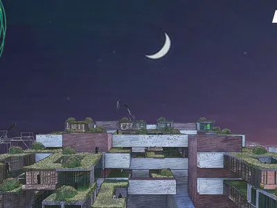
Oasis: Modular Green Housing Carved into Dhaka's Urban Fabric
A shortlisted Plugin Housing entry reclaims unauthorized settlements in Dhaka with stepped concrete volumes, green roofs, and ventilation-driven design.

Black Hole: A Floating Megastructure for the Post-Physical Era
Emiliano Mazzarotto envisions a spherical, self-scaling arena where e-sports, digital hotels, and holographic stadiums replace traditional public space.


Explore Architecture Competitions
Discover active competitions in this discipline



Challenge to reimagine the Iron Throne


Photograph architecture without architects


Illustrate the lost glory of Angkor Wat - Render Challenge


Design challenge to reuse E-waste
Comments (0)
Please login or sign up to add comments
No comments yet. Be the first to comment!