

ATELIER KHJ Turns a Harajuku Alleyway Shop into a Repository of Scent and Memory
A Korean fragrance brand's first overseas showroom wraps 167 square meters of Shibuya in curves, grids, and skylight.


Harajuku's alleyways are lined with retail spaces that scream for attention. The 025S showroom, designed by ATELIER KHJ for Korean scent brand POINTTWOFIVE.SECOND, takes the opposite approach. Occupying 167 square meters across two floors of a low-rise building in Shibuya, the store is the brand's first outpost outside Korea, and it treats fragrance not as product to be sold but as artifact to be kept. The design concept orbits around 'memory,' translating the brand's philosophical commitment to time and personal narrative into a physical space that behaves more like an archive than a shop.
What makes the project genuinely interesting is how it resolves a difficult brief: how do you give architectural form to something invisible and ephemeral? ATELIER KHJ's answer is a central repository structure, a curving, gridded counter that doubles as storage and display. This single element organizes the plan, directs circulation, and sets the emotional register. Everything else, the skylight ceilings, the white walls, the metal detailing, exists in service of it. The result is a retail interior where the architecture does not compete with the merchandise. It frames it.
The Repository as Centerpiece
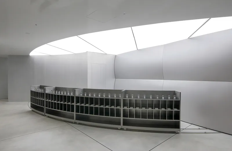
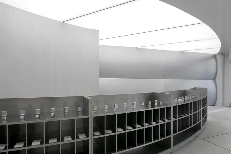
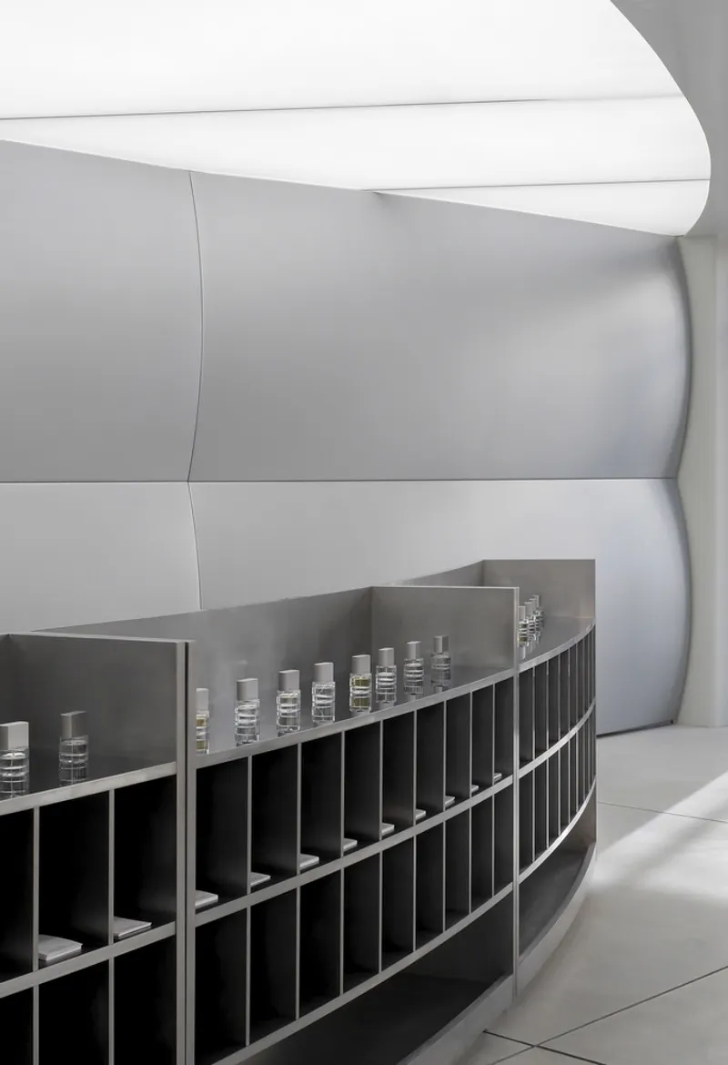
The long, curving display counter is the gravitational center of the store. Its face is divided into a precise grid of compartments, each holding bottles and vials in a manner closer to a specimen cabinet than a typical retail shelf. Angular skylights run overhead in a continuous strip, washing the counter in diffused light and reinforcing its role as the room's primary event. The curve is deliberate: it pulls visitors along its length, creating a natural browsing rhythm that avoids the stop-start pattern of conventional counter layouts.
There is something satisfying about a retail interior that commits this hard to a single gesture. The counter is storage, display, and wayfinding device in one move. It makes the rest of the space possible precisely because it absorbs so many functions.
White Volumes and Controlled Light
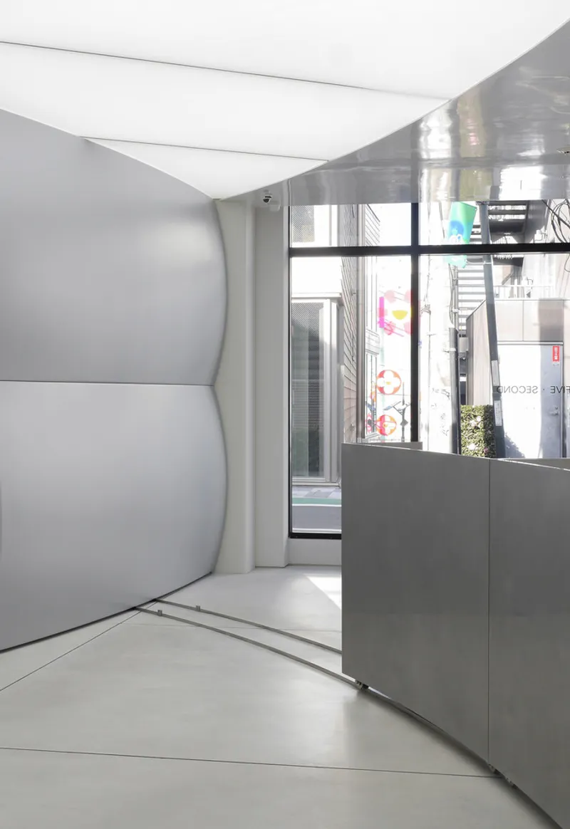
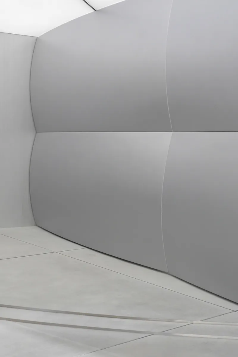
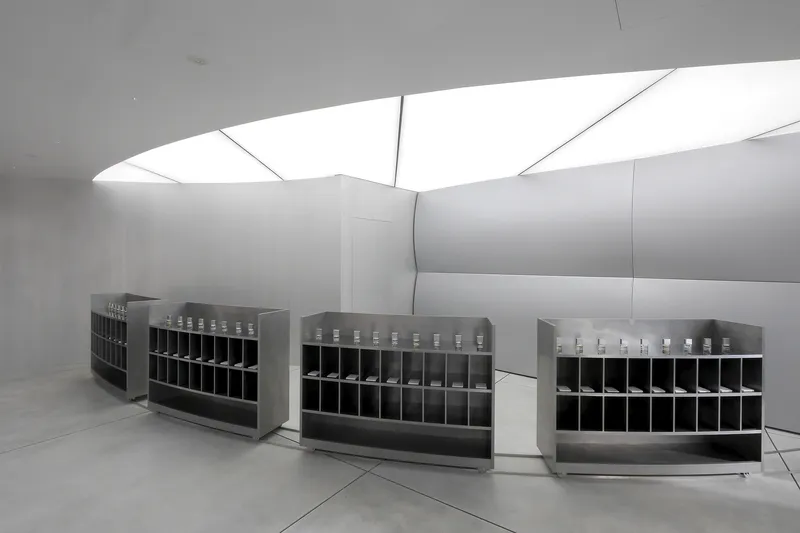
The interior palette is relentlessly white and neutral, a decision that only works because ATELIER KHJ controls the lighting with care. Cove ceilings along the curved corridor produce a soft, even glow that eliminates harsh shadows. Where vertical wall panels meet at seams, the detailing is sharp enough to read as intentional joinery rather than drywall. The effect is clinical without being cold, more laboratory than gallery.
On the upper level, a folded skylight ceiling introduces a different quality of light entirely: more angular, more dramatic, casting geometric shadows across the metal shelving below. The two floors offer contrasting atmospheres within the same material language. Ground floor is warm and enveloping. Upper floor is cooler and more exposed. Both serve the purpose of focusing attention on the products rather than the surfaces around them.
Metal, Glass, and Industrial Precision
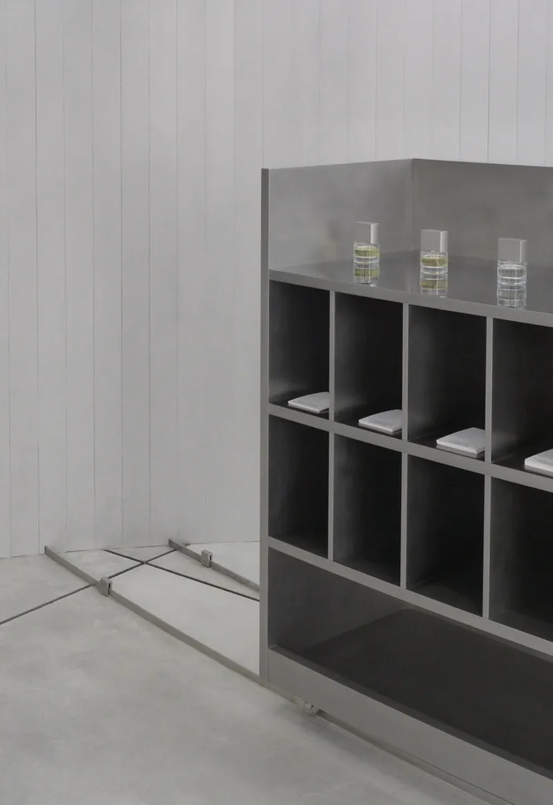
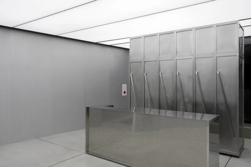
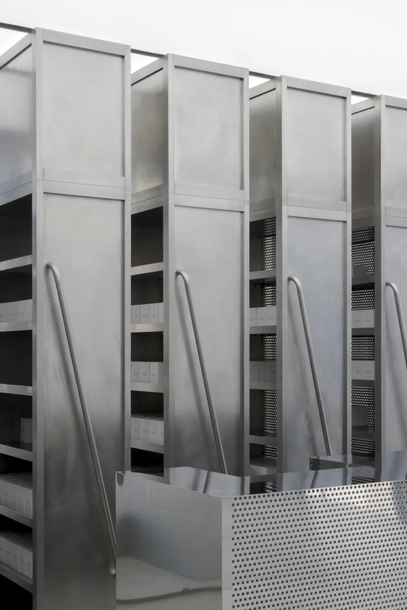
Close up, the material palette reveals its industrial roots. Metal shelving cubicles hold glass vials against paneled walls with the orderly rhythm of a stockroom. Steel storage cabinets with perforated metal bases sit beneath the linear skylights, treating back-of-house function as front-of-house display. Perforated guardrails and diagonal handrails along the access ramp are finished to the same standard as the retail fixtures, erasing the boundary between infrastructure and interior.
The consistency matters. When every surface, from railing to shelf to cabinet, speaks the same material language, the space achieves the kind of coherence that most retail interiors sacrifice to trend. Nothing here looks temporary or seasonal. It looks like it was built to last.
Threshold and Street Presence
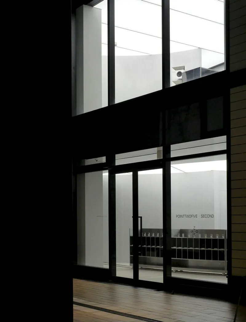

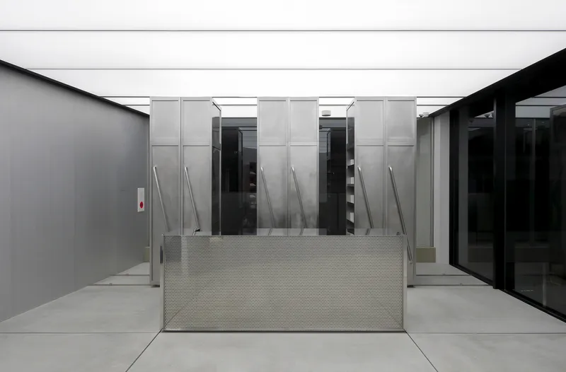
Seen from the alleyway at dusk, the storefront glows through black-framed glazing like a vitrine. A silhouetted figure outside the window reinforces the scale: this is a compact, intimate space, not a flagship spectacle. The translucent sliding panels and metal ramp at the entrance establish a threshold that slows you down before you enter. You are not swept into the store. You decide to cross into it.
For a brand making its first international move, this restraint is a smart strategy. The storefront does not advertise loudly. It invites curiosity. In a district where visual noise is the norm, the quiet glow of a well-lit interior becomes its own form of spectacle.
Plans and Drawings
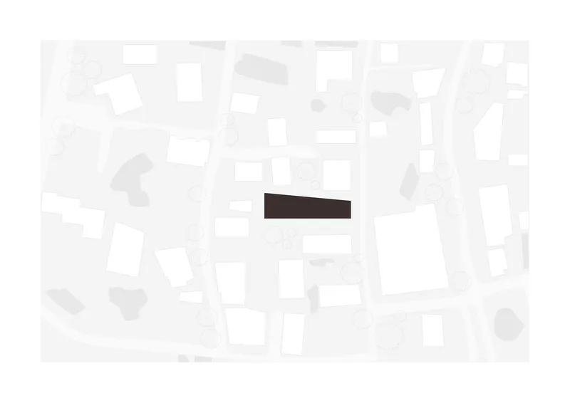

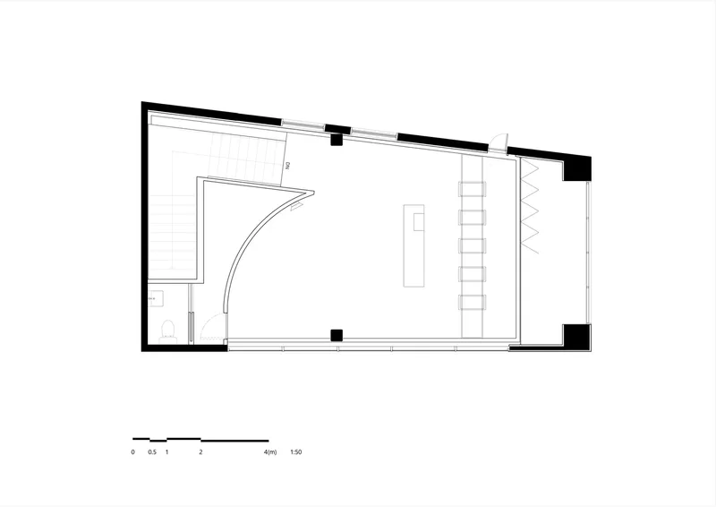
The site plan reveals how tightly the building sits within Harajuku's urban grain, a rectangular volume slotted among surrounding blocks and street trees with no setback to speak of. The ground floor plan shows the curved counter element anchoring the entry sequence, with doors opening directly onto the alley. Upstairs, the plan is more linear: storage, a bathroom enclosure, and a ladder access suggest a back-of-house logic that is nonetheless exposed and integrated.
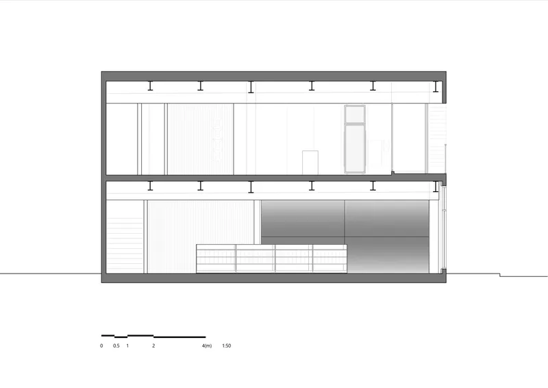
The section drawing is the most revealing. Two levels are connected by an open mezzanine cut, with exposed ceiling joists above and a central void that lets light and air pass between floors. The stairs are positioned to one side, keeping the main volume unobstructed. It is a compact section, efficiently stacked, but the double-height moment at the center gives the 167 square meters a spatial generosity that the plan alone does not suggest.
Why This Project Matters
Retail design too often treats architecture as scenography, a backdrop to be swapped out every few seasons. The 025S Harajuku Store pushes back against that disposability. ATELIER KHJ has designed a space with the permanence and precision of a small museum, built around a single organizational idea, the repository counter, that gives the brand a spatial identity rather than just a visual one. The commitment to material consistency and controlled light means the store will age well, both physically and aesthetically.
More broadly, the project is a case study in how architecture can serve a brand's philosophy without becoming illustration. The concept of memory is not spelled out in signage or themed decor. It is embedded in the logic of the space: the archive-like storage, the contemplative circulation, the absence of visual clutter. For a fragrance brand entering a foreign market for the first time, this kind of spatial intelligence is worth more than any amount of branding. The architecture does not explain the brand. It is the brand.
025S Harajuku Store by ATELIER KHJ, Shibuya, Tokyo, Japan. 167 sqm. Completed 2024. Photography by Sun Kim (ATELIER KHJ).
About the Studio
Share Your Own Work on uni.xyz
If projects like this are the kind of work you want to make, uni.xyz is a place to publish your own, find collaborators, and enter design competitions.




Popular Articles
Popular articles from the community


Conexión: Biophilic Design Reimagines High-Rise Living in Hong Kong
Conexión reimagines high-rise living in Hong Kong through biophilic design, green facades, shared spaces, daylight, water and nature within.

Riyadh For All: Intergenerational Urban Design for Active Aging in Rabat
Riyadh For All reimagines urban design in Rabat with intergenerational co-living, adaptive courtyards, and Moroccan cultural exchange today.

The Musturak Paradise: Senior Living Architecture for a Connected Future in Temara, Morocco
The Musturak Paradise reimagines senior living architecture in Temara via private homes, social spaces, culture, community, and shared care.

Co-life: Sustainable Architecture for Age-Friendly Community Living
Co-life reimagines sustainable architecture for seniors through courtyards, rammed earth, shared gardens, and spaces designed for belonging.


Similar Reads
You might also enjoy these articles


Hodi-Mandai Geram
Project Function: Preservation and revitalization of the Intangible heritage and socio-spatial identity of the Hodi by Housing, Cultural Memory Center, Sacred Grove, landscape, local tourism economy

Olio Towers: A Mid-Rise for Performers That Fuses Housing, Rehearsal, and Stage
Located blocks from Houston's Theater District, this modular tower stacks living units around a central performance atrium.

Oasis: Modular Green Housing Carved into Dhaka's Urban Fabric
A shortlisted Plugin Housing entry reclaims unauthorized settlements in Dhaka with stepped concrete volumes, green roofs, and ventilation-driven design.

Black Hole: A Floating Megastructure for the Post-Physical Era
Emiliano Mazzarotto envisions a spherical, self-scaling arena where e-sports, digital hotels, and holographic stadiums replace traditional public space.


Explore Architecture Competitions
Discover active competitions in this discipline



Challenge to reimagine the Iron Throne


Photograph architecture without architects


Illustrate the lost glory of Angkor Wat - Render Challenge


Design challenge to reuse E-waste
Comments (0)
Please login or sign up to add comments
No comments yet. Be the first to comment!