

Minuspluse Design Puts the Kitchen at the Center of a 6,400 m² Taipei Financial Office
Office H reorganizes corporate workspace around an employee lounge, using walnut and brass to blur the line between work and rest.
The corporate pantry has long been an afterthought: a windowless room off a service corridor, somewhere between the fire exit and the mop closet. Minuspluse Design, led by Yu-Hsuan Chu and Yu-Chen Chang, treats this convention as a design problem worth solving. In Office H, a 6,406 m² workplace for a financial consulting firm in Taipei, the kitchen and employee lounge occupy the spatial and conceptual center of the plan. Everything else, from open desks to private meeting rooms, orbits around it.
The decision is both strategic and culturally pointed. In an era when hybrid work has eroded the commute's social contract, an office has to earn its occupants' presence. Minuspluse's answer is to make the act of gathering feel as deliberate and as materially generous as the act of working. Walnut paneling, travertine portals, brass-clad columns, and generous natural light run through every zone without hierarchy, so the lounge reads not as a perk but as infrastructure.
The Lounge as Organizational Spine
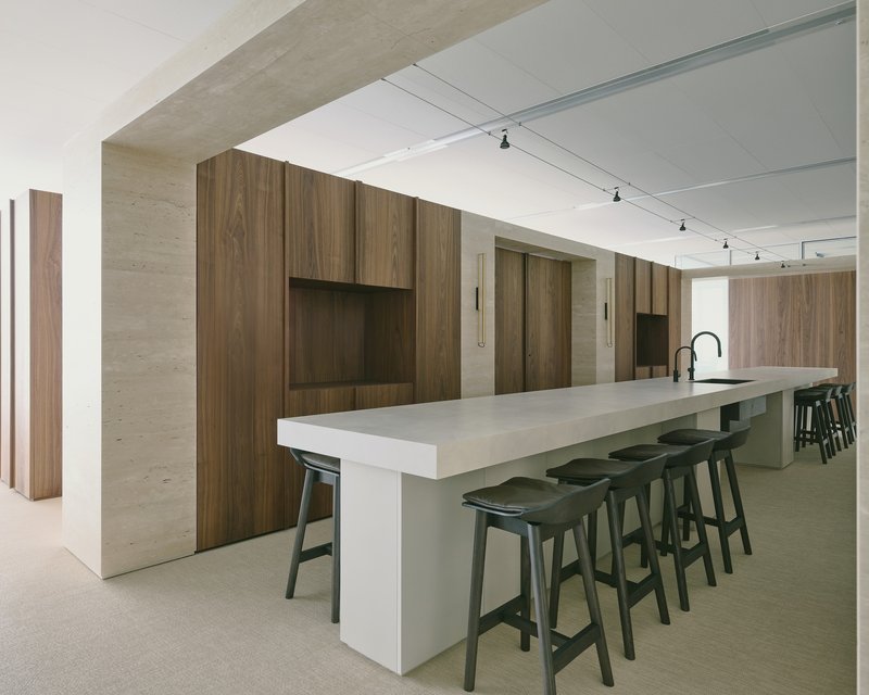
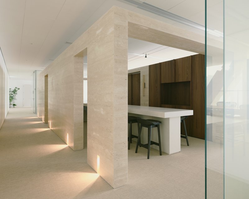
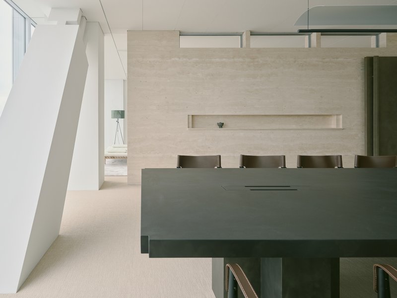
Calling this space a "kitchen" undersells it. A long island topped in pale concrete anchors the lounge, flanked by black stools and bathed in track lighting. The travertine portal that frames entry to this zone is a piece of architectural ceremony: uplighting at the floor line, walnut cabinetry beyond, a threshold that signals transition without closing anything off. The material shift from the warmer tones of the workspaces to the cooler concrete and stone here is subtle but legible, distinguishing a place for decompression from one for concentration.
Positioning this lounge at the heart of the plan means every route through the office passes near it. Minuspluse describes its circulation strategy as "diverted," and the effect is that casual encounters happen by design rather than by accident. For a financial consulting firm, where teams may otherwise remain siloed by project, this is a spatial argument for cross-pollination.
Walnut, Brass, and the Language of Warmth
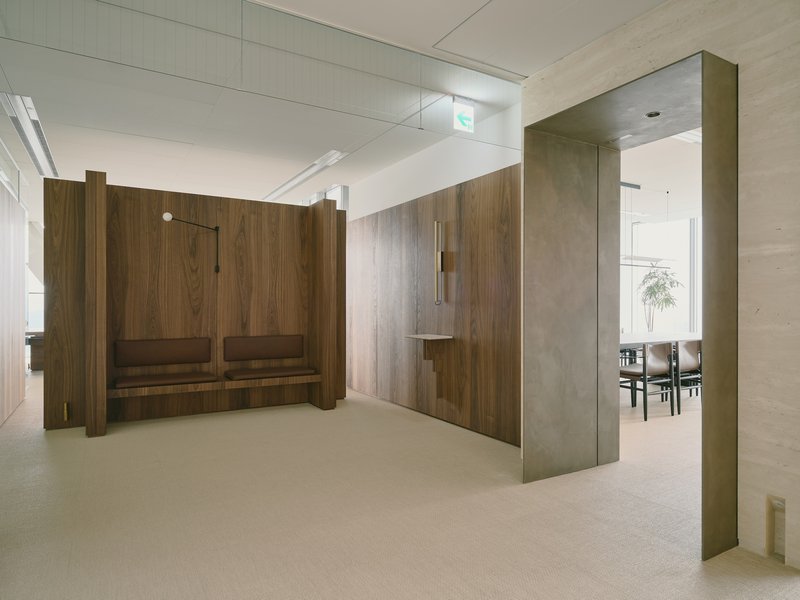
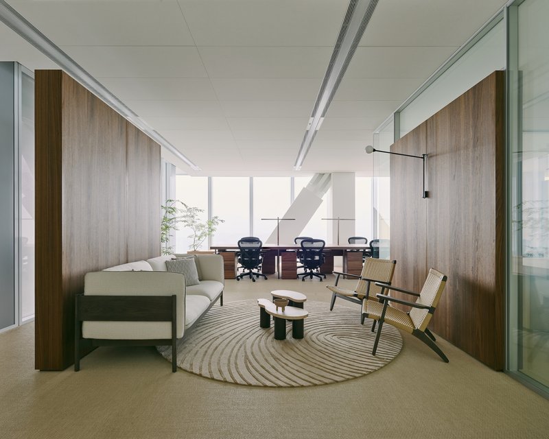
Walnut does a lot of heavy lifting here. It clads partition walls, lines display niches, wraps bench seating, and forms the dominant surface of nearly every corridor. The risk with this much timber veneer in a corporate interior is that it tips into boutique-hotel territory, but Minuspluse keeps it grounded by pairing walnut with restrained detailing: recessed lighting, flush reveals, and minimal hardware. Brass appears selectively, wrapping structural columns to mark moments of transition rather than coating every metal surface in sight.
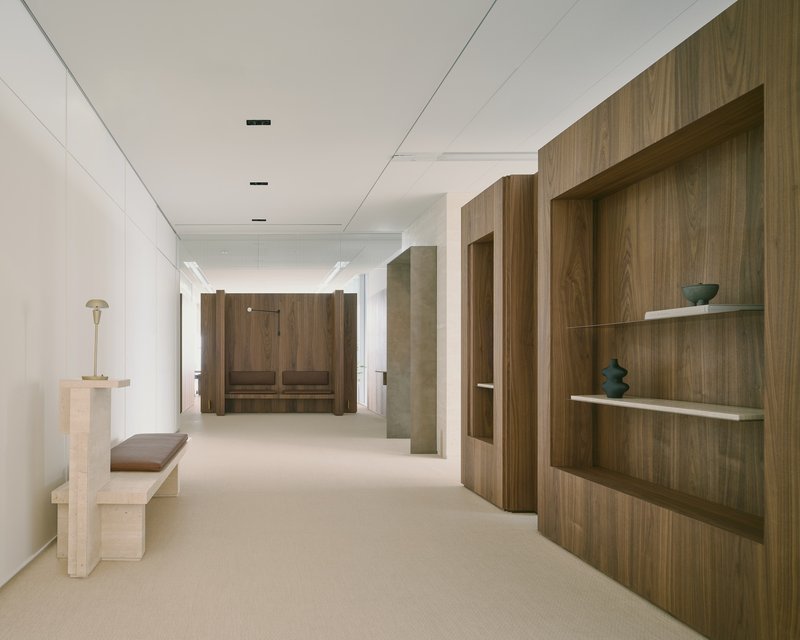
The corridor shown in image 8 is a good example of how material consistency creates spatial continuity. A stone bench sits below walnut display niches, leading the eye to a built-in seating booth at the far end. There is no change in palette, no abrupt threshold. The corridor is both passage and destination, which reinforces the "separate yet connected" logic the designers applied throughout.
Daylight as a Non-Negotiable
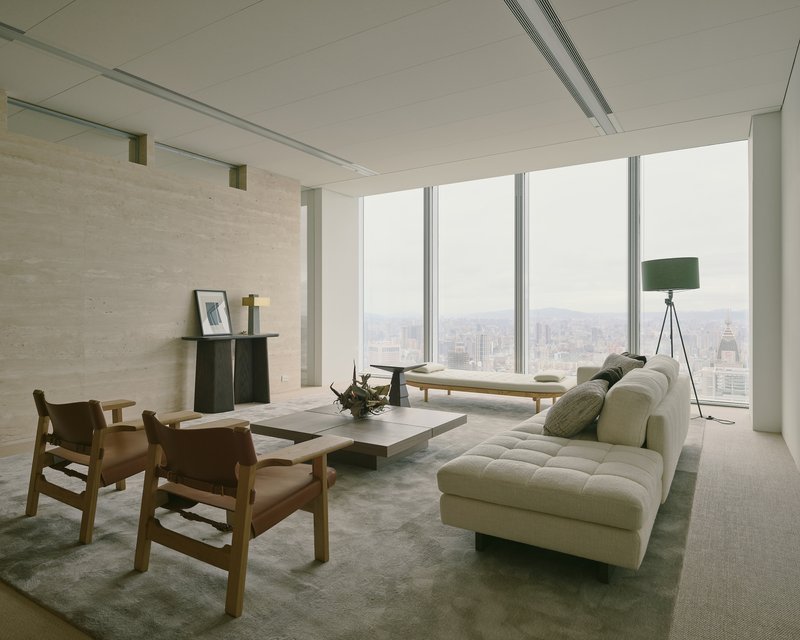
At nearly 6,400 square meters, a floor plate this large could easily bury half its occupants in artificial light. Minuspluse avoids this by pushing open desks to the perimeter window wall and keeping meeting rooms and support spaces along the interior. Full-height glazing wraps the corners, offering views of Taipei's skyline even on overcast days. The effect is that the most populated zones receive the best light, an obvious priority that too many office fitouts still get backwards.
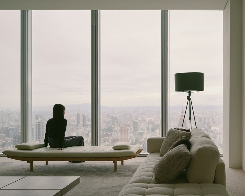
The image of a single occupant on a daybed by the window, afternoon light softening across the room, is quietly radical in a financial office context. It suggests that rest and reflection are not stolen moments but programmed ones. Glazed partitions between the perimeter desks and interior zones allow borrowed light to reach deeper into the plan, so even second-row spaces never feel landlocked.
Workstation Zones and Quiet Detail
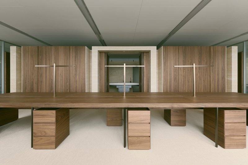
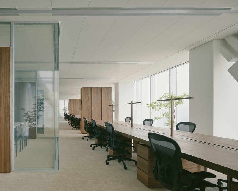
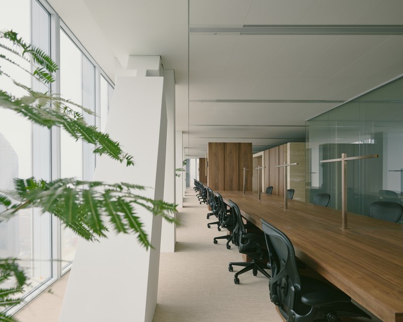
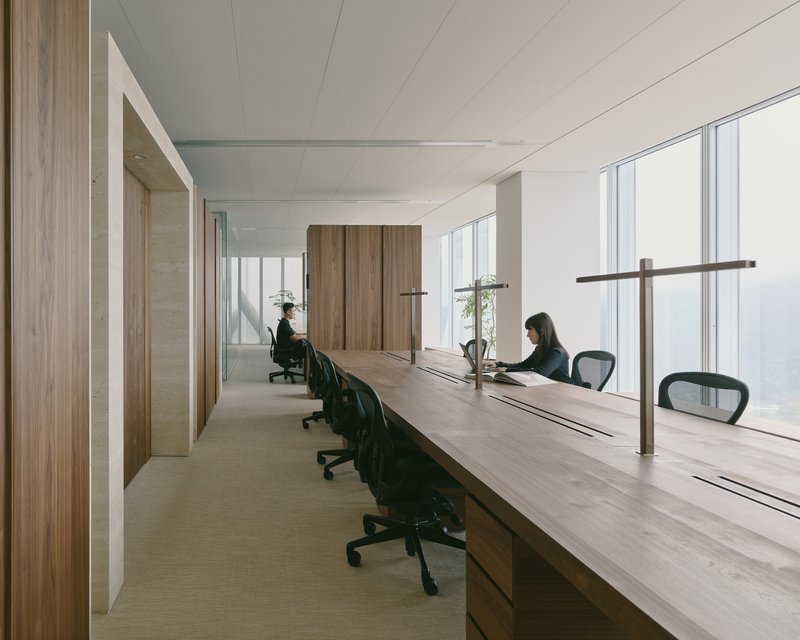
The open workstations follow a consistent formula: walnut desktops on slender steel legs, positioned in long rows parallel to the window wall. Timber-clad walls with recessed lighting run behind the desks, giving each run of workstations a defined backdrop without enclosing them. Glazed partitions and low walnut storage units divide zones laterally, maintaining sightlines while providing acoustic separation.
Greenery appears sparingly, a fern branch in the foreground, a few potted plants on ledges, but never as a substitute for actual spatial quality. The restraint is appreciated. When offices rely on planting to compensate for poor layout or dull surfaces, it shows. Here, the planting reads as incidental because the architecture does not need rescuing.
Reception and Threshold
The reception desk is the project's most restrained moment: grey metal below a textured plaster wall with a single horizontal recessed niche. It reads almost residential, more gallery foyer than corporate lobby. The intent seems clear. A financial consulting firm often needs to project competence without ostentation, and this entrance calibrates that tone precisely.
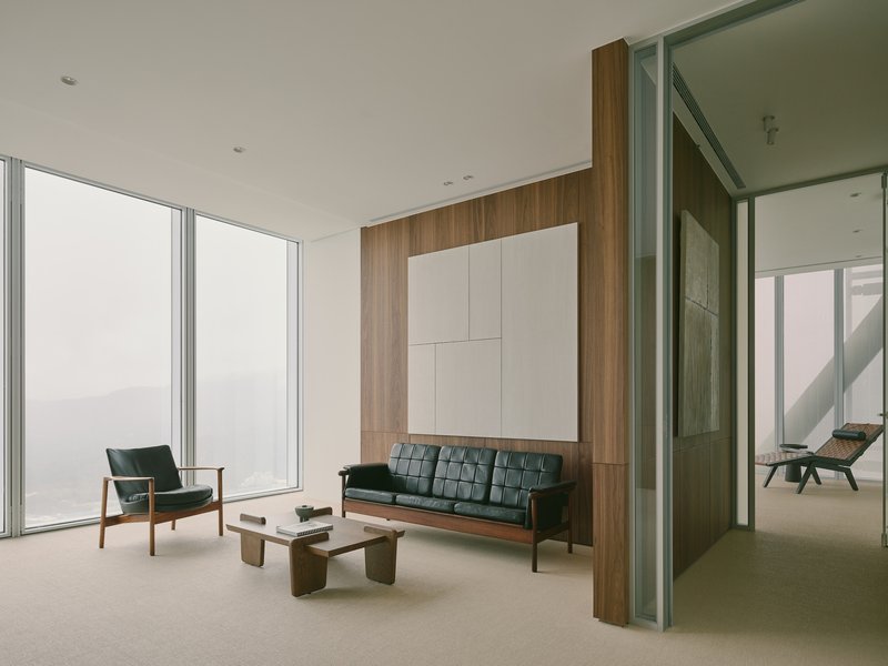
Beyond reception, transitional zones use glazed partitions and ceiling-mounted storage to mediate between public-facing areas and the deeper workspaces. The seating area shown in image 1, with its walnut wall panel and white overhead volumes, feels like a decompression chamber: neither fully formal nor fully casual, a place where a visitor might wait or a colleague might pause.
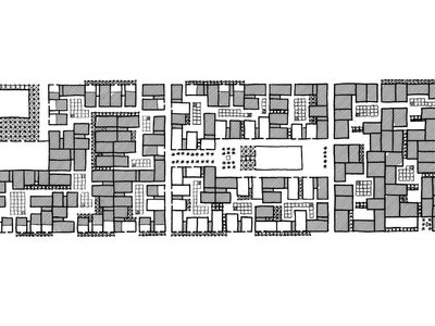
Plans and Drawings
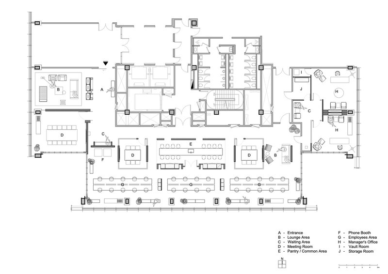
The floor plan confirms what the photographs suggest: support spaces and meeting rooms cluster along the interior core, while open workstations line the perimeter glazing. The employee lounge sits at a crossroads in the plan, accessible from multiple directions without requiring anyone to pass through a private zone. Circulation routes branch and reconnect rather than following a single loop, giving occupants choice in how they move through the office. For a plan this large, the legibility is notable. You can read the hierarchy of spaces at a glance.
Why This Project Matters
Office H is not a co-working space dressed in corporate clothing, nor is it a traditional office with a bean bag thrown in for Instagram. It takes a genuine position: that the social infrastructure of a workplace, the kitchen, the lounge, the informal seating, deserves the same architectural investment as the workstations and boardrooms. In a market saturated with tech-startup aesthetics that feel increasingly formulaic, a financial consulting firm in Taipei committing to this idea carries weight.
Minuspluse Design's contribution is less about novelty than about proportion and conviction. The material palette is warm but disciplined, the spatial organization is logical without being rigid, and the relationship between daylight and plan depth is handled with care. What makes Office H worth studying is not any single gesture but the consistency with which every decision serves the same thesis: that people will come to the office when the office gives them something worth coming to.
Office H by Minuspluse Design (lead architects Yu-Hsuan Chu and Yu-Chen Chang), Taipei, Taiwan. 6,406 m², completed 2024. Photography by Studio Millspace.
About the Studio
Share Your Own Work on uni.xyz
If projects like this are the kind of work you want to make, uni.xyz is a place to publish your own, find collaborators, and enter design competitions.


Popular Articles
Popular articles from the community
Foster + Partners Wraps a 200-Meter Shanghai Tower in Stainless Steel and Industrial Memory
The Suhe Centre Office Tower anchors a regenerated waterfront district in Shanghai with an all-steel structure that nods to local warehouse heritage.
Indiesalon Carves a Plywood Cave into a Seoul Bistro's Second Floor
Munhwa Bistro's second Seongsu branch wraps diners in a laminated timber vault laced with colored light and mirror illusions.
Johnston Architects Reimagines the Methow Valley Hay Barn as a Small-Town Library in Winthrop
A 7,300-square-foot timber library channels the region's agrarian vernacular to serve a rural Washington community of 400 year-round residents.
Constanti Architects Builds a Fortress of Privacy in Nicosia with House 345
A concrete and timber residence in Cyprus reinterprets the traditional introverted courtyard house for a new urban landscape.


Similar Reads
You might also enjoy these articles
127af Flips a Tiny Bagnolet Rowhouse Upside Down with a Handcrafted Roof Extension
A 55-square-meter terraced house on the edge of Paris gains a luminous upper living floor through lightweight timber and steel.
1.61 Design Workshop Wraps a 600-Square-Meter Café in Vietnam in Sculptural Burgundy Drama
Reden Café & Bistro pairs a helical staircase, mosaic floors, and deep red interiors to rethink Vietnamese hospitality space.
The Unbound Brain: A School Shaped by Cognitive Architecture
Cylindrical learning pods radiate like neurons from a central cortex, turning the floor plan into a spatial model of human thought.
Revival Vernacular Architecture: Rammed Earth Settlements for the Sahara
A modular desert community in Mauritania that fuses passive cooling techniques with earthen construction and local craftsmanship.


Explore Office Building Competitions
Discover active competitions in this discipline


The International Standard for Design Portfolios


The Global Benchmark for Architecture Dissertation Awards


The Global Benchmark for Graduation Excellence

Challenge to reimagine the Iron Throne
Comments (0)
Please login or sign up to add comments
No comments yet. Be the first to comment!