
Studio O+A and IA Interior Architects Reframe Corporate Identity at McDonald's Chicago HQ
A multi-level headquarters in Chicago's West Loop uses craft, color, and spatial drama to rethink what a fast-food giant's office can feel like.
When the world's largest fast-food chain decides to move its global headquarters, the design challenge is less about desks and more about mythology. McDonald's relocation to Chicago's West Loop gave Studio O+A and IA Interior Architects the task of building an interior world that simultaneously honors a hyper-recognizable brand and operates as a genuinely productive workplace. The result is a headquarters that treats corporate identity not as wallpaper but as spatial material, woven into circulation, gathering, and display throughout the building.
What makes this project worth studying is the discipline with which it avoids the two obvious traps of branded interiors: ironic kitsch and sterile abstraction. The building never feels like a theme park, and it never pretends the golden arches don't exist. Instead, the design team constructed a series of distinct atmospheres across floors and zones, each calibrated to a different register of work, rest, and encounter. The interiors oscillate between gallery-like installations, quiet focused workspaces, and civic-scale atria that give the building a genuine sense of event.
Threshold and Procession
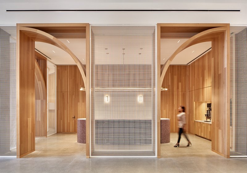
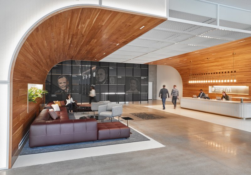
Arrival at the headquarters is choreographed through a sequence of arched timber portals flanking a central mesh screen, establishing a material tone that is warm and slightly ceremonial without being corporate in the worst sense. Inside, the reception zones split into distinct moods: one features a curved timber ceiling and a portrait wall that reads like a curated gallery; another pairs black wall graphics with raw concrete columns, leaning hard into an industrial palette. These are not interchangeable lobbies. Each one sets up the specific character of the floor it serves.
The decision to differentiate entry experiences rather than standardize them is a quiet act of resistance against the open-plan-everything ethos. It tells employees and visitors alike that place still matters, even inside a corporation built on radical consistency.
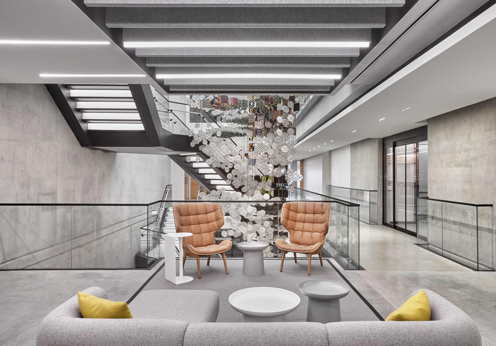
The Atrium as Organizational Engine
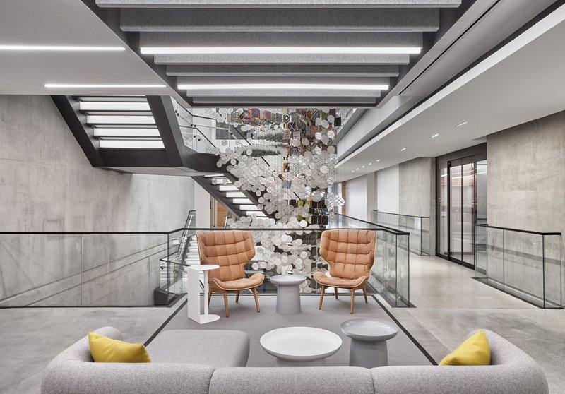
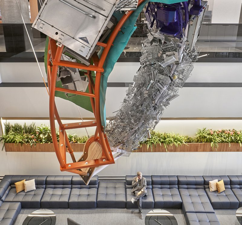
The multi-level atrium is the building's most ambitious space. Floating steel stairs zigzag between levels, while a large sculptural installation hovers above planted beds and modular seating at ground level. The effect is deliberately civic: this is a town square for a corporation, designed to encourage the kind of unplanned collisions that email cannot replicate. Tan leather seating clusters below create a lounge atmosphere that resists the antiseptic quality of many corporate atriums.
What the atrium gets right is vertical legibility. From nearly any level you can see activity on other floors, which collapses the perceived distance between departments. The suspended sculpture, more than decoration, serves as a shared visual anchor that orients you within the void. It is the atrium's campfire.
Brand as Installation
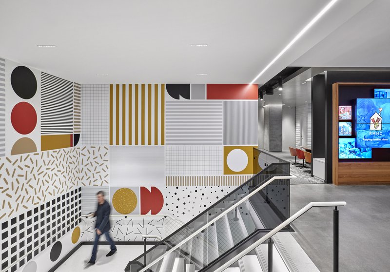
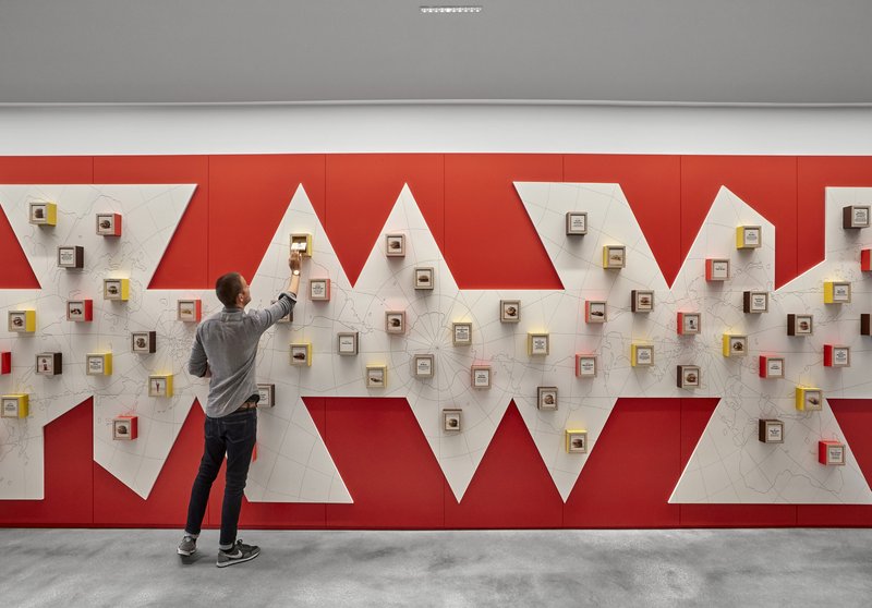
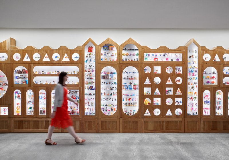
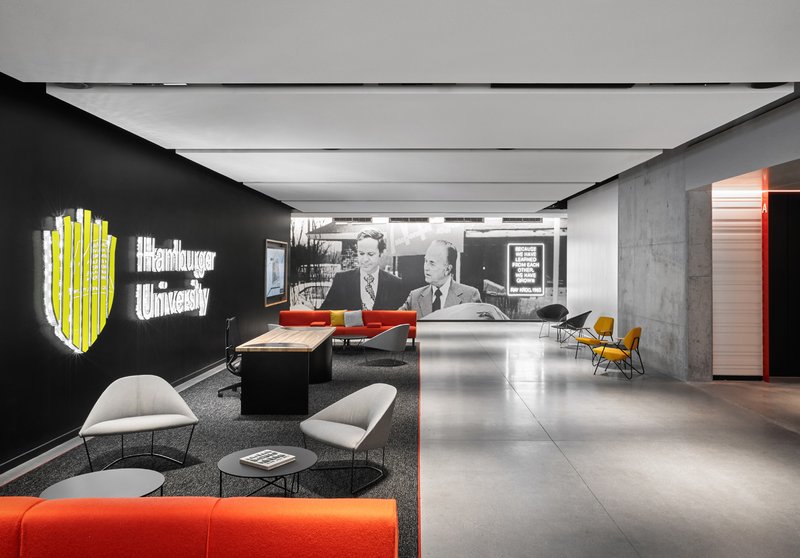
The most distinctive interiors deploy brand identity through gallery-grade installations rather than logo repetition. A graphic wall in red, gold, and black sits beside a steel and glass staircase with the confidence of public art. Elsewhere, a red and white zigzag display wall holds small framed objects like a cabinet of curiosities. A timber wall with arched and circular cutouts showcases colorful objects that feel more like a retail concept than a hallway. Together, these moments convert the brand's visual DNA into tactile, spatial experiences.
The restraint is critical. None of these installations spell out their corporate allegiance too literally, and that ambiguity is what makes them work. They borrow from exhibition design, street art, and retail scenography, allowing the brand to operate at a level of sophistication that a logo slapped on a wall could never achieve.
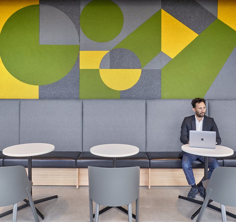
Texture, Acoustics, and the Quiet Zones
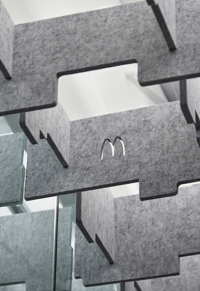
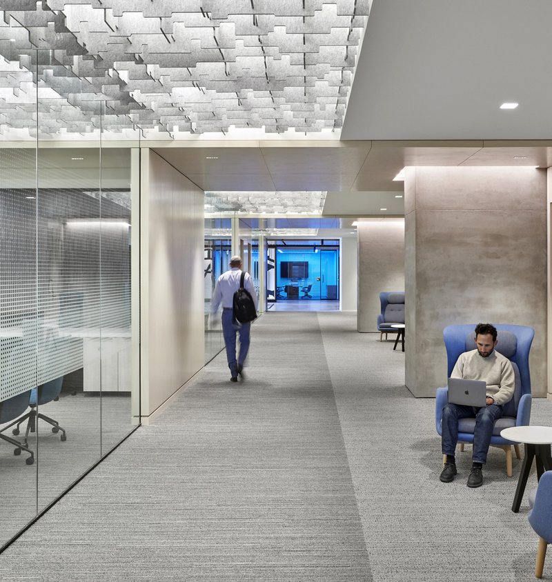
Not every space in the headquarters is designed to impress. Some of the most considered details appear in the corridors and acoustic infrastructure. Interlocking grey felt panels with embossed logo details serve double duty as sound absorption and brand expression at a nearly subliminal scale. Sculptural white acoustic ceiling panels run above glass-walled conference rooms, breaking up what could be a monotonous open ceiling plane into rhythmic, almost topographic surfaces.
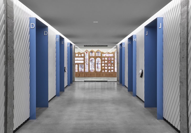
A corridor lined with alternating blue and white ribbed wall panels demonstrates how material cadence alone can make a transitional space feel intentional. These are unglamorous moves, but they reveal the rigor of the project. Acoustic comfort and visual interest are treated as the same problem, not competing priorities.
Workspaces Between Focus and Flexibility
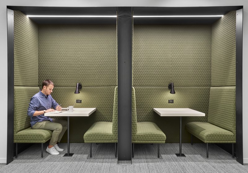
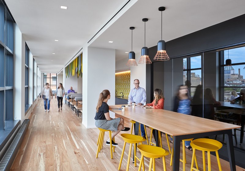
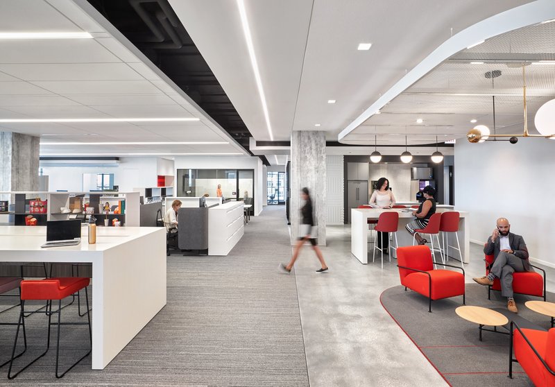
The work environments span a spectrum from enclosed booths to open floors. Twin work booths with olive green upholstered banquettes offer a focused retreat that still feels connected to the larger plan. Along open office corridors, timber communal tables with yellow stools sit alongside glazed meeting rooms, creating a gradient between collaboration and heads-down work. On the open floors, linear ceiling lighting stretches over workstations while lounge seating absorbs the overflow of informal meetings.
The color strategy across these zones is worth noting. Greens, yellows, and warm neutrals rotate by neighborhood, giving each area a legible identity without fragmenting the overall palette. It is activity-based working executed with a material specificity that most tech campuses lack.
Green Walls, Rooftops, and the Biophilic Layer
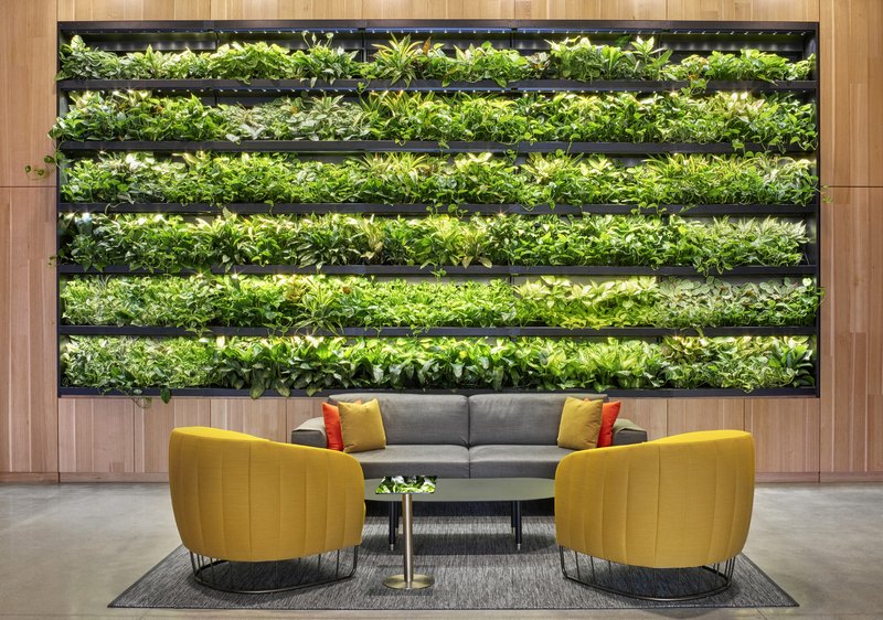
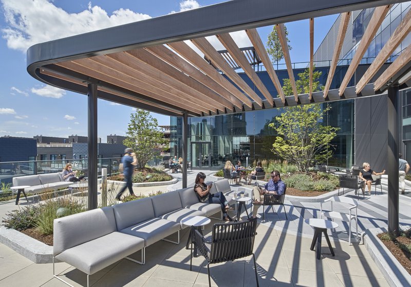
Planted elements appear throughout: a vertical green wall behind reception seating, geometric yellow and green wall panels in a lounge zone, and a rooftop terrace with a timber pergola and planted beds. The biophilic gestures are measured rather than performative. The green wall, for instance, sits behind a grey sofa and yellow chairs in a way that reads as a composed interior rather than a wellness checkbox.
The rooftop terrace, open to a blue sky above the West Loop, is the release valve for the entire building. After floors of dense interior experience, the terrace provides visual distance and fresh air. Its timber pergola echoes the arched entry portals, tying the building's exterior and interior material stories together.
Graphic Identity in the Corridor
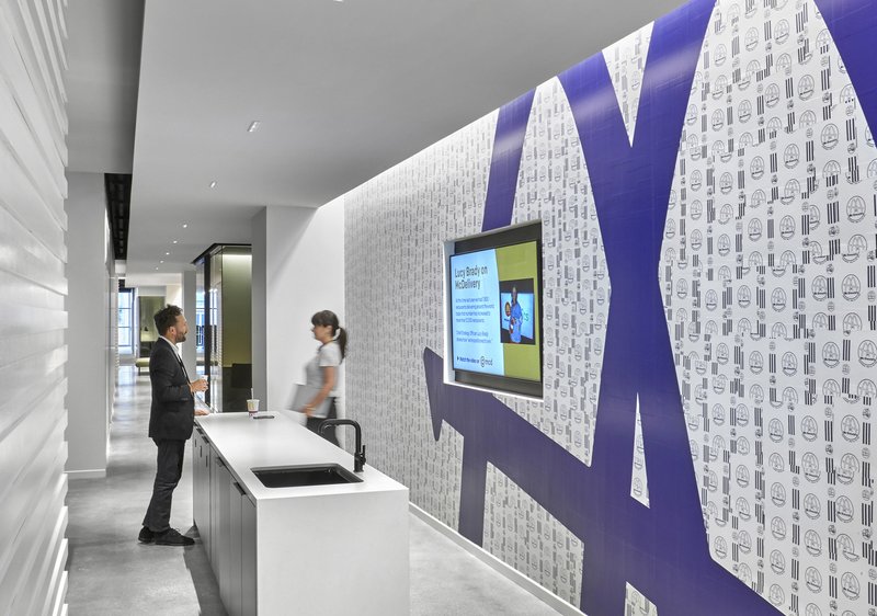
Even the secondary corridors carry graphic weight. Patterned wallpaper featuring oversized letterforms and mounted digital screens transform what could be dead circulation into moments of pause and recognition. Combined with the felt acoustic panels that embed branding at a near-invisible scale, the corridors demonstrate that identity in a corporate interior does not require scale or spectacle. It can be delivered at the corner of your eye.
Why This Project Matters
The McDonald's headquarters is significant not because it is flashy but because it takes the problem of corporate identity in interior architecture seriously and solves it with spatial means rather than graphic overlay. Studio O+A and IA Interior Architects managed to create an environment that feels specific to its occupant without becoming a branded experience in the theme-park sense. Every zone has its own temperature, material logic, and acoustic strategy, and the transitions between them are handled with the kind of care usually reserved for cultural institutions.
For designers working on large corporate interiors, this project offers a useful lesson: brand expression works best when it is embedded in structure, surface, and sequence rather than applied as a skin. The building proves that a company famous for uniformity can commission an interior defined by variety, and that the result can strengthen rather than dilute the brand. That is a harder trick than it looks.
McDonald's Global Headquarters by Studio O+A and IA Interior Architects, Chicago, Illinois, United States.
About the Studio
Share Your Own Work on uni.xyz
If projects like this are the kind of work you want to make, uni.xyz is a place to publish your own, find collaborators, and enter design competitions.

Popular Articles
Popular articles from the community
MAKER architecten Rewire a 1972 Brutalist Dormitory on the VUB Campus as a Living Lab
A modular renovation strategy in Belgium breathes new life into Willy Van Der Meeren's modernist student housing without erasing its concrete bones.
Art 1 Office Strips Athens Back to Its Bones
Neiheiser Argyros transforms a 40-year-old Athens office building into a vivid, materially rich workplace anchored by red steel, exposed concrete, and roof
Not All Architecture Grounds a Timber Retreat in Victoria's Coastal Bushland
Ironbark House stretches low beneath eucalyptus canopy, threading a quiet domestic life between courtyard, deck, and landscape.
ure LLC Builds a Timber-Framed Suburban Office That Doubles as a Community Living Room in Hiroshima
KItoNOKO wraps sawtooth roofs and corrugated metal around an exposed timber frame to give a commercial district a new civic anchor.


Similar Reads
You might also enjoy these articles
Filtering Space: A Gradual Spatial Experience
From urban intensity to spatial calm.
The Ken Roberts Memorial Delineation Competition (Krob)
As the most senior architectural drawing competition currently in operation anywhere in the world, it draws hundreds of entries each year, awarding the very best submissions in a series of medium-based categories.
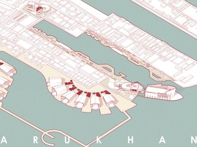
Waterfront Redevelopment and Urban Revitalization in Mumbai: Forging a New Dawn for Darukhana
A transformative waterfront redevelopment project reimagining Darukhana’s shipbreaking heritage into an inclusive urban future.

OUT-OF-MAP: A Call for Postcards on Feminist Narratives of Public Space
Rhizoma Design and Research Lab invites artists, designers, architects, researchers, and students to reflect on how feminist perspectives can reshape public space. Selected works will be exhibited in Barcelona, October 2026. Submissions open until 15 April 2026.


Explore Architecture Competitions
Discover active competitions in this discipline


The International Standard for Design Portfolios


The Global Benchmark for Architecture Dissertation Awards


The Global Benchmark for Graduation Excellence


Challenge to reimagine the Iron Throne
Comments (0)
Please login or sign up to add comments
No comments yet. Be the first to comment!