

ROOVICE Brings a 60-Year-Old Tokyo House Back to Life Through the Kariage Initiative
A decade-vacant wooden residence in Ōta ward becomes a test case for Japan's approach to its mounting vacant homes crisis.


Japan has roughly nine million vacant homes and the number keeps climbing. They are called akiya, and they pose a quiet urban crisis: neighborhoods lose density, owners lose income, and perfectly viable structures rot for want of a tenant. ROOVICE's renovation of a two-story wooden house in Ōmori, within Tokyo's Ōta ward, is a direct response. Through the studio's Kariage program, which takes on aging properties and subleases them at no cost to owners, lead architect Natsuki Murakami has turned a residence that sat empty for more than a decade into a compelling argument that old timber frames deserve better than demolition.
What makes the project worth studying is not scale or budget but discipline. The house is small, its structure unremarkable, and its Shōwa-era finishes are the kind most developers would strip without a thought. ROOVICE's move was the opposite: peel away only what blocks light and air, then use a restrained palette of grey tile, white tile, and a single blue accent to signal that the house has been claimed by the present without disowning its past. The result is a home that reads as both 60 years old and completely current.
Corrugated Metal and a Quiet Entrance
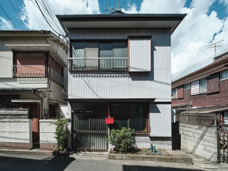


From the street the house barely announces itself. Corrugated metal cladding, a cantilevered balcony, and a tangle of overhead power lines place it firmly in the texture of Tokyo's residential wards, where individuality tends to register at the threshold rather than the facade. A red mailbox and a planted shrub mark the entry; a sliding corrugated door and a weathered stone step set the tone. There is nothing renovated about the outside, and that is the point. The Kariage model works precisely because it avoids expensive exterior overhauls and concentrates investment where people actually live.
Exposed Structure as Interior Identity
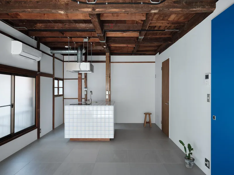
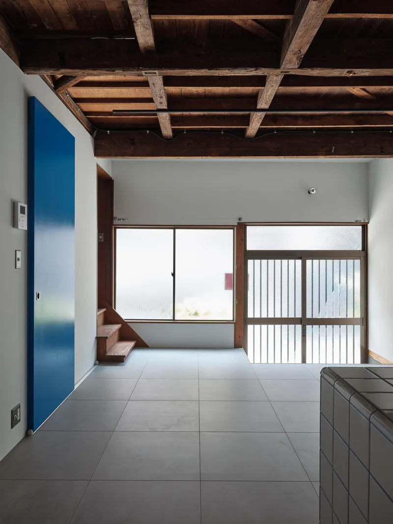

The most consequential decision on the ground floor was subtractive: remove the ceiling boards and unnecessary partition walls to expose the timber frame above and let the south-facing window do its job. What had been a dark, compartmentalized interior is now a single volume defined by columns, beams, and the pattern of old joinery. Structural timber that spent decades hidden behind plasterboard becomes the primary ornament, its weathered surface carrying the narrative the renovation wants to tell.
Uniform grey tile flooring anchors the space below, creating a continuous ground plane that ties kitchen and living areas together. With the ceiling opened up and the plan cleared out, daylight and cross-ventilation reach corners of the house that had been sealed off for years. It is a textbook example of how removal can accomplish more than addition.
A Tiled Kitchen Island with Blue-Grout Precision
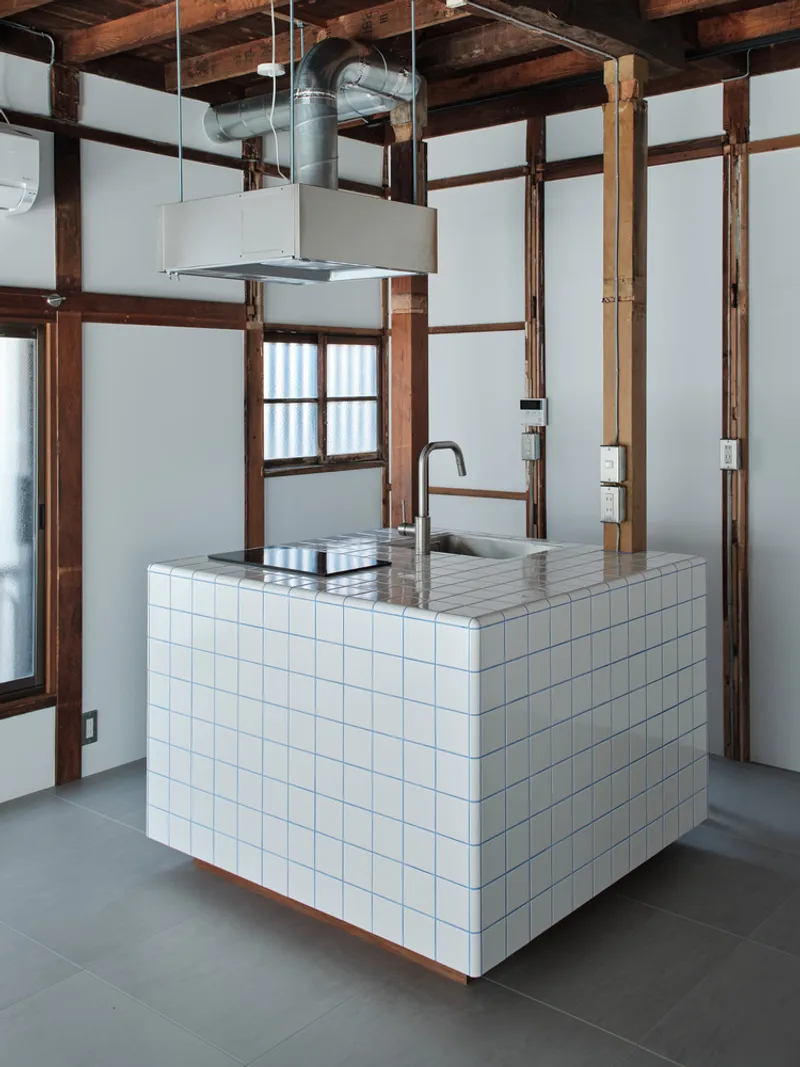

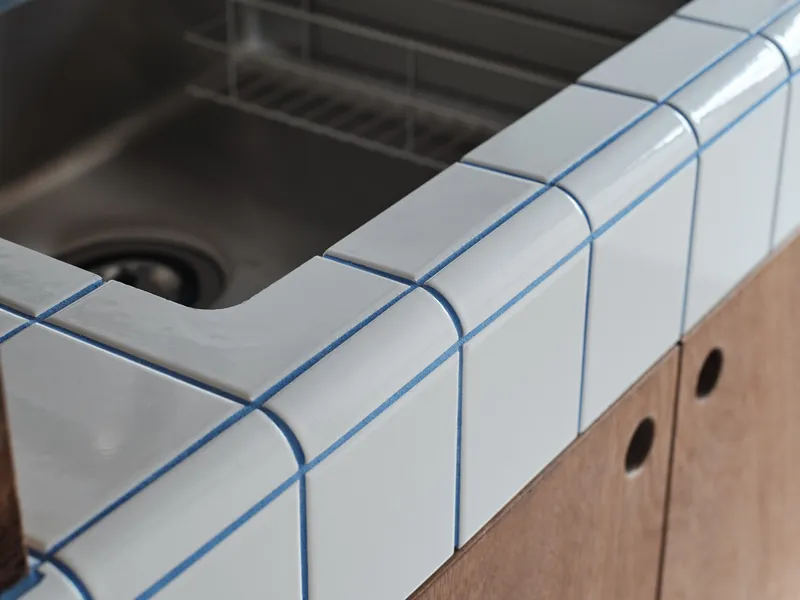
The kitchen counter is the only piece of new furniture that truly commands the ground floor, and ROOVICE treats it like a small building. White square tiles with softly rounded corners wrap the island, their blue grout lines providing the lone chromatic punch on the entire level. A stainless steel countertop, induction cooktop, and sink keep the working surface practical, while a suspended range hood is the sole piece of visible mechanical equipment.
The blue grout is worth pausing on. It shows up again in the sliding door panels and on the accent wall near the staircase, creating a thread that ties disparate rooms together without wallpaper or paint. It is a small gesture that does a disproportionate amount of spatial work, marking the intervention as contemporary while letting the timber frame remain the dominant material story.
Blue Accents and the Staircase Spine
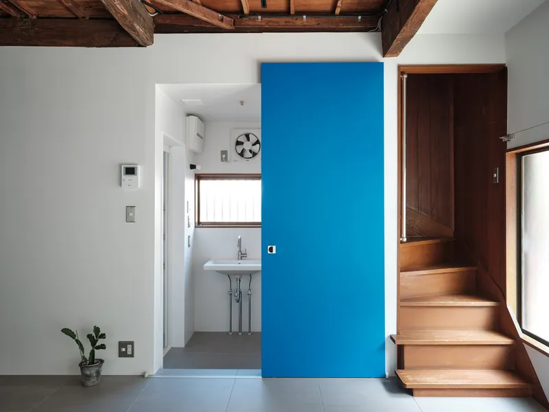
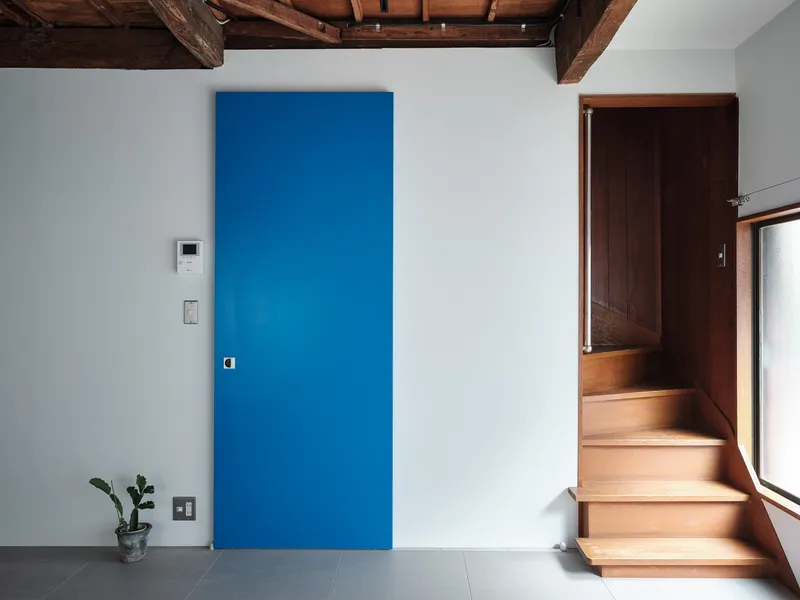
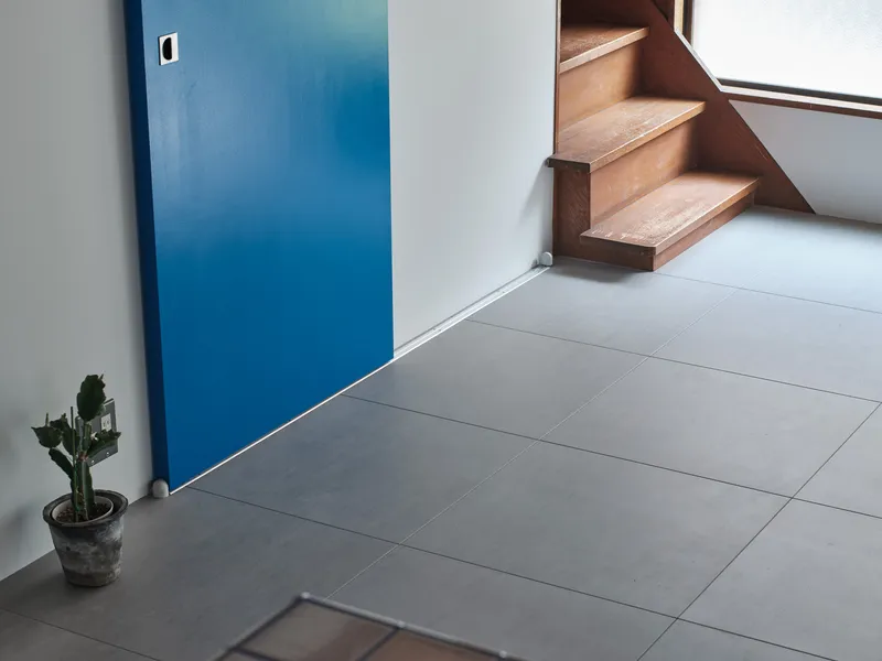
The timber staircase runs along a white wall, functioning as the vertical spine that connects the two very different atmospheres of the house. At its base, a flush blue door panel sits next to the tiled kitchen counter, and a small potted cactus on a step humanizes the composition. The blue panels are not decorative afterthoughts; they mark service elements like storage and circulation, giving the plan a legible color code that visitors can read without being told.
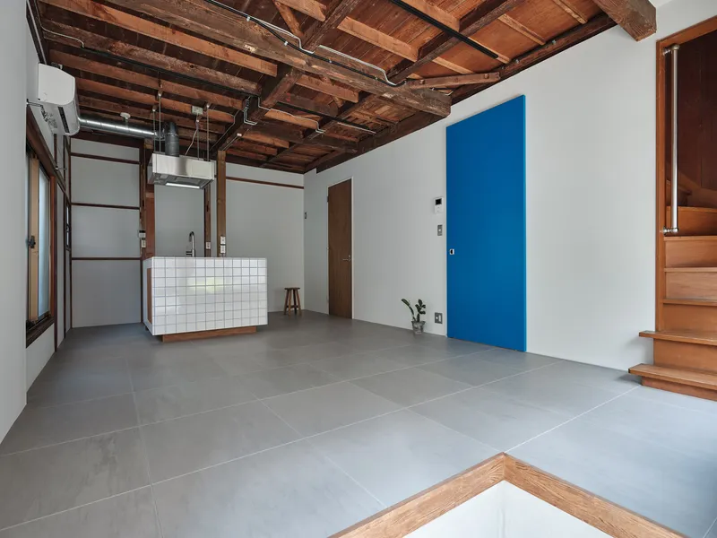
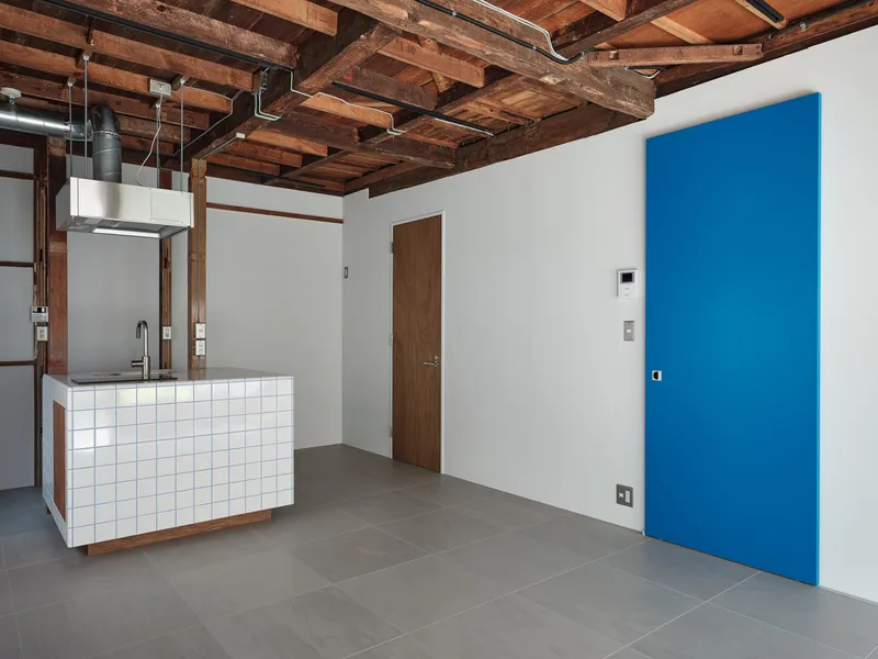
Seen from across the grey-tiled floor, the blue accent wall and the staircase frame each other in a way that feels composed without being staged. ROOVICE uses color sparingly enough that each instance registers. In a house this modest, restraint is the only strategy that holds up.
Tatami and Timber on the Upper Floor
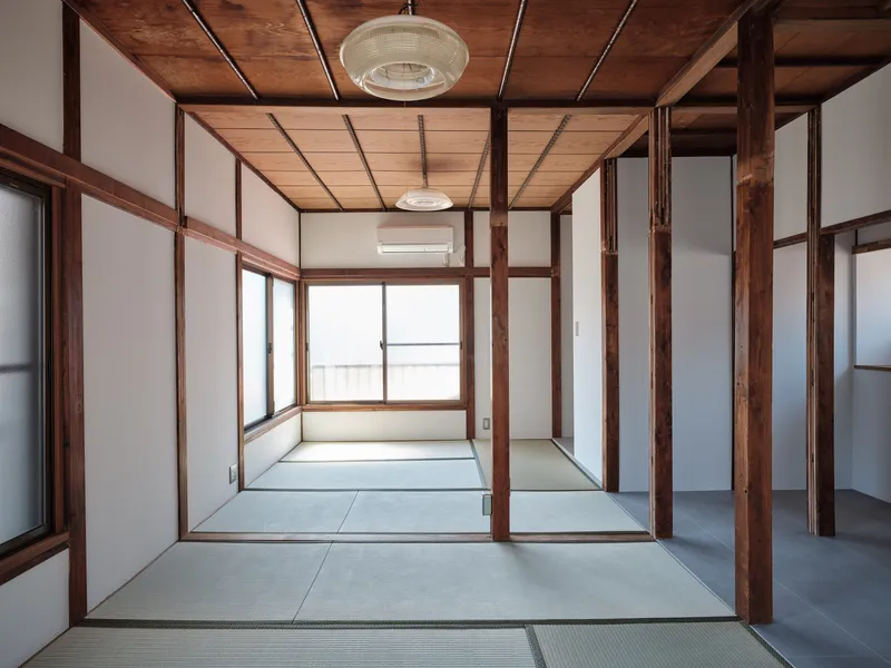
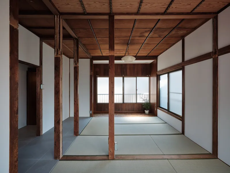
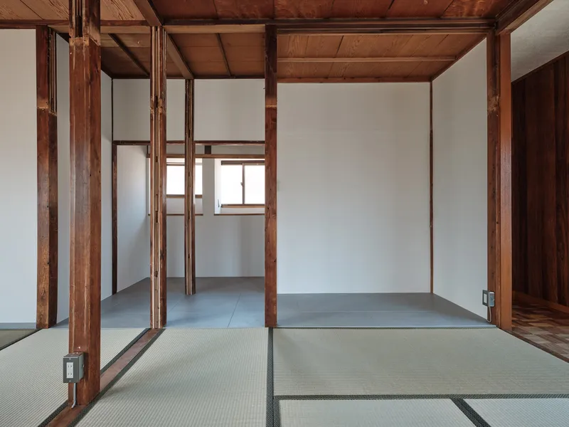
Walk upstairs and the material world shifts entirely. Tatami mats replace grey tile. Translucent sliding screens filter light instead of frosted glass. The exposed timber post-and-beam structure is the same species as below, but up here it reads as traditional rather than industrial because the floor and screens around it establish a different context. ROOVICE retained the tatami and the ceiling boards on this level, an act of preservation that gives the upper floor an unmistakably Japanese domestic atmosphere.
Dividing walls were taken out to open what had been a series of small rooms into a flexible sequence of tatami zones defined by timber columns rather than solid partitions. The bathroom was relocated downstairs, freeing space for a walk-in closet that doubles as a workspace. It is a practical swap that reflects how domestic life has changed since the house was built: fewer people need a second-floor bath, more people need a desk.
Material Transitions and Threshold Details


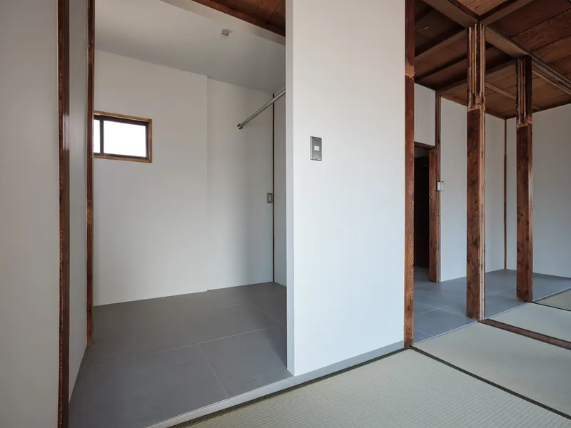
The places where grey tile meets tatami mat tell you everything about ROOVICE's attention to craft. A thin metal trim strip mediates the joint, clean enough to look deliberate but modest enough not to draw attention away from the materials it separates. At the base of a timber column, the junction of tatami and tile becomes a small study in how two eras of construction can coexist without one dominating the other.
The threshold between the tatami room and the grey-tiled shower area is the most dramatic of these transitions: a glass partition holds the wet zone while timber columns stand on both sides, indifferent to the change in program. These details do not photograph as spectacularly as a cantilevered facade, but they are where the project lives or dies.
Compact Bathrooms and Honest Services
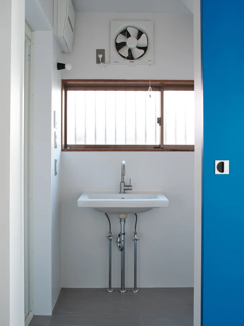


Relocated to the ground floor, the bathroom occupies the tightest footprint the program allows. A wall-mounted sink with exposed plumbing, a timber-framed window, and a ceiling ventilation fan are all visible and unapologetic. There is no attempt to conceal the mechanics of the room behind vanity cabinetry or a suspended ceiling. Upstairs, a second compact washroom with a clerestory window and a timber storage cabinet follows the same logic.
ROOVICE's approach to services mirrors its approach to structure: show the thing, don't hide it. In a house where the primary design move is exposing what was already there, wrapping a pipe in drywall would undermine the argument.
Corridors and In-Between Spaces

A narrow corridor with a timber ceiling and framed doorway leads to a softly lit room beyond, demonstrating that even the leftover spaces in this house have been considered. The corridor is tight, as it would have been in 1960, but the light at its end pulls you through. These interstitial moments are where the Shōwa-era character of the house survives most intact, and ROOVICE wisely left them alone.
Plans and Drawings


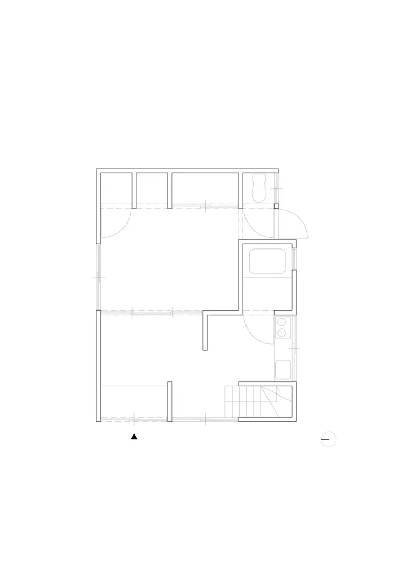

The four floor plans map the house's compact footprint across its levels and reveal how much spatial freedom ROOVICE extracted from a small two-story volume. On the ground floor, the kitchen island, bathroom, and stairwell cluster in one corner, leaving the rest of the plan open. Upper levels show partial-height walls, built-in closets, and the central stair acting as the organizational pivot. The drawings make clear that no grand structural interventions were required: the strategy was always about subtraction and reorganization within the existing frame.
Why This Project Matters
The Ōmori House renovation is not going to win any prizes for daring form. It will not appear on a shortlist next to museums or concert halls. But it operates in a space where architecture can have outsized social impact: the millions of small, aging, owner-held residential buildings that make up the vast majority of Japan's building stock. The Kariage model removes the financial barrier that keeps owners from acting, and ROOVICE's design proves that a limited budget and a modest scope do not preclude thoughtful work. Blue grout lines and exposed ceiling beams are not expensive. They just require someone who pays attention.
If Japan's vacant-house problem is going to be solved at scale, it will not be through landmark projects. It will be through repeatable, economically viable renovations that convince owners their properties still have value. The Ōmori House is a proof of concept: sixty years old, ten years empty, and now a home that someone wants to live in. That is the only metric that matters.
Ōmori House Renovation by ROOVICE, Ōta ward, Tokyo, Japan. Photography by Akira Nakamura.
About the Studio
Share Your Own Work on uni.xyz
If projects like this are the kind of work you want to make, uni.xyz is a place to publish your own, find collaborators, and enter design competitions.




Popular Articles
Popular articles from the community

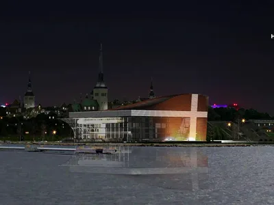
Hill & Cross Opera: Sculptural Opera House Architecture Shaped by Tallinn’s Landscape and Identity
Hill & Cross Opera reimagines opera house architecture in Tallinn through its sculptural hill, civic plaza, glass wave and a luminous cross.
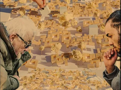
Riyadh For All: Intergenerational Urban Design for Active Aging in Rabat
Riyadh For All reimagines urban design in Rabat with intergenerational co-living, adaptive courtyards, and Moroccan cultural exchange today.

The Ocean Hive: Sustainable Architecture for a Self-Sufficient Civilization at Sea
The Ocean Hive imagines sustainable architecture at sea, where modular habitats, algae, wave power and ocean waste sustain a growing colony.

Co-Life: Senior Housing Design That Reconnects Older Adults With the City
Co-Life reimagines senior housing design through healing gardens, shared streets, workshops, and a sustainable community across generations.


Similar Reads
You might also enjoy these articles


Hodi-Mandai Geram
Project Function: Preservation and revitalization of the Intangible heritage and socio-spatial identity of the Hodi by Housing, Cultural Memory Center, Sacred Grove, landscape, local tourism economy

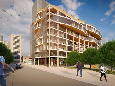
Olio Towers: A Mid-Rise for Performers That Fuses Housing, Rehearsal, and Stage
Located blocks from Houston's Theater District, this modular tower stacks living units around a central performance atrium.
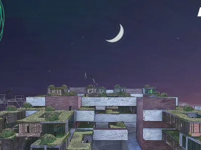
Oasis: Modular Green Housing Carved into Dhaka's Urban Fabric
A shortlisted Plugin Housing entry reclaims unauthorized settlements in Dhaka with stepped concrete volumes, green roofs, and ventilation-driven design.

Black Hole: A Floating Megastructure for the Post-Physical Era
Emiliano Mazzarotto envisions a spherical, self-scaling arena where e-sports, digital hotels, and holographic stadiums replace traditional public space.
Explore Architecture Competitions
Discover active competitions in this discipline



Challenge to reimagine the Iron Throne


Photograph architecture without architects


Illustrate the lost glory of Angkor Wat - Render Challenge


Design challenge to reuse E-waste
Comments (0)
Please login or sign up to add comments
No comments yet. Be the first to comment!