
P&P Architectes and Atelier A4 Rescue 40 Brussels Social Housing Units from Decades of Neglect
A 6-million-euro renovation in Woluwe-Saint-Lambert restores interwar character while adding zinc-clad rooftop volumes and timber extensions.
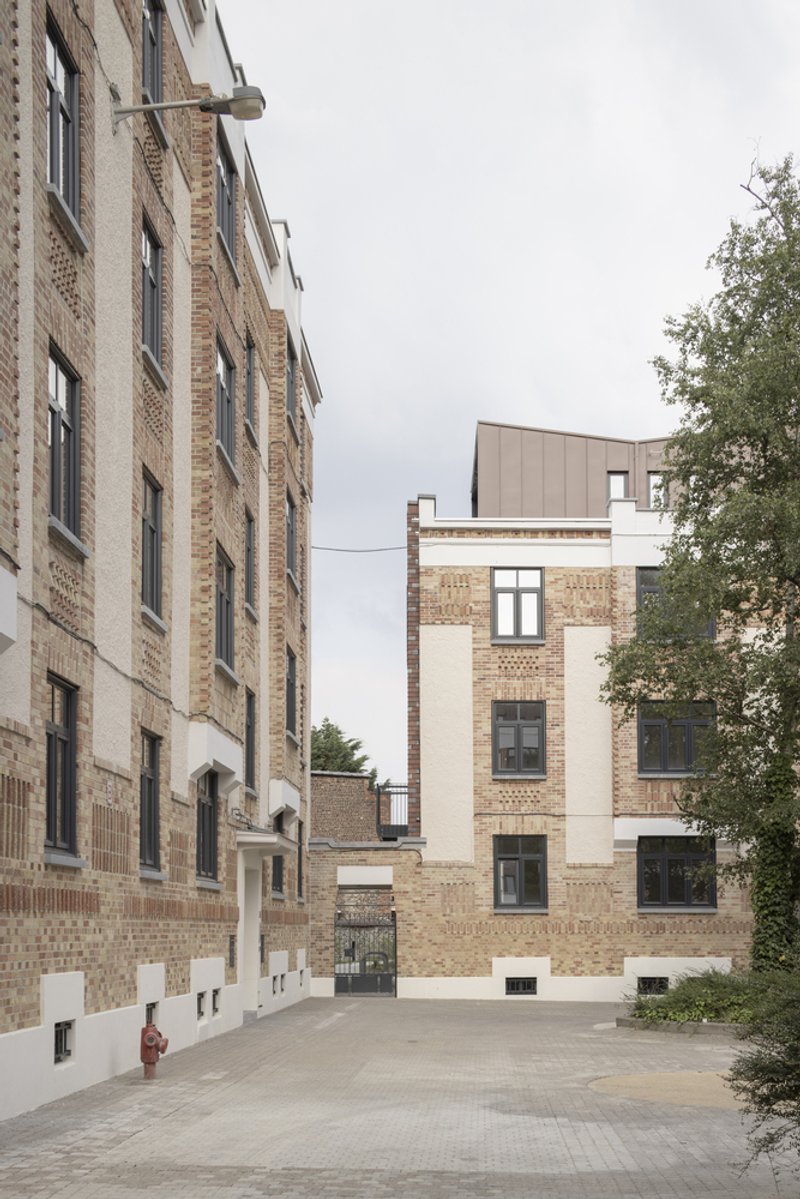
Three interwar residential buildings at the intersection of Rue de la Roche Fatale and Rue Montagne des Cerisiers in Woluwe-Saint-Lambert had, by the 1980s, lost nearly every trace of their original identity. Clumsy window replacements, unsympathetic pitched roofs, and piecemeal alterations had stripped the complex of its coherence. P&P Architectes and Atelier d'Architecture A4 were tasked with reversing that damage across 40 apartments and six addresses, all arranged around a tree-lined courtyard bordering Georges Henri Park. The result, completed in 2024 on a tight budget of 6 million euros, is one of the clearest recent demonstrations that social housing renovation can be simultaneously respectful and ambitious.
What makes the project worth studying is not any single gesture but the discipline of the dual strategy: restore the street facades to their original logic while using the rear and rooftop as sites for unambiguously contemporary intervention. The front elevations got historically proportioned window frames and cleaned brickwork. The back got flat clay tile cladding, timber-framed extensions, and heather-coloured zinc volumes. Neither move tries to impersonate the other, and the 4,108 square metres of gross floor area now contain 14 distinct apartment types, all single-level, all properly insulated, all facing either the courtyard or the park.
Street Facades Reclaimed
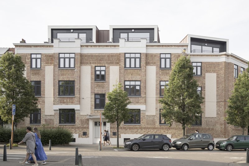
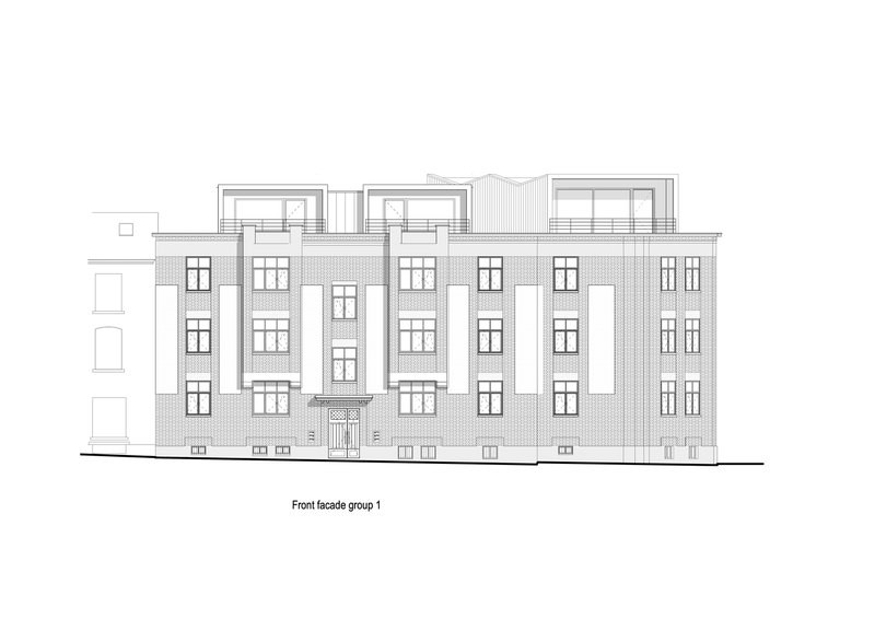
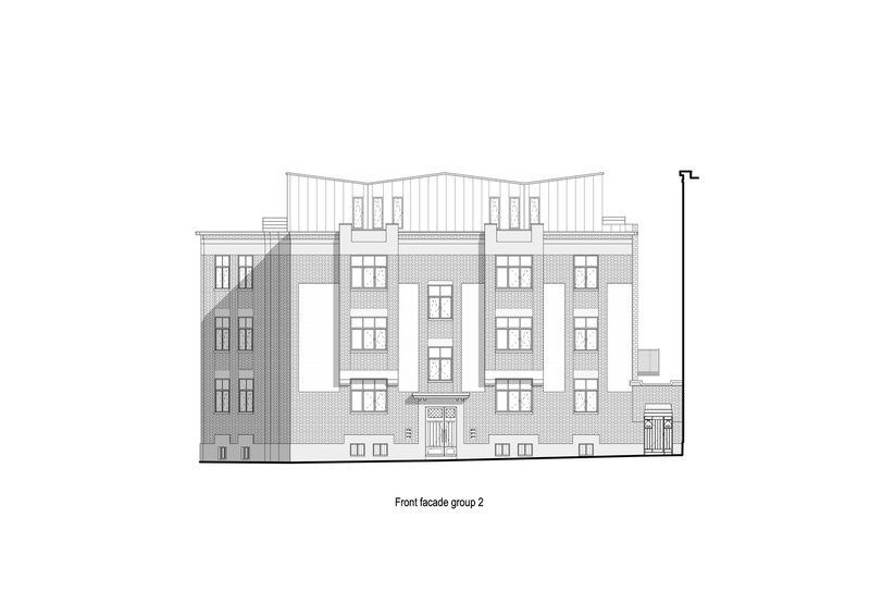
The front elevations tell the story of a building getting its face back. The 1970s-era windows, with their crude divisions and cheap profiles, have been replaced by frames that respect the original openings: taller, thinner, and rhythmically spaced to match the interwar proportions. The patterned brickwork and white stone pilasters, once buried behind decades of grime and mismatched infill, are legible again. It reads not as a facsimile of the past but as a clarification of what was always there.
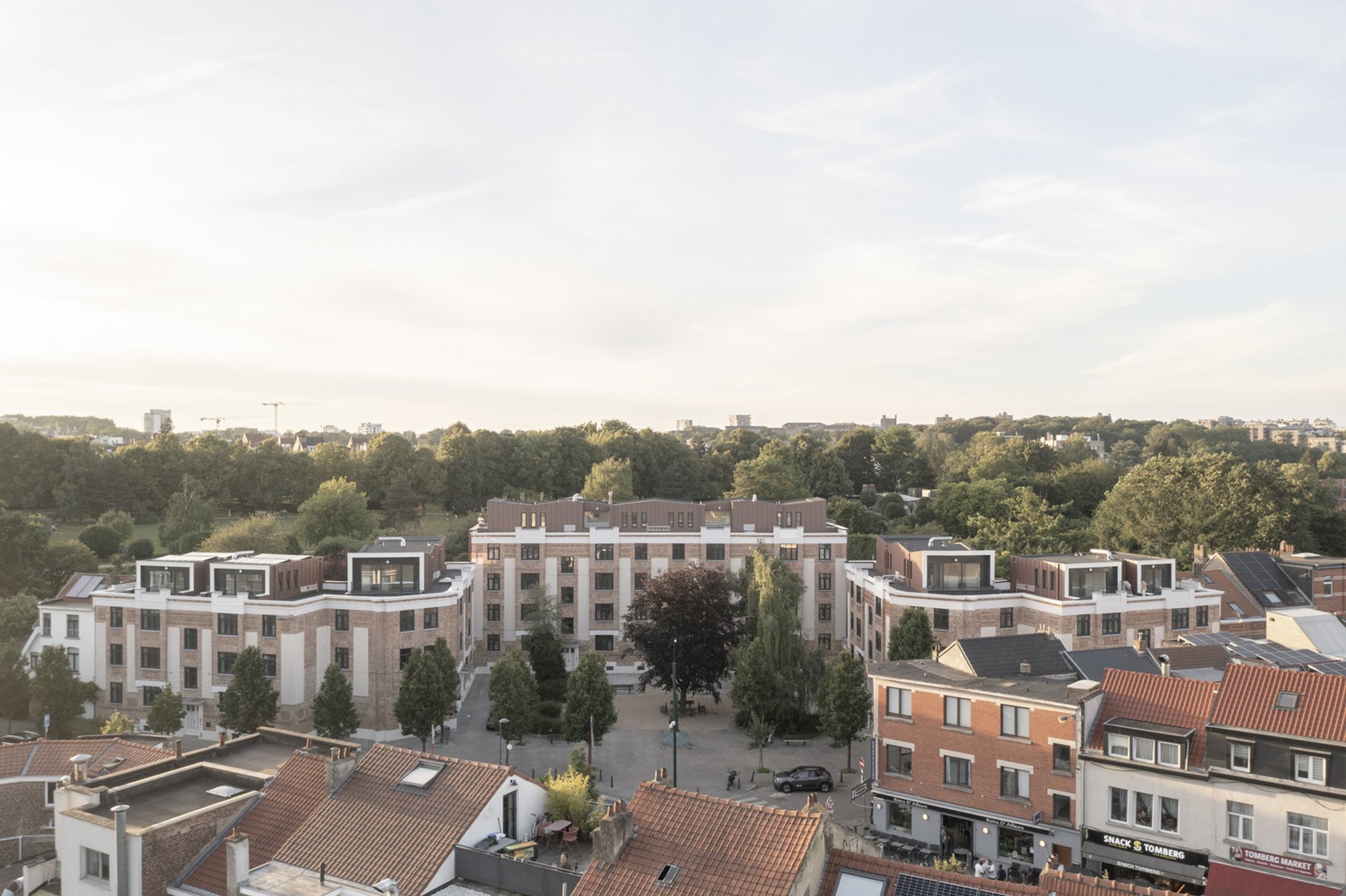
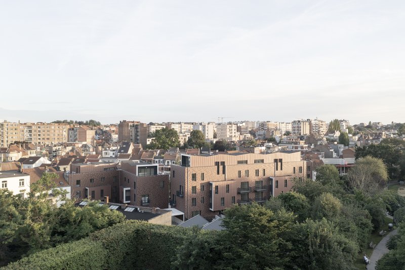
The multicoloured brick tower with recessed balconies shows how the architects handled corners and vertical transitions. A standing-seam metal pavilion crowns the volume, sitting back from the brick edge just enough to register as a new addition without competing with the masonry below. The paired residential blocks at golden hour reveal the payoff of this restraint: warm buff brick, setback upper stories, and a courtyard composition that finally coheres after decades of fragmentation.
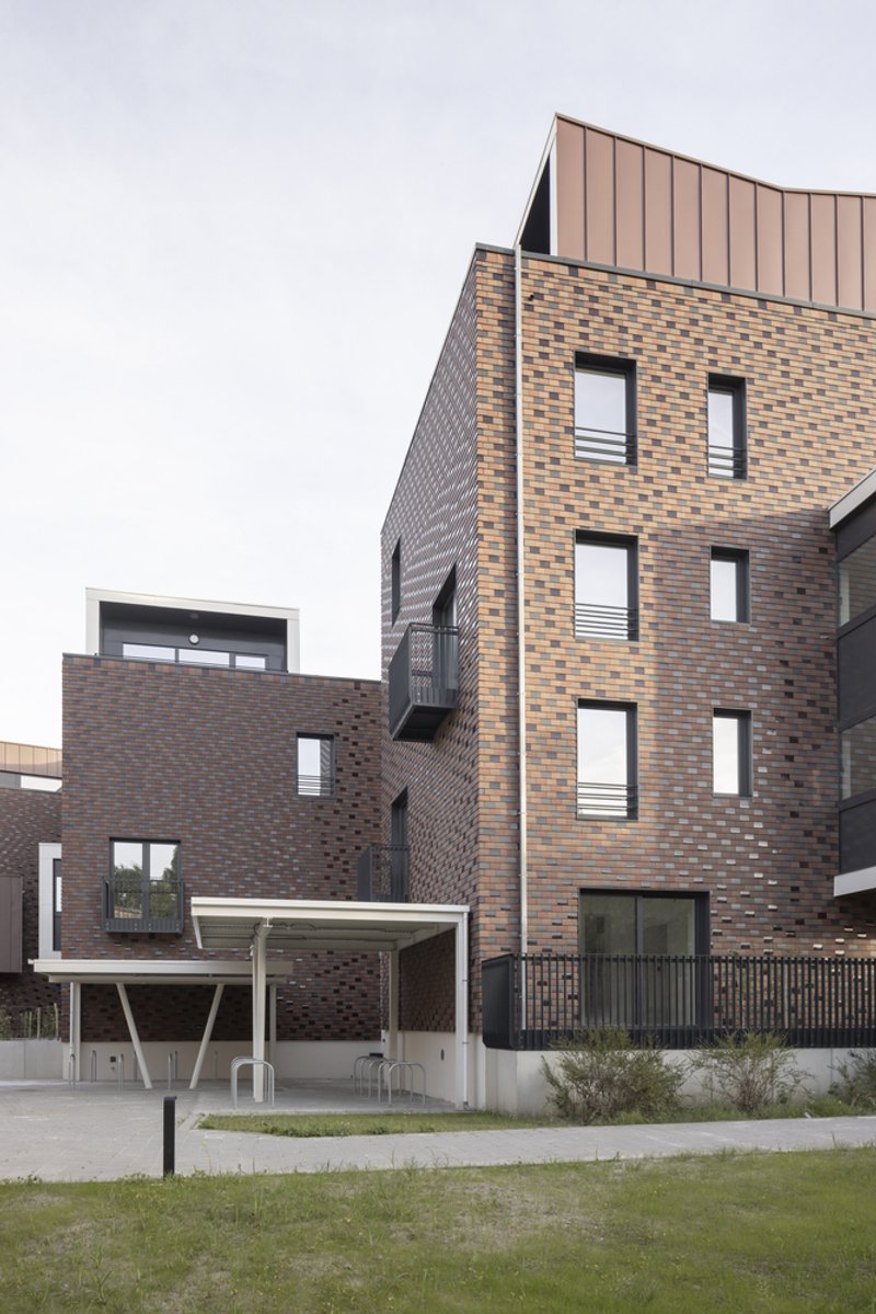
The Rear: A New Material Language
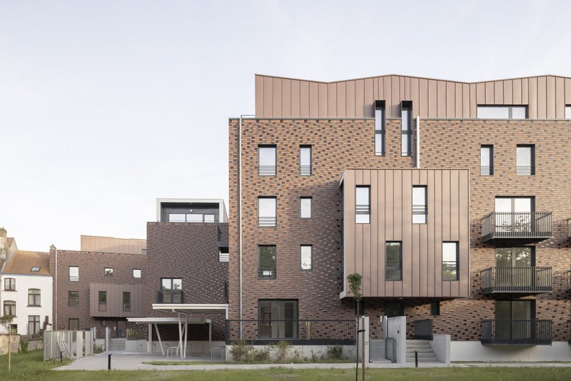
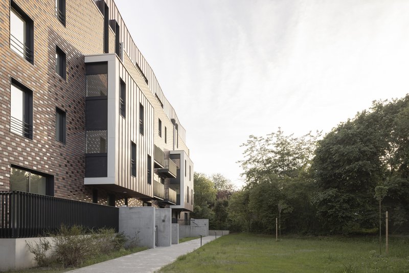
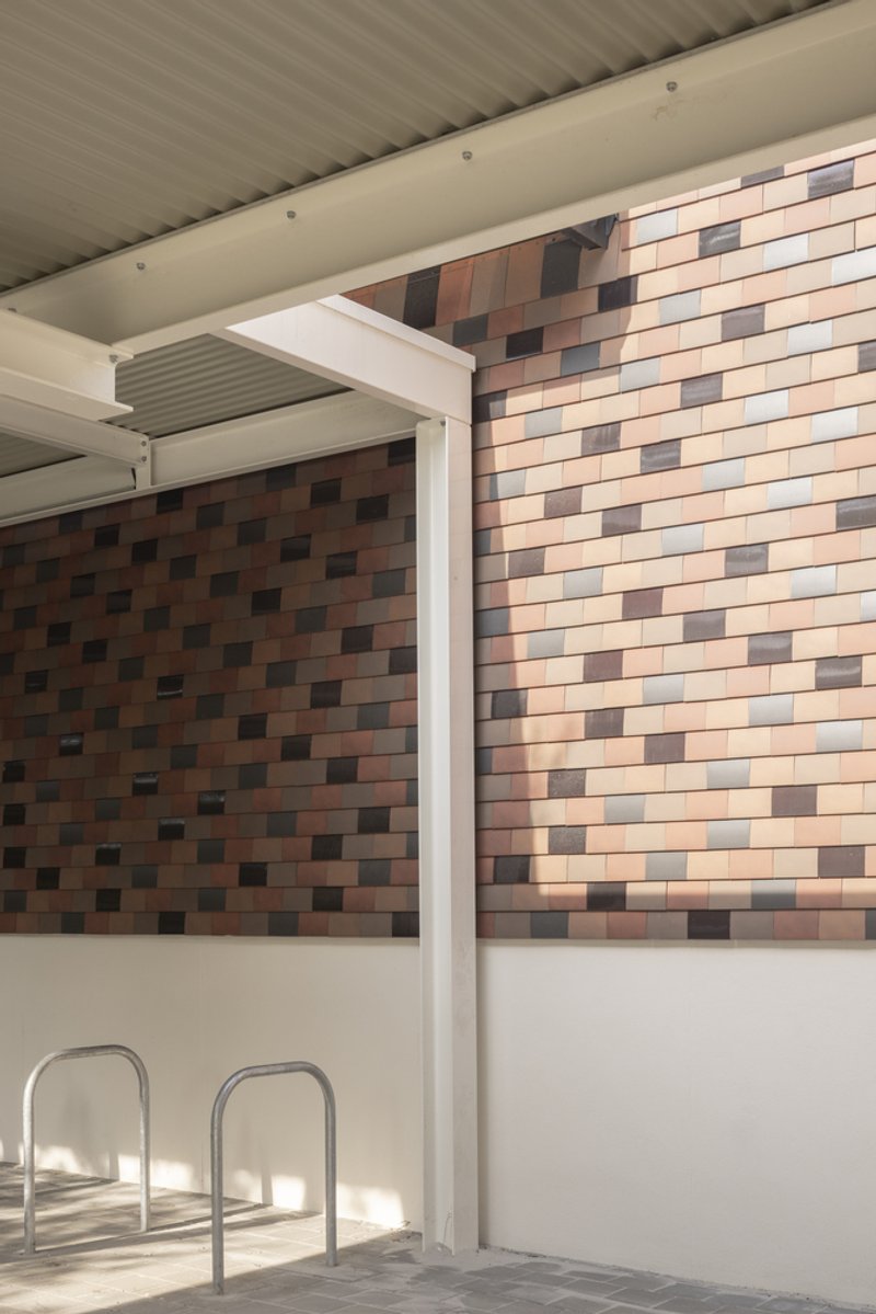
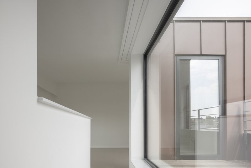
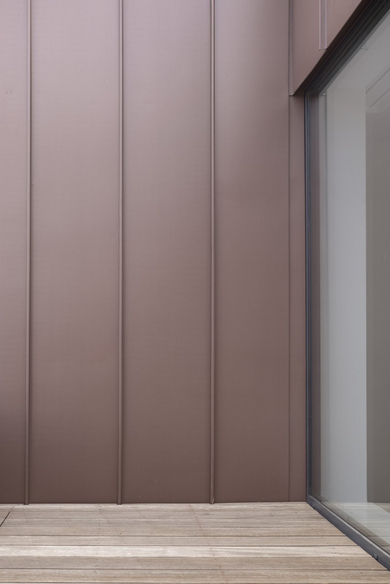
If the street facades are about recovery, the rear facades are about invention. Flat terracotta tiles wrap the insulated walls in a warm, textured skin that reads as a muted cousin to the original brick. Above and beside that skin, vertical zinc panels in a heather-grey tone mark the new extensions: timber-framed volumes that push outward to create extra living space without overloading the existing structure. The material palette is deliberately limited to three elements: clay, zinc, and timber. No composite panels, no render.
The setback logic is visible in the upper volume rising above the patterned brickwork and mature hedges. The new floor pulls away from the facade line, creating a shadow gap that makes the addition legible as an addition. It is a strategy borrowed from heritage practice but applied here with a social housing budget, which makes the precision all the more impressive.
Courtyard and Landscape
The courtyard is the quiet centre of the project. Paved ground surrounds a single mature tree, and the brick facades on either side frame views through to the park beyond. It is not a grand public space; it is a shared domestic threshold, scaled to the 40 households that use it. The absence of fussy landscaping is deliberate. The architects let the trees and the architecture do the work.
The covered parking area, with its white steel columns and multicoloured brick tile wall, deserves mention as an example of infrastructure treated with care. Social housing projects too often dump parking at grade behind blank walls. Here the tile pattern and slender structure make the parking feel like part of the composition rather than an afterthought.
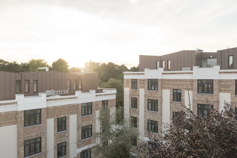
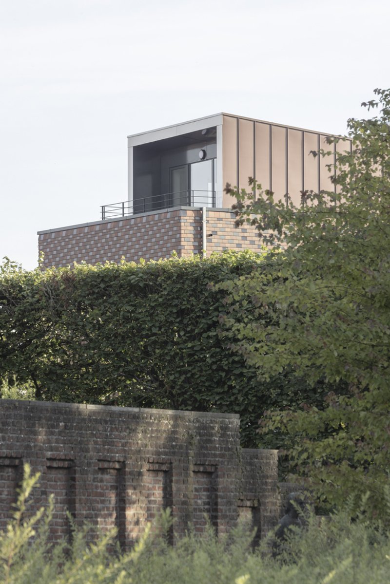
Rooftop Volumes and Zinc Cladding
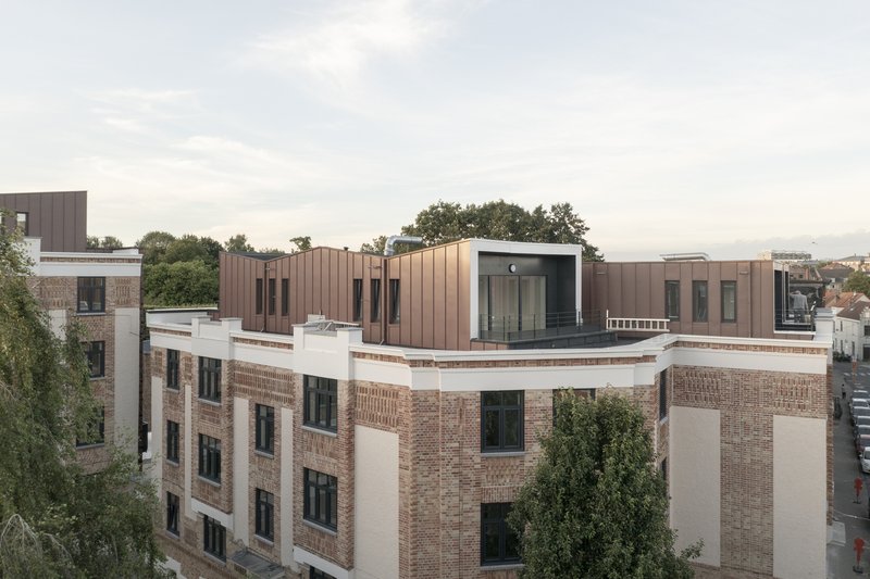
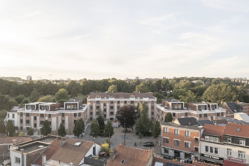
The non-original pitched roofs were dismantled entirely, restoring the original flat roof profiles and creating space for new rooftop volumes. These additions, clad in the same pre-patinated zinc as the rear extensions, sit like quiet boxes atop the brick base. The aerial view at dusk shows the courtyard complex as a whole, with the rooftop terraces catching the last light and the symmetrical U-plan finally readable as a single composition.
By stripping away false roofs and replacing them with occupied, insulated volumes, the architects turned wasted attic space into habitable apartments. The bronze-toned metal cladding weathers gracefully and avoids the institutional flatness that plagues so many rooftop additions in social housing. It is a small thing, but choosing a material that improves with age rather than deteriorating signals a fundamentally different attitude toward public investment.
Inside the Apartments
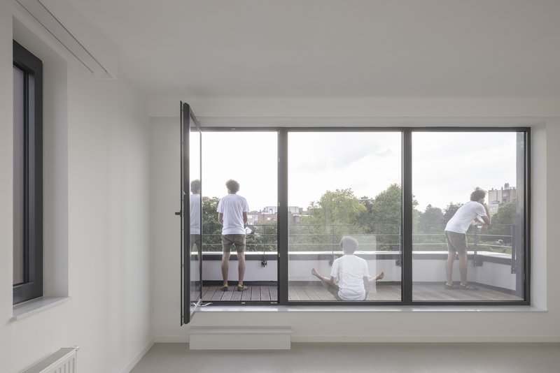
The interiors are bright and direct. Floor-to-ceiling glazed doors open onto timber-decked terraces, erasing the hard boundary between inside and outside that characterised the old apartments. The 14 different plan types, all configured as single-level units, avoid the duplex configurations that can create accessibility problems and awkward circulation in social housing. The decision to keep every apartment on one floor is unglamorous but important: it means elderly residents, families with young children, and people with mobility limitations all get equal access to well-proportioned space.
The sliding glass doors and bronze metal terrace enclosures visible in the upper apartments show the same material discipline found on the exterior. Zinc panels, timber decking, and white walls. The restraint is not about austerity; it is about making a 6-million-euro budget stretch across 40 units without sacrificing quality at the threshold where residents actually live.
Plans and Drawings
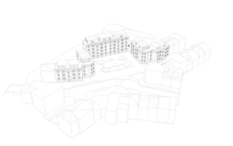
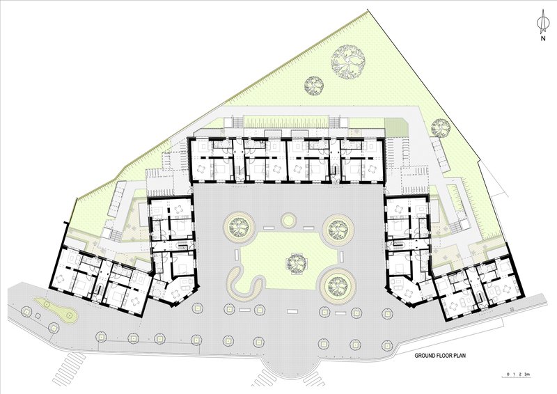
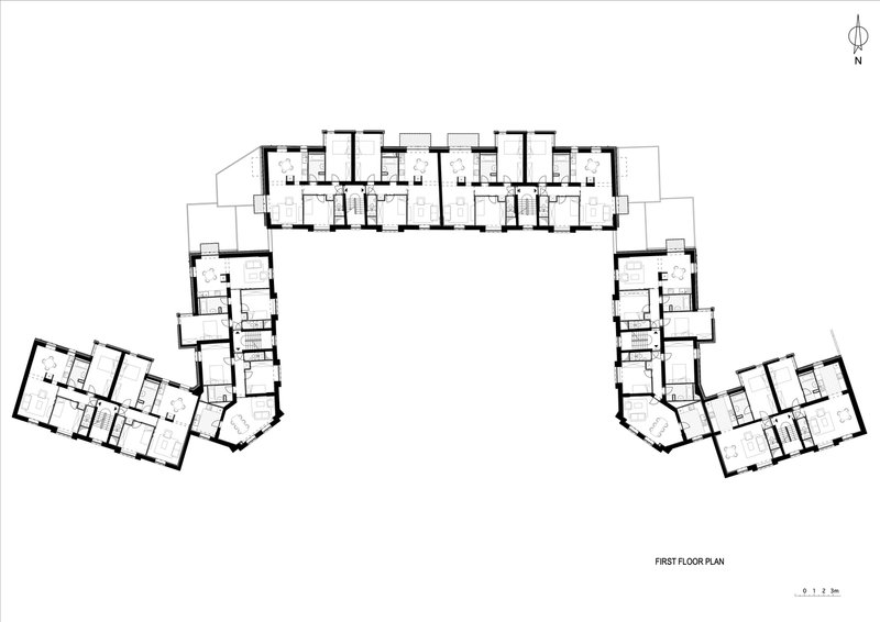
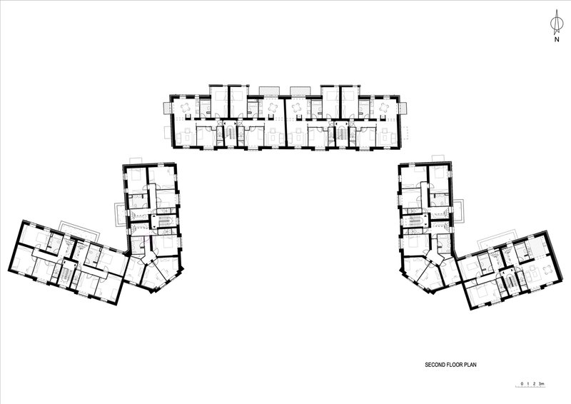
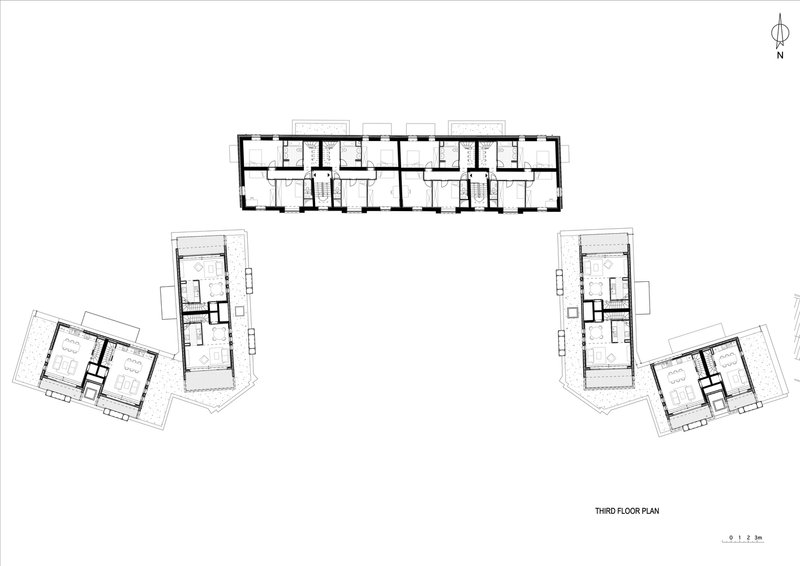
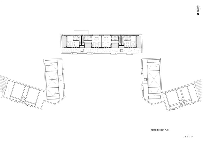
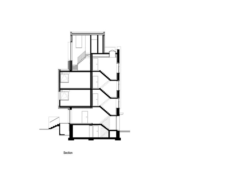
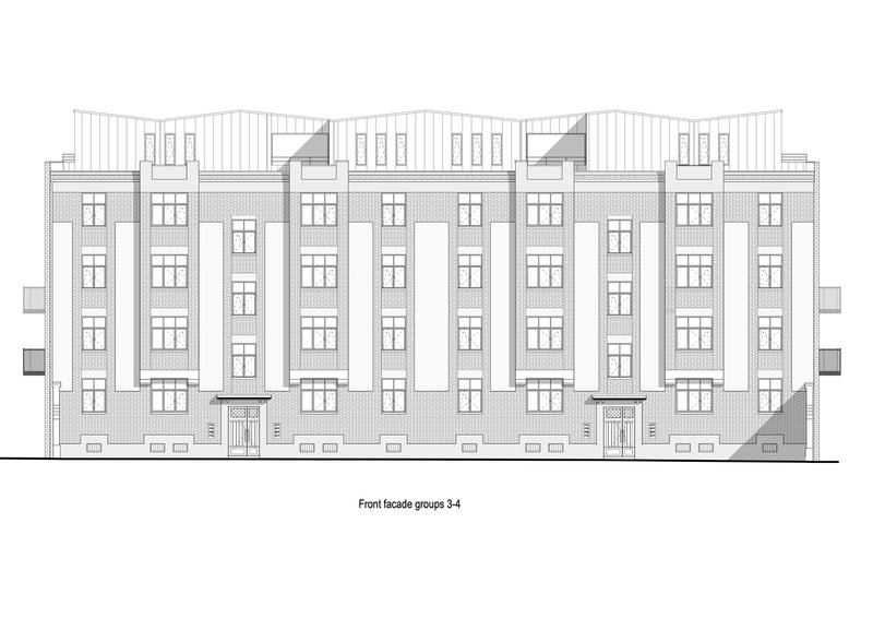
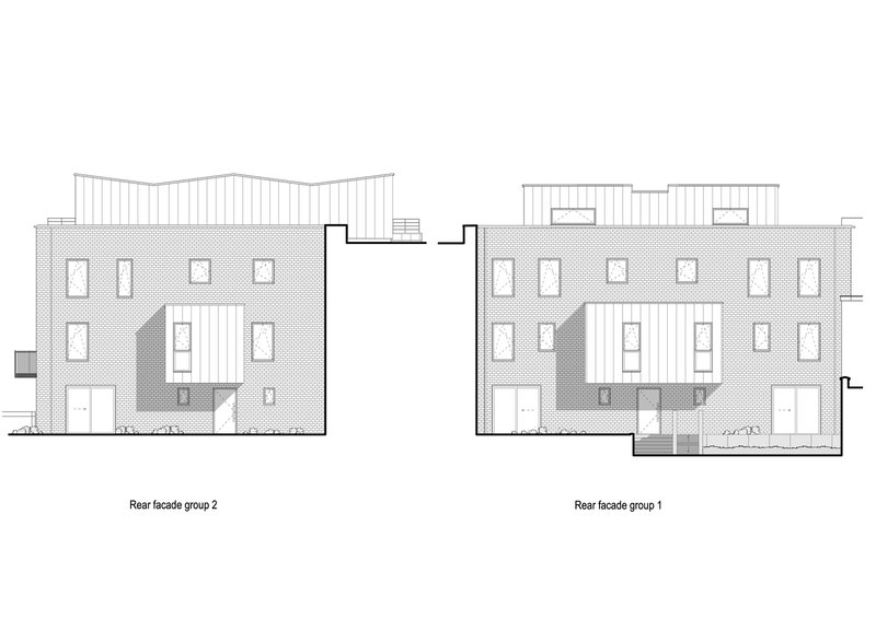
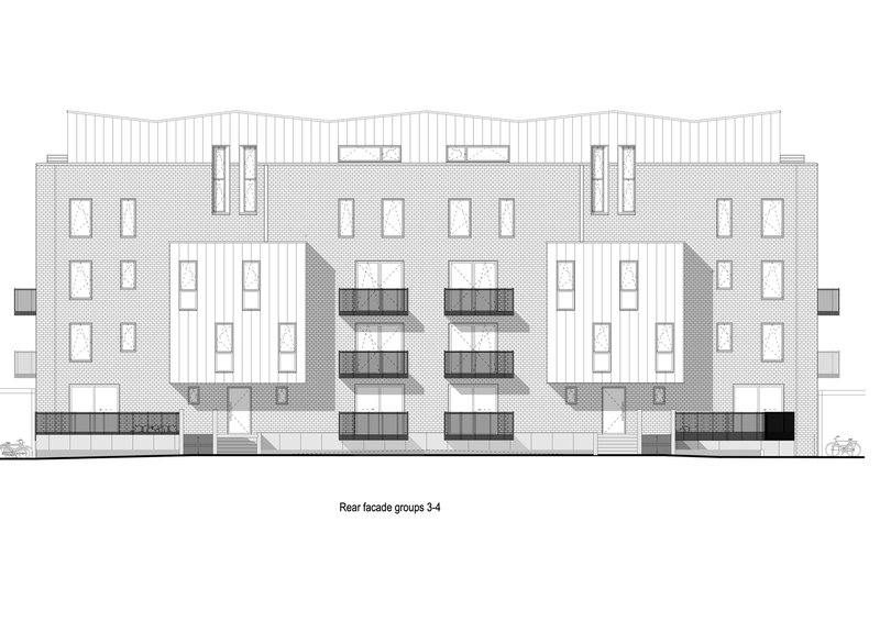
The axonometric drawing reveals the three-wing U-shaped plan in its full context, with the courtyard serving as the organizational core and the surrounding tree canopy forming a secondary enclosure. The ground floor plan shows the landscaped courtyard with circular tree plantings and how the residential wings wrap to create a sheltered interior world. Moving upward through the floors, the plans demonstrate the rational redistribution of spaces around existing vertical circulation cores: the architects kept the stair positions and reorganized everything else around them.
The sections cut through all four residential floors and the rooftop volumes, showing the relationship between the original brick structure and the lightweight timber-framed additions. The front and rear elevations are particularly instructive when read side by side. The front elevations show the restored brick bays, vertical window rhythms, and recessed penthouses. The rear elevations show the textured cladding and balcony extensions, a completely different architectural language applied to the same buildings. The contrast is the project's central idea, rendered clearly in every drawing.
Why This Project Matters
Roche Fatale matters because it refuses the false choice between heritage and performance. Too many social housing renovations treat thermal upgrading as a license to wrap buildings in anonymous insulation panels and call it done. Here, the insulation is there, the energy performance is improved, but the materials chosen to achieve those goals are architecturally specific: clay tiles that echo the original brick, zinc that ages with dignity, timber frames that reduce structural load. The 150,000-euro-per-unit budget is not generous by Brussels standards, which makes the material intelligence all the more relevant as a model.
The project also demonstrates that social housing renovation can produce genuine variety. Fourteen plan types across 40 apartments, each on a single level, each with access to outdoor space, each legibly connected to the courtyard and the park beyond. P&P Architectes and Atelier d'Architecture A4 have shown that working within tight constraints, existing structures, limited budgets, heritage expectations, does not have to produce generic results. The discipline required by those constraints, in fact, generated the project's best qualities.
Roche Fatale Social Housing Renovation by P&P Architectes and Atelier d'Architecture A4. Woluwe-Saint-Lambert, Brussels, Belgium. 4,108 m². Completed 2024. Photography by Nicolas Da Silva Lucas.
About the Studio
Share Your Own Work on uni.xyz
If projects like this are the kind of work you want to make, uni.xyz is a place to publish your own, find collaborators, and enter design competitions.

Popular Articles
Popular articles from the community
RDTH architekti Rips Out Nearly Every Wall in a Prague Apartment and Replaces Them with Furniture
A 101-square-meter post-war flat in Prague trades rigid partitions for a single rotated furniture block, curtains, and glass concrete.
Bernardes Arquitetura Stretches a Timber Roof Along a Reservoir's Edge in Minas Gerais
Dam House in Itaúna lets a sweeping wooden canopy dissolve the boundary between hillside terrain and open water.
HCCH Studio Wraps a Shanghai High-Rise Office in Curved Walls of Translucent Glass
A 1,000 square meter fit-out in Lujiazui replaces the typical tech-office palette with layered glass, micro-cement, and quiet rigor.
Fausto Terán and Toro Fuse Japanese Craft with Mexican Tradition in a Lakeside Retreat
Nakamura House pairs Shou-Sugi-Ban charred pine with handmade clay tile at the foot of Atlangatepec Lagoon in Mexico.


Similar Reads
You might also enjoy these articles
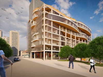
Olio Towers: A Mid-Rise for Performers That Fuses Housing, Rehearsal, and Stage
Located blocks from Houston's Theater District, this modular tower stacks living units around a central performance atrium.
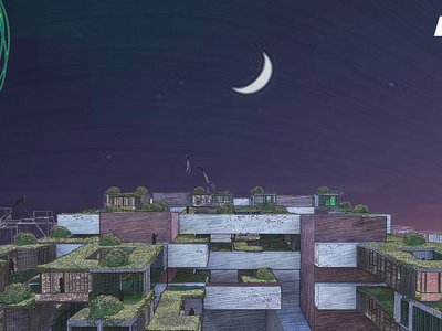
Oasis: Modular Green Housing Carved into Dhaka's Urban Fabric
A shortlisted Plugin Housing entry reclaims unauthorized settlements in Dhaka with stepped concrete volumes, green roofs, and ventilation-driven design.

Black Hole: A Floating Megastructure for the Post-Physical Era
Emiliano Mazzarotto envisions a spherical, self-scaling arena where e-sports, digital hotels, and holographic stadiums replace traditional public space.
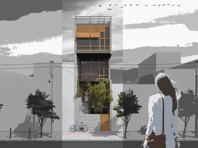
Compact & Sustainable Living in Piraeus: A Four-Level Family Home Built Around Light and Air
A narrow townhouse in one of Greece's densest port cities uses a central atrium and passive strategies to house three generations under one roof.

Explore Architecture Competitions
Discover active competitions in this discipline


The International Standard for Design Portfolios


The Global Benchmark for Architecture Dissertation Awards


The Global Benchmark for Graduation Excellence

Challenge to reimagine the Iron Throne
Comments (0)
Please login or sign up to add comments
No comments yet. Be the first to comment!