
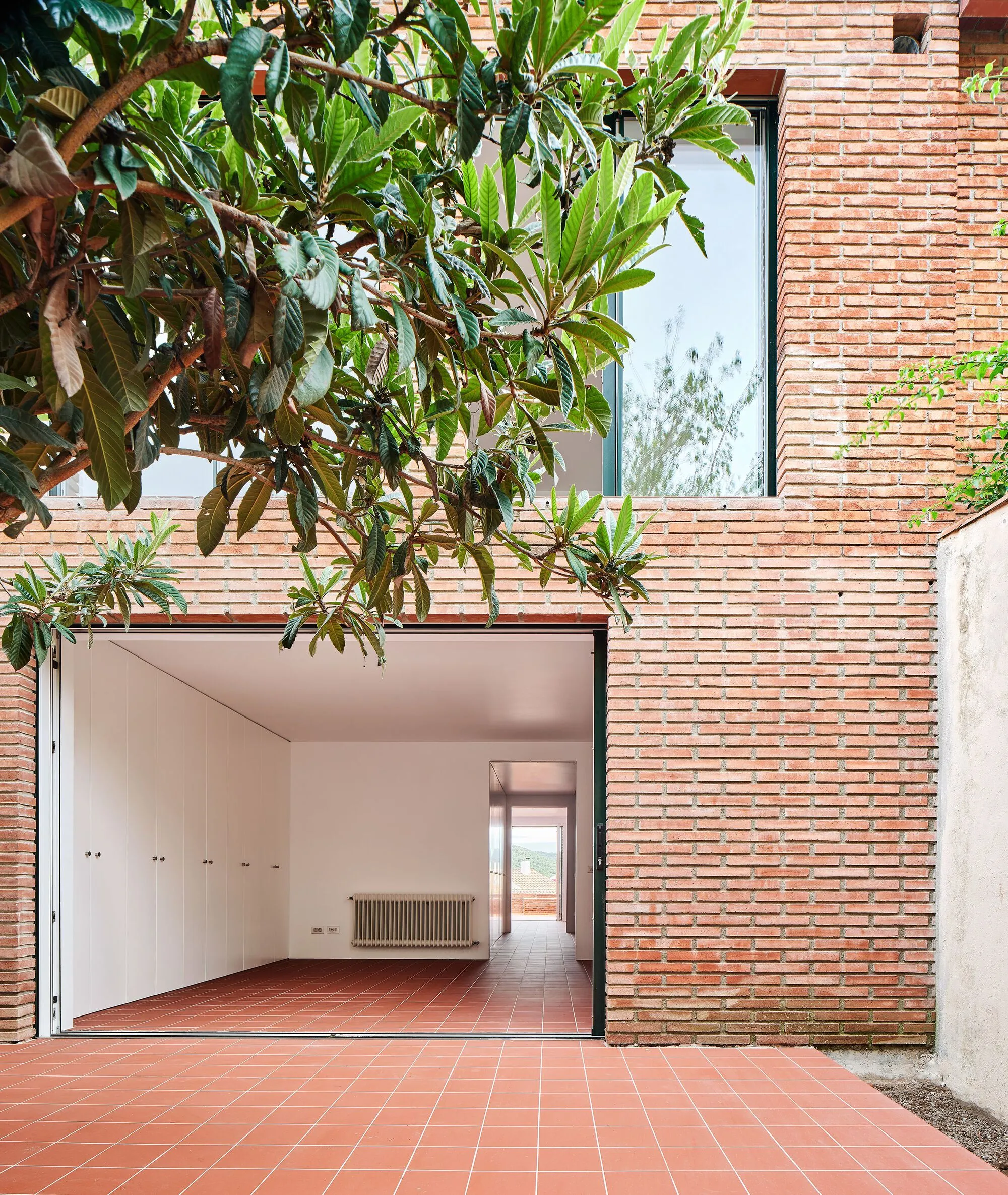
TALLER PONTI Flips a 1990s Row House in Sant Pere de Ribes by Entering Through the Garden
A four-story terraced house near Barcelona sheds its dim corridors for a courtyard-centered life built around terracotta and light.


Row houses from the 1990s speculative boom along the Catalan coast share a common DNA: tight ceiling heights, rooms stacked on narrow footprints, front doors that dump you into a parking garage. The Brunofierro House in Sant Pere de Ribes, about 50 kilometers south of Barcelona, was exactly that kind of building. Dense, large on paper at 203 square meters across four floors, but spatially stingy. Ceilings cleared only 255 centimeters. Semi-dark rooms lined up behind a conventional street entrance that prioritized cars over people.
What makes TALLER PONTI's renovation, led by architect Jaume Coscollar, genuinely interesting is a single strategic reversal: instead of entering from the street through the parking level, you now arrive from the rear public garden at ground level, stepping through a generous glass opening into the heart of the house. That one move reorients the entire domestic experience. Light, sequence, hierarchy, the relationship between inside and outside: everything shifts because the threshold moved.
The Garden Entrance as a Founding Move
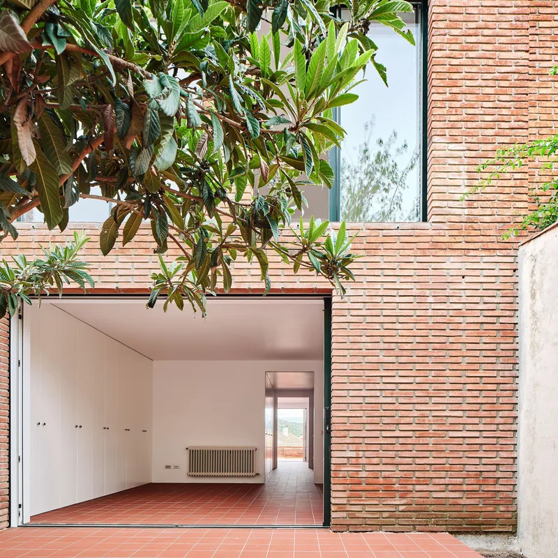


The brick facade facing the rear garden is punched with a large opening that reads more as a frame than a wall. An overhanging frangipani tree filters light across the terracotta courtyard, establishing a transitional zone that belongs neither fully to the public garden nor to the private interior. You pass through climbing vines, along a terracotta-tiled passage, and into the house without ever feeling like you've crossed a hard boundary.
This is important because row houses of this type usually treat their rear elevations as afterthoughts, service walls with small windows and utility balconies. Coscollar and TALLER PONTI reversed that logic entirely. The garden side becomes the address. The courtyard becomes the foyer. It is a quiet but significant act of inversion that redefines what counts as the front of the house.
Terracotta as a Continuous Ground
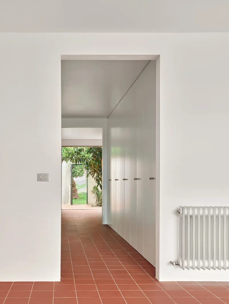

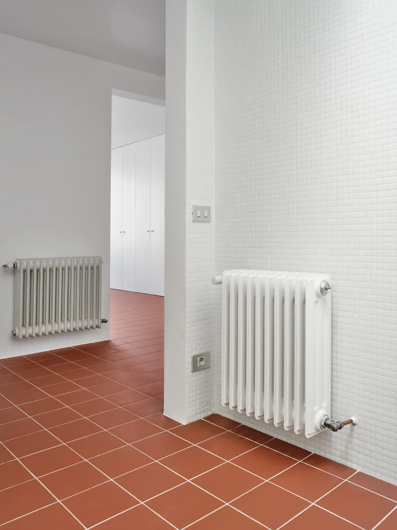
Terracotta tile runs through virtually every room, corridor, and threshold in the house. It paves the courtyard, lines the hallways, covers the bathroom floors. In a project where ceiling heights are restrictive, keeping the floor material constant does real spatial work: it eliminates visual interruptions and lets the eye travel unbroken from one end of the house to the other. The warm reddish tone also counters what must have been a cold, generic palette in the original 1990s interior.
The terracotta is not used as a decorative surface. It functions as the connective tissue of the plan. Where the floor is terracotta, you know you are in the world of the renovation. Where it meets the brick of the exterior wall or the white mosaic tile of the wet rooms, transitions are handled cleanly, without trim or fanfare. The material does the organizational work that, in a larger house, spatial volume alone could accomplish.
White Walls and the Problem of Low Ceilings

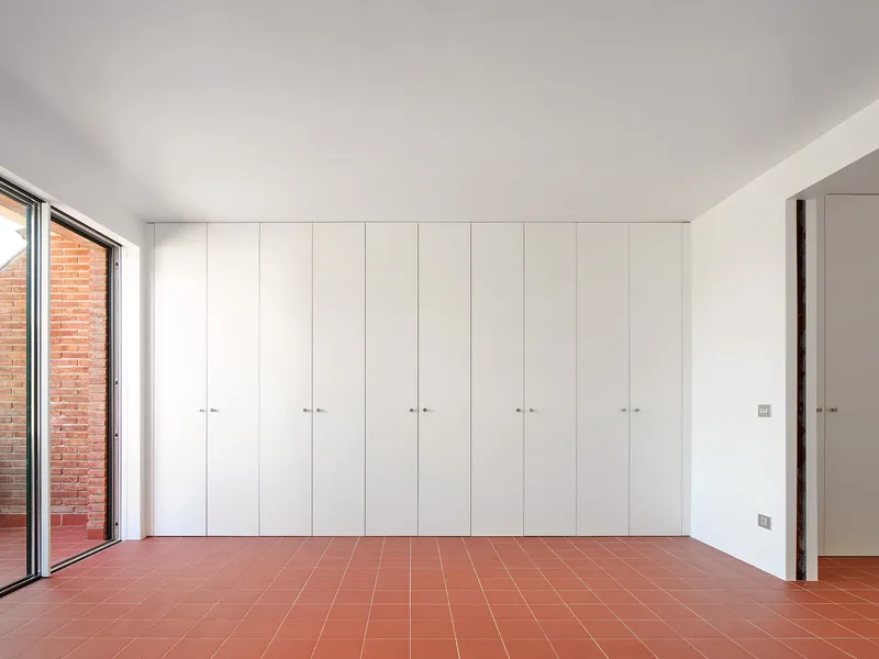
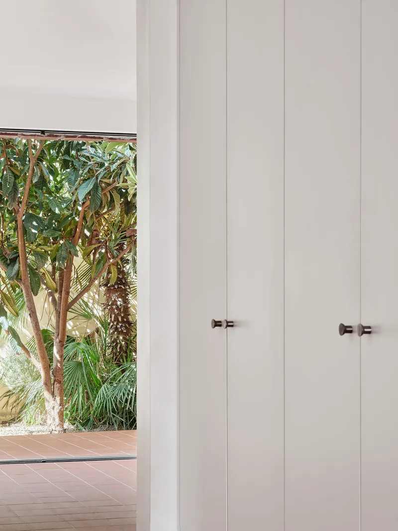
At 255 centimeters, the ceiling clear height is about as low as residential construction gets before feeling oppressive. TALLER PONTI responds with restraint. Walls are plastered white and kept deliberately bare. A continuous white ledge runs beneath the walls in certain rooms, creating a datum line that reads as wainscoting or bench, which paradoxically makes the walls above it feel taller than they are. Full-height white storage cabinets with simple bronze knobs serve as walls themselves, absorbing domestic clutter so that the rooms can remain unencumbered.
The decision to open certain rooms fully to the courtyard through floor-to-ceiling glazing is critical here. When you cannot go up, you go out. The borrowed depth of the courtyard and garden beyond compensates for the compression of the section. Rooms that might feel boxed in become extensions of the outdoor space, their limits dissolved by glass and continuous terracotta underfoot.
Wet Rooms and the Mosaic Curve
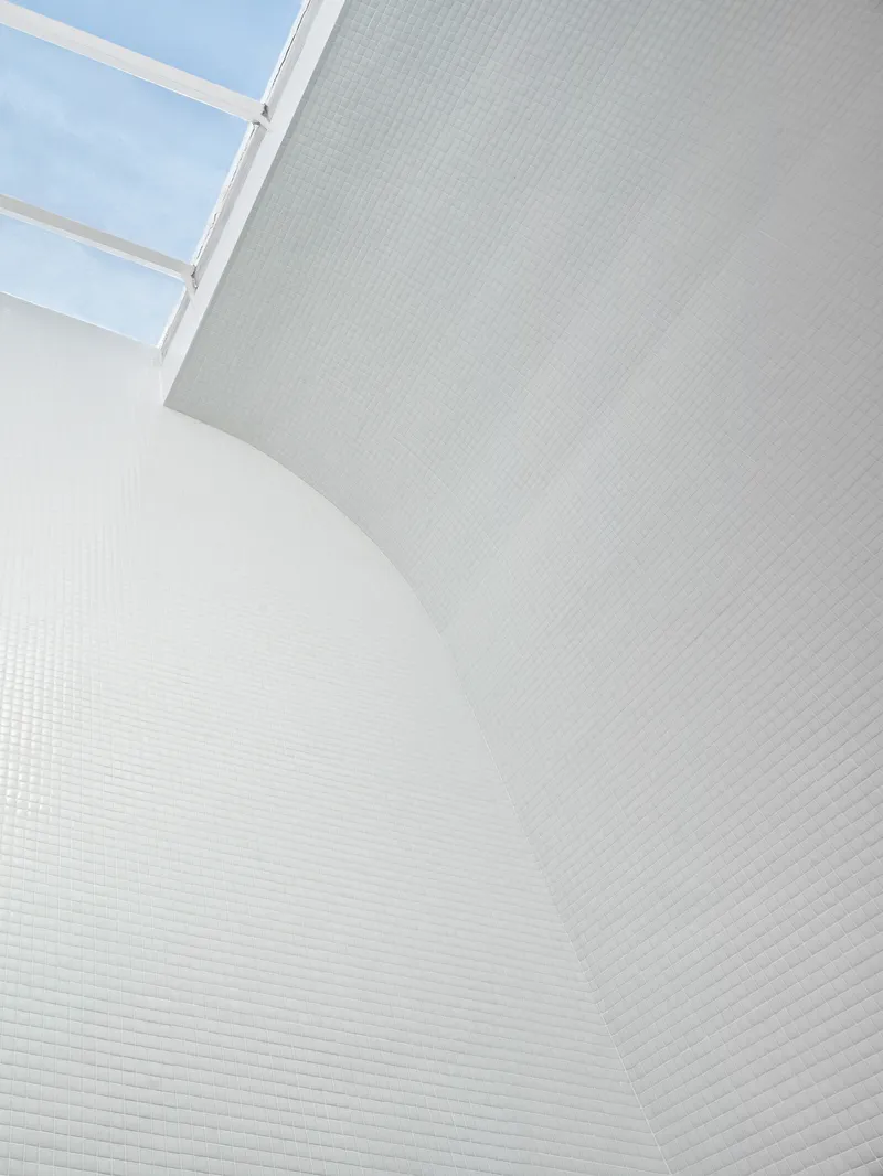
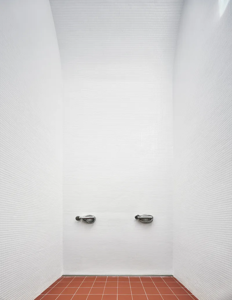

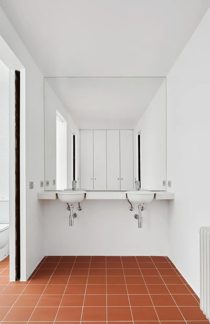
The bathrooms introduce the project's one moment of formal exuberance: a curved wall clad in white mosaic tile that rises to meet a skylight open to the blue sky. In a house defined by orthogonal discipline, this curve is a controlled exception. It softens the shower alcove and the bathroom volumes, turning what are typically the smallest, most utilitarian rooms into the ones with the most spatial generosity.
Clerestory windows in the bathroom cast angular shadows across the white tile, creating a play of light that changes through the day. The twin sinks and chrome fittings are deliberately simple, letting the architecture do the work. The narrow shower alcove with its dual faucets and mosaic walls feels almost vaulted, an impression achieved purely through the curve and the overhead light. It is a smart inversion of effort: lavish the architecture on the rooms where people are most naked and most present.
The Brick Detail at the Roof Edge

A close detail at the roof level reveals how carefully the stepped brick and terracotta tile meet at the parapet. This is not a dramatic move. But it tells you that TALLER PONTI treated the renovation as a material project, not just a spatial one. The brick coursing steps upward with precision, the terracotta caps it, and the street pavement is visible just below. In row house renovation, where budgets are finite and clients want square meters over flourishes, this kind of craft at the building's edge signals an architect who refused to let the top of the wall be an afterthought.
Plans and Drawings
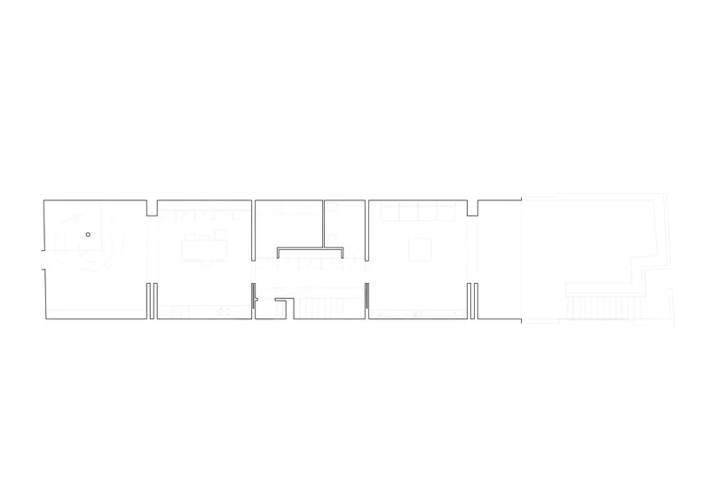
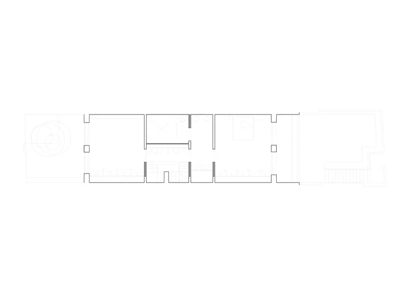
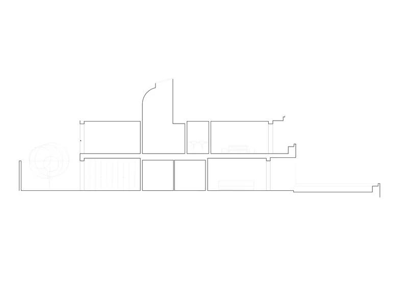
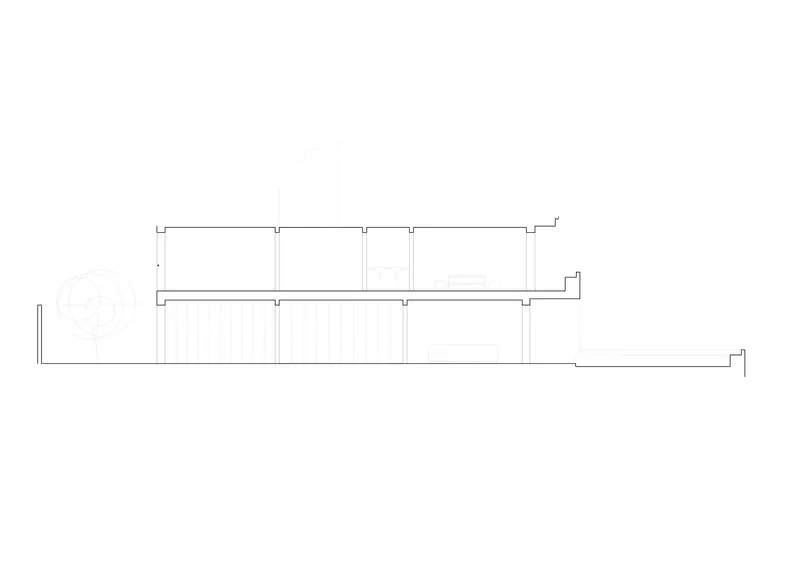
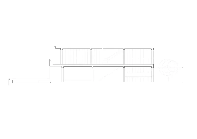
The floor plans confirm the linear organization: rooms arranged along a corridor that runs the full depth of the narrow lot. The sections are where the project's ambition becomes legible. Split-level floors negotiate the grade change between the street and the rear garden, and the stepped roof levels shown in the long section reveal that the attic is not a leftover space but a deliberately shaped volume that gains height through the roof profile. Vertical circulation threads through the center of the plan, connecting four distinct levels within what reads from the street as a modest two-story facade.
What the drawings make clear is that the renovation is not cosmetic. The entry sequence, the section, and the relationship between levels have all been fundamentally restructured. The regular column spacing visible in the long section suggests the original concrete frame was retained, but everything within it has been rethought. This is a renovation that works at the bones of the building, not just its skin.
Why This Project Matters
Millions of speculative row houses from the 1980s and 1990s line the edges of Mediterranean villages, and most of them are awful to live in. Too dark, too compartmentalized, entered through garages. The Brunofierro House demonstrates that the problem is not the building type or even the construction quality. It is the logic of entry and sequence. Flip the entrance, connect the plan to a garden, run a single warm material through the ground plane, and the same 203 square meters become a fundamentally different kind of home.
TALLER PONTI and Jaume Coscollar did not try to make this house spectacular. They tried to make it correct, and they succeeded. The curved mosaic wall, the frangipani in the courtyard, the terracotta underfoot: these are specific, measured pleasures. In a discipline that often treats renovation as a lesser act than new construction, the Brunofierro House is a reminder that the harder, more valuable skill is knowing what to change and what to leave alone.
Brunofierro House by TALLER PONTI, lead architect Jaume Coscollar. Sant Pere de Ribes, Spain. 203 m², completed 2022. Photography by José Hevia.
About the Studio
Share Your Own Work on uni.xyz
If projects like this are the kind of work you want to make, uni.xyz is a place to publish your own, find collaborators, and enter design competitions.



Popular Articles
Popular articles from the community

Hill & Cross Opera: Sculptural Opera House Architecture Shaped by Tallinn’s Landscape and Identity
Hill & Cross Opera reimagines opera house architecture in Tallinn through its sculptural hill, civic plaza, glass wave and a luminous cross.
The Earth Pod: 3D Printed Homes for Resilient Refugee Communities
The Earth Pod reimagines refugee housing through 3D printed homes made from clay, combining resilience, self-sufficiency, and rapid shelter.

The Ocean Hive: Sustainable Architecture for a Self-Sufficient Civilization at Sea
The Ocean Hive imagines sustainable architecture at sea, where modular habitats, algae, wave power and ocean waste sustain a growing colony.

AL-JANNAH: Sustainable Architecture and Permaculture for Afghan Widows
AL-JANNAH uses sustainable architecture and permaculture to create resilient oasis of housing, learning, work and renewal for Afghan widows.


Similar Reads
You might also enjoy these articles

Bao Huynh Watercolor Atelier: A Serene Art Retreat in Hội An
Bao Huynh Watercolor Atelier in Hội An blends multifunctional art spaces, sustainable design, local materials, and family-friendly living in a serene environment.

Atelier Macri Concept Store Interior Design by CASE-REAL
Atelier Macri store features a "ko" counter, walnut wood details, cork displays, blending retail, gallery, and seamless customer experiences.

Manuel Vargas Izquierdo Stadium and High-Performance Sports Center: Architectural Excellence in Jalpa de Méndez
The Manuel Vargas Izquierdo Stadium blends sustainable design, inclusive sports facilities, and cultural-inspired architecture, revitalizing Jalpa de Méndez’s public spaces.

KAKR Buluh Awar Hall: Revitalizing Community and Ecology Through Bamboo Architecture
Community built bamboo hall revitalizes Buluh Awar village, empowering youth, restoring ecology, celebrating vernacular craftsmanship through sustainable architecture and culture.

Explore Residential Building Competitions
Discover active competitions in this discipline


Challenge to design mud housing for contemporary communities


Challenge to design luxury tourism on rails


VR headsets Storefront design competition

Designing a staircase for a client
Comments (0)
Please login or sign up to add comments
No comments yet. Be the first to comment!